3: Examining the Evidence using Graphs and Statistics
- Page ID
- 5328
\( \newcommand{\vecs}[1]{\overset { \scriptstyle \rightharpoonup} {\mathbf{#1}} } \)
\( \newcommand{\vecd}[1]{\overset{-\!-\!\rightharpoonup}{\vphantom{a}\smash {#1}}} \)
\( \newcommand{\dsum}{\displaystyle\sum\limits} \)
\( \newcommand{\dint}{\displaystyle\int\limits} \)
\( \newcommand{\dlim}{\displaystyle\lim\limits} \)
\( \newcommand{\id}{\mathrm{id}}\) \( \newcommand{\Span}{\mathrm{span}}\)
( \newcommand{\kernel}{\mathrm{null}\,}\) \( \newcommand{\range}{\mathrm{range}\,}\)
\( \newcommand{\RealPart}{\mathrm{Re}}\) \( \newcommand{\ImaginaryPart}{\mathrm{Im}}\)
\( \newcommand{\Argument}{\mathrm{Arg}}\) \( \newcommand{\norm}[1]{\| #1 \|}\)
\( \newcommand{\inner}[2]{\langle #1, #2 \rangle}\)
\( \newcommand{\Span}{\mathrm{span}}\)
\( \newcommand{\id}{\mathrm{id}}\)
\( \newcommand{\Span}{\mathrm{span}}\)
\( \newcommand{\kernel}{\mathrm{null}\,}\)
\( \newcommand{\range}{\mathrm{range}\,}\)
\( \newcommand{\RealPart}{\mathrm{Re}}\)
\( \newcommand{\ImaginaryPart}{\mathrm{Im}}\)
\( \newcommand{\Argument}{\mathrm{Arg}}\)
\( \newcommand{\norm}[1]{\| #1 \|}\)
\( \newcommand{\inner}[2]{\langle #1, #2 \rangle}\)
\( \newcommand{\Span}{\mathrm{span}}\) \( \newcommand{\AA}{\unicode[.8,0]{x212B}}\)
\( \newcommand{\vectorA}[1]{\vec{#1}} % arrow\)
\( \newcommand{\vectorAt}[1]{\vec{\text{#1}}} % arrow\)
\( \newcommand{\vectorB}[1]{\overset { \scriptstyle \rightharpoonup} {\mathbf{#1}} } \)
\( \newcommand{\vectorC}[1]{\textbf{#1}} \)
\( \newcommand{\vectorD}[1]{\overrightarrow{#1}} \)
\( \newcommand{\vectorDt}[1]{\overrightarrow{\text{#1}}} \)
\( \newcommand{\vectE}[1]{\overset{-\!-\!\rightharpoonup}{\vphantom{a}\smash{\mathbf {#1}}}} \)
\( \newcommand{\vecs}[1]{\overset { \scriptstyle \rightharpoonup} {\mathbf{#1}} } \)
\(\newcommand{\longvect}{\overrightarrow}\)
\( \newcommand{\vecd}[1]{\overset{-\!-\!\rightharpoonup}{\vphantom{a}\smash {#1}}} \)
\(\newcommand{\avec}{\mathbf a}\) \(\newcommand{\bvec}{\mathbf b}\) \(\newcommand{\cvec}{\mathbf c}\) \(\newcommand{\dvec}{\mathbf d}\) \(\newcommand{\dtil}{\widetilde{\mathbf d}}\) \(\newcommand{\evec}{\mathbf e}\) \(\newcommand{\fvec}{\mathbf f}\) \(\newcommand{\nvec}{\mathbf n}\) \(\newcommand{\pvec}{\mathbf p}\) \(\newcommand{\qvec}{\mathbf q}\) \(\newcommand{\svec}{\mathbf s}\) \(\newcommand{\tvec}{\mathbf t}\) \(\newcommand{\uvec}{\mathbf u}\) \(\newcommand{\vvec}{\mathbf v}\) \(\newcommand{\wvec}{\mathbf w}\) \(\newcommand{\xvec}{\mathbf x}\) \(\newcommand{\yvec}{\mathbf y}\) \(\newcommand{\zvec}{\mathbf z}\) \(\newcommand{\rvec}{\mathbf r}\) \(\newcommand{\mvec}{\mathbf m}\) \(\newcommand{\zerovec}{\mathbf 0}\) \(\newcommand{\onevec}{\mathbf 1}\) \(\newcommand{\real}{\mathbb R}\) \(\newcommand{\twovec}[2]{\left[\begin{array}{r}#1 \\ #2 \end{array}\right]}\) \(\newcommand{\ctwovec}[2]{\left[\begin{array}{c}#1 \\ #2 \end{array}\right]}\) \(\newcommand{\threevec}[3]{\left[\begin{array}{r}#1 \\ #2 \\ #3 \end{array}\right]}\) \(\newcommand{\cthreevec}[3]{\left[\begin{array}{c}#1 \\ #2 \\ #3 \end{array}\right]}\) \(\newcommand{\fourvec}[4]{\left[\begin{array}{r}#1 \\ #2 \\ #3 \\ #4 \end{array}\right]}\) \(\newcommand{\cfourvec}[4]{\left[\begin{array}{c}#1 \\ #2 \\ #3 \\ #4 \end{array}\right]}\) \(\newcommand{\fivevec}[5]{\left[\begin{array}{r}#1 \\ #2 \\ #3 \\ #4 \\ #5 \\ \end{array}\right]}\) \(\newcommand{\cfivevec}[5]{\left[\begin{array}{c}#1 \\ #2 \\ #3 \\ #4 \\ #5 \\ \end{array}\right]}\) \(\newcommand{\mattwo}[4]{\left[\begin{array}{rr}#1 \amp #2 \\ #3 \amp #4 \\ \end{array}\right]}\) \(\newcommand{\laspan}[1]{\text{Span}\{#1\}}\) \(\newcommand{\bcal}{\cal B}\) \(\newcommand{\ccal}{\cal C}\) \(\newcommand{\scal}{\cal S}\) \(\newcommand{\wcal}{\cal W}\) \(\newcommand{\ecal}{\cal E}\) \(\newcommand{\coords}[2]{\left\{#1\right\}_{#2}}\) \(\newcommand{\gray}[1]{\color{gray}{#1}}\) \(\newcommand{\lgray}[1]{\color{lightgray}{#1}}\) \(\newcommand{\rank}{\operatorname{rank}}\) \(\newcommand{\row}{\text{Row}}\) \(\newcommand{\col}{\text{Col}}\) \(\renewcommand{\row}{\text{Row}}\) \(\newcommand{\nul}{\text{Nul}}\) \(\newcommand{\var}{\text{Var}}\) \(\newcommand{\corr}{\text{corr}}\) \(\newcommand{\len}[1]{\left|#1\right|}\) \(\newcommand{\bbar}{\overline{\bvec}}\) \(\newcommand{\bhat}{\widehat{\bvec}}\) \(\newcommand{\bperp}{\bvec^\perp}\) \(\newcommand{\xhat}{\widehat{\xvec}}\) \(\newcommand{\vhat}{\widehat{\vvec}}\) \(\newcommand{\uhat}{\widehat{\uvec}}\) \(\newcommand{\what}{\widehat{\wvec}}\) \(\newcommand{\Sighat}{\widehat{\Sigma}}\) \(\newcommand{\lt}{<}\) \(\newcommand{\gt}{>}\) \(\newcommand{\amp}{&}\) \(\definecolor{fillinmathshade}{gray}{0.9}\)We live in a world in which decisions must be made without complete information. Knowing this, we intuitively seek to gather as much information as possible before making the actual decision. Consider marriage, which is a rather important decision. We can never know everything possible about a person we’d want to marry but we do seek as much information as possible by dating first. Employment is another example of an important decision, for both the employer and the potential employee. In each case, information is gained through interviews, resumes, references and research before a job offer is given or accepted.
When faced with a decision that will be based on data, it is the production of graphs and statistics that will be analogous to dating and interviews. The data that is collected must be useful to answer the questions that were asked. Chapter 2 focused on both the planning of the experiment and the random selection process that is important for producing good sample data. Chapter 3 will now focus on what to do with the data once you have it.
Types of Data
We have already classified data into two categories. Numeric data is considered quantitative while data consisting of words is called categorical or qualitative data. Quantitative data can be subdivided into discrete and continuous data.
- Discrete data contains a finite number of possible values because they are often based on counts. Often these values are whole numbers, but that is not a requirement. Examples of discrete data include the number of salmon migrating up a stream to spawn, the number of vehicles crossing a bridge each day, or number of homeless people in a community.
- Continuous data contains an infinite number of possible values because they are often based on measurements, which in theory could be measured to many decimal places if the technology existed to do so. Examples of continuous data include the weight of the salmon that are spawning, the time it takes to cross the bridge, or the number of calories a homeless person consumes in a day.
Discrete quantitative data and categorical data are often confused. Look at the actual data that would be written for each unit in the sample to determine the type of data. As an example, consider the brown beetle, which is infecting trees in the western US and Canada. If the purpose of the research was to determine the proportion of trees that are infected, then the data that would be collected for each tree is “infected” or “not infected”. Ultimately, the researcher would count the number of trees marked infected or not infected, but the data itself would be those words. If the purpose of the research was to determine the average number of brown beetle on each tree, then the data that would be collected is “the number of brown beetle on a tree”, which is a count. Thus, counts are involved for both categorical and discrete quantitative data. Categorical data is counted were as if categorical data is counted in multiple places or times, then the counts become discrete quantitative data. For example, in class today, students in the class roster can be marked as present or absent and this would be categorical. However, if we consider the number of students who have been present each class during the past week, then the data in which we are interested is quantitative discrete.
Examining the evidence from sample data
Since sample data are our window into the stochastic data in the population, we need ways to make the data meaningful and understandable. This is accomplished by using a combination of graphs and statistics. There is one or more graph and statistic that is appropriate for each type of data. In the following sections you will learn how to make the graphs by hand and how to find the statistics. There are many other graphs that exist besides this collection, but these are the basic ones.
Examining the evidence provided by sample categorical data
There are two graphs and two statistics that are appropriate for categorical data. The graphs most commonly used are bar graphs and pie charts. The statistics are counts and proportions. If the hypothesis being tested is about counts, then a bar graph and sample counts should be used. If the hypothesis being tested is about proportions, then a pie chart and sample proportions should be used. For categorical data, the statistics are found first and then used in the production of a graph.
Counts and Bar Graphs
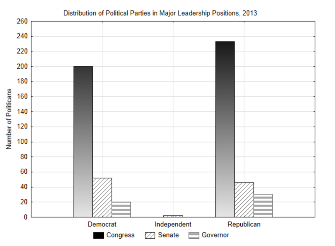
Political leadership in the US is typically divided between two political parties, the Democrats and the Republicans. Only a few politicians have been elected as independents meaning they do not belong to one of these parties. The highest politically elected positions other than the President are congressmen, senators and state governors. If we want to understand the distribution of political parties in 2013, then the political party of our leaders is categorical data that can be put into a contingency table in which each cell represents a count of the number of people who fit both the leadership position category and the political party category. A bar graph can be made from these counts.
| 2013 | Leadership Position | |||
| Congress | Senate | Governor | ||
| Political Party | Democrats | 200 | 52 | 20 |
| Independents | 0 | 2 | 0 | |
| Republicans | 233 | 46 | 30 | |
Proportions and Pie Charts
Opinion polls frequently use proportions or percentages to show support for candidates or initiatives. The difference between proportions and percentages is that percentages are obtained by multiplying the proportion by 100. Thus, a proportion of 0.25 would be equivalent to 25%. Formulas use proportions while we often communicate verbally using percentages. You should be able to move from one to the other effortlessly.
There are almost always two proportions of interest to us. The population proportion, represented with the symbol p, is the proportion we would really like to know, but which is usually unknowable. We make hypotheses about p. The sample proportion, represented with \(\hat{p}\), is what we can find from sample data and is used to test the hypothesis. The formula for proportions are:
\[p = \dfrac{x}{N}\]
and
\[\hat{p} = \dfrac{x}{n}\]
where \(x\) is a count of the number of values in a category, \(N\) is the size of the population, and \(n\) is the size of the sample.
The results of two surveys discussed on a washingtonstatewire.com blog will be used for an example. Given that much of the transportation gridlock is caused by cars, and that Washington State’s bridges need maintenance (there was a bridge collapse on Interstate 5 near Mount Vernon, WA in 2013) it would be natural to wonder about voter support for state funding of transportation projects. Two polls were conducted at about the same time in 2013. (washingtonstatewire.com/blog/...portation-tax- package-offer-a-measure-of-voter-mood-after-bridge-collapse/ viewed 7-25-13.)
Poll 1 used human interviewers who began a scripted interview by observing that “of course transportation projects are expensive and take a long time to complete,” and concluded with, “as I said, transportation projects are expensive. The other part of the package will be how to pay for those improvements. No one likes to raise taxes, but as I read some funding options, tell me whether you would favor the proposal, be inclined to accept it, be inclined to oppose, or find it unacceptable.”
Poll 2 used robo-polling which asked voters whether it is important for “the legislature to pass a statewide package this year to address congestion and safety issues, fund road and bridge maintenance and improvement, and provide additional transit funding.”
As best as can be estimated from the article, the results of Poll 1 were that 160 out of 400 people who were surveyed supported raising taxes for improving the transportation system. The results of Poll 2 were that 414 out of 600 think it is important for the Legislature to pass the funding package.
From data such as this we can make a pie chart. This will be demonstrated with Poll 1 and then you should make a pie chart for Poll 2.
The first step in making a pie chart is to calculate the proportion of values in each group. In Poll 1, we will consider there are two groups. The first group is for those who supported raising taxes and the second group is for those who did not support raising taxes. Since 160 out of 400 people supported raising taxes, then the proportion is found by dividing 160 by 400. Therefore, \(\hat{p} = \dfrac{160}{400} = 0.40\). As a
reminder, \(\hat{p}\) is the proportion of the sample that supports raising taxes. It is a statistic, which provides insight into the population proportion, represented with the variable p. The legislators would like to know the value of p, but that would require doing a census, so they must settle for the sample proportion, \(\hat{p}\). It is likely the p does not equal \(\hat{p}\), but that it is close to that value. When making a pie chart, draw the line separating the slices so that 40% of the circle is in one slice, which means that 60% of the circle is in the other.
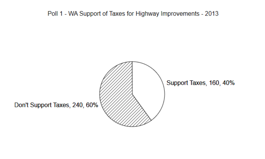
There are a few things to notice about the pie chart. First, it contains a title that describes the content of the graph. Next, each slice contains a label that briefly explains the meaning of the slice, the number of data values that contributed to the slice and the percent of all the values that are put in the slice. Why should all of this information be included?
If you are going to use any graph to show the results of your research, it is important to communicate those results clearly. The goal is to produce reader-friendly graphs. A reader looking at an unlabeled graph will not be able to gain any understanding from it, and thus you have failed to communicate something important. The percentage is included to make it easy for the reader to know the percent of values in each slice. Without the percentages, a person would need to guess at the percentage and it is likely their guess would not be precise. Including the number of people in each slice is important because it gives the reader an indication of how seriously to treat the results. A survey of 40 people of which 16 supported taxes would have a pie chart identical to the one above. Likewise, a survey of 40,000 people, of which 16,000 supported taxes, would also be identical to the above graph. The more people there are, the stronger the support. This should be obvious from the graph and therefore it is important to include the value.
A mention must be made about computer graphics since most pie charts are produced on a computer. While computers can make very fancy and colorful graphs, the colors can be indistinguishable if printed on a black and white printer or photo copied in black and white. Keep this in mind when you make graphs and pick colors that will be distinguishable when copied in black and white.
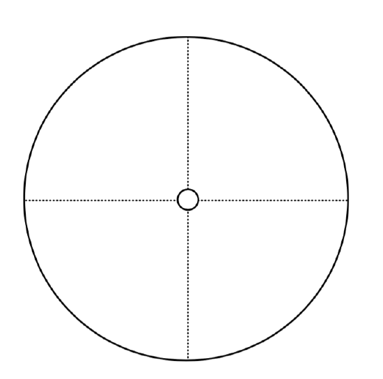
Use the results of Poll 2 to produce a completely labeled pie chart. Find the sample proportion first.
Do these two polls produce similar results or opposite results? Were the questions well worded?
Why or why not?
A final word about pie charts needs to be made. In some circles, pie charts are not considered useful graphs. There is some evidence that people do not do a good job of interpreting them. Pie charts very seldom appear in scholarly journals. However, pie charts do appear in print media and can give an indication of how the whole is divided. They may be of benefit to those who like the visual representation, rather than just the statistics.
Examining the evidence provided by sample quantitative data
The three most common types of graphs used for quantitative data are histograms, box plots and scatter plots. Histograms and box plots are used for univariate data whereas scatter plots are used for bivariate data. A variate is a single measurement or observation of a random variable obtained for each subject or unit in a sample.(Sokal, Robert R., and F. James Rohlf. Introduction to Biostatistics. New York: Freeman, 1987, Print.) When there is only one random variable that is being considered, the data that are collected are univariate. When two random variables are being considered simultaneously for the same unit, then the data for the two variables are considered bivariate. Examples of univariate data include the number of vehicles on a stretch of highway, the amount it costs for a student to earn their degree, or the amount of water used by a household each month. Examples of bivariate data include the pairing of number of cars on the highway and the commute time, the amount of tuition and the amount of financial aid a student uses, or the number of people in a household and the amount of water used.
The statistics used for univariate data fit one of two objectives. The first objective is to define the center of the data and the second objective is to define the variation that exists in the data. The most common ways of defining the center are with the arithmetic mean and the median, although these are not the only two measures of center. In cases where the arithmetic mean is used, variation is quantified using standard deviation. The statistic most commonly used for bivariate data is correlation, which indicates the strength of the linear relationship between the two variables.
Histograms
Chapters one and two contained numerous examples of histograms. They are used to show the distribution of the data by showing the frequency or count of data in each class. The process for creating histograms by hand includes the following steps.
- Identify the lowest and highest data values.
- Create reader-friendly boundaries that will be used to sort the data into 4 to 10 classes. The lowest boundary should be a number that either equals, or is a nice number below, the lowest data value. The class width, which is the difference between consecutive boundaries, should be a factor of the boundary values.
- Make a frequency distribution to provide an organized structure to count the number of data values in each class.
- Create the histogram by labeling the x-axis with the lower boundaries and the y-axis with the frequencies. The height of the bars reflects the number of values in each class. Adjacent bars should touch.
- Put a title on the graph and on each axis.
There isn’t a precise mathematical way to pick the starting value and the class width for a histogram. Rather, some thought is necessary to use numbers that are easy for a reader to understand. For example, if the lowest number in a set of data is 9 and the highest number is 62, then using a starting value of 0 and a class width of 10 would result in the creation of 7 classes with reader-friendly boundaries of 0,10,20,30,40,50,60, and 70. On the other hand, starting at 9 and using a class width of 10 would not produce reader-friendly boundaries (9,19,29, ...). Numbers such as 2,4,6,8... or 5,10,15,20... or any version of these numbers if they are multiplied by a power of 10 make good class boundaries.
Once the class boundaries have been determined, a frequency distribution is created. A frequency distribution is a table that shows the classes and provides a place to tally the number of data values in each class. The frequency distribution should also help clarify which class will be given the boundary values. For example, would a value of 20 be put into a 10 – 20 class or a 20 – 30 class? While there is no universal agreement on this issue, it seems a little more logical to have all the values that begin with the same number be grouped together. Thus, 20 would be put into the 20 – 30 class which contains all the values from 20.000 up to 29.999. This can be shown in a few ways as are demonstrated in the table below.
| 0 up to, but not including 10 | \(0 \le x < 10\) | [0, 10) |
| 10 up to, but not including 10 | \(10 \le x < 20\) | [10, 20) |
| 20 up to, but not including 10 | \(20 \le x < 30\) | [20, 30) |
| 30 up to, but not including 10 | \(30 \le x < 40\) | [30, 40) |
All three columns indicate the same classes. The third column uses interval notation and because it is explicit and uses the least amount of writing, will be the method used in this text. As a reminder about interval notation, the symbol “ [ “ indicates that the low number is included whereas the symbol “ ) “ indicates the high number is not included.
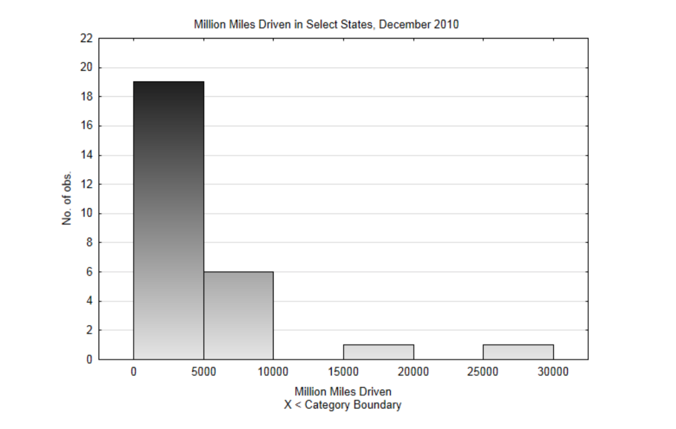
To demonstrate the construction of a histogram, data from the US Department of Transportation, Federal Highway Administration will be used.(explore.data.gov/Transportat...3-mssz,7-28-13) The data is the estimated number of miles driven in a state in December, 2010. A stratified sample will be used since the data are already divided into regions of the country. The data in the table has units of millions miles.
| 4778 | 768 | 859 | 3816 |
| 6305 | 4425 | 789 | 1517 |
| 9389 | 3681 | 21264 | 8394 |
| 583 | 2958 | 2034 | 2362 |
| 712 | 5858 | 738 | 7861 |
| 5664 | 352 | 16256 | 2594 |
| 665 | 28695 | 4435 |
- The low value is 352, the high value is 28,695.
- The lowest class boundary will be 0, the class width will be 5000. This will produce 6 classes.
- This is the frequency distribution that includes a count of the number of values in each class.
| Classes | Frequency |
|---|---|
| [0, 5000) | 19 |
| [5000, 10000) | 6 |
| [10000, 15000) | 0 |
| [15000, 20000) | 1 |
| [20000, 25000) | 0 |
| [25000, 30000) | 1 |
4, This is the completely labeled histogram. Notice how the height of the bars corresponds with the frequencies in the frequency distribution.
Suppose we want to compare the amount of driving in states with a large area to those with a smaller area. This could be done using a multiple bar histogram in which one set of bars will be for larger states and the other for smaller states.
Frequency Distribution and Multiple Bar Histogram:
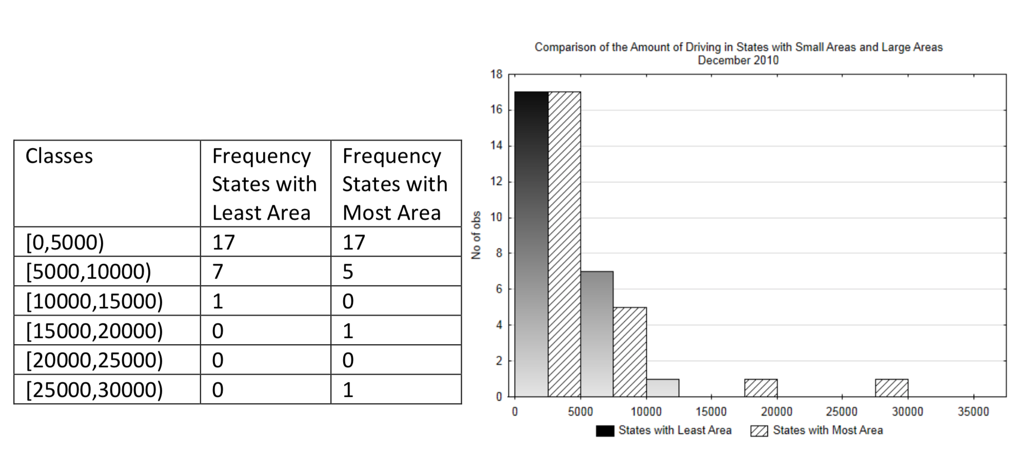
Interpretation: While it might be reasonable to assume there would be more driving in bigger states because the distance between cities is larger, it is difficult to discern from this graph if that is the case. Therefore, in addition to the use of a graph, this data can be compared using the arithmetic mean and the standard deviation.
Arithmetic Mean, Variance and Standard Deviation
The arithmetic mean and standard deviation are common statistics used in conjunction with histograms. The mean is probably the most commonly used way to identify the center of data, but it is not the only method. The mean can be thought of as the balance point for the data, much like the fulcrum on a teeter-totter. Values far from the mean have a greater impact on it than do values closer to the mean in the same way a small child sitting at the end of a teeter-totter can balance with a larger person sitting near the fulcrum.
There are almost always two arithmetic means of interest to us. The population mean, represented with the symbol \(\mu\) (mu), is the mean we would really like to know, but which is usually unknowable. We make hypotheses about \(\mu\). The sample mean, represented with \(\bar{x}\) (x-bar), is what we can find from a sample and is what is used to test the hypothesis. The formula for the means, as shown in Chapter 1 are:
\(\mu = \dfrac{\sum x_i}{N}\) and \(\bar{x} = \dfrac{\sum x_i}{n}\)
Where \(\sum\) is an upper case sigma used in summation notation that means add everything that follows, xiis the set of data values and N is the number of values in the population and n is the number of values in the sample. These formulas say to add all the values and divide by the number of values.
There are several reasons why the arithmetic mean is commonly used and some reasons why it shouldn’t be used at times. A primary reason it is commonly used is because the sample mean is an unbiased estimator of the population mean. This is because about half the sample means that could be obtained from a population will be lower than the population mean and half will be higher. An arithmetic mean is not the best measure of center when there are a few extremely high values in the data, as they will have more of an impact on the mean than the remaining values.
In addition to the mean, it is also useful to know how much variation exists in the data. Notice in the double bar histogram how the data in the states with the largest area is spread out more than the data in the states with the smallest area. The more spread out data is, the more difficult it is to obtain a significant result when testing hypotheses.
Standard deviation is the primary way in which the spread of data is quantified. It can be thought of as the approximate average distance between each data value and the mean. As with the mean, there are two values of standard deviation that interest us. The population standard deviation,represented with the symbol σ (lower case sigma), is the standard deviation we would really like to know, but which is usually unknowable. The sample standard deviation, represented with s, is what we can find from a sample. The formulas of standard deviation are:
\[\sigma = \sqrt{\dfrac{\sum (x - \mu)^2}{N}}\]
and
\[s = \sqrt{\dfrac{\sum (x - \bar{x})^2}{n - 1}}\]
North Atlantic hurricane data will be used to demonstrate the process of finding the mean and standard deviation. (Data from: www.wunderground.com/hurrican...asp?region=ep.)
| Year | 2005 | 2006 | 2007 | 2008 | 2009 | 2010 | 2011 |
| Number of Hurricanes | 15 | 5 | 6 | 8 | 3 | 12 | 7 |
Since this is a sample, the appropriate formula for finding the sample mean is \(\bar{x} = \dfrac{\sum x_i}{n}\). The calculation is \(\dfrac{15 + 5 + 6 + 8 + 3 + 12 + 7}{7} = \dfrac{56}{7} = 8\). There were an average of 8 North Atlantic hurricanes per year between 2005 and 2011. Notice that there weren’t 8 hurricanes every year. This is because there is natural variation in the number of hurricanes. We can use standard deviation as one way for determining the amount of variation. To do so, we will build a 3-column table to help with the calculations.
| x | \((x - \bar{x})\) | \((x - \bar{x})^2\) |
|---|---|---|
| 15 | 15- 8 = 7 | \((7)^2 = 49\) |
| 5 | 5 - 8 = -3 | \((-3)^2 = 9\) |
| 6 | 6 - 8 = -2 | \((-2)^2 = 4\) |
| 8 | 8 - 8 = 0 | \((0)^2 = 0\) |
| 3 | 3 - 8 = -5 | \((-5)^2 = 25\) |
| 12 | 12 - 8 = 4 | \((4)^2 = 16\) |
| 7 | 7 - 8 = -1 | \((-1)^2 = 1\) |
| \(\sum (x - \bar{x}) = 0\) | \(\sum (x - \bar{x})^2 = 0\) |
Since this is a sample, the appropriate formula for finding the sample standard deviation is \(s = \sqrt{\dfrac{\sum (x - \bar{x})^2}{n - 1}}\) which, after substitution is \(\sqrt{\dfrac{104}{7 - 1}} = 4.16\). This number indicates that the average variation from the mean in each year is 4.16 hurricanes.
Variance is another measure of variation that is related to the standard deviation. Variance is the square of the standard deviation or, conversely, the standard deviation is the square root of the variance. The formulas for variance are:
\[\sigma ^2 = \dfrac{\sum (x - \mu)^2}{N}\]
and
\[s^2 = \dfrac{\sum (x - \bar{x})^2}{n - 1}\]
In the example about hurricanes, the variance is \(s^2 = \dfrac{104}{7 - 1} = 17.33\).
Medians and Box Plots
Another combination of statistics and graphs are medians and box plots. A median is found before a box plot can be created. A median is the value of a variable in an ordered array that has an equal number of items on either side of it.(5 Sokal, Robert R., and F. James Rohlf. Introduction to Biostatistics. New York: Freeman, 1987. Print.) To find the median, put the data in order from small to large. Assign a rank to the numbers. The smallest number has a rank of 1, the second smallest has a rank of 2, etc. The rank of the median is found using formula 4.5.
\[Rank\ of Median = \dfrac{n + 1}{2}\]
If n is odd, that is, if there are an odd number of data values, then the median will be one of the data values. If n is an even number, then the median will be the average of the two middle values.
The same hurricane data will be used in the first of two demonstrations for finding the median.
| Year | 2005 | 2006 | 2007 | 2008 | 2009 | 2010 | 2011 |
| Number of Hurricanes | 15 | 5 | 6 | 8 | 3 | 12 | 7 |
The first step is to create an ordered array.
| Number of Hurricanes | 3 | 5 | 6 | 7 | 8 | 12 | 15 |
| Rank | 1 | 2 | 3 | 4 | 5 | 6 | 7 |
The second step is to find the rank of the median using the formula \(Rank\ of\ Median = \dfrac{n + 1}{2}\), \(\dfrac{7 + 1}{2} = 4\).
The third step is to find the data value that corresponds with the rank of the median.
Since the rank of the median is 4 and the corresponding number is 7 hurricanes then the median number is 7 hurricanes.
The second demonstration will be with the number of East Pacific Hurricanes. Since there is no data for 2011, only the years 2005-2010 will be used.
| Year | 2005 | 2006 | 2007 | 2008 | 2009 | 2010 | 2011 |
| Number of Hurricanes | 5 | 10 | 2 | 4 | 7 | 3 |
The first step is to create an ordered array.
| Number of Hurricanes | 2 | 3 | 4 | 5 | 7 | 10 |
| Rank | 1 | 2 | 3 | 4 | 5 | 6 |
The second step is to find the rank of the median using the formula \(Rank\ of\ Median = \dfrac{n + 1}{2}\)
\(\dfrac{6 + 1}{2} = 3.5\). This means the median is halfway between the third and fourth values.
The third step is to find the data value that corresponds with the rank of the median.
The average of the third and fourth values is \(\dfrac{4 + 5}{2} = 4.5\). Therefore the median number of East Pacific
hurricanes between 2005 and 2010 is 4.5. Notice that in this case, 4.5 is not one of the data values and it is not even possible to have half of a hurricane, but it is still the median.
A box plot is a graph that shows the median along with the highest and lowest values and two other values called the first quartile and the third quartile. The first quartile can be thought of as the median of the lower half of the data and the third quartile can be thought of as the median of the upper half of the data.
The North Atlantic Hurricane Data will be used to produce a box plot.
The first step is to create an ordered array.
| Number of Hurricanes | 3 | 5 | 6 | 7 | 8 | 12 | 15 |
| Rank | 1 | 2 | 3 | 4 | 5 | 6 | 7 |
The second step is to identify the lowest value, the median, and the highest value.
| Lowest | Median | Highest | |||||
| Number of Hurricanes | 3 | 5 | 6 | 7 | 8 | 12 | 15 |
| Rank | 1 | 2 | 3 | 4 | 5 | 6 | 7 |
The third step is to identify the first quartile and the third quartile. This is done by finding the median of all the values below the median and above the median.
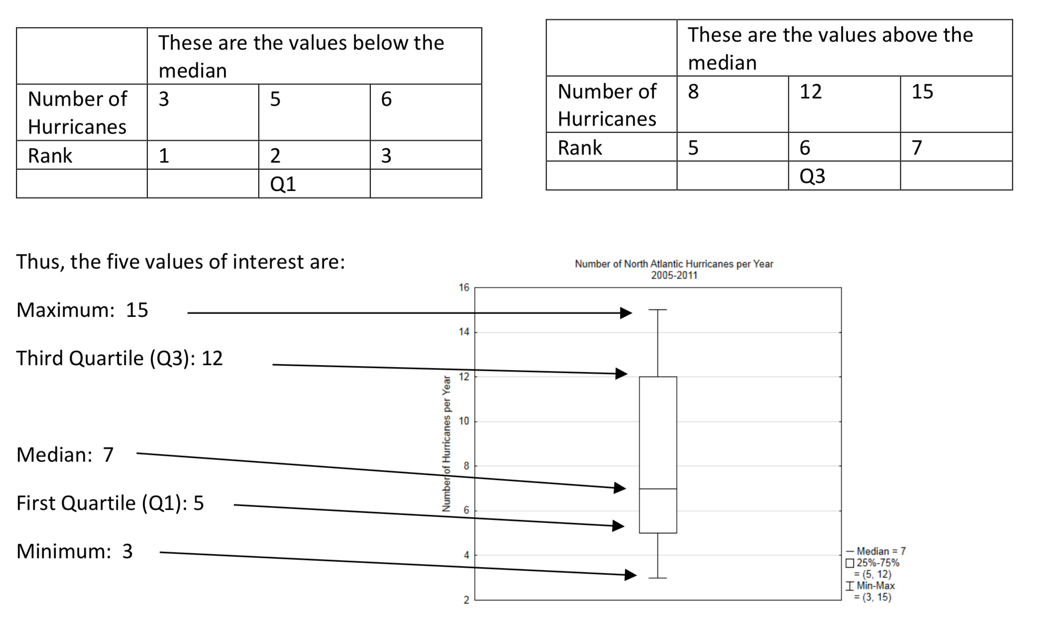
The box plot divides the data into 4 groups. It shows how the data within each group is spread out.
When graphing quantitative data, is it better to use a histogram or box plot? Compare the follow graphs that show a comparison of the number of hurricanes in four areas, North Atlantic, East Pacific, West Pacific, Indian Ocean. The data is from the years 1970 – 2010.
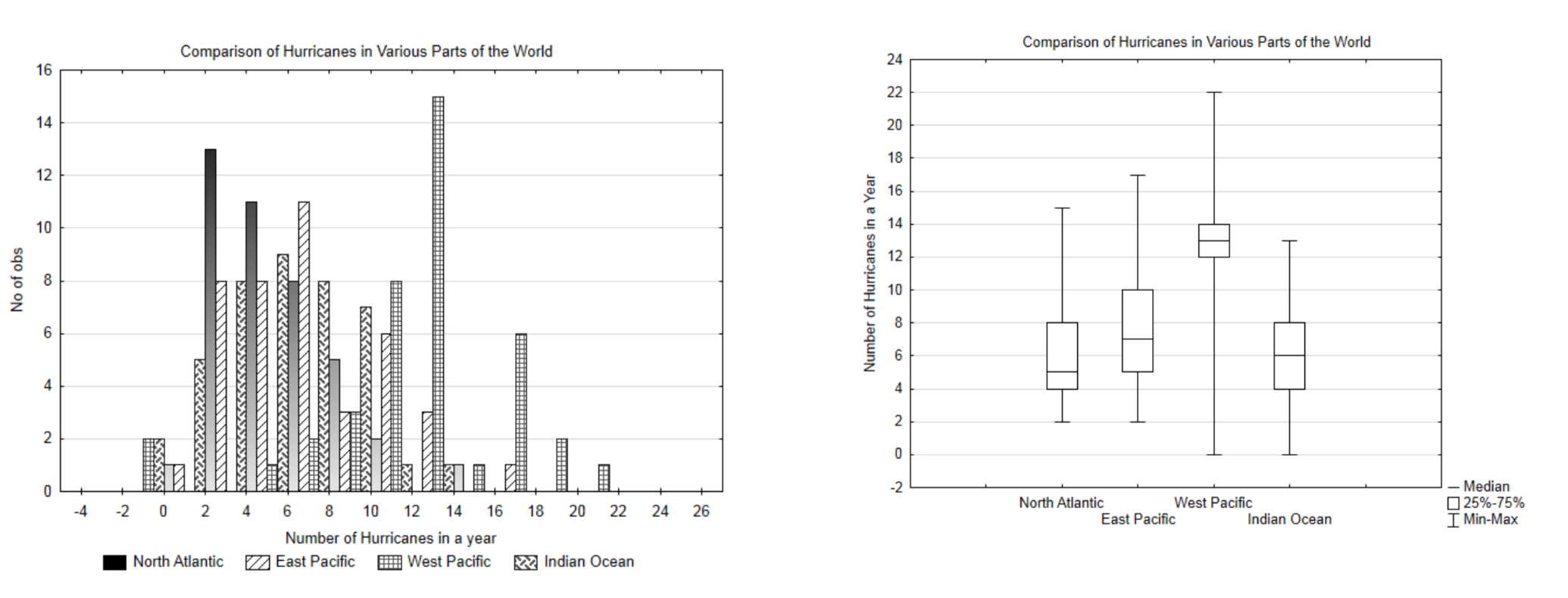
While the histogram gives a more detailed break down of the data, it is very cluttered and difficult to interpret. Therefore, in spite of the additional information it provides, the reader has to study the graph intently to understand what it shows. On the other hand, the box plot provides less information, but it is much easier to draw a comparison between the different hurricane areas. In general, if there is only one set of data being graphed, a histogram is the better choice. If there are three or more sets of data being graphed, a box plot is the better choice. If there are two sets of data being graphed, make both a histogram and a box plot and decide which is more effective for helping the reader understand the data.
Scatter Plots and Correlation
Some research questions result from the desire to find an association between two quantitative variables. Examples include wealth gap (Gini Coefficient)/poverty rates, driving speed/distance to stop, height/jumping ability. The goal is to determine the relationship between these two random variables and in many cases to see if that relationship is linear.
For demonstration purposes, we will explore the relationship between the wealth gap as measured by the Gini Coefficient and the poverty rate. The units will be randomly selected US states from the year 2010. A scatter plot will give a quick understanding of the relationship.
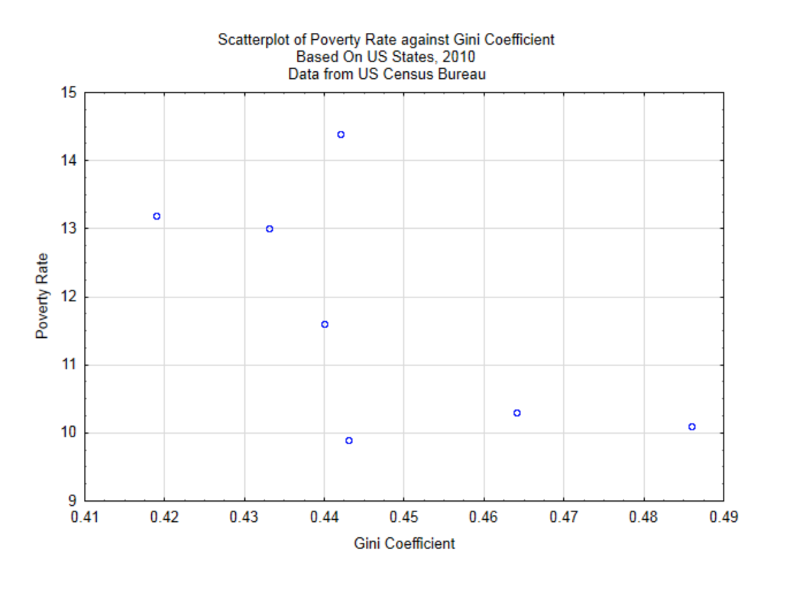
From this scatter plot it appears that the greater the wealth gap, the lower the poverty rate, although the relationship is not a strong one since the points do not appear to be grouped close together to form a straight line. To determine the strength of the linear relationship between these variables we use the Pearson Product-Moment Correlation Coefficient.
There are almost always two correlation coefficients of interest to us. The population correlation, represented with the symbol ρ (rho), is the correlation coefficient we would really like to know, but which is usually unknowable. We make hypotheses about ρ. The sample correlation, represented with r, is what we can find from a sample and is what is used to test the hypothesis. The formula for the sample correlation coefficient is:
\[r = \dfrac{\text{cov}(x, y)}{s_x s_y}\]
The numerator is the covariance between the two variables, the denominator is the product of the standard deviation of each variable.
Correlation will always be a value between -1 and 1. A correlation of 0 means no correlation. A correlation of 1 means a direct linear relationship in which y gets larger as x gets larger. A correlation of -1 means an inverse linear relationship in which y gets smaller as x gets larger.
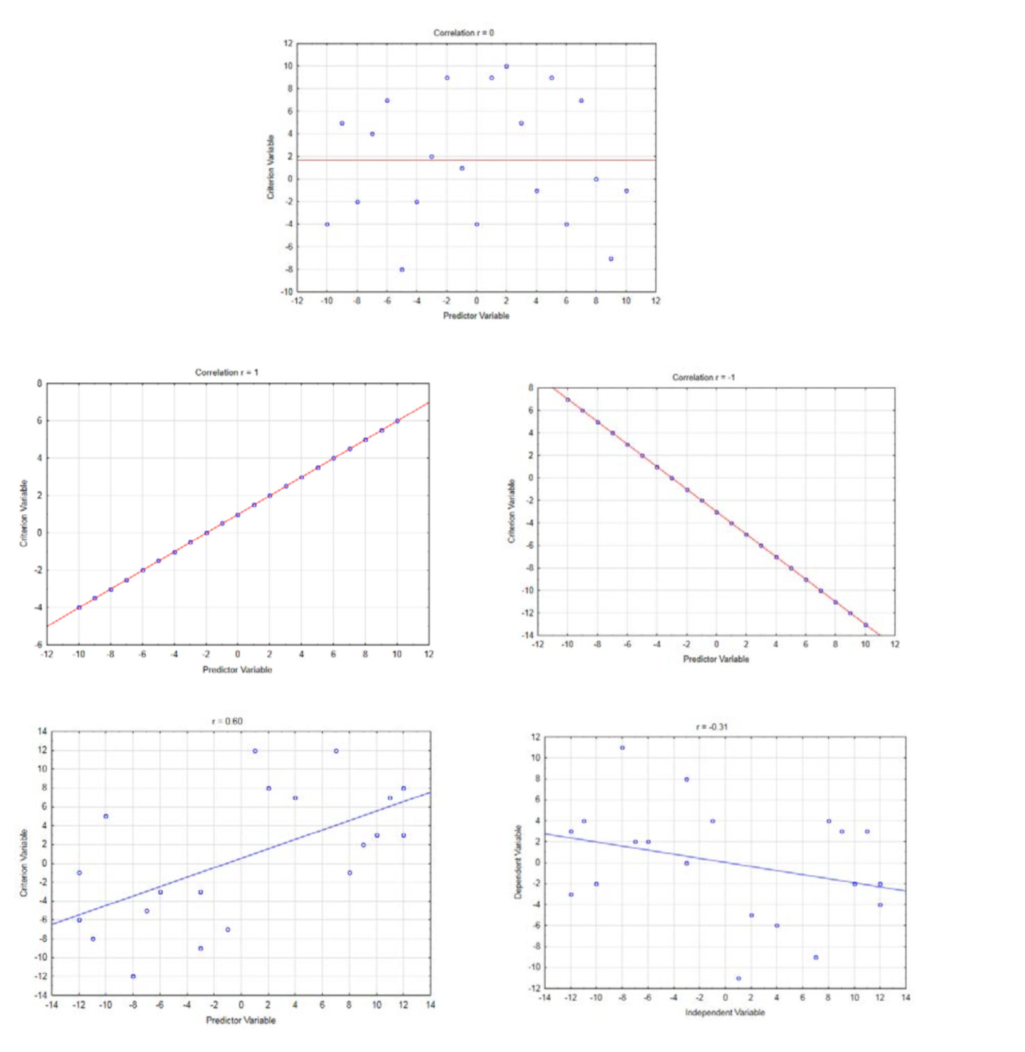
A brief explanation of the correlation formula follows. Think of bivariate data as an (x,y) ordered pair. The ordered pair \((\bar{x}, \bar{y})\) is the centroid of the data. For this data, the centroid is at (0.4467, 11.7857). This is shown in the graph below.
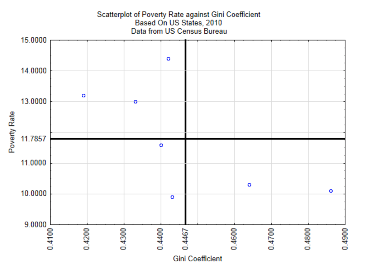
The covariance is given by the formula \(\text{cov}(x, y) = \dfrac{\sum (x - \bar{x})(y - \bar{y})}{n - 1}\). It shows the product of
the distance each point is away from the average x value and the average y value. Since multiplying both the x values and y values by 10 would result in a covariance that is 100 times larger than this data would produce, yet the graph would look the same, the covariance is standardized by dividing by the product of the standard deviations of x and y.
Calculate the Covariance
| (x, y) or (gini, pov) | \((x - \bar{x})\) (\(x\) - 0.4467) |
\((y - \bar{y})\) (\(y\) - 11.7857) |
\((x - \bar{x})(y - \bar{y})\) |
|---|---|---|---|
| (0.486, 10.1) | 0.0393 | -1.6857 | -0.0662 |
| (0.443, 9.9) | -0.0037 | -1.8857 | 0.0070 |
| (0.44, 11.6) | -0.0067 | -0.1857 | 0.0012 |
| (0.433, 13) | -0.0137 | 1.2143 | -0.0167 |
| (0.419, 13.2) | -0.0277 | 1.4143 | -0.0392 |
| (0.442, 14.4) | -0.0047 | 2.6143 | -0.0123 |
| (0.464, 10.3) | 0.0173 | -1.4857 | -0.0257 |
| Sum | 0.0000 | 0.0000 | -0.1518 |
\(\text{cov}(x, y) = \dfrac{\sum (x - \bar{x})(y - \bar{y})}{n - 1}\)
\(\text{cov}(x, y) = \dfrac{-0.1518}{7 - 1}\)
\(\text{cov}(x, y) = -0.0253\)
Calculate the standard deviation of \(x\) and \(y\)
| (\(x\), \(y\)) or (gini, pov) | \((x - \bar{x})\) \((x - 0.4467)\) |
\((x - \bar{x})^2\) | \((y - \bar{y})\) \((y - 11.7857)\) |
\((y - \bar{y})^2\) |
|---|---|---|---|---|
| (0.486, 10.1) | 0.0393 | 0.00154 | -1.6857 | 2.84163 |
| (0.443, 9.9) | -0.0037 | 0.00001 | -1.8857 | 3.55592 |
| (0.44, 11.6) | -0.0067 | 0.00005 | -0.1857 | 0.03449 |
| (0.433, 13) | -0.0137 | 0.00019 | 1.2143 | 1.47449 |
| (0.419, 13.2) | -0.0277 | 0.00077 | 1.4143 | 2.00020 |
| (0.442, 14.4) | -0.0047 | 0.00002 | 2.6143 | 6.83449 |
| (0.464, 10.3) | 0.0173 | 0.00030 | -1.4857 | 2.20735 |
| Sum | 0.0000 | 0.0029 | 0.0000 | 18.9486 |
\[ S_x = \sqrt{\dfrac{\sum (x - \bar{x})^2}{n - 1}}\] \[ S_y = \sqrt{\dfrac{\sum (y - \bar{y})^2}{n - 1}}\] \[S_x = \sqrt{\dfrac{0.0029}{7 - 1}}\] \[S_y = \sqrt{\dfrac{19.9486}{7 - 1}}\] \[S_x = 0.0219\] \[S_y = 1.777 \]
Use these results to calculate the correlation.
\[ \begin{align*} = \dfrac{\text{cov}(x, y)}{S_x S_y} \\[4pt] &= \dfrac{-0.0253}{0.0219 \cdot 1.777} \\[4pt] &= -0.650 \end{align*}\]
This correlation indicates that higher Gini Coefficients correspond with lower poverty levels. Whether a correlation of –0.650 indicates the data are significant or simply random results from a population without correlation, is a matter for a later chapter. (www.census.gov/prod/2012pubs/acsbr11-02.pdf)
While it is important to understand that a correlation between variables does not imply causation, a scatter plot is drawn with one of the variables being the independent x value, also known as the explanatory variable and the other being the dependent y value, also known as the response variable. The names explanatory and response are used because if a linear relationship between the two variables exists, the explanatory variable can be used to predict the response variable. For example, one would expect that driving speed would influence stopping distance rather than stopping distance influencing driving speed so that driving speed would be the explanatory variable and stopping distance would be the response variable. However, a person may choose to drive slower under certain conditions because of how long it could take them to stop (e.g. a school zone) so the choice of explanatory and response variables must be consistent with the intent of the research. The accuracy of the prediction is based on the strength of the linear relationship. (www.census.gov/prod/2012pubs/acsbr11-01.pdf Sheskin, David J. Handbook of Parametric and Nonparametric Statistical Procedures. Boca Raton: Chapman & Hall/CRC, 2000. Print.)
If a correlation between the explanatory variable and the response variable can be established, one of seven possibilities exists.
- Changing the x variable will cause a change in the y variable
- Changing the y variable will cause a change in the x variable
- A feedback loop may exist in which a change in the x variable leads to a change in the y variable which leads to another change in the x variable, etc.
- The changes in both variables are determined by a third variable
- The changes in both variables are coincidental.
- The correlation is the result of outliers, without which there would not be significant correlation.
- The correlation is the result of confounding variables.
The best guideline is to assume that correlation is not causation, but if you think it is in a certain circumstance, additional proof will need to be provided. A causal relationship can be established easier with a manipulative experiment than an observational experiment since the later may contain hidden confounding variables that are not accounted for.
TI-84 Calculator
The TI-84 calculator has the ability to quickly find all the statistics presented in this chapter. To find the arithmetic mean, standard deviation and all 5 box plot numbers, use the Stat key on your calculator. You will be presented with three options: EDIT, CALC, TESTS. Edit is already highlighted, so press the enter key and you will find three lists labeled L1, L2 and L3. There are also three other lists labeled L4, L5, L6 that can be found by scrolling to the right. Enter your data into one of the lists. After that, press the stat key again, use your cursor arrows to scroll to the right until Calc is highlighted, then press enter. The first option is 1-Var Stats. It is already highlighted, so press enter, then press the 2ndkey and the number corresponding to the list that your data is in (1-6). You will be presented with the following information.
\(\bar{x}\) - Sample Arithmetic Mean
\(\sum x\)
\(\sum x^2\)
\(S_x\) - Sample S tan dard Deviation
\(\sigma_x\) - Population S tan dard Deviation
\(n\) - sample size
min \(X\) - lowest value
\(Q\)1 - first quartile
Med - median
\(Q\)3 - third quartile
max \(X\) - highest value
For bivariate data, enter the x values into one list and the y values into a different list, making certain they are properly paired. Use the stat key, select Calc, then select 4:LinReg(ax + b). Use the second key to enter the list number for the x variable followed by a comma and then enter the list number for the y variable. This will provide more information than we are ready for at the moment, but the one value you will look for is labeled r. If the r is not visible, you will need to turn the calculator diagnostics on. This is done by using the 2\(^{\text{nd}}\) key followed by 0 (which will get the catalog). Scroll down to diagnosticOn, then press enter twice.


