
1: Statistical Reasoning
- Page ID
- 5319

\( \newcommand{\vecs}[1]{\overset { \scriptstyle \rightharpoonup} {\mathbf{#1}} } \)
\( \newcommand{\vecd}[1]{\overset{-\!-\!\rightharpoonup}{\vphantom{a}\smash {#1}}} \)
\( \newcommand{\dsum}{\displaystyle\sum\limits} \)
\( \newcommand{\dint}{\displaystyle\int\limits} \)
\( \newcommand{\dlim}{\displaystyle\lim\limits} \)
\( \newcommand{\id}{\mathrm{id}}\) \( \newcommand{\Span}{\mathrm{span}}\)
( \newcommand{\kernel}{\mathrm{null}\,}\) \( \newcommand{\range}{\mathrm{range}\,}\)
\( \newcommand{\RealPart}{\mathrm{Re}}\) \( \newcommand{\ImaginaryPart}{\mathrm{Im}}\)
\( \newcommand{\Argument}{\mathrm{Arg}}\) \( \newcommand{\norm}[1]{\| #1 \|}\)
\( \newcommand{\inner}[2]{\langle #1, #2 \rangle}\)
\( \newcommand{\Span}{\mathrm{span}}\)
\( \newcommand{\id}{\mathrm{id}}\)
\( \newcommand{\Span}{\mathrm{span}}\)
\( \newcommand{\kernel}{\mathrm{null}\,}\)
\( \newcommand{\range}{\mathrm{range}\,}\)
\( \newcommand{\RealPart}{\mathrm{Re}}\)
\( \newcommand{\ImaginaryPart}{\mathrm{Im}}\)
\( \newcommand{\Argument}{\mathrm{Arg}}\)
\( \newcommand{\norm}[1]{\| #1 \|}\)
\( \newcommand{\inner}[2]{\langle #1, #2 \rangle}\)
\( \newcommand{\Span}{\mathrm{span}}\) \( \newcommand{\AA}{\unicode[.8,0]{x212B}}\)
\( \newcommand{\vectorA}[1]{\vec{#1}} % arrow\)
\( \newcommand{\vectorAt}[1]{\vec{\text{#1}}} % arrow\)
\( \newcommand{\vectorB}[1]{\overset { \scriptstyle \rightharpoonup} {\mathbf{#1}} } \)
\( \newcommand{\vectorC}[1]{\textbf{#1}} \)
\( \newcommand{\vectorD}[1]{\overrightarrow{#1}} \)
\( \newcommand{\vectorDt}[1]{\overrightarrow{\text{#1}}} \)
\( \newcommand{\vectE}[1]{\overset{-\!-\!\rightharpoonup}{\vphantom{a}\smash{\mathbf {#1}}}} \)
\( \newcommand{\vecs}[1]{\overset { \scriptstyle \rightharpoonup} {\mathbf{#1}} } \)
\(\newcommand{\longvect}{\overrightarrow}\)
\( \newcommand{\vecd}[1]{\overset{-\!-\!\rightharpoonup}{\vphantom{a}\smash {#1}}} \)
\(\newcommand{\avec}{\mathbf a}\) \(\newcommand{\bvec}{\mathbf b}\) \(\newcommand{\cvec}{\mathbf c}\) \(\newcommand{\dvec}{\mathbf d}\) \(\newcommand{\dtil}{\widetilde{\mathbf d}}\) \(\newcommand{\evec}{\mathbf e}\) \(\newcommand{\fvec}{\mathbf f}\) \(\newcommand{\nvec}{\mathbf n}\) \(\newcommand{\pvec}{\mathbf p}\) \(\newcommand{\qvec}{\mathbf q}\) \(\newcommand{\svec}{\mathbf s}\) \(\newcommand{\tvec}{\mathbf t}\) \(\newcommand{\uvec}{\mathbf u}\) \(\newcommand{\vvec}{\mathbf v}\) \(\newcommand{\wvec}{\mathbf w}\) \(\newcommand{\xvec}{\mathbf x}\) \(\newcommand{\yvec}{\mathbf y}\) \(\newcommand{\zvec}{\mathbf z}\) \(\newcommand{\rvec}{\mathbf r}\) \(\newcommand{\mvec}{\mathbf m}\) \(\newcommand{\zerovec}{\mathbf 0}\) \(\newcommand{\onevec}{\mathbf 1}\) \(\newcommand{\real}{\mathbb R}\) \(\newcommand{\twovec}[2]{\left[\begin{array}{r}#1 \\ #2 \end{array}\right]}\) \(\newcommand{\ctwovec}[2]{\left[\begin{array}{c}#1 \\ #2 \end{array}\right]}\) \(\newcommand{\threevec}[3]{\left[\begin{array}{r}#1 \\ #2 \\ #3 \end{array}\right]}\) \(\newcommand{\cthreevec}[3]{\left[\begin{array}{c}#1 \\ #2 \\ #3 \end{array}\right]}\) \(\newcommand{\fourvec}[4]{\left[\begin{array}{r}#1 \\ #2 \\ #3 \\ #4 \end{array}\right]}\) \(\newcommand{\cfourvec}[4]{\left[\begin{array}{c}#1 \\ #2 \\ #3 \\ #4 \end{array}\right]}\) \(\newcommand{\fivevec}[5]{\left[\begin{array}{r}#1 \\ #2 \\ #3 \\ #4 \\ #5 \\ \end{array}\right]}\) \(\newcommand{\cfivevec}[5]{\left[\begin{array}{c}#1 \\ #2 \\ #3 \\ #4 \\ #5 \\ \end{array}\right]}\) \(\newcommand{\mattwo}[4]{\left[\begin{array}{rr}#1 \amp #2 \\ #3 \amp #4 \\ \end{array}\right]}\) \(\newcommand{\laspan}[1]{\text{Span}\{#1\}}\) \(\newcommand{\bcal}{\cal B}\) \(\newcommand{\ccal}{\cal C}\) \(\newcommand{\scal}{\cal S}\) \(\newcommand{\wcal}{\cal W}\) \(\newcommand{\ecal}{\cal E}\) \(\newcommand{\coords}[2]{\left\{#1\right\}_{#2}}\) \(\newcommand{\gray}[1]{\color{gray}{#1}}\) \(\newcommand{\lgray}[1]{\color{lightgray}{#1}}\) \(\newcommand{\rank}{\operatorname{rank}}\) \(\newcommand{\row}{\text{Row}}\) \(\newcommand{\col}{\text{Col}}\) \(\renewcommand{\row}{\text{Row}}\) \(\newcommand{\nul}{\text{Nul}}\) \(\newcommand{\var}{\text{Var}}\) \(\newcommand{\corr}{\text{corr}}\) \(\newcommand{\len}[1]{\left|#1\right|}\) \(\newcommand{\bbar}{\overline{\bvec}}\) \(\newcommand{\bhat}{\widehat{\bvec}}\) \(\newcommand{\bperp}{\bvec^\perp}\) \(\newcommand{\xhat}{\widehat{\xvec}}\) \(\newcommand{\vhat}{\widehat{\vvec}}\) \(\newcommand{\uhat}{\widehat{\uvec}}\) \(\newcommand{\what}{\widehat{\wvec}}\) \(\newcommand{\Sighat}{\widehat{\Sigma}}\) \(\newcommand{\lt}{<}\) \(\newcommand{\gt}{>}\) \(\newcommand{\amp}{&}\) \(\definecolor{fillinmathshade}{gray}{0.9}\)Take a moment to visualize humanity in its entirety, from the earliest humans to the present. How would you characterize the well-being of humanity? Think beyond the latest stories in the news. To help clarify, think about medical treatment, housing, transportation, education, and our knowledge. While there is no denying that we have some problems that did not exist in earlier generations, we also have considerably more knowledge.
The progress humanity has made in learning about ourselves, our world and our universe has been fueled by the desire of people to solve problems or gain an understanding. It has been financed through both public and private monies. It has been achieved through a continual process of people proposing theories and others attempting to refute the theories using evidence. Theories that are not refuted become part of our collective knowledge. No single person has accomplished this, it has been a collective effort of humankind.
As much as we know and have accomplished, there is a lot that we don’t know and have not yet accomplished. There are many different organizations and institutions that contribute to humanity’s gains in knowledge, however one organization stands out for challenging humanity to achieve even more. This organization is XPrize.1 On their webpage they explain that they are an innovation engine. A facilitator of exponential change. A catalyst for the benefit of humanity.” This organization challenges humanity to solve bold problems by hosting competitions and providing a monetary prize to the winning team. Examples of some of their competitions include:
- 2004: Ansari XPrize ($10 million) – Private Space Travel – build a reliable, reusable, privately financed, manned spaceship capable of carrying three people to 100 kilometers above the Earth’s surface twice within two weeks.
- Current: The Barbara Bush Foundation Adult Literacy XPrize ($7 million) - “challenging teams to develop mobile applications for existing smart devices that result in the greatest increase in literacy skills among participating adult learners in just 12 months.”
There are an estimated 36 million American adults with a reading level below third grade level. They have difficulty reading bedtime stories, reading prescriptions, and completing job applications, among other things. Developing a good app could have huge benefits for a lot of people, which would also provide benefits for the country.
The following fictional story will introduce you to the way data and statistics are used to test theories and make decisions. The goal is for you to see that the thought processes are not algebraic and that it is necessary to develop new ways of thinking so we can validate our theories or make evidence- based decisions.
Adult Literacy Prize Story
Imagine being part of a team competing for the Adult Literacy Xprize. During the early stages of development, a goal of your team is to create an app that is engaging for the user so that they will use it frequently. You tested your first version (Version 1) of the app on some adults who lacked basic literacy and found it was used an average of 6 hours during the first month. Your team decided this was not very impressive and that you could do better, so you developed a completely new version of the software designated as Version 2. When it was time to test the software, the 10 members of your team each gave it to 8 different people with low literacy skills. This group of 80 individuals that received the software is a small subset, or sample, of all those who have low literacy skills. The objective was to determine if Version 2 is used more than an average of 6 hours per month.
While the data will ultimately be pooled together, your teammates decide to compete against each other to determine whose group of 8 does better. The results are shown in the table below. The column on the right is the mean (average) of the data in the row. The mean is found by adding the numbers in the row and dividing that sum by 8.
| Team Member | Version 2 Data (hours of use in 1 month) | Mean | |||||||
|---|---|---|---|---|---|---|---|---|---|
| You, The reader | 4.4 | 3.8 | 4.4 | 6.7 | 1.1 | 5.7 | 0.8 | 2.5 | 3.675 |
| Betty | 11 | 8.4 | 8.4 | 2.7 | 4.4 | 8.4 | 5.7 | 4.4 | 6.675 |
| Joy | 1.6 | 2.2 | 12.5 | 5.7 | 2.2 | 6.6 | 0.8 | 0.3 | 3.9875 |
| Kerissa | 16.1 | 11.1 | 8.7 | 9.1 | 1.4 | 9.1 | 1.2 | 14.4 | 8.8875 |
| Crystal | 0 | 2.1 | 0 | 3.2 | 0.2 | 1.8 | 9.1 | 3.3 | 2.4625 |
| Marcin | 2.2 | 6.3 | 1.3 | 8.8 | 0.8 | 2.7 | 0.9 | 0.8 | 2.975 |
| Tisa | 8.8 | 5.8 | 9.7 | 2.8 | 3.2 | 0.9 | 0.1 | 16.1 | 5.925 |
| Tyler | 11 | 0.9 | 11.3 | 6.6 | 0.3 | 5.9 | 1.7 | 1.9 | 4.95 |
| Patrick | 0.9 | 1.8 | 6.3 | 3.1 | 6.1 | 6.3 | 3.2 | 6.7 | 4.3 |
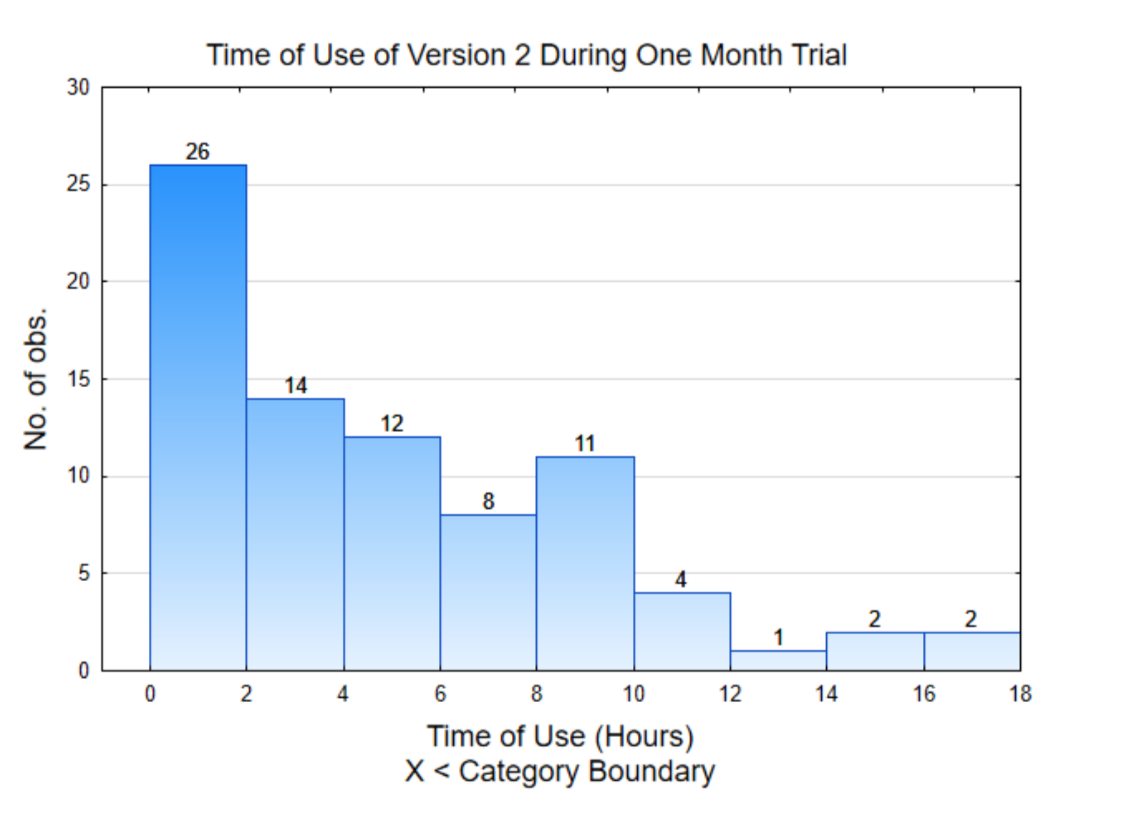
One way to make sense of the data is to graph it. The graph to the right is called a histogram. It shows the distribution of the amount of time the software was used by each participant. To interpret this graph, notice the scale on the horizontal (x) axis counts by 2. These numbers represent hours of use. The height of each bar shows how many usage times fall between the x values. For example, 26 people used the app between 0 and 2 hours while 2 people used the app between 16 and 18 hours.
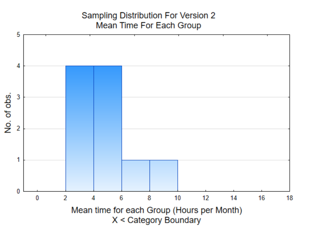
The second graph is a histogram of the mean (average) for each of the 10 groups. This is a graph of the column in the table that is shaded. A histogram of means is called a sampling distribution. The distribution to the right shows that 4 of the means are between 2 and 4 hours while only one mean was between 8 and 10 hours. Notice how the means are grouped closer together than the original data.
The overall mean for the 80 data values is 4.88 hours. Our task is to use the graphs and the overall mean to decide if Version 2 is used more than the Version 1 was used (6 hours per month). What is your conclusion? Answer this question before continuing your reading.
Yes Version 2 is better than Version 1 No, Version 2 is not better than Version 1
Which of the following had the biggest influence on your decision?
______ 54 of the 80 data values were below 6
______ The mean of the data is 4.88, which is below 6
______ 8 of the 10 sample means are below 6.
Version 3
Version 3 was a total redesign of the software. A similar testing strategy was employed as with the prior version. When you received the data from the 8 users you gave the software to, you found that the average length of usage was 10.25 hours. Based on your results, do you feel that this version is better than version 1?
| Team Member | Version 3 Data (hours of use in 1 month) | Mean | |||||||
| You, The reader | 14 | 13 | 8 | 4 | 8 | 21 | 3 | 11 | 10.25 |
Yes Version 3 is better than Version 1 No, Version 3 is not better than Version 1
Your colleague Keer looked at her data, which is shown in the table below. What conclusion would Keer arrive at, based on her data?
| Team Member | Version 3 Data (hours of use in 1 month) | Mean | |||||||
| Keer | 0 | 3 | 2 | 3 | 5 | 4 | 8 | 11 | 4. |
Yes Version 3 is better than Version 1 No, Version 3 is not better than Version 1
If your interpretation of your data and Keer’s data are typical, then you would have concluded that Version 3 was better than Version 1 based on your data and Version 3 was not better based on Keer’s data. This illustrates how different samples can lead to different conclusions. Clearly, the conclusion based on your data and the conclusion based on Keer’s data cannot both be correct. To help appreciate who might be in error, let’s look at all the data for the 80 people who tested Version 3 of the software.
| Team Member | Version 3 Data (hours of use in 1 month) | Mean | |||||||
| You, The reader | 14 | 13 | 8 | 4 | 8 | 21 | 3 | 11 | 10.25 |
| Keer | 0 | 3 | 2 | 3 | 5 | 4 | 8 | 11 | 4.5 |
| Betty | 8 | 5 | 5 | 4 | 5 | 0 | 1 | 16 | 5.5 |
| Joy | 7 | 5 | 8 | 4 | 7 | 13 | 7 | 6 | 7.125 |
| Kerissa | 8 | 6 | 14 | 3 | 11 | 2 | 5 | 8 | 7.125 |
| Crystal | 6 | 7 | 4 | 7 | 6 | 3 | 7 | 5 | 5.625 |
| Marcin | 7 | 7 | 6 | 1 | 2 | 7 | 5 | 5 | 5 |
| Tisa | 3 | 3 | 5 | 4 | 14 | 13 | 3 | 2 | 5.875 |
| Tyler | 0 | 7 | 2 | 7 | 4 | 2 | 5 | 2 | 3.625 |
| Patrick | 8 | 3 | 1 | 14 | 2 | 6 | 7 | 2 | 5.375 |
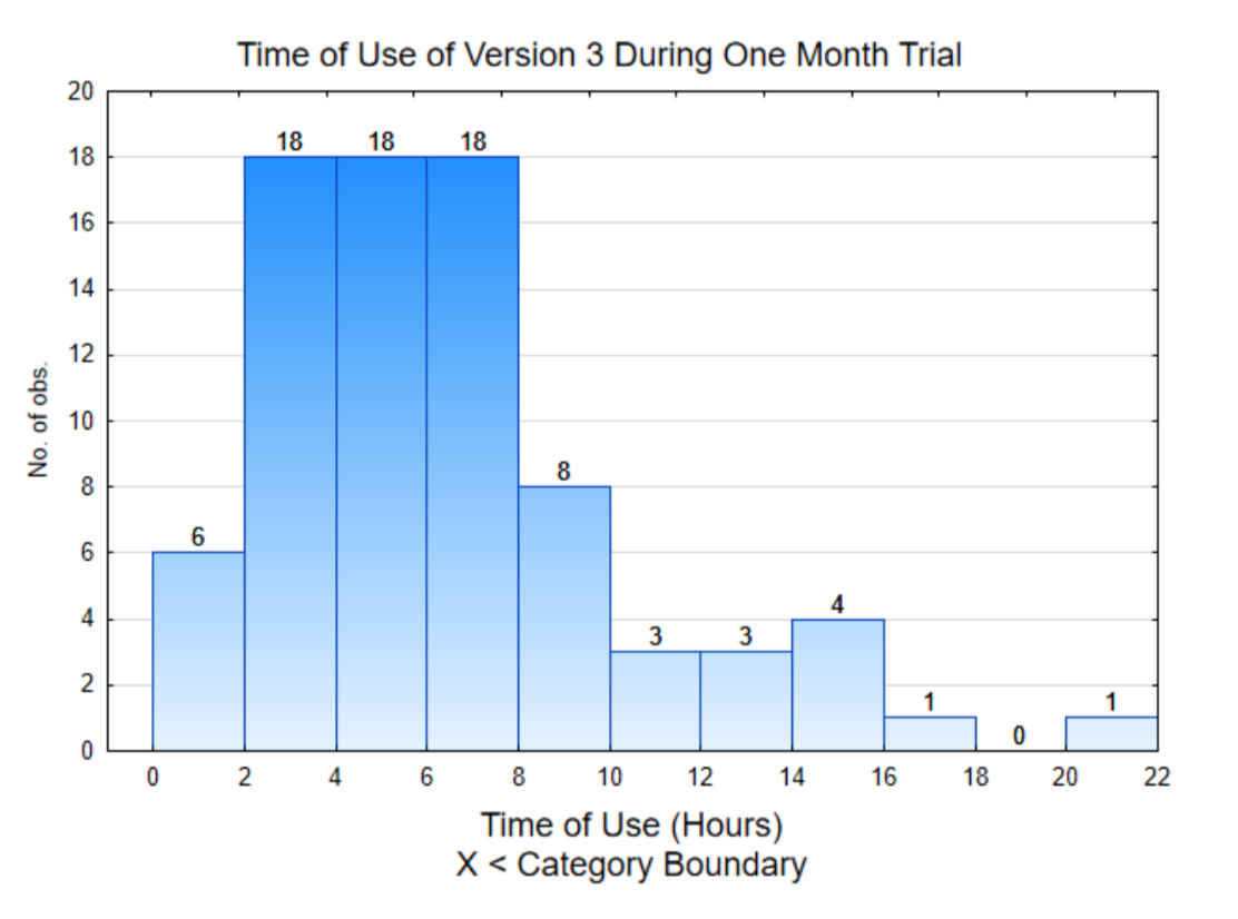
The histogram on the right is of the data from individual users. This shows that about half the data (42 out of 80) are below 6 and the rest are above 6.
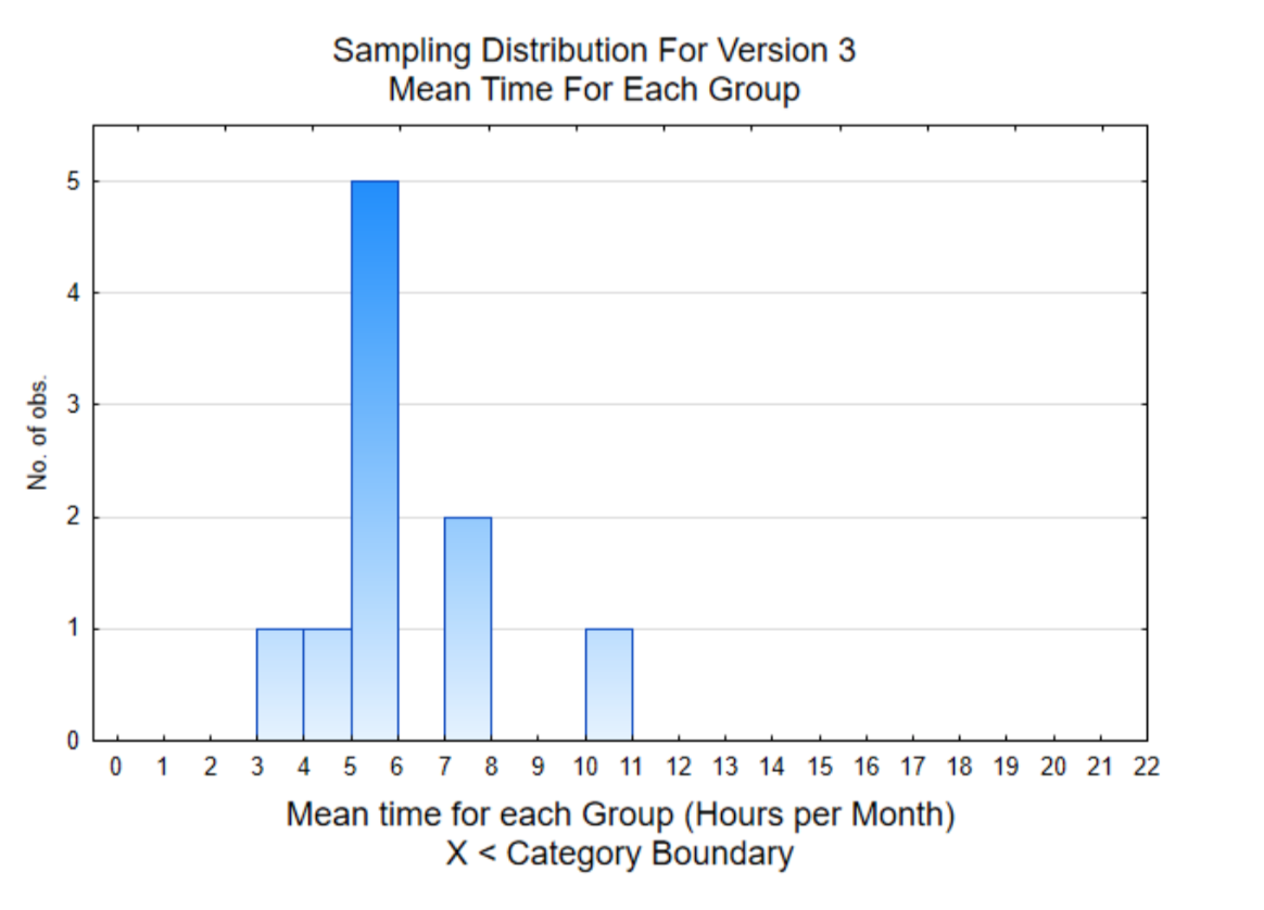
The histogram on the right is of the mean of the 8 users for each member of the team. This sampling distribution shows that 7 of the 10 sample means are below 6.
The mean of all the individual data values is 6.0. Consequently, if you concluded that Version 3 was better than Version 1 because the mean of your 8 users was 10.25 hours, you would have come to the wrong conclusion. You would have been misled by data that was selected by pure chance.
None of the first 3 versions was particularly successful but your team is not discouraged. They already have new ideas and are putting together another version of their literacy program.
Version 4.
When Version 4 is complete, each member of the team randomly selects 8 people with low literacy levels, just as was done for the prior versions. The data that is recorded is the amount of time the app is used during the month. Your data is shown below.
| Team Member | Version 4 Data (hours of use in 1 month) | Mean | ||||||
| You, The reader | 60 | 44 | 37 | 62 | 32 | 88 | 32 | 48.375 |
Based on your results, do you feel that this version is better than version 1?
Yes Version 4 is better than Version 1 No, Version 4 is not better than Version 1
The results of all 80 participants is shown in the table below.
| Team Member | Version 4 Data (hours of use in 1 month) | Mean | |||||||
| You, The reader | 60 | 44 | 37 | 32 | 62 | 32 | 88 | 32 | 48.375 |
| Keer | 48 | 37 | 24 | 20 | 82 | 76 | 67 | 67 | 52.625 |
| Betty | 88 | 39 | 67 | 24 | 71 | 85 | 81 | 24 | 59.875 |
| Joy | 23 | 58 | 21 | 88 | 81 | 75 | 84 | 81 | 63.875 |
| Kerissa | 88 | 24 | 58 | 53 | 81 | 57 | 88 | 24 | 59.125 |
| Crystal | 47 | 85 | 767 | 24 | 39 | 67 | 40 | 77 | 56.875 |
| Marcin | 61 | 45 | 75 | 58 | 87 | 51 | 37 | 73 | 60.875 |
| Tisa | 76 | 77 | 58 | 84 | 20 | 55 | 81 | 82 | 66.625 |
| Tyler | 82 | 47 | 48 | 60 | 88 | 21 | 50 | 24 | 52.5 |
| Patrick | 20 | 40 | 52 | 24 | 55 | 33 | 33 | 84 | 42.625 |
The histogram on the right is of the data from individual users. Notice that all these values are higher than 20.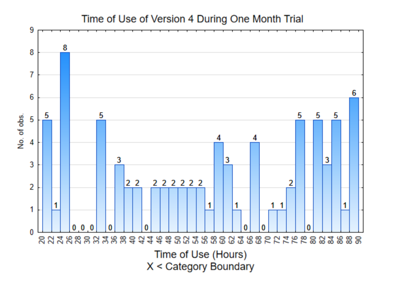
The histogram on the right is of the mean of the 8 users for each member of the team. Notice that all the sample means are significantly higher than 6.
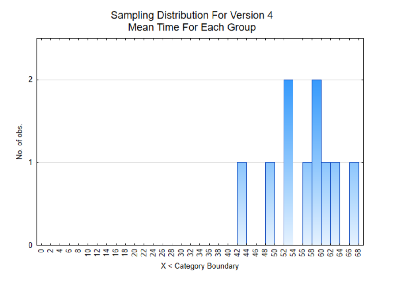
Based on the results of Version 4, all the data is much higher than 6 hours per month. The average is 56.3 hours per month which is almost 2 hours per day. This is significantly more usage of the app than the early versions and consequently will be the app that is used in the XPrize competition.
Making decisions using statistics
There were several objectives of the story you just read.
- To give you an appreciation of the variation that can exist in sample data.
- To introduce you to a type of data graph called a histogram, which is a good way for looking at the distribution of data.
- To introduce you to the concept of a sampling distribution, which is a distribution of means of a sample, rather than of the original data.
- To illustrate the various results that can occur when we try to answer questions using data. These results are summarized below in answer to the question of whether the new version is better than the first version.
a. Version 2: This was not better. In fact, it appeared to be worse.
b. Version 3: At first it looked better, but ultimately it was the same.
c. Version 4: This was much better.
Because data sometimes provide clarity about a decision that should be made (Versions 2 and 4), but other times is not clear (Version 3), a more formal, statistical reasoning process will be explained in this chapter with the details being developed throughout the rest of the book.
Before beginning with this process, it is necessary to be clear about the role of statistics in helping us understand our world. There are two primary ways in which we establish confidence in our knowledge of the world, by providing analytical evidence or empirical evidence.
Analytical evidence makes use of definitions or mathematical rules. A mathematical proof is an analytical method for using established facts to prove something new. Analytical evidence is useful for proving things that are deterministic. Deterministic means that the same outcome will be achieved each time (if errors aren’t made). Algebra and Calculus are examples of deterministic math and they can be used to provide analytical evidence.
In contrast, empirical evidence is based on observations. More specifically, someone will propose a theory and then research can be conducted to determine the validity of that theory. Most of the ideas we believe with confidence have resulted because of the rejection of theories we previously had and our current knowledge consists of those ideas we have not been able to reject with empirical evidence. Empirical evidence is gained through rigorous research. This contrasts with anecdotal evidence, which is also gained through observation, but not in a rigorous manner. Anecdotal evidence can be misleading.
The role of statistics is to objectively evaluate the evidence so a decision can be made about whether to reject, or not reject a theory. It is particularly useful for those situations in which the evidence is the result of a sample taken from a much larger population. In contrast to deterministic relationships, stochastic populations are ones in which there is randomness, while the evidence is gained though random sampling, thus meaning the evidence we see is the result of chance.
The scientific method that is used throughout the research community to increase our understanding of the world is based on proposing and then testing theories using empirical methods. Statistics plays a vital role in helping researchers understand the data they produce. The scientific method contains the following components.
- Ask a question
- Propose a hypothesis about the answer to the question
- Design research (Chapter 2)
- Collect data (Chapter 2)
- Develop an understanding of the data using graphs and statistics (Chapter 3)
- Use the data to determine if it supports, or contradicts the hypothesis (Chapters 5,7,8)
- Draw a conclusion.
Before exploring the statistical tools used in the scientific method, it is helpful to understand the challenges we face with stochastic populations and the statistical reasoning process we use to draw conclusions.
- When a theory is proposed about a population, it is based on every person or element of the population. A population is the entire set of people or things of interest.
- Because the population contains too many people or elements from which to get information, we make a hypothesis about what the information would be, if we could get all of it.
- Evidence is collected by taking a sample from the population.
- The evidence is used to determine if the hypothesis should be rejected or not rejected.
These four components of the statistical reasoning process will now be developed more fully. The challenge is to determine if there is sufficient support for the hypothesis, based on partial evidence, when it is known that partial evidence varies, depending upon the sample that was selected. By analogy, it is like trying to find the right person to marry, by getting partial evidence from dating or to find the right person to hire, by getting partial evidence from interviews.
1. Theories about populations.
When someone has a theory, that theory applies to a population that should be clearly defined. For example, a population might be everyone in the country, or all senior citizens, or everyone in a political party, or everyone who is athletic, or everyone who is bilingual, etc. Populations can also be any part of the natural world including animals, plants, chemicals, water, etc. Theories that might be valid for one population are not necessarily valid for another. Examples of theories being applied to a population include the following.
- The team working on the literacy app theorizes that one version of their app will be used regularly by the entire population of adults with low literacy skills who have access to it.
- A teacher theorizes that her teaching pedagogy will lead to the greatest level of success for the entire population of all the students she will teach.
- A pharmaceutical company theorizes that a new medicine will be effective in treating the entire population of people suffering from a disease who use the medicine.
- A water resource scientist theorizes that the level of contamination in an entire body of water is at an unsafe level.
1.5 Data, Parameters, and Statistics
Before discussing hypotheses, it is necessary to talk about data, parameters and statistics.
On the largest level, there are two types of data, categorical and quantitative. Categorical datais data that can be put into categories. Examples include yes/no responses, or categories such as color, religion, nationality, pass/fail, win/lose, etc. Quantitative data is data that consists of numbers resulting from counts or measurements. Examples include, height, weight, time, amount of money, number of crimes, heart rate, etc.
The ways in which we understand the data, graphs and statistics, are dependent upon the type of data. Statistics are numbers used to summarize the data. For the moment, there are two statistics that will be important, proportions and means. Later in the book, other statistics will be introduced.
A proportion is the part divided by the whole. It is similar to percent, but it is not multiplied by 100. The part is the number of data values in a category. The whole is the number of data values that were collected. Thus, if 800 people were asked if they had ever visited a foreign country and 200 said they had, then the proportion of people who had visited a foreign country would be:
\(\dfrac{\text{part}}{\text{whole}} = \dfrac{x}{n} = \dfrac{200}{800} = 0.25\)
The part is represented by the variable x and the whole by the variable n.
A mean, often known as an average, is the sum of the quantitative data divided by the number of data values. If we refer back to the literacy app, version 3, the data for Marcin was:
| Marcin | 7 | 7 | 6 | 1 | 2 | 7 | 5 | 5 | 5 |
The mean is \(\dfrac{7+ 7 + 6 + 1 + 2 + 7 + 5 +}{8} = \dfrac{40}{8} = 5\)
While statistics are numbers that are used to summarize sample data, parameters are numbers used to summarize all the data in the population. To find a parameter, however, requires getting data from every person or element in the population. This is called a census. Generally, it is too expensive, takes too much time, or is simply impossible to conduct a census. However, because our theory is about the population, then we have to distinguish between parameters and statistics. To do this, we use different variables.
| Data Type | Summary | Population | Sample |
| Categorical | Proportion | p | \(\hat{p}\) (p-hat) |
| Quantitative | Mean | \(\mu\) | \(bar{x}\) (x-bar) |
To elaborate, when the data is categorical, the proportion of the entire population is represented with the variable p, while the proportion of the sample is represented with the variable \(\hat{p}\). When the data is quantitative, the mean of the entire population is represented with the Greek letter \(\mu\), while the mean of the sample is represented with the variable \(bar{x}\).
In a typical situation, we will not know either p or \(\mu\) and so we would make a hypothesis about them. From the data we collect we will find \(\hat{p}\) or \(bar{x}\) and use that to determine if we should reject our hypothesis.
2. Hypotheses
Hypotheses are written about parameters before data is collected (a priori). Hypotheses are written in pairs that contain a null hypothesis (\(H_0\)) and an alternative hypothesis (\(H_1\)).
Suppose someone had a theory that the proportion of people who have attended a live sporting event in the last year was greater than 0.2. In such a case, they would write their hypotheses as:
\(H_0\) : \(p = 0.2\)
\(H_1\) : \(p > 0.2\)
If someone had a theory that the mean hours of watching sporting events on the TV was less than 15 hours per week, then they would write their hypotheses as:
\(H_0\) : \(\mu\) = 15
\(H_1\) : \(\mu\) < 15
The rules that are used to write hypotheses are:
- There are always two hypotheses, the null and the alternative.
- Both hypotheses are about the same parameter.
- The null hypothesis always contains the equal sign (=).
- The alternative contains an inequality sign (<, >, ≠).
- The number will be the same for both hypotheses.
When hypotheses are used for decision making, they should be selected in such a way that if the evidence supports the null hypothesis, one decision should be made, while evidence supporting the alternative hypothesis should lead to a different decision.
The hypothesis that researchers desire is often the alternative hypothesis. The hypothesis that will be tested is the null hypothesis. If the null hypothesis is rejected because of the evidence, then the alternative hypothesis is accepted. If the evidence does not lead to a rejection of the null hypothesis, we cannot conclude the null is true, only that it was not rejected. We will use the term “supported” in this text. Thus either the null hypothesis is supported by the data or the alternative hypothesis is supported. Being supported by the data does not mean the hypothesis is true, but rather that the decision we make should be based on the hypothesis that is supported.
Two of the situations you will encounter in this text are when there is a theory about the proportion or mean for one population or when there is a theory about how the proportion or mean compares between two populations. These are summarized in the table below.
|
Hypothesis about one population |
Notation |
Hypothesis about 2 populations |
Notation |
|
The proportion is greater than 0.2 |
\(H_0\) : \(p = 0.2\) |
The proportion of population A is greater than the proportion of population B |
\(H_0\) : \(p_A = p_B\) |
|
The proportion is less than 0.2 |
\(H_0\) : \(p = 0.2\) |
The proportion of population A is less than the proportion of population B |
\(H_0\) : \(p_A = p_B\) \(H_1\) : \(p_A < p_B\) |
|
The proportion is not equal to 0.2 |
\(H_0\) : \(p = 0.2\) |
The proportion of population A is different than the proportion of population B |
\(H_0\) : \(p_A = p_B\) \(H_1\) : \(p_A \ne p_B\) |
|
The mean is greater than 15 |
\(H_0\) : \(\mu = 15\) |
The mean of population A is greater than the mean of population B |
\(H_0\) : \(\mu_A = \mu_B\) \(H_1\) : \(\mu_A > \mu_B\) |
|
The mean is less than 15 |
\(H_0\) : \(\mu = 15\) \(H_1\) : \(\mu < 15\) |
The mean of population A is less than the mean of population B |
\(H_0\) : \(\mu_A = \mu_B\) \(H_1\) : \(\mu_A < \mu_B\) |
|
The mean does not equal 15 |
\(H_0\) : \(\mu = 15\) \(H_1\) : \(\mu \ne 15\) |
The mean of population A is different than the mean of population B |
\(H_0\) : \(\mu_A = \mu_B\) \(H_1\) : \(\mu_A \ne \mu_B\) |
3. Using evidence to determine which hypothesis is more likely correct.
From the Literacy App story, you should have seen that sometimes the evidence clearly supports one conclusion (e.g. version 2 is worse than version 1), sometimes it clearly supports the other conclusion (version 4 is better than version 1), and sometimes it is too difficult to tell (version 3). Before discussing a more formal way of testing hypotheses, let’s develop some intuition about the hypotheses and the evidence.
Suppose the hypotheses are
\(H_0\): p = 0.4
\(H_0\): p < 0.4
If the evidence from the sample is \(\hat{p} = 0.45\), would this evidence support the null or alternative? Decide before continuing.
The hypotheses contain an equal sign and a less than sign but not a greater than sign, so when the evidence is greater than, what conclusion should be drawn? Since the sample proportion does not support the alternative hypothesis because it is not less than 0.4, then we will conclude 0.45 supports the null hypothesis.
If the evidence from the sample is \(\hat{p}\) = 0.12, would this evidence support the null or alternative? Decide before continuing.
In this case, 0.12 is considerably less than 0.4, therefore it supports the alternative.
If the evidence from the sample is \(\hat{p}\) = 0.38, would this evidence support the null or alternative? Decide before continuing.
This is a situation that is more difficult to determine. While you might have decided that 0.38 is less than 0.4 and therefore supports the alternative, it is more likely that it supports the null hypothesis.
How can that be?
In arithmetic, 0.38 is always less than 0.4. However, in statistics, it is not necessarily the case. The reason is that the hypothesis is about a parameter, it is about the entire population. On the other hand, the evidence is from the sample. Different samples yield different results. A direct comparison of the statistic (0.38) to the hypothesized parameter (0.4) is not appropriate. Rather, we need a different way of making that determination. Before elaborating on the different way, let’s try another one.
Suppose the hypotheses are
\(H_0\) : \(\mu = 30\)
\(H_1\) : \(\mu > 30\)
If the evidence from the sample is \(\bar{x}\) = 80, which hypothesis is supported? Null Alternative
If the evidence from the sample is \(\bar{x}\) = 26, which hypothesis is supported? Null Alternative
If the evidence from the sample is \(\bar{x}\) = 32, which hypothesis is supported? Null Alternative
If the evidence is \(\bar{x}\) = 80, the alternative would be supported. If the evidence is \(\bar{x}\) = 26, the null would be supported. If the evidence is \(\bar{x}\) = 32, at first glance, it appears to support the alternative, but it is close to the hypothesis, so we will conclude that we are not sure which it supports.
It might be disconcerting to you to be unable to draw a clear conclusion from the evidence. After all, how can people make a decision? What follows is an explanation of the statistical reasoning strategy that is used.
Statistical Reasoning Process
The reasoning process for deciding which hypothesis the data supports is the same for any parameter (p or μ).
- Assume the null hypothesis is true.
- Gather data and calculate the statistic.
- Determine the likelihood of selecting the data that produced the statistic or could produce a more extreme statistic, assuming the null hypothesis is true.
- If the data are likely, they support the null hypothesis. However, if they are unlikely, they support the alternative hypothesis.
To illustrate this, we will use a different research question: “What proportion of American adults believe we should transition to a society that no longer uses fossil fuels (coal, oil, natural gas)? Let’s assume a researcher has a theory that the proportion of American adults who believe we should make this transition is greater than 0.6. The hypotheses that would be used for this are:
\(H_0\) : p = 0.6
\(H_1\) : p > 0.6
We could visualize this situation if we used a bag of marbles. Since the first step in the statistical reasoning process is to assume the null hypothesis is true, then our bag of marbles might contain 6 green marbles that represent the adults who want to stop using fossil fuels, and 4 white marbles to represent those who want to keep using fossil fuels. Sampling will be done with replacement, which means that after a marble is picked, the color is recorded and the marble is placed back in the bag.
If 100 marbles are selected from the bag (with replacement), do you expect exactly 60 of them (60%) to be green? Would this happen every time?
The results of a computer simulation of this sampling process are shown below. The simulation is of 100 marbles being selected, with the process being repeated 20 times.
| 0.62 | 0.57 | 0.58 | 0.64 | 0.64 | 0.53 | 0.73 | 0.55 | 0.58 | 0.55 |
| 0.61 | 0.66 | 0.6 | 0.54 | 0.54 | 0.5 | 0.62 | 0.55 | 0.61 | 0.61 |
Notice that some of the times, the sample proportion is greater than 0.6, some of the times it is less than 0.6 and there is only one time in which it actually equaled 0.6. From this we can infer that although the null hypothesis really was true, there are sample proportions that might make us think the alternative is true (which could lead us to making an error).
There are three items in the statistical reasoning process that need to be clarified. The first is to determine what values are likely or unlikely to occur while the second is to determine the division point between likely and unlikely. The third point of clarification is the direction of the extreme.
Likely and Unlikely values
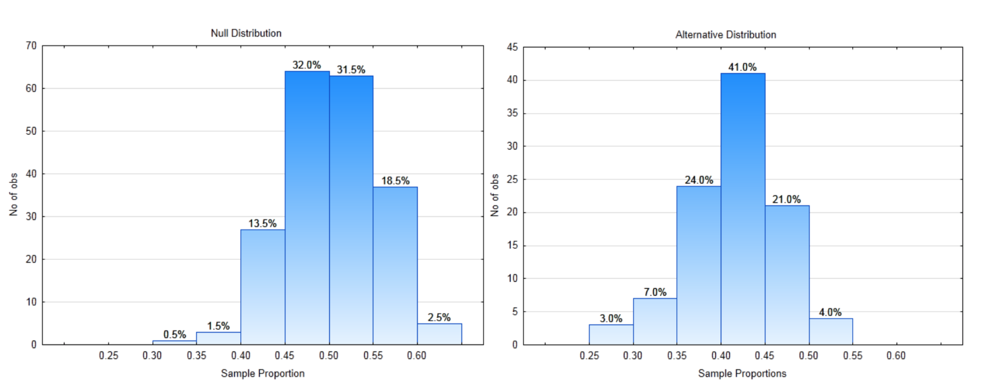
When the evidence is gathered by taking a random sample from the population, the random sample that is actually selected is only one of many, many, many possible samples that could have been taken instead. Each random sample would produce different statistics. If you could see all the statistics, you would be able to determine if the sample you took was likely or unlikely. A graph of statistics, such as sample proportions or sample means, is called a sampling distribution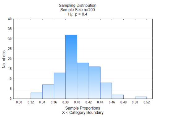 .
.
While it does not make sense to take lots of different samples to find all possible statistics, a few demonstrations of what happens if someone does do that can give you some confidence that similar results would occur in other situations as well. The data used in the graphs below were done using computer simulations.
The histogram at the right is a sampling distribution of sample proportions. 100 different samples that contained 200 data values were selected from a population in which 40% favored replacing fossil fuel (green marbles). The proportion in favor of replacing fossil fuels (green marbles) was found for each sample and graphed. There are two things you should notice in the graph. The first is that most of the sample proportions are grouped together in the middle and the second thing is that the middle is approximately 0.40 which is equivalent to the proportion of green marbles in the container.
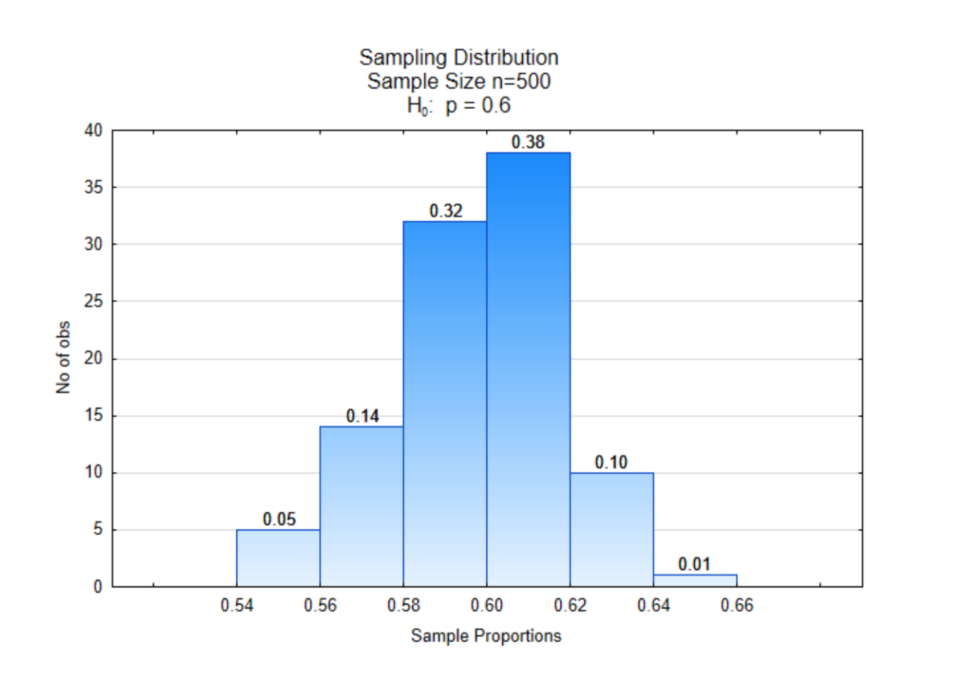
That may, of course, have been a coincidence. So let’s look at a different sample. In this one, the original population was 60% green marbles representing those in favor of replacing fossil fuels. The sample size was 500 and the process was repeated 100 times.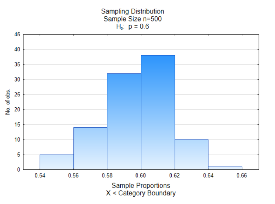
Once again we see most of the sample proportions grouped in the middle and the middle is around the value of 0.60, which is the proportion of green marbles in the original population.
We will look at one more example. In this example, the proportion in favor of replacing fossil fuels is 0.80 while the proportion of those opposed is 0.20. The sample size will be 1000 and there will be 100 samples of that size. Where do you expect the center of this distribution to fall?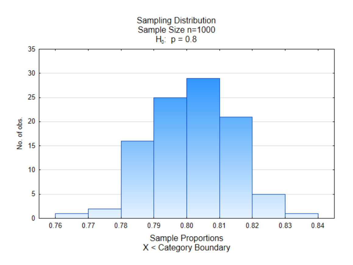
As you can see, the center of this distribution is near 0.80 with more values near the middle than at the edges.
One issue that has not been addressed is the effect of the sample size. Sample sizes are represented with the variable n. These three graphs all had different sample sizes. The first sample had n=200, the second had n=500 and the third had n=1000. To see the effect of these different sample sizes, all three sets of sample proportions have been graphed on the same histogram.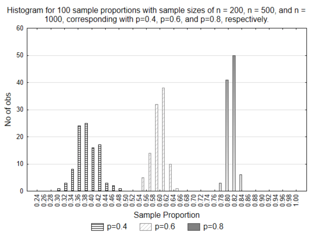
What this graph illustrates is that the smaller the sample size, the more variation that exists in the sample proportions. This is evident because they are spread out more. Conversely, the larger the sample size, the less variation that exists. What this means is the larger the sample size, the closer the sample result will be to the parameter. Does this seem reasonable? If there were 10,000 people in a population and you got the opinion of 9,999 of them, do you think all your possible sample proportions would be closer to the parameter (population proportion) than if you only asked 20 people?
We will return to sampling distributions in a short time, but first we need to learn about directions of extremes and probability.
Direction of Extreme
The direction of extreme is the direction (left or right) on a number line that would make you think the alternative hypothesis is true. Greater than symbols have a direction of extreme to the right, less than symbols indicate the direction is to the left and not-equal signs indicate a two-sided direction of extreme.
| Notation | Notation | Direction of Extreme |
| \(H_0\) : \(p = 0.2\) \(H_1\) : \(p > 0.2\) |
\(H_0\) : \(p_A = p_B\) \(H_1\) : \(p_A > p_B\) |
Right |
| Left | \(H_0\) : \(p_A = p_B\) \(H_1\) : \(p_A < p_B\) |
Left |
| \(H_0\) : \(p = 0.2\) \(H_1\) : \(p \ne 0.2\) |
\(H_0\) : \(p_A = p_B\) \(H_1\) : \(p_A \ne p_B\) |
Two-sided |
| \(H_0\) : \(\mu = 15\) \(H_1\) : \(\mu > 15\) |
\(H_0\) : \(\mu_A = \mu_B\) \(H_1\) : \(\mu_A > \mu_B\) |
Right |
| \(H_0\) : \(\mu = 15\) \(H_1\) : \(\mu < 15\) |
\(H_0\) : \(\mu_A = \mu_B\) \(H_1\) : \(\mu_A < \mu_B\) |
Left |
| \(H_0\) : \(\mu = 15\) \(H_1\) : \(\mu \ne 15\) |
\(H_0\) : \(\mu_A = \mu_B\) \(H_1\) : \(\mu_A \ne \mu_B\) |
Two-sided |
Probability
At this time it is necessary to have a brief discussion about probability. A more detailed discussion will occur in Chapter 4. When theories are tested empirically by sampling from a stochastic population, then the sample that is obtained is based on chance. When a sample is selected through a random process and the statistic is calculated, it is possible to determine the probability of obtaining that statistic or more extreme statistics if we know the sampling distribution.
By definition, probability is the number of favorable outcomes divided by the number of possible outcomes.
\[P(A) = \dfrac{Number\ of\ Favorable\ Outcomes}{Number\ of\ Possible\ Outcomes}\]
This formula assumes that all outcomes are equally likely as is theoretically the case in a random selection processes. It reflects the proportion of times that a result would be obtained if an experiment were done a very large number of times. Because you cannot have a negative number of outcomes or more successful outcomes than are possible, probability is always a fraction or a decimal between 0 and 1. This is shown generically as \(0 \le P(A) \le 1\) where P(A) represents the probability of event A.
Using Sampling Distributions to Test Hypotheses
Remember our research question, “What proportion of American adults believe we should transition to a society that no longer uses fossil fuels (coal, oil, natural gas)? The researchers theory is that the proportion of American adults who believe we should make this transition is greater than 0.6. The hypotheses that would be used for this are:
\(H_0 : p = 0.6\)
\(H_1 : p > 0.6\)
To test this hypothesis, we need two things. First, we need the sampling distribution for the null hypothesis, since we will assume that is true, as stated first in the list for the reasoning process used for testing a hypothesis. The second thing we need is data. Because this is instructional, at this point, several sample proportions will be provided so you can compare and contrast the results.
A small change has been made to the sampling distribution that was shown previously. At the top of each bar is a proportion. On the x-axis there are also proportions. The difference between these proportions is that the ones on the x-axis indicate the sample proportions while the proportions at the top of the bars indicate the proportion of sample proportions that were between the two boundary values. Thus, out of 100 sample proportions, 0.38 (or 38%) of them were between 0.60 and 0.62. The proportions at the top of the bars can also be interpreted as probabilities.
It is with this sampling distribution from the null hypotheses that we can find the likelihood, or probability of getting our data, or more extreme data. We will call this probability a p-value.
As a reminder, for the hypothesis we are testing, the direction of extreme is to the right.
Suppose the sample proportion we got for our data was \(\hat{p}\) = 0.64. What is the probability we would have gotten that sample proportion or more extreme from this distribution? That probability is 0.01, consequently the p-value is 0.01. This number is found at the top of the right-most bar.
Suppose the sample proportion we got from our data was \(\hat{p}\) = 0.62. What is the probability we would have gotten that sample proportion from this distribution? That probability is 0.11. This was calculated by adding the proportions on the top of the two right-most bars. The p-value is 0.11.
You try it. Suppose the sample proportion we got from our data was \(\hat{p}\) = 0.60. What is the probability we would have gotten that sample proportion from this distribution?
Now, suppose the sample proportion we got from our data was \(\hat{p}\) = 0.68. What is the probability we would have gotten that sample proportion from this distribution? In this case, there is no evidence of any sample proportions equal to 0.68 or higher, so consequently the probability, or p-value would be 0.
Testing the hypothesis
We will now try to determine which hypothesis is supported by the data. We will use the p=0.8 distribution to represent the alternative hypothesis. Both the null and alternative distributions are shown on the same graph.
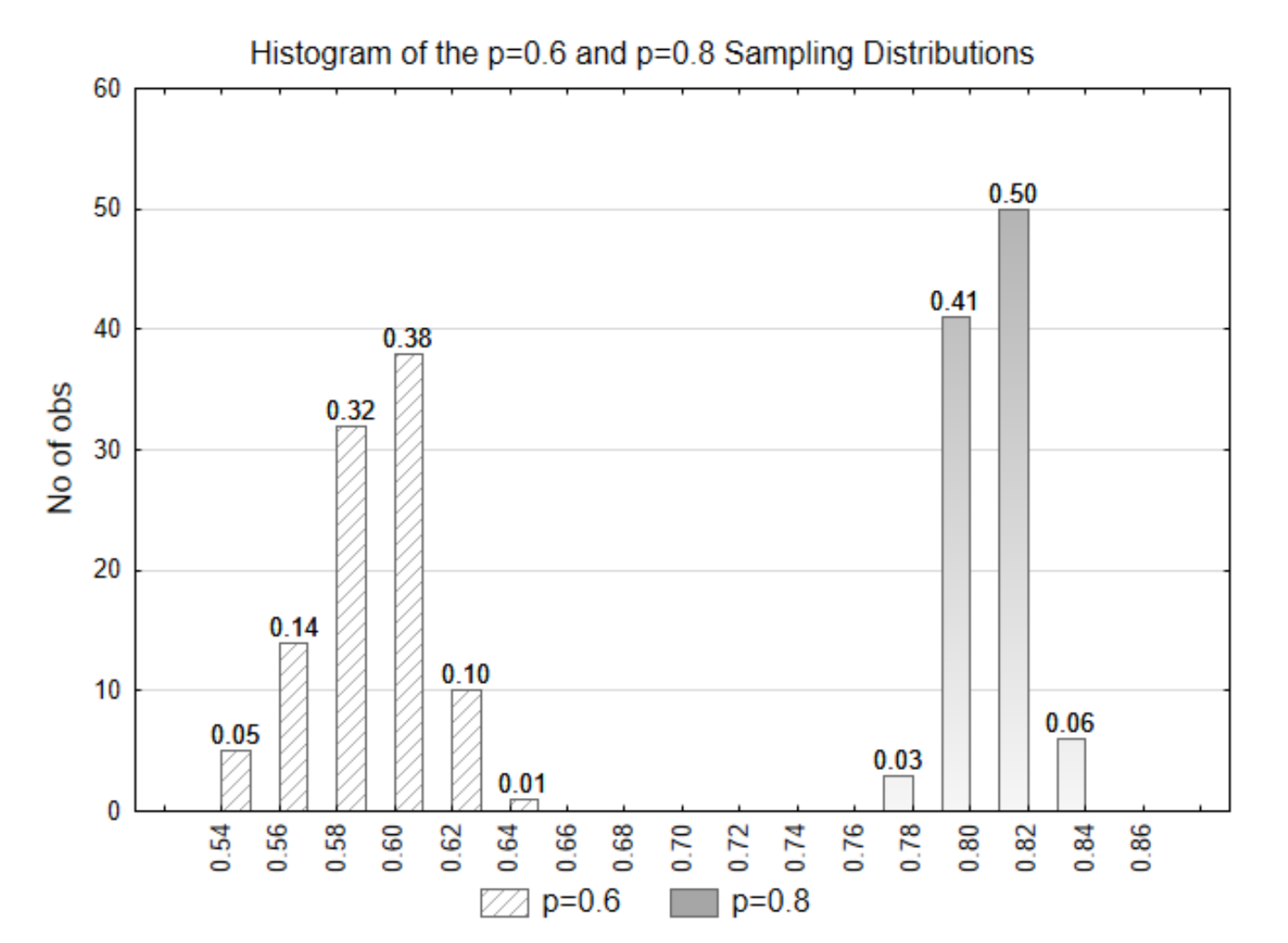
If the data that is selected had a statistic of \(\hat{p}\) = 0.58, what is the p-value? Which of the two distributions do you think the data came from? Which hypothesis is supported?
The p-value is 0.81 (0.32+0.38+0.10+0.01). This data came from the null distribution (p=0.6). This evidence supports the null hypothesis.
If the data that is selected was \(\hat{p}\) = 0.78, what is the p-value? Which of the two distributions do you think the data came from? Which hypothesis is supported?
The p-value is 0 because there are no values in the p=0.6 distribution that are 0.78 or higher. The data came from the alternative (p=0.8) distribution. The alternative hypothesis is supported.
In the prior examples, there as a clear distinction between the null and alternative distributions. In the next example, the distinction is not as clear. The alternative distribution will be represented with a proportion of 0.65
.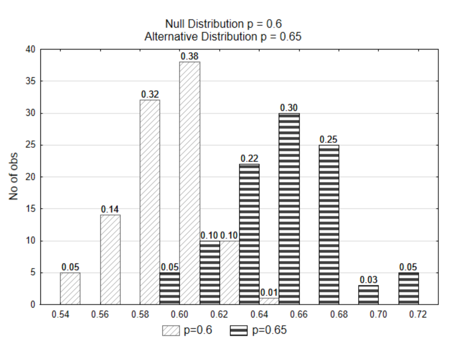
If the data that is selected was \(\hat{p}\) = 0.62, from which of the two distributions do you think the data came from? Which hypothesis is supported?
Notice that in this case, because the distributions overlap, a sample proportion of 0.62 or more extreme could have come from either distribution. It isn’t clear which one it came from. Because of this lack of clarity, we could possibly make an error. We might think it came from the null distribution whereas it really came from the alternative distribution. Or perhaps we thought it came from the alternative distribution, but it really came from the null distribution. How do we decide???
Before explaining the way we decide, we need to discuss errors, as they are part of the decision- making process.
There are two types of errors we can make as a result of the sampling process. They are known as sampling errors. These errors are named Type I and Type II errors. A type I error occurs when we think the data supports the alternative hypothesis but in reality, the null hypothesis is correct. A type II error occurs when we think the data supports the null hypothesis, but in reality the alternative hypothesis is correct. In all cases of testing hypotheses, there is the possibility of making either a type I or type II error.
The probability of making either Type I or Type II errors is important in the decision-making process. We represent the probability of making a Type I error with the Greek letter alpha, \(\alpha\). It is also called the level of significance. The probability of making a Type II error is represented with the Greek letter Beta, \(\beta\). The probability of the data supporting the alternative hypothesis, when the alternative is true is called power. Power is not an error. The errors are summarized in the table below.
| The True Hypothesis | |||
| \(H_0\) Is True | \(H_1\) Is True | ||
| The Evidence upon which the decision is based | The Data Supports \(H_0\) | No Error | Type II Error Probability: \(\beta\) |
| The Data Supports \(H_1\) | Type I Error Probability: \(\alpha\) | No Error Probability: Power | |
The reasoning process for deciding which hypothesis the data supports is reprinted here.
- Assume the null hypothesis is true.
- Gather data and calculate the statistic.
- Determine the likelihood of selecting the data that produced the statistic or could produce a more extreme statistic, assuming the null hypothesis is true. This is called the p-value.
- If the data are likely, they support the null hypothesis. However, if they are unlikely, they support the alternative hypothesis.
The determination of whether data are likely or not is based on a comparison between the p- value and α. Both alpha and p-values are probabilities. They must always be values between 0 and 1, inclusive. If the p-value is less than or equal to α, the data supports the alternative hypothesis. If the p-value is greater than α, the data supports the null hypothesis. When the data supports the alternative hypothesis, the data are said to be significant. When the data supports the null hypothesis, the data arenot significant. Reread this paragraph at least 3 times as it defines the decision making rule used throughout statistics and it is critical to understand.
Because some values clearly support the null hypothesis, others clearly support the alternative hypothesis but some do not clearly support either, then a decision has to be made, before data is ever collected (a priori), as to the probability of making a type I error that is acceptable to the researcher.The most common values for α are 0.05, 0.01, and 0.10. There is not a specific reason for these choices but there is considerable historical precedence for them and they will be used routinely in this book. The choice for a level of significance should be based on several factors.
- If the power of the test is low because of small sample sizes or weak experimental design, a larger level of significance should be used.
- Keep in mind the ultimate objective of research – “to understand which hypotheses about the universe are correct. Ultimately these are yes and no decisions.” (Scheiner, Samuel M., and Jessica Gurevitch. Design and Analysis of Ecological Experiments. Oxford [etc.: Oxford UP, 2001. Print.) Statistical tests should lead to one of three results. One result is that the hypothesis is almost certainly correct. The second result is that the hypothesis is almost certainly incorrect. The third result is that further research is justified. P- values within the interval (0.01,0.10) may warrant continued research, although these values are as arbitrary as the commonly used levels of significance.
- If we are attempting to build a theory, we should use more liberal (higher) values of α, whereas if we are attempting to validate a theory, we should use more conservative (lower) values of \(\alpha\).
Demonstration of an elementary hypothesis test
Now, you have all the parts for deciding which hypothesis is supported by the evidence (the data). The problem will be restated here.
\(H_0 : p = 0.6\)
\(H_1 : p > 0.6\)
\(\alpha = 0.01\)
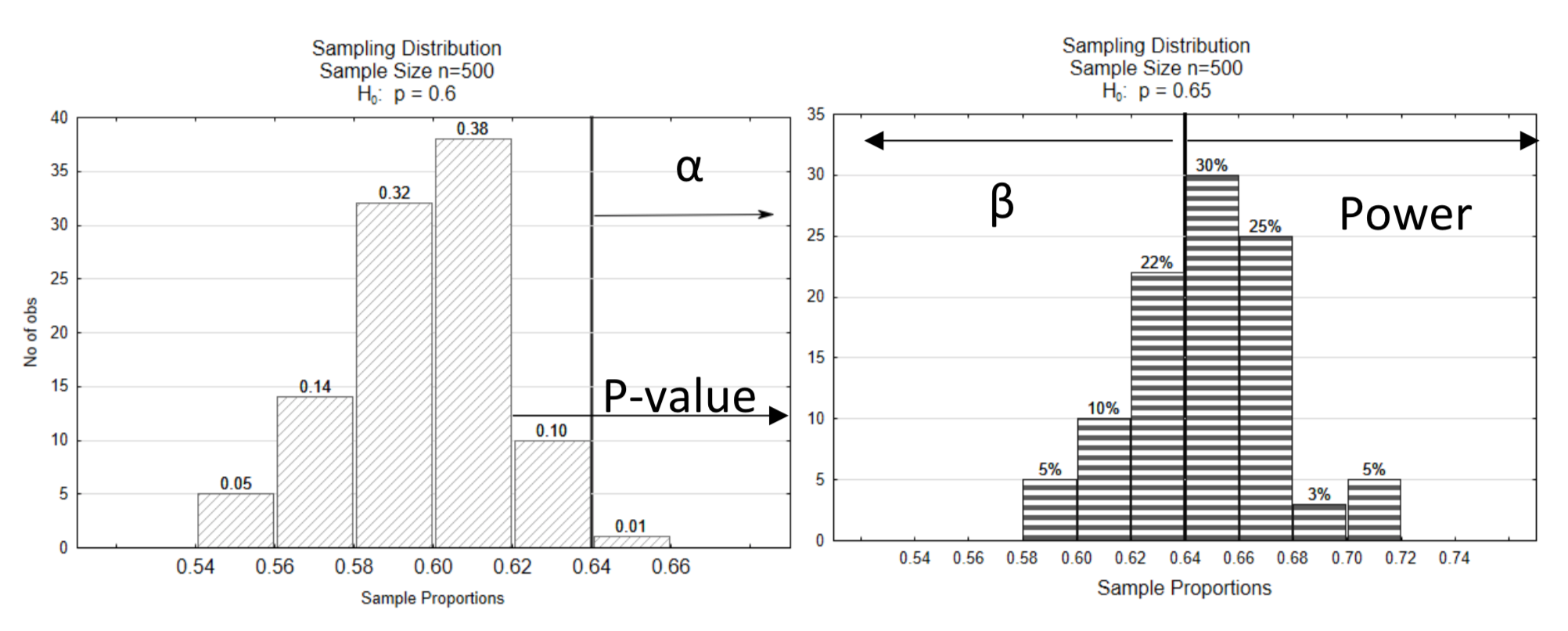
A vertical line was drawn on the graph so that a proportion of only 0.01 was to the right of the line in the null distribution. This is called a decision line because it is the line that determines how we will decide if the statistic supports the null or alternative hypothesis. The number at the bottom of the decision line is called the critical value.
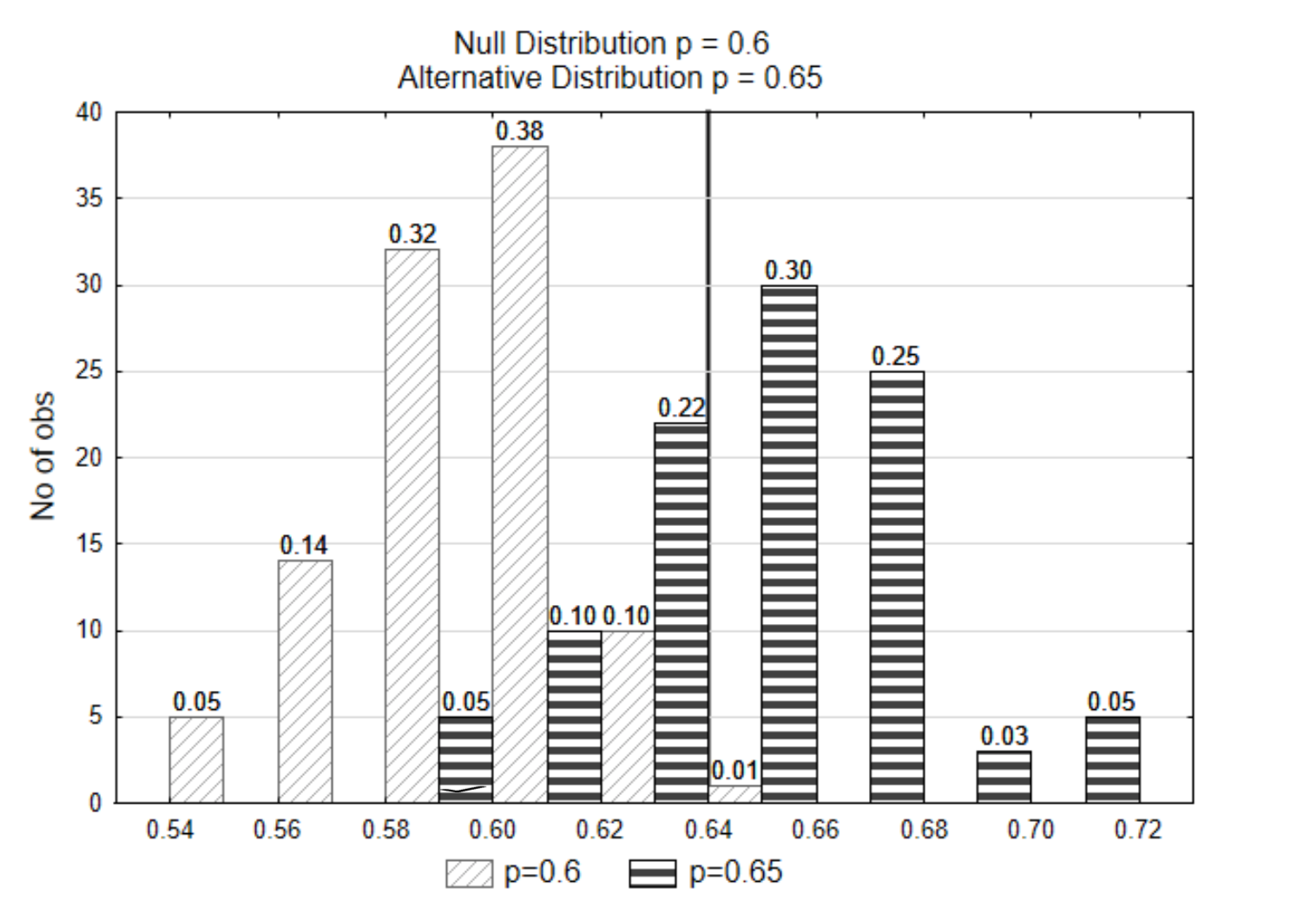
If the data that is selected was \(\hat{p}\) = 0.62, from which of the two distributions do you think the data came from? Which hypothesis is supported?
To answer these questions, first find the p-value. The p-value is 0.11 (0.10 + 0.01).
Next, compare the p-value to \(\alpha\). Since 0.11 > 0.01, this evidence supports the null hypothesis.
Because showing both distributions on the same graph can make the graph a little difficult to read, this graph will be split into two graphs. The decision line is shown at the same critical value on both graphs (0.64). The level of significance, α, is shown on the null distribution. It points in the direction of the extreme. β and power are shown on the alternative distribution. Power is on the same side of the distribution as the direction of extreme while β is on the opposite side. The p-value is also shown on the null distribution, pointing in the direction of the extreme.
Another example will be demonstrated next.
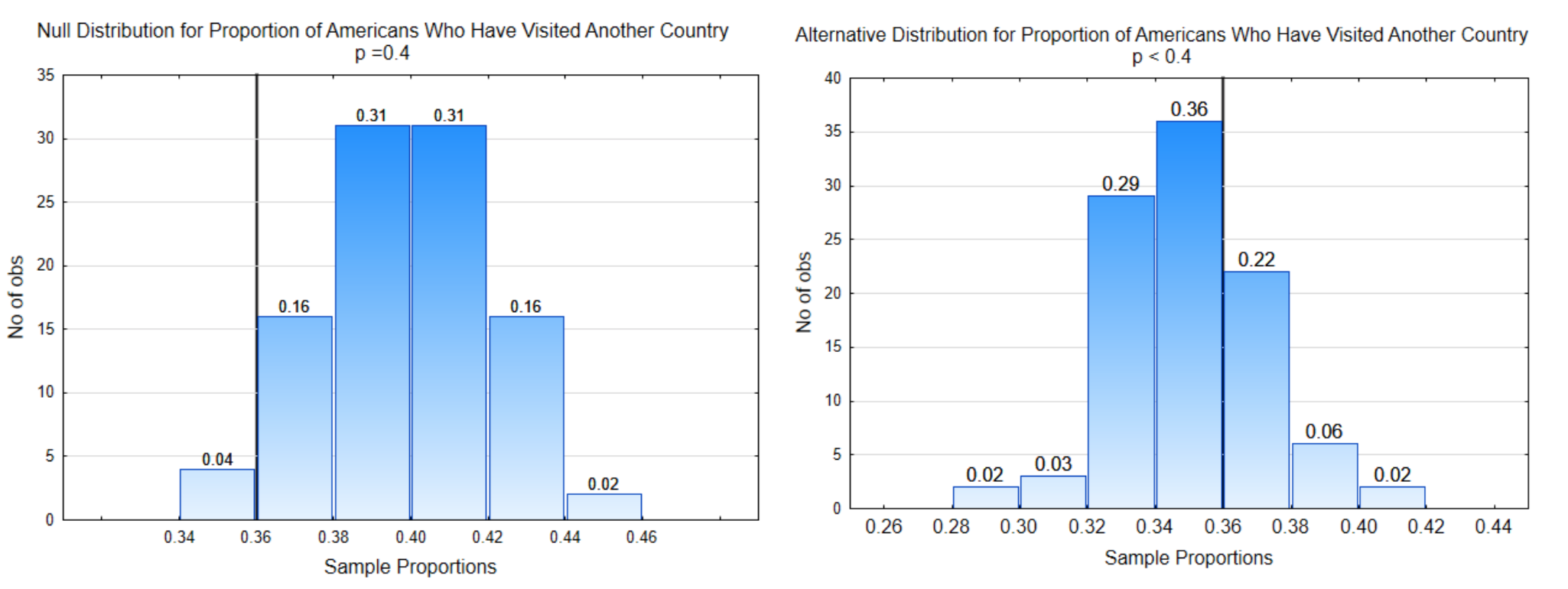
Question: What is the proportion of people who have visited a different country?
Theory: The proportion is less than 0.40
Hypotheses: \(H_0: p = 0.40\)
\(H_1: p < 0.40\)
\(\alpha = 0.04\)
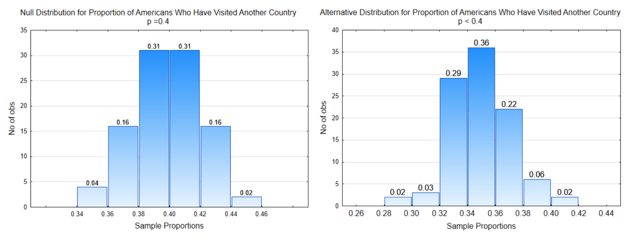
The distribution on the left is the null distribution, that is, it is the distribution that was obtained by sampling from a population in which the proportion of people who have visited a different country is really 0.40. The distribution on the right is representing the alternative hypothesis.
The objective is to identify the portion of each graph associated with α, β, and power. Once the data has been provided, you will also be able to show the part of the graph that indicates the p-value.
The reasoning process for labeling the distributions is as follows.
1. Determine the direction of the extreme. This is done by looking at the inequality sign in the alternative hypothesis. If the sign is <, then the direction of the extreme is to the left. If the sign is >, then the direction of the extreme is to the right. If the sign is \(\ne\), then the direction of extreme is to the left and right, which is called two-sided. Notice that the inequality sign points towards the direction of extreme. To keep these concepts a little easier as you are learning them, we will not do two-sided alternative hypotheses until later in the text.
In this problem the direction of extreme is to the left because smaller sample proportions support the alternative hypothesis.
2. Draw the Decision line. The direction of extreme along with α are used to determine the placement of the decision line. Alpha is the probability of making a Type I error. A Type I error can only occur if the null hypothesis is true, therefore, we always place alpha on the null distribution. Starting on the side of the direction of extreme, add the proportions at the top of the bars until they equal alpha. Draw the decision line between bars separating those that could lead to a Type I error from the rest of the distribution.
Notice the x-axis value at the bottom of the decision line. This value is called the critical value. Identify the critical value on the alternative distribution and place another decision line there.
In this problem, the direction of extreme is to the left and \(\alpha\) = 4% (0.04) so the decision line is placed so that the proportion of sample proportions to the left is 0.04. The critical value is 0.36 so the other decision line is placed at 0.36 on the alternative distribution.
3. Labeling \(\alpha\), \(\beta\), and power. \(\alpha\) is always placed on the null distribution on the side of the decision line that is in the direction of extreme. \(\beta\) is always placed on the alternative distribution on the side of the decision line that is opposite of the direction of extreme. Power is always placed on the alternative distribution on the side of the decision line that is in the direction of extreme.
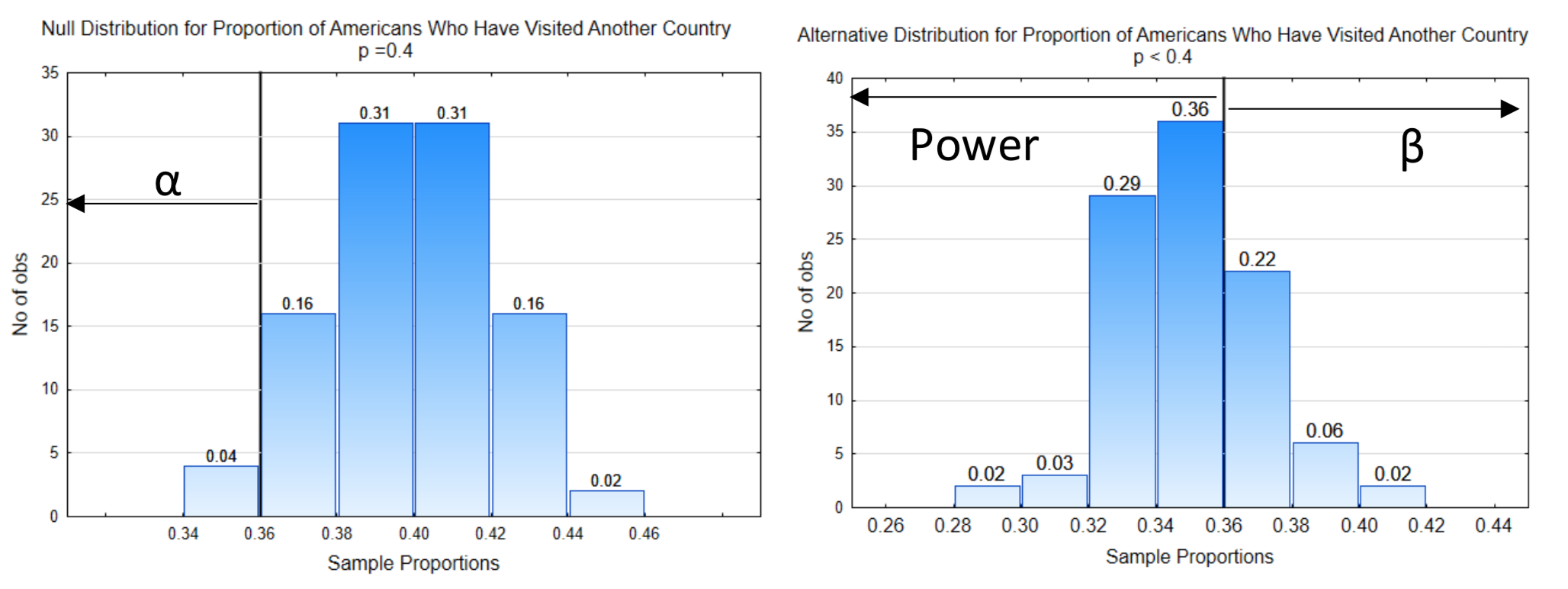
4. Identify the probabilities for \(\alpha\), \(\beta\), and power. This is done by adding the proportions at the top of the bars.
In this example, the probability for \(\alpha\) is 0.04. The probability for \(\beta\) is 0.30 (0.02 + 0.06 + 0.22). The probability for power is 0.70 (0.02 + 0.03 + 0.29 + 0.36).
5. Find the p-value. Data is needed to test the hypothesis, so here is the data: In a sample of 200 people, 72 have visited another country. The sample proportion is \(\hat{p} = \dfrac{72}{200} = 0.36\). The p-value, which is the probability of getting the data, or more extreme values, assuming the null hypothesis is true, is always placed on the null distribution and always points in the direction of the extreme.
In this example, the p-value has been indicated on the null distribution.
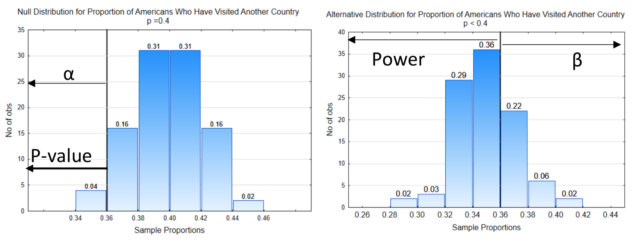
6. Make a decision. The probability for the p-value is 0.04. To determine which hypothesis is supported by the data, we compare the p-value to alpha. If the p-value is less than or equal to alpha, the evidence supports the alternative hypothesis. In this case, the p-value of 0.04 equals alpha which is also 0.04, so this evidence supports the alternative hypothesis leading to the conclusion that the proportion of people who have visited another country is less than 40%.
7. Errors and their consequence. While this problem is not serious enough to have consequences that matter, we will, nevertheless, explore the consequences of the various errors that could be made.
Because the evidence supported the alternative hypothesis, we have the possibility of making a type I error. If we did make a type I error it would mean that we think fewer than 40% of Americans have visited another country, when in fact 40% have done so.
In contrast to this, if our data had been 0.38 so that our p-value was 0.20, then our results would have supported the null hypothesis and we could be making a Type II error. This error means that we would think 40% of Americans had visited another country when, in fact, the true proportion would be less than that.
8. Reporting results. Statistical results are reported in a sentence that indicates whether the data are significant, the alternative hypothesis, and the supporting evidence, in parentheses, which at this point include the p-value and the sample size (n).
For the example in which \(\hat{p}\) = 0.36 we would write, the proportion of Americans who have visited other countries is significantly less than 0.40 (p = 0.04, n = 200).
For the example in which \(\hat{p}\) = 0.38 we would write, the proportion of Americans who have visited other countries is not significantly less than 0.40 (p= 0.20, n = 200).
At this point, a brief explanation is needed about the letter p. In the study of statistics there are several words that start with the letter p and use p as a variable. The list of words includes parameters, population, proportion, sample proportion, probability, and p-value. The words parameter and population are never represented with a p. Probability is represented with notation that is similar to function notation you learned in algebra, f(x), which is read f of x. For probability, we write P(A) which is read the probability of event A. To distinguish between the use of p for proportion and p for p-value, pay attention to the location of the p. When p is used in hypotheses, such as \(H_0: p = 0.6\), \(H_1: p > 0.6\), it means the proportion of the population. When p is used in the conclusion, such as the proportion is significantly greater than 0.6 (p = 0.01, n = 200), then the p in p = 0.01 is interpreted as a p-value. If the sample proportion is given, it is represented as \(\hat{p}\) = 0.64.
We will conclude this chapter with a final thought about why we are formal in the testing of hypotheses. According to Colquhoun (1971), “Most people need all the help they can get to prevent them from making fools of themselves by claiming that their favorite theory is substantiated by observations that do nothing of the sort. And the main function of that section of statistics that deals with tests of significance is to prevent people making fools of themselves”. (Green, 1979).
Chapter 1 Homework
- Identify each of the following as a parameter or statistic.
A. p is a
B. \(\bar{x}\) is a
C. \(\hat{p}\) is a
D. \(\mu\) is a - Are hypotheses written about parameters or statistics? _________________
- A sampling distribution is a histogram of which of the following?
______original data
______possible statistics that could be obtained when sampling from a population - Write the hypotheses using the appropriate notation for each of the following hypotheses. Using meaningful subscripts when comparing two population parameters. For example, comparing men to women, you might use scripts of m and w, for instance \(p_m = p_w\).
4a. The mean is greater than 20. \(H_0\): \(H_1\):
4b. The proportion is less than 0.75. \(H_0\): \(H_1\):
4c. The mean for Americans is different than the mean for Canadians. \(H_0\): \(H_1\):
4d. The proportion for Mexicans is greater than the proportion for Americans. \(H_0\): \(H_1\):
4e. The proportion is different than 0.45. 4f. The mean is less than 3000. \(H_0\): \(H_1\): - If the p-value is less than \(\alpha\),
5a. which hypothesis is supported?
5b. are the data significant?
5c. what type error could be made? - For each row of the table you are given a p-value and a level of significance (α). Determine whichhypothesis is supported, if the data are significant and which type error could be made. If a given p- value is not a valid p-value (because it is greater than 1), put an x in each box in the row.
p-value \(\alpha\) Hypothesis \(H_0\) or \(H_1\) Significant or Not Significant Error
Type I or Type II0.043 0.05 0.32 0.05 0.043 0.01 0.0035 0.01 0.043 0.10 0.15 0.10 5.6 \(\times 10^{-6}\) 0.05 7.3256 0.01 - For each set of information that is provided, write the concluding sentence in the form used by researchers.
7a. \(H_1: p > 0.5, n = 350\), p - value = 0.022, \(\alpha = 0.05\)
7b. \(H_1: p < 0.25, n = 1400\), p - value = 0.048, \(\alpha = 0.01\)
7c. \(H_1: \mu > 20, n = 32\), p - value = \(5.6 \times 10^{-5}\), \(\alpha = 0.05\)
7d. \(H_1: \mu \ne 20, n = 32\), p - value = \(5.6 \times 10^{-5}\), \(\alpha = 0.05\) - Test the hypotheses:
\(H_0: p = 0.5\)
\(H_1: p < 0.5\)
Use a 2% level of significance.
8a. What is the direction of the extreme?
8b. Label each distribution with a decision rule line. Identify \(\alpha\), \(\beta\), and power on the appropriate distribution.
8c. What is the critical value?
8d. What is the value of \(\alpha\)?
8e. What is the value of \(\beta\)?
8f. What is the value of Power?
The Data: The sample size is 80. The sample proportion is 0.45.
8g. Show the p-value on the appropriate distribution.
8h. What is the value of the p-value?
8i. Which hypothesis is supported by the data?
8j. Are the data significant?
8k. What type error could have been made?
8l. Write the concluding sentence. - Test the hypotheses:
\(H_0: \mu = 300\)
\(H_0: \mu > 300\)
Use a 3.5% level of significance.
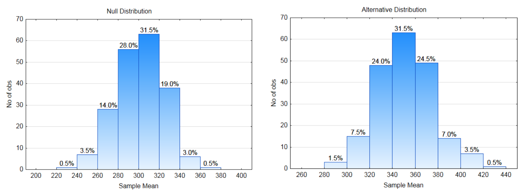
8a. What is the direction of the extreme?
8b. Label each distribution with a decision rule line. Identify \(\alpha\), \(\beta\), and power on the appropriate distribution.
8c. What is the critical value?
8d. What is the value of \(\alpha\)?
8e. What is the value of \(\beta\)?
8f. What is the value of Power?
The Data: The sample size is 10. The sample mean is 360.
8g. Show the p-value on the appropriate distribution.
8h. What is the value of the p-value?
8i. Which hypothesis is supported by the data?
8j. Are the data significant?
8k. What type error could have been made?
8l. Write the concluding sentence. - Question: Is the five-year cancer survival rate for all races improving?
.
5 – year Cancer Survival Rate. According to the American Cancer Society, in 1974-1976 the five- year survival rate for all races was 50%. This means that 50% of the people who were diagnosed with cancer were still alive 5 years later. These people could still be undergoing treatment, could be in remission or could be disease-free. (www.cancer.org/acs/groups/con...securedpdf.pdf Viewed 5-29-13)
Study Design: To determine if the survival rates are improving, data will be gathered from people who have been diagnosed with cancer at least 5 years before the start of this study. The data that will be collected is whether the people are still alive 5 years after their diagnosis. The data will be categorical, that is the people will be put into one of two categories, survive or did not survive. Suppose the medical records of 100 people diagnosed with cancer are examined. Use a level of significance of 0.02.
10a. Write the hypotheses that would be used to show that the proportion of people who survive cancer for at least five years after diagnosis is greater than 0.5. Use the appropriate parameter.
\(H_0:\)
\(H_1:\)
10b. What is the direction of the extreme?
10c. Label the null and alternate sampling distributions below with the decision rule line, \(\alpha\), \(\beta\), power.
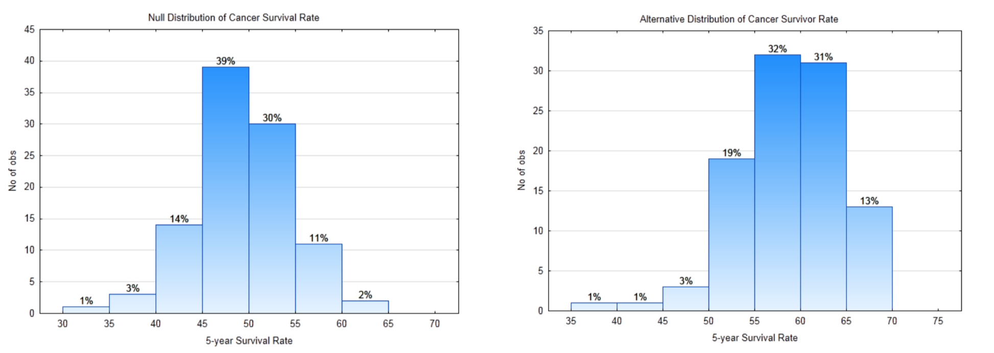
10d. What is the critical value?
10e. What is the value of \(\alpha\)?
10f. What is the value of \(\beta\)?
10g. What is the value of Power?The data: The 5-year survival rate is 65%.
10h. What is the p-value for the data?
10i. Write your conclusion in the appropriate format.
10j. What Type Error is possible?
10k. In English, explain the conclusion that can be drawn about the question. - Why Statistical Reasoning Is Important for a Business Student and Professional
Developed in Collaboration with Tom Phelps, Professor of Economics, Mathematics, and Statistics This topic is discussed in ECON 201, Micro Economics.
Briefing 1.2
Generally speaking, as the price of an item increases, there are fewer units of the item purchased. In economics terms, there is less “quantity demanded”. The ratio of the percent change in quantity demanded to the percent change in price is called price elasticity of demand. The formula is \(e_d = \dfrac{\%\Delta Q_d}{\%\Delta P}\). For example, if a 1% price increase resulted in a 1.5% decrease in the quantity demanded, the price elasticity is \(e_d = \dfrac{-1.5\%}{1\%}\) = −1.5. It is common for economists to use the absolute value of \(e_d\) since almost all \(e_d\) values are negative. Elasticity is a unit-less number called an elasticity coefficient.
Food is an item that is essential, so demand will always exist, however eating out, which is more expensive than eating in, is not as essential. The average price elasticity of demand for food for the home is 0.51. This means that a 1% price increase results in a 0.51% decrease in quantity demanded. Because eating at home is less expensive than eating in restaurants, it would not be unreasonable to assume that as prices increase, people would eat out less often. If this is the case, we would expect that the price elasticity of demand for eating out would be greater than for eating at home. Test the hypothesis that the mean elasticity for food away from home is higher than for food at home, meaning that changing prices have a greater impact on eating out. (www.ncbi.nlm.nih.gov/pmc/articles/PMC2804646/) (www.ncbi.nlm.nih.gov/pmc/arti...46/table/tbl1/)
11a. Write the hypotheses that would be used to show that the mean elasticity for food away from home is greater than 0.51. Use a level of significance of 7%.
\(H_0:\)
\(H_1:\)
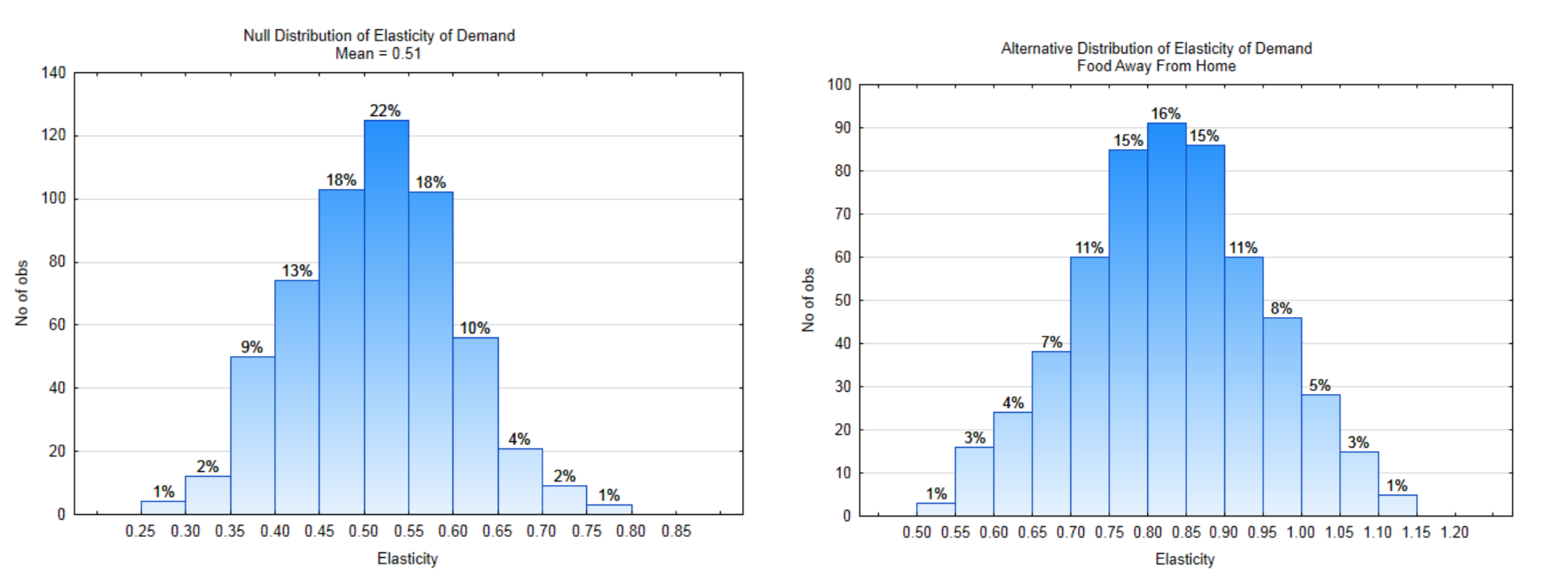
11b. Label each distribution with the decision rule line. Identify \(\alpha\), \(\beta\), and power on the appropriate distribution.
11c. What is the direction of the extreme?
11d. What is the value of \(\alpha\)?
11e. What is the value of \(\beta\)?
11f. What is the value of Power?The Data: A sample of 13 restaurants had a mean elasticity of 0.80.
11g. Show the p-value on the appropriate distribution.
11h. What is the value of the p-value?
11i. Which hypothesis is supported by the data?
11j. Are the data significant?
11k. What type error could have been made?
11l. Write the concluding sentence.