
One Quantitative Variable: Introduction
- Page ID
- 31280
\( \newcommand{\vecs}[1]{\overset { \scriptstyle \rightharpoonup} {\mathbf{#1}} } \)
\( \newcommand{\vecd}[1]{\overset{-\!-\!\rightharpoonup}{\vphantom{a}\smash {#1}}} \)
\( \newcommand{\dsum}{\displaystyle\sum\limits} \)
\( \newcommand{\dint}{\displaystyle\int\limits} \)
\( \newcommand{\dlim}{\displaystyle\lim\limits} \)
\( \newcommand{\id}{\mathrm{id}}\) \( \newcommand{\Span}{\mathrm{span}}\)
( \newcommand{\kernel}{\mathrm{null}\,}\) \( \newcommand{\range}{\mathrm{range}\,}\)
\( \newcommand{\RealPart}{\mathrm{Re}}\) \( \newcommand{\ImaginaryPart}{\mathrm{Im}}\)
\( \newcommand{\Argument}{\mathrm{Arg}}\) \( \newcommand{\norm}[1]{\| #1 \|}\)
\( \newcommand{\inner}[2]{\langle #1, #2 \rangle}\)
\( \newcommand{\Span}{\mathrm{span}}\)
\( \newcommand{\id}{\mathrm{id}}\)
\( \newcommand{\Span}{\mathrm{span}}\)
\( \newcommand{\kernel}{\mathrm{null}\,}\)
\( \newcommand{\range}{\mathrm{range}\,}\)
\( \newcommand{\RealPart}{\mathrm{Re}}\)
\( \newcommand{\ImaginaryPart}{\mathrm{Im}}\)
\( \newcommand{\Argument}{\mathrm{Arg}}\)
\( \newcommand{\norm}[1]{\| #1 \|}\)
\( \newcommand{\inner}[2]{\langle #1, #2 \rangle}\)
\( \newcommand{\Span}{\mathrm{span}}\) \( \newcommand{\AA}{\unicode[.8,0]{x212B}}\)
\( \newcommand{\vectorA}[1]{\vec{#1}} % arrow\)
\( \newcommand{\vectorAt}[1]{\vec{\text{#1}}} % arrow\)
\( \newcommand{\vectorB}[1]{\overset { \scriptstyle \rightharpoonup} {\mathbf{#1}} } \)
\( \newcommand{\vectorC}[1]{\textbf{#1}} \)
\( \newcommand{\vectorD}[1]{\overrightarrow{#1}} \)
\( \newcommand{\vectorDt}[1]{\overrightarrow{\text{#1}}} \)
\( \newcommand{\vectE}[1]{\overset{-\!-\!\rightharpoonup}{\vphantom{a}\smash{\mathbf {#1}}}} \)
\( \newcommand{\vecs}[1]{\overset { \scriptstyle \rightharpoonup} {\mathbf{#1}} } \)
\(\newcommand{\longvect}{\overrightarrow}\)
\( \newcommand{\vecd}[1]{\overset{-\!-\!\rightharpoonup}{\vphantom{a}\smash {#1}}} \)
\(\newcommand{\avec}{\mathbf a}\) \(\newcommand{\bvec}{\mathbf b}\) \(\newcommand{\cvec}{\mathbf c}\) \(\newcommand{\dvec}{\mathbf d}\) \(\newcommand{\dtil}{\widetilde{\mathbf d}}\) \(\newcommand{\evec}{\mathbf e}\) \(\newcommand{\fvec}{\mathbf f}\) \(\newcommand{\nvec}{\mathbf n}\) \(\newcommand{\pvec}{\mathbf p}\) \(\newcommand{\qvec}{\mathbf q}\) \(\newcommand{\svec}{\mathbf s}\) \(\newcommand{\tvec}{\mathbf t}\) \(\newcommand{\uvec}{\mathbf u}\) \(\newcommand{\vvec}{\mathbf v}\) \(\newcommand{\wvec}{\mathbf w}\) \(\newcommand{\xvec}{\mathbf x}\) \(\newcommand{\yvec}{\mathbf y}\) \(\newcommand{\zvec}{\mathbf z}\) \(\newcommand{\rvec}{\mathbf r}\) \(\newcommand{\mvec}{\mathbf m}\) \(\newcommand{\zerovec}{\mathbf 0}\) \(\newcommand{\onevec}{\mathbf 1}\) \(\newcommand{\real}{\mathbb R}\) \(\newcommand{\twovec}[2]{\left[\begin{array}{r}#1 \\ #2 \end{array}\right]}\) \(\newcommand{\ctwovec}[2]{\left[\begin{array}{c}#1 \\ #2 \end{array}\right]}\) \(\newcommand{\threevec}[3]{\left[\begin{array}{r}#1 \\ #2 \\ #3 \end{array}\right]}\) \(\newcommand{\cthreevec}[3]{\left[\begin{array}{c}#1 \\ #2 \\ #3 \end{array}\right]}\) \(\newcommand{\fourvec}[4]{\left[\begin{array}{r}#1 \\ #2 \\ #3 \\ #4 \end{array}\right]}\) \(\newcommand{\cfourvec}[4]{\left[\begin{array}{c}#1 \\ #2 \\ #3 \\ #4 \end{array}\right]}\) \(\newcommand{\fivevec}[5]{\left[\begin{array}{r}#1 \\ #2 \\ #3 \\ #4 \\ #5 \\ \end{array}\right]}\) \(\newcommand{\cfivevec}[5]{\left[\begin{array}{c}#1 \\ #2 \\ #3 \\ #4 \\ #5 \\ \end{array}\right]}\) \(\newcommand{\mattwo}[4]{\left[\begin{array}{rr}#1 \amp #2 \\ #3 \amp #4 \\ \end{array}\right]}\) \(\newcommand{\laspan}[1]{\text{Span}\{#1\}}\) \(\newcommand{\bcal}{\cal B}\) \(\newcommand{\ccal}{\cal C}\) \(\newcommand{\scal}{\cal S}\) \(\newcommand{\wcal}{\cal W}\) \(\newcommand{\ecal}{\cal E}\) \(\newcommand{\coords}[2]{\left\{#1\right\}_{#2}}\) \(\newcommand{\gray}[1]{\color{gray}{#1}}\) \(\newcommand{\lgray}[1]{\color{lightgray}{#1}}\) \(\newcommand{\rank}{\operatorname{rank}}\) \(\newcommand{\row}{\text{Row}}\) \(\newcommand{\col}{\text{Col}}\) \(\renewcommand{\row}{\text{Row}}\) \(\newcommand{\nul}{\text{Nul}}\) \(\newcommand{\var}{\text{Var}}\) \(\newcommand{\corr}{\text{corr}}\) \(\newcommand{\len}[1]{\left|#1\right|}\) \(\newcommand{\bbar}{\overline{\bvec}}\) \(\newcommand{\bhat}{\widehat{\bvec}}\) \(\newcommand{\bperp}{\bvec^\perp}\) \(\newcommand{\xhat}{\widehat{\xvec}}\) \(\newcommand{\vhat}{\widehat{\vvec}}\) \(\newcommand{\uhat}{\widehat{\uvec}}\) \(\newcommand{\what}{\widehat{\wvec}}\) \(\newcommand{\Sighat}{\widehat{\Sigma}}\) \(\newcommand{\lt}{<}\) \(\newcommand{\gt}{>}\) \(\newcommand{\amp}{&}\) \(\definecolor{fillinmathshade}{gray}{0.9}\)CO-4: Distinguish among different measurement scales, choose the appropriate descriptive and inferential statistical methods based on these distinctions, and interpret the results.
Video: One Quantitative Variable (4:16)
Related SAS Tutorials
- 5A – (3:01) Numeric Measures using PROC MEANS
- 5B – (4:05) Creating Histograms and Boxplots using SGPLOT
- 5C – (5:41) Creating QQ-Plots and other plots using UNIVARIATE
Related SPSS Tutorials
- 5A – (8:00) Numeric Measures using EXPLORE
- 5B – (2:29) Creating Histograms and Boxplots
- 5C – (2:31) Creating QQ-Plots and PP-Plots
Distribution of One Quantitative Variable
LO 4.4: Using appropriate graphical displays and/or numerical measures, describe the distribution of a quantitative variable in context: a) describe the overall pattern, b) describe striking deviations from the pattern
In the previous section, we explored the distribution of a categorical variable using graphs (pie chart, bar chart) supplemented by numerical measures (percent of observations in each category).
In this section, we will explore the data collected from a quantitative variable, and learn how to describe and summarize the important features of its distribution.
We will learn how to display the distribution using graphs and discuss a variety of numerical measures.
An introduction to each of these topics follows.
Graphs
To display data from one quantitative variable graphically, we can use either a histogram or boxplot.
We will also present several “by-hand” displays such as the stemplot and dotplot (although we will not rely on these in this course).
Numerical Measures
The overall pattern of the distribution of a quantitative variable is described by its shape, center, and spread.
By inspecting the histogram or boxplot, we can describe the shape of the distribution, but we can only get a rough estimate for the center and spread.
A description of the distribution of a quantitative variable must include, in addition to the graphical display, a more precise numerical description of the center and spread of the distribution.
In this section we will learn:
- how to display the distribution of one quantitative variable using various graphs;
- how to quantify the center and spread of the distribution of one quantitative variable with various numerical measures;
- some of the properties of those numerical measures;
- how to choose the appropriate numerical measures of center and spread to supplement the graph(s); and
- how to identify potential outliers in the distribution of one quantitative variable
- We will also discuss a few measures of position (also called measures of location). These measures
- allow us to quantify where a particular value is relative to the distribution of all values
- do provide information about the distribution itself
- also use the information about the distribution to learn more about an INDIVIDUAL
We will present the material in a logical sequence which builds in difficulty, intermingling discussion of visual displays and numerical measures as we proceed.
Before reading further, try this interactive applet which will give you a preview of some of the topics we will be learning about in this section on exploratory data analysis for one quantitative variable.
Interactive Applet: Analyze One Quantitative Variable with this One-Variable Statistical Calculator
Histograms & Stemplots
CO-4: Distinguish among different measurement scales, choose the appropriate descriptive and inferential statistical methods based on these distinctions, and interpret the results.
LO 4.4: Using appropriate graphical displays and/or numerical measures, describe the distribution of a quantitative variable in context: a) describe the overall pattern, b) describe striking deviations from the pattern
Video: Histograms and Stemplots (5:03)
Related SAS Tutorials
- 5B – (4:05) Creating Histograms and Boxplots using SGPLOT
Related SPSS Tutorials
- 5B – (2:29) Creating Histograms and Boxplots
Histograms
LO 4.5: Explain the process of creating a histogram.
The idea is to break the range of values into intervals and count how many observations fall into each interval.
Here are the exam grades of 15 students:
88, 48, 60, 51, 57, 85, 69, 75, 97, 72, 71, 79, 65, 63, 73
We first need to break the range of values into intervals (also called “bins” or “classes”).
In this case, since our dataset consists of exam scores, it will make sense to choose intervals that typically correspond to the range of a letter grade, 10 points wide: [40,50), [50, 60), … [90, 100).
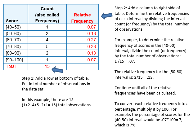
By counting how many of the 15 observations fall in each of the intervals, we get the following table:
| Score | Count |
|---|---|
| [40-50) | 1 |
| [50-60) | 2 |
| [60-70) | 4 |
| [70-80) | 5 |
| [80-90) | 2 |
| [90-100) | 1 |
Note: The observation 60 was counted in the 60-70 interval. See comment 1 below.
To construct the histogram from this table we plot the intervals on the X-axis, and show the number of observations in each interval (frequency of the interval) on the Y-axis, which is represented by the height of a rectangle located above the interval:

The previous table can also be turned into a relative frequency table using the following steps:
- Add a row on the bottom and include the total number of observations in the dataset that are represented in the table.
- Add a column, at the end of the table, and calculate the relative frequency for each interval, by dividing the number of observations in each row by the total number of observations.
These two steps are illustrated in red in the following frequency distribution table:
It is also possible to determine the number of scores for an interval, if you have the total number of observations and the relative frequency for that interval.
- For instance, suppose there are 15 scores (or observations) in a set of data and the relative frequency for an interval is 0.13.
- To determine the number of scores in that interval, multiplying the total number of observations by the relative frequency and round up to the next whole number: 15*.13 = 1.95, which rounds up to 2 observations.
A relative frequency table, like the one above, can be used to determine the frequency of scores occurring at or across intervals.
Here are some examples, using this frequency table:
What is the percentage of exam scores that were 70 and up to, but not including, 80?
- To determine the answer, we look at the relative frequency associated with the [70-80) interval.
- The relative frequency is 0.33; to convert to percentage, multiply by 100 (0.33*100= 33) or 33%.
What is the percentage of exam scores that are at least 70? To determine the answer, we need to:
- Add together the relative frequencies for the intervals that have scores of at least 70 or above.
- Thus, would need to add together the relative frequencies from [70-80), [80-90), and [90-100]
= 0.33 + 0.13 + 0.07 = 0.53. - To get the percentage, need to multiple the calculated relative frequency by 100.
- In this case, it would be 0.53*100 = 53 or 53%.
Study the histogram again and table and answer the following question.
Learn By Doing: Histograms
Comments:
- It is very important that each observation be counted only in one interval. For the most part, it is clear which interval an observation falls in. However, in our example, we needed to decide whether to include 60 in the interval 50-60, or the interval 60-70, and we chose to count it in the latter.
- In fact, this decision is captured by the way we wrote the intervals. If you’ll scroll up and look at the table, you’ll see that we wrote the intervals in a peculiar way: [40-50), [50,60), [60,70) etc.
- The square bracket means “including” and the parenthesis means “not including”. For example, [50,60) is the interval from 50 to 60, including 50 and not including 60; [60,70) is the interval from 60 to 70, including 60, and not including 70, etc.
- It really does not matter how you decide to set up your intervals, as long as you are consistent.
- When you look at a histogram such as the one above it is important to know that values falling on the border are only counted in one interval, even if you do not know which way this was done for a particular graph.
- When data are displayed in a histogram, some information is lost. Note that by looking at the histogram
- we can answer: “How many students scored 70 or above?” (5+2+1=8)
- But we cannot answer: “What was the lowest score?” All we can say is that the lowest score is somewhere between 40 and 50.
- Obviously, we could have chosen to break the data into intervals differently — for example: [45, 50), [50, 55), [55, 60) etc.
To see how our choice of bins or intervals affects a histogram, you can use the applet linked below that let you change the intervals dynamically.
(OPTIONAL) Interactive Applet: Histograms
Question: How do I know what interval width to choose?
Answer: There are many valid choices for interval widths and starting points. There are a few rules of thumb used by software packages to find optimal values. In this course, we will rely on a statistical package to produce the histogram for us, and we will focus instead on describing and summarizing the distribution as it appears from the histogram.
The following exercises provide more practice working with histograms created from a single quantitative variable.
Did I Get This?: Histograms
Stemplot (Stem and Leaf Plot)
LO 4.6: Explain the process of creating a stemplot.
The stemplot (also called stem and leaf plot) is another graphical display of the distribution of quantitative variable.
To create a stemplot, the idea is to separate each data point into a stem and leaf, as follows:
- The leaf is the right-most digit.
- The stem is everything except the right-most digit.
- So, if the data point is 34, then 3 is the stem and 4 is the leaf.
- If the data point is 3.41, then 3.4 is the stem and 1 is the leaf.
- Note: For this to work, ALL data points should be rounded to the same number of decimal places.
We will continue with the Best Actress Oscar winners example (Link to the Best Actress Oscar Winners data).
34 34 26 37 42 41 35 31 41 33 30 74 33 49 38 61 21 41 26 80 43 29 33 35 45 49 39 34 26 25 35 33
To make a stemplot:
- Separate each observation into a stem and a leaf.
- Write the stems in a vertical column with the smallest at the top, and draw a vertical line at the right of this column.
- Go through the data points, and write each leaf in the row to the right of its stem.
- Rearrange the leaves in an increasing order.
: first row: 2|1 second row: 2|56669 third row: 3|013333444 fourth row: 3|555789 fifth row: 4|11123 sixth row: 4|599 seventh row: 5| eighth row: 5| ninth row: 6|1 tenth row: 7|4 eleventh row:7| twelfth row: 8|0")
* When some of the stems hold a large number of leaves, we can split each stem into two: one holding the leaves 0-4, and the other holding the leaves 5-9. A statistical software package will often do the splitting for you, when appropriate.
Note that when rotated 90 degrees counterclockwise, the stemplot visually resembles a histogram:

The stemplot has additional unique features:
- It preserves the original data.
- It sorts the data (which will become very useful in the next section).
You will not need to create these plots by hand but you may need to be able to discuss the information they contain.
To see more stemplots, use the interactive applet we introduced earlier.
In particular, notice how the raw data are rounded and look at the stemplot with and without split stems.
Interactive Applet: Analyze One Quantitative Variable with this One-Variable Statistical Calculator
Comments: ABOUT DOTPLOTS
- There is another type of display that we can use to summarize a quantitative variable graphically — the dotplot.
- The dotplot, like the stemplot, shows each observation, but displays it with a dot rather than with its actual value.
- We will not use these in this course but you may see them occasionally in practice and they are relatively easy to create by-hand.
- Here is the dotplot for the ages of Best Actress Oscar winners.

Question: How do we know which graph to use: the histogram, stemplot, or dotplot?
Answer Since for the most part we are not going to deal with very small data sets in this course, we will generally display the distribution of a quantitative variable using a histogram generated by a statistical software package.
Let’s Summarize
- The histogram is a graphical display of the distribution of a quantitative variable. It plots the number (count) of observations that fall in intervals of values.
- The stemplot is a simple, but useful visual display of a quantitative variable. Its principal virtues are:
- Easy and quick to construct for small, simple datasets.
- Retains the actual data.
- Sorts (ranks) the data.
Describing Distributions
CO-4: Distinguish among different measurement scales, choose the appropriate descriptive and inferential statistical methods based on these distinctions, and interpret the results.
LO 4.4: Using appropriate graphical displays and/or numerical measures, describe the distribution of a quantitative variable in context: a) describe the overall pattern, b) describe striking deviations from the pattern
Video: Describing Distributions (2 videos, 7:38 total)
Related SAS Tutorials
- 5A – (3:01) Numeric Measures using PROC MEANS
- 5B – (4:05) Creating Histograms and Boxplots using SGPLOT
- 5C – (5:41) Creating QQ-Plots and other plots using UNIVARIATE
Related SPSS Tutorials
- 5A – (8:00) Numeric Measures using EXPLORE
- 5B – (2:29) Creating Histograms and Boxplots
- 5C – (2:31) Creating QQ-Plots and PP-Plots
Features of Distributions of Quantitative Variables
LO 4.7: Define and describe the features of the distribution of one quantitative variable (shape, center, spread, outliers).
Once the distribution has been displayed graphically, we can describe the overall pattern of the distribution and mention any striking deviations from that pattern.
More specifically, we should consider the following features of the Distribution for One Quantitative Variable:

Shape
When describing the shape of a distribution, we should consider:
- Symmetry/skewness of the distribution.
- Peakedness (modality) — the number of peaks (modes) the distribution has.
We distinguish between:
Symmetric Distributions
A distribution is called symmetric if, as in the histograms above, the distribution forms an approximate mirror image with respect to the center of the distribution.
The center of the distribution is easy to locate and both tails of the distribution are the approximately the same length.
 distribution. The histogram's bars start at low values close to 0 on the left and rise to a peak where the x-axis is labeled 10. Then, the values decrease as we go right, back down to nearly 0.")
 distribution. The histogram's bars start at low values close to 0 on the left and rise to the first peak where the x-axis is labeled 10. Then, the values decrease as we go right, back down to nearly 0 at roughly where x=15. The values increase again and peak at x=20, and then, continuing right, decrease to nearly 0.")

Note that all three distributions are symmetric, but are different in their modality (peakedness).
- The first distribution is unimodal — it has one mode (roughly at 10) around which the observations are concentrated.
- The second distribution is bimodal — it has two modes (roughly at 10 and 20) around which the observations are concentrated.
- The third distribution is kind of flat, or uniform. The distribution has no modes, or no value around which the observations are concentrated. Rather, we see that the observations are roughly uniformly distributed among the different values.
Skewed Right Distributions

A distribution is called skewed right if, as in the histogram above, the right tail (larger values) is much longer than the left tail (small values).
Note that in a skewed right distribution, the bulk of the observations are small/medium, with a few observations that are much larger than the rest.
- An example of a real-life variable that has a skewed right distribution is salary. Most people earn in the low/medium range of salaries, with a few exceptions (CEOs, professional athletes etc.) that are distributed along a large range (long “tail”) of higher values.
Skewed Left Distributions

A distribution is called skewed left if, as in the histogram above, the left tail (smaller values) is much longer than the right tail (larger values).
Note that in a skewed left distribution, the bulk of the observations are medium/large, with a few observations that are much smaller than the rest.
- An example of a real life variable that has a skewed left distribution is age of death from natural causes (heart disease, cancer etc.). Most such deaths happen at older ages, with fewer cases happening at younger ages.
Comments:
- Distributions with more than two peaks are generally called multimodal.
- Bimodal or multimodal distributions can be evidence that two distinct groups are represented.
- Unimodal, Bimodal, and multimodal distributions may or may not be symmetric.
Here is an example. A medium size neighborhood 24-hour convenience store collected data from 537 customers on the amount of money spent in a single visit to the store. The following histogram displays the data.

Note that the overall shape of the distribution is skewed to the right with a clear mode around $25. In addition, it has another (smaller) “peak” (mode) around $50-55.
The majority of the customers spend around $25 but there is a cluster of customers who enter the store and spend around $50-55.
Center
The center of the distribution is often used to represent a typical value.
One way to define the center is as the value that divides the distribution so that approximately half the observations take smaller values, and approximately half the observations take larger values.
Another common way to measure the center of a distribution is to use the average value.
From looking at the histogram we can get only a rough estimate for the center of the distribution. More exact ways of finding measures of center will be discussed in the next section.
Spread
One way to measure the spread (also called variability or variation) of the distribution is to use the approximate range covered by the data.
From looking at the histogram, we can approximate the smallest observation (min), and the largest observation (max), and thus approximate the range. (More exact ways of finding measures of spread will be discussed soon.)
Outliers
Outliers are observations that fall outside the overall pattern.
For example, the following histogram represents a distribution with a highly probable outlier:
10 have a frequency of 0, exception for x=15, which has a frequency of greater than zero. This is a outlier." height="258" loading="lazy" src="http://phhp-faculty-cantrell.sites.m...histogram7.gif" title="A histogram with frequency on the Y-axis. As we go from left to right on the x-axis, the frequency increases to a peak at x=5, then decreases. Eventually, we reach 0 at x=11. All of x > 10 have a frequency of 0, exception for x=15, which has a frequency of greater than zero. This is a outlier." width="377">

As you can see from the histogram, the grades distribution is roughly symmetric and unimodal with no outliers.
The center of the grades distribution is roughly 70 (7 students scored below 70, and 8 students scored above 70).
| approximate min: | 45 (the middle of the lowest interval of scores) |
| approximate max: | 95 (the middle of the highest interval of scores) |
| approximate range: | 95-45=50 |
Let’s look at a new example.
To provide an example of a histogram applied to actual data, we will look at the ages of Best Actress Oscar winners from 1970 to 2001
The histogram for the data is shown below. (Link to the Best Actress Oscar Winners data).

We will now summarize the main features of the distribution of ages as it appears from the histogram:
Shape: The distribution of ages is skewed right. We have a concentration of data among the younger ages and a long tail to the right. The vast majority of the “best actress” awards are given to young actresses, with very few awards given to actresses who are older.
Center: The data seem to be centered around 35 or 36 years old. Note that this implies that roughly half the awards are given to actresses who are less than 35 years old.
Spread: The data range from about 20 to about 80, so the approximate range equals 80 – 20 = 60.
Outliers: There seem to be two probable outliers to the far right and possibly a third around 62 years old.
You can see how informative it is to know “what to look at” in a histogram.
Learn By Doing: Shapes of Distributions (Best Actor Oscar Winners)
The following exercises provide more practice with shapes of distributions for one quantitative variable.
Did I Get This?: Shapes of Distributions
Did I Get This?: Shapes of Distributions Part 2
Let’s Summarize
- When examining the distribution of a quantitative variable, one should describe the overall pattern of the data (shape, center, spread), and any deviations from the pattern (outliers).
- When describing the shape of a distribution, one should consider:
- Symmetry/skewness of the distribution
- Peakedness (modality) — the number of peaks (modes) the distribution has.
- Not all distributions have a simple, recognizable shape.
- Outliers are data points that fall outside the overall pattern of the distribution and need further research before continuing the analysis.
- It is always important to interpret what the features of the distribution mean in the context of the data.
Measures of Center
CO-4: Distinguish among different measurement scales, choose the appropriate descriptive and inferential statistical methods based on these distinctions, and interpret the results.
LO 4.4: Using appropriate graphical displays and/or numerical measures, describe the distribution of a quantitative variable in context: a) describe the overall pattern, b) describe striking deviations from the pattern
LO 4.7: Define and describe the features of the distribution of one quantitative variable (shape, center, spread, outliers).
Video: Measures of Center (2 videos, 6:09 total)
Related SAS Tutorials
- 5A – (3:01) Numeric Measures using PROC MEANS
Related SPSS Tutorials
- 5A – (8:00) Numeric Measures using EXPLORE
Introduction
Intuitively speaking, a numerical measure of center describes a “typical value” of the distribution.
The two main numerical measures for the center of a distribution are the mean and the median.
In this unit on Exploratory Data Analysis, we will be calculating these results based upon a sample and so we will often emphasize that the values calculated are the sample mean and sample median.
Each one of these measures is based on a completely different idea of describing the center of a distribution.
We will first present each one of the measures, and then compare their properties.
Mean
LO 4.8: Define and calculate the sample mean of a quantitative variable.
The mean is the average of a set of observations (i.e., the sum of the observations divided by the number of observations).
The mean is the average of a set of observations
- The sum of the observations divided by the number of observations).
- If the n observations are written as
\(x_1, x_2, \cdots, x_n\)
- their mean can be written mathematically as:their mean is:
\(\bar{x}=\dfrac{x_{1}+x_{2}+\cdots+x_{n}}{n}=\dfrac{\sum_{i=1}^{n} x_{i}}{n}\)
We read the symbol as “x-bar.” The bar notation is commonly used to represent the sample mean, i.e. the mean of the sample.
Using any appropriate letter to represent the variable (x, y, etc.), we can indicate the sample mean of this variable by adding a bar over the variable notation.
We will continue with the Best Actress Oscar winners example (Link to the Best Actress Oscar Winners data).
34 34 26 37 42 41 35 31 41 33 30 74 33 49 38 61 21 41 26 80 43 29 33 35 45 49 39 34 26 25 35 33
The mean age of the 32 actresses is:
\(\bar{x}=\dfrac{34+34+26+\ldots+35+33}{32}=\dfrac{1233}{32}=38.5\)
We add all of the ages to get 1233 and divide by the number of ages which was 32 to get 38.5.
We denote this result as x-bar and called the sample mean.
Note that the sample mean gives a measure of center which is higher than our approximation of the center from looking at the histogram (which was 35). The reason for this will be clear soon.
Often we have large sets of data and use a frequency table to display the data more efficiently.
Data were collected from the last three World Cup soccer tournaments. A total of 192 games were played. The table below lists the number of goals scored per game (not including any goals scored in shootouts).
| Total # Goals/Game | Frequency |
|---|---|
| 0 | 17 |
| 1 | 45 |
| 2 | 51 |
| 3 | 37 |
| 4 | 25 |
| 5 | 11 |
| 6 | 3 |
| 7 | 2 |
| 8 | 1 |
To find the mean number of goals scored per game, we would need to find the sum of all 192 numbers, and then divide that sum by 192.
Rather than add 192 numbers, we use the fact that the same numbers appear many times. For example, the number 0 appears 17 times, the number 1 appears 45 times, the number 2 appears 51 times, etc.
If we add up 17 zeros, we get 0. If we add up 45 ones, we get 45. If we add up 51 twos, we get 102. Repeated addition is multiplication.
Thus, the sum of the 192 numbers
= 0(17) + 1(45) + 2(51) + 3(37) + 4(25) + 5(11) + 6(3) + 7(2) + 8(1) = 453.
The sample mean is then 453 / 192 = 2.359.
Note that, in this example, the values of 1, 2, and 3 are the most common and our average falls in this range representing the bulk of the data.
Did I Get This?: Mean
Median
LO 4.9: Define and calculate the sample median of a quantitative variable.
The median M is the midpoint of the distribution. It is the number such that half of the observations fall above, and half fall below.
To find the median:
- Order the data from smallest to largest.
- Consider whether n, the number of observations, is even or odd.
- If n is odd, the median M is the center observation in the ordered list. This observation is the one “sitting” in the (n + 1) / 2 spot in the ordered list.
- If n is even, the median M is the mean of the two center observations in the ordered list. These two observations are the ones “sitting” in the (n / 2) and (n / 2) + 1 spots in the ordered list.
For a simple visualization of the location of the median, consider the following two simple cases of n = 7 and n = 8 ordered observations, with each observation represented by a solid circle:
/2 = 4th spot in the ordered list. When there are n=8 ordered observations, the mediam M is the mean of the two center observations, which in this care are located at the 8/2=4th and 8/2+1=5th spots in the ordered list.")
Comments:
- In the images above, the dots are equally spaced, this need not indicate the data values are actually equally spaced as we are only interested in listing them in order.
- In fact, in the above pictures, two subsequent dots could have exactly the same value.
- It is clear that the value of the median will be in the same position regardless of the distance between data values.
Did I Get This?: Median
To find the median age of the Best Actress Oscar winners, we first need to order the data.
It would be useful, then, to use the stemplot, a diagram in which the data are already ordered.
- Here n = 32 (an even number), so the median M, will be the mean of the two center observations
- These are located at the (n / 2) = 32 / 2 = 16th and (n / 2) + 1 = (32 / 2) + 1 = 17th
Counting from the top, we find that:
- the 16th ranked observation is 35
- the 17th ranked observation also happens to be 35
Therefore, the median M = (35 + 35) / 2 = 35

Learn By Doing: Measures of Center #1
Comparing the Mean and the Median
LO 4.10: Choose the appropriate measures for a quantitative variable based upon the shape of the distribution.
As we have seen, the mean and the median, the most common measures of center, each describe the center of a distribution of values in a different way.
- The mean describes the center as an average value, in which the actual valuesof the data points play an important role.
- The median, on the other hand, locates the middle value as the center, and the orderof the data is the key.
To get a deeper understanding of the differences between these two measures of center, consider the following example. Here are two datasets:
| Data set A → 64 65 66 68 70 71 73 |
| Data set B → 64 65 66 68 70 71 730 |
For dataset A, the mean is 68.1, and the median is 68.
Looking at dataset B, notice that all of the observations except the last one are close together. The observation 730 is very large, and is certainly an outlier.
In this case, the median is still 68, but the mean will be influenced by the high outlier, and shifted up to 162.
The message that we should take from this example is:
The mean is very sensitive to outliers (because it factors in their magnitude), while the median is resistant (or robust) to outliers.
Interactive Applet: Comparing the Mean and Median
Therefore:
- For symmetric distributions with no outliers: the mean is approximately equal to the median.

- For skewed right distributions and/or datasets with high outliers: the mean is greater than the median.
. The median=35, and the mean=38.5 . The mode is 32.")
- For skewed left distributions and/or datasets with low outliers: the mean is less than the median.

Conclusions… When to use which measures?
- Use the sample mean as a measure of center for symmetric distributions with no outliers.
- Otherwise, the median will be a more appropriate measure of the center of our data.
Did I Get This?: Measures of Center
Learn By Doing: Measures of Center #2
Learn By Doing: Measures of Center – Additional Practice
Let’s Summarize
- The two main numerical measures for the center of a distribution are the mean and the median. The mean is the average value, while the median is the middle value.
- The mean is very sensitive to outliers (as it factors in their magnitude), while the median is resistant to outliers.
- The mean is an appropriate measure of center for symmetric distributions with no outliers. In all other cases, the median is often a better measure of the center of the distribution.
Measures of Spread
CO-4: Distinguish among different measurement scales, choose the appropriate descriptive and inferential statistical methods based on these distinctions, and interpret the results.
LO 4.4: Using appropriate graphical displays and/or numerical measures, describe the distribution of a quantitative variable in context: a) describe the overall pattern, b) describe striking deviations from the pattern
LO 4.7: Define and describe the features of the distribution of one quantitative variable (shape, center, spread, outliers).
Video: Measures of Spread (3 videos, 8:44 total)
Related SAS Tutorials
- 5A – (3:01) Numeric Measures using PROC MEANS
Related SPSS Tutorials
- 5A – (8:00) Numeric Measures using EXPLORE
Introduction
So far we have learned about different ways to quantify the center of a distribution. A measure of center by itself is not enough, though, to describe a distribution.
Consider the following two distributions of exam scores. Both distributions are centered at 70 (the median of both distributions is approximately 70), but the distributions are quite different.
The first distribution has a much larger variability in scores compared to the second one.

In order to describe the distribution, we therefore need to supplement the graphical display not only with a measure of center, but also with a measure of the variability (or spread) of the distribution.
In this section, we will discuss the three most commonly used measures of spread:
- Range
- Inter-quartile range (IQR)
- Standard deviation
Although the measures of center did approach the question differently, they do attempt to measure the same point in the distribution and thus are comparable.
However, the three measures of spread provide very different ways to quantify the variability of the distribution and do not try to estimate the same quantity.
In fact, the three measures of spread provide information about three different aspects of the spread of the distribution which, together, give a more complete picture of the spread of the distribution.
Range
LO 4.11: Define and calculate the range of one quantitative variable.
The range covered by the data is the most intuitive measure of variability. The range is exactly the distance between the smallest data point (min) and the largest one (Max).
- Range = Max – min
Note: When we first looked at the histogram, and tried to get a first feel for the spread of the data, we were actually approximating the range, rather than calculating the exact range.
Here we have the Best Actress Oscar winners’ data
34 34 26 37 42 41 35 31 41 33 30 74 33 49 38 61 21 41 26 80 43 29 33 35 45 49 39 34 26 25 35 33
In this example:
- min = 21 (Marlee Matlin for Children of a Lesser God, 1986)
- Max = 80 (Jessica Tandy for Driving Miss Daisy, 1989)
The range covered by all the data is 80 – 21 = 59 years.
Inter-Quartile Range (IQR)
LO 4.12: Define and calculate Q1, Q3, and the IQR for one quantitative variable
While the range quantifies the variability by looking at the range covered by ALL the data,
the Inter-Quartile Range or IQR measures the variability of a distribution by giving us the range covered by the MIDDLE 50% of the data.
- IQR = Q3 – Q1
- Q3 = 3rd Quartile = 75th Percentile
- Q1 = 1st Quartile = 25th Percentile
The following picture illustrates this idea: (Think about the horizontal line as the data ranging from the min to the Max). IMPORTANT NOTE: The “lines” in the following illustrations are not to scale. The equal distances indicate equal amounts of data NOT equal distance between the numeric values.
Although we will use software to calculate the quartiles and IQR, we will illustrate the basic process to help you fully understand.

To calculate the IQR:
- Arrange the data in increasing order, and find the median M. Recall that the median divides the data, so that 50% of the data points are below the median, and 50% of the data points are above the median.

2. Find the median of the lower 50% of the data. This is called the first quartile of the distribution, and the point is denoted by Q1. Note from the picture that Q1 divides the lower 50% of the data into two halves, containing 25% of the data points in each half. Q1 is called the first quartile, since one quarter of the data points fall below it.

3. Repeat this again for the top 50% of the data. Find the median of the top 50% of the data. This point is called the third quartile of the distribution, and is denoted by Q3.
Note from the picture that Q3 divides the top 50% of the data into two halves, with 25% of the data points in each.Q3 is called the third quartile, since three quarters of the data points fall below it.

4. The middle 50% of the data falls between Q1 and Q3, and therefore: IQR = Q3 – Q1

Comments:
- The last picture shows that Q1, M, and Q3 divide the data into four quarters with 25% of the data points in each, where the median is essentially the second quartile. The use of IQR = Q3 – Q1 as a measure of spread is therefore particularly appropriate when the median M is used as a measure of center.
- We can define a bit more precisely what is considered the bottom or top 50% of the data. The bottom (top) 50% of the data is all the observations whose position in the ordered list is to the left (right) of the location of the overall median M. The following picture will visually illustrate this for the simple cases of n = 7 and n = 8.

Note that when n is odd (as in n = 7 above), the median is not included in either the bottom or top half of the data; When n is even (as in n = 8 above), the data are naturally divided into two halves.
To find the IQR of the Best Actress Oscar winners’ distribution, it will be convenient to use the stemplot.
. We begin with the bottom half: 2|1 2|56669 3|013333444 3|5 The top half:5789 4|11123 4|599 5| 5| 6|1 6| 7|4 7| 8|0")
Q1 is the median of the bottom half of the data. Since there are 16 observations in that half, Q1 is the mean of the 8th and 9th ranked observations in that half:
Q1 = (31 + 33) / 2 = 32
Similarly, Q3 is the median of the top half of the data, and since there are 16 observations in that half, Q3 is the mean of the 8th and 9th ranked observations in that half:
Q3 = (41 + 42) / 2 = 41.5
IQR = 41.5 – 32 = 9.5
Note that in this example, the range covered by all the ages is 59 years, while the range covered by the middle 50% of the ages is only 9.5 years. While the whole dataset is spread over a range of 59 years, the middle 50% of the data is packed into only 9.5 years. Looking again at the histogram will illustrate this:

Comment:
- Software packages use different formulas to calculate the quartiles Q1 and Q3. This should not worry you, as long as you understand the idea behind these concepts. For example, here are the quartile values provided by three different software packages for the age of best actress Oscar winners:
R:
![]()
Minitab:

Excel:
![]()
Q1 and Q3 as reported by the various software packages differ from each other and are also slightly different from the ones we found here. This should not worry you.
There are different acceptable ways to find the median and the quartiles. These can give different results occasionally, especially for datasets where n (the number of observations) is fairly small.
As long as you know what the numbers mean, and how to interpret them in context, it doesn’t really matter much what method you use to find them, since the differences are negligible.
Standard Deviation
LO 4.13: Define and calculate the standard deviation and variance of one quantitative variable.
So far, we have introduced two measures of spread; the range (covered by all the data) and the inter-quartile range (IQR), which looks at the range covered by the middle 50% of the distribution. We also noted that the IQR should be paired as a measure of spread with the median as a measure of center.
We now move on to another measure of spread, the standard deviation, which quantifies the spread of a distribution in a completely different way.
Idea
The idea behind the standard deviation is to quantify the spread of a distribution by measuring how far the observations are from their mean. The standard deviation gives the average (or typical distance) between a data point and the mean.
Notation
There are many notations for the standard deviation: SD, s, Sd, StDev. Here, we’ll use SD as an abbreviation for standard deviation, and use s as the symbol.
Formula
The sample standard deviation formula is:
\(s=\sqrt{\dfrac{\sum_{i=1}^{n}\left(x_{i}-\bar{x}\right)^{2}}{n-1}}\)
where,
\(\mathrm{s}=\) sample standard deviation
\(\mathrm{n}=\) number of scores in sample
\(\sum=\) sum of...
and
\(\overline{\mathcal{A}}=\) sample mean
Calculation
In order to get a better understanding of the standard deviation, it would be useful to see an example of how it is calculated. In practice, we will use a computer to do the calculation.
The following are the number of customers who entered a video store in 8 consecutive hours:
7, 9, 5, 13, 3, 11, 15, 9
To find the standard deviation of the number of hourly customers:
- Find the mean, x-bar, of your data:
(7 + 9 + 5 + 13 + 3 + 11 + 15 + 9)/8 = 9
- Find the deviations from the mean:
- The differences between each observation and the mean here are
(7 – 9), (9 – 9), (5 – 9), (13 – 9), (3 – 9), (11 – 9), (15 – 9), (9 – 9)
-2, 0, -4, 4, -6, 2, 6, 0
- Since the standard deviation attempts to measure the average (typical) distance between the data points and their mean, it would make sense to average the deviation we obtained.
- Note, however, that the sum of the deviations is zero.
- This is always the case, and is the reason why we need a more complex calculation.
- To solve the previous problem, in our calculation, we square each of the deviations.
(-2)2, (0)2, (-4)2, (4)2, (-6)2, (2)2, (6)2, (0)2
4, 0, 16, 16, 36, 4, 36, 0
- Sum the squared deviations and divide by n – 1:
(4 + 0 + 16 + 16 + 36 + 4 + 36 + 0)/(8 – 1)
(112)/(7) = 16
- The reason we divide by n-1 will be discussed later.
- This value, the sum of the squared deviations divided by n – 1, is called the variance. However, the variance is not used as a measure of spread directly as the units are the square of the units of the original data.
- The standard deviationof the data is the square root of the variance calculated in step 4:
- In this case, we have the square root of 16 which is 4. We will use the lower case letter sto represent the standard deviation.
s = 4
- We take the square root to obtain a measure which is in the original units of the data. The units of the variance of 16 are in “squared customers” which is difficult to interpret.
- The units of the standard deviation are in “customers” which makes this measure of variation more useful in practice than the variance.
Recall that the average of the number of customers who enter the store in an hour is 9.
The interpretation of the standard deviation is that on average, the actual number of customers who enter the store each hour is 4 away from 9.
Comment: The importance of the numerical figure that we found in #4 above called the variance (=16 in our example) will be discussed much later in the course when we get to the inference part.
Learn By Doing: Standard Deviation
Properties of the Standard Deviation
- It should be clear from the discussion thus far that the SD should be paired as a measure of spread with the mean as a measure of center.
- Note that the only way, mathematically, in which the SD = 0, is when all the observations have the same value (Ex: 5, 5, 5, … , 5), in which case, the deviations from the mean (which is also 5) are all 0. This is intuitive, since if all the data points have the same value, we have no variability (spread) in the data, and expect the measure of spread (like the SD) to be 0. Indeed, in this case, not only is the SD equal to 0, but the range and the IQR are also equal to 0. Do you understand why?
- Like the mean, the SD is strongly influenced by outliers in the data. Consider the example concerning video store customers: 3, 5, 7, 9, 9, 11, 13, 15 (data ordered). If the largest observation was wrongly recorded as 150, then the average would jump up to 25.9, and the standard deviation would jump up to SD = 50.3. Note that in this simple example, it is easy to see that while the standard deviation is strongly influenced by outliers, the IQR is not. The IQR would be the same in both cases, since, like the median, the calculation of the quartiles depends only on the order of the data rather than the actual values.
The last comment leads to the following very important conclusion:
Choosing Numerical Measures
LO 4.10: Choose the appropriate measures for a quantitative variable based upon the shape of the distribution.
- Use the mean and the standard deviation as measures of center and spread for reasonably symmetric distributions with no extreme outliers.
- For all other cases, use the five-number summary = min, Q1, Median, Q3, Max (which gives the median, and easy access to the IQR and range). We will discuss the five-number summary in the next section in more detail.
Let’s Summarize
- The range covered by the data is the most intuitive measure of spread and is exactly the distance between the smallest data point (min) and the largest one (Max).
- Another measure of spread is the inter-quartile range (IQR), which is the range covered by the middle 50% of the data.
- IQR = Q3 – Q1, the difference between the third and first quartiles.
- The first quartile (Q1) is the value such that one quarter (25%) of the data points fall below it, or the median of the bottom half of the data.
- The third quartile (Q3) is the value such that three quarters (75%) of the data points fall below it, or the median of the top half of the data.
- The IQR is generally used as a measure of spread of a distribution when the median is used as a measure of center.
- The standard deviation measures the spread by reporting a typical (average) distance between the data points and their mean.
- It is appropriate to use the standard deviation as a measure of spread with the mean as the measure of center.
- Since the mean and standard deviations are highly influenced by extreme observations, they should be used as numerical descriptions of the center and spread only for distributions that are roughly symmetric, and have no extreme outliers. In all other situations, we prefer the 5-number summary.
Measures of Position
CO-4: Distinguish among different measurement scales, choose the appropriate descriptive and inferential statistical methods based on these distinctions, and interpret the results.
LO 4.4: Using appropriate graphical displays and/or numerical measures, describe the distribution of a quantitative variable in context: a) describe the overall pattern, b) describe striking deviations from the pattern
LO 4.14: Define and interpret measures of position (percentiles, quartiles, the five-number summary, z-scores).
Video: Measures of Position (2 videos, 4:20 total)
Related SAS Tutorials
- 5A – (3:01) Numeric Measures using PROC MEANS
Related SPSS Tutorials
- 5A – (8:00) Numeric Measures using EXPLORE
Although not a required aspect of describing distributions of one quantitative variable, we are often interested in where a particular value falls in the distribution. Is the value unusually low or high or about what we would expect?
Answers to these questions rely on measures of position (or location). These measures give information about the distribution but also give information about how individual values relate to the overall distribution.
Percentiles
A common measure of position is the percentile. Although there are some mathematical considerations involved with calculating percentiles which we will not discuss, you should have a basic understanding of their interpretation.
In general the P-th percentile can be interpreted as a location in the data for which approximately P% of the other values in the distribution fall below the P-th percentile and (100 –P)% fall above the P-th percentile.
The quartiles Q1 and Q3 are special cases of percentiles and thus are measures of position.
Five-Number Summary
The combination of the five numbers (min, Q1, M, Q3, Max) is called the five number summary, and provides a quick numerical description of both the center and spread of a distribution.
Each of the values represents a measure of position in the dataset.
The min and max providing the boundaries and the quartiles and median providing information about the 25th, 50th, and 75th percentiles.
Standardized Scores (Z-Scores)
Standardized scores, also called z-scores use the mean and standard deviation as the primary measures of center and spread and are therefore most useful when the mean and standard deviation are appropriate, i.e. when the distribution is reasonably symmetric with no extreme outliers.
For any individual, the z-score tells us how many standard deviations the raw score for that individual deviates from the mean and in what direction. A positive z-score indicates the individual is above average and a negative z-score indicates the individual is below average.
To calculate a z-score, we take the individual value and subtract the mean and then divide this difference by the standard deviation.
\(z_{i}=\dfrac{x_{i}-\bar{x}}{S}\)
Measures of Position
Measures of position also allow us to compare values from different distributions. For example, we can present the percentiles or z-scores of an individual’s height and weight. These two measures together would provide a better picture of how the individual fits in the overall population than either would alone.
Although measures of position are not stressed in this course as much as measures of center and spread, we have seen and will see many measures of position used in various aspects of examining the distribution of one variable and it is good to recognize them as measures of position when they appear.
Outliers
CO-4: Distinguish among different measurement scales, choose the appropriate descriptive and inferential statistical methods based on these distinctions, and interpret the results.
LO 4.4: Using appropriate graphical displays and/or numerical measures, describe the distribution of a quantitative variable in context: a) describe the overall pattern, b) describe striking deviations from the pattern
LO 4.7: Define and describe the features of the distribution of one quantitative variable (shape, center, spread, outliers).
Video: Outliers (2:30)
Using the IQR to Detect Outliers
LO 4.15: Define and use the 1.5(IQR) and 3(IQR) criterion to identify potential outliers and extreme outliers.
So far we have quantified the idea of center, and we are in the middle of the discussion about measuring spread, but we haven’t really talked about a method or rule that will help us classify extreme observations as outliers. The IQR is commonly used as the basis for a rule of thumb for identifying outliers.
The 1.5(IQR) Criterion for Outliers
An observation is considered a suspected outlier or potential outlier if it is:
- below Q1 – 1.5(IQR) or
- above Q3 + 1.5(IQR)
The following picture (not to scale) illustrates this rule:
. Points farther left than this are suspected outliers. To the right of M is Q3, and farther to the right is Q3+1.5(IQR). Points even farther than this are also suspected outliers.")
We will continue with the Best Actress Oscar winners example (Link to the Best Actress Oscar Winners data).
34 34 26 37 42 41 35 31 41 33 30 74 33 49 38 61 21 41 26 80 43 29 33 35 45 49 39 34 26 25 35 33
Recall that when we first looked at the histogram of ages of Best Actress Oscar winners, there were three observations that looked like possible outliers:

We can now use the 1.5(IQR) criterion to check whether the three highest ages should indeed be classified as potential outliers:
- For this example, we found Q1 = 32 and Q3 = 41.5 which give an IQR = 9.5
- Q1 – 1.5 (IQR) = 32 – (1.5)(9.5) = 17.75
- Q3 + 1.5 (IQR) = 41.5 + (1.5)(9.5) = 55.75
The 1.5(IQR) criterion tells us that any observation with an age that is below 17.75 or above 55.75 is considered a suspected outlier.
We therefore conclude that the observations with ages of 61, 74 and 80 should be flagged as suspected outliers in the distribution of ages. Note that since the smallest observation is 21, there are no suspected low outliers in this distribution.
The 3(IQR) Criterion for Outliers
An observation is considered an EXTREME outlier if it is:
- below Q1 – 3(IQR) or
- above Q3 + 3(IQR)
We can now use the 3(IQR) criterion to check whether any of the three suspected outliers can be classified as extreme outliers:
- For this example, we found Q1 = 32 and Q3 = 41.5 which give an IQR = 9.5
- Q1 – 3 (IQR) = 32 – (3)(9.5) = 3.5
- Q3 + 3 (IQR) = 41.5 + (3)(9.5) = 70
The 3(IQR) criterion tells us that any observation that is below 3.5 or above 70 is considered an extreme outlier.
We therefore conclude that the observations with ages 74 and 80 should be flagged as extreme outliers in the distribution of ages.
Note that since there were no suspected outliers on the low end there can be no extreme outliers on the low end of the distribution. Thus there was no real need for us to calculate the low cutoff for extreme outliers, i.e. Q1 – 3(IQR) = 3.5.
See the histogram below, and consider the outliers individually.
- The observation with age 62 is visually much closer to the center of the data. We might have a difficult time deciding if this value is really an outlier using this graph alone.
- However, the ages of 74 and 80 are clearly far from the bulk of the distribution. We might feel very comfortable deciding these values are outliers based only on the graph.

Did I Get This?: Identifying Outliers using IQR Method
Understanding Outliers
LO 4.16: Discuss possible methods for handling outliers in practice.
We just practiced one way to ‘flag’ possible outliers. Why is it important to identify possible outliers, and how should they be dealt with? The answers to these questions depend on the reasons for the outlying values. Here are several possibilities:
- Even though it is an extreme value, if an outlier can be understood to have been produced by essentially the same sort of physical or biological process as the rest of the data, and if such extreme values are expected to eventually occur again, then such an outlier indicates something important and interesting about the process you’re investigating, and it should be kept in the data.
- If an outlier can be explained to have been produced under fundamentally different conditions from the rest of the data (or by a fundamentally different process), such an outlier can be removed from the data if your goal is to investigate only the process that produced the rest of the data.
- An outlier might indicate a mistake in the data (like a typo, or a measuring error), in which case it should be corrected if possible or else removed from the data before calculating summary statistics or making inferences from the data (and the reason for the mistake should be investigated).
Here are examples of each of these types of outliers:
- The following histogram displays the magnitude of 460 earthquakes in California, occurring in the year 2000, between August 28 and September 9:

Identifying the outlier: On the very far right edge of the display (beyond 4.8), we see a low bar; this represents one earthquake (because the bar has height of 1) that was much more severe than the others in the data.
Understanding the outlier: In this case, the outlier represents a much stronger earthquake, which is relatively rarer than the smaller quakes that happen more frequently in California.
How to handle the outlier: For many purposes, the relatively severe quakes represented by the outlier might be the most important (because, for instance, that sort of quake has the potential to do more damage to people and infrastructure). The smaller-magnitude quakes might not do any damage, or even be felt at all. So, for many purposes it could be important to keep this outlier in the data.
2. The following histogram displays the monthly percent return on the stock of Phillip Morris (a large tobacco company) from July 1990 to May 1997:
, a bar indicating frequency of 1 appears. Then, we see no bar until x=-15, where there is a bar of frequency 5. As we continue moving right along the x-axis, frequency increases to the mode of 30 at the interval x=(0,5), and then decreases, until reaching a frequency of 5 at the interval x=(15,20).")
Identifying the outlier: On the display, we see a low bar far to the left of the others; this represents one month’s return (because the bar has height of 1), where the value of Phillip Morris stock was unusually low.
Understanding the outlier: The explanation for this particular outlier is that, in the early 1990s, there were highly-publicized federal hearings being conducted regarding the addictiveness of smoking, and there was growing public sentiment against the tobacco companies. The unusually low monthly value in the Phillip Morris dataset was due to public pressure against smoking, which negatively affected the company’s stock for that particular month.
How to handle the outlier: In this case, the outlier was due to unusual conditions during one particular month that aren’t expected to be repeated, and that were fundamentally different from the conditions that produced the values in all the other months. So in this case, it would be reasonable to remove the outlier, if we wanted to characterize the “typical” monthly return on Phillip Morris stock.
3. When archaeologists dig up objects such as pieces of ancient pottery, chemical analysis can be performed on the artifacts. The chemical content of pottery can vary depending on the type of clay as well as the particular manufacturing technique. The following histogram displays the results of one such actual chemical analysis, performed on 48 ancient Roman pottery artifacts from archaeological sites in Britain:
![A histogram titled "Manganous Oxide Content in a sample of Ancient Roman Pottery". The X-axis is labeled "number of pottery shards", and ranges from 0 to 20. The Y-axis is labeled "manganous oxide [MnO] content" and ranges from 0.0 to 0.4 . The histogram is skewed-right. Here are the bars: x=0.0,y=10; x=0.05,y=13; x=0.1,y=18; x=0.15,y=5; x=0.20,y=1; x=0.4,y=1. Note that there are no shards for x=0.25 to x=0.35](https://stats.libretexts.org/@api/deki/files/19723/images-mod1-spread23.gif?revision=1 "A histogram titled \"Manganous Oxide Content in a sample of Ancient Roman Pottery\". The X-axis is labeled \"number of pottery shards\", and ranges from 0 to 20. The Y-axis is labeled \"manganous oxide [MnO] content\" and ranges from 0.0 to 0.4 . The histogram is skewed-right. Here are the bars: x=0.0,y=10; x=0.05,y=13; x=0.1,y=18; x=0.15,y=5; x=0.20,y=1; x=0.4,y=1. Note that there are no shards for x=0.25 to x=0.35")
As appeared in Tubb, et al. (1980). “The analysis of Romano-British pottery by atomic absorption spectrophotometry.” Archaeometry, vol. 22, reprinted in Statistics in Archaeology by Michael Baxter, p. 21.
Identifying the outlier: On the display, we see a low bar far to the right of the others; this represents one piece of pottery (because the bar has a height of 1), which has a suspiciously high manganous oxide value.
Understanding the outlier: Based on comparison with other pieces of pottery found at the same site, and based on expert understanding of the typical content of this particular compound, it was concluded that the unusually high value was most likely a typo that was made when the data were published in the original 1980 paper (it was typed as “.394” but it was probably meant to be “.094”).
How to handle the outlier: In this case, since the outlier was judged to be a mistake, it should be removed from the data before further analysis. In fact, removing the outlier is useful not only because it’s a mistake, but also because doing so reveals important structure that was otherwise hidden. This feature is evident on the next display:
![A histogram titled " Histogram without the outlier" The Y-axis is labeled "number of pottery shards", and it ranges from 0 to 12. The X-axis is labeled "manganous oxide [MnO] content" and ranges from 0.00 to about 0.18. Going from left to right along the X-axis reveals that at x=0, there is a frequency of 10. Then, there are no bars until x=0.4 . From here the bars increase in height until x=0.08, where the frequency is 12. Then the bars begin to decrease.](https://stats.libretexts.org/@api/deki/files/19726/images-mod1-spread24.gif?revision=1 "A histogram titled \" Histogram without the outlier\" The Y-axis is labeled \"number of pottery shards\", and it ranges from 0 to 12. The X-axis is labeled \"manganous oxide [MnO] content\" and ranges from 0.00 to about 0.18. Going from left to right along the X-axis reveals that at x=0, there is a frequency of 10. Then, there are no bars until x=0.4 . From here the bars increase in height until x=0.08, where the frequency is 12. Then the bars begin to decrease.")
When the outlier is removed, the display is re-scaled so that now we can see the set of 10 pottery pieces that had almost no manganous oxide. These 10 pieces might have been made with a different potting technique, so identifying them as different from the rest is historically useful. This feature was only evident after the outlier was removed.
Reading: Outliers (≈ 1400 words)
Boxplots
CO-4: Distinguish among different measurement scales, choose the appropriate descriptive and inferential statistical methods based on these distinctions, and interpret the results.
LO 4.4: Using appropriate graphical displays and/or numerical measures, describe the distribution of a quantitative variable in context: a) describe the overall pattern, b) describe striking deviations from the pattern
LO 4.7: Define and describe the features of the distribution of one quantitative variable (shape, center, spread, outliers).
Video: Boxplots (2 videos, 7:02 total)
Related SAS Tutorials
- 5B – (4:05) Creating Histograms and Boxplots using SGPLOT
Related SPSS Tutorials
- 5B – (2:29) Creating Histograms and Boxplots
Introduction
Now we introduce another graphical display of the distribution of a quantitative variable, the boxplot.
The Five Number Summary
So far, in our discussion about measures of spread, some key players were:
- the extremes (min and Max), which provide the range covered by all the data; and
- the quartiles (Q1, M and Q3), which together provide the IQR, the range covered by the middle 50% of the data.
Recall that the combination of all five numbers (min, Q1, M, Q3, Max) is called the five number summary, and provides a quick numerical description of both the center and spread of a distribution.
We will continue with the Best Actress Oscar winners example (Link to the Best Actress Oscar Winners data).
34 34 26 37 42 41 35 31 41 33 30 74 33 49 38 61 21 41 26 80 43 29 33 35 45 49 39 34 26 25 35 33
The five number summary of the age of Best Actress Oscar winners (1970-2001) is:
min = 21, Q1 = 32, M = 35, Q3 = 41.5, Max = 80
To sketch the boxplot we will need to know the 5-number summary as well as identify any outliers. We will also need to locate the largest and smallest values which are not outliers. The stemplot below might be helpful as it displays the data in order.

Learn By Doing: 5-Number Summary
Now that you understand what each of the five numbers means, you can appreciate how much information about the distribution is packed into the five-number summary. All this information can also be represented visually by using the boxplot.
The Boxplot
LO 4.17: Explain the process of creating a boxplot (including appropriate indication of outliers).
The boxplot graphically represents the distribution of a quantitative variable by visually displaying the five-number summary and any observation that was classified as a suspected outlier using the 1.5(IQR) criterion.
(Link to the Best Actress Oscar Winners data).
- The central box spans from Q1 to Q3. In our example, the box spans from 32 to 41.5. Note that the width of the box has no meaning.

2. A line in the box marks the median M, which in our case is 35.

3. Lines extend from the edges of the box to the smallest and largest observations that were not classified as suspected outliers (using the 1.5xIQR criterion). In our example, we have no low outliers, so the bottom line goes down to the smallest observation, which is 21. Since we have three high outliers (61,74, and 80), the top line extends only up to 49, which is the largest observation that has not been flagged as an outlier.
. In our example, we have no low outliers, so the bottom line goes down to the smallest observation, which is 21. Since we have three high outliers (61,74, and 80), the top line extends only up to 49, which is the largest observation that has not been flagged as an outlier.")
4. outliers are marked with asterisks (*).
.")
To summarize: the following information is visually depicted in the boxplot:
- the five number summary (blue)
- the range and IQR (red)
- outliers (green)

Learn By Doing: Boxplots
Did I Get This?: Boxplots
Side-By-Side (Comparative) Boxplots
LO 4.18: Compare and contrast distributions (of quantitative data) from two or more groups, and produce a brief summary, interpreting your findings in context.
As we learned earlier, the distribution of a quantitative variable is best represented graphically by a histogram. Boxplots are most useful when presented side-by-side for comparing and contrasting distributions from two or more groups.
So far we have examined the age distributions of Oscar winners for males and females separately. It will be interesting to compare the age distributions of actors and actresses who won best acting Oscars. To do that we will look at side-by-side boxplots of the age distributions by gender.
 Boxplots - Age of Best Actor/Actress Oscar Winners (1970-2001). On the left is the axis labeled \"Age \", And it goes from 20 to 80. There are two box-plots represented here, one for actors and one for actresses.")
Recall also that we found the five-number summary and means for both distributions. For the Best Actress dataset, we did the calculations by hand. For the Best Actor dataset, we used statistical software, and here are the results:
- Actors: min = 31, Q1 = 37.25, M = 42.5, Q3 = 50.25, Max = 76
- Actresses: min = 21, Q1 = 32, M = 35, Q3 = 41.5, Max = 80
Based on the graph and numerical measures, we can make the following comparison between the two distributions:
Center: The graph reveals that the age distribution of the males is higher than the females’ age distribution. This is supported by the numerical measures. The median age for females (35) is lower than for males (42.5). Actually, it should be noted that even the third quartile of the females’ distribution (41.5) is lower than the median age for males. We therefore conclude that in general, actresses win the Best Actress Oscar at a younger age than actors do.
Spread: Judging by the range of the data, there is much more variability in the females’ distribution (range = 59) than there is in the males’ distribution (range = 45). On the other hand, if we look at the IQR, which measures the variability only among the middle 50% of the distribution, we see more spread in the ages of males (IQR = 13) than females (IQR = 9.5). We conclude that among all the winners, the actors’ ages are more alike than the actresses’ ages. However, the middle 50% of the age distribution of actresses is more homogeneous than the actors’ age distribution.
Outliers: We see that we have outliers in both distributions. There is only one high outlier in the actors’ distribution (76, Henry Fonda, On Golden Pond), compared with three high outliers in the actresses’ distribution.
In order to compare the average high temperatures of Pittsburgh to those in San Francisco we will look at the following side-by-side boxplots, and supplement the graph with the descriptive statistics of each of the two distributions.
, and it goes from 30-80. There are two box plots, one for Pittsburgh and one for San Francisco.")
| Statistic | Pittsburgh | San Francisco |
|---|---|---|
| min | 33.7 | 56.3 |
| Q1 | 41.2 | 60.2 |
| Median | 61.4 | 62.7 |
| Q3 | 77.75 | 65.35 |
| Max | 82.6 | 68.7 |
When looking at the graph, the similarities and differences between the two distributions are striking. Both distributions have roughly the same center (medians are 61.4 for Pitt, and 62.7 for San Francisco). However, the temperatures in Pittsburgh have a much larger variability than the temperatures in San Francisco (Range: 49 vs. 12. IQR: 36.5 vs. 5).
The practical interpretation of the results we obtained is that the weather in San Francisco is much more consistent than the weather in Pittsburgh, which varies a lot during the year. Also, because the temperatures in San Francisco vary so little during the year, knowing that the median temperature is around 63 is actually very informative. On the other hand, knowing that the median temperature in Pittsburgh is around 61 is practically useless, since temperatures vary so much during the year, and can get much warmer or much colder.
Note that this example provides more intuition about variability by interpreting small variability as consistency, and large variability as lack of consistency. Also, through this example we learned that the center of the distribution is more meaningful as a typical value for the distribution when there is little variability (or, as statisticians say, little “noise”) around it. When there is large variability, the center loses its practical meaning as a typical value.
Learn By Doing: Comparing Distributions with Boxplots
Let’s Summarize
- The five-number summary of a distribution consists of the median (M), the two quartiles (Q1, Q3) and the extremes (min, Max).
- The five-number summary provides a complete numerical description of a distribution. The median describes the center, and the extremes (which give the range) and the quartiles (which give the IQR) describe the spread.
- The boxplot graphically represents the distribution of a quantitative variable by visually displaying the five number summary and any observation that was classified as a suspected outlier using the 1.5(IQR) criterion. (Some software packages indicate extreme outliers with a different symbol)
- Boxplots are most useful when presented side-by-side to compare and contrast distributions from two or more groups.
The "Normal" Shape
CO-4: Distinguish among different measurement scales, choose the appropriate descriptive and inferential statistical methods based on these distinctions, and interpret the results.
CO-6: Apply basic concepts of probability, random variation, and commonly used statistical probability distributions.
LO 4.4: Using appropriate graphical displays and/or numerical measures, describe the distribution of a quantitative variable in context: a) describe the overall pattern, b) describe striking deviations from the pattern
LO 4.7: Define and describe the features of the distribution of one quantitative variable (shape, center, spread, outliers).
Video: The Normal Shape (5:34)
Related SAS Tutorials
- 5B – (4:05) Creating Histograms and Boxplots using SGPLOT
- 5C – (5:41) Creating QQ-Plots and other plots using UNIVARIATE
Related SPSS Tutorials
- 5B – (2:29) Creating Histograms and Boxplots
- 5C – (2:31) Creating QQ-Plots and PP-Plots
The Standard Deviation Rule
LO 6.2: Apply the standard deviation rule to the special case of distributions having the “normal” shape.
In the previous activity we tried to help you develop better intuition about the concept of standard deviation. The rule that we are about to present, called “The Standard Deviation Rule” (also known as “The Empirical Rule”) will hopefully also contribute to building your intuition about this concept.
Consider a symmetric mound-shaped distribution:

For distributions having this shape (later we will define this shape as “normally distributed”), the following rule applies:
The Standard Deviation Rule:
- Approximately 68% of the observations fall within 1 standard deviation of the mean.
- Approximately 95% of the observations fall within 2 standard deviations of the mean.
- Approximately 99.7% (or virtually all) of the observations fall within 3 standard deviations of the mean.
The following picture illustrates this rule:
 than the center 68% did. Lastly, 99.7% of the observations fall within 3 standard deviations of the mean. Even more bars are selected.")
This rule provides another way to interpret the standard deviation of a distribution, and thus also provides a bit more intuition about it.
Interactive Applet: The Standard Deviation Rule
To see how this rule works in practice, consider the following example:
The following histogram represents height (in inches) of 50 males. Note that the data are roughly normal, so we would like to see how the Standard Deviation Rule works for this example.

Below are the actual data, and the numerical measures of the distribution. Note that the key players here, the mean and standard deviation, have been highlighted.
| Statistic | Height |
|---|---|
| N | 50 |
| Mean | 70.58 |
| StDev | 2.858 |
| min | 64 |
| Q1 | 68 |
| Median | 70.5 |
| Q3 | 72 |
| Max | 77 |
To see how well the Standard Deviation Rule works for this case, we will find what percentage of the observations falls within 1, 2, and 3 standard deviations from the mean, and compare it to what the Standard Deviation Rule tells us this percentage should be.
 = 64.9 and mean+2(SD)=76.3, which encompasses 48 out of 50 observations = 96%. The SD rule says 95%. Mean-3(SD)=62, and mean+3(SD)=79.2, which captures all of the observations = 100%. The SD rule says 99.7%")
It turns out the Standard Deviation Rule works very well in this example.
The following example illustrates how we can apply the Standard Deviation Rule to variables whose distribution is known to be approximately normal.
The length of the human pregnancy is not fixed. It is known that it varies according to a distribution which is roughly normal, with a mean of 266 days, and a standard deviation of 16 days. (Source: Figures are from Moore and McCabe, Introduction to the Practice of Statistics).
First, let’s apply the Standard Deviation Rule to this case by drawing a picture:
![A histogram. The X-axis is labeled "Length (days)", and it ranges from about 214 to 314 days. The mode and mean of the histogram is at x=266. The 1st Standard Deviation, or the middle 68%, spans the range [250,282]. The 2nd Standard Deviation (middle 95%) spans the range [234,298]. The 3rd Standard Deviation (middle 99.7%) spans the range[218,314].](https://stats.libretexts.org/@api/deki/files/19666/images-mod1-sdgraph4.gif?revision=1 "A histogram. The X-axis is labeled \"Length (days)\", and it ranges from about 214 to 314 days. The mode and mean of the histogram is at x=266. The 1st Standard Deviation, or the middle 68%, spans the range [250,282]. The 2nd Standard Deviation (middle 95%) spans the range [234,298]. The 3rd Standard Deviation (middle 99.7%) spans the range[218,314].")
- Question: How long do the middle 95% of human pregnancies last? We can now use the information provided by the Standard Deviation Rule about the distribution of the length of human pregnancy, to answer some questions. For example:
- Answer: The middle 95% of pregnancies last within 2 standard deviations of the mean, or in this case 234-298 days.
- Question: What percent of pregnancies last more than 298 days?
- Answer: To answer this consider the following picture:

- Question: How short are the shortest 2.5% of pregnancies? Since 95% of the pregnancies last between 234 and 298 days, the remaining 5% of pregnancies last either less than 234 days or more than 298 days. Since the normal distribution is symmetric, these 5% of pregnancies are divided evenly between the two tails, and therefore 2.5% of pregnancies last more than 298 days.
- Answer: Using the same reasoning as in the previous question, the shortest 2.5% of human pregnancies last less than 234 days.
- Question: What percent of human pregnancies last more than 266 days?
- Answer: Since 266 days is the mean, approximately 50% of pregnancies last more than 266 days.
Here is a complete picture of the information provided by the standard deviation rule.
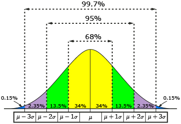
Did I Get This?: Standard Deviation Rule
Visual Methods of Assessing Normality
LO 6.3: Use histograms and QQ-plots (or Normal Probability Plots) to visually assess the normality of distributions of quantitative variables.
The normal distribution exists in theory but rarely, if ever, in real life. Histograms provide an excellent graphical display to help us assess normality. We can add a “normal curve” to the histogram which shows the normal distribution having the same mean and standard deviation as our sample. The closer the histogram fits this curve, the more (perfectly) normal the sample.
In the examples below, the graph on the top is approximately normally distributed whereas the graph on the bottom is clearly skewed right.


Unfortunately, we cannot quantitatively determine the extent to which the distribution is normally or not normally distributed using this method, but it can be helpful for making qualitative judgments about whether the data approximates the normal curve.
Another common graph to assess normality is the Q-Q plot (or Normal Probability Plot). In these graphs, the percentiles or quantiles of the theoretical distribution (in this case the standard normal distribution) are plotted against those from the data. If the data matches the theoretical distribution, the graph will result in a straight line. The graph below shows a distribution which closely follows a normal model.
Note: QQ-plots are not scatterplots (which we will dicuss soon), they only display information about one quantitative variable and graph this against the theoretical or expected values from a normal distribution with the same mean and standard deviation as our data. Other distributions can also be used.

In most cases the distributions that you encounter will only be approximations of the normal curve, or they will not resemble the normal distribution at all! However, it can be important to consider how well the data being analyzed approximates the normal curve since this distribution is a key assumption of many statistical analyses.
Here are a few more examples:
The following gives the QQ-plot, histogram and boxplot for variables from a dataset from a population of women who were at least 21 years old, of Pima Indian heritage and living near Phoenix, Arizona, who were tested for diabetes according to World Health Organization criteria. The data were collected by the US National Institute of Diabetes and Digestive and Kidney Diseases. We used the 532 complete records after dropping the (mainly missing) data on serum insulin.
Body Mass Index is definitely unimodal and symmetric and could easily have come from a population which is normally distributed.

The Diabetes Pedigree Function scores were unimodal and skewed right. This data does not seem to have come from a population which is normally distributed.

The Triceps Skin Fold Thickness is basically symmetric with one extreme outlier (and one potential but mild outlier).
Be careful not to call such a distribution “skewed right” as it is only the single outlier which really shows that pattern here. At a minimum remove the outlier and recreate the graphs to see how skewed the rest of the data might be.
Since there were no skewed left examples in the real data, here are two randomly generated skewed left distributions. Notice that the first is less skewed left than the second and this is indicated clearly in all three plots.
Comments:
- Even if the population is exactly normally distributed, samples from this population can appear non-normal especially for small sample sizes. See this document containing 21 samples of size n = 50 from a normal distribution with a mean of 200 and a standard deviation of 30. The samples that produce results which are skewed or otherwise seemingly not-normal are highlighted but even among those not highlighted, notice the variation in shapes seen: Normal Samples
- The standard deviation rule can also help in assessing normality in that the closer the percentage of data points within 1, 2, and 3 standard deviations is to that of the rule, the closer the data itself fits a normal distribution.
- In our example of male heights, we see that the histogram resembles a normal distribution and the sample percentages are very close to that predicted by the standard deviation rule.
Did I Get This?: Assessing Normality
(Optional) Reading: The Normal Distribution (≈ 500 words)
Standardized Scores (Z-Scores)
LO 4.14: Define and interpret measures of position (percentiles, quartiles, the five-number summary, z-scores).
We have already learned the standard deviation rule, which for normally distributed data, provides approximations for the proportion of data values within 1, 2, and 3 standard deviations. From this we know that approximately 5% of the data values would be expected to fall OUTSIDE 2 standard deviations.
If we calculate the standardized scores (or z-scores) for our data, it would be easy to identify these unusually large or small values in our data. To calculate a z-score, recall that we take the individual value and subtract the mean and then divide this difference by the standard deviation.
\(z_{i}=\dfrac{x_{i}-\bar{x}}{S}\)
For any individual, the z-score tells us how many standard deviations the raw score for that individual deviates from the mean and in what direction. A positive z-score indicates the individual is above average and a negative z-score indicates the individual is below average.
Comments:
- Standardized scores can be used to help identify potential outliers
- For approximately normal distributions, z-scores greater than 2 or less than -2 are rare (will happen approximately 5% of the time).
- For any distribution, z-scores greater than 4 or less than -4 are rare (will happen less than 6.25% of the time).
- Standardized scores, along with other measures of position, are useful when comparing individuals in different datasets since the comparison takes into account the relative position of the individuals in their dataset. With z-scores, we can tell which individual has a relatively higher or lower position in their respective dataset.
- Later in the course, we will see that this idea of standardizing is used often in statistical analyses.
We will continue with the Best Actress Oscar winners example (Link to the Best Actress Oscar Winners data).
34 34 26 37 42 41 35 31 41 33 30 74 33 49 38 61 21 41 26 80 43 29 33 35 45 49 39 34 26 25 35 33
In previous examples, we identified three observations as outliers, two of which were classified as extreme outliers (ages of 61, 74 and 80)

The mean of this sample is 38.5 and the standard deviation is 12.95.
- The z-score for the actress with age = 80 is
\(z=\dfrac{80-38.5}{12.95} = 3.20\)
Thus, among our female Oscar winners from our sample, this actress is 3.20 standard deviations older than average.
Did I Get This?: Z-Scores