One Categorical Variable
- Page ID
- 31279
\( \newcommand{\vecs}[1]{\overset { \scriptstyle \rightharpoonup} {\mathbf{#1}} } \)
\( \newcommand{\vecd}[1]{\overset{-\!-\!\rightharpoonup}{\vphantom{a}\smash {#1}}} \)
\( \newcommand{\dsum}{\displaystyle\sum\limits} \)
\( \newcommand{\dint}{\displaystyle\int\limits} \)
\( \newcommand{\dlim}{\displaystyle\lim\limits} \)
\( \newcommand{\id}{\mathrm{id}}\) \( \newcommand{\Span}{\mathrm{span}}\)
( \newcommand{\kernel}{\mathrm{null}\,}\) \( \newcommand{\range}{\mathrm{range}\,}\)
\( \newcommand{\RealPart}{\mathrm{Re}}\) \( \newcommand{\ImaginaryPart}{\mathrm{Im}}\)
\( \newcommand{\Argument}{\mathrm{Arg}}\) \( \newcommand{\norm}[1]{\| #1 \|}\)
\( \newcommand{\inner}[2]{\langle #1, #2 \rangle}\)
\( \newcommand{\Span}{\mathrm{span}}\)
\( \newcommand{\id}{\mathrm{id}}\)
\( \newcommand{\Span}{\mathrm{span}}\)
\( \newcommand{\kernel}{\mathrm{null}\,}\)
\( \newcommand{\range}{\mathrm{range}\,}\)
\( \newcommand{\RealPart}{\mathrm{Re}}\)
\( \newcommand{\ImaginaryPart}{\mathrm{Im}}\)
\( \newcommand{\Argument}{\mathrm{Arg}}\)
\( \newcommand{\norm}[1]{\| #1 \|}\)
\( \newcommand{\inner}[2]{\langle #1, #2 \rangle}\)
\( \newcommand{\Span}{\mathrm{span}}\) \( \newcommand{\AA}{\unicode[.8,0]{x212B}}\)
\( \newcommand{\vectorA}[1]{\vec{#1}} % arrow\)
\( \newcommand{\vectorAt}[1]{\vec{\text{#1}}} % arrow\)
\( \newcommand{\vectorB}[1]{\overset { \scriptstyle \rightharpoonup} {\mathbf{#1}} } \)
\( \newcommand{\vectorC}[1]{\textbf{#1}} \)
\( \newcommand{\vectorD}[1]{\overrightarrow{#1}} \)
\( \newcommand{\vectorDt}[1]{\overrightarrow{\text{#1}}} \)
\( \newcommand{\vectE}[1]{\overset{-\!-\!\rightharpoonup}{\vphantom{a}\smash{\mathbf {#1}}}} \)
\( \newcommand{\vecs}[1]{\overset { \scriptstyle \rightharpoonup} {\mathbf{#1}} } \)
\(\newcommand{\longvect}{\overrightarrow}\)
\( \newcommand{\vecd}[1]{\overset{-\!-\!\rightharpoonup}{\vphantom{a}\smash {#1}}} \)
\(\newcommand{\avec}{\mathbf a}\) \(\newcommand{\bvec}{\mathbf b}\) \(\newcommand{\cvec}{\mathbf c}\) \(\newcommand{\dvec}{\mathbf d}\) \(\newcommand{\dtil}{\widetilde{\mathbf d}}\) \(\newcommand{\evec}{\mathbf e}\) \(\newcommand{\fvec}{\mathbf f}\) \(\newcommand{\nvec}{\mathbf n}\) \(\newcommand{\pvec}{\mathbf p}\) \(\newcommand{\qvec}{\mathbf q}\) \(\newcommand{\svec}{\mathbf s}\) \(\newcommand{\tvec}{\mathbf t}\) \(\newcommand{\uvec}{\mathbf u}\) \(\newcommand{\vvec}{\mathbf v}\) \(\newcommand{\wvec}{\mathbf w}\) \(\newcommand{\xvec}{\mathbf x}\) \(\newcommand{\yvec}{\mathbf y}\) \(\newcommand{\zvec}{\mathbf z}\) \(\newcommand{\rvec}{\mathbf r}\) \(\newcommand{\mvec}{\mathbf m}\) \(\newcommand{\zerovec}{\mathbf 0}\) \(\newcommand{\onevec}{\mathbf 1}\) \(\newcommand{\real}{\mathbb R}\) \(\newcommand{\twovec}[2]{\left[\begin{array}{r}#1 \\ #2 \end{array}\right]}\) \(\newcommand{\ctwovec}[2]{\left[\begin{array}{c}#1 \\ #2 \end{array}\right]}\) \(\newcommand{\threevec}[3]{\left[\begin{array}{r}#1 \\ #2 \\ #3 \end{array}\right]}\) \(\newcommand{\cthreevec}[3]{\left[\begin{array}{c}#1 \\ #2 \\ #3 \end{array}\right]}\) \(\newcommand{\fourvec}[4]{\left[\begin{array}{r}#1 \\ #2 \\ #3 \\ #4 \end{array}\right]}\) \(\newcommand{\cfourvec}[4]{\left[\begin{array}{c}#1 \\ #2 \\ #3 \\ #4 \end{array}\right]}\) \(\newcommand{\fivevec}[5]{\left[\begin{array}{r}#1 \\ #2 \\ #3 \\ #4 \\ #5 \\ \end{array}\right]}\) \(\newcommand{\cfivevec}[5]{\left[\begin{array}{c}#1 \\ #2 \\ #3 \\ #4 \\ #5 \\ \end{array}\right]}\) \(\newcommand{\mattwo}[4]{\left[\begin{array}{rr}#1 \amp #2 \\ #3 \amp #4 \\ \end{array}\right]}\) \(\newcommand{\laspan}[1]{\text{Span}\{#1\}}\) \(\newcommand{\bcal}{\cal B}\) \(\newcommand{\ccal}{\cal C}\) \(\newcommand{\scal}{\cal S}\) \(\newcommand{\wcal}{\cal W}\) \(\newcommand{\ecal}{\cal E}\) \(\newcommand{\coords}[2]{\left\{#1\right\}_{#2}}\) \(\newcommand{\gray}[1]{\color{gray}{#1}}\) \(\newcommand{\lgray}[1]{\color{lightgray}{#1}}\) \(\newcommand{\rank}{\operatorname{rank}}\) \(\newcommand{\row}{\text{Row}}\) \(\newcommand{\col}{\text{Col}}\) \(\renewcommand{\row}{\text{Row}}\) \(\newcommand{\nul}{\text{Nul}}\) \(\newcommand{\var}{\text{Var}}\) \(\newcommand{\corr}{\text{corr}}\) \(\newcommand{\len}[1]{\left|#1\right|}\) \(\newcommand{\bbar}{\overline{\bvec}}\) \(\newcommand{\bhat}{\widehat{\bvec}}\) \(\newcommand{\bperp}{\bvec^\perp}\) \(\newcommand{\xhat}{\widehat{\xvec}}\) \(\newcommand{\vhat}{\widehat{\vvec}}\) \(\newcommand{\uhat}{\widehat{\uvec}}\) \(\newcommand{\what}{\widehat{\wvec}}\) \(\newcommand{\Sighat}{\widehat{\Sigma}}\) \(\newcommand{\lt}{<}\) \(\newcommand{\gt}{>}\) \(\newcommand{\amp}{&}\) \(\definecolor{fillinmathshade}{gray}{0.9}\)CO-4: Distinguish among different measurement scales, choose the appropriate descriptive and inferential statistical methods based on these distinctions, and interpret the results.
One Categorical Variable (4:57)
Note: These videos are listed for reference. If you would like to follow along in your first reading, then you will need to see the preceding tutorial videos. These videos are also linked in the programming assignments.
Related SAS Tutorials
- 4A – (3:03) Frequency Distributions
Related SPSS Tutorials
- 4A – (7:00) Frequency Distributions
Distribution of One Categorical Variable
LO 4.3: Using appropriate numerical measures and/or visual displays, describe the distribution of a categorical variable in context.
What is your perception of your own body? Do you feel that you are overweight, underweight, or about right?
A random sample of 1,200 U.S. college students were asked this question as part of a larger survey. The following table shows part of the responses:
| Student | Body Image |
| student 25 | overweight |
| student 26 | about right |
| student 27 | underweight |
| student 28 | about right |
| student 29 | about right |
Here is some information that would be interesting to get from these data:
- What percentage of the sampled students fall into each category?
- How are students divided across the three body image categories? Are they equally divided? If not, do the percentages follow some other kind of pattern?
There is no way that we can answer these questions by looking at the raw data, which are in the form of a long list of 1,200 responses, and thus not very useful.
Both of these questions will be easily answered once we summarize and look at the distribution of the variable Body Image (i.e., once we summarize how often each of the categories occurs).
Numerical Measures
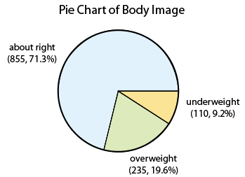
In order to summarize the distribution of a categorical variable, we first create a table of the different values (categories) the variable takes, how many times each value occurs (count) and, more importantly, how often each value occurs (by converting the counts to percentages).
The result is often called a Frequency Distribution or Frequency Table.
A Frequency Distribution or Frequency Table is the primary set of numerical measures for one categorical variable.
- Consists of a table with each category along with the count and percentage for each category.
- Provides a summary of the distribution for one categorical variable.
Here is the table for our example:
| Category | Count | Percent |
|---|---|---|
| About right | 855 | (855/1200)*100 = 71.3% |
| Overweight | 235 | (235/1200)*100 = 19.6% |
| Underweight | 110 | (110/1200)*100 = 9.2% |
| Total | n=1200 | 100% |
Comments:
- If you add the percentages in the above table you will get a total of 100.1% (instead of the true value which is, of course, 100%).This can occur whenever rounding has taken place. You should be aware of this possibility when working with real data.If you add the ratios directly as fractions, you will always get exactly 1 (or 100%).
- In general, although it might be “less confusing” if we recorded the full values above (71.25% instead of 71.3% and so on), we prefer not to display too many decimal places as this can distract from the conclusions we want to illustrate.We don’t want those who are reading our results to be overwhelmed or distracted by unneeded digits.
Visual or Graphical Displays
In order to visualize the numerical measures we’ve obtained, we need a graphical display.
There are two simple graphical displays for visualizing the distribution of one categorical variable:
- Pie Charts
- Bar Charts
Pie Chart

Bar Chart

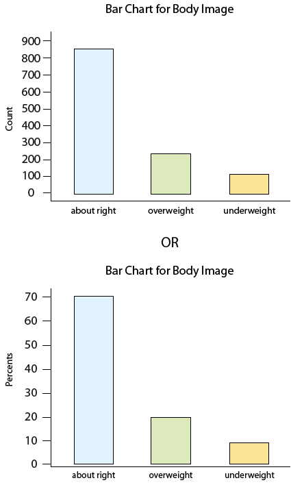
Note that the pie chart and bar chart are visual representations of the information in the frequency table.
Study the bar charts above and then answer the following question.
Learn By Doing: Bar Charts
Now that we have summarized the distribution of values in the Body Image variable, let’s go back and interpret the results in the context of the questions that we posed. Study the frequency table and graphs and answer the following questions.
Learn By Doing: Describe the Distribution of a Categorical Variable
Now that we’ve interpreted the results, there are some other interesting questions that arise:
- Can we reliably generalize our results to the entire population of interest and conclude that a similar distribution across body image categories exists among all U.S. college students? In particular, can we make such a generalization even though our sample consisted of only 1,200 students, which is a very small fraction of the entire population?
- If we had separated our sample by gender and looked at males and females separately, would we have found a similar distribution across body image categories?
These are the types of questions that we will deal with in future sections of the course.
Recall: Categorical variables take category or label values, and place an individual into one of several groups. Categorical variables are often further classified as either
- Nominal, when there is no natural ordering among the categories. Common examples would be gender, eye color, or ethnicity.
- Ordinal, when there is a natural order among the categories, such as, ranking scales or letter grades. However, ordinal variables are categorical and do not provide precise measurements. Differences are not precisely meaningful, for example, if one student scores an A and another a B on an assignment, we cannot say precisely the difference in their scores, only that an A is larger than a B.
Note: For ordinal categorical variables, pie charts are seldom used since the information about the order can be lost in such a display. Be careful that bar charts for ordinal variables display the data in a reasonable order given the scenario.
While both the pie chart and the bar chart help us visualize the distribution of a categorical variable, the pie chart emphasizes how the different categories relate to the whole, and the bar chart emphasizes how the different categories compare with each other.
Pictograms
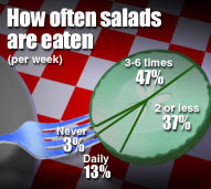
A variation on the pie chart and bar chart that is very commonly used in the media is the pictogram. Here are two examples:

Source: USA Today Snapshots and the Impulse Research for Northern Confidential Bathroom survey

Source: Market Facts for the Association of Dressings and Sauces
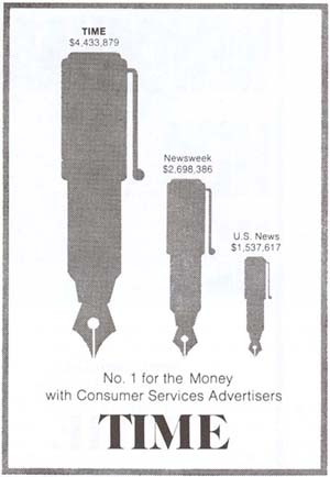
Beware: Pictograms can be misleading. Consider the following pictogram:

This graph is aimed at advertisers deciding where to spend their budgets, and clearly suggests that Time magazine attracts by far the largest amount of advertising spending.
Are the differences really as dramatic as the graph suggests?
If we look carefully at the numbers above the pens, we find that advertisers spend in Time only $4,433,879 / $2,698,386 = 1.64 times more than in Newsweek, and only $4,433,879 / $1,537,617 = 2.88 times more than in U.S. News.
By looking at the pictogram, however, we get the impression that Time is much further ahead. Why?
In order to magnify the picture without distorting it, we must increase both its height and width. As a result, the area of Time’s pen is 1.64 * 1.64 = 2.7 times larger than the Newsweek pen, and 2.88 * 2.88 = 8.3 times larger than the U.S. News pen. Our eyes capture the area of the pens rather than only the height, and so we are misled to think that Time is a bigger winner than it really is.
Learn By Doing: One Categorical Variable (College Student Survey)
Let’s Summarize
The distribution of a categorical variable is summarized using:
- Visual display: pie chart or bar chart, supplemented by
- Numerical measures: frequency table of category counts and percentages.
A variation on pie charts and bar charts is the pictogram. Pictograms can be misleading, so make sure to use a critical approach when interpreting the information the pictogram is trying to convey.

