Case C-Q
- Page ID
- 31276
\( \newcommand{\vecs}[1]{\overset { \scriptstyle \rightharpoonup} {\mathbf{#1}} } \)
\( \newcommand{\vecd}[1]{\overset{-\!-\!\rightharpoonup}{\vphantom{a}\smash {#1}}} \)
\( \newcommand{\dsum}{\displaystyle\sum\limits} \)
\( \newcommand{\dint}{\displaystyle\int\limits} \)
\( \newcommand{\dlim}{\displaystyle\lim\limits} \)
\( \newcommand{\id}{\mathrm{id}}\) \( \newcommand{\Span}{\mathrm{span}}\)
( \newcommand{\kernel}{\mathrm{null}\,}\) \( \newcommand{\range}{\mathrm{range}\,}\)
\( \newcommand{\RealPart}{\mathrm{Re}}\) \( \newcommand{\ImaginaryPart}{\mathrm{Im}}\)
\( \newcommand{\Argument}{\mathrm{Arg}}\) \( \newcommand{\norm}[1]{\| #1 \|}\)
\( \newcommand{\inner}[2]{\langle #1, #2 \rangle}\)
\( \newcommand{\Span}{\mathrm{span}}\)
\( \newcommand{\id}{\mathrm{id}}\)
\( \newcommand{\Span}{\mathrm{span}}\)
\( \newcommand{\kernel}{\mathrm{null}\,}\)
\( \newcommand{\range}{\mathrm{range}\,}\)
\( \newcommand{\RealPart}{\mathrm{Re}}\)
\( \newcommand{\ImaginaryPart}{\mathrm{Im}}\)
\( \newcommand{\Argument}{\mathrm{Arg}}\)
\( \newcommand{\norm}[1]{\| #1 \|}\)
\( \newcommand{\inner}[2]{\langle #1, #2 \rangle}\)
\( \newcommand{\Span}{\mathrm{span}}\) \( \newcommand{\AA}{\unicode[.8,0]{x212B}}\)
\( \newcommand{\vectorA}[1]{\vec{#1}} % arrow\)
\( \newcommand{\vectorAt}[1]{\vec{\text{#1}}} % arrow\)
\( \newcommand{\vectorB}[1]{\overset { \scriptstyle \rightharpoonup} {\mathbf{#1}} } \)
\( \newcommand{\vectorC}[1]{\textbf{#1}} \)
\( \newcommand{\vectorD}[1]{\overrightarrow{#1}} \)
\( \newcommand{\vectorDt}[1]{\overrightarrow{\text{#1}}} \)
\( \newcommand{\vectE}[1]{\overset{-\!-\!\rightharpoonup}{\vphantom{a}\smash{\mathbf {#1}}}} \)
\( \newcommand{\vecs}[1]{\overset { \scriptstyle \rightharpoonup} {\mathbf{#1}} } \)
\(\newcommand{\longvect}{\overrightarrow}\)
\( \newcommand{\vecd}[1]{\overset{-\!-\!\rightharpoonup}{\vphantom{a}\smash {#1}}} \)
\(\newcommand{\avec}{\mathbf a}\) \(\newcommand{\bvec}{\mathbf b}\) \(\newcommand{\cvec}{\mathbf c}\) \(\newcommand{\dvec}{\mathbf d}\) \(\newcommand{\dtil}{\widetilde{\mathbf d}}\) \(\newcommand{\evec}{\mathbf e}\) \(\newcommand{\fvec}{\mathbf f}\) \(\newcommand{\nvec}{\mathbf n}\) \(\newcommand{\pvec}{\mathbf p}\) \(\newcommand{\qvec}{\mathbf q}\) \(\newcommand{\svec}{\mathbf s}\) \(\newcommand{\tvec}{\mathbf t}\) \(\newcommand{\uvec}{\mathbf u}\) \(\newcommand{\vvec}{\mathbf v}\) \(\newcommand{\wvec}{\mathbf w}\) \(\newcommand{\xvec}{\mathbf x}\) \(\newcommand{\yvec}{\mathbf y}\) \(\newcommand{\zvec}{\mathbf z}\) \(\newcommand{\rvec}{\mathbf r}\) \(\newcommand{\mvec}{\mathbf m}\) \(\newcommand{\zerovec}{\mathbf 0}\) \(\newcommand{\onevec}{\mathbf 1}\) \(\newcommand{\real}{\mathbb R}\) \(\newcommand{\twovec}[2]{\left[\begin{array}{r}#1 \\ #2 \end{array}\right]}\) \(\newcommand{\ctwovec}[2]{\left[\begin{array}{c}#1 \\ #2 \end{array}\right]}\) \(\newcommand{\threevec}[3]{\left[\begin{array}{r}#1 \\ #2 \\ #3 \end{array}\right]}\) \(\newcommand{\cthreevec}[3]{\left[\begin{array}{c}#1 \\ #2 \\ #3 \end{array}\right]}\) \(\newcommand{\fourvec}[4]{\left[\begin{array}{r}#1 \\ #2 \\ #3 \\ #4 \end{array}\right]}\) \(\newcommand{\cfourvec}[4]{\left[\begin{array}{c}#1 \\ #2 \\ #3 \\ #4 \end{array}\right]}\) \(\newcommand{\fivevec}[5]{\left[\begin{array}{r}#1 \\ #2 \\ #3 \\ #4 \\ #5 \\ \end{array}\right]}\) \(\newcommand{\cfivevec}[5]{\left[\begin{array}{c}#1 \\ #2 \\ #3 \\ #4 \\ #5 \\ \end{array}\right]}\) \(\newcommand{\mattwo}[4]{\left[\begin{array}{rr}#1 \amp #2 \\ #3 \amp #4 \\ \end{array}\right]}\) \(\newcommand{\laspan}[1]{\text{Span}\{#1\}}\) \(\newcommand{\bcal}{\cal B}\) \(\newcommand{\ccal}{\cal C}\) \(\newcommand{\scal}{\cal S}\) \(\newcommand{\wcal}{\cal W}\) \(\newcommand{\ecal}{\cal E}\) \(\newcommand{\coords}[2]{\left\{#1\right\}_{#2}}\) \(\newcommand{\gray}[1]{\color{gray}{#1}}\) \(\newcommand{\lgray}[1]{\color{lightgray}{#1}}\) \(\newcommand{\rank}{\operatorname{rank}}\) \(\newcommand{\row}{\text{Row}}\) \(\newcommand{\col}{\text{Col}}\) \(\renewcommand{\row}{\text{Row}}\) \(\newcommand{\nul}{\text{Nul}}\) \(\newcommand{\var}{\text{Var}}\) \(\newcommand{\corr}{\text{corr}}\) \(\newcommand{\len}[1]{\left|#1\right|}\) \(\newcommand{\bbar}{\overline{\bvec}}\) \(\newcommand{\bhat}{\widehat{\bvec}}\) \(\newcommand{\bperp}{\bvec^\perp}\) \(\newcommand{\xhat}{\widehat{\xvec}}\) \(\newcommand{\vhat}{\widehat{\vvec}}\) \(\newcommand{\uhat}{\widehat{\uvec}}\) \(\newcommand{\what}{\widehat{\wvec}}\) \(\newcommand{\Sighat}{\widehat{\Sigma}}\) \(\newcommand{\lt}{<}\) \(\newcommand{\gt}{>}\) \(\newcommand{\amp}{&}\) \(\definecolor{fillinmathshade}{gray}{0.9}\)CO-4: Distinguish among different measurement scales, choose the appropriate descriptive and inferential statistical methods based on these distinctions, and interpret the results.
LO 4.20: Classify a data analysis situation involving two variables according to the “role-type classification.”
LO 4.21: For a data analysis situation involving two variables, determine the appropriate graphical display(s) and/or numerical measures(s) that should be used to summarize the data.
Video: Case C-Q (6:34)
Related SAS Tutorials
- 7A (2:32) Numeric Summaries by Groups
- 7B (3:03) Side-By-Side Boxplots
Related SPSS Tutorials
- 7A (3:29) Numeric Summaries by Groups
- 7B (1:59) Side-By-Side Boxplots
Categorical Explanatory and Quantitative Response
LO 4.18: Compare and contrast distributions (of quantitative data) from two or more groups, and produce a brief summary, interpreting your findings in context.
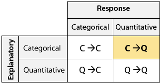
Recall the role-type classification table for framing our discussion about the relationship between two variables:

We are now ready to start with Case C→Q, exploring the relationship between two variables where the explanatory variable is categorical, and the response variable is quantitative. As you’ll discover, exploring relationships of this type is something we’ve already discussed in this course, but we didn’t frame the discussion this way.
Background: People who are concerned about their health may prefer hot dogs that are low in calories. A study was conducted by a concerned health group in which 54 major hot dog brands were examined, and their calorie contents recorded. In addition, each brand was classified by type: beef, poultry, and meat (mostly pork and beef, but up to 15% poultry meat). The purpose of the study was to examine whether the number of calories a hot dog has is related to (or affected by) its type. (Reference: Moore, David S., and George P. McCabe (1989). Introduction to the Practice of Statistics. Original source: Consumer Reports, June 1986, pp. 366-367.)
Answering this question requires us to examine the relationship between the categorical variable, Type and the quantitative variable Calories. Because the question of interest is whether the type of hot dog affects calorie content,
- the explanatory variable is Type, and
- the response variable is Calories.
Here is what the raw data look like:

The raw data are a list of types and calorie contents, and are not very useful in that form. To explore how the number of calories is related to the type of hot dog, we need an informative visual display of the data that will compare the three types of hot dogs with respect to their calorie content.
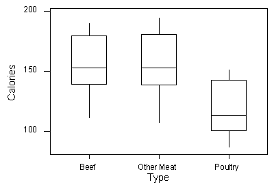
The visual display that we’ll use is side-by-side boxplots (which we’ve seen before). The side-by-side boxplots will allow us to compare the distribution of calorie counts within each category of the explanatory variable, hot dog type:

As before, we supplement the side-by-side boxplots with the descriptive statistics of the calorie content (response) for each type of hot dog separately (i.e., for each level of the explanatory variable separately):
Let’s summarize the results we obtained and interpret them in the context of the question we posed:
| Statistic | Beef | Meat | Poultry |
|---|---|---|---|
| min | 111 | 107 | 86 |
| Q1 | 139.5 | 138.5 | 100.5 |
| Median | 152.5 | 153 | 113 |
| Q3 | 179.75 | 180.5 | 142.5 |
| Max | 190 | 195 | 152 |
By examining the three side-by-side boxplots and the numerical measures, we see at once that poultry hot dogs, as a group, contain fewer calories than those made of beef or meat. The median number of calories in poultry hot dogs (113) is less than the median (and even the first quartile) of either of the other two distributions (medians 152.5 and 153). The spread of the three distributions is about the same, if IQR is considered (all slightly above 40), but the (full) ranges vary slightly more (beef: 80, meat: 88, poultry: 66). The general recommendation to the health-conscious consumer is to eat poultry hot dogs. It should be noted, though, that since each of the three types of hot dogs shows quite a large spread among brands, simply buying a poultry hot dog does not guarantee a low-calorie food.
What we learn from this example is that when exploring the relationship between a categorical explanatory variable and a quantitative response (Case C→Q), we essentially compare the distributions of the quantitative response for each category of the explanatory variable using side-by-side boxplots supplemented by descriptive statistics. Recall that we have actually done this before when we talked about the boxplot and argued that boxplots are most useful when presented side by side for comparing distributions of two or more groups. This is exactly what we are doing here!
Here is another example:
Background: The Survey of Study Habits and Attitudes (SSHA) is a psychological test designed to measure the motivation, study habits, and attitudes toward learning of college students. Is there a relationship between gender and SSHA scores? In other words, is there a “gender effect” on SSHA scores? Data were collected from 40 randomly selected college students, and here is what the raw data look like:

(Reference: Moore and McCabe. (2003). Introduction to the Practice of Statistics)
Side-by-side boxplots supplemented by descriptive statistics allow us to compare the distribution of SSHA scores within each category of the explanatory variable—gender:

| Statistic | Female | Male |
|---|---|---|
| min | 103 | 70 |
| Q1 | 128.75 | 95 |
| Median | 153 | 114.5 |
| Q3 | 163.75 | 144.5 |
| Max | 200 | 187 |
Let’s summarize our results and interpret them:
By examining the side-by-side boxplots and the numerical measures, we see that in general females perform better on the SSHA than males. The median SSHA score of females is higher than the median score for males (153 vs. 114), and in fact, it is even higher than the third quartile of the males’ distribution (144.5). On the other hand, the males’ scores display more variability, both in terms of IQR (49.5 vs. 35) and in terms of the full range of scores (117 vs. 97). Based on these results, it seems that there is a gender effect on SSHA score. It should be noted, though, that our sample consists of only 20 males and 20 females, so we should be cautious about making any kind of generalizations beyond this study. One interesting question that comes to mind is, “Why did we observe this relationship between gender and SSHA scores?” In other words, is there maybe an explanation for why females score higher on the SSHA? Let’s leave it to the psychologists to try and answer that one.
Let’s Summarize
- The relationship between a categorical explanatory variable and a quantitative response variable is summarized using:
- Visual display: side-by-side boxplots
- Numerical measures: descriptive statistics used for one quantitative variable calculated in each group
- Exploring the relationship between a categorical explanatory variable and a quantitative response variable amounts to comparing the distributions of the quantitative response for each category of the explanatory variable. In particular, we look at how the distribution of the response variable differs between the values of the explanatory variable

