Case Q-Q
- Page ID
- 31277
\( \newcommand{\vecs}[1]{\overset { \scriptstyle \rightharpoonup} {\mathbf{#1}} } \)
\( \newcommand{\vecd}[1]{\overset{-\!-\!\rightharpoonup}{\vphantom{a}\smash {#1}}} \)
\( \newcommand{\dsum}{\displaystyle\sum\limits} \)
\( \newcommand{\dint}{\displaystyle\int\limits} \)
\( \newcommand{\dlim}{\displaystyle\lim\limits} \)
\( \newcommand{\id}{\mathrm{id}}\) \( \newcommand{\Span}{\mathrm{span}}\)
( \newcommand{\kernel}{\mathrm{null}\,}\) \( \newcommand{\range}{\mathrm{range}\,}\)
\( \newcommand{\RealPart}{\mathrm{Re}}\) \( \newcommand{\ImaginaryPart}{\mathrm{Im}}\)
\( \newcommand{\Argument}{\mathrm{Arg}}\) \( \newcommand{\norm}[1]{\| #1 \|}\)
\( \newcommand{\inner}[2]{\langle #1, #2 \rangle}\)
\( \newcommand{\Span}{\mathrm{span}}\)
\( \newcommand{\id}{\mathrm{id}}\)
\( \newcommand{\Span}{\mathrm{span}}\)
\( \newcommand{\kernel}{\mathrm{null}\,}\)
\( \newcommand{\range}{\mathrm{range}\,}\)
\( \newcommand{\RealPart}{\mathrm{Re}}\)
\( \newcommand{\ImaginaryPart}{\mathrm{Im}}\)
\( \newcommand{\Argument}{\mathrm{Arg}}\)
\( \newcommand{\norm}[1]{\| #1 \|}\)
\( \newcommand{\inner}[2]{\langle #1, #2 \rangle}\)
\( \newcommand{\Span}{\mathrm{span}}\) \( \newcommand{\AA}{\unicode[.8,0]{x212B}}\)
\( \newcommand{\vectorA}[1]{\vec{#1}} % arrow\)
\( \newcommand{\vectorAt}[1]{\vec{\text{#1}}} % arrow\)
\( \newcommand{\vectorB}[1]{\overset { \scriptstyle \rightharpoonup} {\mathbf{#1}} } \)
\( \newcommand{\vectorC}[1]{\textbf{#1}} \)
\( \newcommand{\vectorD}[1]{\overrightarrow{#1}} \)
\( \newcommand{\vectorDt}[1]{\overrightarrow{\text{#1}}} \)
\( \newcommand{\vectE}[1]{\overset{-\!-\!\rightharpoonup}{\vphantom{a}\smash{\mathbf {#1}}}} \)
\( \newcommand{\vecs}[1]{\overset { \scriptstyle \rightharpoonup} {\mathbf{#1}} } \)
\(\newcommand{\longvect}{\overrightarrow}\)
\( \newcommand{\vecd}[1]{\overset{-\!-\!\rightharpoonup}{\vphantom{a}\smash {#1}}} \)
\(\newcommand{\avec}{\mathbf a}\) \(\newcommand{\bvec}{\mathbf b}\) \(\newcommand{\cvec}{\mathbf c}\) \(\newcommand{\dvec}{\mathbf d}\) \(\newcommand{\dtil}{\widetilde{\mathbf d}}\) \(\newcommand{\evec}{\mathbf e}\) \(\newcommand{\fvec}{\mathbf f}\) \(\newcommand{\nvec}{\mathbf n}\) \(\newcommand{\pvec}{\mathbf p}\) \(\newcommand{\qvec}{\mathbf q}\) \(\newcommand{\svec}{\mathbf s}\) \(\newcommand{\tvec}{\mathbf t}\) \(\newcommand{\uvec}{\mathbf u}\) \(\newcommand{\vvec}{\mathbf v}\) \(\newcommand{\wvec}{\mathbf w}\) \(\newcommand{\xvec}{\mathbf x}\) \(\newcommand{\yvec}{\mathbf y}\) \(\newcommand{\zvec}{\mathbf z}\) \(\newcommand{\rvec}{\mathbf r}\) \(\newcommand{\mvec}{\mathbf m}\) \(\newcommand{\zerovec}{\mathbf 0}\) \(\newcommand{\onevec}{\mathbf 1}\) \(\newcommand{\real}{\mathbb R}\) \(\newcommand{\twovec}[2]{\left[\begin{array}{r}#1 \\ #2 \end{array}\right]}\) \(\newcommand{\ctwovec}[2]{\left[\begin{array}{c}#1 \\ #2 \end{array}\right]}\) \(\newcommand{\threevec}[3]{\left[\begin{array}{r}#1 \\ #2 \\ #3 \end{array}\right]}\) \(\newcommand{\cthreevec}[3]{\left[\begin{array}{c}#1 \\ #2 \\ #3 \end{array}\right]}\) \(\newcommand{\fourvec}[4]{\left[\begin{array}{r}#1 \\ #2 \\ #3 \\ #4 \end{array}\right]}\) \(\newcommand{\cfourvec}[4]{\left[\begin{array}{c}#1 \\ #2 \\ #3 \\ #4 \end{array}\right]}\) \(\newcommand{\fivevec}[5]{\left[\begin{array}{r}#1 \\ #2 \\ #3 \\ #4 \\ #5 \\ \end{array}\right]}\) \(\newcommand{\cfivevec}[5]{\left[\begin{array}{c}#1 \\ #2 \\ #3 \\ #4 \\ #5 \\ \end{array}\right]}\) \(\newcommand{\mattwo}[4]{\left[\begin{array}{rr}#1 \amp #2 \\ #3 \amp #4 \\ \end{array}\right]}\) \(\newcommand{\laspan}[1]{\text{Span}\{#1\}}\) \(\newcommand{\bcal}{\cal B}\) \(\newcommand{\ccal}{\cal C}\) \(\newcommand{\scal}{\cal S}\) \(\newcommand{\wcal}{\cal W}\) \(\newcommand{\ecal}{\cal E}\) \(\newcommand{\coords}[2]{\left\{#1\right\}_{#2}}\) \(\newcommand{\gray}[1]{\color{gray}{#1}}\) \(\newcommand{\lgray}[1]{\color{lightgray}{#1}}\) \(\newcommand{\rank}{\operatorname{rank}}\) \(\newcommand{\row}{\text{Row}}\) \(\newcommand{\col}{\text{Col}}\) \(\renewcommand{\row}{\text{Row}}\) \(\newcommand{\nul}{\text{Nul}}\) \(\newcommand{\var}{\text{Var}}\) \(\newcommand{\corr}{\text{corr}}\) \(\newcommand{\len}[1]{\left|#1\right|}\) \(\newcommand{\bbar}{\overline{\bvec}}\) \(\newcommand{\bhat}{\widehat{\bvec}}\) \(\newcommand{\bperp}{\bvec^\perp}\) \(\newcommand{\xhat}{\widehat{\xvec}}\) \(\newcommand{\vhat}{\widehat{\vvec}}\) \(\newcommand{\uhat}{\widehat{\uvec}}\) \(\newcommand{\what}{\widehat{\wvec}}\) \(\newcommand{\Sighat}{\widehat{\Sigma}}\) \(\newcommand{\lt}{<}\) \(\newcommand{\gt}{>}\) \(\newcommand{\amp}{&}\) \(\definecolor{fillinmathshade}{gray}{0.9}\)CO-4: Distinguish among different measurement scales, choose the appropriate descriptive and inferential statistical methods based on these distinctions, and interpret the results.
LO 4.20: Classify a data analysis situation involving two variables according to the “role-type classification.”
LO 4.21: For a data analysis situation involving two variables, determine the appropriate graphical display(s) and/or numerical measures(s) that should be used to summarize the data.
Video: Case Q-Q (2:30)
Related SAS Tutorials
- 9A – (3:53) Basic Scatterplots
- 9B – (2:29) Grouped Scatterplots
- 9C – (3:46) Pearson’s Correlation Coefficient
- 9D – (3:00) Simple Linear Regression – EDA
Related SPSS Tutorials
- 9A – (2:38) Basic Scatterplots
- 9B – (2:54) Grouped Scatterplots
- 9C – (3:35) Pearson’s Correlation Coefficient
- 9D – (2:53) Simple Linear Regression – EDA
Introduction – Two Quantitative Variables
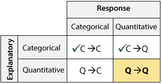
Here again is the role-type classification table for framing our discussion about the relationship between two variables:
Before reading further, try this interactive online data analysis applet.
Interactive Applet: Case Q-Q
We are done with cases C→Q and C→C, and now we will move on to case Q→Q, where we examine the relationship between two quantitative variables.
In this section we will discuss scatterplots, which are the appropriate visual display in this case along with numerical methods for linear relationships including correlation and linear regression.
Scatterplots
CO-4: Distinguish among different measurement scales, choose the appropriate descriptive and inferential statistical methods based on these distinctions, and interpret the results.
LO 4.21: For a data analysis situation involving two variables, determine the appropriate graphical display(s) and/or numerical measures(s) that should be used to summarize the data.
Video: Scatterplots (7:20)
Related SAS Tutorials
- 9A – (3:53) Basic Scatterplots
- 9B – (2:29) Grouped Scatterplots
- 9C – (3:46) Pearson’s Correlation Coefficient
- 9D – (3:00) Simple Linear Regression – EDA
Related SPSS Tutorials
- 9A – (2:38) Basic Scatterplots
- 9B – (2:54) Grouped Scatterplots
- 9C – (3:35) Pearson’s Correlation Coefficient
- 9D – (2:53) Simple Linear Regression – EDA
In the previous two cases we had a categorical explanatory variable, and therefore exploring the relationship between the two variables was done by comparing the distribution of the response variable for each category of the explanatory variable:
- In case C→Q we compared distributions of the quantitative response.
- In case C→C we compared distributions of the categorical response.
Case Q→Q is different in the sense that both variables (in particular the explanatory variable) are quantitative. As you will discover, although we are still in essence comparing the distribution of one variable for different values of the other, this case will require a different kind of treatment and tools.
LO 4.24: Explain the process of creating a scatterplot.
Creating Scatterplots
Let’s start with an example:
A Pennsylvania research firm conducted a study in which 30 drivers (of ages 18 to 82 years old) were sampled, and for each one, the maximum distance (in feet) at which he/she could read a newly designed sign was determined. The goal of this study was to explore the relationship between a driver’s age and the maximum distance at which signs were legible, and then use the study’s findings to improve safety for older drivers. (Reference: Utts and Heckard, Mind on Statistics (2002). Original source: Data collected by Last Resource, Inc, Bellfonte, PA.)
Since the purpose of this study is to explore the effect of age on maximum legibility distance,
- the explanatory variable is Age, and
- the response variable is Distance.
Here is what the raw data look like:
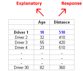
Note that the data structure is such that for each individual (in this case driver 1….driver 30) we have a pair of values (in this case representing the driver’s age and distance). We can therefore think about these data as 30 pairs of values: (18, 510), (32, 410), (55, 420), … , (82, 360).
The first step in exploring the relationship between driver age and sign legibility distance is to create an appropriate and informative graphical display. The appropriate graphical display for examining the relationship between two quantitative variables is the scatterplot. Here is how a scatterplot is constructed for our example:
To create a scatterplot, each pair of values is plotted, so that the value of the explanatory variable (X) is plotted on the horizontal axis, and the value of the response variable (Y) is plotted on the vertical axis. In other words, each individual (driver, in our example) appears on the scatterplot as a single point whose X-coordinate is the value of the explanatory variable for that individual, and whose Y-coordinate is the value of the response variable. Here is an illustration:
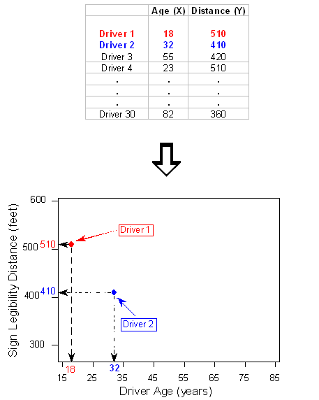
And here is the completed scatterplot:

Comment:
- It is important to mention again that when creating a scatterplot, the explanatory variable should always be plotted on the horizontal X-axis, and the response variable should be plotted on the vertical Y-axis. If in a specific example we do not have a clear distinction between explanatory and response variables, each of the variables can be plotted on either axis.
Interpreting Scatterplots
LO 4.25: Describe the relationship displayed in a scatterplot including: a) the overall pattern, b) striking deviations from the pattern.
How do we explore the relationship between two quantitative variables using the scatterplot? What should we look at, or pay attention to?
Recall that when we described the distribution of a single quantitative variable with a histogram, we described the overall pattern of the distribution (shape, center, spread) and any deviations from that pattern (outliers). We do the same thing with the scatterplot. The following figure summarizes this point:

As the figure explains, when describing the overall pattern of the relationship we look at its direction, form and strength.
Direction
- The direction of the relationship can be positive, negative, or neither:
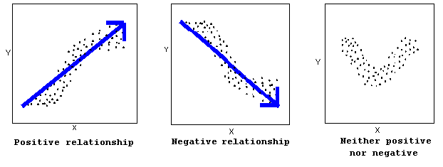
A positive (or increasing) relationship means that an increase in one of the variables is associated with an increase in the other.
A negative (or decreasing) relationship means that an increase in one of the variables is associated with a decrease in the other.
Not all relationships can be classified as either positive or negative.
Form
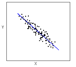
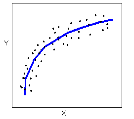
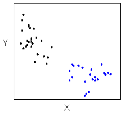
- The form of the relationship is its general shape. When identifying the form, we try to find the simplest way to describe the shape of the scatterplot. There are many possible forms. Here are a couple that are quite common:
Relationships with a linear form are most simply described as points scattered about a line:
Relationships with a non-linear (sometimes called curvilinear) form are most simply described as points dispersed around the same curved line:
There are many other possible forms for the relationship between two quantitative variables, but linear and curvilinear forms are quite common and easy to identify. Another form-related pattern that we should be aware of is clusters in the data:
Strength
- The strength of the relationship is determined by how closely the data follow the form of the relationship. Let’s look, for example, at the following two scatterplots displaying positive, linear relationships:
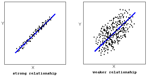
The strength of the relationship is determined by how closely the data points follow the form. We can see that in the left scatterplot the data points follow the linear pattern quite closely. This is an example of a strong relationship. In the right scatterplot, the points also follow the linear pattern, but much less closely, and therefore we can say that the relationship is weaker. In general, though, assessing the strength of a relationship just by looking at the scatterplot is quite problematic, and we need a numerical measure to help us with that. We will discuss that later in this section.
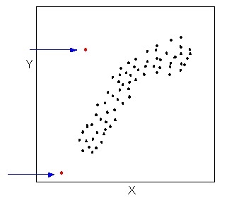
- Data points that deviate from the pattern of the relationship are called outliers. We will see several examples of outliers during this section. Two outliers are illustrated in the scatterplot below:
Let’s go back now to our example, and use the scatterplot to examine the relationship between the age of the driver and the maximum sign legibility distance.
Here is the scatterplot:
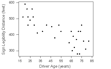
The direction of the relationship is negative, which makes sense in context, since as you get older your eyesight weakens, and in particular older drivers tend to be able to read signs only at lesser distances. An arrow drawn over the scatterplot illustrates the negative direction of this relationship:

The form of the relationship seems to be linear. Notice how the points tend to be scattered about the line. Although, as we mentioned earlier, it is problematic to assess the strength without a numerical measure, the relationship appears to be moderately strong, as the data is fairly tightly scattered about the line. Finally, all the data points seem to “obey” the pattern — there do not appear to be any outliers.
We will now look at two more examples:
The average gestation period, or time of pregnancy, of an animal is closely related to its longevity (the length of its lifespan). Data on the average gestation period and longevity (in captivity) of 40 different species of animals have been examined, with the purpose of examining how the gestation period of an animal is related to (or can be predicted from) its longevity. (Source: Rossman and Chance. (2001). Workshop statistics: Discovery with data and Minitab. Original source: The 1993 world almanac and book of facts).
Here is the scatterplot of the data.
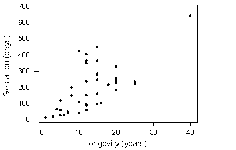
What can we learn about the relationship from the scatterplot? The direction of the relationship is positive, which means that animals with longer life spans tend to have longer times of pregnancy (this makes intuitive sense). An arrow drawn over the scatterplot below illustrates this:
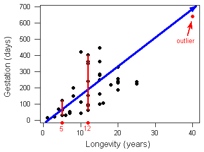
The form of the relationship is again essentially linear. There appears to be one outlier, indicating an animal with an exceptionally long longevity and gestation period. (This animal happens to be the elephant.) Note that while this outlier definitely deviates from the rest of the data in term of its magnitude, it does follow the direction of the data.
Comment:
- Another feature of the scatterplot that is worth observing is how the variation in gestation increases as longevity increases. This fact is illustrated by the two red vertical lines at the bottom left part of the graph. Note that the gestation periods for animals that live 5 years range from about 30 days up to about 120 days. On the other hand, the gestation periods of animals that live 12 years vary much more, and range from about 60 days up to more than 400 days.
As a third example, consider the relationship between the average amount of fuel used (in liters) to drive a fixed distance in a car (100 kilometers), and the speed at which the car is driven (in kilometers per hour). (Source: Moore and McCabe, (2003). Introduction to the practice of statistics. Original source: T.N. Lam. (1985). “Estimating fuel consumption for engine size,” Journal of Transportation Engineering, vol. 111)
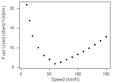
The data describe a relationship that decreases and then increases — the amount of fuel consumed decreases rapidly to a minimum for a car driving 60 kilometers per hour, and then increases gradually for speeds exceeding 60 kilometers per hour. This suggests that the speed at which a car economizes on fuel the most is about 60 km/h. This forms a non-linear (curvilinear) relationship that seems to be very strong, as the observations seem to perfectly fit the curve. Finally, there do not appear to be any outliers.
Learn By Doing: Scatterplots
The example in the last activity provides a great opportunity for interpretation of the form of the relationship in context. Recall that the example examined how the percentage of participants who completed a survey is affected by the monetary incentive that researchers promised to participants. Here again is the scatterplot that displays the relationship:
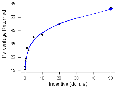
The positive relationship definitely makes sense in context, but what is the interpretation of the non-linear (curvilinear) form in the context of the problem? How can we explain (in context) the fact that the relationship seems at first to be increasing very rapidly, but then slows down? The following graph will help us:
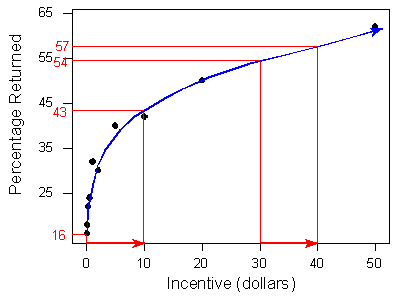
Note that when the monetary incentive increases from $0 to $10, the percentage of returned surveys increases sharply — an increase of 27% (from 16% to 43%). However, the same increase of $10 from $30 to $40 doesn’t result in the same dramatic increase in the percentage of returned surveys — it results in an increase of only 3% (from 54% to 57%). The form displays the phenomenon of “diminishing returns” — a return rate that after a certain point fails to increase proportionately to additional outlays of investment. $10 is worth more to people relative to $0 than $30 is relative to $10.
A Labeled (or Grouped) Scatterplot
In certain circumstances, it may be reasonable to indicate different subgroups or categories within the data on the scatterplot, by labeling each subgroup differently. The result is sometimes called a labeled scatterplot or grouped scatterplot, and can provide further insight about the relationship we are exploring. Here is an example.
The scatterplot below displays the relationship between the sodium and calorie content of 54 brands of hot dogs. Note that in this example there is no clear explanatory-response distinction, and we decided to have sodium content as the explanatory variable, and calorie content as the response variable.
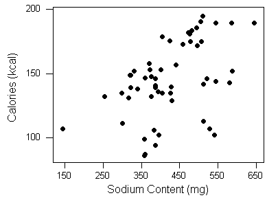
The scatterplot displays a positive relationship, which means that hot dogs containing more sodium tend to be higher in calories.
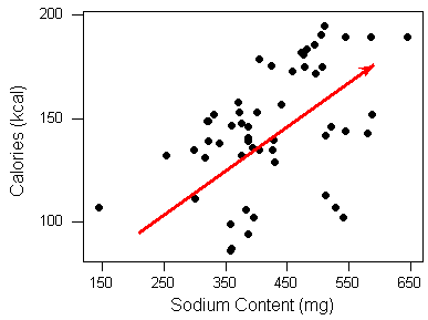
The form of the relationship, however, is kind of hard to determine. Maybe if we label the scatterplot, indicating the type of hot dogs, we will get a better understanding of the form.
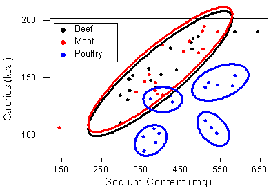
Here is the labeled scatterplot, with the three different colors representing the three types of hot dogs, as indicated.

The display does give us more insight about the form of the relationship between sodium and calorie content.

It appears that there is a positive relationship within all three types. In other words, we can generally expect hot dogs that are higher in sodium to be higher in calories, no matter what type of hot dog we consider. In addition, we can see that hot dogs made of poultry (indicated in blue) are generally lower in calories. This is a result we have seen before.
Interestingly, it appears that the form of the relationship specifically for poultry is further clustered, and we can only speculate about whether there is another categorical variable that describes these apparent sub-categories of poultry hot dogs.
Learn By Doing: Scatterplots (Software)
Let’s Summarize
- The relationship between two quantitative variables is visually displayed using the scatterplot, where each point represents an individual. We always plot the explanatory variable on the horizontal X axis, and the response variable on the vertical Y axis.
- When we explore a relationship using the scatterplot we should describe the overall pattern of the relationship and any deviations from that pattern. To describe the overall pattern consider the direction, form and strength of the relationship. Assessing the strength just by looking at the scatterplot can be problematic; using a numerical measure to determine strength will be discussed later in this course.
- Adding labels to the scatterplot that indicate different groups or categories within the data might help us get more insight about the relationship we are exploring.
Linear Relationships – Correlation
CO-4: Distinguish among different measurement scales, choose the appropriate descriptive and inferential statistical methods based on these distinctions, and interpret the results.
LO 4.21: For a data analysis situation involving two variables, determine the appropriate graphical display(s) and/or numerical measures(s) that should be used to summarize the data.
Video: Linear Relationships – Correlation (8:37)
Related SAS Tutorials
- 9A – (3:53) Basic Scatterplots
- 9B – (2:29) Grouped Scatterplots
- 9C – (3:46) Pearson’s Correlation Coefficient
- 9D – (3:00) Simple Linear Regression – EDA
Related SPSS Tutorials
- 9A – (2:38) Basic Scatterplots
- 9B – (2:54) Grouped Scatterplots
- 9C – (3:35) Pearson’s Correlation Coefficient
- 9D – (2:53) Simple Linear Regression – EDA
Introduction
So far we have visualized relationships between two quantitative variables using scatterplots, and described the overall pattern of a relationship by considering its direction, form, and strength. We noted that assessing the strength of a relationship just by looking at the scatterplot is quite difficult, and therefore we need to supplement the scatterplot with some kind of numerical measure that will help us assess the strength.
In this part, we will restrict our attention to the special case of relationships that have a linear form, since they are quite common and relatively simple to detect. More importantly, there exists a numerical measure that assesses the strength of the linear relationship between two quantitative variables with which we can supplement the scatterplot. We will introduce this numerical measure here and discuss it in detail.
Even though from this point on we are going to focus only on linear relationships, it is important to remember that not every relationship between two quantitative variables has a linear form. We have actually seen several examples of relationships that are not linear. The statistical tools that will be introduced here are appropriate only for examining linear relationships, and as we will see, when they are used in nonlinear situations, these tools can lead to errors in reasoning.
Let’s start with a motivating example. Consider the following two scatterplots.
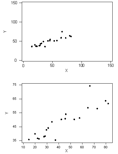
We can see that in both cases, the direction of the relationship is positive and the form of the relationship is linear. What about the strength? Recall that the strength of a relationship is the extent to which the data follow its form.
Learn By Doing: Strength of Correlation
The purpose of this example was to illustrate how assessing the strength of the linear relationship from a scatterplot alone is problematic, since our judgment might be affected by the scale on which the values are plotted. This example, therefore, provides a motivation for the need to supplement the scatterplot with a numerical measure that will measure the strength of the linear relationship between two quantitative variables.
The Correlation Coefficient — r
LO 4.26: Explain the limitations of Pearson’s correlation coefficient (r) as a measure of the association between two quantitative variables.
LO 4.27: In the special case of a linear relationship, interpret Pearson’s correlation coefficient (r) in context.
The numerical measure that assesses the strength of a linear relationship is called the correlation coefficient, and is denoted by r. We will:
- give a definition of the correlation r,
- discuss the calculation of r,
- explain how to interpret the value of r, and
- talk about some of the properties of r.
Correlation Coefficient: The correlation coefficient (r) is a numerical measure that measures the strength and direction of a linear relationship between two quantitative variables.
Calculation: r is calculated using the following formula:
\(r=\dfrac{1}{n-1} \sum_{i=1}^{n}\left(\dfrac{x_{i}-\bar{x}}{s_{x}}\right)\left(\dfrac{y_{i}-\bar{y}}{s_{y}}\right)\)
However, the calculation of the correlation (r) is not the focus of this course. We will use a statistics package to calculate r for us, and the emphasis of this course will be on the interpretation of its value.
Interpretation
Once we obtain the value of r, its interpretation with respect to the strength of linear relationships is quite simple, as these images illustrate:

In order to get a better sense for how the value of r relates to the strength of the linear relationship, take a look the following applets.
Interactive Applets: Correlation
If you will be using correlation often in your research, I highly urge you to read the following more detailed discussion of correlation.
(Optional) Outside Reading: Correlation Coefficients (≈ 2700 words)
Now that we understand the use of r as a numerical measure for assessing the direction and strength of linear relationships between quantitative variables, we will look at a few examples.
Earlier, we used the scatterplot below to find a negative linear relationship between the age of a driver and the maximum distance at which a highway sign was legible. What about the strength of the relationship? It turns out that the correlation between the two variables is r = -0.793.
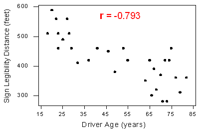
Since r < 0, it confirms that the direction of the relationship is negative (although we really didn’t need r to tell us that). Since r is relatively close to -1, it suggests that the relationship is moderately strong. In context, the negative correlation confirms that the maximum distance at which a sign is legible generally decreases with age. Since the value of r indicates that the linear relationship is moderately strong, but not perfect, we can expect the maximum distance to vary somewhat, even among drivers of the same age.
A statistics department is interested in tracking the progress of its students from entry until graduation. As part of the study, the department tabulates the performance of 10 students in an introductory course and in an upper-level course required for graduation. What is the relationship between the students’ course averages in the two courses? Here is the scatterplot for the data:

The scatterplot suggests a relationship that is positive in direction, linear in form, and seems quite strong. The value of the correlation that we find between the two variables is r = 0.931, which is very close to 1, and thus confirms that indeed the linear relationship is very strong.
Comments:
- Note that in both examples we supplemented the scatterplot with the correlation (r). Now that we have the correlation (r), why do we still need to look at a scatterplot when examining the relationship between two quantitative variables?
- The correlation coefficient can only be interpreted as the measure of the strength of a linear relationship, so we need the scatterplot to verify that the relationship indeed looks linear. This point and its importance will be clearer after we examine a few properties of r.
Did I Get This? Correlation Coefficient
Properties of r
We will now discuss and illustrate several important properties of the correlation coefficient as a numerical measure of the strength of a linear relationship.
- The correlation does not change when the units of measurement of either one of the variables change. In other words, if we change the units of measurement of the explanatory variable and/or the response variable, this has no effect on the correlation (r).
To illustrate this, below are two versions of the scatterplot of the relationship between sign legibility distance and driver’s age:
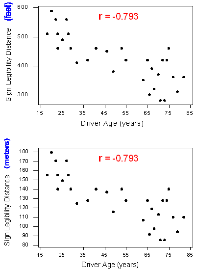
The top scatterplot displays the original data where the maximum distances are measured in feet. The bottom scatterplot displays the same relationship, but with maximum distances changed to meters. Notice that the Y-values have changed, but the correlations are the same. This is an example of how changing the units of measurement of the response variable has no effect on r, but as we indicated above, the same is true for changing the units of the explanatory variable, or of both variables.
This might be a good place to comment that the correlation (r) is “unitless”. It is just a number.
- The correlation only measures the strength of a linear relationship between two variables. It ignores any other type of relationship, no matter how strong it is. For example, consider the relationship between the average fuel usage of driving a fixed distance in a car, and the speed at which the car drives:
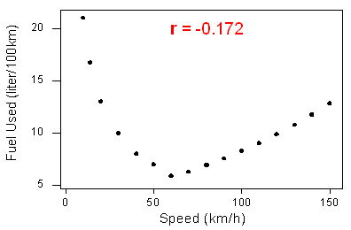
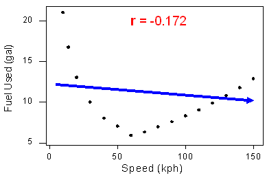
Our data describe a fairly simple non-linear (sometimes called curvilinear) relationship: the amount of fuel consumed decreases rapidly to a minimum for a car driving 60 kilometers per hour, and then increases gradually for speeds exceeding 60 kilometers per hour. The relationship is very strong, as the observations seem to perfectly fit the curve.
Although the relationship is strong, the correlation r = -0.172 indicates a weak linear relationship. This makes sense considering that the data fails to adhere closely to a linear form:
- The correlation by itself is not enough to determine whether or not a relationship is linear. To see this, let’s consider the study that examined the effect of monetary incentives on the return rate of questionnaires. Below is the scatterplot relating the percentage of participants who completed a survey to the monetary incentive that researchers promised to participants, in which we find a strong non-linear (sometimes called curvilinear) relationship:

The relationship is non-linear (sometimes called curvilinear), yet the correlation r = 0.876 is quite close to 1.
In the last two examples we have seen two very strong non-linear (sometimes called curvilinear) relationships, one with a correlation close to 0, and one with a correlation close to 1. Therefore, the correlation alone does not indicate whether a relationship is linear or not. The important principle here is:
Always look at the data!
- The correlation is heavily influenced by outliers. As you will learn in the next two activities, the way in which the outlier influences the correlation depends upon whether or not the outlier is consistent with the pattern of the linear relationship.
Interactive Applet: Correlation and Outliers
Hopefully, you’ve noticed the correlation decreasing when you created this kind of outlier, which is not consistent with the pattern of the relationship.
The next activity will show you how an outlier that is consistent with the direction of the linear relationship actually strengthens it.
Learn By Doing: Correlation and Outliers (Software)
In the previous activity, we saw an example where there was a positive linear relationship between the two variables, and including the outlier just “strengthened” it. Consider the hypothetical data displayed by the following scatterplot:
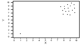
In this case, the low outlier gives an “illusion” of a positive linear relationship, whereas in reality, there is no linear relationship between X and Y.
Linear Relationships – Linear Regression
CO-4: Distinguish among different measurement scales, choose the appropriate descriptive and inferential statistical methods based on these distinctions, and interpret the results.
LO 4.21: For a data analysis situation involving two variables, determine the appropriate graphical display(s) and/or numerical measures(s) that should be used to summarize the data.
Video: Linear Relationships – Linear Regression (5:58)
Related SAS Tutorials
- 9A – (3:53) Basic Scatterplots
- 9B – (2:29) Grouped Scatterplots
- 9C – (3:46) Pearson’s Correlation Coefficient
- 9D – (3:00) Simple Linear Regression – EDA
Related SPSS Tutorials
- 9A – (2:38) Basic Scatterplots
- 9B – (2:54) Grouped Scatterplots
- 9C – (3:35) Pearson’s Correlation Coefficient
- 9D – (2:53) Simple Linear Regression – EDA
Summarizing the Pattern of the Data with a Line
LO 4.28: In the special case of a linear relationship, interpret the slope of the regression line and use the regression line to make predictions.
So far we’ve used the scatterplot to describe the relationship between two quantitative variables, and in the special case of a linear relationship, we have supplemented the scatterplot with the correlation (r).
The correlation, however, doesn’t fully characterize the linear relationship between two quantitative variables — it only measures the strength and direction. We often want to describe more precisely how one variable changes with the other (by “more precisely,” we mean more than just the direction), or predict the value of the response variable for a given value of the explanatory variable.
In order to be able to do that, we need to summarize the linear relationship with a line that best fits the linear pattern of the data. In the remainder of this section, we will introduce a way to find such a line, learn how to interpret it, and use it (cautiously) to make predictions.
Again, let’s start with a motivating example:
Earlier, we examined the linear relationship between the age of a driver and the maximum distance at which a highway sign was legible, using both a scatterplot and the correlation coefficient. Suppose a government agency wanted to predict the maximum distance at which the sign would be legible for 60-year-old drivers, and thus make sure that the sign could be used safely and effectively.
How would we make this prediction?

It would be useful if we could find a line (such as the one that is presented on the scatterplot) that represents the general pattern of the data, because then,
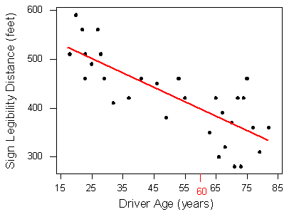
and predict that 60-year-old drivers could see the sign from a distance of just under 400 feet we would simply use this line to find the distance that corresponds to an age of 60 like this:
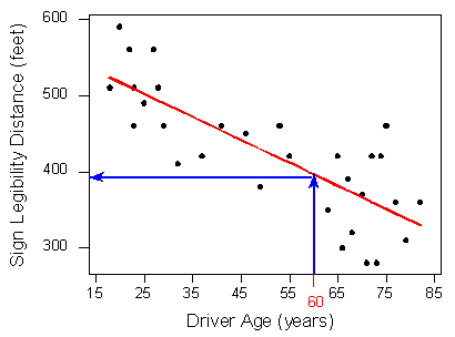
How and why did we pick this particular line (the one shown in red in the above walkthrough) to describe the dependence of the maximum distance at which a sign is legible upon the age of a driver? What line exactly did we choose? We will return to this example once we can answer that question with a bit more precision.
Interactive Applets: Regression by Eye
The technique that specifies the dependence of the response variable on the explanatory variable is called regression. When that dependence is linear (which is the case in our examples in this section), the technique is called linear regression. Linear regression is therefore the technique of finding the line that best fits the pattern of the linear relationship (or in other words, the line that best describes how the response variable linearly depends on the explanatory variable).
To understand how such a line is chosen, consider the following very simplified version of the age-distance example (we left just 6 of the drivers on the scatterplot):

There are many lines that look like they would be good candidates to be the line that best fits the data:

It is doubtful that everyone would select the same line in the plot above. We need to agree on what we mean by “best fits the data”; in other words, we need to agree on a criterion by which we would select this line. We want the line we choose to be close to the data points. In other words, whatever criterion we choose, it had better somehow take into account the vertical deviations of the data points from the line, which are marked with blue arrows in the plot below:

The most commonly used criterion is called the least squares criterion. This criterion says: Among all the lines that look good on your data, choose the one that has the smallest sum of squared vertical deviations. Visually, each squared deviation is represented by the area of one of the squares in the plot below. Therefore, we are looking for the line that will have the smallest total yellow area.
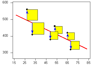
This line is called the least-squares regression line, and, as we’ll see, it fits the linear pattern of the data very well.
For the remainder of this lesson, you’ll need to feel comfortable with the algebra of a straight line. In particular you’ll need to be familiar with the slope and the intercept in the equation of a line, and their interpretation.
Many Students Wonder: Algebra Review – Linear Equation
Interactive Applet: Linear Equations – Effect of Changing the Slope or Intercept on the Line
Like any other line, the equation of the least-squares regression line for summarizing the linear relationship between the response variable (Y) and the explanatory variable (X) has the form: Y = a + bX
All we need to do is calculate the intercept a, and the slope b, which we will learn to do using software.
The slope of the least squares regression line can be interpreted as the estimated (or predicted) change in the mean (or average) value of the response variable when the explanatory variable increases by 1 unit.
Let’s revisit our age-distance example, and find the least-squares regression line. The following output will be helpful in getting the 5 values we need:

- Dependent Variable: Distance
- Independent Variable: Age
- Correlation Coefficient (r) = -0.7929
- The least squares regression line for this example is:
Distance \(= 576 + (-3 * \text{ Age}\)
- This means that for every 1-unit increase of the explanatory variable, there is, on average, a 3-unit decrease in the response variable. The interpretation in context of the slope (-3) is, therefore: In this dataset, when age increases by 1 year the average maximum distance at which subjects can read a sign is expected to decrease by 3 feet.
- Here is the regression line plotted on the scatterplot:
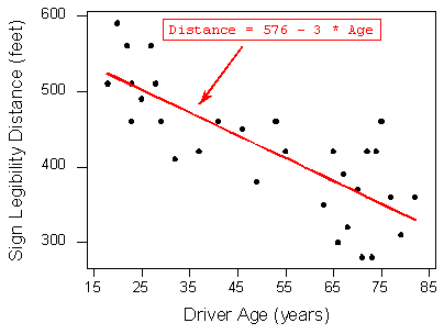
As we can see, the regression line fits the linear pattern of the data quite well.
Let’s go back now to our motivating example, in which we wanted to predict the maximum distance at which a sign is legible for a 60-year-old. Now that we have found the least squares regression line, this prediction becomes quite easy:
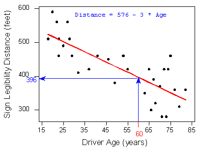
Practically, what the figure tells us is that in order to find the predicted legibility distance for a 60-year-old, we plug Age = 60 into the regression line equation, to find that:
Predicted distance = 576 + (- 3 * 60) = 396
396 feet is our best prediction for the maximum distance at which a sign is legible for a 60-year-old.
Did I Get This?: Linear Regression
Comment About Predictions:
- Suppose a government agency wanted to design a sign appropriate for an even wider range of drivers than were present in the original study. They want to predict the maximum distance at which the sign would be legible for a 90-year-old. Using the least squares regression line again as our summary of the linear dependence of the distances upon the drivers’ ages, the agency predicts that 90-year-old drivers can see the sign at no more than 576 + (- 3 * 90) = 306 feet:
82. The equation of the regression line is Distance = 576 - 3 * Age" height="274" loading="lazy" src="http://phhp-faculty-cantrell.sites.m...2-linear16.gif" title="The scatterplot for Driver Age vs. Sign Legibility Distance. The scales of both axes have been enlarged so that the regression line has room on the right to be extended past where data exists. The regression line is negative, so it grows from the upper left to the lower right of the plot. Where the regression line is creating an estimate in between existing data, it is red. Beyond that, where there are no data points, the line is green. This area is x>82. The equation of the regression line is Distance = 576 - 3 * Age" width="405">
(The green segment of the line is the region of ages beyond 82, the age of the oldest individual in the study.)
Question: Is our prediction for 90-year-old drivers reliable?
Answer: Our original age data ranged from 18 (youngest driver) to 82 (oldest driver), and our regression line is therefore a summary of the linear relationship in that age range only. When we plug the value 90 into the regression line equation, we are assuming that the same linear relationship extends beyond the range of our age data (18-82) into the green segment. There is no justification for such an assumption. It might be the case that the vision of drivers older than 82 falls off more rapidly than it does for younger drivers. (i.e., the slope changes from -3 to something more negative). Our prediction for age = 90 is therefore not reliable.
In General
Prediction for ranges of the explanatory variable that are not in the data is called extrapolation. Since there is no way of knowing whether a relationship holds beyond the range of the explanatory variable in the data, extrapolation is not reliable, and should be avoided. In our example, like most others, extrapolation can lead to very poor or illogical predictions.
Interactive Applets: Linear Regression
Learn By Doing: Linear Regression (Software)
Let’s Summarize
- A special case of the relationship between two quantitative variables is the linear relationship. In this case, a straight line simply and adequately summarizes the relationship.
- When the scatterplot displays a linear relationship, we supplement it with the correlation coefficient (r), which measures the strength and direction of a linear relationship between two quantitative variables. The correlation ranges between -1 and 1. Values near -1 indicate a strong negative linear relationship, values near 0 indicate a weak linear relationship, and values near 1 indicate a strong positive linear relationship.
- The correlation is only an appropriate numerical measure for linear relationships, and is sensitive to outliers. Therefore, the correlation should only be used as a supplement to a scatterplot (after we look at the data).
- The most commonly used criterion for finding a line that summarizes the pattern of a linear relationship is “least squares.” The least squares regression line has the smallest sum of squared vertical deviations of the data points from the line.
- The slope of the least squares regression line can be interpreted as the estimated (or predicted) change in the mean (or average) value of the response variable when the explanatory variable increases by 1 unit.
- The intercept of the least squares regression line is the average value of the response variable when the explanatory variable is zero. Thus, this is only of interest if it makes sense for the explanatory variable to be zero AND we have observed data in that range (explanatory variable around zero) in our sample.
- The least squares regression line predicts the value of the response variable for a given value of the explanatory variable. Extrapolation is prediction of values of the explanatory variable that fall outside the range of the data. Since there is no way of knowing whether a relationship holds beyond the range of the explanatory variable in the data, extrapolation is not reliable, and should be avoided.

