
2.4: Permutation testing for the two sample mean situation
- Page ID
- 33217

In any testing situation, you must define some function of the observations that gives us a single number that addresses our question of interest. This quantity is called a test statistic. These often take on complicated forms and have names like \(t\) or \(z\) statistics that relate to their parametric (named) distributions so we know where to look up p-values34. In randomization settings, they can have simpler forms because we use the data set to find the distribution of the statistic under the null hypothesis and don’t need to rely on a named distribution. We will label our test statistic T (for Test statistic) unless the test statistic has a commonly used name. Since we are interested in comparing the means of the two groups, we can define
\[T = \bar{x}_\text{commute} - \bar{x}_\text{casual},\]
which coincidentally is what the diffmean function and the second coefficient from the lm provided us previously. We label our observed test statistic (the one from the original data set) as
\[T_{obs} = \bar{x}_\text{commute} - \bar{x}_\text{casual},\]
which happened to be -25.933 cm here. We will compare this result to the results for the test statistic that we obtain from permuting the group labels. To denote permuted results, we will add an * to the labels:
\[T^* = \bar{x}_{\text{commute}^*}-\bar{x}_{\text{casual}^*}.\]
We then compare the \(T_{obs} = \bar{x}_\text{commute} - \bar{x}_\text{casual} = -25.933\) to the distribution of results that are possible for the permuted results (\(T^*\)) which corresponds to assuming the null hypothesis is true.
We need to consider lots of permutations to do a permutation test. In contrast to your introductory statistics course where, if you did this, it was just a click away, we are going to learn what was going on “under the hood” of the software you were using. Specifically, we need a for loop in R to be able to repeatedly generate the permuted data sets and record \(T^*\) for each one. Loops are a basic programming task that make randomization methods possible as well as potentially simplifying any repetitive computing task. To write a “for loop”, we need to choose how many times we want to do the loop (call that B) and decide on a counter to keep track of where we are at in the loops (call that b, which goes from 1 up to B). The simplest loop just involves printing out the index, print(b) at each step. This is our first use of curly braces, { and }, that are used to group the code we want to repeatedly run as we proceed through the loop. By typing the following code in a code chunk and then highlighting it all and hitting the run button, R will go through the loop B = 5 times, printing out the counter:
B <- 5
for (b in (1:B)){
  print(b)
}
Note that when you highlight and run the code, it will look about the same with “+” printed after the first line to indicate that all the code is connected when it appears in the console, looking like this:
> for(b in (1:B)){
+   print(b)
+ }
When you run these three lines of code (or compile a .Rmd file that contains this), the console will show you the following output:
[1] 1
[1] 2
[1] 3
[1] 4
[1] 5
Instead of printing the counter, we want to use the loop to repeatedly compute our test statistic across B random permutations of the observations. The shuffle function performs permutations of the group labels relative to responses and the coef(lmP)[2] extracts the estimated difference in the two group means in the permuted data set. For a single permutation, the combination of shuffling Condition and finding the difference in the means, storing it in a variable called Ts is:
lmP <- lm(Distance ~ shuffle(Condition), data = dsample)
Ts <- coef(lmP)[2]
Ts
## shuffle(Condition)commute
## -0.06666667And putting this inside the print function allows us to find the test statistic under 5 different permutations easily:
B <- 5
for (b in (1:B)){
  lmP <- lm(Distance ~ shuffle(Condition), data = dsample)
  Ts <- coef(lmP)[2]
  print(Ts)
}
## shuffle(Condition)commute
## -1.4
## shuffle(Condition)commute
## 1.133333
## shuffle(Condition)commute
## 20.86667
## shuffle(Condition)commute
## 3.133333
## shuffle(Condition)commute
## -2.333333Finally, we would like to store the values of the test statistic instead of just printing them out on each pass through the loop. To do this, we need to create a variable to store the results, let’s call it Tstar. We know that we need to store B results so will create a vector35 of length B, which contains B elements, full of missing values (NA) using the matrix function with the nrow option specifying the number of elements:
Tstar <- matrix(NA, nrow = B)
Tstar
## [,1]
## [1,] NA
## [2,] NA
## [3,] NA
## [4,] NA
## [5,] NANow we can run our loop B times and store the results in Tstar.
for (b in (1:B)){
  lmP <- lm(Distance ~ shuffle(Condition), data = dsample)
  Tstar[b] <- coef(lmP)[2]
}
# Print out the results stored in Tstar with the next line of codeTstar## [,1]
## [1,] -5.400000
## [2,] -3.266667
## [3,] -7.933333
## [4,] 13.133333
## [5,] -6.466667Five permutations are still not enough to assess whether our \(T_{obs}\) of -25.933 is unusual and we need to do many permutations to get an accurate assessment of the possibilities under the null hypothesis. It is common practice to consider something like 1,000 permutations. The Tstar vector when we set B to be large, say B = 1000, contains the permutation distribution for the selected test statistic under36 the null hypothesis – what is called the null distribution of the statistic. The null distribution is the distribution of possible values of a statistic under the null hypothesis. We want to visualize this distribution and use it to assess how unusual our \(T_{obs}\) result of -25.933 cm was relative to all the possibilities under permutations (under the null hypothesis). So we repeat the loop, now with \(B = 1000\) and generate a histogram (modified to add counts to the bars using stat_bin37), density curve, and summary statistics of the results:
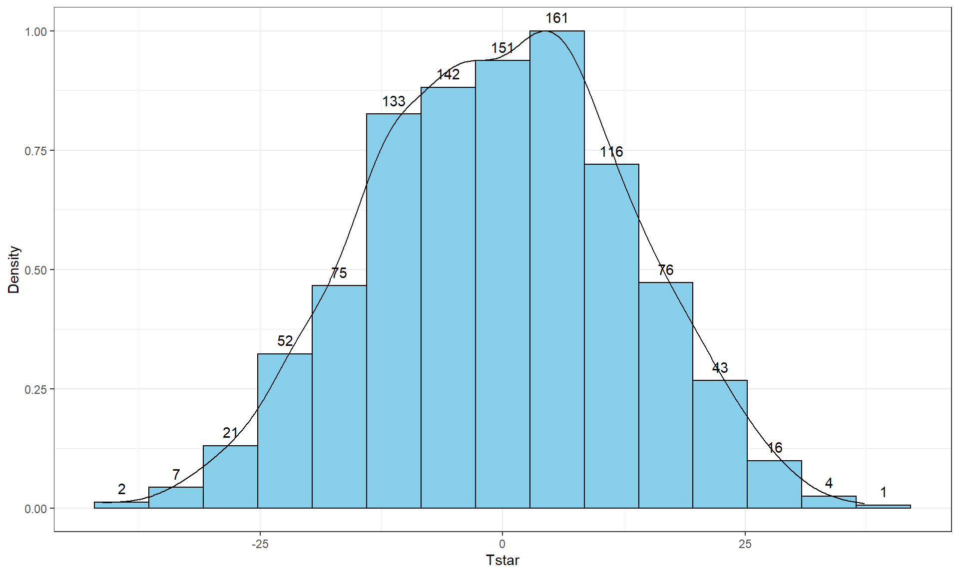
B <- 1000
Tstar <- matrix(NA, nrow = B)
for (b in (1:B)){
  lmP <- lm(Distance ~ shuffle(Condition), data = dsample)
  Tstar[b] <- coef(lmP)[2]
}tibble(Tstar) %>% ggplot(aes(x = Tstar)) +
geom_histogram(aes(y = ..ncount..), bins = 15, col = 1, fill = "skyblue", center = 0) +
geom_density(aes(y = ..scaled..)) +
theme_bw() +
labs(y = "Density") +
stat_bin(aes(y = ..ncount.., label = ..count..), bins = 15, geom = "text", vjust = -0.75)
favstats(Tstar)## min Q1 median Q3 max mean sd n missing
## -41.26667 -10.06667 -0.3333333 8.6 37.26667 -0.5054667 13.17156 1000 0Figure 2.8 contains visualizations of \(T^*\) and the favstats summary provides the related numerical summaries. Our observed \(T_{obs}\) of -25.933 seems somewhat unusual relative to these results with only 30 \(T^*\) values smaller than -25 based on the histogram. We need to make more specific comparisons of the permuted results versus our observed result to be able to clearly decide whether our observed result is really unusual.
To make the comparisons more concrete, first we can enhance the previous graphs by adding the value of the test statistic from the real data set, as shown in Figure 2.9, using the geom_vline function to draw a vertical line at our \(T_{obs}\) value specified in the xintercept option. Notice the order of the parameters. The code for the vertical line is before the code for the bin counts. This order is prefered so that the counts are still readable if the vertical line and a bin count are in the same horizontal position.
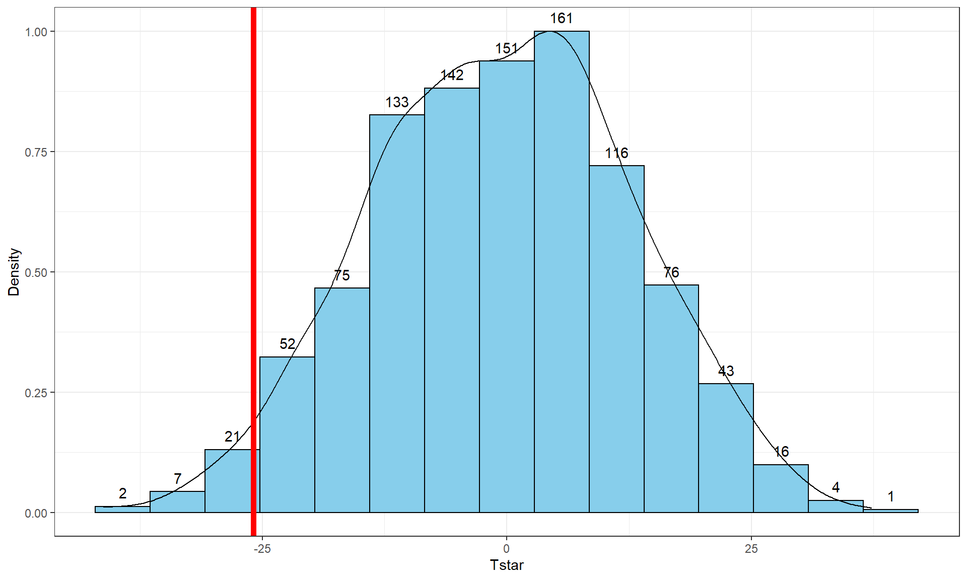
Tobs <- -25.933
tibble(Tstar) %>% ggplot(aes(x = Tstar)) +
  geom_histogram(aes(y = ..ncount..), bins = 15, col = 1, fill = "skyblue", center = 0) +
  geom_density(aes(y = ..scaled..)) +
  theme_bw() +
  labs(y = "Density") +
  geom_vline(xintercept = Tobs, col = "red", lwd = 2) +
  stat_bin(aes(y = ..ncount.., label = ..count..), bins = 15, geom = "text", vjust = -0.75)
Second, we can calculate the exact number of permuted results that were as small or smaller than what we observed. To calculate the proportion of the 1,000 values that were as small or smaller than what we observed, we will use the pdata function. To use this function, we need to provide the distribution of values to compare to the cut-off (Tstar), the cut-off point (Tobs), and whether we want calculate the proportion that are below (left of) or above (right of) the cut-off (lower.tail = T option provides the proportion of values to the left of (below) the cutoff of interest).
pdata(Tstar, Tobs, lower.tail = T)[[1]]## [1] 0.027The proportion of 0.027 tells us that 27 of the 1,000 permuted results (2.7%) were as small or smaller than what we observed. This type of work is how we can generate p-values using permutation distributions. P-values, as you should remember, are the probability of getting a result as extreme as or more extreme than what we observed, \(\underline{\text{given that the null is true}}\). Finding only 27 permutations of 1,000 that were as small or smaller than our observed result suggests that it is hard to find a result like what we observed if there really were no difference, although it is not impossible.
When testing hypotheses for two groups, there are two types of alternative hypotheses, one-sided or two-sided. One-sided tests involve only considering differences in one-direction (like \(\mu_1 > \mu_2\)) and are performed when researchers can decide a priori38 which group should have a larger mean if there is going to be any sort of difference. In this situation, we did not know enough about the potential impacts of the outfits to know which group should be larger than the other so should do a two-sided test. It is important to remember that you can’t look at the responses to decide on the hypotheses. It is often safer and more conservative39 to start with a two-sided alternative (\(\mathbf{H_A: \mu_1 \ne \mu_2}\)). To do a 2-sided test, find the area smaller than what we observed as above (or larger if the test statistic had been positive). We also need to add the area in the other tail (here the right tail) similar to what we observed in the right tail. Some statisticians suggest doubling the area in one tail but we will collect information on the number that were as or more extreme than the same value in the other tail40. In other words, we count the proportion below -25.933 and over 25.933. So we need to find how many of the permuted results were larger than or equal to 25.933 cm to add to our previous proportion. Using pdata with -Tobs as the cut-off and lower.tail = F provides this result:
pdata(Tstar, -Tobs, lower.tail = F)[[1]]## [1] 0.017So the p-value to test our null hypothesis of no difference in the true means between the groups is 0.027 + 0.017, providing a p-value of 0.044. Figure 2.10 shows both cut-offs on the histogram and density curve.

tibble(Tstar) %>% ggplot(aes(x = Tstar)) +
  geom_histogram(aes(y = ..ncount..), bins = 15, col = 1, fill = "skyblue", center = 0) +
  geom_density(aes(y = ..scaled..)) +
  theme_bw() +
  labs(y = "Density") +
  geom_vline(xintercept = c(-1,1)*Tobs, col = "red", lwd = 2) +
  stat_bin(aes(y = ..ncount.., label = ..count..), bins = 15,
           geom = "text", vjust = -0.75)
In general, the one-sided test p-value is the proportion of the permuted results that are as extreme or more extreme than observed in the direction of the alternative hypothesis (lower or upper tail, remembering that this also depends on the direction of the difference taken). For the two-sided test, the p-value is the proportion of the permuted results that are less than or equal to the negative version of the observed statistic and greater than or equal to the positive version of the observed statistic. Using absolute values (| |), we can simplify this: the two-sided p-value is the proportion of the |permuted statistics| that are as large or larger than |observed statistic|. This will always work and finds areas in both tails regardless of whether the observed statistic is positive or negative. In R, the abs function provides the absolute value and we can again use pdata to find our p-value in one line of code:
pdata(abs(Tstar), abs(Tobs), lower.tail = F)[[1]]## [1] 0.044We will encourage you to think through what might constitute strong evidence against your null hypotheses and then discuss how strong you feel the evidence is against the null hypothesis in the p-value that you obtained. Basically, p-values present a measure of evidence against the null hypothesis, with smaller values presenting more evidence against the null. They range from 0 to 1 and you should interpret them on a graded scale from strong evidence (close to 0) to little evidence to no evidence (1). We will discuss the use of a fixed significance level below as it is still commonly used in many fields and is necessary to discuss to think about the theory of hypothesis testing, but, for the moment, we can say that there is moderate evidence against the null hypothesis presented by having a p-value of 0.044 because our observed result is somewhat rare relative to what we would expect if the null hypothesis was true. And so we might conclude (in the direction of the alternative) that there is a difference in the population means in the two groups, but that depends on what you think about how unusual that result was. It is also reasonable to feel that this is not sufficient evidence to conclude that there is a difference in the true means even though many people feel that p-values less than 0.05 are fairly strong evidence against the null hypothesis. If you do not rate this as strong enough evidence (or in general obtain weak evidence) to conclude that there is a difference, then you can only say that there might not be a difference in the means. We can’t conclude that the null hypothesis is true – we just failed to find enough evidence to be sure that it is wrong. It might still be wrong but we couldn’t detect it, either as a mistake because of an unusual sample from our population, or because our sample size was not large enough to detect the size of difference in the populations, or results with larger p-values could happen because there really isn’t a difference. We don’t know which of these might be the truth and certainly don’t know that the null hypothesis is true even if the p-value obtained is 141.
Before we move on, let’s note some interesting features of the permutation distribution of the difference in the sample means shown in Figure 2.10.
- It is basically centered at 0. Since we are performing permutations assuming the null model is true, we are assuming that \(\mu_1 = \mu_2\) which implies that \(\mu_1 - \mu_2 = 0\). This also suggests that 0 should be the center of the permutation distribution and it was.
- It is approximately normally distributed. This is due to the Central Limit Theorem42, where the sampling distribution (distribution of all possible results for samples of this size) of the difference in sample means (\(\bar{x}_1 - \bar{x}_2\)) becomes more normally distributed as the sample sizes increase. With 15 observations in each group, we have no guarantee to have a relatively normal looking distribution of the difference in the sample means but with the distributions of the original observations looking somewhat normally distributed, the sampling distribution of the sample means likely will look fairly normal. This result will allow us to use a parametric method to approximate this sampling distribution under the null model if some assumptions are met, as we’ll discuss below.
- Our observed difference in the sample means (-25.933) is a fairly unusual result relative to the rest of these results but there are some permuted data sets that produce more extreme differences in the sample means. When the observed differences are really large, we may not see any permuted results that are as extreme as what we observed. When
pdatagives you 0, the p-value should be reported to be smaller than 0.001 (not 0!) if B is 1,000 since it happened in less than 1 in 1,000 tries but does occur once – in the actual data set. This applies to any p-values when they are very small – just report them as less than 0.001, or 0.0001 if you prefer that next smaller upper limit, when they are under these values. - Since our null model is not specific about the direction of the difference, considering a result like ours but in the other direction (25.933 cm) needs to be included. The observed result seems to put about the same area in both tails of the distribution but it is not exactly the same. The small difference in the tails is a useful aspect of this approach compared to the parametric method discussed below as it accounts for potential asymmetry in the sampling distribution.
Earlier, we decided that the p-value provided moderate evidence against the null hypothesis. You should use your own judgment about whether the p-value obtain is sufficiently small to conclude that you think the null hypothesis is wrong. Remembering that the p-value is the probability you would observe a result like you did (or more extreme), assuming the null hypothesis is true; this tells you that the smaller the p-value is, the more evidence you have against the null. Figure 2.11 provides a diagram of some suggestions for the graded p-value interpretation that you can use. The next section provides a more formal review of the hypothesis testing infrastructure, terminology, and some of things that can happen when testing hypotheses. P-values have been (validly) criticized for the inability of studies to be reproduced, for the bias in publications to only include studies that have small p-values, and for the lack of thought that often accompanies using a fixed significance level to make decisions (and only focusing on that decision). To alleviate some of these criticisms, we recommend reporting the strength of evidence of the result based on the p-value and also reporting and discussing the size of the estimated results (with a measure of precision of the estimated difference). We will explore the implications of how p-values are used in scientific research in Section 2.8.
