
2.1: Data wrangling and density curves
- Page ID
- 33214

Part of learning statistics is learning to correctly use the terminology, some of which is used colloquially differently than it is used in formal statistical settings. The most commonly “misused” statistical term is data. In statistical parlance, we want to note the plurality of data. Specifically, datum is a single measurement, possibly on multiple random variables, and so it is appropriate to say that “a datum is…”. Once we move to discussing data, we are now referring to more than one observation, again on one, or possibly more than one, random variable, and so we need to use “data are…” when talking about our observations. We want to distinguish our use of the term “data” from its more colloquial15 usage that often involves treating it as singular. In a statistical setting “data” refers to measurements of our cases or units. When we summarize the results of a study (say providing the mean and SD), that information is not “data”. We used our data to generate that information. Sometimes we also use the term “data set” to refer to all our observations and this is a singular term to refer to the group of observations and this makes it really easy to make mistakes on the usage of “data”16.
It is also really important to note that variables have to vary – if you measure the level of education of your subjects but all are high school graduates, then you do not have a “variable”. You may not know if you have real variability in a “variable” until you explore the results you obtained.
The last, but probably most important, aspect of data is the context of the measurement. The “who, what, when, and where” of the collection of the observations is critical to the sort of conclusions we can make based on the results. The information on the study design provides information required to assess the scope of inference (SOI) of the study (see Table 2.1 for more on SOI). Generally, remember to think about the research questions the researchers were trying to answer and whether their study actually would answer those questions. There are no formulas to help us sort some of these things out, just critical thinking about the context of the measurements.
To make this concrete, consider the data collected from a study (Walker, Garrard, and Jowitt 2014) to investigate whether clothing worn by a bicyclist might impact the passing distance of cars. One of the authors wore seven different outfits (outfit for the day was chosen randomly by shuffling seven playing cards) on his regular 26 km commute near London in the United Kingdom. Using a specially instrumented bicycle, they measured how close the vehicles passed to the widest point on the handlebars. The seven outfits (“conditions”) that you can view at www.sciencedirect.com/science/article/pii/S0001457513004636 were:
- COMMUTE: Plain cycling jersey and pants, reflective cycle clips, commuting helmet, and bike gloves.
- CASUAL: Rugby shirt with pants tucked into socks, wool hat or baseball cap, plain gloves, and small backpack.
- HIVIZ: Bright yellow reflective cycle commuting jacket, plain pants, reflective cycle clips, commuting helmet, and bike gloves.
- RACER: Colorful, skin-tight, Tour de France cycle jersey with sponsor logos, Lycra bike shorts or tights, race helmet, and bike gloves.
- NOVICE: Yellow reflective vest with “Novice Cyclist, Pass Slowly” and plain pants, reflective cycle clips, commuting helmet, and bike gloves.
- POLICE: Yellow reflective vest with “POLICEwitness.com – Move Over – Camera Cyclist” and plain pants, reflective cycle clips, commuting helmet, and bike gloves.
- POLITE: Yellow reflective vest with blue and white checked banding and the words “POLITE notice, Pass Slowly” looking similar to a police jacket and plain pants, reflective cycle clips, commuting helmet, and bike gloves.
They collected data (distance to the vehicle in cm for each car “overtake”) on between 8 and 11 rides in each outfit and between 737 and 868 “overtakings” across these rides. The outfit is a categorical predictor or explanatory variable) that has seven different levels here. The distance is the response variable and is a quantitative variable here17. Note that we do not have the information on which overtake came from which ride in the data provided or the conditions related to individual overtake observations other than the distance to the vehicle (they only included overtakings that had consistent conditions for the road and riding).
The data are posted on my website18 at http://www.math.montana.edu/courses/s217/documents/Walker2014_mod.csv if you want to download the file to a local directory and then import the data into R using “Import Dataset”. Or you can use the code in the following code chunk to directly read the data set into R using the URL.
suppressMessages(library(readr))
dd <- read_csv("http://www.math.montana.edu/courses/s217/documents/Walker2014_mod.csv")
It is always good to review the data you have read by running the code and printing the tibble by typing the tibble name (here > dd) at the command prompt in the console, using the View function, (here View(dd)), to open a spreadsheet-like view, or using the head and tail functions to show the first and last six observations:
head(dd)## # A tibble: 6 × 8
## Condition Distance Shirt Helmet Pants Gloves ReflectClips Backpack
## <chr> <dbl> <chr> <chr> <chr> <chr> <chr> <chr>
## 1 casual 132 Rugby hat plain plain no yes
## 2 casual 137 Rugby hat plain plain no yes
## 3 casual 174 Rugby hat plain plain no yes
## 4 casual 82 Rugby hat plain plain no yes
## 5 casual 106 Rugby hat plain plain no yes
## 6 casual 48 Rugby hat plain plain no yestail(dd)## # A tibble: 6 × 8
## Condition Distance Shirt Helmet Pants Gloves ReflectClips Backpack
## <chr> <dbl> <chr> <chr> <chr> <chr> <chr> <chr>
## 1 racer 122 TourJersey race lycra bike yes no
## 2 racer 204 TourJersey race lycra bike yes no
## 3 racer 116 TourJersey race lycra bike yes no
## 4 racer 132 TourJersey race lycra bike yes no
## 5 racer 224 TourJersey race lycra bike yes no
## 6 racer 72 TourJersey race lycra bike yes noAnother option is to directly access specific rows and/or columns of the tibble, especially for larger data sets. In objects containing data, we can select certain rows and columns using the brackets, [..., ...], to specify the row (first element) and column (second element). For example, we can extract the datum in the fourth row and second column using dd[4,2]:
dd[4,2]## # A tibble: 1 × 1
## Distance
## <dbl>
## 1 82This provides the distance (in cm) of a pass at 82 cm. To get all of either the rows or columns, a space is used instead of specifying a particular number. For example, the information in all the columns on the fourth observation can be obtained using dd[4, ]:
dd[4,]## # A tibble: 1 × 8
## Condition Distance Shirt Helmet Pants Gloves ReflectClips Backpack
## <chr> <dbl> <chr> <chr> <chr> <chr> <chr> <chr>
## 1 casual 82 Rugby hat plain plain no yesSo this was an observation from the casual condition that had a passing distance of 82 cm. The other columns describe some other specific aspects of the condition. To get a more complete sense of the data set, we can extract a suite of observations from each condition using their row numbers concatenated, c(), together, extracting all columns for two observations from each of the conditions based on their rows.
dd[c(1, 2, 780, 781, 1637, 1638, 2374, 2375, 3181, 3182, 3971, 3972, 4839, 4840),]## # A tibble: 14 × 8
## Condition Distance Shirt Helmet Pants Gloves ReflectClips Backpack
## <chr> <dbl> <chr> <chr> <chr> <chr> <chr> <chr>
## 1 casual 132 Rugby hat plain plain no yes
## 2 casual 137 Rugby hat plain plain no yes
## 3 commute 70 PlainJersey commuter plain bike yes no
## 4 commute 151 PlainJersey commuter plain bike yes no
## 5 hiviz 94 Jacket commuter plain bike yes no
## 6 hiviz 145 Jacket commuter plain bike yes no
## 7 novice 12 Vest_Novice commuter plain bike yes no
## 8 novice 122 Vest_Novice commuter plain bike yes no
## 9 police 113 Vest_Police commuter plain bike yes no
## 10 police 174 Vest_Police commuter plain bike yes no
## 11 polite 156 Vest_Polite commuter plain bike yes no
## 12 polite 14 Vest_Polite commuter plain bike yes no
## 13 racer 104 TourJersey race lycra bike yes no
## 14 racer 141 TourJersey race lycra bike yes noNow we can see the Condition variable seems to have seven different levels, the Distance variable contains the overtake distance, and then a suite of columns that describe aspects of each outfit, such as the type of shirt or whether reflective cycling clips were used or not. We will only use the “Distance” and “Condition” variables to start with.
When working with data, we should always start with summarizing the sample size. We will use n for the number of subjects in the sample and denote the population size (if available) with N. Here, the sample size is n = 5690. In this situation, we do not have a random sample from a population (these were all of the overtakes that met the criteria during the rides) so we cannot make inferences from our sample to a larger group (other rides or for other situations like different places, times, or riders). But we can assess whether there is a causal effect19: if sufficient evidence is found to conclude that there is some difference in the responses across the conditions, we can attribute those differences to the treatments applied, since the overtake events should be same otherwise due to the outfit being randomly assigned to the rides. The story of the data set – that it was collected on a particular route for a particular rider in the UK – becomes pretty important in thinking about the ramifications of any results. Are drivers and roads in Montana or South Dakota different from drivers and roads near London? Are the road and traffic conditions likely to be different? If so, then we should not assume that the detected differences, if detected, would also exist in some other location for a different rider. The lack of a random sample here from all the overtakes in the area (or more generally all that happen around the world) makes it impossible to assume that this set of overtakes might be like others. So there are definite limitations to the inferences in the following results. But it is still interesting to see if the outfits worn caused a difference in the mean overtake distances, even though the inferences are limited to the conditions in this individual’s commute. If this had been an observational study (suppose that the researcher could select their outfit), then we would have to avoid any of the “causal” language that we can consider here because the outfits were not randomly assigned to the rides. Without random assignment, the explanatory variable of outfit choice could be confounded with another characteristic of rides that might be related to the passing distances, such as wearing a particular outfit because of an expectation of heavy traffic or poor light conditions. Confounding is not the only reason to avoid causal statements with non-random assignment but the inability to separate the effect of other variables (measured or unmeasured) from the differences we are observing means that our inferences in these situations need to be carefully stated to avoid implying causal effects.
In order to get some summary statistics, we will rely on the R package called mosaic (Pruim, Kaplan, and Horton 2021a) as introduced previously. First (but only once), you need to install the package, which can be done either using the Packages tab in the lower right panel of RStudio or using the install.packages function with quotes around the package name:
> install.packages("mosaic")If you open a .Rmd file that contains code that incorporates packages and they are not installed, the bar at the top of the R Markdown document will prompt you to install those missing packages. This is the easiest way to get packages you might need installed. After making sure that any required packages are installed, use the library function around the package name (no quotes now!) to load the package, something that you need to do any time you want to use features of a package.
library(mosaic)When you are loading a package, R might mention a need to install other packages. If the output says that it needs a package that is unavailable, then follow the same process noted above to install that package and then repeat trying to load the package you wanted. These are called package “dependencies” and are due to one package developer relying on functions that already exist in another package.
With tibbles, you have to declare categorical variables as “factors” to have R correctly handle the variables using the factor function, either creating a new variable or replacing the “character” version of the variable that is used to read in the data initially. The following code replaces the Condition character variable with a factor version of the same variable with the same name.
dd$Condition <- factor(dd$Condition)We use this sort of explicit declaration for either character coded (non-numeric) variables or for numerically coded variables where the numbers represent categories to force R to correctly work with the information on those variables. For quantitative variables, we do not need to declare their type and they are stored as numeric variables as long as there is no text in that column of the spreadsheet other than the variable name.
The one-at-a-time declaration of the variables as factors when there are many (here there are six more) creates repetitive and cumbersome code. There is another way of managing this and other similar related “data wrangling”20. To do this, we will combine using the pipe operator (%>% from the magrittr package or |> in base R) and using the mutate function from dplyr, both %>% and mutate are part of the tidyverse and start to help us write code that flows from left to right to accomplish multiple tasks. The pipe operator (%>% or |>) allows us to pass a data set to a function (sometimes more than one if you have multiple data wrangling tasks to complete – see work below) and there is a keyboard short-cut to get the combination of characters for it by using Ctrl+Shift+M on a PC or Cmd+Shift+M on a Mac. The mutate function allows us to create new columns or replace existing ones by using information from other columns, separating each additional operation by a comma (and a “return” for proper style). You will gradually see more reasons why we want to learn these functions, but for now this allows us to convert the character variables into factor variables within mutate and when we are all done to assign our final data set back in the same dd tibble that we started with.
dd <- dd %>% mutate(Shirt = factor(Shirt),
                    Helmet = factor(Helmet),
                    Pants = factor(Pants),
                    Gloves = factor(Gloves),
                    ReflectClips = factor(ReflectClips),
                    Backpack = factor(Backpack)
                    )
The first part of the codechunk (dd <-) is to save our work that follows into the dd tibble. The dd %>% mutate is translated as “take the tibble dd and apply the mutate function.” Inside the mutate function, each line has a variablename = factor(variablename) that declares each variable as a factor variable with the same name as in the original tibble.
With many variables in a data set and with some preliminary data wrangling completed, it is often useful to get some quick information about all of the variables; the summary function provides useful information whether the variables are categorical or quantitative and notes if any values were missing.
summary(dd)## Condition Distance Shirt Helmet Pants Gloves ReflectClips Backpack
## casual :779 Min. : 2.0 Jacket :737 commuter:4059 lycra: 852 bike :4911 no : 779 no :4911
## commute:857 1st Qu.: 99.0 PlainJersey:857 hat : 779 plain:4838 plain: 779 yes:4911 yes: 779
## hiviz :737 Median :117.0 Rugby :779 race : 852
## novice :807 Mean :117.1 TourJersey :852
## police :790 3rd Qu.:134.0 Vest_Novice:807
## polite :868 Max. :274.0 Vest_Police:790
## racer :852 Vest_Polite:868The output is organized by variable, providing summary information based on the type of variable, either counts by category for categorical variables or the 5-number summary plus the mean for the quantitative variable Distance. If present, you would also get a count of missing values that are called “NAs” in R. For the first variable, called Condition and that we might more explicitly name Outfit, we find counts of the number of overtakes for each outfit: \(779\) out of \(5,690\) were when wearing the casual outfit, \(857\) for “commute”, and the other observations from the other five outfits, with the most observations when wearing the “polite” vest. We can also see that overtake distances (variable Distance) ranged from 2 cm to 274 cm with a median of 117 cm.
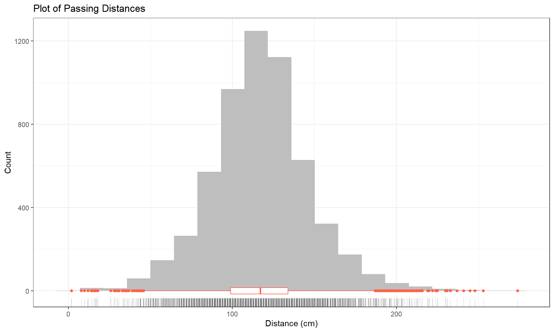
To accompany the numerical summaries, histograms and boxplots can provide some initial information on the shape of the distribution of the responses for the different Outfits. Figure 2.1 contains the histogram with a boxplot and a rug of Distance, all ignoring any information on which outfit was being worn. There are some additional layers and modifications in this version of the ggplot. The code uses our new pipe operator to pass our tibble into the ggplot, skipping the data = ... within ggplot(). There are some additional options modifying the title and the x- and y-axis labels inside the labs() part of the code, which will be useful for improving the labels in your plots and work across most plots made in the framework.
dd %>% ggplot(mapping = aes(x = Distance)) +
  geom_histogram(bins = 20, fill = "grey") +
  geom_rug(alpha = 0.1) +
  geom_boxplot(color = "tomato", width = 30) +
      # width used to scale boxplot to make it more visible
  theme_bw() +
  labs(title = "Plot of Passing Distances",
       x = "Distance (cm)",
       y = "Count")
Based on Figure 2.1, the distribution appears to be relatively symmetric with many observations in both tails flagged as potential outliers. Despite being flagged as potential outliers, they seem to be part of a common distribution. In real data sets, outliers are commonly encountered and the first step is to verify that they were not errors in recording (if so, fixing or removing them is easily justified). If they cannot be easily dismissed or fixed, the next step is to study their impact on the statistical analyses performed, potentially considering reporting results with and without the influential observation(s) in the results (if there are just handful). If the analysis is unaffected by the “unusual” observations, then it matters little whether they are dropped or not. If they do affect the results, then reporting both versions of results allows the reader to judge the impacts for themselves. It is important to remember that sometimes the outliers are the most interesting part of the data set. For example, those observations that were the closest would be of great interest, whether they are outliers or not.
Often when statisticians think of distributions of data, we think of the smooth underlying shape that led to the data set that is being displayed in the histogram. Instead of binning up observations and making bars in the histogram, we can estimate what is called a density curve as a smooth curve that represents the observed distribution of the responses. Density curves can sometimes help us see features of the data sets more clearly.
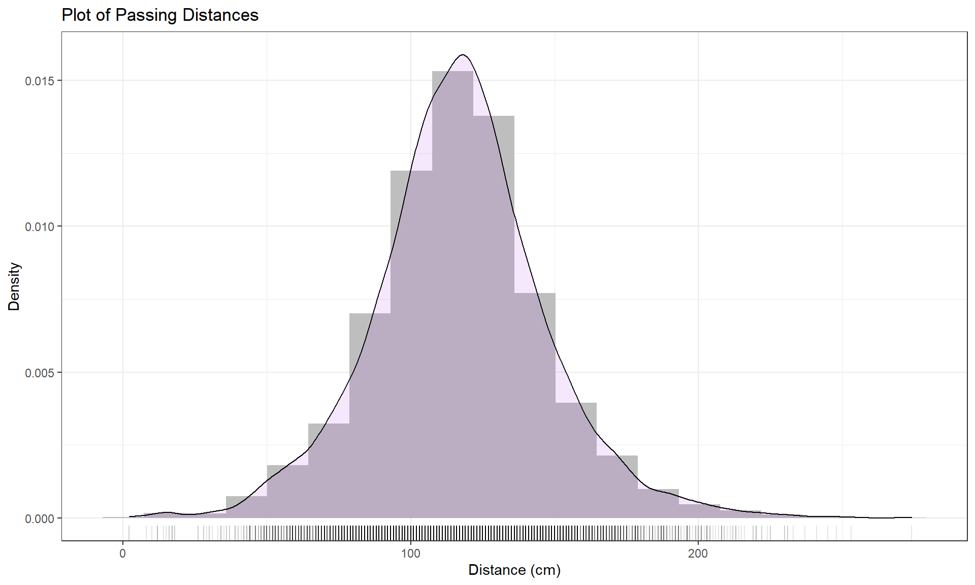
To understand the density curve, it is useful to initially see the histogram and density curve together. The height of the density curve is scaled so that the total area under the curve21 is 1. To make a comparable histogram, the y-axis needs to be scaled so that the histogram is also on the “density” scale which makes the bar heights adjust so that the proportion of the total data set in each bar is represented by the area in each bar (remember that area is height times width). So the height depends on the width of the bars and the total area across all the bars has to be 1. In the geom_histogram, its aesthetic is modified using the (cryptic22) code of (y = ..density..). The density curve is added to the histogram using the geom_density, producing the result in Figure 2.2 with added modifications for filling the density curve but using alpha = 0.1 to make the density curve fill transparent (alpha values range between 0 and 1 with lower values providing more transparency) and in purple (fill = purple). You can see how the density curve somewhat matches the histogram bars but deals with the bumps up and down and edges a little differently. We can pick out the relatively symmetric distribution using either display and will rarely make both together.
dd %>% ggplot(mapping = aes(x = Distance)) +
  geom_histogram(bins = 15, fill = "grey", aes(y = ..density..)) +
  geom_density(fill = "purple", alpha = 0.1) +
  geom_rug(alpha = 0.1) +
  theme_bw() +
  labs(title = "Plot of Passing Distances",
       x = "Distance (cm)",
       y = "Density")
Histograms can be sensitive to the choice of the number of bars and even the cut-offs used to define the bins for a given number of bars. Small changes in the definition of cut-offs for the bins can have noticeable impacts on the shapes observed but this does not impact density curves. We have engaged the arbitrary choice of the number of bins, but we can add information on the original observations being included in each bar to better understand the choices that geom_hist is making. We can (barely) see how there are 2 observations at 2 cm (the noise added generates a wider line than for an individual observation so it is possible to see that it is more than one observation there but I had to check the data set to confirm this). A limitation of the histogram arises at the center of the distribution where the bar that goes from approximately 110 to 120 cm suggests that the mode (peak) is in this range (but it is unclear where) but the density curve suggests that the peak is closer to 120 than 110. Both density curves and histograms can react to individual points in the tails of distributions, but sometimes in different ways.
The graphical tools we’ve just discussed are going to help us move to comparing the distribution of responses across more than one group. We will have two displays that will help us make these comparisons. The simplest is the side-by-side boxplot, where a boxplot is displayed for each group of interest using the same y-axis scaling. In the base R boxplot function, we can use its formula notation to see if the response (Distance) differs based on the group (Condition) by using something like Y ~ X or, here, Distance ~ Condition. We also need to tell R where to find the variables – use the last option in the command, data = DATASETNAME , to inform R of the tibble to look in to find the variables. In this example, data = dd. We will use the formula and data = ... options in almost every function we use from here forward, except in ggplot which has too many options for formulas to be useful.
Figure 2.3 contains the side-by-side boxplots showing similar distributions for all the groups, with a slightly higher median in the “police” group and some potential outliers identified in both tails of the distributions in all groups.
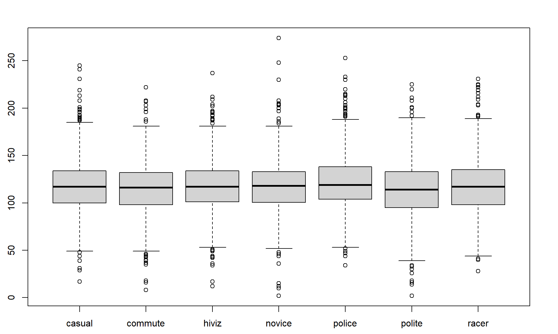
boxplot(Distance ~ Condition, data = dd)The “~” (which is read as the tilde symbol23, which you can find in the upper left corner of your keyboard) notation will be used in two ways in this material. The formula use in R employed previously declares that the response variable here is Distance and the explanatory variable is Condition. The other use for “~” is as shorthand for “is distributed as” and is used in the context of \(Y \sim N(0,1)\), which translates (in statistics) to defining the random variable Y as following a Normal distribution24 with mean 0 and variance of 1 (which also means that the standard deviation is 1). In the current situation, we could ask whether the Distance variable seems like it may follow a normal distribution in each group, in other words, is \(\text{Distance}\sim N(\mu,\sigma^2)\)? Since the responses are relatively symmetric, it is not clear that we have a violation of the assumption of the normality assumption for the Distance variable for any of the seven groups (more later on how we can assess this and the issues that occur when we have a violation of this assumption). Remember that \(\mu\) and \(\sigma\) are parameters where \(\mu\) (“mu”) is our standard symbol for the population mean and that \(\sigma\) (“sigma”) is the symbol of the population standard deviation and \(\sigma^2\) is the symbol of the population variance.