
8.11: Different slopes and different intercepts
- Page ID
- 33301

Sometimes researchers are specifically interested in whether the slopes vary across groups or the regression lines in the scatterplot for the different groups may not look parallel or it may just be hard to tell visually if there really is a difference in the slopes. Unless you are very sure that there is not an interaction between the grouping variable and the quantitative predictor, you should153 start by fitting a model containing an interaction and then see if you can drop it. It may be the case that you end up with the simpler additive model from the previous sections, but you don’t want to assume the same slope across groups unless you are absolutely sure that is the case. This should remind you a bit of the discussions of the additive and interaction models in the Two-way ANOVA material. The models, concerns, and techniques are very similar, but with the quantitative variable replacing one of the two categorical variables. As always, the scatterplot is a good first step to understanding whether we need the extra complexity that these models require.
A new example provides motivation for the consideration of different slopes and intercepts. A study was performed to address whether the relationship between nonverbal IQs and reading accuracy differs between dyslexic and non-dyslexic students. Two groups of students were identified, one group of dyslexic students was identified first (19 students) and then a group of gender and age similar student matches were identified (25 students) for a total sample size of \(n = 44\), provided in the dyslexic3 data set from the smdata package (Merkle and Smithson 2018). This type of study design is an attempt to “balance” the data from the two groups on some important characteristics to make the comparisons of the groups as fair as possible. The researchers attempted to balance the characteristics of the subjects in the two groups so that if they found different results for the two groups, they could attribute it to the main difference they used to create the groups – dyslexia or not. This design, case-control or case-comparison where each subject with a trait is matched to one or more subjects in the “control” group would hopefully reduce confounding from other factors and then allow stronger conclusions in situations where it is impossible to randomly assign treatments to subjects. We still would avoid using “causal” language but this design is about as good as you can get when you are unable to randomly assign levels to subjects.
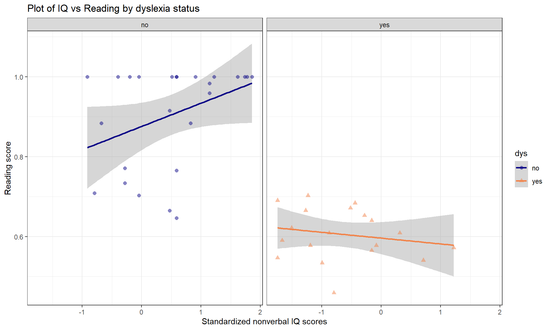
Using these data, we can explore the relationship between nonverbal IQ scores and reading accuracy, with reading accuracy measured as a proportion correct. The fact that there is an upper limit to the response variable attained by many students will cause complications below, but we can still learn something from our attempts to analyze these data using an MLR model. The scatterplot in Figure 8.31 seems to indicate some clear differences in the IQ vs reading score relationship between the dys = 0 (non-dyslexic) and dys = 1 (dyslexic) students (code below makes these levels more explicit in the data set). Note that the IQ is standardized to have mean 0 and standard deviation of 1 which means that a 1 unit change in IQ score is a 1 SD change and that the y-intercept (for \(x = 0\)) is right in the center of the plot and actually interesting154.
library(smdata)
data("dyslexic3")
dyslexic3 <- dyslexic3 %>% mutate(dys = factor(dys))
levels(dyslexic3$dys) <- c("no", "yes")

dyslexic3 %>% ggplot(mapping = aes(x = ziq, y = score, color = dys, shape = dys)) +
  geom_smooth(method = "lm") +
  geom_point(size = 2, alpha = 0.5) +
  theme_bw() +
  scale_color_viridis_d(end = 0.7, option = "plasma") +
  labs(title = "Plot of IQ vs Reading by dyslexia status",
       x = "Standardized nonverbal IQ scores",
       y = "Reading score") +
  facet_grid(cols = vars(dys))
To allow for both different \(y\)-intercepts and slope coefficients on the quantitative predictor, we need to include a “modification” of the slope coefficient. This is performed using an interaction between the two predictor variables where we allow the impacts of one variable (slopes) to change based on the levels of another variable (grouping variable). The formula notation is y ~ x * group, remembering that this also includes the main effects (the additive variable components) as well as the interaction coefficients; this is similar to what we discussed in the Two-Way ANOVA interaction model. We can start with the general model for a two-level categorical variable with an interaction, which is
\[y_i = \beta_0 + \beta_1x_i +\beta_2I_{\text{CatName},i} + {\color{red}{\boldsymbol{\beta_3I_{\text{CatName},i}x_i}}}+\varepsilon_i,\]
where the new component involves the product of both the indicator and the quantitative predictor variable. The \(\color{red}{\boldsymbol{\beta_3}}\) coefficient will be found in a row of output with both variable names in it (with the indicator level name) with a colon between them (something like x:grouplevel). As always, the best way to understand any model involving indicators is to plug in 0s or 1s for the indicator variable(s) and simplify the equations.
- For any observation in the baseline group \(I_{\text{CatName},i} = 0\), so
\[y_i = \beta_0+\beta_1x_i+\beta_2I_{\text{CatName},i}+ {\color{red}{\boldsymbol{\beta_3I_{\text{CatName},i}x_i}}}+\varepsilon_i\]
simplifies quickly to:
\[y_i = \beta_0+\beta_1x_i+\varepsilon_i\]
- So the baseline group’s model involves the initial intercept and quantitative slope coefficient.
- For any observation in the second category \(I_{\text{CatName},i} = 1\), so
\[y_i = \beta_0+\beta_1x_i+\beta_2I_{\text{CatName},i}+ {\color{red}{\boldsymbol{\beta_3I_{\text{CatName},i}x_i}}}+\varepsilon_i\]
is
\[y_i = \beta_0+\beta_1x_i+\beta_2*1+ {\color{red}{\boldsymbol{\beta_3*1*x_i}}}+\varepsilon_i\]
which “simplifies” to
\[y_i = (\beta_0+\beta_2) + (\beta_1+{\color{red}{\boldsymbol{\beta_3}}})x_i +\varepsilon_i,\]
by combining like terms.
- For the second category, the model contains a modified \(y\)-intercept, now \(\beta_0+\beta_2\), and a modified slope coefficient, now \(\beta_1+\color{red}{\boldsymbol{\beta_3}}\).
We can make this more concrete by applying this to the dyslexia data with dys as a categorical variable for dyslexia status of subjects (levels of no and yes) and ziq the standardized IQ. The model is estimated as:
dys_model <- lm(score ~ ziq * dys, data = dyslexic3)
summary(dys_model)
##
## Call:
## lm(formula = score ~ ziq * dys, data = dyslexic3)
##
## Residuals:
## Min 1Q Median 3Q Max
## -0.26362 -0.04152 0.01682 0.06790 0.17740
##
## Coefficients:
## Estimate Std. Error t value Pr(>|t|)
## (Intercept) 0.87586 0.02391 36.628 < 2e-16
## ziq 0.05827 0.02535 2.299 0.0268
## dysyes -0.27951 0.03827 -7.304 7.11e-09
## ziq:dysyes -0.07285 0.03821 -1.907 0.0638
##
## Residual standard error: 0.1017 on 40 degrees of freedom
## Multiple R-squared: 0.712, Adjusted R-squared: 0.6904
## F-statistic: 32.96 on 3 and 40 DF, p-value: 6.743e-11The estimated model can be written as
\[\widehat{\text{Score}}_i = 0.876+0.058\cdot\text{ZIQ}_i - 0.280I_{\text{yes},i} -{\color{red}{\boldsymbol{0.073}}}I_{\text{yes},i}\cdot\text{ZIQ}_i\]
and simplified for the two groups as:
- For the baseline (non-dyslexic, \(I_{\text{yes},i} = 0\)) students:
\[\widehat{\text{Score}}_i = 0.876+0.058\cdot\text{ZIQ}_i\]
- For the deviation (dyslexic, \(I_{\text{yes},i} = 1\)) students:
\[\begin{array}{rl} \widehat{\text{Score}}_i& = 0.876+0.058\cdot\text{ZIQ}_i - 0.280*1- 0.073*1\cdot\text{ZIQ}_i \\ & = (0.876- 0.280) + (0.058-0.073)\cdot\text{ZIQ}_i, \\ \end{array}\]
which simplifies finally to:
\[\widehat{\text{Score}}_i = 0.596-0.015\cdot\text{ZIQ}_i\]
- So the slope switched from 0.058 in the non-dyslexic students to -0.015 in the dyslexic students. The interpretations of these coefficients are outlined below:
- For the non-dyslexic students: For a 1 SD increase in verbal IQ score, we estimate, on average, the reading score to go up by 0.058 “points”.
- For the dyslexic students: For a 1 SD increase in verbal IQ score, we estimate, on average, the reading score to change by -0.015 “points”.
So, an expected pattern of results emerges for the non-dyslexic students. Those with higher IQs tend to have higher reading accuracy; this does not mean higher IQ’s cause more accurate reading because random assignment of IQ is not possible. However, for the dyslexic students, the relationship is not what one would might expect. It is slightly negative, showing that higher verbal IQ’s are related to lower reading accuracy. What we conclude from this is that we should not expect higher IQ’s to show higher performance on a test like this.
Checking the assumptions is always recommended before getting focused on the inferences in the model. When interactions are present, you should not use VIFs as they are naturally inflated because the same variable is re-used in multiple parts of the model to create the interaction components. Checking the multicollinearity in the related additive model can be performed to understand shared information in the variables used in interactions. When fitting models with multiple groups, it is possible to see “groups” in the fitted values (\(x\)-axis in Residuals vs Fitted and Scale-Location plots) and that is not a problem – it is a feature of these models. You should look for issues in the residuals for each group but the residuals should overall still be normally distributed and have the same variability everywhere. It is a bit hard to see issues in Figure 8.32 because of the group differences, but note the line of residuals for the higher fitted values. This is an artifact of the upper threshold in the reading accuracy test used. As in the first year of college GPA, these observations were censored – their true score was outside the range of values we could observe – and so we did not really get a measure of how good these students were since a lot of their abilities were higher than the test could detect and they all binned up at the same value of getting all the questions correct. The relationship in this group might be even stronger if we could really observe differences in the highest level readers. We should treat the results for the non-dyslexic group with caution even though they are clearly scoring on average higher and have a different slope than the results for the dyslexic students. The QQ-plot suggests a slightly long left tail but this deviation is not too far from what might happen if we simulated from a normal distribution, so is not clear evidence of a violation of the normality assumption. The influence diagnostics do not suggest any influential points because no points have Cook’s D over 0.5.
par(mfrow = c(2,2), oma = c(0,0,2,0))
plot(dys_model, pch = 16, sub.caption = "")
title(main="Plot of diagnostics for Dyslexia Interaction model", outer=TRUE)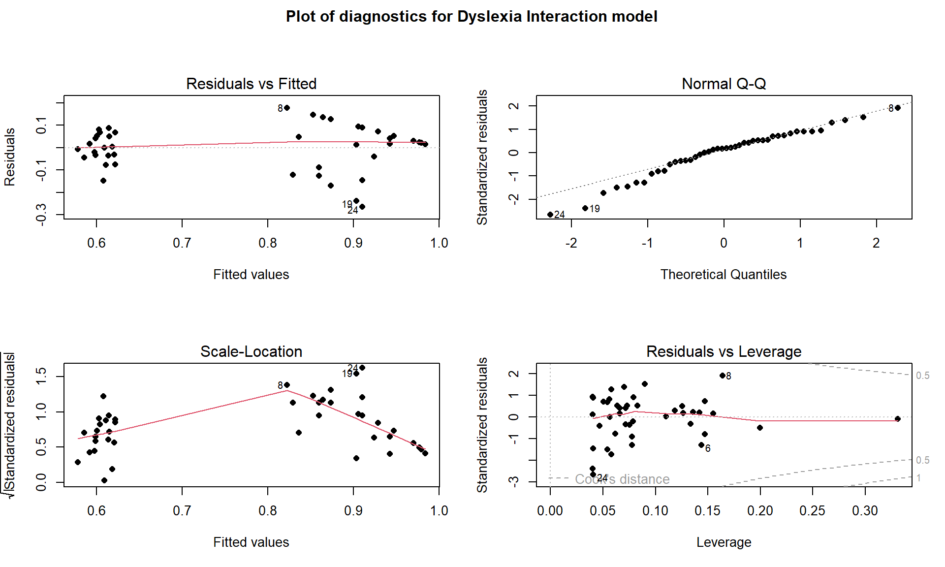
For these models, we have relaxed an earlier assumption that data were collected from only one group. In fact, we are doing specific research that is focused on questions about the differences between groups. However, these models still make assumptions that, within a specific group, the relationships are linear between the predictor and response variables. They also assume that the variability in the residuals is the same for all observations. Sometimes it can be difficult to check the assumptions by looking at the overall diagnostic plots and it may be easier to go back to the original scatterplot or plot the residuals vs fitted values by group to fully assess the results. Figure 8.33 shows a scatterplot of the residuals vs the quantitative explanatory variable by the groups. The variability in the residuals is a bit larger in the non-dyslexic group, possibly suggesting that variability in the reading test is higher for higher scoring individuals even though we couldn’t observe all of that variability because there were so many perfect scores in this group.
dyslexic3 <- dyslexic3 %>% mutate(resids = residuals(dys_model),
                                  fits = fitted(dys_model)
                                  )
dyslexic3 %>% ggplot(mapping = aes(x = fits, y = resids, color = dys, shape = dys)) +
  geom_smooth(method = "lm", se = F) +
  geom_point(size = 2.5) +
  theme_bw() +
  scale_color_viridis_d(end = 0.7, option = "plasma") +
  labs(title = "Scatterplot of Residuals vs Fitted by Group")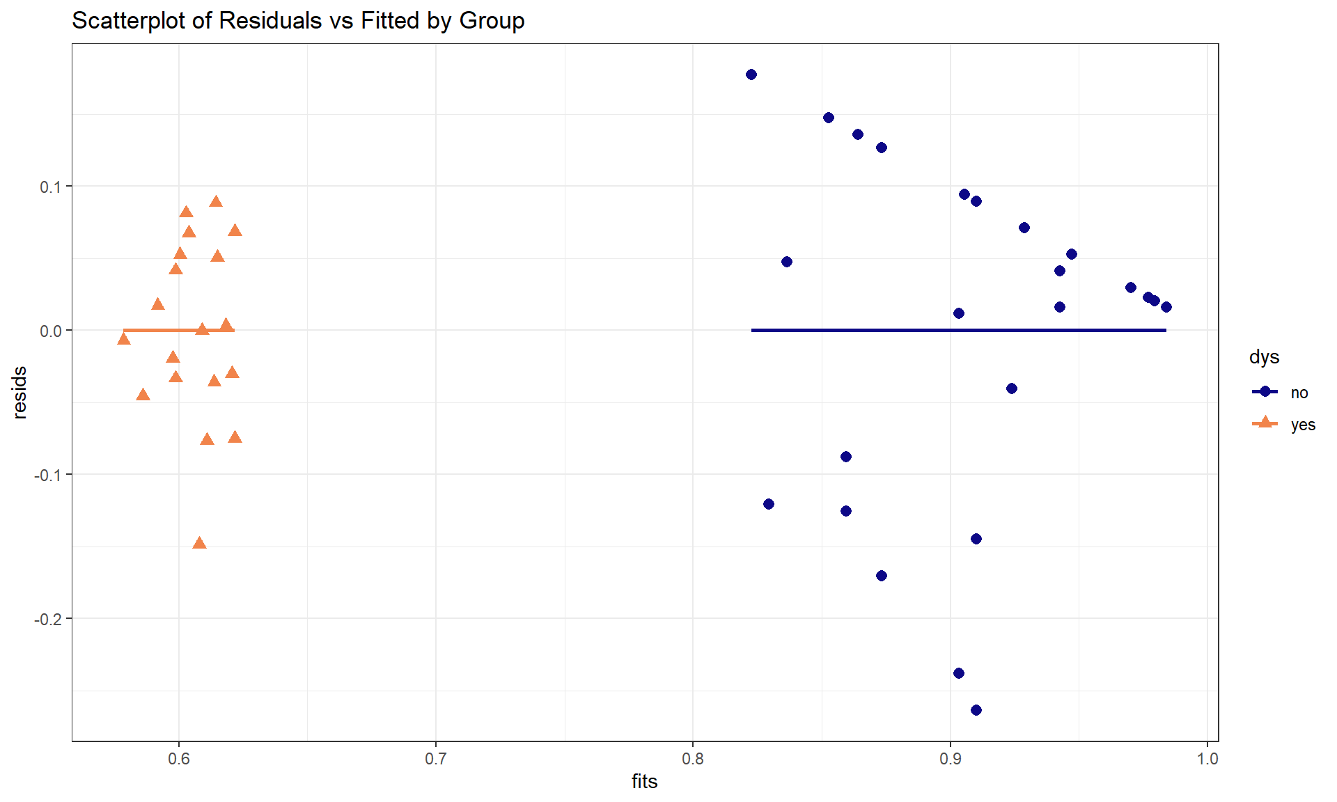
If we feel comfortable enough with the assumptions to trust the inferences here (this might be dangerous), then we can consider what some of the model inferences provide us in this situation. For example, the test for \(H_0: {\color{red}{\boldsymbol{\beta_3}}} = 0\) vs \(H_A: {\color{red}{\boldsymbol{\beta_3}}}\ne 0\) provides an interesting comparison. Under the null hypothesis, the two groups would have the same slope so it provides an opportunity to directly consider whether the relationship (via the slope) is different between the groups in their respective populations. We find \(t = -1.907\) which, if the assumptions are true, follows a \(t(40)\)-distribution under the null hypothesis. This test statistic has a corresponding p-value of 0.0638. So it provides some evidence against the null hypothesis of no difference in the slopes between the two groups but it isn’t strong evidence against it. There are serious issues (like getting the wrong idea about directions of relationships) if we ignore a potentially important interaction and some statisticians would recommend retaining interactions even if the evidence is only moderate for its inclusion in the model. For the original research question of whether the relationships differ for the two groups, we only have marginal evidence to support that result. Possibly with a larger sample size or a reading test that only a few students could get 100% on, the researchers might have detected a more pronounced difference in the slopes for the two groups.
In the presence of a categorical by quantitative interaction, term-plots can be generated that plot the results for each group on the same display or on separate facets for each level of the categorical variable. The first version is useful for comparing the different lines and the second version is useful to add the partial residuals and get a final exploration of model assumptions and ranges of values where predictor variables were observed in each group. The term-plots basically provide a plot of the “simplified” SLR models for each group. In Figure 8.34 we can see noticeable differences in the slopes and intercepts. Note that testing for differences in intercepts between groups is not very interesting when there are different slopes because if you change the slope, you have to change the intercept. The plot shows that there are clear differences in the means even though we don’t have a test to directly assess that in this complicated of a model155. Figure 8.35 splits the plots up and adds partial residuals to the plots. The impact on the estimated model for the perfect scores in the non-dyslexic subjects is very prominent as well as the difference in the relationships between the two variables in the two groups.
plot(allEffects(dys_model), ci.style = "bands", multiline = T, lty = c(1,2), grid = T)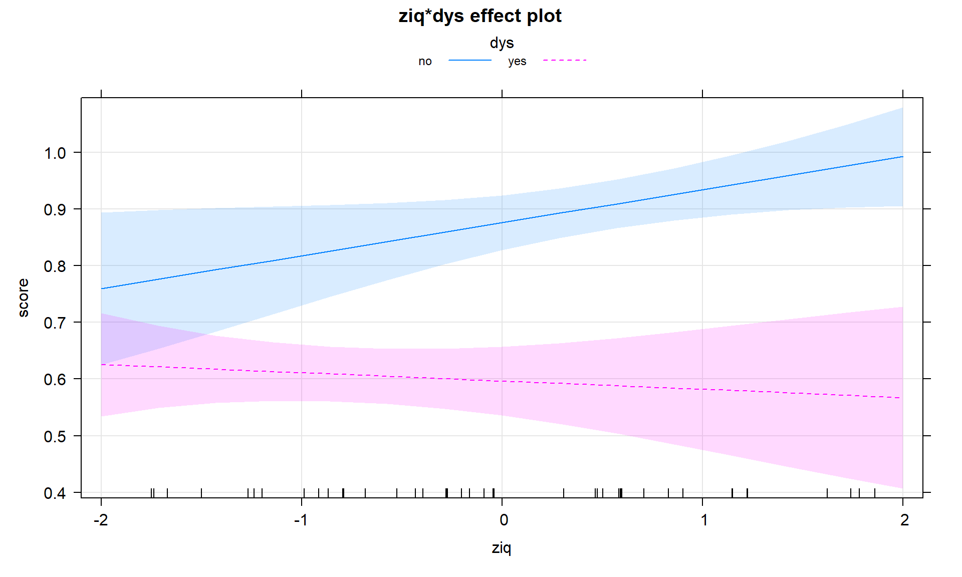
multiline = T option to overlay the results for the two groups on one plot.plot(allEffects(dys_model, residuals = T), lty = c(1,2), grid = T)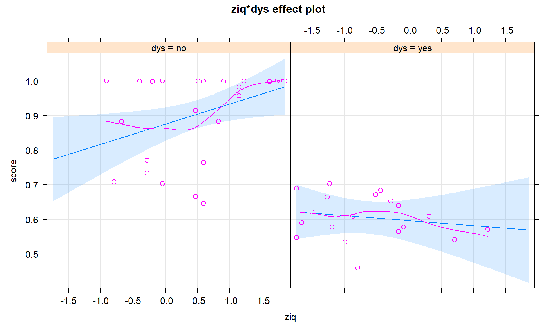
It certainly appears in the plots that IQ has a different impact on the mean score in the two groups (even though the p-value only provided marginal evidence in support of the interaction). To reinforce the potential dangers of forcing the same slope for both groups, consider the additive model for these data. Again, this just shifts one group off the other one, but both have the same slope. The following model summary and term-plots (Figure 8.36) suggest the potentially dangerous conclusion that can come from assuming a common slope when that might not be the case.
dys_modelR <- lm(score ~ ziq + dys, data = dyslexic3)

summary(dys_modelR)
##
## Call:
## lm(formula = score ~ ziq + dys, data = dyslexic3)
##
## Residuals:
## Min 1Q Median 3Q Max
## -0.26062 -0.05565 0.02932 0.07577 0.13217
##
## Coefficients:
## Estimate Std. Error t value Pr(>|t|)
## (Intercept) 0.89178 0.02312 38.580 < 2e-16
## ziq 0.02620 0.01957 1.339 0.188
## dysyes -0.26879 0.03905 -6.883 2.41e-08
##
## Residual standard error: 0.1049 on 41 degrees of freedom
## Multiple R-squared: 0.6858, Adjusted R-squared: 0.6705
## F-statistic: 44.75 on 2 and 41 DF, p-value: 4.917e-11plot(allEffects(dys_modelR, residuals = T))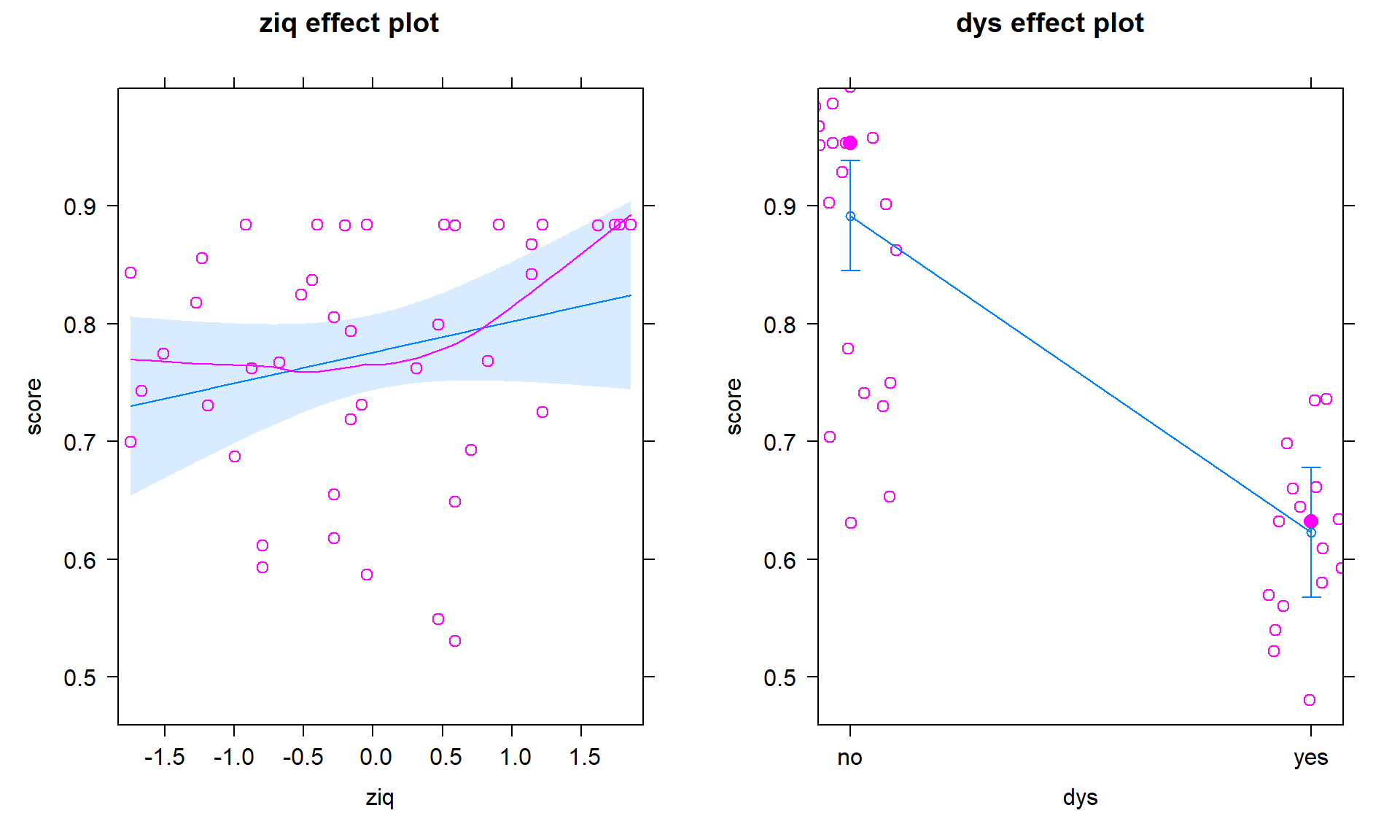
This model provides little evidence against the null hypothesis that IQ is not linearly related to reading score for all students (\(t_{41} = 1.34\), p-value = 0.188), adjusted for dyslexia status, but strong evidence against the null hypothesis of no difference in the true \(y\)-intercepts (\(t_{41} = -6.88\), p-value \(<0.00001\)) after adjusting for the verbal IQ score.
Since the IQ term has a large p-value, we could drop it from the model – leaving a model that only includes the grouping variable:
dys_modelR2 <- lm(score ~ dys, data = dyslexic3)
summary(dys_modelR2)
##
## Call:
## lm(formula = score ~ dys, data = dyslexic3)
##
## Residuals:
## Min 1Q Median 3Q Max
## -0.25818 -0.04510 0.02514 0.09520 0.09694
##
## Coefficients:
## Estimate Std. Error t value Pr(>|t|)
## (Intercept) 0.90480 0.02117 42.737 <2e-16
## dysyes -0.29892 0.03222 -9.278 1e-11
##
## Residual standard error: 0.1059 on 42 degrees of freedom
## Multiple R-squared: 0.6721, Adjusted R-squared: 0.6643
## F-statistic: 86.08 on 1 and 42 DF, p-value: 1e-11plot(allEffects(dys_modelR2, residuals = T), grid = T)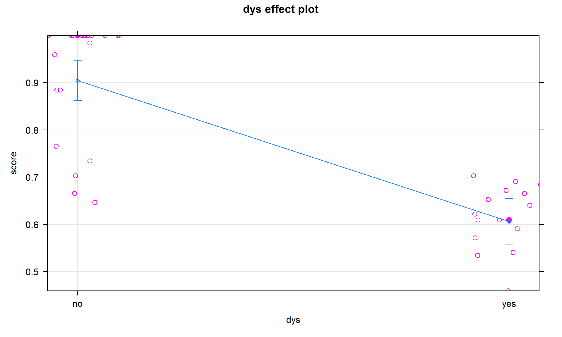
These results, including the term-plot in Figure 8.37, suggest a difference in the mean reading scores between the two groups and maybe that is all these data really say… This is the logical outcome if we decide that the interaction is not important in this data set. In general, if the interaction is dropped, the interaction model can be reduced to considering an additive model with the categorical and quantitative predictor variables. Either or both of those variables could also be considered for removal, usually starting with the variable with the larger p-value, leaving a string of ever-simpler models possible if large p-values are continually encountered156.
It is useful to note that the last model has returned us to the first model we encountered in Chapter 2 where we were just comparing the means for two groups. However, the researchers probably were not seeking to make the discovery that dyslexic students have a tougher time than non-dyslexic students on a reading test but sometimes that is all that the data support. The key part of this sequence of decisions was how much evidence you think a p-value of 0.06 contains…
For more than two categories in a categorical variable, the model contains more indicators to keep track of but uses the same ideas. We have to deal with modifying the intercept and slope coefficients for every deviation group so the task is onerous but relatively repetitive. The general model is:
\[\begin{array}{rl} y_i = \beta_0 &+ \beta_1x_i +\beta_2I_{\text{Level }2,i}+\beta_3I_{\text{Level }3,i} +\cdots+\beta_JI_{\text{Level }J,i} \\ &+\beta_{J+1}I_{\text{Level }2,i}\:x_i+\beta_{J+2}I_{\text{Level }3,i}\:x_i +\cdots+\beta_{2J-1}I_{\text{Level }J,i}\:x_i +\varepsilon_i.\ \end{array}\]
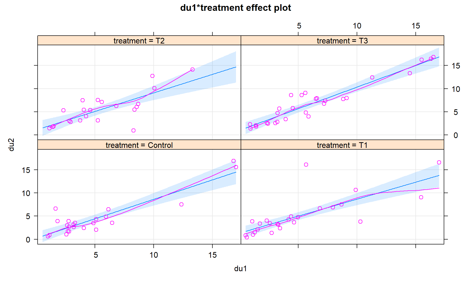
Specific to the audible tolerance/headache data that had four groups. The model with an interaction present is
\[\begin{array}{rl} \text{du2}_i = \beta_0 & + \beta_1\cdot\text{du1}_i + \beta_2I_{T1,i} + \beta_3I_{T2,i} + \beta_4I_{\text{T3},i} \\ &+ \beta_5I_{T1,i}\cdot\text{du1}_i + \beta_6I_{T2,i}\cdot\text{du1}_i + \beta_7I_{\text{T3},i}\cdot\text{du1}_i+\varepsilon_i.\ \end{array}\]
Based on the following output, the estimated general regression model is
\[\begin{array}{rl} \widehat{\text{du2}}_i = 0.241 &+ 0.839\cdot\text{du1}_i + 1.091I_{T1,i} + 0.855I_{T2,i} +0.775I_{T3,i} \\ & - 0.106I_{T1,i}\cdot\text{du1}_i - 0.040I_{T2,i}\cdot\text{du1}_i + 0.093I_{T3,i}\cdot\text{du1}_i.\ \end{array}\]
Then we could work out the specific equation for each group with replacing their indicator variable in two places with 1s and the rest of the indicators with 0. For example, for the T1 group:
\[\begin{array}{rll} \widehat{\text{du2}}_i & = 0.241 &+ 0.839\cdot\text{du1}_i + 1.091\cdot1 + 0.855\cdot0 +0.775\cdot0 \\ &&- 0.106\cdot1\cdot\text{du1}_i - 0.040\cdot0\cdot\text{du1}_i + 0.093\cdot0\cdot\text{du1}_i \\ \widehat{\text{du2}}_i& = 0.241&+0.839\cdot\text{du1}_i + 1.091 - 0.106\cdot\text{du1}_i \\ \widehat{\text{du2}}_i& = 1.332 &+ 0.733\cdot\text{du1}_i.\ \end{array}\]
head2 <- lm(du2 ~ du1 * treatment, data = Headache)
summary(head2)
##
## Call:
## lm(formula = du2 ~ du1 * treatment, data = Headache)
##
## Residuals:
## Min 1Q Median 3Q Max
## -6.8072 -1.0969 -0.3285 0.8192 10.6039
##
## Coefficients:
## Estimate Std. Error t value Pr(>|t|)
## (Intercept) 0.24073 0.68331 0.352 0.725
## du1 0.83923 0.10289 8.157 1.93e-12
## treatmentT1 1.09084 0.95020 1.148 0.254
## treatmentT2 0.85524 1.14770 0.745 0.458
## treatmentT3 0.77471 0.97370 0.796 0.428
## du1:treatmentT1 -0.10604 0.14326 -0.740 0.461
## du1:treatmentT2 -0.03981 0.17658 -0.225 0.822
## du1:treatmentT3 0.09300 0.13590 0.684 0.496
##
## Residual standard error: 2.148 on 90 degrees of freedom
## Multiple R-squared: 0.7573, Adjusted R-squared: 0.7384
## F-statistic: 40.12 on 7 and 90 DF, p-value: < 2.2e-16Or we can let the term-plots (Figures 8.38 and 8.39) show us all four different simplified models. Here we can see that all the slopes “look” to be pretty similar. When the interaction model is fit and the results “look” like the additive model, there is a good chance that we will be able to avoid all this complication and just use the additive model without missing anything interesting. There are two different options for displaying interaction models. Version 1 (Figure 8.38) has a different panel for each level of the categorical variable and Version 2 (Figure 8.39) puts all the lines on the same plot. In this case, neither version shows much of a difference and Version 2 overlaps so much that you can’t see all the groups. In these situations, it can be useful to make the term-plots twice, once with multiline = T and once multiline = F, and then select the version that captures the results best.
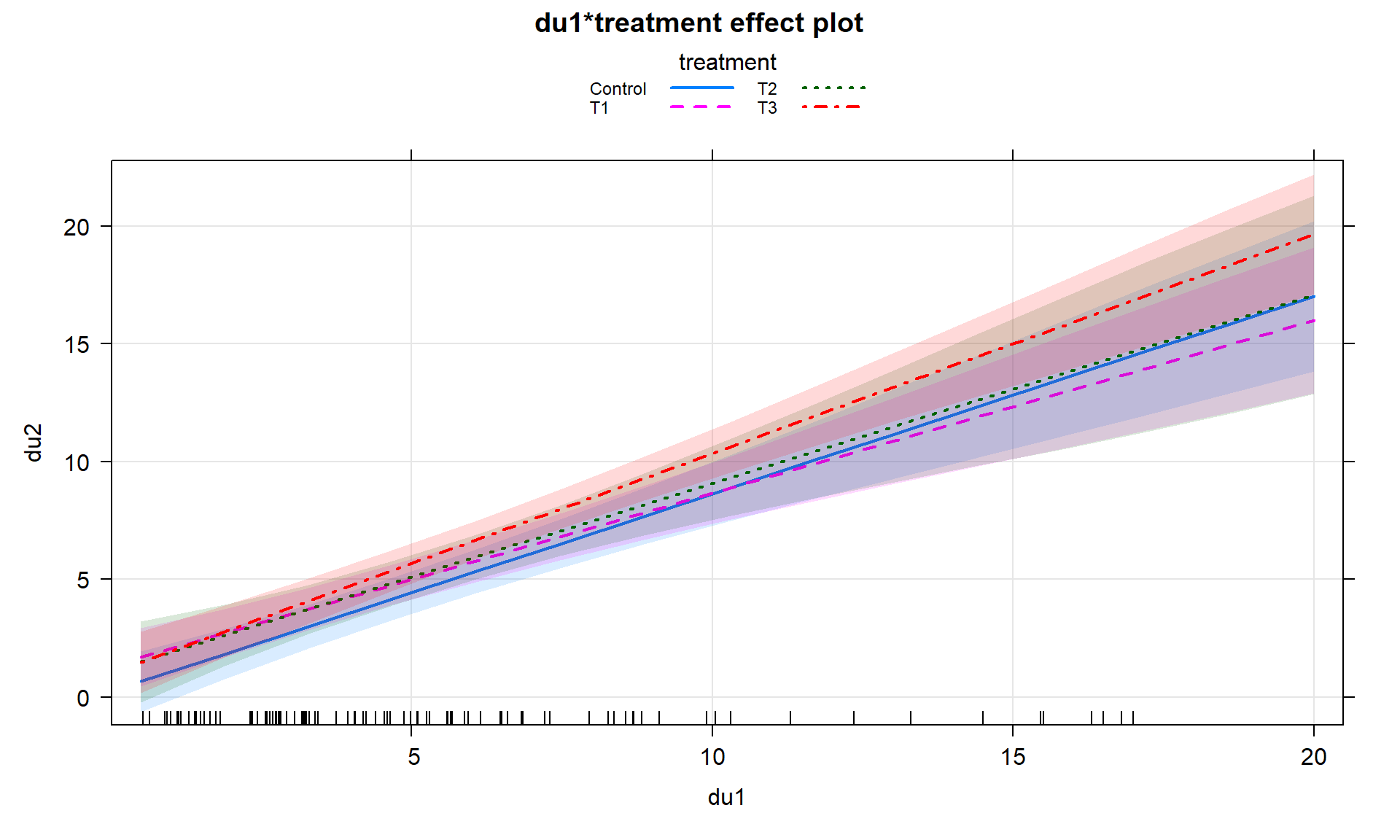
lty = c(1:4) that provides four different line types does help a bit.plot(allEffects(head2, residuals = T), grid = T) #version 1
plot(allEffects(head2), multiline = T, ci.style = "bands", grid = T,
lty = c(1:4), lwd = 2) #version 2In situations with more than 2 levels, the \(t\)-tests for the interaction or changing \(y\)-intercepts are not informative for deciding if you really need different slopes or intercepts for all the groups. They only tell you if a specific group is potentially different from the baseline group and the choice of the baseline is arbitrary. To assess whether we really need to have varying slopes or intercepts with more than two groups we need to develop \(F\)-tests for the interaction part of the model.