
8.3: Interpretation of MLR terms
- Page ID
- 33293

Since these results (finally) do not contain any highly influential points, we can formally discuss interpretations of the slope coefficients and how the term-plots (Figure 8.10) aid our interpretations. Term-plots in MLR are constructed by holding all the other quantitative variables138 at their mean and generating predictions and 95% CIs for the mean response across the levels of observed values for each predictor variable. This idea also help us to work towards interpretations of each term in an MLR model. For example, for Elevation, the term-plot starts at an elevation around 5000 feet and ends at an elevation around 8000 feet. To generate that line and CIs for the mean snow depth at different elevations, the MLR model of
\[\widehat{\text{SnowDepth}}_i = -213.3 + 0.0269\cdot\text{Elevation}_i +0.984\cdot\text{MinTemp}_i +1.243\cdot\text{MaxTemp}_i\]
is used, but we need to have “something” to put in for the two temperature variables to predict Snow Depth for different Elevations. The typical convention is to hold the “other” variables at their means to generate these plots. This tactic also provides a way of interpreting each slope coefficient. Specifically, we can interpret the Elevation slope as: For a 1 foot increase in Elevation, we estimate the mean Snow Depth to increase by 0.0269 inches, holding the minimum and maximum temperatures constant. More generally, the slope interpretation in an MLR is:
For a 1 [units of \(\boldsymbol{x_k}\)] increase in \(\boldsymbol{x_k}\), we estimate the mean of \(\boldsymbol{y}\) to change by \(\boldsymbol{b_k}\) [units of y], after controlling for [list of other explanatory variables in model].
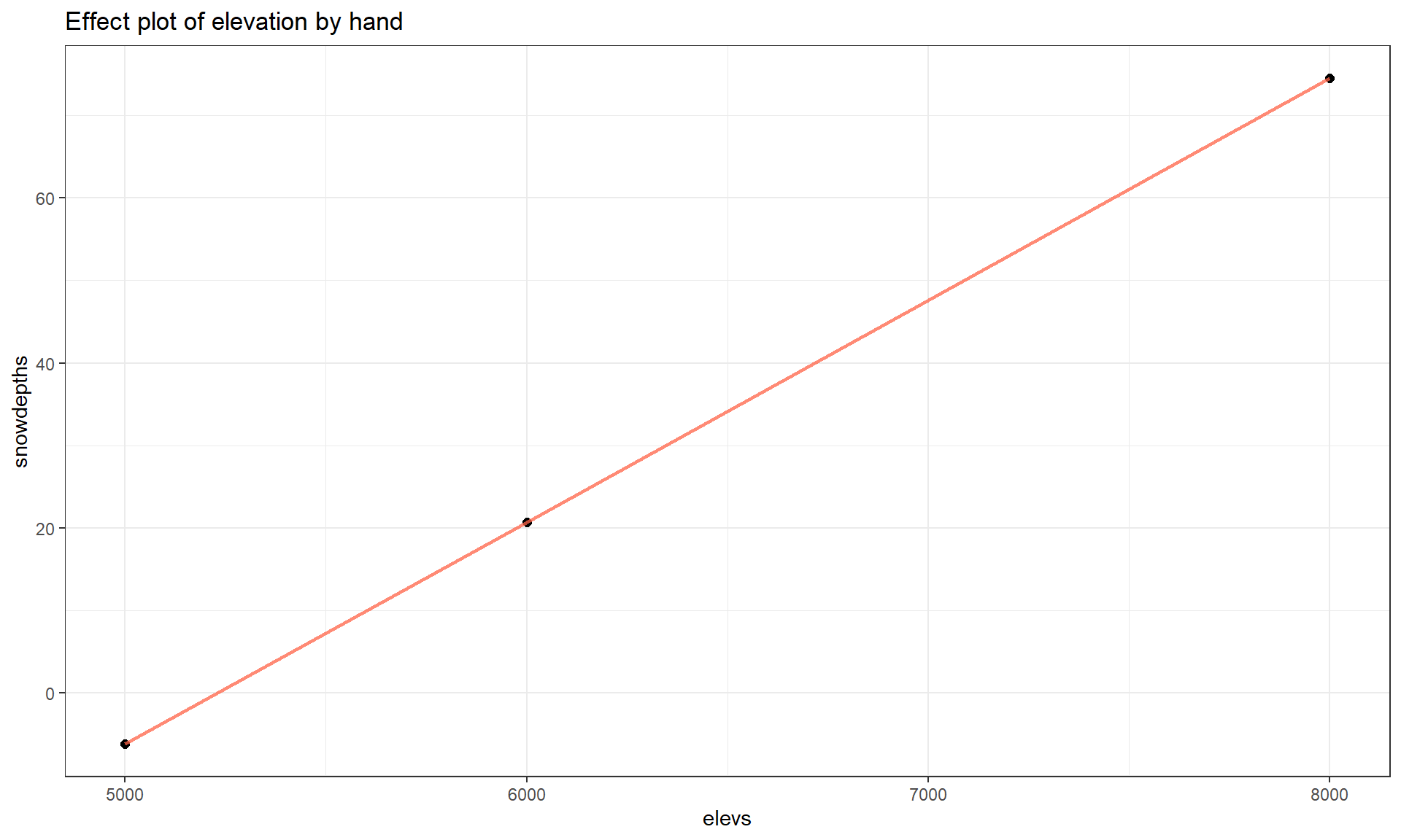
To make this more concrete, we can recreate some points in the Elevation term-plot. To do this, we first need the mean of the “other” predictors, Min.Temp and Max.Temp.
mean(snotel_final$Min.Temp)## [1] 27.82609mean(snotel_final$Max.Temp)## [1] 36.3913We can put these values into the MLR equation and simplify it by combining like terms, to an equation that is in terms of just Elevation given that we are holding Min.Temp and Max.Temp at their means:
\[\begin{array}{rl} \widehat{\text{SnowDepth}}_i & = -213.3 + 0.0269\cdot\text{Elevation}_i +0.984*\boldsymbol{27.826} +1.243*\boldsymbol{36.391} \\ & = -213.3 + 0.0269\cdot\text{Elevation}_i + 27.38 + 45.23 \\ & = \boldsymbol{-140.69 + 0.0269\cdot\textbf{Elevation}_i}. \end{array}\]
So at the means on the two temperature variables, the model looks like an SLR with an estimated \(y\)-intercept of -140.69 (mean Snow Depth for Elevation of 0 if temperatures are at their means) and an estimated slope of 0.0269. Then we can plot the predicted changes in \(y\) across all the values of the predictor variable (Elevation) while holding the other variables constant. To generate the needed values to define a line, we can plug various Elevation values into the simplified equation:
- For an elevation of 5000 at the average temperatures, we predict a mean snow depth of \(-140.69 + 0.0269*5000 = -6.19\) inches.
- For an elevation of 6000 at the average temperatures, we predict a mean snow depth of \(-140.69 + 0.0269*6000 = 20.71\) inches.
- For an elevation of 8000 at the average temperatures, we predict a mean snow depth of \(-140.69 + 0.0269*8000 = 74.51\) inches.
We can plot this information (Figure 8.12) using the geom_point function to show the points we calculated and the geom_line function to add a line that connects the dots. In the geom_point, the size option is used to make the points a little easier to see.
# Making own effect plot:
modelres2 <- tibble(elevs = c(5000, 6000, 8000), snowdepths = c(-6.19, 20.71, 74.51))
modelres2 %>% ggplot(mapping = aes(x = elevs, y = snowdepths)) +
  geom_point(size = 2) +
  geom_line(lwd = 1, alpha = .75, col = "tomato") +
  theme_bw() +
  labs(title = "Effect plot of elevation by hand")
Note that we only needed 2 points to define the line but need a denser grid of elevations if we want to add the 95% CIs for the true mean snow depth across the different elevations since they vary as a function of the distance from the mean of the explanatory variables.
The partial residuals in MLR models139 highlight the relationship between each predictor and the response after the impacts of the other variables are incorporated. To do this, we start with the raw residuals, \(e_i = y_i - \hat{y}_i\), which is the left-over part of the responses after accounting for all the predictors. If we add the component of interest to explore (say \(b_kx_{kj}\)) to the residuals, \(e_i\), we get \(e_i + b_kx_{kj} = y_i - \hat{y}_i + b_kx_{kj} = y_i - (b_0 + b_1x_{1i} + b_2x_{2i}+\ldots + b_kx_{ki} + \ldots + b_Kx_{Ki}) + b_kx_{kj}\) \(= y_i - (b_0 + b_1x_{1i} +b_2x_{2i}+\ldots + b_{k-1}x_{k-1,i} + b_{k+1}x_{k+1,i} + \ldots + b_Kx_{Ki})\). This new residual is a partial residual (also known as “component-plus-residuals” to indicate that we put the residuals together with the component of interest to create them). It contains all of the regular residual as well as what would be explained by \(b_kx_{kj}\) given the other variables in the model. Some choose to plot these partial residuals or to center them at 0 and, either way, plot them versus the component, here \(x_{kj}\). In effects plots, partial residuals are vertically scaled to match the height that the term-plot has created by holding the other predictors at their means so they can match the y-axis of the lines of the estimated terms based on the model. However they are vertically located, partial residuals help to highlight missed patterns left in the residuals that might be related to a particular predictor.
To get the associated 95% CIs for an individual term, we could return to using the predict function for the MLR, again holding the temperatures at their mean values. The predict function is sensitive and needs the same variable names as used in the original model fitting to work. First we create a “new” data set using the seq function to generate the desired grid of elevations and the rep function140 to repeat the means of the temperatures for each of elevation values we need to make the plot. The code creates a specific version of the predictor variables that is stored in newdata1 that is provided to the predict function so that it will provide fitted values and CIs across different elevations with temperatures held constant.
elevs <- seq(from = 5000, to = 8000, length.out = 30)
newdata1 <- tibble(Elevation = elevs, Min.Temp = rep(27.826,30),
                   Max.Temp = rep(36.3913,30))
newdata1
## # A tibble: 30 × 3
## Elevation Min.Temp Max.Temp
## <dbl> <dbl> <dbl>
## 1 5000 27.8 36.4
## 2 5103. 27.8 36.4
## 3 5207. 27.8 36.4
## 4 5310. 27.8 36.4
## 5 5414. 27.8 36.4
## 6 5517. 27.8 36.4
## 7 5621. 27.8 36.4
## 8 5724. 27.8 36.4
## 9 5828. 27.8 36.4
## 10 5931. 27.8 36.4
## # … with 20 more rows
## # ℹ Use `print(n = ...)` to see more rowsThe first 10 predicted snow depths along with 95% confidence intervals for the mean, holding temperatures at their means, are:
predict(m6, newdata = newdata1, interval = "confidence") %>% head(10)## fit lwr upr
## 1 -6.3680312 -24.913607 12.17754
## 2 -3.5898846 -21.078518 13.89875
## 3 -0.8117379 -17.246692 15.62322
## 4 1.9664088 -13.418801 17.35162
## 5 4.7445555 -9.595708 19.08482
## 6 7.5227022 -5.778543 20.82395
## 7 10.3008489 -1.968814 22.57051
## 8 13.0789956 1.831433 24.32656
## 9 15.8571423 5.619359 26.09493
## 10 18.6352890 9.390924 27.87965So we could do this with any model for each predictor variable to create term-plots, or we can just use the allEffects function to do this for us. This exercise is useful to complete once to understand what is being displayed in term-plots but using the allEffects function makes getting these plots much easier.
There are two other model components of possible interest in this model. The slope of 0.984 for Min.Temp suggests that for a 1\(^\circ F\) increase in Minimum Temperature, we estimate a 0.984 inch change in the mean Snow Depth, after controlling for Elevation and Max.Temp at the sites. Similarly, the slope of 1.243 for the Max.Temp suggests that for a 1\(^\circ F\) increase in Maximum Temperature, we estimate a 1.243 inch change in the mean Snow Depth, holding Elevation and Min.Temp constant. Note that there are a variety of ways to note that each term in an MLR is only a particular value given the other variables in the model. We can use words such as “holding the other variables constant” or “after adjusting for the other variables” or “in a model with…” or “for observations with similar values of the other variables but a difference of 1 unit in the predictor..”. The main point is to find words that reflect that this single slope coefficient might be different if we had a different overall model and the only way to interpret it is conditional on the other model components.
Term-plots have a few general uses to enhance our regular slope interpretations. They can help us assess how much change in the mean of \(y\) the model predicts over the range of each observed \(x\). This can help you to get a sense of the “practical” importance of each term. Additionally, the term-plots show 95% confidence intervals for the mean response across the range of each variable, holding the other variables at their means. These intervals can be useful for assessing the precision in the estimated mean at different values of each predictor. However, note that you should not use these plots for deciding whether the term should be retained in the model – we have other tools for making that assessment. And one last note about term-plots – they do not mean that the relationships are really linear between the predictor and response variable being displayed. The model forces the relationship to be linear even if that is not the real functional form. Term-plots are not diagnostics for the model unless you add the partial residuals, the lines are just summaries of the model you assumed was correct! Any time we do linear regression, the inferences are contingent upon the model we chose. We know our model is not perfect, but we hope that it helps us learn something about our research question(s) and, to trust its results, we hope it matches the data fairly well.
To both illustrate the calculation of partial residuals and demonstrate their potential utility, a small simulated example is considered. These are simulated data to help to highlight these patterns but are not too different than results that can be seen in some real applications. This situation has a response of simulated cholesterol levels with (also simulated) predictors of age, exercise level, and healthiness level with a sample size of \(n = 100\). First, consider the plot of the response versus each of the predictors in Figure 8.13. It appears that age might be positively related to the response, but exercise and healthiness levels do not appear to be related to the response. But it is important to remember that the response is made up of potential contributions that can be explained by each predictor and unexplained variation, and so plotting the response versus each predictor may not allow us to see the real relationship with each predictor.
a1 <- d1 %>% ggplot(mapping = aes(x = Age, y = CholLevel)) +
  geom_point() +
  theme_bw()
e1 <- d1 %>% ggplot(mapping = aes(x = ExAmount, y = CholLevel)) +
  geom_point() +
  theme_bw()
h1 <- d1 %>% ggplot(mapping = aes(x = HealthLevel, y = CholLevel)) +
  geom_point() +
  theme_bw()
grid.arrange(a1, e1, h1, ncol = 3)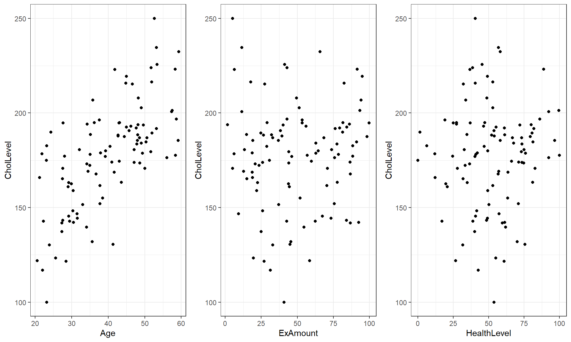
sim1 <- lm(CholLevel ~ Age + ExAmount + HealthLevel, data = d1)
summary(sim1)$coefficients
## Estimate Std. Error t value Pr(>|t|)
## (Intercept) 94.54572326 4.63863859 20.382214 1.204735e-36
## Age 3.50787191 0.14967450 23.436670 1.679060e-41
## ExAmount 0.07447965 0.04029175 1.848508 6.760692e-02
## HealthLevel -1.16373873 0.07212890 -16.134153 4.339546e-29In the summary it appears that each predictor might be related to the response given the other predictors in the model with p-values of <0.0001, 0.068, and < 0.0001 for Age, Exercise, and Healthiness, respectively.
In Figure 8.14, we can see more of the story here by exploring the partial residuals versus each of the predictors. There are actually quite clear relationships for each partial residual versus its predictor. For Age and HealthLevel, the relationship after adjusting for other predictors is clearly positive and linear. For ExAmount there is a clear relationship but it is actually curving, so would violate the linearity assumption. It is interesting that none of these were easy to see or even at all present in plots of the response versus individual predictors. This demonstrates the power of MLR methods to adjust/control for other variables to help us potentially more clearly see relationships between individual predictors and the response, or at least their part of the response.
plot(allEffects(sim1, residuals = T), grid = T)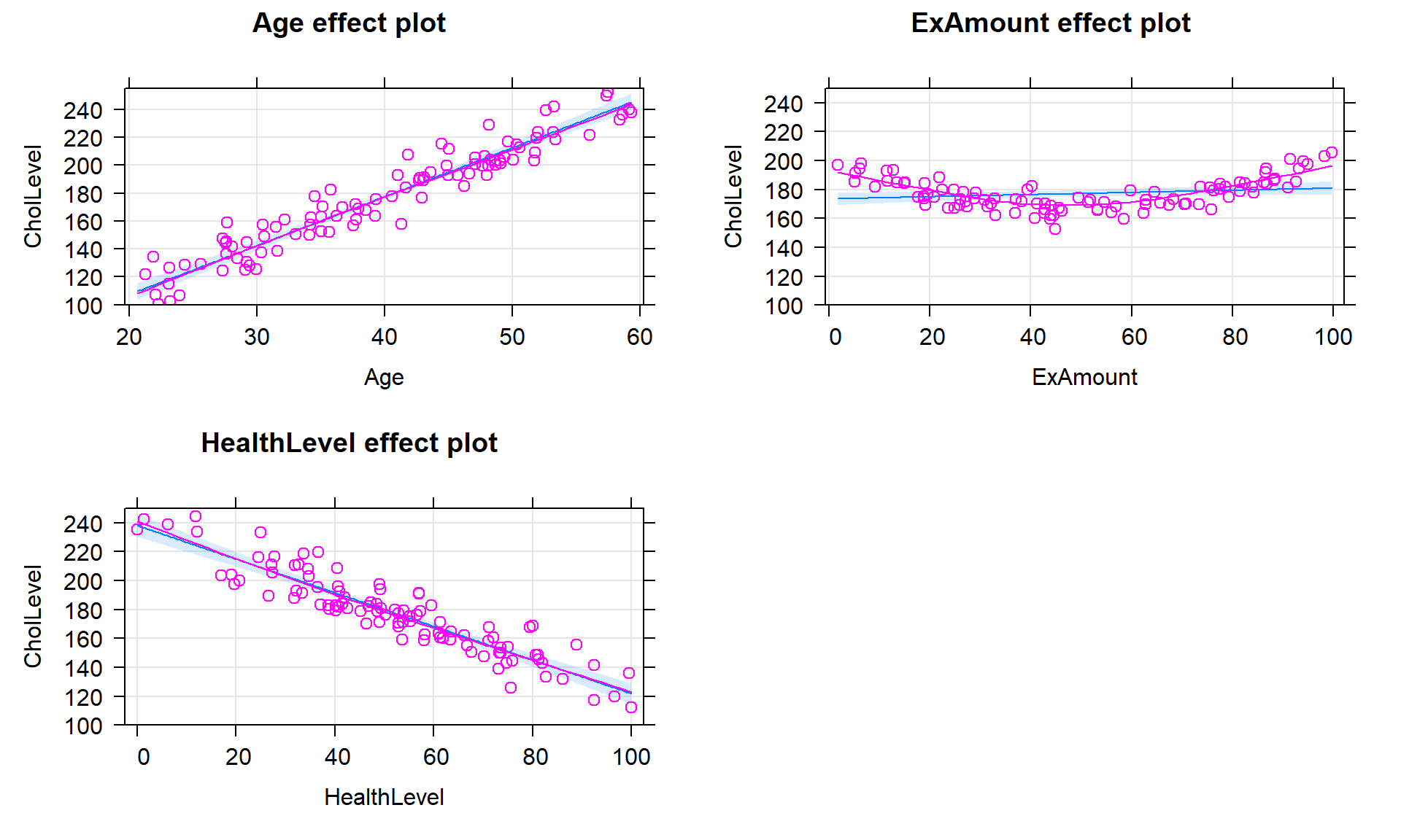
For those that are interested in these partial residuals, we can re-construct some of the work that the effects package does to provide them. As noted above, we need to take our regular residuals and add back in the impacts of a predictor of interest to calculate the partial residuals. The regular residuals can be extracted using the residuals function on the estimated model and the contribution of, say, the ExAmount predictor is found by taking the values in that variable times its estimated slope coefficient, \(b_2 = 0.07447965\). Plotting these partial residuals versus ExAmount as in Figure 8.15 provides a plot that is similar to the second term-plot except for differences in the y-axis. The y-axis in term-plots contains an additional adjustment but the two plots provide the same utility in diagnosing a clear missed curve in the partial residuals that is related to the ExAmount. Methods to incorporate polynomial functions of the predictor are simple extensions of the lm work we have been doing but are beyond the scope of this material – but you should always be checking the partial residuals to assess the linearity assumption with each quantitative predictor and if you see a pattern like this, seek out additional statistical resources such as the Statistical Sleuth (Ramsey and Schafer (2012)) or a statistician for help.
d1 <- d1 %>% mutate(partres = residuals(sim1) + ExAmount * 0.07447965)
d1 %>% ggplot(mapping = aes(x = ExAmount, y = partres)) +
  geom_point() +
  geom_smooth(method = "lm", se = F) +
  geom_smooth(se = F, col = "darkred", lty = 2, lwd = 1) +
  theme_bw() +
  labs(y = "Partial Residual")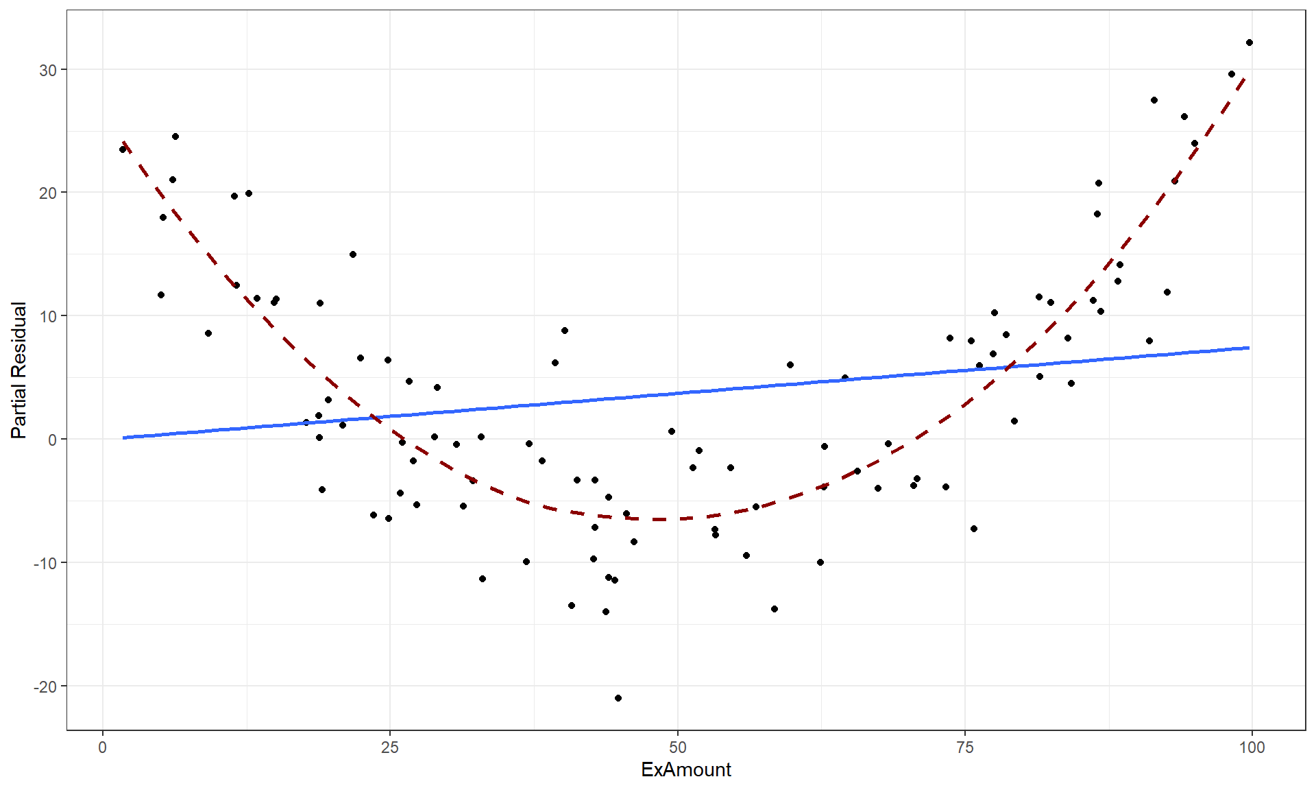
ExAmount with the solid line for the MLR fit for this model component and the dashed line for the smoothing line that highlights the curvilinear relationship that the model failed to account for.