
7.3: Bozeman temperature trend
- Page ID
- 33282

\( \newcommand{\vecs}[1]{\overset { \scriptstyle \rightharpoonup} {\mathbf{#1}} } \)
\( \newcommand{\vecd}[1]{\overset{-\!-\!\rightharpoonup}{\vphantom{a}\smash {#1}}} \)
\( \newcommand{\id}{\mathrm{id}}\) \( \newcommand{\Span}{\mathrm{span}}\)
( \newcommand{\kernel}{\mathrm{null}\,}\) \( \newcommand{\range}{\mathrm{range}\,}\)
\( \newcommand{\RealPart}{\mathrm{Re}}\) \( \newcommand{\ImaginaryPart}{\mathrm{Im}}\)
\( \newcommand{\Argument}{\mathrm{Arg}}\) \( \newcommand{\norm}[1]{\| #1 \|}\)
\( \newcommand{\inner}[2]{\langle #1, #2 \rangle}\)
\( \newcommand{\Span}{\mathrm{span}}\)
\( \newcommand{\id}{\mathrm{id}}\)
\( \newcommand{\Span}{\mathrm{span}}\)
\( \newcommand{\kernel}{\mathrm{null}\,}\)
\( \newcommand{\range}{\mathrm{range}\,}\)
\( \newcommand{\RealPart}{\mathrm{Re}}\)
\( \newcommand{\ImaginaryPart}{\mathrm{Im}}\)
\( \newcommand{\Argument}{\mathrm{Arg}}\)
\( \newcommand{\norm}[1]{\| #1 \|}\)
\( \newcommand{\inner}[2]{\langle #1, #2 \rangle}\)
\( \newcommand{\Span}{\mathrm{span}}\) \( \newcommand{\AA}{\unicode[.8,0]{x212B}}\)
\( \newcommand{\vectorA}[1]{\vec{#1}} % arrow\)
\( \newcommand{\vectorAt}[1]{\vec{\text{#1}}} % arrow\)
\( \newcommand{\vectorB}[1]{\overset { \scriptstyle \rightharpoonup} {\mathbf{#1}} } \)
\( \newcommand{\vectorC}[1]{\textbf{#1}} \)
\( \newcommand{\vectorD}[1]{\overrightarrow{#1}} \)
\( \newcommand{\vectorDt}[1]{\overrightarrow{\text{#1}}} \)
\( \newcommand{\vectE}[1]{\overset{-\!-\!\rightharpoonup}{\vphantom{a}\smash{\mathbf {#1}}}} \)
\( \newcommand{\vecs}[1]{\overset { \scriptstyle \rightharpoonup} {\mathbf{#1}} } \)
\( \newcommand{\vecd}[1]{\overset{-\!-\!\rightharpoonup}{\vphantom{a}\smash {#1}}} \)
\(\newcommand{\avec}{\mathbf a}\) \(\newcommand{\bvec}{\mathbf b}\) \(\newcommand{\cvec}{\mathbf c}\) \(\newcommand{\dvec}{\mathbf d}\) \(\newcommand{\dtil}{\widetilde{\mathbf d}}\) \(\newcommand{\evec}{\mathbf e}\) \(\newcommand{\fvec}{\mathbf f}\) \(\newcommand{\nvec}{\mathbf n}\) \(\newcommand{\pvec}{\mathbf p}\) \(\newcommand{\qvec}{\mathbf q}\) \(\newcommand{\svec}{\mathbf s}\) \(\newcommand{\tvec}{\mathbf t}\) \(\newcommand{\uvec}{\mathbf u}\) \(\newcommand{\vvec}{\mathbf v}\) \(\newcommand{\wvec}{\mathbf w}\) \(\newcommand{\xvec}{\mathbf x}\) \(\newcommand{\yvec}{\mathbf y}\) \(\newcommand{\zvec}{\mathbf z}\) \(\newcommand{\rvec}{\mathbf r}\) \(\newcommand{\mvec}{\mathbf m}\) \(\newcommand{\zerovec}{\mathbf 0}\) \(\newcommand{\onevec}{\mathbf 1}\) \(\newcommand{\real}{\mathbb R}\) \(\newcommand{\twovec}[2]{\left[\begin{array}{r}#1 \\ #2 \end{array}\right]}\) \(\newcommand{\ctwovec}[2]{\left[\begin{array}{c}#1 \\ #2 \end{array}\right]}\) \(\newcommand{\threevec}[3]{\left[\begin{array}{r}#1 \\ #2 \\ #3 \end{array}\right]}\) \(\newcommand{\cthreevec}[3]{\left[\begin{array}{c}#1 \\ #2 \\ #3 \end{array}\right]}\) \(\newcommand{\fourvec}[4]{\left[\begin{array}{r}#1 \\ #2 \\ #3 \\ #4 \end{array}\right]}\) \(\newcommand{\cfourvec}[4]{\left[\begin{array}{c}#1 \\ #2 \\ #3 \\ #4 \end{array}\right]}\) \(\newcommand{\fivevec}[5]{\left[\begin{array}{r}#1 \\ #2 \\ #3 \\ #4 \\ #5 \\ \end{array}\right]}\) \(\newcommand{\cfivevec}[5]{\left[\begin{array}{c}#1 \\ #2 \\ #3 \\ #4 \\ #5 \\ \end{array}\right]}\) \(\newcommand{\mattwo}[4]{\left[\begin{array}{rr}#1 \amp #2 \\ #3 \amp #4 \\ \end{array}\right]}\) \(\newcommand{\laspan}[1]{\text{Span}\{#1\}}\) \(\newcommand{\bcal}{\cal B}\) \(\newcommand{\ccal}{\cal C}\) \(\newcommand{\scal}{\cal S}\) \(\newcommand{\wcal}{\cal W}\) \(\newcommand{\ecal}{\cal E}\) \(\newcommand{\coords}[2]{\left\{#1\right\}_{#2}}\) \(\newcommand{\gray}[1]{\color{gray}{#1}}\) \(\newcommand{\lgray}[1]{\color{lightgray}{#1}}\) \(\newcommand{\rank}{\operatorname{rank}}\) \(\newcommand{\row}{\text{Row}}\) \(\newcommand{\col}{\text{Col}}\) \(\renewcommand{\row}{\text{Row}}\) \(\newcommand{\nul}{\text{Nul}}\) \(\newcommand{\var}{\text{Var}}\) \(\newcommand{\corr}{\text{corr}}\) \(\newcommand{\len}[1]{\left|#1\right|}\) \(\newcommand{\bbar}{\overline{\bvec}}\) \(\newcommand{\bhat}{\widehat{\bvec}}\) \(\newcommand{\bperp}{\bvec^\perp}\) \(\newcommand{\xhat}{\widehat{\xvec}}\) \(\newcommand{\vhat}{\widehat{\vvec}}\) \(\newcommand{\uhat}{\widehat{\uvec}}\) \(\newcommand{\what}{\widehat{\wvec}}\) \(\newcommand{\Sighat}{\widehat{\Sigma}}\) \(\newcommand{\lt}{<}\) \(\newcommand{\gt}{>}\) \(\newcommand{\amp}{&}\) \(\definecolor{fillinmathshade}{gray}{0.9}\)For a new example, consider the yearly average maximum temperatures in Bozeman, MT. For over 100 years, daily measurements have been taken of the minimum and maximum temperatures at hundreds of weather stations across the US. In early years, this involved manual recording of the temperatures and resetting the thermometer to track the extremes for the following day. More recently, these measures have been replaced by digital temperature recording devices that continue to track this sort of information with much less human effort and, possibly, errors. This sort of information is often aggregated to monthly or yearly averages to be able to see “on average” changes from month-to-month or year-to-year as opposed to the day-to-day variation in the temperature121. Often the local information is aggregated further to provide regional, hemispheric, or even global average temperatures. Climate change research involves attempting to quantify the changes over time in these and other long-term temperature or temperature proxies.
These data were extracted from the National Oceanic and Atmospheric Administration’s National Centers for Environmental Information’s database (http://www.ncdc.noaa.gov/cdo-web/) and we will focus on the yearly average of the monthly averages of the daily maximum temperature in Bozeman in degrees F from 1901 to 2014. We can call them yearly average maximum temperatures but note that it was a little more complicated than that to arrive at the response variable we are analyzing.
bozemantemps <- read_csv("http://www.math.montana.edu/courses/s217/documents/BozemanMeanMax.csv")summary(bozemantemps)## meanmax Year
## Min. :49.75 Min. :1901
## 1st Qu.:53.97 1st Qu.:1930
## Median :55.43 Median :1959
## Mean :55.34 Mean :1958
## 3rd Qu.:57.02 3rd Qu.:1986
## Max. :60.05 Max. :2014length(bozemantemps$Year) #Some years are missing (1905, 1906, 1948, 1950, 1995)## [1] 109bozemantemps %>% ggplot(mapping = aes(x = Year, y = meanmax)) +
geom_point() +
geom_smooth(method = "lm") +
geom_smooth(lty = 2, col = "red", lwd = 1.5, se = F) + #Add smoothing line
theme_bw() +
labs(title = "Scatterplot of Bozeman Yearly Average Max Temperatures",
y = "Mean Maximum Temperature (degrees F)")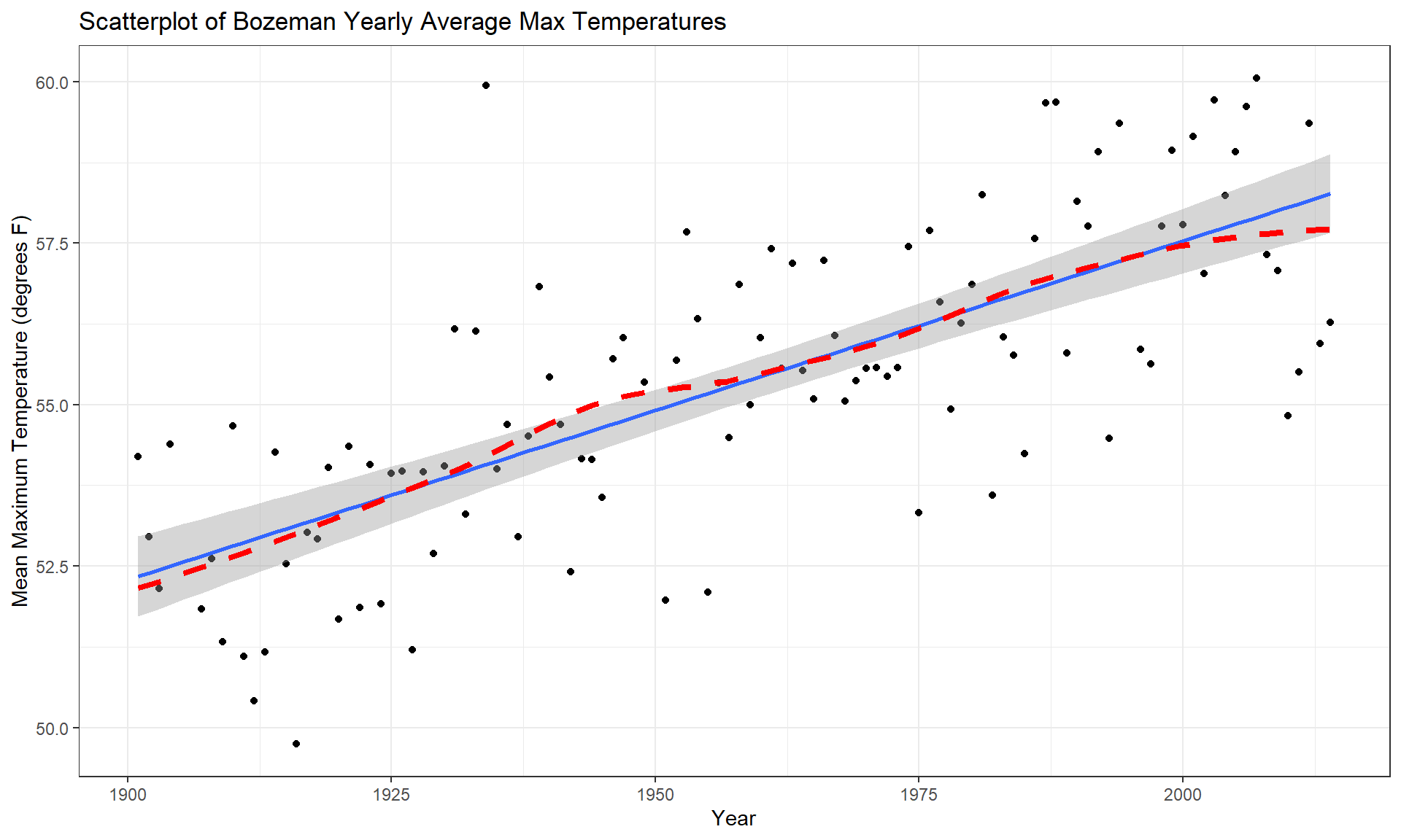
The scatterplot in Figure 7.5 shows the results between 1901 and 2014 based on a sample of \(n = 109\) years because four years had too many missing months to fairly include in the responses. Missing values occur for many reasons and in this case were likely just machine or human error122. These are time series data and in time series analysis we assume that the population of interest for inference is all possible realizations from the underlying process over this time frame even though we only ever get to observe one realization. In terms of climate change research, we would want to (a) assess evidence for a trend over time (hopefully assessing whether any observed trend is clearly different from a result that could have been observed by chance if there really is no change over time in the true process) and (b) quantify the size of the change over time along with the uncertainty in that estimate relative to the underlying true mean change over time. The hypothesis test for the slope answers (a) and the confidence interval for the slope addresses (b). We also should be concerned about problematic (influential) points, changing variance, and potential nonlinearity in the trend over time causing problems for the SLR inferences. The scatterplot suggests that there is a moderate or strong positive linear relationship between temperatures and year. Both looking at the points and at the smoothing line does not suggest a clear curve in these responses over time and the variability seems similar across the years. There appears to be one potential large outlier in the late 1930s.
We’ll perform all 6+ steps of the hypothesis test for the slope coefficient and use the confidence interval interpretation to discuss the size of the change. First, we need to select our hypotheses (the 2-sided test would be a conservative choice and no one that does climate change research wants to be accused of taking a liberal approach in their analyses123) and our test statistic, \(t = \frac{b_1}{\text{SE}_{b_1}}\). The scatterplot is the perfect tool to illustrate the situation.
- Hypotheses for the slope coefficient test:
\[H_0: \beta_1 = 0 \text{ vs } H_A: \beta_1 \ne 0\]
- Validity conditions:
- Quantitative variables condition
- Both
Yearand yearly averageTemperatureare quantitative variables so are suitable for an SLR analysis.
- Both
- Independence of observations
- There may be a lack of independence among years since a warm year might be followed by another warmer than average year. It would take more sophisticated models to account for this and the standard error on the slope coefficient could either get larger or smaller depending on the type of autocorrelation (correlation between neighboring time points or correlation with oneself at some time lag) present. This creates a caveat on these results but this model is often the first one researchers fit in these situations and often is reasonably correct even in the presence of some autocorrelation.
To assess the remaining conditions, we need to fit the regression model and use the diagnostic plots in Figure 7.6 to aid our assessment:
temp1 <- lm(meanmax ~ Year, data = bozemantemps)
par(mfrow = c(2,2))
plot(temp1, add.smooth = F, pch = 16)
- Linearity of relationship
- Examine the Residuals vs Fitted plot:
- There does not appear to be a clear curve remaining in the residuals so we should be able to proceed without worrying too much about missed nonlinearity.
- Compare the smoothing line to the regression line in Figure 7.5:
- There does not appear to be a big difference between the straight line and the smoothing line.
- Examine the Residuals vs Fitted plot:
- Equal (constant) variance
- Examining the Residuals vs Fitted and the “Scale-Location” plots provide little to no evidence of changing variance. The variability does decrease slightly in the middle fitted values but those changes are really minor and present no real evidence of changing variability.
- Normality of residuals
- Examining the Normal QQ-plot for violations of the normality assumption shows only one real problem in the outlier from the 32nd observation in the data set (the temperature observed in 1934) which was identified as a large outlier when examining the original scatterplot. We should be careful about inferences that assume normality and contain this point in the analysis. We might consider running the analysis with and without that point to see how much it impacts the results just to be sure it isn’t creating evidence of a trend because of a violation of the normality assumption. The next check reassures us that re-running the model without this point would only result in slightly changing the SEs and not the slopes.
- No influential points:
- There are no influential points displayed in the Residuals vs Leverage plot since the Cook’s D contours are not displayed.
- Note: by default this plot contains a smoothing line that is relatively meaningless, so ignore it if is displayed. We suppressed it using the
add.smooth = Foption inplot(temp1)but if you forget to do that, just ignore the smoothers in the diagnostic plots especially in the Residuals vs Leverage plot.
- Note: by default this plot contains a smoothing line that is relatively meaningless, so ignore it if is displayed. We suppressed it using the
- These results tells us that the outlier was not influential. If you look back at the scatterplot, it was located near the middle of the observed \(x\text{'s}\) so its potential leverage is low. You can find its leverage based on the plot to be around 0.12 when there are observations in the data set with leverages over 0.3. The high leverage points occur at the beginning and the end of the record because they are at the edges of the observed \(x\text{'s}\) and most of these points follow the overall pattern fairly well.
- There are no influential points displayed in the Residuals vs Leverage plot since the Cook’s D contours are not displayed.
So the main issues are with the assumption of independence of observations and one non-influential outlier that might be compromising our normality assumption a bit.
- Calculate the test statistic and p-value:
- \(t = 0.05244/0.00476 = 11.02\)
summary(temp1)## ## Call: ## lm(formula = meanmax ~ Year, data = bozemantemps) ## ## Residuals: ## Min 1Q Median 3Q Max ## -3.3779 -0.9300 0.1078 1.1960 5.8698 ## ## Coefficients: ## Estimate Std. Error t value Pr(>|t|) ## (Intercept) -47.35123 9.32184 -5.08 1.61e-06 ## Year 0.05244 0.00476 11.02 < 2e-16 ## ## Residual standard error: 1.624 on 107 degrees of freedom ## Multiple R-squared: 0.5315, Adjusted R-squared: 0.5271 ## F-statistic: 121.4 on 1 and 107 DF, p-value: < 2.2e-16- From the model summary: p-value < 2e-16 or just < 0.0001
- The test statistic is assumed to follow a \(t\)-distribution with \(n-2 = 109-2 = 107\) degrees of freedom. The p-value can also be calculated as:
2*pt(11.02, df = 107, lower.tail = F)## [1] 2.498481e-19- Which is then reported as < 0.0001, which means that the chances of observing a slope coefficient as extreme or more extreme than 0.052 if the null hypothesis of no linear relationship is true is less than 0.01%.
- Write a conclusion:
- There is very strong evidence (\(t_{107} = 11.02\), p-value < 0.0001) against the null hypothesis of no linear relationship between Year and yearly mean Temperature so we can conclude that there is, in fact, some linear relationship between Year and yearly mean maximum Temperature in Bozeman.
- Size:
- For a one year increase in Year, we estimate that, on average, the yearly average maximum temperature will change by 0.0524 \(^\circ F\) (95% CI: 0.043 to 0.062). This suggests a modest but noticeable change in the mean temperature in Bozeman and the confidence suggests minimal variation around this estimate, going from 0.04 to 0.06 \(^\circ F\). The “size” of this change is discussed more in Section 7.5.
confint(temp1)## 2.5 % 97.5 % ## (Intercept) -65.83068375 -28.87177785 ## Year 0.04300681 0.06187746 - Scope of inference:
- We can conclude that this detected trend pertains to the Bozeman area in the years 1901 to 2014 but not outside of either this area or time frame. We cannot say that time caused the observed changes since it was not randomly assigned and we cannot attribute the changes to any other factors because we did not consider them. But knowing that there was a trend toward increasing temperatures is an intriguing first step in a more complete analysis of changing climate in the area.
It is also good to report the percentage of variation that the model explains: Year explains 54.91% of the variation in yearly average maximum Temperature. If the coefficient of determination value had been very small, we might discount the previous result. Since it is moderately large with over 50% of the variation in the response explained, that suggests that just by using a linear trend over time we can account for quite a bit of the variation in yearly average maximum temperatures in Bozeman. Note that the percentage of variation explained would get much worse if we tried to analyze the monthly or original daily maximum temperature data even though we might find about the same estimated mean change over time.
Interpreting a confidence interval provides more useful information than the hypothesis test here – instead of just assessing evidence against the null hypothesis, we can actually provide our best guess at the true change in the mean of \(y\) for a change in \(x\). Here, the 95% CI is (0.043, 0.062). This tells us that for a 1 year increase in Year, we are 95% confident that the change in the true mean of the yearly average maximum Temperatures in Bozeman is between 0.043 and 0.062 \(^\circ F\).
Sometimes the scale of the \(x\)-variable makes interpretation a little difficult, so we can re-scale it to make the resulting slope coefficient more interpretable without changing how the model fits the responses. One option is to re-scale the variable and re-fit the regression model and the other (easier) option is to re-scale our interpretation. The idea here is that a 100-year change might be easier and more meaningful scale to interpret than a single year change. If we have a slope in the model of 0.052 (for a 1 year change), we can also say that a 100 year change in the mean is estimated to be 0.052*100 = 0.52\(^\circ F\). Similarly, the 95% CI for the population mean 100-year change would be from 0.43\(^\circ F\) to 0.62\(^\circ F\). In 2007, the IPCC (Intergovernmental Panel on Climate Change; www.ipcc.ch/publications_and_data/ar4/wg1/en/tssts-3-1-1.html) estimated the global temperature change from 1906 to 2005 to be 0.74\(^\circ C\) per decade or, scaled up, 7.4\(^\circ C\) per century (1.33\(^\circ F\)). There are many reasons why our local temperature trend might differ, including that our analysis was of average maximum temperatures and the IPCC was considering the average temperature (which was not measured locally or in most places in a good way until digital instrumentation was installed) and that local trends are likely to vary around the global average change based on localized environmental conditions.
One issue that arises in studies of climate change is that researchers often consider these sorts of tests at many locations and on many response variables (if I did the maximum temperature, why not also do the same analysis of the minimum temperature time series as well? And if I did the analysis for Bozeman, what about Butte and Helena and…?). Remember our discussion of multiple testing issues? This issue can arise when regression modeling is repeated in many similar data sets, say different sites or different response variables or both, in one study. In Moore, Harper, and Greenwood (2007), we considered the impacts on the assessment of evidence of trends of earlier spring onset timing in the Mountain West when the number of tests across many sites is accounted for. We found that the evidence for time trends decreases substantially but does not disappear. In a related study, M. C. Greenwood, Harper, and Moore (2011) found evidence for regional trends to earlier spring onset using more sophisticated statistical models. The main point here is to be careful when using simple statistical methods repeatedly if you are not accounting for the number of tests performed.
Along with the confidence interval, we can also plot the estimated model (Figure 7.7) using a term-plot from the effects package (Fox, 2003). This is the same function we used for visualizing results in the ANOVA models and in its basic application you just need plot(allEffects(MODELNAME)) although we from time to time, we will add some options. In regression models, we get to see the regression line along with bounds for 95% confidence intervals for the mean at every value of \(x\) that was observed (explained in the next section). Note that there is also a rugplot on the \(x\)-axis showing you where values of the explanatory variable were obtained, which is useful to understanding how much information is available for different aspects of the line. Here it provides gaps for missing years of observations as sort of broken teeth in a comb. Also not used here, we can also turn on the residuals = T option, which in SLR just plots the original points and adds a smoothing line to this plot to reinforce the previous assessment of assumptions.
library(effects)
plot(allEffects(temp1, xlevels = list(Year = bozemantemps$Year)),
     grid = T)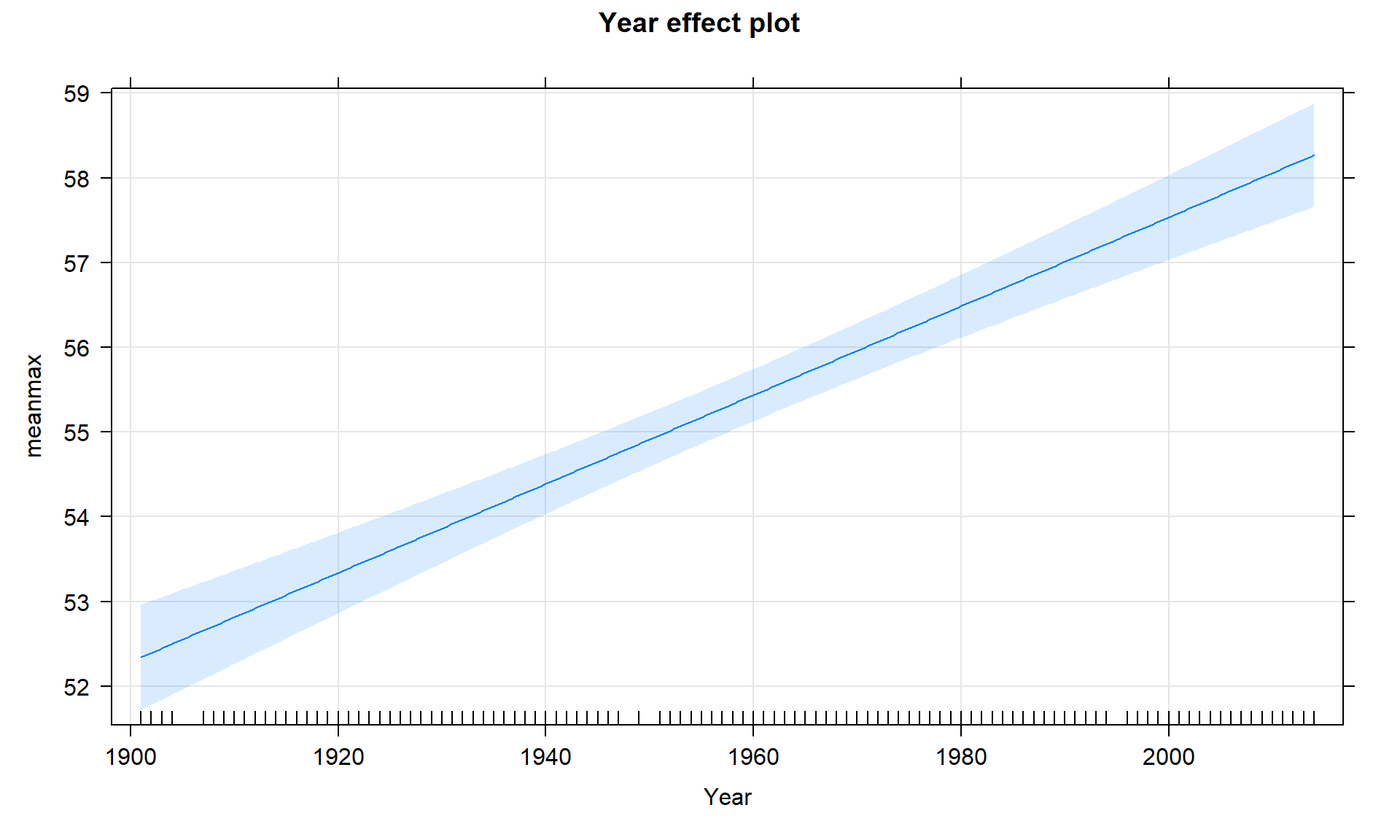
If we extended the plot for the model to Year = 0, we could see the reason that the y-intercept in this model is -47.4\(^\circ F\). This is obviously a large extrapolation for these data and provides a silly result. However, in paleoclimate data that goes back thousands of years using tree rings, ice cores, or sea sediments, the estimated mean in year 0 might be interesting and within the scope of observed values or it might not. For example, in Santibáñez et al. (2018), the data were a time series from 27,000 to about 9,000 years before present extracted from Antarctic ice cores. It all depends on the application.
To make the y-intercept more interesting for our data set, we can re-scale the \(x\text{'s}\) using mutate before we fit the model to have the first year in the data set (1901) be “0”. This is accomplished by calculating \(\text{Year2} = \text{Year}-1901\).
bozemantemps <- bozemantemps %>% mutate(Year2 = Year - 1901)
summary(bozemantemps$Year2)
## Min. 1st Qu. Median Mean 3rd Qu. Max.
## 0.00 29.00 58.00 57.27 85.00 113.00The new estimated regression equation is \(\widehat{\text{Temp}}_i = 52.34 + 0.052\cdot\text{Year2}_i\). The slope and its test statistic are the same as in the previous model. The y-intercept has changed dramatically with a 95% CI from 51.72\(^\circ F\) to 52.96\(^\circ F\) for Year2 = 0. But we know that Year2 has a 0 value for 1901 because of our subtraction. That means that this CI is for the true mean in 1901 and is now at least somewhat interesting. If you revisit Figure 7.7 you will actually see that the displayed confidence intervals provide upper and lower bounds that match this result for 1901 – the y-intercept CI matches the 95% CI for the true mean in the first year of the data set.
temp2 <- lm(meanmax ~ Year2, data = bozemantemps)
summary(temp2)
##
## Call:
## lm(formula = meanmax ~ Year2, data = bozemantemps)
##
## Residuals:
## Min 1Q Median 3Q Max
## -3.3779 -0.9300 0.1078 1.1960 5.8698
##
## Coefficients:
## Estimate Std. Error t value Pr(>|t|)
## (Intercept) 52.34126 0.31383 166.78 <2e-16
## Year2 0.05244 0.00476 11.02 <2e-16
##
## Residual standard error: 1.624 on 107 degrees of freedom
## Multiple R-squared: 0.5315, Adjusted R-squared: 0.5271
## F-statistic: 121.4 on 1 and 107 DF, p-value: < 2.2e-16confint(temp2)## 2.5 % 97.5 %
## (Intercept) 51.71913822 52.96339150
## Year2 0.04300681 0.06187746Ideally, we want to find a regression model that does not violate any assumptions, has a high \(\mathbf{R^2}\) value, and a slope coefficient with a small p-value. If any of these are not the case, then we are not completely satisfied with the regression and should be suspicious of any inference we perform. We can sometimes resolve some of the systematic issues noted above using transformations, discussed in Sections 7.5 and 7.6.