
3.5: Guinea pig tooth growth One-Way ANOVA example
- Page ID
- 33232

\( \newcommand{\vecs}[1]{\overset { \scriptstyle \rightharpoonup} {\mathbf{#1}} } \)
\( \newcommand{\vecd}[1]{\overset{-\!-\!\rightharpoonup}{\vphantom{a}\smash {#1}}} \)
\( \newcommand{\dsum}{\displaystyle\sum\limits} \)
\( \newcommand{\dint}{\displaystyle\int\limits} \)
\( \newcommand{\dlim}{\displaystyle\lim\limits} \)
\( \newcommand{\id}{\mathrm{id}}\) \( \newcommand{\Span}{\mathrm{span}}\)
( \newcommand{\kernel}{\mathrm{null}\,}\) \( \newcommand{\range}{\mathrm{range}\,}\)
\( \newcommand{\RealPart}{\mathrm{Re}}\) \( \newcommand{\ImaginaryPart}{\mathrm{Im}}\)
\( \newcommand{\Argument}{\mathrm{Arg}}\) \( \newcommand{\norm}[1]{\| #1 \|}\)
\( \newcommand{\inner}[2]{\langle #1, #2 \rangle}\)
\( \newcommand{\Span}{\mathrm{span}}\)
\( \newcommand{\id}{\mathrm{id}}\)
\( \newcommand{\Span}{\mathrm{span}}\)
\( \newcommand{\kernel}{\mathrm{null}\,}\)
\( \newcommand{\range}{\mathrm{range}\,}\)
\( \newcommand{\RealPart}{\mathrm{Re}}\)
\( \newcommand{\ImaginaryPart}{\mathrm{Im}}\)
\( \newcommand{\Argument}{\mathrm{Arg}}\)
\( \newcommand{\norm}[1]{\| #1 \|}\)
\( \newcommand{\inner}[2]{\langle #1, #2 \rangle}\)
\( \newcommand{\Span}{\mathrm{span}}\) \( \newcommand{\AA}{\unicode[.8,0]{x212B}}\)
\( \newcommand{\vectorA}[1]{\vec{#1}} % arrow\)
\( \newcommand{\vectorAt}[1]{\vec{\text{#1}}} % arrow\)
\( \newcommand{\vectorB}[1]{\overset { \scriptstyle \rightharpoonup} {\mathbf{#1}} } \)
\( \newcommand{\vectorC}[1]{\textbf{#1}} \)
\( \newcommand{\vectorD}[1]{\overrightarrow{#1}} \)
\( \newcommand{\vectorDt}[1]{\overrightarrow{\text{#1}}} \)
\( \newcommand{\vectE}[1]{\overset{-\!-\!\rightharpoonup}{\vphantom{a}\smash{\mathbf {#1}}}} \)
\( \newcommand{\vecs}[1]{\overset { \scriptstyle \rightharpoonup} {\mathbf{#1}} } \)
\(\newcommand{\longvect}{\overrightarrow}\)
\( \newcommand{\vecd}[1]{\overset{-\!-\!\rightharpoonup}{\vphantom{a}\smash {#1}}} \)
\(\newcommand{\avec}{\mathbf a}\) \(\newcommand{\bvec}{\mathbf b}\) \(\newcommand{\cvec}{\mathbf c}\) \(\newcommand{\dvec}{\mathbf d}\) \(\newcommand{\dtil}{\widetilde{\mathbf d}}\) \(\newcommand{\evec}{\mathbf e}\) \(\newcommand{\fvec}{\mathbf f}\) \(\newcommand{\nvec}{\mathbf n}\) \(\newcommand{\pvec}{\mathbf p}\) \(\newcommand{\qvec}{\mathbf q}\) \(\newcommand{\svec}{\mathbf s}\) \(\newcommand{\tvec}{\mathbf t}\) \(\newcommand{\uvec}{\mathbf u}\) \(\newcommand{\vvec}{\mathbf v}\) \(\newcommand{\wvec}{\mathbf w}\) \(\newcommand{\xvec}{\mathbf x}\) \(\newcommand{\yvec}{\mathbf y}\) \(\newcommand{\zvec}{\mathbf z}\) \(\newcommand{\rvec}{\mathbf r}\) \(\newcommand{\mvec}{\mathbf m}\) \(\newcommand{\zerovec}{\mathbf 0}\) \(\newcommand{\onevec}{\mathbf 1}\) \(\newcommand{\real}{\mathbb R}\) \(\newcommand{\twovec}[2]{\left[\begin{array}{r}#1 \\ #2 \end{array}\right]}\) \(\newcommand{\ctwovec}[2]{\left[\begin{array}{c}#1 \\ #2 \end{array}\right]}\) \(\newcommand{\threevec}[3]{\left[\begin{array}{r}#1 \\ #2 \\ #3 \end{array}\right]}\) \(\newcommand{\cthreevec}[3]{\left[\begin{array}{c}#1 \\ #2 \\ #3 \end{array}\right]}\) \(\newcommand{\fourvec}[4]{\left[\begin{array}{r}#1 \\ #2 \\ #3 \\ #4 \end{array}\right]}\) \(\newcommand{\cfourvec}[4]{\left[\begin{array}{c}#1 \\ #2 \\ #3 \\ #4 \end{array}\right]}\) \(\newcommand{\fivevec}[5]{\left[\begin{array}{r}#1 \\ #2 \\ #3 \\ #4 \\ #5 \\ \end{array}\right]}\) \(\newcommand{\cfivevec}[5]{\left[\begin{array}{c}#1 \\ #2 \\ #3 \\ #4 \\ #5 \\ \end{array}\right]}\) \(\newcommand{\mattwo}[4]{\left[\begin{array}{rr}#1 \amp #2 \\ #3 \amp #4 \\ \end{array}\right]}\) \(\newcommand{\laspan}[1]{\text{Span}\{#1\}}\) \(\newcommand{\bcal}{\cal B}\) \(\newcommand{\ccal}{\cal C}\) \(\newcommand{\scal}{\cal S}\) \(\newcommand{\wcal}{\cal W}\) \(\newcommand{\ecal}{\cal E}\) \(\newcommand{\coords}[2]{\left\{#1\right\}_{#2}}\) \(\newcommand{\gray}[1]{\color{gray}{#1}}\) \(\newcommand{\lgray}[1]{\color{lightgray}{#1}}\) \(\newcommand{\rank}{\operatorname{rank}}\) \(\newcommand{\row}{\text{Row}}\) \(\newcommand{\col}{\text{Col}}\) \(\renewcommand{\row}{\text{Row}}\) \(\newcommand{\nul}{\text{Nul}}\) \(\newcommand{\var}{\text{Var}}\) \(\newcommand{\corr}{\text{corr}}\) \(\newcommand{\len}[1]{\left|#1\right|}\) \(\newcommand{\bbar}{\overline{\bvec}}\) \(\newcommand{\bhat}{\widehat{\bvec}}\) \(\newcommand{\bperp}{\bvec^\perp}\) \(\newcommand{\xhat}{\widehat{\xvec}}\) \(\newcommand{\vhat}{\widehat{\vvec}}\) \(\newcommand{\uhat}{\widehat{\uvec}}\) \(\newcommand{\what}{\widehat{\wvec}}\) \(\newcommand{\Sighat}{\widehat{\Sigma}}\) \(\newcommand{\lt}{<}\) \(\newcommand{\gt}{>}\) \(\newcommand{\amp}{&}\) \(\definecolor{fillinmathshade}{gray}{0.9}\)3.5 Guinea pig tooth growth One-Way ANOVA example
A second example of the One-way ANOVA methods involves a study of length of odontoblasts (cells that are responsible for tooth growth) in 60 Guinea Pigs (measured in microns) from Crampton (1947) and is available in base R using data(ToothGrowth). \(N = 60\) Guinea Pigs were obtained from a local breeder and each received one of three dosages (0.5, 1, or 2 mg/day) of Vitamin C via one of two delivery methods, Orange Juice (OJ) or ascorbic acid (the stuff in vitamin C capsules, called \(\text{VC}\) below) as the source of Vitamin C in their diets. Each guinea pig was randomly assigned to receive one of the six different treatment combinations possible (OJ at 0.5 mg, OJ at 1 mg, OJ at 2 mg, VC at 0.5 mg, VC at 1 mg, and VC at 2 mg). The animals were treated similarly otherwise and we can assume lived in separate cages and only one observation was taken for each guinea pig, so we can assume the observations are independent71. We need to create a variable that combines the levels of delivery type (OJ, VC) and the dosages (0.5, 1, and 2) to use our One-Way ANOVA on the six levels. The interaction function can be used create a new variable that is based on combinations of the levels of other variables. Here a new variable is created in the ToothGrowth tibble that we called Treat using the interaction function that provides a six-level grouping variable for our One-Way ANOVA to compare the combinations of treatments. To get a sense of the pattern of observations in the data set, the counts in supp (supplement type) and dose are provided and then the counts in the new categorical explanatory variable, Treat.
data(ToothGrowth) #Available in Base R
library(tibble)
ToothGrowth <- as_tibble(ToothGrowth) #Convert data.frame to tibble
library(mosaic)tally(~ supp, data = ToothGrowth) #Supplement Type (VC or OJ)## supp
## OJ VC
## 30 30tally(~ dose, data = ToothGrowth) #Dosage level## dose
## 0.5 1 2
## 20 20 20# Creates a new variable Treat with 6 levels using mutate and interaction:
ToothGrowth <- ToothGrowth %>% mutate(Treat = interaction(supp, dose))
# New variable that combines supplement type and dosage
tally(~ Treat, data = ToothGrowth) ## Treat
## OJ.0.5 VC.0.5 OJ.1 VC.1 OJ.2 VC.2
## 10 10 10 10 10 10The tally function helps us to check for balance; this is a balanced design because the same number of guinea pigs (\(n_j = 10 \text{ for } j = 1, 2,\ldots, 6\)) were measured in each treatment combination.
With the variable Treat prepared, the first task is to visualize the results using pirate-plots72 (Figure 3.14) and generate some summary statistics for each group using favstats.
favstats(len ~ Treat, data = ToothGrowth)## Treat min Q1 median Q3 max mean sd n missing
## 1 OJ.0.5 8.2 9.700 12.25 16.175 21.5 13.23 4.459709 10 0
## 2 VC.0.5 4.2 5.950 7.15 10.900 11.5 7.98 2.746634 10 0
## 3 OJ.1 14.5 20.300 23.45 25.650 27.3 22.70 3.910953 10 0
## 4 VC.1 13.6 15.275 16.50 17.300 22.5 16.77 2.515309 10 0
## 5 OJ.2 22.4 24.575 25.95 27.075 30.9 26.06 2.655058 10 0
## 6 VC.2 18.5 23.375 25.95 28.800 33.9 26.14 4.797731 10 0pirateplot(len ~ Treat, data = ToothGrowth, inf.method = "ci", inf.disp = "line",
ylab = "Odontoblast Growth in microns", point.o = .7)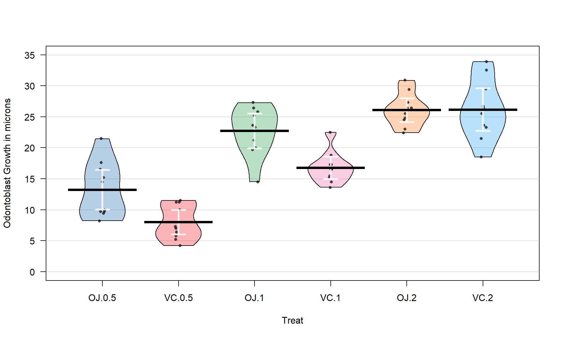
Figure 3.14 suggests that the mean tooth growth increases with the dosage level and that OJ might lead to higher growth rates than VC except at a dosage of 2 mg/day. The variability around the means looks to be small relative to the differences among the means, so we should expect a small p-value from our \(F\)-test. The design is balanced as noted above (\(n_j = 10\) for all six groups) so the methods are somewhat resistant to impacts from potential non-normality and non-constant variance but we should still assess the patterns in the plots, especially with smaller sample sizes in each group. There is some suggestion of non-constant variance in the plots but this will be explored further below when we can remove the difference in the means and combine all the residuals together. There might be some skew in the responses in some of the groups (for example in OJ.0.5 a right skew may be present and in OJ.1 a left skew) but there are only 10 observations per group so visual evidence of skew in the pirate-plots could be generated by impacts of very few of the observations. This actually highlights an issue with residual explorations: when the sample sizes are small, our assumptions matter more than when the sample sizes are large, but when the sample sizes are small, we don’t have much information to assess the assumptions and come to a clear conclusion.
Now we can apply our 6+ steps for performing a hypothesis test with these observations.
- The research question is about differences in odontoblast growth across these combinations of treatments and they seem to have collected data that allow this to explored. A pirate-plot would be a good start to displaying the results and understanding all the combinations of the predictor variable.
- Hypotheses:
\(\boldsymbol{H_0: \mu_{\text{OJ}0.5} = \mu_{\text{VC}0.5} = \mu_{\text{OJ}1} = \mu_{\text{VC}1} = \mu_{\text{OJ}2} = \mu_{\text{VC}2}}\)
vs
\(\boldsymbol{H_A:}\textbf{ Not all } \boldsymbol{\mu_j} \textbf{ equal}\)
- The null hypothesis could also be written in reference-coding as below since OJ.0.5 is chosen as the baseline group (discussed below).
- \(\boldsymbol{H_0:\tau_{\text{VC}0.5} = \tau_{\text{OJ}1} = \tau_{\text{VC}1} = \tau_{\text{OJ}2} = \tau_{\text{VC}2} = 0}\)
- The alternative hypothesis can be left a bit less specific:
- \(\boldsymbol{H_A:} \textbf{ Not all } \boldsymbol{\tau_j} \textbf{ equal 0}\) for \(j = 2, \ldots, 6\)
- The null hypothesis could also be written in reference-coding as below since OJ.0.5 is chosen as the baseline group (discussed below).
- Plot the data and assess validity conditions:
- Independence:
- This is where the separate cages note above is important. Suppose that there were cages that contained multiple animals and they competed for food or could share illness or levels of activity. The animals in one cage might be systematically different from the others and this “clustering” of observations would present a potential violation of the independence assumption.
If the experiment had the animals in separate cages, there is no clear dependency in the design of the study and we can assume73 that there is no problem with this assumption.
- This is where the separate cages note above is important. Suppose that there were cages that contained multiple animals and they competed for food or could share illness or levels of activity. The animals in one cage might be systematically different from the others and this “clustering” of observations would present a potential violation of the independence assumption.
- Constant variance:
- There is some indication of a difference in the variability among the groups in the pirate-plots but the sample size was small in each group. We need to fit the linear model to get the other diagnostic plots to make an overall assessment.
m2 <- lm(len ~ Treat, data = ToothGrowth)
par(mfrow = c(2,2))
plot(m2, pch = 16)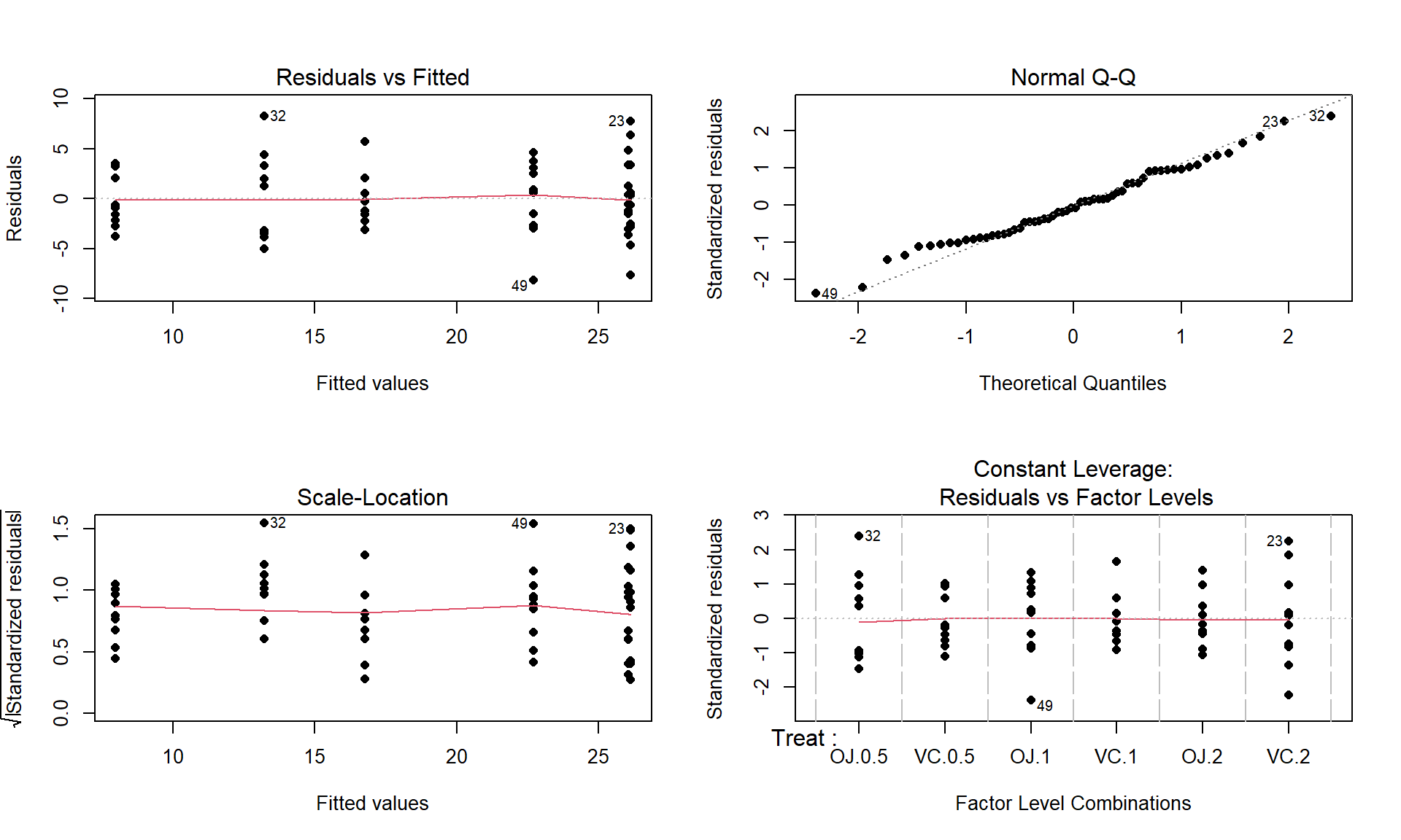
Figure 3.15: Diagnostic plots for the odontoblast growth model. - The Residuals vs Fitted panel in Figure 3.15 shows some difference in the spreads but the spread is not that different among the groups.
- The Scale-Location plot also shows just a little less variability in the group with the smallest fitted value but the spread of the groups looks fairly similar in this alternative presentation related to assessing equal variance.
- Put together, the evidence for non-constant variance is not that strong and we can proceed comfortably that there is at least not a clear issue with this assumption. Because of the balanced design, we also get a little more resistance to violation of the equal variance assumption.
- Normality of residuals:
- The Normal Q-Q plot shows a small deviation in the lower tail but nothing that we wouldn’t expect from a normal distribution. So there is no evidence of a problem with the normality assumption based on the upper right panel of Figure 3.15. Because of the balanced design, we also get a little more resistance to violation of the normality assumption.
- Independence:
- Calculate the test statistic and find the p-value:
- The ANOVA table for our model follows, providing an \(F\)-statistic of 41.557:
m2 <- lm(len ~ Treat, data = ToothGrowth)
anova(m2)
## Analysis of Variance Table ## ## Response: len ## Df Sum Sq Mean Sq F value Pr(>F) ## Treat 5 2740.10 548.02 41.557 < 2.2e-16 ## Residuals 54 712.11 13.19- There are two options here, especially since it seems that our assumptions about variance and normality are not violated (note that we do not say “met” – we just have no clear evidence against them). The parametric and nonparametric approaches should provide similar results here.
- The parametric approach is easiest – the p-value comes from the previous ANOVA table as
< 2e-16. First, note that this is in scientific notation that is a compact way of saying that the p-value here is \(2.2*10^{-16}\) or 0.00000000000000022. When you see2.2e-16in R output, it also means that the calculation is at the numerical precision limits of the computer. What R is really trying to report is that this is a very small number. When you encounter p-values that are smaller than 0.0001, you should just report that the p-value < 0.0001. Do not report that it is 0 as this gives the false impression that there is no chance of the result occurring when it is just a really small probability. This p-value came from an \(F(5,54)\) distribution (this is the distribution of the test statistic if the null hypothesis is true) with an \(F\)-statistic of 41.56. - The nonparametric approach is not too hard so we can compare the two approaches here as well. The permutation p-value is reported as 0. This should be reported as p-value < 0.001 since we did 1,000 permutations and found that none of the permuted \(F\)-statistics, \(F^\ast\), were larger than the observed \(F\)-statistic of 41.56. The permuted results do not exceed 6 as seen in Figure 3.16, so the observed result is really unusual relative to the null hypothesis. As suggested previously, the parametric and nonparametric approaches should be similar here and they were.
Tobs <- anova(lm(len ~ Treat, data = ToothGrowth))[1,4]; Tobs## [1] 41.55718 par(mfrow = c(1,2))
B <- 1000
Tstar <- matrix(NA, nrow = B)
for (b in (1:B)){
Tstar[b] <- anova(lm(len ~ shuffle(Treat), data = ToothGrowth))[1,4]
}
pdata(Tstar, Tobs, lower.tail = F)[[1]]## [1] 0tibble(Tstar) %>% ggplot(aes(x = Tstar)) +
geom_histogram(aes(y = ..ncount..), bins = 25, col = 1, fill = "skyblue") +
geom_density(aes(y = ..scaled..)) +
theme_bw() +
labs(y = "Density") +
geom_vline(xintercept = Tobs, col = "red", lwd = 2) +
stat_bin(aes(y = ..ncount.., label = ..count..), bins = 25,
geom = "text", vjust = -0.75)
- Write a conclusion:
- There is strong evidence (\(F = 41.56\), permutation p-value < 0.001) against the null hypothesis that the different treatments (combinations of OJ/VC and dosage levels) have the same true mean odontoblast growth for these guinea pigs, so we would conclude that the treatments cause at least one of the combinations to have a different true mean.
- We can make the causal statement of the treatment causing differences because the treatments were randomly assigned but these inferences only apply to these guinea pigs since they were not randomly selected from a larger population.
- Remember that we are making inferences to the population or true means and not the sample means and want to make that clear in any conclusion. When there is not a random sample from a population it is more natural to discuss the true means since we can’t extend to the population values.
- The alternative is that there is some difference in the true means – be sure to make the wording clear that you aren’t saying that all the means differ. In fact, if you look back at Figure 3.14, the means for the 2 mg dosages look almost the same so we will have a tough time arguing that all groups differ. The \(F\)-test is about finding evidence of some difference somewhere among the true means. The next section will provide some additional tools to get more specific about the source of those detected differences and allow us to get at estimates of the differences we observed to complete our interpretation.
- There is strong evidence (\(F = 41.56\), permutation p-value < 0.001) against the null hypothesis that the different treatments (combinations of OJ/VC and dosage levels) have the same true mean odontoblast growth for these guinea pigs, so we would conclude that the treatments cause at least one of the combinations to have a different true mean.
- Discuss size of differences:
- It appears that increasing dose levels are related to increased odontoblast growth and that the differences in dose effects change based on the type of delivery method. The difference between 7 and 26 microns for the average length of the cells could be quite interesting to the researchers. This result is harder for me to judge and likely for you than the average distances of cars to bikes but the differences could be very interesting to these researchers.
- The “size” discussion can be further augmented by estimated pair-wise differences using methods discussed below.
- Scope of inference:
- We can make a causal statement of the treatment causing differences in the responses because the treatments were randomly assigned but these inferences only apply to these guinea pigs since they were not randomly selected from a larger population.
- Remember that we are making inferences to the population or true means and not the sample means and want to make that clear. When there is not a random sample from a population it is often more natural to discuss the true means since we can’t extend the results to the population values.
- We can make a causal statement of the treatment causing differences in the responses because the treatments were randomly assigned but these inferences only apply to these guinea pigs since they were not randomly selected from a larger population.
Before we leave this example, we should revisit our model estimates and interpretations. The default model parameterization uses reference-coding. Running the model summary function on m2 provides the estimated coefficients:
summary(m2)$coefficients## Estimate Std. Error t value Pr(>|t|)
## (Intercept) 13.23 1.148353 11.520847 3.602548e-16
## TreatVC.0.5 -5.25 1.624017 -3.232726 2.092470e-03
## TreatOJ.1 9.47 1.624017 5.831222 3.175641e-07
## TreatVC.1 3.54 1.624017 2.179781 3.365317e-02
## TreatOJ.2 12.83 1.624017 7.900166 1.429712e-10
## TreatVC.2 12.91 1.624017 7.949427 1.190410e-10For some practice with the reference-coding used in these models, let’s find the estimates (fitted values) for observations for a couple of the groups. To work with the parameters, you need to start with determining the baseline category that was used by considering which level is not displayed in the output. The levels function can list the groups in a categorical variable and their coding in the data set. The first level is usually the baseline category but you should check this in the model summary as well.
levels(ToothGrowth$Treat)## [1] "OJ.0.5" "VC.0.5" "OJ.1" "VC.1" "OJ.2" "VC.2"There is a VC.0.5 in the second row of the model summary, but there is no row for 0J.0.5 and so this must be the baseline category. That means that the fitted value or model estimate for the OJ at 0.5 mg/day group is the same as the (Intercept) row or \(\widehat{\alpha}\), estimating a mean tooth growth of 13.23 microns when the pigs get OJ at a 0.5 mg/day dosage level. You should always start with working on the baseline level in a reference-coded model. To get estimates for any other group, then you can use the (Intercept) estimate and add the deviation (which could be negative) for the group of interest. For VC.0.5, the estimated mean tooth growth is \(\widehat{\alpha} + \widehat{\tau}_2 = \widehat{\alpha} + \widehat{\tau}_{\text{VC}0.5} = 13.23 + (-5.25) = 7.98\) microns. It is also potentially interesting to directly interpret the estimated difference (or deviation) between OJ.0.5 (the baseline) and VC.0.5 (group 2) that is \(\widehat{\tau}_{\text{VC}0.5} = -5.25\): we estimate that the mean tooth growth in VC.0.5 is 5.25 microns shorter than it is in OJ.0.5. This and many other direct comparisons of groups are likely of interest to researchers involved in studying the impacts of these supplements on tooth growth and the next section will show us how to do that (correctly!).
The reference-coding is still going to feel a little uncomfortable so the comparison to the cell means model and exploring the effect plot can help to reinforce that both models patch together the same estimated means for each group. For example, we can find our estimate of 7.98 microns for the VC0.5 group in the output and Figure 3.17. Also note that Figure 3.17 is the same whether you plot the results from m2 or m3.
m3 <- lm(len ~ Treat - 1, data = ToothGrowth)
summary(m3)
##
## Call:
## lm(formula = len ~ Treat - 1, data = ToothGrowth)
##
## Residuals:
## Min 1Q Median 3Q Max
## -8.20 -2.72 -0.27 2.65 8.27
##
## Coefficients:
## Estimate Std. Error t value Pr(>|t|)
## TreatOJ.0.5 13.230 1.148 11.521 3.60e-16
## TreatVC.0.5 7.980 1.148 6.949 4.98e-09
## TreatOJ.1 22.700 1.148 19.767 < 2e-16
## TreatVC.1 16.770 1.148 14.604 < 2e-16
## TreatOJ.2 26.060 1.148 22.693 < 2e-16
## TreatVC.2 26.140 1.148 22.763 < 2e-16
##
## Residual standard error: 3.631 on 54 degrees of freedom
## Multiple R-squared: 0.9712, Adjusted R-squared: 0.968
## F-statistic: 303 on 6 and 54 DF, p-value: < 2.2e-16
plot(allEffects(m2), rotx = 45)