
3.4: ANOVA model diagnostics including QQ-plots
- Page ID
- 33231

3.4 ANOVA model diagnostics including QQ-plots
The requirements for a One-Way ANOVA \(F\)-test are similar to those discussed in Chapter 2, except that there are now \(J\) groups instead of only 2. Specifically, the linear model assumes:
- Independent observations,
- Equal variances, and
- Normal distributions.
For assessing equal variances across the groups, it is best to use plots to assess this. We can use pirate-plots to compare the spreads of the groups, which were provided in Figure 3.1. The spreads (both in terms of extrema and rest of the distributions) should look relatively similar across the groups for you to suggest that there is not evidence of a problem with this assumption. You should start with noting how clear or big the violation of the conditions might be but remember that there will always be some differences in the variation among groups even if the true variability is exactly equal in the populations. In addition to our direct plotting, there are some diagnostic plots available from the lm function that can help us more clearly assess potential violations of the assumptions.
We can obtain a suite of four diagnostic plots by using the plot function on any linear model object that we have fit. To get all the plots together in four panels we need to add the par(mfrow = c(2,2)) command to tell R to make a graph with 4 panels67.
par(mfrow = c(2,2))
plot(lm2, pch = 16)
There are two plots in Figure 3.9 with useful information for assessing the equal variance assumption. The “Residuals vs Fitted” panel in the top left panel displays the residuals \((e_{ij} = y_{ij}-\widehat{y}_{ij})\) on the y-axis and the fitted values \((\widehat{y}_{ij})\) on the x-axis. This allows you to see if the variability of the observations differs across the groups as a function of the mean of the groups, because all the observations in the same group get the same fitted value – the mean of the group. In this plot, the points seem to have fairly similar spreads at the fitted values for the seven groups with fitted values at 114 up to 122 cm. The “Scale-Location” plot in the lower left panel has the same x-axis of fitted values but the y-axis contains the square-root of the absolute value of the standardized residuals. The standardization scales the residuals to have a variance of 1 so help you in other displays to get a sense of how many standard deviations you are away from the mean in the residual distribution. The absolute value transforms all the residuals into a magnitude scale (removing direction) and the square-root helps you see differences in variability more accurately. The visual assessment is similar in the two plots – you want to consider whether it appears that the groups have somewhat similar or noticeably different amounts of variability. If you see a clear funnel shape (narrow (less variability) on the left or right and wide (more variability) at the right or left) in the Residuals vs Fitted and/or an increase or decrease in the height of the upper edge of points in the Scale-Location plot that may indicate a violation of the constant variance assumption. Remember that some variation across the groups is expected, does not suggest a violation of a validity conditions, and means that you can proceed with trusting your inferences, but large differences in the spread are problematic for all the procedures that involve linear models. When discussing these results, you want to discuss how clearly the differences in variation are and whether that shows a clear violation of the condition of equal variance for all observations. Like in hypothesis testing, you can never prove that an assumption is true based on a plot “looking OK”, but you can say that there is no clear evidence that the condition is violated!
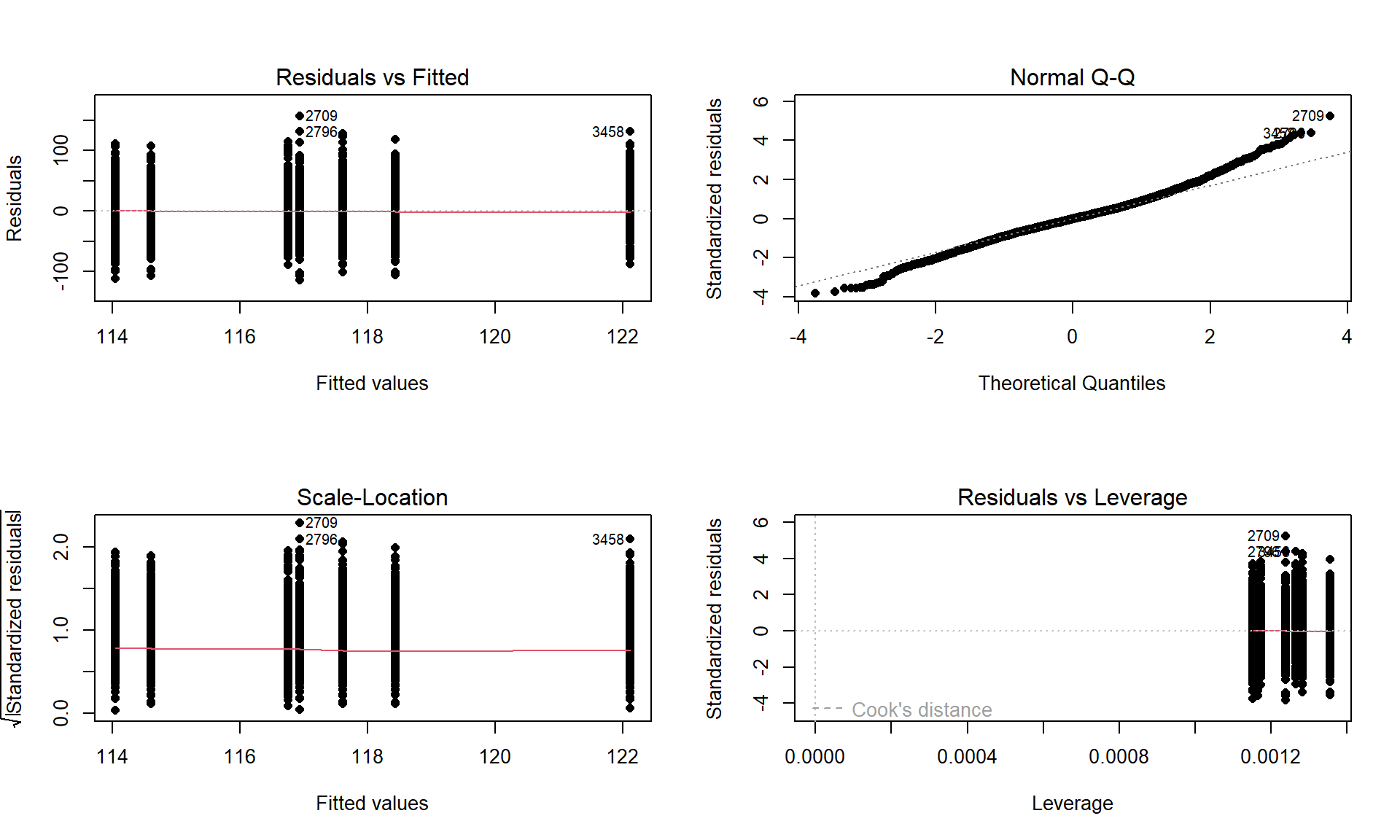
The linear model also assumes that all the random errors (\(\varepsilon_{ij}\)) follow a normal distribution. To gain insight into the validity of this assumption, we can explore the original observations as displayed in the pirate-plots, mentally subtracting off the differences in the means and focusing on the shapes of the distributions of observations in each group. Each group should look approximately normal to avoid a concern on this assumption. These plots are especially good for assessing whether there is a skew or are outliers present in each group. If either skew or clear outliers are present, by definition, the normality assumption is violated. But our assumption is about the distribution of all the errors after removing the differences in the means and so we want an overall assessment technique to understand how reasonable our assumption might be overall for our model. The residuals from the entire model provide us with estimates of the random errors and if the normality assumption is met, then the residuals all-together should approximately follow a normal distribution. The Normal QQ-Plot in the upper right panel of Figure 3.9 also provides a direct visual assessment of how well our residuals match what we would expect from a normal distribution. Outliers, skew, heavy and light-tailed aspects of distributions (all violations of normality) show up in this plot once you learn to read it – which is our next task. To make it easier to read QQ-plots, it is nice to start with just considering histograms and/or density plots of the residuals and to see how that maps into this new display. We can obtain the residuals from the linear model using the residuals function on any linear model object. Figure 3.10 makes both a histogram and density curve of these residuals. It shows that they have a subtle right skew present (right half of the distribution is a little more spread out than the left, so the skew is to the right) once we accounted for the different means in the groups but there are no apparent outliers.
par(mfrow = c(1,2))
dd <- dd %>% mutate(eij = residuals(lm2)) #Adds residuals to dd

dd %>% ggplot(aes(x = eij)) +
  geom_histogram(aes(y = ..ncount..), bins = 25, col = 1, fill = "tomato") +
  geom_density(aes(y = ..scaled..)) +
  theme_bw() +
  labs(y = "Density",
       x = "Residuals",
       title = "Histogram of residuals")
A Quantile-Quantile plot (QQ-plot) shows the “match” of an observed distribution with a theoretical distribution, almost always the normal distribution. They are also known as Quantile Comparison, Normal Probability, or Normal Q-Q plots, with the last two names being specific to comparing results to a normal distribution. In this version68, the QQ-plots display the value of observed percentiles in the residual distribution on the y-axis versus the percentiles of a theoretical normal distribution on the x-axis. If the observed distribution of the residuals matches the shape of the normal distribution, then the plotted points should follow a 1-1 relationship. The 1-1 line is based on the Q1 (25th) and Q3 (75th) percentiles in the distributions to avoid impacts of the tails on the line you are using to compare the two distributions, with points added to the plot using geom_qq and the reference (1-1) line added with stat_qq_line. If the points follow the displayed straight line then that suggests that the residuals have a similar shape to a normal distribution. Some variation is expected around the line and some patterns of deviation are worse than others for our models, so you need to go beyond saying “it does not match a normal distribution”. Be specific about the type of deviation you are detecting (right or left skew, heavy tails, multi-modal, etc.) and how clear or obvious that deviation is. And to do that, we need to practice interpreting some QQ-plots.
qq1 <- dd %>% ggplot(aes(sample = eij)) +
  geom_qq() +
  stat_qq_line() +
  theme_bw() +
  labs(title = "QQ-Plot of residuals")
den1 <- dd %>% ggplot(mapping = aes(x = eij)) +
  geom_density(color = "darkcyan") +
  labs(title = "Density plot of residuals",
       y = "Density",
       x = "Residuals") +
  theme_bw()
grid.arrange(qq1, den1, ncol = 2)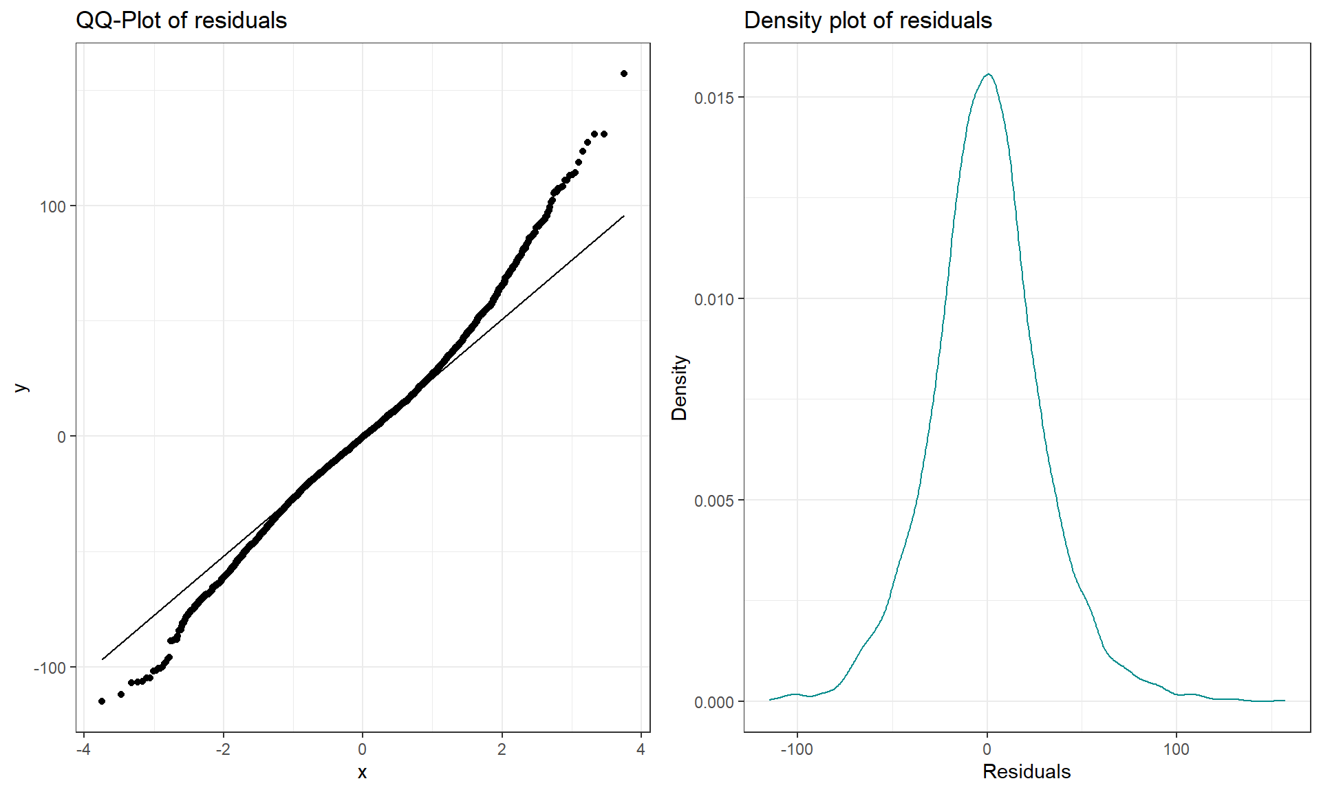
The QQ-plot of the linear model residuals from Figure 3.9 is extracted and enhanced a little to make Figure 3.11 so we can just focus on it. We know from looking at the histogram that this is a (very) slightly right skewed distribution. Either version of the QQ-plots we will work with place the observed residuals on the y-axis and the expected results for a normal distribution on the x-axis. In some plots, the standardized69 residuals are used (Figure 3.9) and in others the raw residuals are used (Figure 3.11) to compare the residual distribution to a normal (Gaussian) one. Both the upper and lower tails (upper tail in the upper right and the lower tail in the lower right of the plot) show some separation from the 1-1 line. The separation in the upper tail is more clear and these positive residuals are higher than the line “predicts” if the distribution had been normal. Being higher than the line in the right tail means being bigger than expected and so more spread out in that direction than a normal distribution should be. The left tail for the negative residuals also shows some separation from the line to have more extreme (here more negative) than expected, suggesting a little extra spread in the lower tail than suggested by a normal distribution. If the two sides had been similarly far from the 1-1 line, then we would have a symmetric and heavy-tailed distribution. Here, the slight difference in the two sides suggests that the right tail is more spread out than the left and we should be concerned about a minor violation of the normality assumption. If the distribution had followed the normal distribution here, there would be no clear pattern of deviation from the 1-1 line (not all points need to be on the line!) and the standardized residuals would not have quite so many extreme results (over 5 in both tails). Note that the diagnostic plots will label a few points (3 by default) that might be of interest for further exploration. These identifications are not to be used for any other purpose – this is not the software identifying outliers or other problematic points – that is your responsibility to assess using these plots. For example, the point “2709” is identified in Figure 3.9 (the 2709th observation in the data set) as a potentially interesting point that falls in the far right-tail of positive residuals with a raw residual of almost 160 cm. This is a great opportunity to review what residuals are and how they are calculated for this observation. First, we can extract the row for this observation and find that it was a novice vest observation with a distance of 274 cm (that is almost 9 feet). The fitted value for this observation can be obtained using the fitted function on the estimated lm – which here is just the sample mean of the group of the observations (novice) of 116.94 cm. The residual is stored in the 2,709th value of eij or can be calculated by taking 274 minus the fitted value of 116.94. Given the large magnitude of this passing distance (it was the maximum distance observed in the Distance variable), it is not too surprising that it ends up as the largest positive residual.
dd[2709, c(1:2)]## # A tibble: 1 × 2
## Condition Distance
## <fct> <dbl>
## 1 novice 274fitted(lm2)[2709]## 2709
## 116.9405dd$eij[2709]## 2709
## 157.0595274 - 116.9405## [1] 157.0595Generally, when both tails deviate on the same side of the line (forming a sort of quadratic curve, especially in more extreme cases), that indicates a skewed residual distribution (the one above has a very minor skew so this does not occur) and presence of a skew is evidence of a violation of the normality assumption. To see some different potential shapes in QQ-plots, six different data sets are displayed in Figures 3.12 and 3.13. In each row, a QQ-plot and associated density curve are displayed. If the points form a pattern where all are above the 1-1 line in the lower and upper tails as in Figure 3.12(a), then the pattern is a right skew, more extreme and easy to see than in the previous real data set. If the points form a pattern where they are below the 1-1 line in both tails as in Figure 3.12(c), then the pattern is identified as a left skew. Skewed residual distributions (either direction) are problematic for models that assume normally distributed responses but not necessarily for our permutation approaches if all the groups have similar skewed shapes. The other problematic pattern is to have more spread than a normal curve as in Figure 3.12(e) and (f). This shows up with the points being below the line in the left tail (more extreme negative than expected by the normal) and the points being above the line for the right tail (more extreme positive than the normal predicts). We call these distributions heavy-tailed which can manifest as distributions with outliers in both tails or just a bit more spread out than a normal distribution.

Heavy-tailed residual distributions can be problematic for our models as the variation is greater than what the normal distribution can account for and our methods might under-estimate the variability in the results. The opposite pattern with the left tail above the line and the right tail below the line suggests less spread (light-tailed) than a normal as in Figure 3.12(g) and (h). This pattern is relatively harmless and you can proceed with methods that assume normality safely as they will just be a little conservative. For any of the patterns, you would note a potential violation of the normality assumption and then proceed to describe the type of violation and how clear or extreme it seems to be.
Finally, to help you calibrate expectations for data that are actually normally distributed, two data sets simulated from normal distributions are displayed in Figure 3.13. Note how neither follows the line exactly but that the overall pattern matches fairly well. You have to allow for some variation from the line in real data sets and focus on when there are really noticeable issues in the distribution of the residuals such as those displayed above. Again, you will never be able to prove that you have normally distributed residuals even if the residuals are all exactly on the line, but if you see QQ-plots as in Figure 3.12 you can determine that there is clear evidence of violations of the normality assumption.

The last issues with assessing the assumptions in an ANOVA relates to situations where the methods are more or less resistant70 to violations of assumptions. In simulation studies of the performance of the \(F\)-test, researchers have found that the parametric ANOVA \(F\)-test is more resistant to violations of the assumptions of the normality and equal variance assumptions if the design is balanced. A balanced design occurs when each group is measured the same number of times. The resistance decreases as the data set becomes less balanced, as the sample sizes in the groups are more different, so having close to balance is preferred to a more imbalanced situation if there is a choice available. There is some intuition available here – it makes some sense that you would have better results in comparing groups if the information available is similar in all the groups and none are relatively under-represented. We can check the number of observations in each group to see if they are equal or similar using the tally function from the mosaic package. This function is useful for being able to get counts of observations, especially for cross-classifying observations on two variables that is used in Chapter 5. For just a single variable, we use tally(~ x, data = ...):
library(mosaic)
tally(~ Condition, data = dd)
## Condition
## casual commute hiviz novice police polite racer
## 779 857 737 807 790 868 852So the sample sizes do vary among the groups and the design is not balanced, but all the sample sizes are between 737 and 868 so it is (in percentage terms at least) not too far from balanced. It is better then having, say, 50 in one group and 1,200 in another. This tells us that the \(F\)-test should have some resistance to violations of assumptions. We also get more resistance to violation of assumptions as our sample sizes increase. With such a large data set here and only minor concerns with the normality assumption, the inferences generated for the means should be trustworthy and we will get similar results from parametric and nonparametric procedures. If we had only 15 observations per group and a slightly skewed residual distribution, then we might want to appeal to the permutation approach to have more trustworthy results, even if the design were balanced.