
6.3: Relationships between variables by groups
- Page ID
- 33266

In assessing the relationship between variables, incorporating information from a third variable can often enhance the information gathered by either showing that the relationship between the first two variables is the same across levels of the other variable or showing that it differs. When the other variable is categorical (or just can be made categorical), it can be added to scatterplots, changing the symbols and colors for the points based on the different groups. These techniques are especially useful if the categorical variable corresponds to potentially distinct groups in the responses. In the previous example, the data set was built with male and female athletes. For some characteristics, the relationships might be the same for both sexes but for others, there are likely some physiological differences to consider.
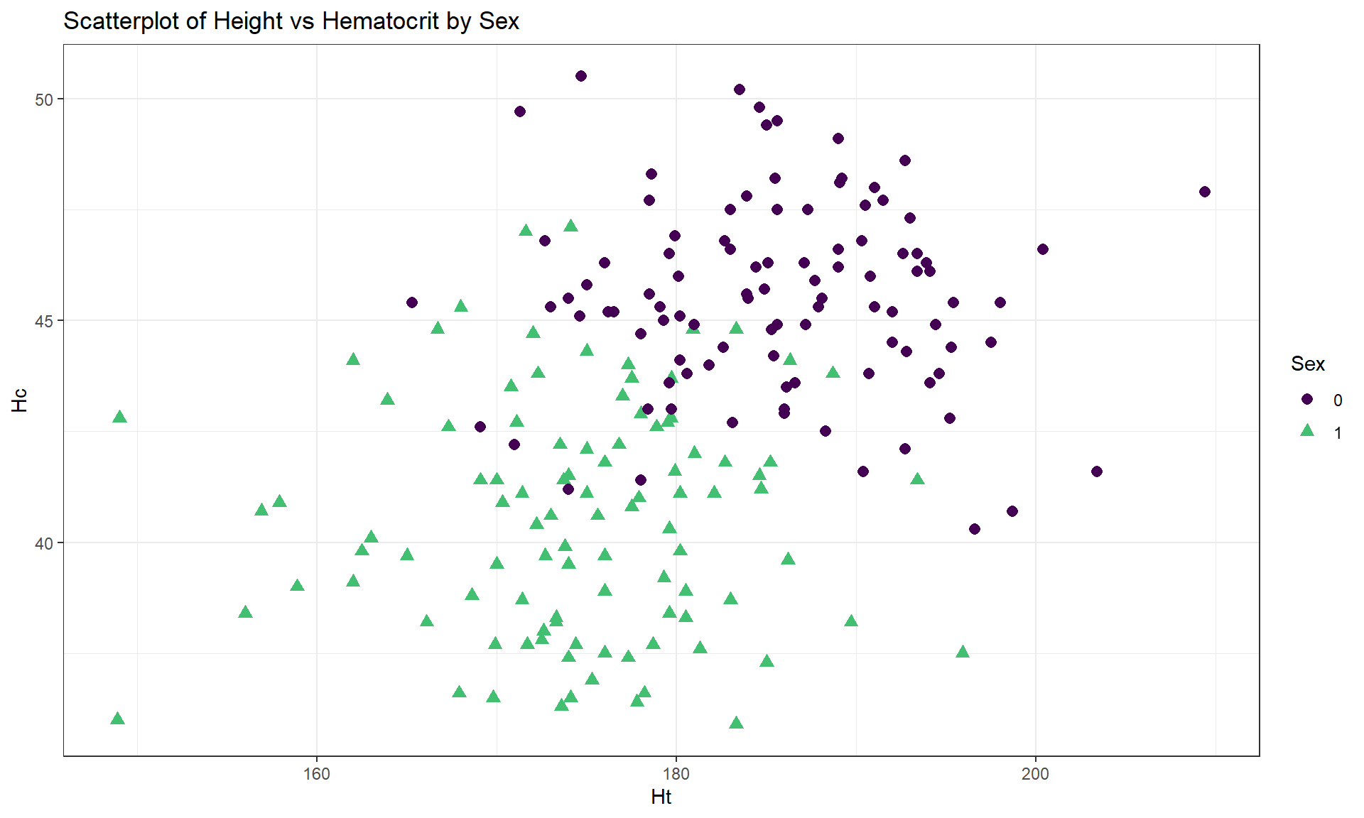
This set of material is where the ggplot2 methods will really pay off for us, providing you with an extensive set of tools for visualizing relationships between two quantitative variables and incorporating information from other variables. There are three ways to add a categorical variable to a scatterplot that we will use. The first is to modify the colors, the second is modify the plotting symbol, and the third is to split the graph into panels or facets based on the groups of the variable. We usually combine the first two options to give the reader the best chance of detecting the group differences using both colors and symbols by groups; we will save faceting for a little later in the material. In these modifications, we can modify the colors and symbols based on the levels of categorical variable (say groupfactor) by adding color = groupfactor, shape = groupfactor to the aes() definition in the initial ggplot part of the function or within an aesthetic inside geom_point. Defining the colors and shape within the geom_point only is useful if you want to change colors or symbols for the points in a way that might differ from the colors and groupings you use for other layers in the plot. The addition of grouping information in the initial ggplot aesthetic is called a “global” aesthetic and will apply to all the following geom’s. Defining the colors or symbols within geom_point is called a “local” aesthetic and only applies to that layer of the plot. To enhance visibility of the points in the scatterplot, we often engage different color palettes, using a version113 of the viridis colors with scale_color_viridis_d(end = 0.7). Using these ggplot additions, Figure 6.7 displays the Height and Hematocrit relationship with information on the sex of the athletes where sex was coded 0 for males and 1 for females, changing both the symbol and color for the groups – with a legend to help to understand the plot.
aisR2 <- ais %>%
  slice(-c(56, 166)) %>%
  select(Ht, Hc, Bfat, Sex) %>%
  mutate(Sex = factor(Sex))


aisR2 %>% ggplot(mapping = aes(x = Ht, y = Hc)) +
  geom_point(aes(shape = Sex, color = Sex), size = 2.5) +
  theme_bw() +
  scale_color_viridis_d(end = 0.7) +
  labs(title = "Scatterplot of Height vs Hematocrit by Sex")
Adding the grouping information really changes the impressions of the relationship between Height and Hematocrit – within each sex, there is little relationship between the two variables. The overall relationship is of moderate strength and positive but the subgroup relationships are weak at best. The overall relationship is created by inappropriately combining two groups that had different means in both the \(x\) and \(y\) directions. Men have higher mean heights and hematocrit values than women and putting them together in one large group creates the misleading overall relationship114.
To get the correlation coefficients by groups, we can subset the data set using a logical inquiry on the Sex variable in the updated aisR2 data set, using Sex == 0 in the filter function to get a tibble with male subjects only and Sex == 1 for the female subjects, then running the cor function on each version of the data set:
cor(Hc ~ Ht, data = aisR2 %>% filter(Sex == 0)) #Males only## [1] -0.04756589cor(Hc ~ Ht, data = aisR2 %>% filter(Sex == 1)) #Females only## [1] 0.02795272These results show that \(\boldsymbol{r} = -0.05\) for Height and Hematocrit for males and \(\boldsymbol{r} = 0.03\) for females. The first suggests a very weak negative linear relationship and the second suggests a very weak positive linear relationship. The correlation when the two groups were combined (and group information was ignored!) was that \(\boldsymbol{r} = 0.37\). So one conclusion here is that correlations on data sets that contain groups can be very misleading (if the groups are ignored). It also emphasizes the importance of exploring for potential subgroups in the data set – these two groups were not obvious in the initial plot, but with added information the real story became clear.
For the Body Fat vs Hematocrit results in Figure 6.8, with an overall correlation of \(\boldsymbol{r} = -0.54\), the subgroup correlations show weaker relationships that also appear to be in different directions (\(\boldsymbol{r} = 0.13\) for men and \(\boldsymbol{r} = -0.17\) for women). This doubly reinforces the dangers of aggregating different groups and ignoring the group information.
cor(Hc ~ Bfat, data = aisR2 %>% filter(Sex == 0)) #Males only## [1] 0.1269418cor(Hc ~ Bfat, data = aisR2 %>% filter(Sex == 1)) #Females only## [1] -0.1679751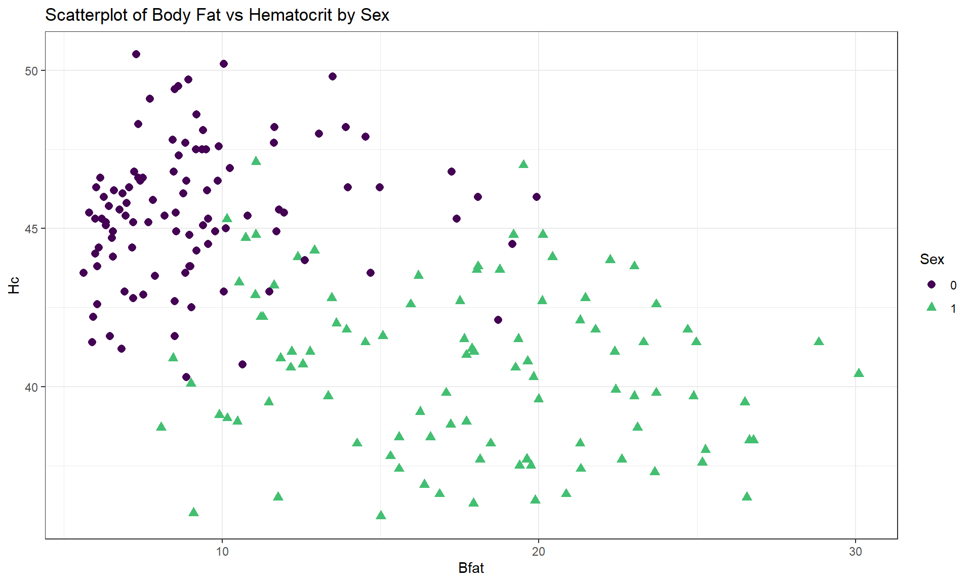
aisR2 %>% ggplot(mapping = aes(x = Bfat, y = Hc)) +
  geom_point(aes(shape = Sex, color = Sex), size = 2.5) +
  theme_bw() +
  scale_color_viridis_d(end = 0.7) +
  labs(title = "Scatterplot of Body Fat vs Hematocrit by Sex")
One final exploration for these data involves the body fat and height relationship displayed in Figure 6.9. This relationship shows an even greater disparity between overall and subgroup results. The overall relationship is characterized as a weak negative relationship \((\boldsymbol{r} = -0.20)\) that is not clearly linear or nonlinear. The subgroup relationships are both clearly positive with a stronger relationship for men that might also be nonlinear (for the linear relationships \(\boldsymbol{r} = 0.45\) for women and \(\boldsymbol{r} = 0.20\) for men). Especially for female athletes, those that are taller seem to have higher body fat percentages. This might be related to the types of sports they compete in (there were 10 in the data set) – that would be another categorical variable we could incorporate… Both groups also seem to demonstrate slightly more variability in Body Fat associated with taller athletes (each sort of “fans out”).
cor(Bfat ~ Ht, data = aisR2 %>% filter(Sex == 0)) #Males only## [1] 0.1954609cor(Bfat ~ Ht, data = aisR2 %>% filter(Sex == 1)) #Females only## [1] 0.4476962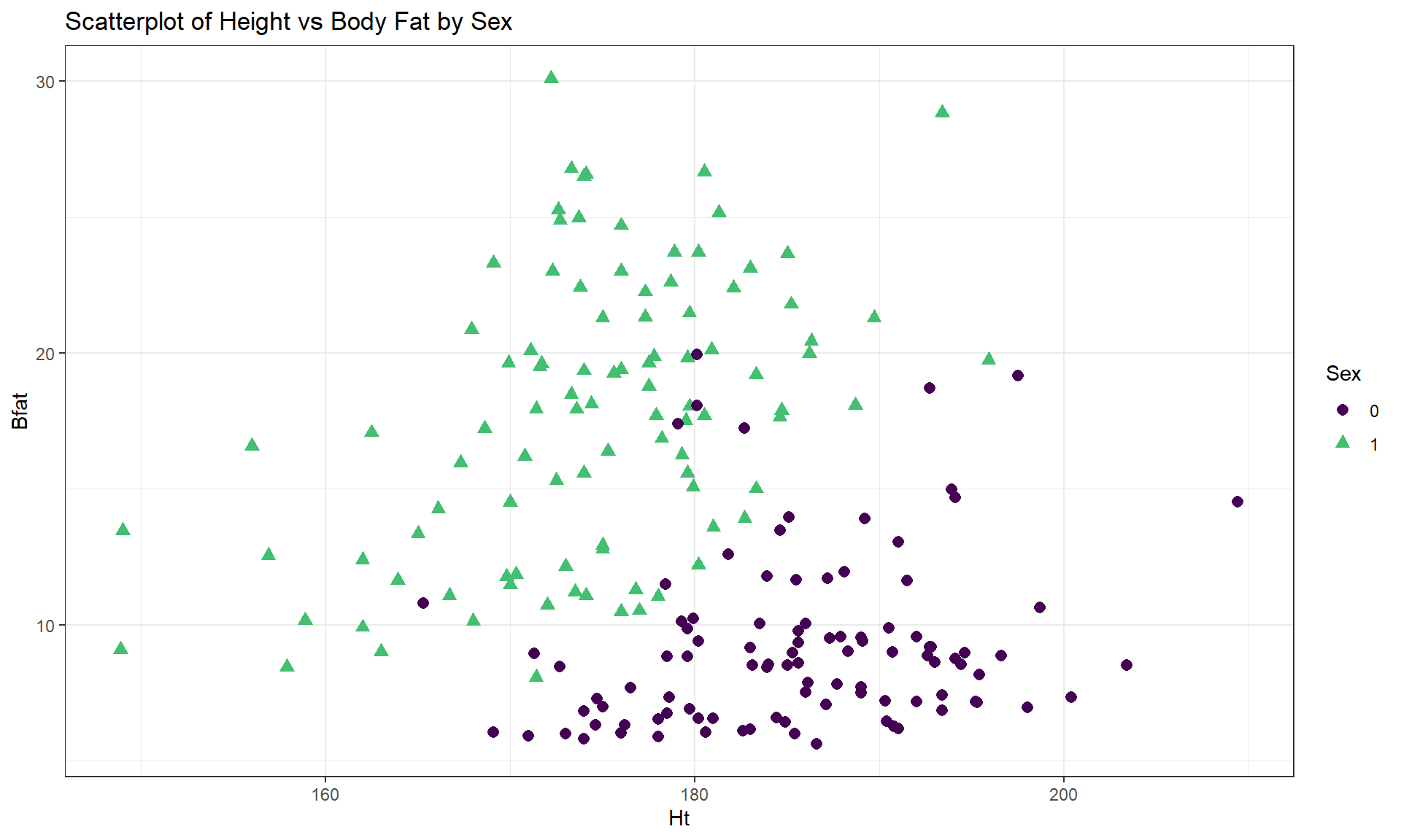
aisR2 %>% ggplot(mapping = aes(x = Ht, y = Bfat)) +
  geom_point(aes(shape = Sex, color = Sex), size = 2.5) +
  theme_bw() +
  scale_color_viridis_d(end = 0.7) +
  labs(title = "Scatterplot of Height vs Body Fat by Sex")
In each of these situations, the sex of the athletes has the potential to cause misleading conclusions if ignored. There are two ways that this could occur – if we did not measure it then we would have no hope to account for it OR we could have measured it but not adjusted for it in our results, as was done initially. We distinguish between these two situations by defining the impacts of this additional variable as either a confounding or lurking variable:
- Confounding variable: affects the response variable and is related to the explanatory variable. The impacts of a confounding variable on the response variable cannot be separated from the impacts of the explanatory variable.
- Lurking variable: a potential confounding variable that is not measured and is not considered in the interpretation of the study.
Lurking variables show up in studies sometimes due to lack of knowledge of the system being studied or a lack of resources to measure these variables. Note that there may be no satisfying resolution to the confounding variable problem but that it is better to have measured it and know about it than to have it remain a lurking variable.
To help think about confounding and lurking variables, consider the following situation. On many highways, such as Highway 93 in Montana and north into Canada, recent construction efforts have been involved in creating safe passages for animals by adding fencing and animal crossing structures. These structures both can improve driver safety, save money from costs associated with animal-vehicle collisions, and increase connectivity of animal populations. Researchers (such as Clevenger and Waltho (2005)) involved in these projects are interested in which characteristics of underpasses lead to the most successful structures, mainly measured by rates of animal usage (number of times they cross under the road). Crossing structures are typically made using culverts and those tend to be cylindrical. Researchers are interested in studying the effect of height and width of crossing structures on animal usage. Unfortunately, all the tallest structures are also the widest structures. If animals prefer the tall and wide structures, then there is no way to know if it is due to the height or width of the structure since they are confounded. If the researchers had only measured width, then they might assume that it is the important characteristic of the structures but height could be a lurking variable that really was the factor related to animal usage of the structures. This is an example where it may not be possible to design a study that prevents confounding of the two variables height and width. If the researchers could control the height and width of the structures independently, then they could randomly assign both variables to make sure that some narrow structures are installed that are tall and some that are short. Additionally, they would also want to have some wide structures that are short and some are tall. Careful design of studies can prevent confounding of variables if they are known in advance and it is possible to control them, but in observational studies the observed combinations of variables are uncontrollable. This is why we need to employ additional caution in interpreting results from observational studies. Here that would mean that even if width was found to be a predictor of animal usage, we would likely want to avoid saying that width of the structures caused differences in animal usage.