6.2: Estimating the correlation coefficient
- Page ID
- 33265

In terms of quantifying relationships between variables, we start with the correlation coefficient, a measure that is the same regardless of your choice of variables as explanatory or response. We measure the strength and direction of linear relationships between two quantitative variables using Pearson’s r or Pearson’s Product Moment Correlation Coefficient. For those who really like acronyms, Wikipedia even suggests calling it the PPMCC. However, its use is so ubiquitous that the lower case r or just “correlation coefficient” are often sufficient to identify that you have used the PPMCC. Some of the extra distinctions arise because there are other ways of measuring correlations in other situations (for example between two categorical variables), but we will not consider them here.
The correlation coefficient, r, is calculated as
\[r = \frac{1}{n-1}\sum^n_{i = 1}\left(\frac{x_i-\bar{x}}{s_x}\right) \left(\frac{y_i-\bar{y}}{s_y}\right),\]
where \(s_x\) and \(s_y\) are the standard deviations of \(x\) and \(y\). This formula can also be written as
\[r = \frac{1}{n-1}\sum^n_{i = 1}z_{x_i}z_{y_i}\]
where \(z_{x_i}\) is the z-score (observation minus mean divided by standard deviation) for the \(i^{th}\) observation on \(x\) and \(z_{y_i}\) is the z-score for the \(i^{th}\) observation on \(y\). We won’t directly use this formula, but its contents inform the behavior of r. First, because it is a sum divided by (\(n-1\)) it is a bit like an average – it combines information across all observations and, like the mean, is sensitive to outliers. Second, it is a dimension-less measure, meaning that it has no units attached to it. It is based on z-scores which have units of standard deviations of \(x\) or \(y\) so the original units of measurement are canceled out going into this calculation. This also means that changing the original units of measurement, say from Fahrenheit to Celsius or from miles to km for one or the other variable will have no impact on the correlation. Less obviously, the formula guarantees that r is between -1 and 1. It will attain -1 for a perfect negative linear relationship, 1 for a perfect positive linear relationship, and 0 for no linear relationship. We are being careful here to say linear relationship because you can have a strong nonlinear relationship with a correlation of 0. For example, consider Figure 6.2.

There are some conditions for trusting the results that the correlation coefficient provides:
- Two quantitative variables measured.
- This might seem silly, but categorical variables can be coded numerically and a meaningless correlation can be estimated if you are not careful what you correlate.
- The relationship between the variables is relatively linear.
- If the relationship is nonlinear, the correlation is meaningless since it only measures linear relationships and can be misleading if applied to a nonlinear relationship.
- There should be no outliers.
- The correlation is very sensitive (technically not resistant) to the impacts of certain types of outliers and you should generally avoid reporting the correlation when they are present.
- One option in the presence of outliers is to report the correlation with and without outliers to see how they influence the estimated correlation.
The correlation coefficient is dimensionless but larger magnitude values (closer to -1 OR 1) mean stronger linear relationships. A rough interpretation scale based on experiences working with correlations follows, but this varies between fields and types of research and variables measured. It depends on the levels of correlation researchers become used to obtaining, so can even vary within fields. Use this scale for the discussing the strength of the linear relationship until you develop your own experience with typical results in a particular field and what is expected:
- \(\left|\boldsymbol{r}\right|<0.3\): weak linear relationship,
- \(0.3 < \left|\boldsymbol{r}\right|<0.7\): moderate linear relationship,
- \(0.7 < \left|\boldsymbol{r}\right|<0.9\): strong linear relationship, and
- \(0.9 < \left|\boldsymbol{r}\right|<1.0\): very strong linear relationship.
And again note that this scale only relates to the linear aspect of the relationship between the variables.
When we have linear relationships between two quantitative variables, \(x\) and \(y\), we can obtain estimated correlations from the cor function either using y ~ x or by running the cor function110 on the entire data set. When you run the cor function on a data set it produces a correlation matrix which contains a matrix of correlations where you can triangulate the variables being correlated by the row and column names, noting that the correlation between a variable and itself is 1. A matrix of correlations is useful for comparing more than two variables, discussed below.
library(mosaic)
cor(BAC ~ Beers, data = BB)
## [1] 0.8943381cor(BB)## Beers BAC
## Beers 1.0000000 0.8943381
## BAC 0.8943381 1.0000000Based on either version of using the function, we find that the correlation between Beers and BAC is estimated to be 0.89. This suggests a strong linear relationship between the two variables. Examples are about the only way to build up enough experience to become skillful in using the correlation coefficient. Some additional complications arise in more complicated studies as the next example demonstrates.
Gude et al. (2009) explored the relationship between average summer temperature (degrees F) and area burned (natural log of hectares111 = log(hectares)) by wildfires in Montana from 1985 to 2007. The log-transformation is often used to reduce the impacts of really large observations with non-negative (strictly greater than 0) variables (more on transformations and their impacts on regression models in Chapter 7). Based on your experiences with the wildfire “season” and before analyzing the data, I’m sure you would assume that summer temperature explains the area burned by wildfires. But could it be that more fires are related to having warmer summers? That second direction is unlikely on a state-wide scale but could apply at a particular weather station that is near a fire. There is another option – some other variable is affecting both variables. For example, drier summers might be the real explanatory variable that is related to having both warm summers and lots of fires. These variables are also being measured over time making them examples of time series. In this situation, if there are changes over time, they might be attributed to climate change. So there are really three relationships to explore with the variables measured here (remembering that the full story might require measuring even more!): log-area burned versus temperature, temperature versus year, and log-area burned versus year.
As demonstrated in the following code, with more than two variables, we can use the cor function on all the variables and end up getting a matrix of correlations or, simply, the correlation matrix. If you triangulate the row and column labels, that cell provides the correlation between that pair of variables. For example, in the first row (Year) and the last column (loghectares), you can find that the correlation coefficient is r = 0.362. Note the symmetry in the matrix around the diagonal of 1’s – this further illustrates that correlation between \(x\) and \(y\) does not depend on which variable is viewed as the “response”. The estimated correlation between Temperature and Year is -0.004 and the correlation between loghectares (log-hectares burned) and Temperature is 0.81. So Temperature has almost no linear change over time. And there is a strong linear relationship between loghectares and Temperature. So it appears that temperatures may be related to log-area burned but that the trend over time in both is less clear (at least the linear trends).
mtfires <- read_csv("http://www.math.montana.edu/courses/s217/documents/climateR2.csv")# natural log transformation of area burned
mtfires <- mtfires %>% mutate(loghectares = log(hectares))
# Cuts the original hectares data so only log-scale version in tibble
mtfiresR <- mtfires %>%
select(-hectares)
cor(mtfiresR)## Year Temperature loghectares
## Year 1.0000000 -0.0037991 0.3617789
## Temperature -0.0037991 1.0000000 0.8135947
## loghectares 0.3617789 0.8135947 1.0000000The correlation matrix alone is misleading – we need to explore scatterplots to check for nonlinear relationships, outliers, and clustering of observations that may be distorting the numerical measure of the linear relationship. The ggpairs function from the GGally package (Schloerke et al. 2021) combines the numerical correlation information and scatterplots in one display112. As in the correlation matrix, you triangulate the variables for the pairwise relationship. The upper right panel of Figure 6.3 displays a correlation of 0.362 for Year and loghectares and the lower left panel contains the scatterplot with Year on the \(x\)-axis and loghectares on the \(y\)-axis. The correlation between Year and Temperature is really small, both in magnitude and in display, but appears to be nonlinear (it goes down between 1985 and 1995 and then goes back up), so the correlation coefficient doesn’t mean much here since it just measures the overall linear relationship. We might say that this is a moderate strength (moderately “clear”) curvilinear relationship. In terms of the underlying climate process, it suggests a decrease in summer temperatures between 1985 and 1995 and then an increase in the second half of the data set.
library(GGally)
mtfiresR %>% ggpairs() + theme_bw()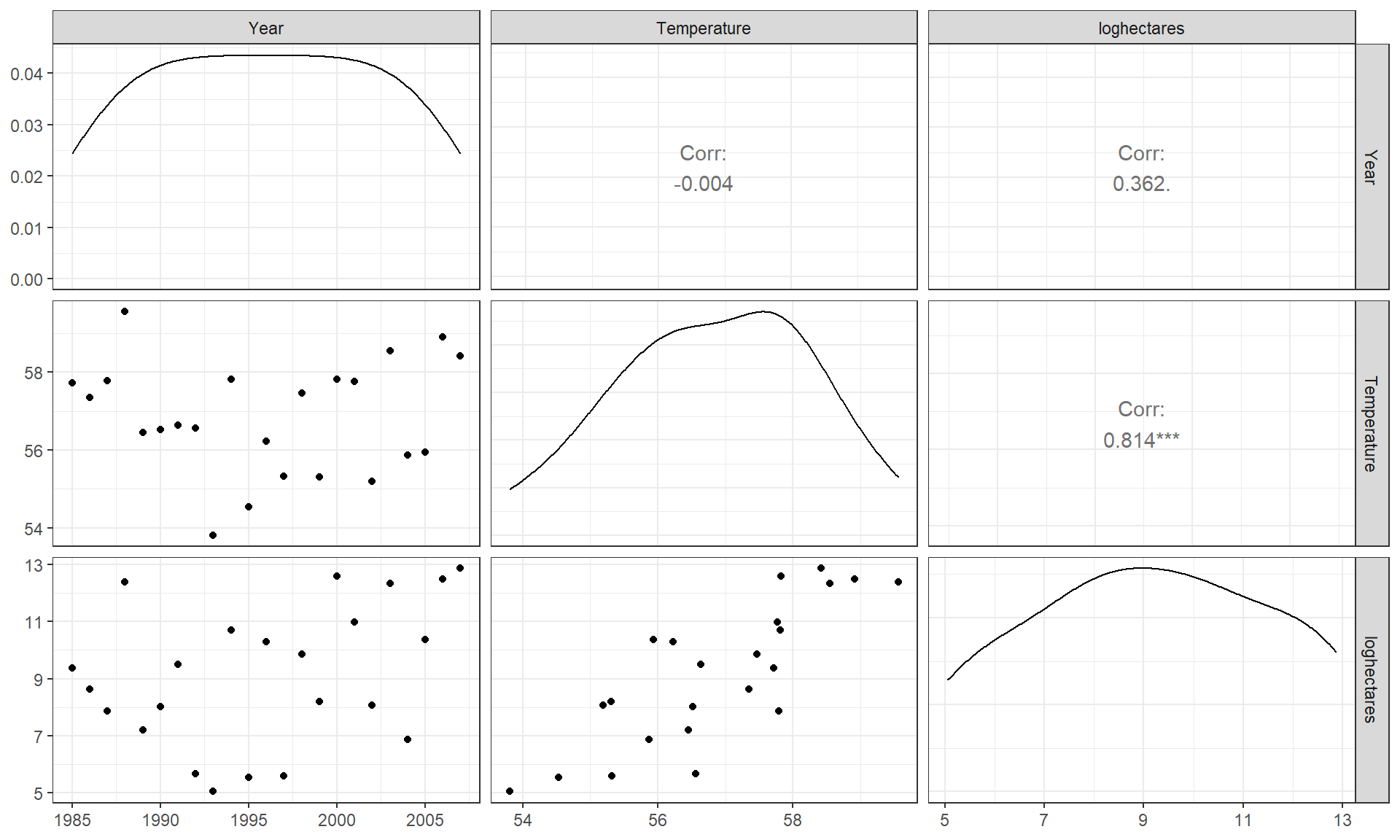
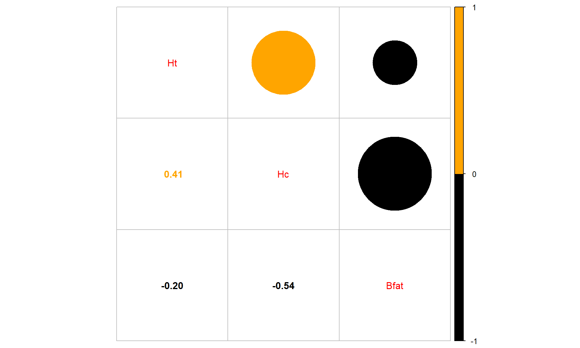
As one more example, the Australian Institute of Sport collected data on 102 male and 100 female athletes that are available in the ais data set from the alr4 package (Weisberg (2018), Weisberg (2014)). They measured a variety of variables including the athlete’s Hematocrit (Hc, units of percentage of red blood cells in the blood), Body Fat Percentage (Bfat, units of percentage of total body weight), and height (Ht, units of cm). Eventually we might be interested in predicting Hc based on the other variables, but for now the associations are of interest.
library(alr4)
data(ais)
library(tibble)
ais <- as_tibble(ais)
aisR <- ais %>%
  select(Ht, Hc, Bfat)
summary(aisR)
## Ht Hc Bfat
## Min. :148.9 Min. :35.90 Min. : 5.630
## 1st Qu.:174.0 1st Qu.:40.60 1st Qu.: 8.545
## Median :179.7 Median :43.50 Median :11.650
## Mean :180.1 Mean :43.09 Mean :13.507
## 3rd Qu.:186.2 3rd Qu.:45.58 3rd Qu.:18.080
## Max. :209.4 Max. :59.70 Max. :35.520aisR %>% ggpairs() + theme_bw()
cor(aisR)## Ht Hc Bfat
## Ht 1.0000000 0.3711915 -0.1880217
## Hc 0.3711915 1.0000000 -0.5324491
## Bfat -0.1880217 -0.5324491 1.0000000Ht (Height) and Hc (Hematocrit) have a moderate positive relationship that may contain a slight nonlinearity. It also contains one clear outlier for a middle height athlete (around 175 cm) with an Hc of close to 60% (a result that is extremely high). One might wonder about whether this athlete has been doping or if that measurement involved a recording error. We should consider removing that observation to see how our results might change without it impacting the results. For the relationship between Bfat (body fat) and Hc (hematocrit), that same high Hc value is a clear outlier. There is also a high Bfat (body fat) athlete (35%) with a somewhat low Hc value. This also might be influencing our impressions so we will remove both “unusual” values and remake the plot. The two offending observations were found for individuals numbered 56 and 166 in the data set. To access those observations (and then remove them), we introduce the slice function that we can apply to a tibble as a way to use the row number to either select (as used here) or remove those rows:
aisR %>% slice(56, 166)## # A tibble: 2 × 3
## Ht Hc Bfat
## <dbl> <dbl> <dbl>
## 1 180. 37.6 35.5
## 2 175. 59.7 9.56We can create a reduced version of the data (aisR2) using the slice function to slice “out” the rows we don’t want by passing a vector of the rows we don’t want to retain with a minus sign in front of each of them, slice(-56, -166), or as vector of rows with a minus in front of the concatenated (c(...)) vector (slice(-c(56, 166))), and then remake the plot:
aisR2 <- aisR %>% slice(-56, -166) #Removes observations in rows 56 and 166
aisR2 %>% ggpairs() + theme_bw()
After removing these two unusual observations, the relationships between the variables are more obvious (Figure 6.5). There is a moderate strength, relatively linear relationship between Height and Hematocrit. There is almost no relationship between Height and Body Fat % \((\boldsymbol{r} = -0.20)\). There is a negative, moderate strength, somewhat curvilinear relationship between Hematocrit and Body Fat % \((\boldsymbol{r} = -0.54)\). As hematocrit increases initially, the body fat percentage decreases but at a certain level (around 45% for Hc), the body fat percentage seems to level off. Interestingly, it ended up that removing those two outliers had only minor impacts on the estimated correlations – this will not always be the case.
Sometimes we want to just be able to focus on the correlations, assuming we trust that the correlation is a reasonable description of the results between the variables. To make it easier to see patterns of positive and negative correlations, we can employ a different version of the same display from the corrplot package (Wei and Simko 2021) with the corrplot.mixed function. In this case (Figure 6.6), it tells much the same story but also allows the viewer to easily distinguish both size and direction and read off the numerical correlations if desired.
library(corrplot)
corrplot.mixed(cor(aisR2), upper.col = c("black", "orange"),
               lower.col = c("black", "orange"))