
5.9: Political party and voting results - Complete analysis
- Page ID
- 33257

As introduced in Section 5.3, a national random sample of voters was obtained related to the 2000 Presidential Election with the party affiliations and voting results recorded for each subject. The data are available in election in the poLCA package (Linzer and Lewis. 2022). It is always good to start with a bit of data exploration with a tableplot, displayed in Figure 5.13. Many of the lines of code here are just for making sure that R is treating the categorical variables that were coded numerically as categorical variables.
election <- election %>% mutate(VOTEF = factor(VOTE3),
                                PARTY = factor(PARTY),
                                EDUC = factor(EDUC),
                                GENDER = factor(GENDER)
                                )

levels(election$VOTEF) <- c("Gore","Bush","Other")
# (Possibly) required options to avoid error when running on a PC,
# should have no impact on other platforms
# options(ffbatchbytes = 1024^2 * 128); options(ffmaxbytes = 1024^2 * 128 * 32)
tableplot(election, select = c(VOTEF, PARTY, EDUC, GENDER), pals = list("BrBG"),
          sample = F)
Gender. Education is coded from 1 to 7 with higher values related to higher educational attainment. Gender code 1 is for male and 2 is for female.In Figure 5.13, we can see many missing VOTEF responses but also some missingness in PARTY and EDUC (Education) status. While we don’t know too much about why people didn’t respond on the Vote question – they could have been unwilling to answer it or may not have voted. It looks like those subjects have more of the lower education level responses (more dark colors, especially level 2 of education) than in the responders to this question. There are many “middle” ratings in the party affiliation responses for the missing VOTEF responses, suggesting that independents were less likely to answer the question in the survey for whatever reason. Even though this comes with concerns about who these results actually apply to (likely not the population that was sampled from), we want to focus on those that did respond in VOTEF, so will again use drop_na to clean out any subjects with any missing responses after using select to focus just on these four variables. Then we remake the tableplot (Figure 5.14). The code also adds the sort option to the tableplot function call that provides an easy way to sort the data set based on other variables. It is interesting, for example, to sort the responses by Education level and explore the differences in other variables. These explorations are omitted here but easily available by changing the sorting column from 1 to sort = 3 or sort = EDUC. Figure 5.14 shows us that there are clear differences in party affiliation based on voting for Bush, Gore, or Other. It is harder to see if there are differences in education level or gender based on the voting status in this plot, but, as noted above, sorting on these other variables can sometimes help to see other relationships between variables.
election2 <- election %>%
  select(VOTEF, PARTY, EDUC, GENDER) %>%
  drop_na()
tableplot(election2, select = c(VOTEF, PARTY, EDUC, GENDER), sort = 1,
          pals = list("BrBG"), sample = F)
Focusing on the party affiliation and voting results, the appropriate analysis is with an Independence test because a single random sample was obtained from the population. The total sample size for the complete responses was \(N =\) 1,149 (out of the original 1,785 subjects). Because this is an Independence test, the mosaic plot is the appropriate display of the results, which was provided in Figure 5.5.
electable <- tally(~ PARTY + VOTEF, data = election2)
electable
## VOTEF
## PARTY Gore Bush Other
## 1 238 6 2
## 2 151 18 1
## 3 113 31 13
## 4 37 36 11
## 5 21 124 12
## 6 20 121 2
## 7 3 188 1There is a potential for bias in some polls because of the methods used to find and contact people. As U.S. residents have transitioned from land-lines to cell phones, the early adopting cell phone users were often excluded from political polling. These policies are being reconsidered to adapt to the decline in residential phone lines and most polling organizations now include cell phone numbers in their list of potential respondents. This study may have some bias regarding who was considered as part of the population of interest and who was actually found that was willing to respond to their questions. We don’t have much information here but biases arising from unobtainable members of populations are a potential issue in many studies, especially when questions tend toward more sensitive topics. We can make inferences here to people that were willing to respond to the request to answer the survey but should be cautious in extending it to all Americans or even voters in the year 2000. When we say “population” below, this nuanced discussion is what we mean. Because the political party is not randomly assigned to the subjects, we cannot make causal inferences for political affiliation causing different voting patterns106.
Here are our 6+ steps applied to this example:
- The desired RQ is about assessing the relationship between part affiliation and vote choice, but this is constrained by the large rate of non-response in this data set. This is an Independence test and so the tableplot and mosaic plot are good visualizations to consider and the \(X^2\)-statistic will be used.
- Hypotheses:
- \(H_0\): There is no relationship between the party affiliation (7 levels) and voting results (Bush, Gore, Other) in the population.
- \(H_A\): There is a relationship between the party affiliation (7 levels) and voting results (Bush, Gore, Other) in the population.
- Plot the data and assess validity conditions:
- Independence:
- There is no indication of an issue with this assumption since each subject is measured only once in the table. No other information suggests a potential issue since a random sample was taken from presumably a large national population and we have no information that could suggest dependencies among observations.
- All expected cell counts larger than 5 to use the parametric \(\boldsymbol{\chi^2}\)-distribution to find p-values:
- We need to generate a table of expected cell counts to be able to check this condition:
chisq.test(electable)$expected## Warning in chisq.test(electable): Chi-squared approximation may be incorrect## VOTEF ## PARTY Gore Bush Other ## 1 124.81984 112.18799 8.992167 ## 2 86.25762 77.52829 6.214099 ## 3 79.66144 71.59965 5.738903 ## 4 42.62141 38.30809 3.070496 ## 5 79.66144 71.59965 5.738903 ## 6 72.55788 65.21497 5.227154 ## 7 97.42037 87.56136 7.018277- When we request the expected cell counts, R tries to help us with a warning message if the expected cell counts might be small, as in this situation.
- There is one expected cell count below 5 for
Party= 4 who voted Other with an expected cell count of 3.07, so the condition is violated and the permutation approach should be used to obtain more trustworthy p-values. The conditions are met for performing a permutation test.
- Independence:
- Calculate the test statistic and p-value:
- The test statistic is best calculated by the
chisq.testfunction since there are 21 cells and many potential places for a calculation error if performed by hand.
chisq.test(electable)## ## Pearson's Chi-squared test ## ## data: electable ## X-squared = 762.81, df = 12, p-value < 2.2e-16- The observed \(X^2\) statistic is 762.81.
- The parametric p-value is < 2.2e-16 from the R output which would be reported as < 0.0001. This was based on a \(\boldsymbol{\chi^2}\)-distribution with \((7-1)*(3-1) = 12\) degrees of freedom displayed in Figure 5.15.
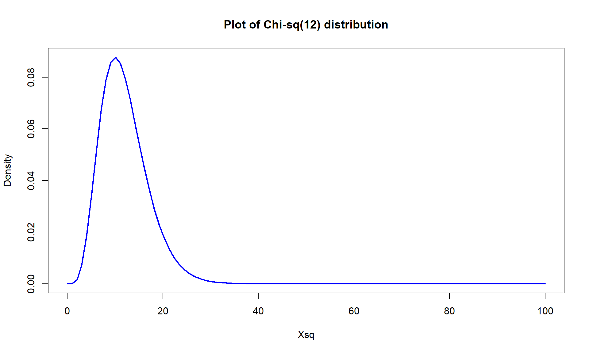
Figure 5.15: Plot of \(\boldsymbol{\chi^2}\)-distribution with 12 degrees of freedom. - If you want to repeat this calculation directly you get a similarly tiny value that R reports as 1.5e-155. Again, reporting less than 0.0001 is just fine.
pchisq(762.81, df = 12, lower.tail = F)## [1] 1.553744e-155- But since the expected cell count condition is violated, we should use permutations as implemented in the following code to provide a more trustworthy p-value:
Tobs <- chisq.test(electable)$statistic; Tobs## X-squared ## 762.8095par(mfrow = c(1,2)) B <- 1000 Tstar <- matrix(NA, nrow = B) for (b in (1:B)){ Tstar[b] <- chisq.test(tally(~ shuffle(PARTY) + VOTEF, data = election2, margins = F))$statistic } pdata(Tstar, Tobs, lower.tail = F)[[1]]## [1] 0tibble(Tstar) %>% ggplot(aes(x = Tstar)) + geom_histogram(aes(y = ..ncount..), bins = 30, col = 1, fill = "khaki") + geom_density(aes(y = ..scaled..)) + theme_bw() + labs(y = "Density") + geom_vline(xintercept = Tobs, col = "red", lwd = 2) + stat_bin(aes(y = ..ncount.., label = ..count..), bins = 30, geom = "text", vjust = -0.75)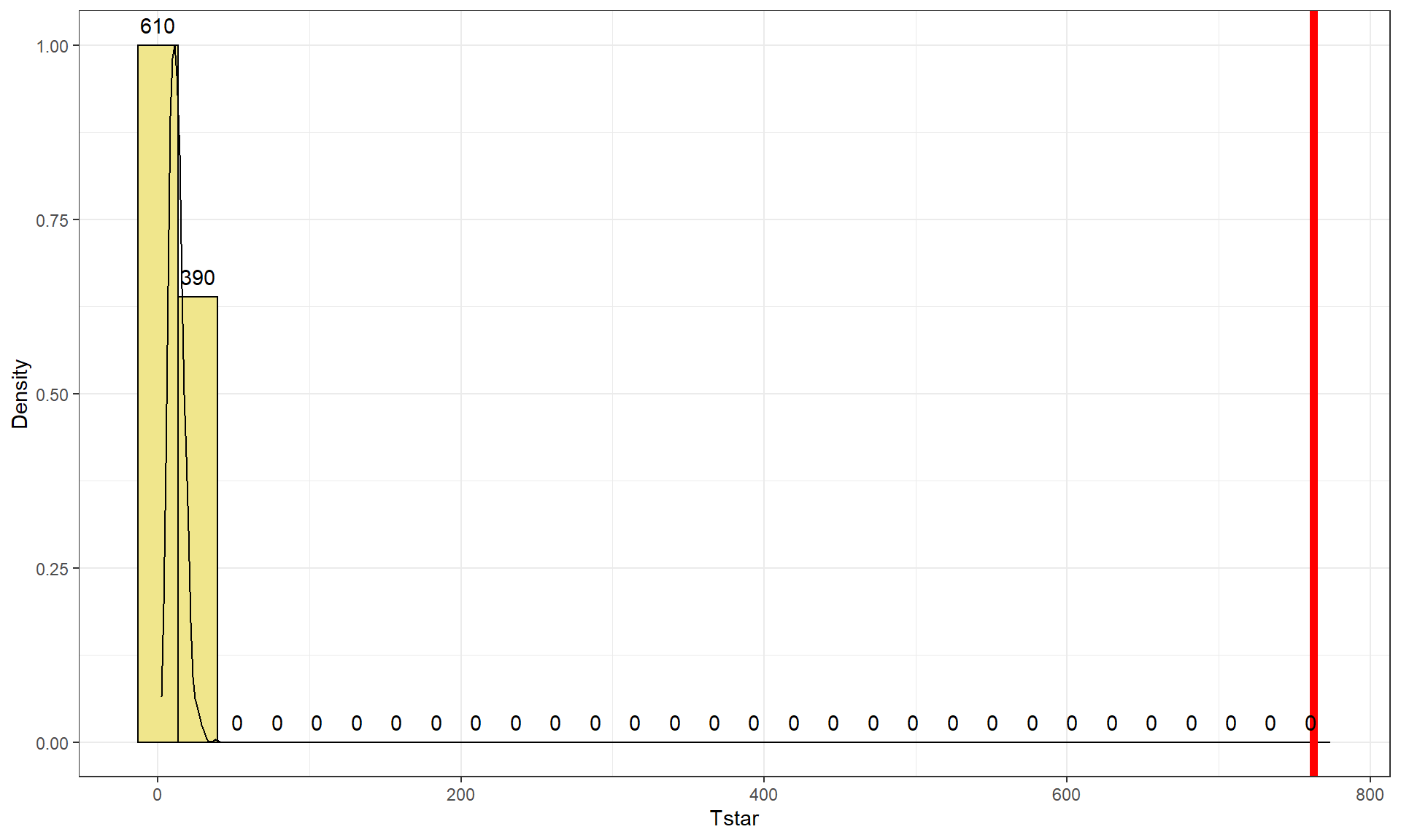
Figure 5.16: Permutation distribution of \(X^2\) for the election data. - The last results tells us that there were no permuted data sets that produced larger \(X^2\text{'s}\) than the observed \(X^2\) in 1,000 permutations, so we report that the p-value was less than 0.001 using the permutation approach. The permutation distribution in Figure 5.16 contains no results over 40, so the observed configuration was really far from the null hypothesis of no relationship between party status and voting.
- The test statistic is best calculated by the
- Conclusion:
- There is strong evidence against the null hypothesis of no relationship between party affiliation and voting results in the population (\(X^2\) = 762.81, p-value<0.001), so we would conclude that there is a relationship between party affiliation and voting results.
- Size:
- We can add insight into the results by exploring the standardized residuals. The numerical results are obtained using
chisq.test(electable)$residualsand visually usingmosaicplot(electable, shade = T)in Figure 5.17. The standardized residuals show some clear sources of the differences from the results expected if there were no relationship present. The largest contributions are found in the highest democrat category (PARTY= 1) where the standardized residual for Gore is 10.13 and for Bush is -10.03, showing much higher than expected (under \(H_0\)) counts for Gore voters and much lower than expected (under \(H_0\)) for Bush.
Similar results in the opposite direction are found in the strong republicans (
PARTY= 7). Note how the brightest shade of blue in Figure 5.17 shows up for much higher than expected results and the brighter red for results in the other direction, where observed counts were much lower than expected. When there are many large standardized residuals, it is OK to focus on the largest results but remember that some of the intermediate deviations, or lack thereof, could also be interesting. For example, the Gore voters fromPARTY= 3 had a standardized residual of 3.75 but thePARTY= 5 voters for Bush had a standardized residual of 6.17. So maybe Gore didn’t have as strong of support from his center-leaning supporters as Bush was able to obtain from the same voters on the other side of the middle? Exploring the relative proportion of each vertical bar in the response categories is also interesting to see the proportions of each level of party affiliation and how they voted. A political scientist would easily obtain many more (useful) theories based on this combination of results. - We can add insight into the results by exploring the standardized residuals. The numerical results are obtained using
chisq.test(electable)$residuals #(Obs - expected)/sqrt(expected)## VOTEF
## PARTY Gore Bush Other
## 1 10.1304439 -10.0254117 -2.3317373
## 2 6.9709179 -6.7607252 -2.0916557
## 3 3.7352759 -4.7980730 3.0310127
## 4 -0.8610559 -0.3729136 4.5252413
## 5 -6.5724708 6.1926811 2.6135809
## 6 -6.1701472 6.9078679 -1.4115200
## 7 -9.5662296 10.7335798 -2.2717310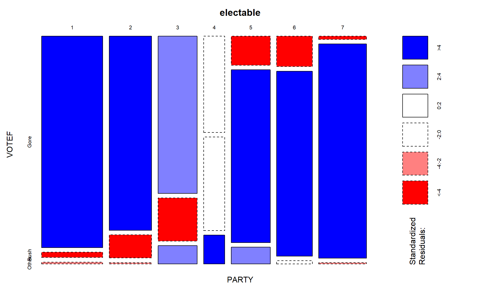
#Adds information on the size of the residuals
mosaicplot(electable, shade = T) - Scope of inference:
- The results are not causal since no random assignment was present but they do apply to the population of voters in the 2000 election that were able to be contacted by those running the poll and who would be willing to answer all the questions and actually voted.