
5.1: Situation, contingency tables, and tableplots
- Page ID
- 33249

In this chapter, the focus shifts briefly from analyzing quantitative response variables to methods for handling categorical response variables. This is important because in some situations it is not possible to measure the response variable quantitatively. For example, we will analyze the results from a clinical trial where the results for the subjects were measured as one of three categories: no improvement, some improvement, and marked improvement. While that type of response could be treated as numerical, coded possibly as 1, 2, and 3, it would be difficult to assume that the responses such as those follow a normal distribution since they are discrete (not continuous, measured at whole number values only) and, more importantly, the difference between no improvement and some improvement is not necessarily the same as the difference between some and marked improvement. If it is treated numerically, then the differences between levels are assumed to be the same unless a different coding scheme is used (say 1, 2, and 5). It is better to treat this type of responses as being in one of the three categories and use statistical methods that don’t make unreasonable and arbitrary assumptions about what the numerical coding might mean. The study being performed here involved subjects randomly assigned to either a treatment or a placebo (control) group and we want to address research questions similar to those considered in Chapters 2 and 3 – assessing differences in a response variable among two or more groups. With quantitative responses, the differences in the distributions are parameterized via the means of the groups and we used linear models. With categorical responses, the focus is on the probabilities of getting responses in each category and whether they differ among the groups.
We start with some useful summary techniques, both numerical and graphical, applied to some examples of studies these methods can be used to analyze. Graphical techniques provide opportunities for assessing specific patterns in variables, relationships between variables, and for generally understanding the responses obtained. There are many different types of plots and each can elucidate certain features of data. The tableplot, briefly introduced98 in Chapter 4, is a great and often fun starting point for working with data sets that contain categorical variables. We will start here with using it to help us understand some aspects of the results from a double-blind randomized clinical trial investigating a treatment for rheumatoid arthritis. These data are available in the Arthritis data set available in the vcd package (D. Meyer, Zeileis, and Hornik 2022). There were \(n = 84\) subjects, with some demographic information recorded along with the Treatment status (Treated, Placebo) and whether the patients’ arthritis symptoms Improved (with levels of None, Some, and Marked). When using tableplot, we may not want to display everything in the tibble and can just select some of the variables. We use Treatment, Improved, Gender, and Age in the select = ... option with a c() and commas between the names of the variables we want to display as shown below. The first one in the list is also the one that the data are sorted on and is what we want here – to start with sorting observations based on Treatment status.
library(vcd)
data(Arthritis) #Double-blind clinical trial with treatment and control groups
library(tibble)
Arthritis <- as_tibble(Arthritis)
# Homogeneity example
library(tabplot)
library(RColorBrewer)
# Options needed to (sometimes) prevent errors on PC
# options(ffbatchbytes = 1024^2 * 128); options(ffmaxbytes = 1024^2 * 128 * 32)
tableplot(Arthritis, select = c(Treatment, Improved, Sex, Age), pals = list("BrBG"),
          sample = F, colorNA_num = "orange", numMode = "MB-ML")
The first thing we can gather from Figure 5.1 is that there are no red cells so there were no missing observations in the data set. Missing observations regularly arise in real studies when observations are not obtained for many different reasons and it is always good to check for missing data issues – this plot provides a quick visual method for doing that check. Primarily we are interested in whether the treatment led to a different pattern (or rates) of improvement responses. There seems to be more light (Marked) improvement responses in the treatment group and more dark (None) responses in the placebo group. This sort of plot also helps us to simultaneously consider the role of other variables in the observed responses. You can see the sex of each subject in the vertical panel for Sex and it seems that there is a relatively balanced mix of males and females in the treatment/placebo groups. Quantitative variables are also displayed with horizontal bars corresponding to the responses (the x-axis provides the units of the responses, here in years). From the panel for Age, we can see that the ages of subjects ranged from the 20s to 70s and that there is no clear difference in the ages between the treated and placebo groups. If, for example, all the male subjects had ended up being randomized into the treatment group, then we might have worried about whether sex and treatment were confounded and whether any differences in the responses might be due to sex instead of the treatment. The random assignment of treatment/placebo to the subjects appears to have been successful here in generating a mix of ages and sexes among the two treatment groups99. The main benefit of this sort of plot is the ability to visualize more than two categorical variables simultaneously. But now we want to focus more directly on the researchers’ main question – does the treatment lead to different improvement outcomes than the placebo?
To directly assess the effects of the treatment, we want to display just the two variables of interest. Stacked bar charts provide a method of displaying the response patterns (in Improved) across the levels of a predictor variable (Treatment) by displaying a bar for each predictor variable level and the proportions of responses in each category of the response in each of those groups. If the placebo is as effective as the treatment, then we would expect similar proportions of responses in each improvement category. A difference in the effectiveness would manifest in different proportions in the different improvement categories between Treated and Placebo. To get information in this direction, we start with obtaining the counts in each combination of categories using the tally function to generate contingency tables. Contingency tables with R rows and C columns (called R by C tables) summarize the counts of observations in each combination of the explanatory and response variables. In these data, there are \(R = 2\) rows and \(C = 3\) columns making a \(2\times 3\) table – note that you do not count the row and column for the “Totals” in defining the size of the table. In the table, there seems to be many more Marked improvement responses (21 vs 7) and fewer None responses (13 vs 29) in the treated group compared to the placebo group.
library(mosaic)
tally(~ Treatment + Improved, data = Arthritis, margins = T)
## Improved
## Treatment None Some Marked Total
## Placebo 29 7 7 43
## Treated 13 7 21 41
## Total 42 14 28 84Using the tally function with ~ x + y provides a contingency table with the x variable on the rows and the y variable on the columns, with margins = T as an option so we can obtain the totals along the rows, columns, and table total of \(N = 84\). In general, contingency tables contain the counts \(n_{rc}\) in the \(r^{th}\) row and \(c^{th}\) column where \(r = 1,\ldots,R\) and \(c = 1,\ldots,C\). We can also define the row totals as the sum across the columns of the counts in row \(r\) as
\[\mathbf{n_{r\bullet}} = \Sigma^C_{c = 1}n_{rc},\]
the column totals as the sum across the rows for the counts in column \(c\) as
\[\mathbf{n_{\bullet c}} = \Sigma^R_{r = 1}n_{rc},\]
and the table total as
\[\mathbf{N} = \Sigma^R_{r = 1}\mathbf{n_{r\bullet}} = \Sigma^C_{c = 1}\mathbf{n_{\bullet c}} = \Sigma^R_{r = 1}\Sigma^C_{c = 1}\mathbf{n_{rc}}.\]
We’ll need these quantities to do some calculations in a bit. A generic contingency table with added row, column, and table totals just like the previous result from the tally function is provided in Table 5.1.
| Response Level 1 | Response Level 2 | Response Level 3 | … | Response Level C | Totals | |
|---|---|---|---|---|---|---|
| Group 1 | \(n_{11}\) | \(n_{12}\) | \(n_{13}\) | … | \(n_{1C}\) | \(\boldsymbol{n_{1 \bullet}}\) |
| Group 2 | \(n_{21}\) | \(n_{22}\) | \(n_{23}\) | … | \(n_{2C}\) | \(\boldsymbol{n_{2 \bullet}}\) |
| … | … | … | … | … | … | … |
| Group R | \(n_{R1}\) | \(n_{R2}\) | \(n_{R3}\) | … | \(n_{RC}\) | \(\boldsymbol{n_{R \bullet}}\) |
| Totals | \(\boldsymbol{n_{\bullet 1}}\) | \(\boldsymbol{n_{\bullet 2}}\) | \(\boldsymbol{n_{\bullet 3}}\) | … | \(\boldsymbol{n_{\bullet C}}\) | \(\boldsymbol{N}\) |
Comparing counts from the contingency table is useful, but comparing proportions in each category is better, especially when the sample sizes in the levels of the explanatory variable differ. Switching the formula used in the tally function formula to ~ y | x and adding the format = "proportion" option provides the proportions in the response categories conditional on the category of the predictor (these are called conditional proportions or the conditional distribution of, here, Improved on Treatment)100. Note that they sum to 1.0 in each level of x, placebo or treated:
tally(~ Improved | Treatment, data = Arthritis, format = "proportion", margins = T)## Treatment
## Improved Placebo Treated
## None 0.6744186 0.3170732
## Some 0.1627907 0.1707317
## Marked 0.1627907 0.5121951
## Total 1.0000000 1.0000000This version of the tally result switches the variables between the rows and columns from the first summary of the data but the single “Total” row makes it clear to read the proportions down the columns in this version of the table. In this application, it shows how the proportions seem to be different among categories of Improvement between the placebo and treatment groups. This matches the previous thoughts on these data, but now a difference of marked improvement of 16% vs 51% is more clearly a big difference. We can also display this result using a stacked bar chart101 that displays the same information using the plot function with a y ~ x formula:
par(mai = c(1.5,1.5,0.82,0.42), #Adds extra space to bottom and left margin,
    las = 2, #Rotates text labels, optional code
    mgp = c(6,1,0)) #Adds space to labels, order is axis label, tick label, tick mark
plot(Improved ~ Treatment, data = Arthritis,
     main = "Stacked Bar Chart of Arthritis Data")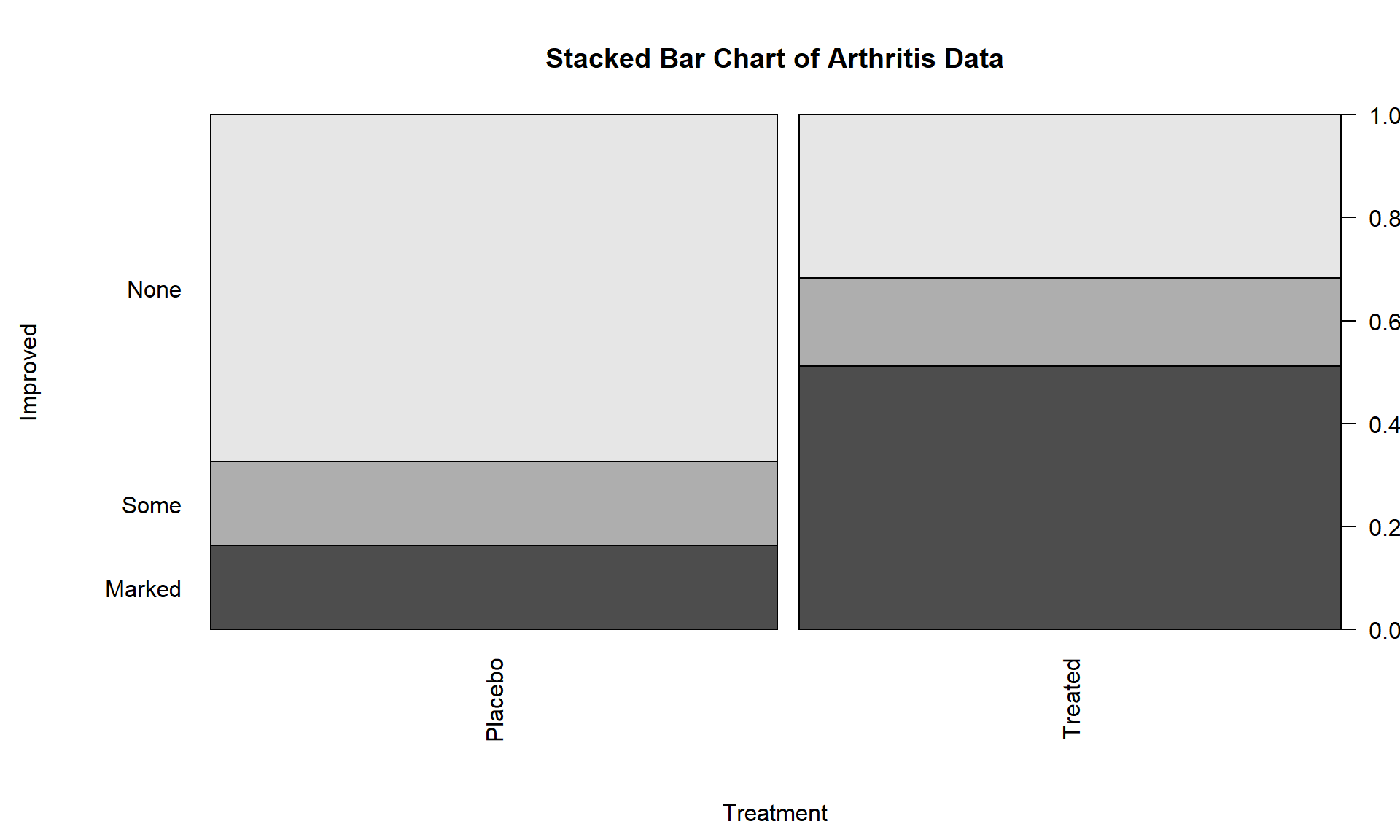
The stacked bar chart in Figure 5.2 displays the previous conditional proportions for the groups, with the same relatively clear difference between the groups persisting. If you run the plot function with variables that are coded numerically, it will make a very different looking graph (R is smart!) so again be careful that you are instructing R to treat your variables as categorical if they really are categorical. R is powerful but can’t read your mind!
In this chapter, we analyze data collected in two different fashions and modify the hypotheses to reflect the differences in the data collection processes, choosing either between what are called Homogeneity and Independence tests. The previous situation where levels of a treatment are randomly assigned to the subjects in a study describes the situation for what is called a Homogeneity Test. Homogeneity also applies when random samples are taken from each population of interest to generate the observations in each group of the explanatory variable based on the population groups. These sorts of situations resemble many of the examples from Chapter 3 where treatments were assigned to subjects. The other situation considered is where a single sample is collected to represent a population and then a contingency table is formed based on responses on two categorical variables. When one sample is collected and analyzed using a contingency table, the appropriate analysis is called a Chi-square test of Independence or Association. In this situation, it is not necessary to have variables that are clearly classified as explanatory or response although it is certainly possible. Data that often align with Independence testing are collected using surveys of subjects randomly selected from a single, large population. An example, analyzed below, involves a survey of voters and whether their party affiliation is related to who they voted for – the Republican, Democrat, or other candidate. There is clearly an explanatory variable of the Party affiliation but a single large sample was taken from the population of all likely voters so the Independence test needs to be applied. Another example where Independence is appropriate involves a study of student cheating behavior. Again, a single sample was taken from the population of students at a university and this determines that it will be an Independence test. Students responded to questions about lying to get out of turning in a paper and/or taking an exam (none, either, or both) and copying on an exam and/or turning in a paper written by someone else (neither, either, or both). In this situation, it is not clear which variable is response or explanatory (which should explain the other) and it does not matter with the Independence testing framework. Figure 5.3 contains a diagram of the data collection processes and can help you to identify the appropriate analysis situation.

You will discover that the test statistics are the same for both methods, which can create some desire to assume that the differences in the data collection don’t matter. In Homogeneity designs, the sample size in each group \((\mathbf{n_{1\bullet}},\mathbf{n_{2\bullet},\ldots,\mathbf{n_{R\bullet}}})\) is fixed (researcher chooses the size of each group). In Independence situations, the total sample size \(\mathbf{N}\) is fixed but all the \(\mathbf{n_{r\bullet}}\text{'s}\) are random (we need the data set to know how many are in each group). These differences impact the graphs, hypotheses, and conclusions used even though the test statistics and p-values are calculated the same way – so we only need to learn one test statistic to handle the two situations, but we need to make sure we know which we’re doing!