
5.2: Homogeneity test hypotheses
- Page ID
- 33250

If we define some additional notation, we can then define hypotheses that allow us to assess evidence related to whether the treatment “matters” in Homogeneity situations. This situation is similar to what we did in the One-Way ANOVA (Chapter 3) situation with quantitative responses but the parameters now relate to proportions in the response variable categories across the groups. First we can define the conditional population proportions in level \(c\) (column \(c = 1,\ldots,C\)) of group \(r\) (row \(r = 1,\ldots,R\)) as \(p_{rc}\). Table 5.2 shows the proportions, noting that the proportions in each row sum to 1 since they are conditional on the group of interest. A transposed (rows and columns flipped) version of this table is produced by the tally function if you use the formula ~ y | x.
| Response Level 1 | Response Level 2 | Response Level 3 | … | Response Level C | Totals | |
|---|---|---|---|---|---|---|
| Group 1 | \(p_{11}\) | \(p_{12}\) | \(p_{13}\) | … | \(p_{1C}\) | \(\boldsymbol{1.0}\) |
| Group 2 | \(p_{21}\) | \(p_{22}\) | \(p_{23}\) | … | \(p_{2C}\) | \(\boldsymbol{1.0}\) |
| … | … | … | … | … | … | … |
| Group R | \(p_{R1}\) | \(p_{R2}\) | \(p_{R3}\) | … | \(p_{RC}\) | \(\boldsymbol{1.0}\) |
| Totals | \(\boldsymbol{p_{\bullet 1}}\) | \(\boldsymbol{n_{\bullet 2}}\) | \(\boldsymbol{p_{\bullet 3}}\) | … | \(\boldsymbol{p_{\bullet C}}\) | \(\boldsymbol{1.0}\) |
In the Homogeneity situation, the null hypothesis is that the distributions are the same in all the \(R\) populations. This means that the null hypothesis is:
\[\begin{array}{rl} \mathbf{H_0:}\ & \mathbf{p_{11} = p_{21} = \ldots = p_{R1}} \textbf{ and } \mathbf{p_{12} = p_{22} = \ldots = p_{R2}} \textbf{ and } \mathbf{p_{13} = p_{23} = \ldots = p_{R3}} \\ & \textbf{ and } \mathbf{\ldots} \textbf{ and }\mathbf{p_{1C} = p_{2C} = \ldots = p_{RC}}. \\ \end{array}\]
If all the groups are the same, then they all have the same conditional proportions and we can more simply write the null hypothesis as:
\[\mathbf{H_0:(p_{r1},p_{r2},\ldots,p_{rC}) = (p_1,p_2,\ldots,p_C)} \textbf{ for all } \mathbf{r}.\]
In other words, the pattern of proportions across the columns are the same for all the \(\mathbf{R}\) groups. The alternative is that there is some difference in the proportions of at least one response category for at least one group. In slightly more gentle and easier to reproduce words, equivalently, we can say:
- \(\mathbf{H_0:}\) The population distributions of the responses for variable \(\mathbf{y}\) are the same across the \(\mathbf{R}\) groups.
The alternative hypothesis is then:
- \(\mathbf{H_A:}\) The population distributions of the responses for variable \(\mathbf{y}\) are NOT ALL the same across the \(\mathbf{R}\) groups.
To make this concrete, consider what the proportions could look like if they satisfied the null hypothesis for the Arthritis example, as displayed in Figure 5.4. Stacked bar charts provide a natural way to visualize the null hypothesis (equal distributions) to compare to the observed proportions in the observed data. Stacked bar charts are the appropriate visual display to present the summarized data in homogeneity test situations.
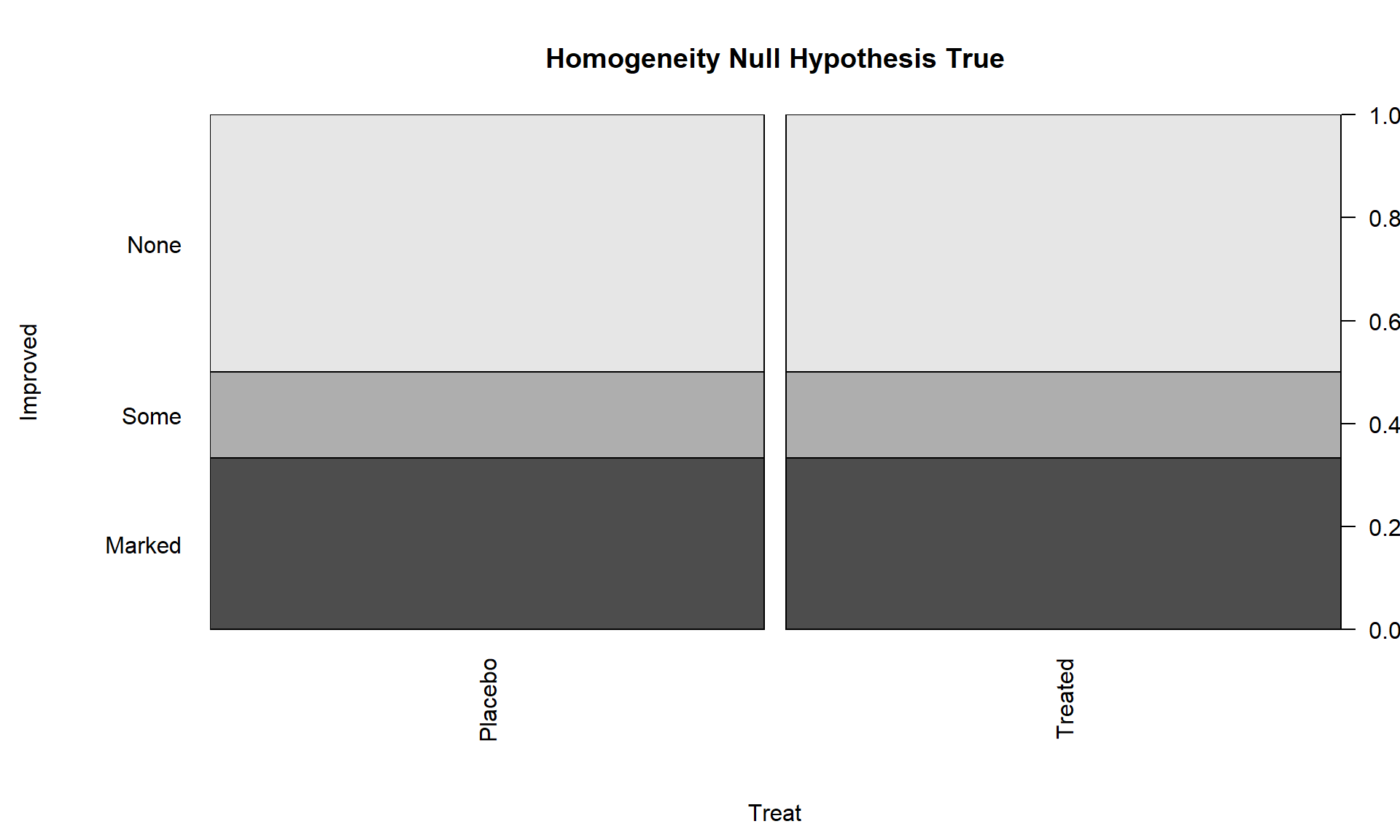
Note that the proportions in the different response categories do not need to be the same just that the distribution needs to be the same across the groups. The null hypothesis does not require that all three response categories (none, some, marked) be equally likely. It assumes that whatever the distribution of proportions is across these three levels of the response that there is no difference in that distribution between the explanatory variable (here treated/placebo) groups. Figure 5.4 shows an example of a situation where the null hypothesis is true and the distributions of responses across the groups look the same but the proportions for none, some and marked are not all equally likely. That situation satisfies the null hypothesis. Compare this plot to the one for the real data set in Figure 5.2. It looks like there might be some differences in the responses between the treated and placebo groups as that plot looks much different from this one, but we will need a test statistic and a p-value to fully address the evidence relative to the previous null hypothesis.