5.3: Independence test hypotheses
- Page ID
- 33251

When we take a single random sample of size \(N\) and make a contingency table, our inferences relate to whether there is a relationship or association (that they are not independent) between the variables. This is related to whether the distributions of proportions match across rows in the table but is a more general question since we do not need to determine a variable to condition on, one that takes on the role of an explanatory variable, from the two variables of interest. In general, the hypotheses for an Independence test for variables \(x\) and \(y\) are:
- \(\mathbf{H_0}\): There is no relationship between \(\mathbf{x}\) and \(\mathbf{y}\) in the population.
- Or: \(H_0\): \(x\) and \(y\) are independent in the population.
- \(\mathbf{H_A}\): There is a relationship between \(\mathbf{x}\) and \(\mathbf{y}\) in the population.
- Or: \(H_A\): \(x\) and \(y\) are dependent in the population.
To illustrate a test of independence, consider an example involving data from a national random sample taken prior to the 2000 U.S. elections from the data set election from the package poLCA (Linzer and Lewis. (2022), Linzer and Lewis (2011)). Each respondent’s democratic-republican partisan identification was collected, provided in the PARTY variable for measurements on a seven-point scale from (1) Strong Democrat, (2) Weak Democrat, (3) Independent-Democrat, (4) Independent-Independent, (5) Independent-Republican, (6) Weak Republican, to (7) Strong Republican. The VOTEF variable that is created below will contain the candidate that the participants voted for (the data set was originally coded with 1, 2, and 3 for the candidates and we replaced those levels with the candidate names). The contingency table shows some expected results, that individuals with strong party affiliations tend to vote for the party nominee with strong support for Gore in the Democrats (PARTY = 1 and 2) and strong support for Bush in the Republicans (PARTY = 6 and 7). As always, we want to support our explorations with statistical inferences, here with the potential to extend inferences to the overall population of voters. The inferences in an independence test are related to whether there is a relationship between the two variables in the population. A relationship between variables occurs when knowing the level of one variable for a person, say that they voted for Gore, informs the types of responses that you would expect for that person, here that they are likely affiliated with the Democratic Party. When there is no relationship (the null hypothesis here), knowing the level of one variable is not informative about the level of the other variable.
library(poLCA)
# 2000 Survey - use package = "" because other data sets in R have same name
data(election, package = "poLCA")
election <- as_tibble(election)
# Subset variables and remove missing values
election2 <- election %>%
  select(PARTY, VOTE3) %>%
  mutate(VOTEF = factor(VOTE3)) %>%
  drop_na()

levels(election2$VOTEF) <- c("Gore", "Bush", "Other") #Replace 1,2,3 with meaningful names
levels(election2$VOTEF) #Check new names of levels in VOTEF
## [1] "Gore" "Bush" "Other"electable <- tally(~ PARTY + VOTEF, data = election2) #Contingency tableelectable## VOTEF
## PARTY Gore Bush Other
## 1 238 6 2
## 2 151 18 1
## 3 113 31 13
## 4 37 37 11
## 5 21 124 12
## 6 20 121 2
## 7 3 189 1The hypotheses for an Independence/Association Test here are:
- \(H_0\): There is no relationship between party affiliation and voting status in the population.
- Or: \(H_0\): Party affiliation and voting status are independent in the population.
- \(H_A\): There is a relationship between party affiliation and voting status in the population.
- Or: \(H_A\): Party affiliation and voting status are dependent in the population.
You could also write these hypotheses with the variables switched and that is also perfectly acceptable. Because these hypotheses are ambivalent about the choice of a variable as an “x” or a “y”, the summaries of results should be consistent with that idea. We should not calculate conditional proportions or make stacked bar charts since they imply a directional relationship from x to y (or results for y conditional on the levels of x) that might be hard to justify. Our summaries in these situations are the contingency table (tally(~ var1 + var2, data = DATASETNAME)) and a new graph called a mosaic plot (using the mosaicplot function).
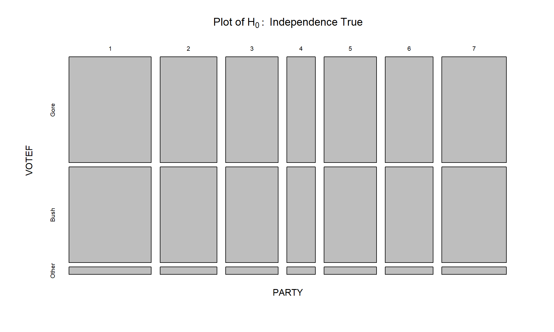
Mosaic plots display a box for each cell count whose area corresponds to the proportion of the total data set that is in that cell \((n_{rc}/\mathbf{N})\). In some cases, the bars can be short or narrow if proportions of the total are small and the labels can be hard to read but the same bars or a single line exist for each category of the variables in all rows and columns. The mosaic plot makes it easy to identify the most common combination of categories. For example, in Figure 5.5 the Gore and PARTY = 1 (Strong Democrat) box in the top segment under column 1 of the plot has the largest area so is the highest proportion of the total. Similarly, the middle segment on the right for the PARTY category 7s corresponds to the Bush voters who were a 7 (Strong Republican). Knowing that the middle box in each column is for Bush voters is a little difficult as “Other” and “Bush” overlap each other in the y-axis labeling but it is easy enough to sort out the story here if we have briefly explored the contingency table. We can also get information about the variable used to make the columns as the width of the columns is proportional to the number of subjects in each PARTY category in this plot. There were relatively few 4s (Independent-Independent responses) in total in the data set. Also, the Other category was the highest proportion of any vote-getter in the PARTY = 4 column but there were actually slightly more Other votes out of the total in the 3s (Independent-Democrat) party affiliation. Comparing the size of the 4s & Other segment with the 3s & Other segment, one should conclude that the 3s & Other segment is a slightly larger portion of the total data set. There is generally a gradient of decreasing/increasing voting rates for the two main party candidates across the party affiliations, but there are a few exceptions. For example, the proportion of Gore voters goes up slightly between the PARTY affiliations of 5s and 6s – as the voters become more strongly republican. To have evidence of a relationship, there just needs to be a pattern of variation across the plot of some sort but it does not need to follow such an easily described pattern, especially when the categorical variables do not contain natural ordering.
The mosaic plots are best made on the tables created by the tally function from a table that just contains the counts (no totals):
# Makes a mosaic plot where areas are related to the proportion of
# the total in the table
mosaicplot(electable, main = "Mosaic plot of observed results") 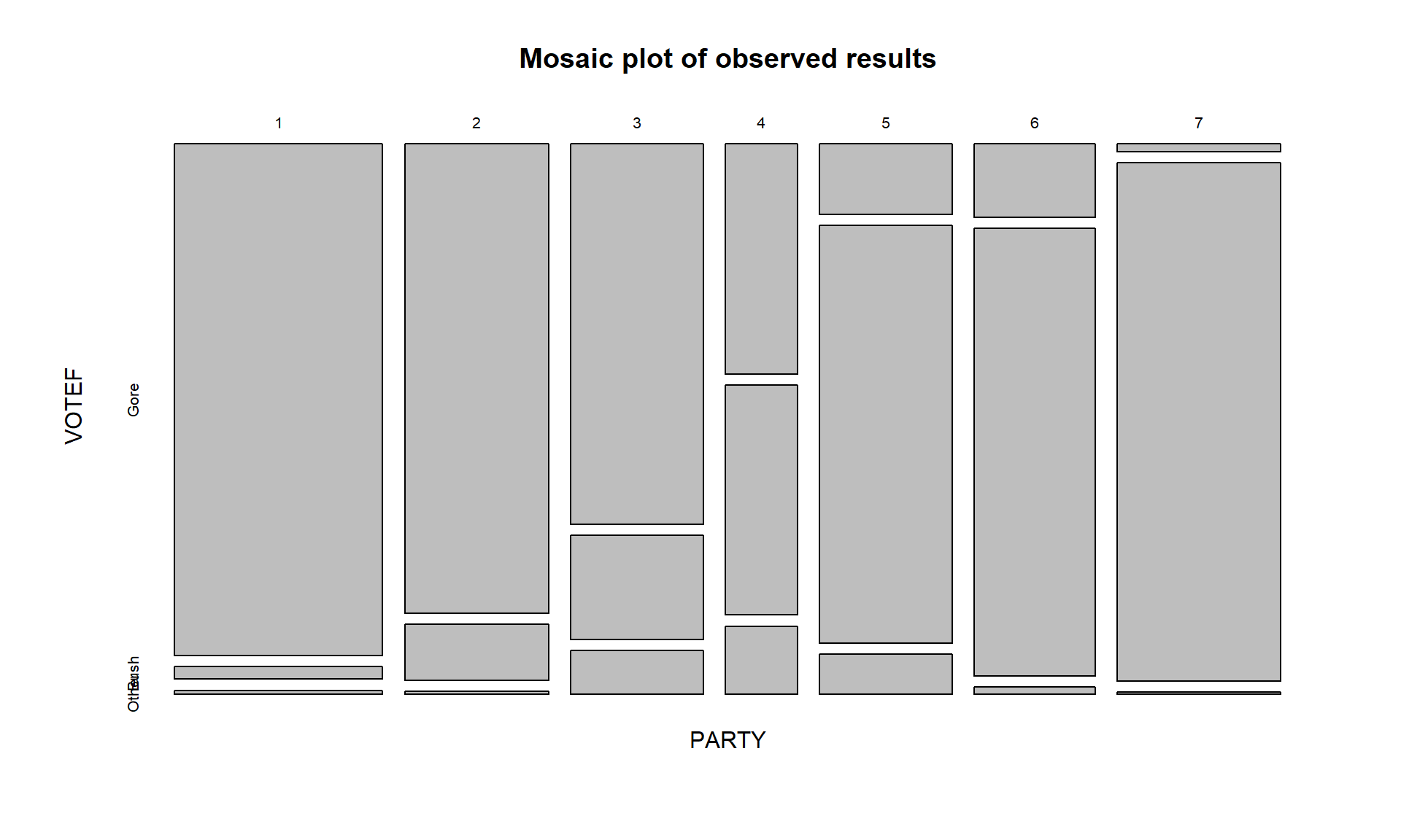
In general, the results here are not too surprising as the respondents became more heavily republican, they voted for Bush and the same pattern occurs as you look at more democratic respondents. As the voters leaned towards being independent, the proportion voting for “Other” increased. So it certainly seems that there is some sort of relationship between party affiliation and voting status. As always, it is good to compare the observed results to what we would expect if the null hypothesis is true. Figure 5.6 assumes that the null hypothesis is true and shows the variation in the proportions in each category in the columns and variation in the proportions across the rows, but displays no relationship between PARTY and VOTEF. Essentially, the pattern down a column is the same for all the columns or vice-versa for the rows. The way to think of “no relationship” here would involve considering whether knowing the party level could help you predict the voting response and that is not the case in Figure 5.6 but was in certain places in Figure 5.5.