
1.5: Grammar of Graphics
- Page ID
- 33208

\( \newcommand{\vecs}[1]{\overset { \scriptstyle \rightharpoonup} {\mathbf{#1}} } \)
\( \newcommand{\vecd}[1]{\overset{-\!-\!\rightharpoonup}{\vphantom{a}\smash {#1}}} \)
\( \newcommand{\dsum}{\displaystyle\sum\limits} \)
\( \newcommand{\dint}{\displaystyle\int\limits} \)
\( \newcommand{\dlim}{\displaystyle\lim\limits} \)
\( \newcommand{\id}{\mathrm{id}}\) \( \newcommand{\Span}{\mathrm{span}}\)
( \newcommand{\kernel}{\mathrm{null}\,}\) \( \newcommand{\range}{\mathrm{range}\,}\)
\( \newcommand{\RealPart}{\mathrm{Re}}\) \( \newcommand{\ImaginaryPart}{\mathrm{Im}}\)
\( \newcommand{\Argument}{\mathrm{Arg}}\) \( \newcommand{\norm}[1]{\| #1 \|}\)
\( \newcommand{\inner}[2]{\langle #1, #2 \rangle}\)
\( \newcommand{\Span}{\mathrm{span}}\)
\( \newcommand{\id}{\mathrm{id}}\)
\( \newcommand{\Span}{\mathrm{span}}\)
\( \newcommand{\kernel}{\mathrm{null}\,}\)
\( \newcommand{\range}{\mathrm{range}\,}\)
\( \newcommand{\RealPart}{\mathrm{Re}}\)
\( \newcommand{\ImaginaryPart}{\mathrm{Im}}\)
\( \newcommand{\Argument}{\mathrm{Arg}}\)
\( \newcommand{\norm}[1]{\| #1 \|}\)
\( \newcommand{\inner}[2]{\langle #1, #2 \rangle}\)
\( \newcommand{\Span}{\mathrm{span}}\) \( \newcommand{\AA}{\unicode[.8,0]{x212B}}\)
\( \newcommand{\vectorA}[1]{\vec{#1}} % arrow\)
\( \newcommand{\vectorAt}[1]{\vec{\text{#1}}} % arrow\)
\( \newcommand{\vectorB}[1]{\overset { \scriptstyle \rightharpoonup} {\mathbf{#1}} } \)
\( \newcommand{\vectorC}[1]{\textbf{#1}} \)
\( \newcommand{\vectorD}[1]{\overrightarrow{#1}} \)
\( \newcommand{\vectorDt}[1]{\overrightarrow{\text{#1}}} \)
\( \newcommand{\vectE}[1]{\overset{-\!-\!\rightharpoonup}{\vphantom{a}\smash{\mathbf {#1}}}} \)
\( \newcommand{\vecs}[1]{\overset { \scriptstyle \rightharpoonup} {\mathbf{#1}} } \)
\(\newcommand{\longvect}{\overrightarrow}\)
\( \newcommand{\vecd}[1]{\overset{-\!-\!\rightharpoonup}{\vphantom{a}\smash {#1}}} \)
\(\newcommand{\avec}{\mathbf a}\) \(\newcommand{\bvec}{\mathbf b}\) \(\newcommand{\cvec}{\mathbf c}\) \(\newcommand{\dvec}{\mathbf d}\) \(\newcommand{\dtil}{\widetilde{\mathbf d}}\) \(\newcommand{\evec}{\mathbf e}\) \(\newcommand{\fvec}{\mathbf f}\) \(\newcommand{\nvec}{\mathbf n}\) \(\newcommand{\pvec}{\mathbf p}\) \(\newcommand{\qvec}{\mathbf q}\) \(\newcommand{\svec}{\mathbf s}\) \(\newcommand{\tvec}{\mathbf t}\) \(\newcommand{\uvec}{\mathbf u}\) \(\newcommand{\vvec}{\mathbf v}\) \(\newcommand{\wvec}{\mathbf w}\) \(\newcommand{\xvec}{\mathbf x}\) \(\newcommand{\yvec}{\mathbf y}\) \(\newcommand{\zvec}{\mathbf z}\) \(\newcommand{\rvec}{\mathbf r}\) \(\newcommand{\mvec}{\mathbf m}\) \(\newcommand{\zerovec}{\mathbf 0}\) \(\newcommand{\onevec}{\mathbf 1}\) \(\newcommand{\real}{\mathbb R}\) \(\newcommand{\twovec}[2]{\left[\begin{array}{r}#1 \\ #2 \end{array}\right]}\) \(\newcommand{\ctwovec}[2]{\left[\begin{array}{c}#1 \\ #2 \end{array}\right]}\) \(\newcommand{\threevec}[3]{\left[\begin{array}{r}#1 \\ #2 \\ #3 \end{array}\right]}\) \(\newcommand{\cthreevec}[3]{\left[\begin{array}{c}#1 \\ #2 \\ #3 \end{array}\right]}\) \(\newcommand{\fourvec}[4]{\left[\begin{array}{r}#1 \\ #2 \\ #3 \\ #4 \end{array}\right]}\) \(\newcommand{\cfourvec}[4]{\left[\begin{array}{c}#1 \\ #2 \\ #3 \\ #4 \end{array}\right]}\) \(\newcommand{\fivevec}[5]{\left[\begin{array}{r}#1 \\ #2 \\ #3 \\ #4 \\ #5 \\ \end{array}\right]}\) \(\newcommand{\cfivevec}[5]{\left[\begin{array}{c}#1 \\ #2 \\ #3 \\ #4 \\ #5 \\ \end{array}\right]}\) \(\newcommand{\mattwo}[4]{\left[\begin{array}{rr}#1 \amp #2 \\ #3 \amp #4 \\ \end{array}\right]}\) \(\newcommand{\laspan}[1]{\text{Span}\{#1\}}\) \(\newcommand{\bcal}{\cal B}\) \(\newcommand{\ccal}{\cal C}\) \(\newcommand{\scal}{\cal S}\) \(\newcommand{\wcal}{\cal W}\) \(\newcommand{\ecal}{\cal E}\) \(\newcommand{\coords}[2]{\left\{#1\right\}_{#2}}\) \(\newcommand{\gray}[1]{\color{gray}{#1}}\) \(\newcommand{\lgray}[1]{\color{lightgray}{#1}}\) \(\newcommand{\rank}{\operatorname{rank}}\) \(\newcommand{\row}{\text{Row}}\) \(\newcommand{\col}{\text{Col}}\) \(\renewcommand{\row}{\text{Row}}\) \(\newcommand{\nul}{\text{Nul}}\) \(\newcommand{\var}{\text{Var}}\) \(\newcommand{\corr}{\text{corr}}\) \(\newcommand{\len}[1]{\left|#1\right|}\) \(\newcommand{\bbar}{\overline{\bvec}}\) \(\newcommand{\bhat}{\widehat{\bvec}}\) \(\newcommand{\bperp}{\bvec^\perp}\) \(\newcommand{\xhat}{\widehat{\xvec}}\) \(\newcommand{\vhat}{\widehat{\vvec}}\) \(\newcommand{\uhat}{\widehat{\uvec}}\) \(\newcommand{\what}{\widehat{\wvec}}\) \(\newcommand{\Sighat}{\widehat{\Sigma}}\) \(\newcommand{\lt}{<}\) \(\newcommand{\gt}{>}\) \(\newcommand{\amp}{&}\) \(\definecolor{fillinmathshade}{gray}{0.9}\)The previous plots were made using what is called “base R” graphics. It is possible to make versions of all the graphics we need in this material using single function calls like boxplot – and there are some places we will utilize these simple versions because they get us exactly what we want to see. But to make more complex displays and have complete control of the way the graphs look, we will utilize the ggplot2 package (Wickham et al. 2022) which was built to implement a type of grammar for making and layering graphical displays of data, adding each layer step by step. While it takes a little bit of work to get started, the power of these displays will ultimately make the investment worthwhile12.
As opposed to base graphics, the ggplots will contain multiple components that are patched together with a +, with the general format of ggplot(data = <DATA>, mapping = aes(<VARIABLE MAPPINGS>)) + <GEOM_FUNCTION>(). Breaking this down, the data = ... tells the ggplot function where to look, the information inside the aes (or aesthetic) defines which variables in the data set to use and how to use them (often with x = variable1, y = variable2, etc., with x = ... for the variable on the x (horizontal) axis and y = ... for the variable on the y (vertical) axis), and the + <GEOM_FUNCTION>() defines which type of graph to make (there are geom_histogram and geom_boxplot to make the graphs discussed previously and many, many more). Because we often have many “+”’s to include, the common practice is to hit return after the “+” and start the next layer or option on the following line for better readability. Figure 1.10 shows a histogram of the RunTime variable made using the + geom_histogram().
library(ggplot2)
ggplot(data = treadmill, mapping = aes(x = RunTime)) + geom_histogram()
`stat_bin()` using `bins = 30`. Pick better value with `binwidth`.
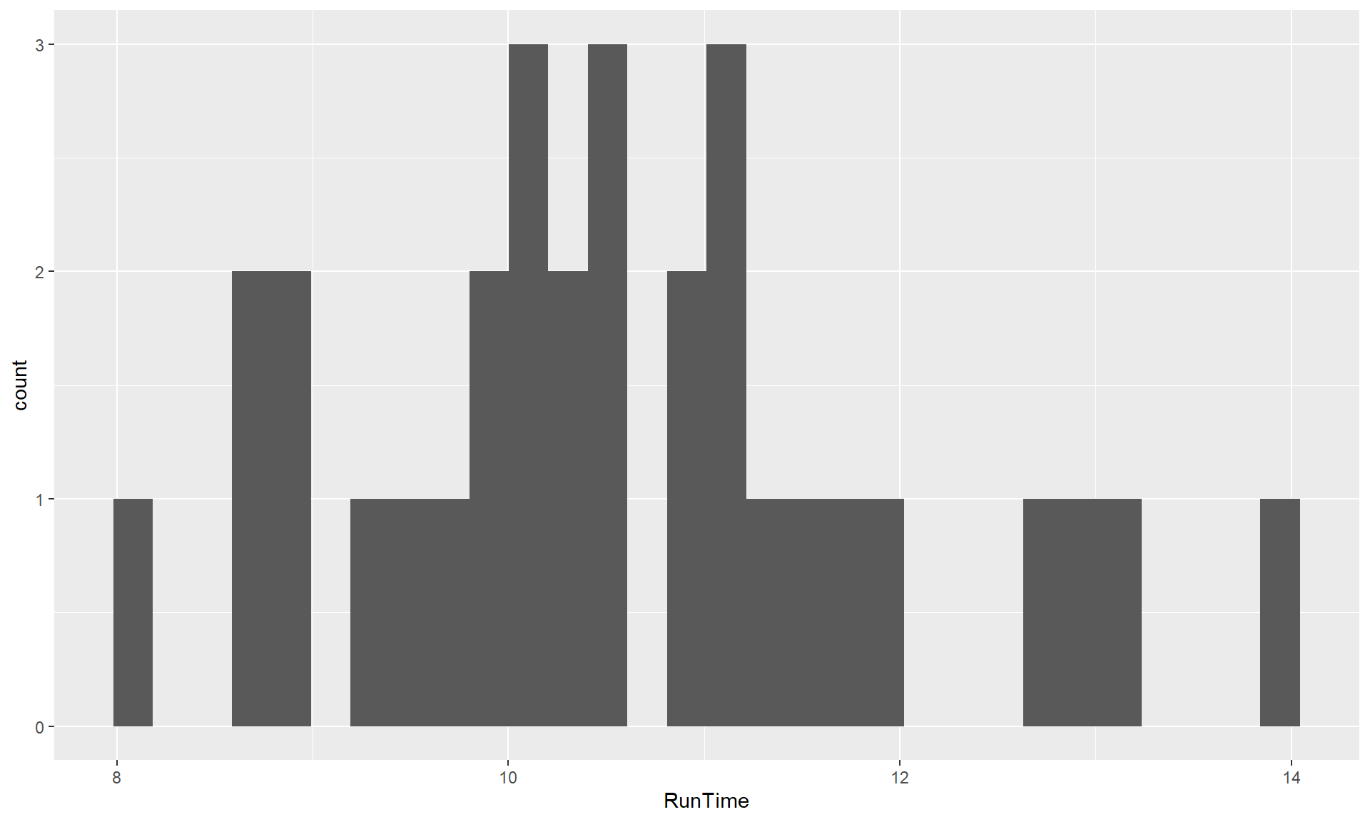
ggplot.The warning message reflects a challenge in making histograms that involves how many bins to use. In geom_histogram, it always uses 30 bins and expects you to make your own choice, compared to hist that used a different method to try to make a better automatic choice, but there is no single right answer. So maybe we should try out other values to get a “smoother” result here, which we can do by adding the bins = ... to the + geom_histogram(), such as + geom_histogram(bins = 8) to get an 8 bin histogram in Figure 1.11.

ggplot with 8 bins.ggplot(data = treadmill, mapping = aes(x = RunTime)) +
geom_histogram(bins = 8)The following chapters will explore further modifications for these plots, but there are a couple of additions to highlight. The first is that we can often layer multiple geoms on the same plot and the order of the additions defines which layer is “on top”, with the plot built up sequentially. So we can add a boxplot on top of a histogram by putting it after the histogram layer. Also in Figure 1.12, the geom_rug is also added, which puts a tick mark for each observation on the lower part of the x-axis. Rug plots can also use a graphical technique called jittering to add a little noise using the options geom_rug(sides = "b", aes(y = 0), position = "jitter")13 to each observation so that multiple similar or tied observations do not plot as a single line. There are options to control the color of individual components when we add them (the histogram is filled with grey (fill = "grey"), the boxplot is in “tomato” (color = "tomato"), and the rug plot is in “skyblue”). Finally, the last change here is to the “theme” for the plot14 which we can include one of a suite of different layouts with themes such as + theme_bw() or + theme_light(). If you add the ggthemes package(Arnold 2021), you can access a long list of alternative looks for your plot (see https://jrnold.github.io/ggthemes/reference/index.html for options there).
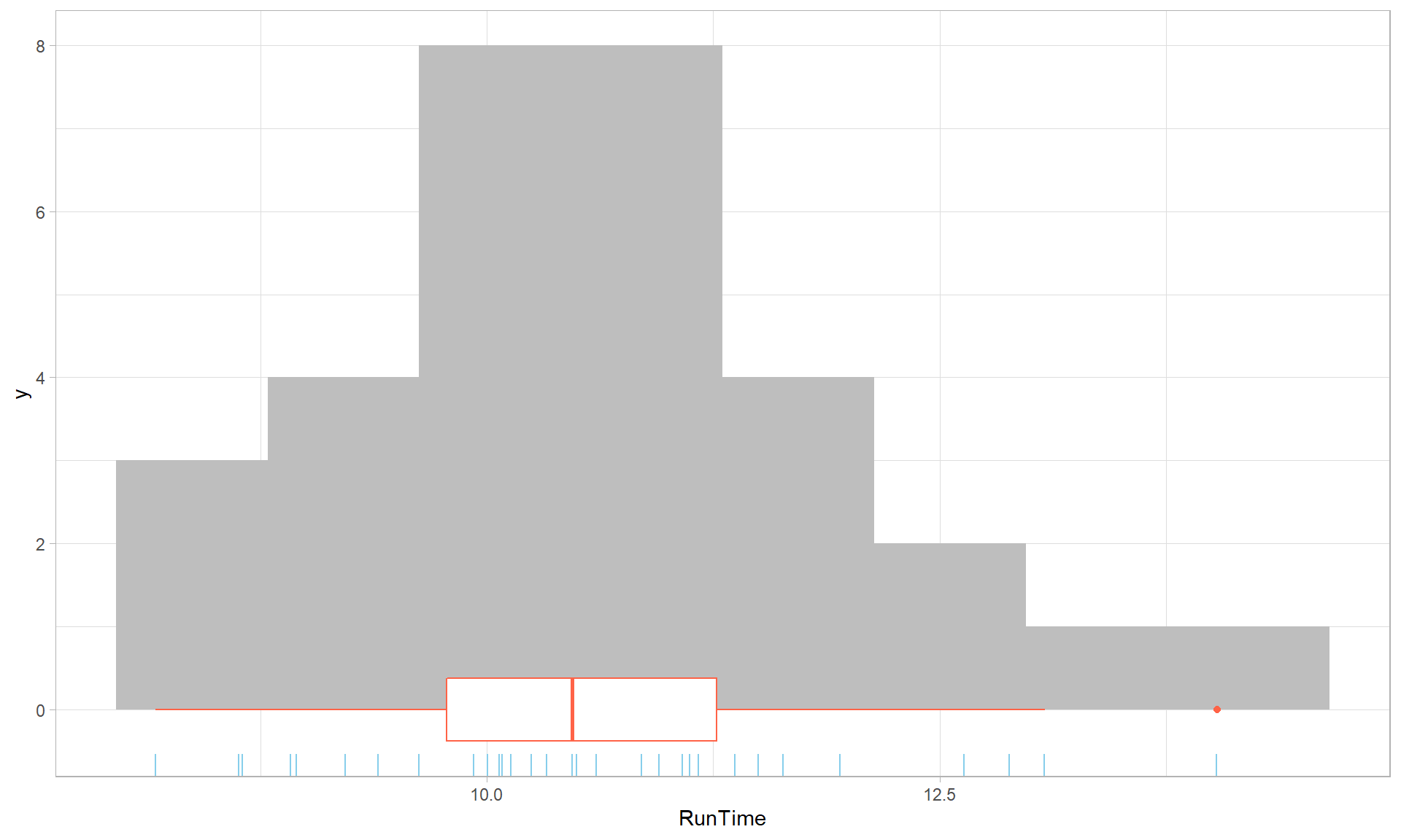
ggplot with modified colors and theme.ggplot(data = treadmill, mapping = aes(x = RunTime)) +
geom_histogram(fill = "grey", bins = 8) +
geom_boxplot(color = "tomato") +
geom_rug(color = "skyblue", sides = "b", aes(y = 0), position = "jitter") +
theme_light()