
1.3: Basic summary statistics, histograms, and boxplots using R
- Page ID
- 33206

For the following material, you will need to install and load the mosaic package (Pruim, Kaplan, and Horton 2021a).
> library(mosaic)It provides a suite of enhanced functions to aid our initial explorations. With RStudio running, the mosaic package loaded, a place to write and save code, and the treadmill data set loaded, we can (finally!) start to summarize the results of the study. The treadmill object is what R calls a tibble9 and contains columns corresponding to each variable in the spreadsheet. Every function in R will involve specifying the variable(s) of interest and how you want to use them. To access a particular variable (column) in a tibble, you can use a $ between the name of the tibble and the name of the variable of interest, generically as tibblename$variablename. You can think of this as tibblename’s variablename where the ’s is replaced by the dollar sign. To identify the RunTime variable here it would be treadmill$RunTime. In the command line it would look like:
> treadmill$RunTime
[1]  8.63  8.17  8.92  8.65 10.33  9.93 10.13 10.08  9.22  8.95 10.85  9.40 11.50 10.50
[15] 10.60 10.25 10.00 11.17 10.47 11.95  9.63 10.07 11.08 11.63 11.12 11.37 10.95 13.08
[29] 12.63 12.88 14.03
Just as in the previous section, we can generate summary statistics using functions like mean and sd by running them on a specific variable:
> mean(treadmill$RunTime)
[1] 10.58613
> sd(treadmill$RunTime)
[1] 1.387414
And now we know that the average running time for 1.5 miles for the subjects in the study was 10.6 minutes with a standard deviation (SD) of 1.39 minutes. But you should remember that the mean and SD are only appropriate summaries if the distribution is roughly symmetric (both sides of the distribution are approximately the same shape and length). The mosaic package provides a useful function called favstats that provides the mean and SD as well as the 5 number summary: the minimum (min), the first quartile (Q1, the 25th percentile), the median (50th percentile), the third quartile (Q3, the 75th percentile), and the maximum (max). It also provides the number of observations (n) which was 31, as noted above, and a count of whether any missing values were encountered (missing), which was 0 here since all subjects had measurements available on this variable.
> favstats(treadmill$RunTime)
  min   Q1 median    Q3   max     mean       sd  n missing
 8.17 9.78  10.47 11.27 14.03 10.58613 1.387414 31       0
We are starting to get somewhere with understanding that the runners were somewhat fit with the worst runner covering 1.5 miles in 14 minutes (the equivalent of a 9.3 minute mile) and the best running at a 5.4 minute mile pace. The limited variation in the results suggests that the sample was obtained from a restricted group with somewhat common characteristics. When you explore the ages and weights of the subjects in the Practice Problems in Section 1.6, you will get even more information about how similar all the subjects in this study were. Researchers often publish numerical summaries of this sort of demographic information to help readers understand the subjects that they studied and that their results might apply to.
A graphical display of these results will help us to assess the shape of the distribution of run times – including considering the potential for the presence of a skew (whether the right or left tail of the distribution is noticeably more spread out, with left skew meaning that the left tail is more spread out than the right tail) and outliers (unusual observations). A histogram is a good place to start. Histograms display connected bars with counts of observations defining the height of bars based on a set of bins of values of the quantitative variable. We will apply the hist function to the RunTime variable, which produces Figure 1.5.
> hist(treadmill$RunTime)
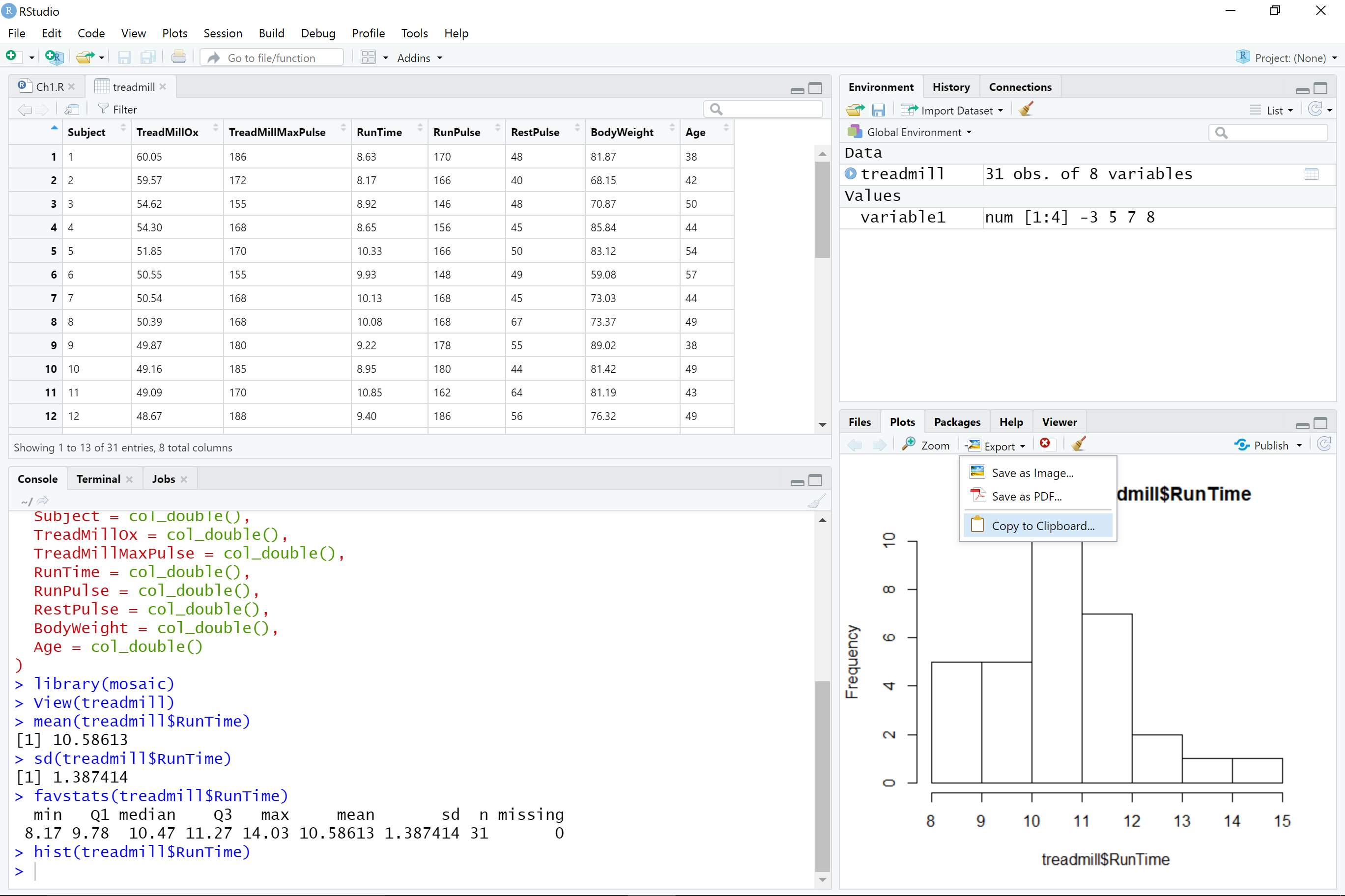
You can save this plot by clicking on the Export button found above the plot, followed by Copy to Clipboard and clicking on the Copy Plot button. Then if you open your favorite word-processing program, you should be able to paste it into a document for writing reports that include the figures. You can see the first parts of this process in the screen grab in Figure 1.6. You can also directly save the figures as separate files using Save as Image or Save as PDF and then insert them into your word processing documents.
The function hist defaults into providing a histogram on the frequency (count) scale. In most R functions, there are the default options that will occur if we don’t make any specific choices but we can override the default options if we desire. One option we can modify here is to add labels to the bars to be able to see exactly how many observations fell into each bar. Specifically, we can turn the labels option “on” by making it true (“T”) by adding labels = T to the previous call to the hist function, separated by a comma. Note that we will use the = sign only for changing options within functions.
> hist(treadmill$RunTime, labels = T)
Based on this histogram (Figure 1.8), it does not appear that there any outliers in the responses since there are no bars that are separated from the other observations. However, the distribution does not look symmetric and there might be a skew to the distribution. Specifically, it appears to be skewed right (the right tail is longer than the left). But histograms can sometimes mask features of the data set by binning observations and it is hard to find the percentiles accurately from the plot.
When assessing outliers and skew, the boxplot (or Box and Whiskers plot) can also be helpful (Figure 1.8) to describe the shape of the distribution as it displays the 5-number summary and will also indicate observations that are “far” above the middle of the observations. R’s boxplot function uses the standard rule to indicate an observation as a potential outlier if it falls more than 1.5 times the IQR (Inter-Quartile Range, calculated as Q3 – Q1) below Q1 or above Q3. The potential outliers are plotted with circles and the Whiskers (lines that extend from Q1 and Q3 typically to the minimum and maximum) are shortened to only go as far as observations that are within \(1.5*\)IQR of the upper and lower quartiles. The box part of the boxplot is a box that goes from Q1 to Q3 and the median is displayed as a line somewhere inside the box.10 Looking back at the summary statistics above, Q1 = 9.78 and Q3 = 11.27, providing an IQR of:
> IQR <- 11.27 - 9.78
> IQR
[1] 1.49
One observation (the maximum value of 14.03) is indicated as a potential outlier based on this result by being larger than Q3 \(+1.5*\)IQR, which was 13.505:
> 11.27 + 1.5*IQR
[1] 13.505
The boxplot also shows a slight indication of a right skew (skew towards larger values) with the distance from the minimum to the median being smaller than the distance from the median to the maximum. Additionally, the distance from Q1 to the median is smaller than the distance from the median to Q3. It is modest skew, but worth noting.

> boxplot(treadmill$RunTime)While the default boxplot is fine, it fails to provide good graphical labels, especially on the y-axis. Additionally, there is no title on the plot. The following code provides some enhancements to the plot by using the ylab and main options in the call to boxplot, with the results displayed in Figure 1.9. When we add text to plots, it will be contained within quotes and be assigned into the options ylab (for y-axis) or main (for the title) here to put it into those locations.

> boxplot(treadmill$RunTime, ylab = "1.5 Mile Run Time (minutes)",
          main = "Boxplot of the Run Times of n = 31 participants")
Throughout the book, we will often use extra options to make figures that are easier for you to understand. There are often simpler versions of the functions that will suffice but the extra work to get better labeled figures is often worth it. I guess the point is that “a picture is worth a thousand words” but in data visualization, that is only true if the reader can understand what is being displayed. It is also important to think about the quality of the information that is being displayed, regardless of how pretty the graphic might be. So maybe it is better to say “a picture can be worth a thousand words” if it is well-labeled?