
5.2.1: Nested Model in SAS
- Page ID
- 33639

Here is the SAS code to run the ANOVA model for the hours of exercise for high school students example discussed in lesson 5.2:
data Nested_Example_data;
infile datalines delimiter=',';
input Region $ City $ ExHours;
datalines;
    NE,NY,30
    NE,NY,35
    NE,Pittsburgh,18
    NE,Pittsburgh,20
    MW,Chicago,10
    MW,Chicago,9
    MW,Detroit,20
    MW,Detroit,22
    W,LA,18
    W,LA,19
    W,Seattle,4
    W,Seattle,6
;

/*to run the nested ANOVA model*/
proc mixed data=Nested_Example_data method=type3;
    class Region City;
    model ExHours = Region City(Region);
    store nested1;
run;

/*to obtain the resulting multiple comparison results*/
ods graphics on;
proc plm restore=nested1;
    lsmeans Region / adjust=tukey plot=meanplot cl lines;
    lsmeans City(Region) / adjust=tukey plot=meanplot cl lines;
run;
When we run this SAS program, here is the output that we are interested in:
| Type 3 Analysis of Variance | ||||||||
|---|---|---|---|---|---|---|---|---|
| Source | DF | Sum of Squares | Mean Square | Expected Mean Square | Error Term | Error DF | F Value | Pr > F |
| Region | 2 | 424.666667 | 212.333333 | Var(Residual)+Q(Region, City(Region)) | MS(Residual) | 6 | 65.33 | <.0001 |
| City(Region) | 3 | 496.750000 | 165.583333 | Var(Residual)+Q(City(Region)) | MS(Residual) | 6 | 50.95 | 0.0001 |
| Residual | 6 | 19.500000 | 3.250000 | Var(Residual) | ||||
| Type 3 Test of Fixed Effects | ||||
|---|---|---|---|---|
| Effect | Num DF | Den DF | F Value | Pr>F |
| Region | 2 | 6 | 65.33 | <.0001 |
| City(Region) | 3 | 6 | 50.95 | 0.0001 |
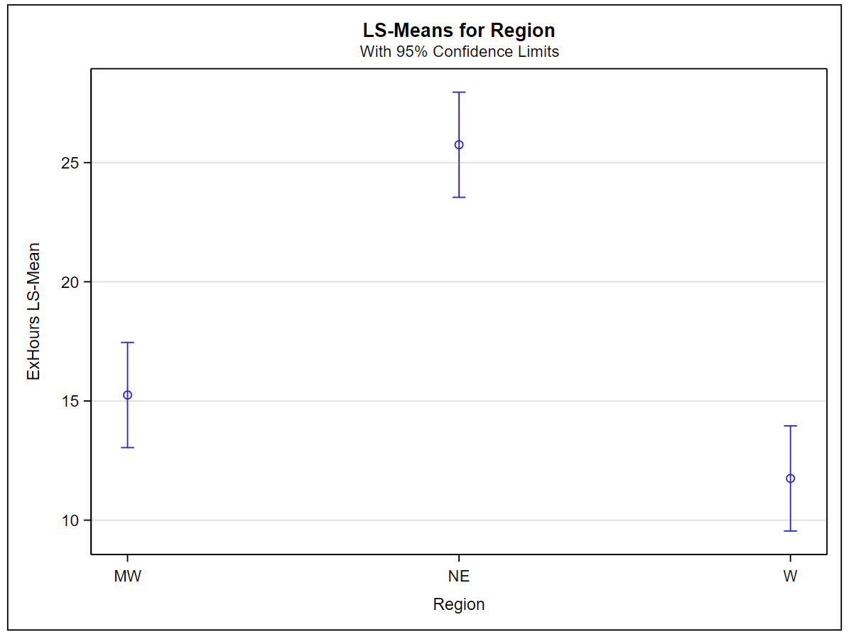
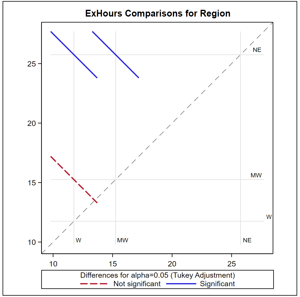
The \(p\)-values above indicate that both Region and City(Region) are statistically significant. The plots and charts below obtained from the Tukey option specify the means which are significantly different.
.png?revision=1&size=bestfit&width=534&height=401)
.png?revision=1&size=bestfit&width=464&height=459)
.png?revision=1&size=bestfit&width=500&height=377)
.png?revision=1&size=bestfit&width=464&height=461)
The exercise hours on average are statistically higher in the northeastern region compared to the midwest and the west while the average exercise hours of these two regions are not significantly different.
Also, the comparison of the means between cities indicates that the high schoolers in New York city exercise significantly more than the other cities in the study. The exercise levels are similar among Detroit, Pittsburgh, and LA, while exercise levels of high schoolers in Chicago and Seattle are similar but significantly lower than all other cities in the study.
These grouping observations are further confirmed by the lines plots below.
.png?revision=1&size=bestfit&width=505&height=421)
.png?revision=1&size=bestfit&width=530&height=466)