
6.2: Probability in Graphs and Distributions
- Page ID
- 14480

\( \newcommand{\vecs}[1]{\overset { \scriptstyle \rightharpoonup} {\mathbf{#1}} } \)
\( \newcommand{\vecd}[1]{\overset{-\!-\!\rightharpoonup}{\vphantom{a}\smash {#1}}} \)
\( \newcommand{\id}{\mathrm{id}}\) \( \newcommand{\Span}{\mathrm{span}}\)
( \newcommand{\kernel}{\mathrm{null}\,}\) \( \newcommand{\range}{\mathrm{range}\,}\)
\( \newcommand{\RealPart}{\mathrm{Re}}\) \( \newcommand{\ImaginaryPart}{\mathrm{Im}}\)
\( \newcommand{\Argument}{\mathrm{Arg}}\) \( \newcommand{\norm}[1]{\| #1 \|}\)
\( \newcommand{\inner}[2]{\langle #1, #2 \rangle}\)
\( \newcommand{\Span}{\mathrm{span}}\)
\( \newcommand{\id}{\mathrm{id}}\)
\( \newcommand{\Span}{\mathrm{span}}\)
\( \newcommand{\kernel}{\mathrm{null}\,}\)
\( \newcommand{\range}{\mathrm{range}\,}\)
\( \newcommand{\RealPart}{\mathrm{Re}}\)
\( \newcommand{\ImaginaryPart}{\mathrm{Im}}\)
\( \newcommand{\Argument}{\mathrm{Arg}}\)
\( \newcommand{\norm}[1]{\| #1 \|}\)
\( \newcommand{\inner}[2]{\langle #1, #2 \rangle}\)
\( \newcommand{\Span}{\mathrm{span}}\) \( \newcommand{\AA}{\unicode[.8,0]{x212B}}\)
\( \newcommand{\vectorA}[1]{\vec{#1}} % arrow\)
\( \newcommand{\vectorAt}[1]{\vec{\text{#1}}} % arrow\)
\( \newcommand{\vectorB}[1]{\overset { \scriptstyle \rightharpoonup} {\mathbf{#1}} } \)
\( \newcommand{\vectorC}[1]{\textbf{#1}} \)
\( \newcommand{\vectorD}[1]{\overrightarrow{#1}} \)
\( \newcommand{\vectorDt}[1]{\overrightarrow{\text{#1}}} \)
\( \newcommand{\vectE}[1]{\overset{-\!-\!\rightharpoonup}{\vphantom{a}\smash{\mathbf {#1}}}} \)
\( \newcommand{\vecs}[1]{\overset { \scriptstyle \rightharpoonup} {\mathbf{#1}} } \)
\( \newcommand{\vecd}[1]{\overset{-\!-\!\rightharpoonup}{\vphantom{a}\smash {#1}}} \)
\(\newcommand{\avec}{\mathbf a}\) \(\newcommand{\bvec}{\mathbf b}\) \(\newcommand{\cvec}{\mathbf c}\) \(\newcommand{\dvec}{\mathbf d}\) \(\newcommand{\dtil}{\widetilde{\mathbf d}}\) \(\newcommand{\evec}{\mathbf e}\) \(\newcommand{\fvec}{\mathbf f}\) \(\newcommand{\nvec}{\mathbf n}\) \(\newcommand{\pvec}{\mathbf p}\) \(\newcommand{\qvec}{\mathbf q}\) \(\newcommand{\svec}{\mathbf s}\) \(\newcommand{\tvec}{\mathbf t}\) \(\newcommand{\uvec}{\mathbf u}\) \(\newcommand{\vvec}{\mathbf v}\) \(\newcommand{\wvec}{\mathbf w}\) \(\newcommand{\xvec}{\mathbf x}\) \(\newcommand{\yvec}{\mathbf y}\) \(\newcommand{\zvec}{\mathbf z}\) \(\newcommand{\rvec}{\mathbf r}\) \(\newcommand{\mvec}{\mathbf m}\) \(\newcommand{\zerovec}{\mathbf 0}\) \(\newcommand{\onevec}{\mathbf 1}\) \(\newcommand{\real}{\mathbb R}\) \(\newcommand{\twovec}[2]{\left[\begin{array}{r}#1 \\ #2 \end{array}\right]}\) \(\newcommand{\ctwovec}[2]{\left[\begin{array}{c}#1 \\ #2 \end{array}\right]}\) \(\newcommand{\threevec}[3]{\left[\begin{array}{r}#1 \\ #2 \\ #3 \end{array}\right]}\) \(\newcommand{\cthreevec}[3]{\left[\begin{array}{c}#1 \\ #2 \\ #3 \end{array}\right]}\) \(\newcommand{\fourvec}[4]{\left[\begin{array}{r}#1 \\ #2 \\ #3 \\ #4 \end{array}\right]}\) \(\newcommand{\cfourvec}[4]{\left[\begin{array}{c}#1 \\ #2 \\ #3 \\ #4 \end{array}\right]}\) \(\newcommand{\fivevec}[5]{\left[\begin{array}{r}#1 \\ #2 \\ #3 \\ #4 \\ #5 \\ \end{array}\right]}\) \(\newcommand{\cfivevec}[5]{\left[\begin{array}{c}#1 \\ #2 \\ #3 \\ #4 \\ #5 \\ \end{array}\right]}\) \(\newcommand{\mattwo}[4]{\left[\begin{array}{rr}#1 \amp #2 \\ #3 \amp #4 \\ \end{array}\right]}\) \(\newcommand{\laspan}[1]{\text{Span}\{#1\}}\) \(\newcommand{\bcal}{\cal B}\) \(\newcommand{\ccal}{\cal C}\) \(\newcommand{\scal}{\cal S}\) \(\newcommand{\wcal}{\cal W}\) \(\newcommand{\ecal}{\cal E}\) \(\newcommand{\coords}[2]{\left\{#1\right\}_{#2}}\) \(\newcommand{\gray}[1]{\color{gray}{#1}}\) \(\newcommand{\lgray}[1]{\color{lightgray}{#1}}\) \(\newcommand{\rank}{\operatorname{rank}}\) \(\newcommand{\row}{\text{Row}}\) \(\newcommand{\col}{\text{Col}}\) \(\renewcommand{\row}{\text{Row}}\) \(\newcommand{\nul}{\text{Nul}}\) \(\newcommand{\var}{\text{Var}}\) \(\newcommand{\corr}{\text{corr}}\) \(\newcommand{\len}[1]{\left|#1\right|}\) \(\newcommand{\bbar}{\overline{\bvec}}\) \(\newcommand{\bhat}{\widehat{\bvec}}\) \(\newcommand{\bperp}{\bvec^\perp}\) \(\newcommand{\xhat}{\widehat{\xvec}}\) \(\newcommand{\vhat}{\widehat{\vvec}}\) \(\newcommand{\uhat}{\widehat{\uvec}}\) \(\newcommand{\what}{\widehat{\wvec}}\) \(\newcommand{\Sighat}{\widehat{\Sigma}}\) \(\newcommand{\lt}{<}\) \(\newcommand{\gt}{>}\) \(\newcommand{\amp}{&}\) \(\definecolor{fillinmathshade}{gray}{0.9}\)We will see shortly that the normal distribution is the key to how probability works for our purposes. To understand exactly how, let’s first look at a simple, intuitive example using pie charts.
Probability in Pie
Recall that a pie chart represents how frequently a category was observed and that all slices of the pie chart add up to 100%, or 1. This means that if we randomly select an observation from the data used to create the pie chart, the probability of it taking on a specific value is exactly equal to the size of that category’s slice in the pie chart.
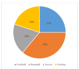
Take, for example, the pie chart in Figure \(\PageIndex{1}\) representing the favorite sports of 100 people. If you put this pie chart on a dart board and aimed blindly (assuming you are guaranteed to hit the board), the likelihood of hitting the slice for any given sport would be equal to the size of that slice. So, the probability of hitting the baseball slice is the highest at 36%. The probability is equal to the proportion of the chart taken up by that section.
We can also add slices together. For instance, maybe we want to know the probability to finding someone whose favorite sport is usually played on grass. The outcomes that satisfy this criteria are baseball, football, and soccer. To get the probability, we simply add their slices together to see what proportion of the area of the pie chart is in that region: 36% + 25% + 20% = 81%. We can also add sections together even if they do not touch. If we want to know the likelihood that someone’s favorite sport is not called football somewhere in the world (i.e. baseball and hockey), we can add those slices even though they aren’t adjacent or continuous in the chart itself: 36% + 20% = 56%. We are able to do all of this because 1) the size of the slice corresponds to the area of the chart taken up by that slice, 2) the percentage for a specific category can be represented as a decimal (this step was skipped for ease of explanation above), and 3) the total area of the chart is equal to 100% or 1.0, which makes the size of the slices interpretable.
Probability in Normal Distributions
If the language at the end of the last section sounded familiar, that’s because its exactly the language used in the last chapter to describe the normal distribution. Recall that the normal distribution has an area under its curve that is equal to 1 and that it can be split into sections by drawing a line through it that corresponds to a given \(z\)-score. Because of this, we can interpret areas under the normal curve as probabilities that correspond to \(z\)-scores.
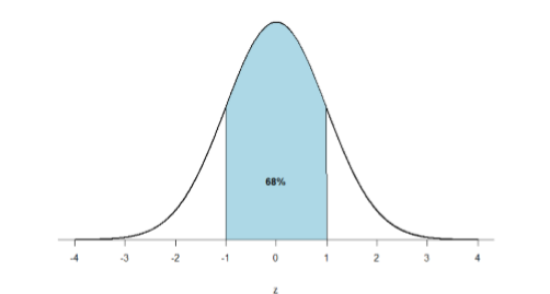
First, let’s look back at the area between \(z\) = -1.00 and \(z\) = 1.00 presented in Figure \(\PageIndex{2}\). We were told earlier that this region contains 68% of the area under the curve. Thus, if we randomly chose a \(z\)-score from all possible z-scores, there is a 68% chance that it will be between \(z\) = -1.00 and \(z\) = 1.00 because those are the \(z\)-scores that satisfy our criteria.
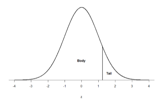
Just like a pie chart is broken up into slices by drawing lines through it, we can also draw a line through the normal distribution to split it into sections. Take a look at the normal distribution in Figure \(\PageIndex{3}\) which has a line drawn through it as \(z\) = 1.25. This line creates two sections of the distribution: the smaller section called the tail and the larger section called the body. Differentiating between the body and the tail does not depend on which side of the distribution the line is drawn. All that matters is the relative size of the pieces: bigger is always body.
As you can see, we can break up the normal distribution into 3 pieces (lower tail, body, and upper tail) as in Figure \(\PageIndex{2}\) or into 2 pieces (body and tail) as in Figure \(\PageIndex{3}\). We can then find the proportion of the area in the body and tail based on where the line was drawn (i.e. at what \(z\)-score). Mathematically this is done using calculus. Fortunately, the exact values are given to you in the Standard Normal Distribution Table, also known at the \(z\)-table. Using the values in this table, we can find the area under the normal curve in any body, tail, or combination of tails no matter which \(z\)-scores are used to define them.
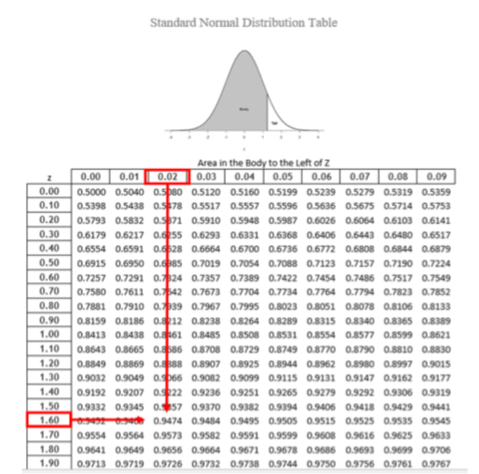
The \(z\)-table presents the values for the area under the curve to the left of the positive \(z\)-scores from 0.00-3.00 (technically 3.09), as indicated by the shaded region of the distribution at the top of the table. To find the appropriate value, we first find the row corresponding to our \(z\)-score then follow it over until we get to the column that corresponds to the number in the hundredths place of our \(z\)-score. For example, suppose we want to find the area in the body for a \(z\)-score of 1.62. We would first find the row for 1.60 then follow it across to the column labeled 0.02 (1.60 + 0.02 = 1.62) and find 0.9474 (see Figure \(\PageIndex{4}\)). Thus, the odds of randomly selecting someone with a \(z\)-score less than (to the left of) \(z\) = 1.62 is 94.74% because that is the proportion of the area taken up by values that satisfy our criteria.
The \(z\)-table only presents the area in the body for positive \(z\)-scores because the normal distribution is symmetrical. Thus, the area in the body of \(z\) = 1.62 is equal to the area in the body for \(z\) = -1.62, though now the body will be the shaded area to the right of \(z\) (because the body is always larger). When in doubt, drawing out your distribution and shading the area you need to find will always help. The table also only presents the area in the body because the total area under the normal curve is always equal to 1.00, so if we need to find the area in the tail for \(z\) = 1.62, we simply find the area in the body and subtract it from 1.00 (1.00 – 0.9474 = 0.0526).
Let’s look at another example. This time, let’s find the area corresponding to \(z\)-scores more extreme than \(z\) = -1.96 and \(z\) = 1.96. That is, let’s find the area in the tails of the distribution for values less than \(z\) = -1.96 (farther negative and therefore more extreme) and greater than \(z\) = 1.96 (farther positive and therefore more extreme). This region is illustrated in Figure \(\PageIndex{5}\).
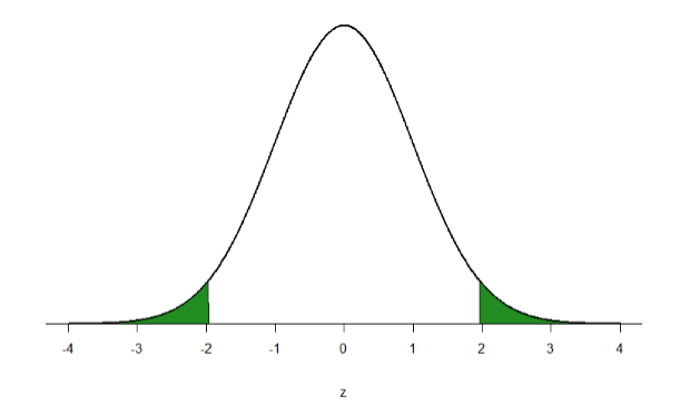
Let’s start with the tail for \(z\) = 1.96. If we go to the \(z\)-table we will find that the body to the left of \(z\) = 1.96 is equal to 0.9750. To find the area in the tail, we subtract that from 1.00 to get 0.0250. Because the normal distribution is symmetrical, the area in the tail for \(z\) = -1.96 is the exact same value, 0.0250. Finally, to get the total area in the shaded region, we simply add the areas together to get 0.0500. Thus, there is a 5% chance of randomly getting a value more extreme than \(z\) = -1.96 or \(z\) = 1.96 (this particular value and region will become incredibly important in Unit 2).
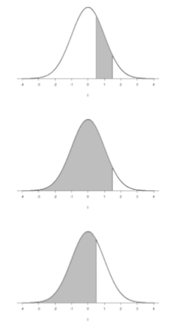
Finally, we can find the area between two \(z\)-scores by shading and subtracting. Figure \(\PageIndex{6}\) shows the area between \(z\) = 0.50 and \(z\) = 1.50. Because this is a subsection of a body (rather than just a body or a tail), we must first find the larger of the two bodies, in this case the body for \(z\) = 1.50, and subtract the smaller of the two bodies, or the body for \(z\) = 0.50. Aligning the distributions vertically, as in Figure 6, makes this clearer. From the z-table, the area in the body for \(z\) = 1.50 is 0.9332 and the area in the body for \(z\) = 0.50 is 0.6915. Subtracting these gives us 0.9332 – 0.6915 = 0.2417.
Contributors
Foster et al. (University of Missouri-St. Louis, Rice University, & University of Houston, Downtown Campus)