
2.2: Histograms, Frequency Polygons, and Time Series Graphs
- Page ID
- 5847

\( \newcommand{\vecs}[1]{\overset { \scriptstyle \rightharpoonup} {\mathbf{#1}} } \)
\( \newcommand{\vecd}[1]{\overset{-\!-\!\rightharpoonup}{\vphantom{a}\smash {#1}}} \)
\( \newcommand{\id}{\mathrm{id}}\) \( \newcommand{\Span}{\mathrm{span}}\)
( \newcommand{\kernel}{\mathrm{null}\,}\) \( \newcommand{\range}{\mathrm{range}\,}\)
\( \newcommand{\RealPart}{\mathrm{Re}}\) \( \newcommand{\ImaginaryPart}{\mathrm{Im}}\)
\( \newcommand{\Argument}{\mathrm{Arg}}\) \( \newcommand{\norm}[1]{\| #1 \|}\)
\( \newcommand{\inner}[2]{\langle #1, #2 \rangle}\)
\( \newcommand{\Span}{\mathrm{span}}\)
\( \newcommand{\id}{\mathrm{id}}\)
\( \newcommand{\Span}{\mathrm{span}}\)
\( \newcommand{\kernel}{\mathrm{null}\,}\)
\( \newcommand{\range}{\mathrm{range}\,}\)
\( \newcommand{\RealPart}{\mathrm{Re}}\)
\( \newcommand{\ImaginaryPart}{\mathrm{Im}}\)
\( \newcommand{\Argument}{\mathrm{Arg}}\)
\( \newcommand{\norm}[1]{\| #1 \|}\)
\( \newcommand{\inner}[2]{\langle #1, #2 \rangle}\)
\( \newcommand{\Span}{\mathrm{span}}\) \( \newcommand{\AA}{\unicode[.8,0]{x212B}}\)
\( \newcommand{\vectorA}[1]{\vec{#1}} % arrow\)
\( \newcommand{\vectorAt}[1]{\vec{\text{#1}}} % arrow\)
\( \newcommand{\vectorB}[1]{\overset { \scriptstyle \rightharpoonup} {\mathbf{#1}} } \)
\( \newcommand{\vectorC}[1]{\textbf{#1}} \)
\( \newcommand{\vectorD}[1]{\overrightarrow{#1}} \)
\( \newcommand{\vectorDt}[1]{\overrightarrow{\text{#1}}} \)
\( \newcommand{\vectE}[1]{\overset{-\!-\!\rightharpoonup}{\vphantom{a}\smash{\mathbf {#1}}}} \)
\( \newcommand{\vecs}[1]{\overset { \scriptstyle \rightharpoonup} {\mathbf{#1}} } \)
\( \newcommand{\vecd}[1]{\overset{-\!-\!\rightharpoonup}{\vphantom{a}\smash {#1}}} \)
\(\newcommand{\avec}{\mathbf a}\) \(\newcommand{\bvec}{\mathbf b}\) \(\newcommand{\cvec}{\mathbf c}\) \(\newcommand{\dvec}{\mathbf d}\) \(\newcommand{\dtil}{\widetilde{\mathbf d}}\) \(\newcommand{\evec}{\mathbf e}\) \(\newcommand{\fvec}{\mathbf f}\) \(\newcommand{\nvec}{\mathbf n}\) \(\newcommand{\pvec}{\mathbf p}\) \(\newcommand{\qvec}{\mathbf q}\) \(\newcommand{\svec}{\mathbf s}\) \(\newcommand{\tvec}{\mathbf t}\) \(\newcommand{\uvec}{\mathbf u}\) \(\newcommand{\vvec}{\mathbf v}\) \(\newcommand{\wvec}{\mathbf w}\) \(\newcommand{\xvec}{\mathbf x}\) \(\newcommand{\yvec}{\mathbf y}\) \(\newcommand{\zvec}{\mathbf z}\) \(\newcommand{\rvec}{\mathbf r}\) \(\newcommand{\mvec}{\mathbf m}\) \(\newcommand{\zerovec}{\mathbf 0}\) \(\newcommand{\onevec}{\mathbf 1}\) \(\newcommand{\real}{\mathbb R}\) \(\newcommand{\twovec}[2]{\left[\begin{array}{r}#1 \\ #2 \end{array}\right]}\) \(\newcommand{\ctwovec}[2]{\left[\begin{array}{c}#1 \\ #2 \end{array}\right]}\) \(\newcommand{\threevec}[3]{\left[\begin{array}{r}#1 \\ #2 \\ #3 \end{array}\right]}\) \(\newcommand{\cthreevec}[3]{\left[\begin{array}{c}#1 \\ #2 \\ #3 \end{array}\right]}\) \(\newcommand{\fourvec}[4]{\left[\begin{array}{r}#1 \\ #2 \\ #3 \\ #4 \end{array}\right]}\) \(\newcommand{\cfourvec}[4]{\left[\begin{array}{c}#1 \\ #2 \\ #3 \\ #4 \end{array}\right]}\) \(\newcommand{\fivevec}[5]{\left[\begin{array}{r}#1 \\ #2 \\ #3 \\ #4 \\ #5 \\ \end{array}\right]}\) \(\newcommand{\cfivevec}[5]{\left[\begin{array}{c}#1 \\ #2 \\ #3 \\ #4 \\ #5 \\ \end{array}\right]}\) \(\newcommand{\mattwo}[4]{\left[\begin{array}{rr}#1 \amp #2 \\ #3 \amp #4 \\ \end{array}\right]}\) \(\newcommand{\laspan}[1]{\text{Span}\{#1\}}\) \(\newcommand{\bcal}{\cal B}\) \(\newcommand{\ccal}{\cal C}\) \(\newcommand{\scal}{\cal S}\) \(\newcommand{\wcal}{\cal W}\) \(\newcommand{\ecal}{\cal E}\) \(\newcommand{\coords}[2]{\left\{#1\right\}_{#2}}\) \(\newcommand{\gray}[1]{\color{gray}{#1}}\) \(\newcommand{\lgray}[1]{\color{lightgray}{#1}}\) \(\newcommand{\rank}{\operatorname{rank}}\) \(\newcommand{\row}{\text{Row}}\) \(\newcommand{\col}{\text{Col}}\) \(\renewcommand{\row}{\text{Row}}\) \(\newcommand{\nul}{\text{Nul}}\) \(\newcommand{\var}{\text{Var}}\) \(\newcommand{\corr}{\text{corr}}\) \(\newcommand{\len}[1]{\left|#1\right|}\) \(\newcommand{\bbar}{\overline{\bvec}}\) \(\newcommand{\bhat}{\widehat{\bvec}}\) \(\newcommand{\bperp}{\bvec^\perp}\) \(\newcommand{\xhat}{\widehat{\xvec}}\) \(\newcommand{\vhat}{\widehat{\vvec}}\) \(\newcommand{\uhat}{\widehat{\uvec}}\) \(\newcommand{\what}{\widehat{\wvec}}\) \(\newcommand{\Sighat}{\widehat{\Sigma}}\) \(\newcommand{\lt}{<}\) \(\newcommand{\gt}{>}\) \(\newcommand{\amp}{&}\) \(\definecolor{fillinmathshade}{gray}{0.9}\)For most of the work you do in this book, you will use a histogram to display the data. One advantage of a histogram is that it can readily display large data sets. A rule of thumb is to use a histogram when the data set consists of 100 values or more.
A histogram consists of contiguous (adjoining) boxes. It has both a horizontal axis and a vertical axis. The horizontal axis is labeled with what the data represents (for instance, distance from your home to school). The vertical axis is labeled either frequency or relative frequency (or percent frequency or probability). The graph will have the same shape with either label. The histogram (like the stemplot) can give you the shape of the data, the center, and the spread of the data.
The relative frequency is equal to the frequency for an observed value of the data divided by the total number of data values in the sample.(Remember, frequency is defined as the number of times an answer occurs.) If:
- \(f\) is frequency
- \(n\) is total number of data values (or the sum of the individual frequencies), and
- \(RF\) is relative frequency,
then:
\[RF=\dfrac{f}{n} \label{2.3.1}\]
For example, if three students in Mr. Ahab's English class of 40 students received from 90% to 100%, then, f = 3, n = 40, and RF = fn = 340 = 0.075. 7.5% of the students received 90–100%. 90–100% are quantitative measures.
To construct a histogram, first decide how many bars or intervals, also called classes, represent the data. Many histograms consist of five to 15 bars or classes for clarity. The number of bars needs to be chosen. Choose a starting point for the first interval to be less than the smallest data value. A convenient starting point is a lower value carried out to one more decimal place than the value with the most decimal places. For example, if the value with the most decimal places is 6.1 and this is the smallest value, a convenient starting point is \(6.05 (6.1 – 0.05 = 6.05)\). We say that 6.05 has more precision. If the value with the most decimal places is 2.23 and the lowest value is 1.5, a convenient starting point is \(1.495 (1.5 – 0.005 = 1.495)\). If the value with the most decimal places is 3.234 and the lowest value is 1.0, a convenient starting point is \(0.9995 (1.0 – 0.0005 = 0.9995)\). If all the data happen to be integers and the smallest value is two, then a convenient starting point is \(1.5 (2 - 0.5 = 1.5)\). Also, when the starting point and other boundaries are carried to one additional decimal place, no data value will fall on a boundary. The next two examples go into detail about how to construct a histogram using continuous data and how to create a histogram using discrete data.
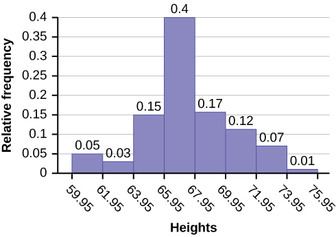
The following data are the heights (in inches to the nearest half inch) of 100 male semiprofessional soccer players. The heights are continuous data, since height is measured.
60; 60.5; 61; 61; 61.5
63.5; 63.5; 63.5
64; 64; 64; 64; 64; 64; 64; 64.5; 64.5; 64.5; 64.5; 64.5; 64.5; 64.5; 64.5
66; 66; 66; 66; 66; 66; 66; 66; 66; 66; 66.5; 66.5; 66.5; 66.5; 66.5; 66.5; 66.5; 66.5; 66.5; 66.5; 66.5; 67; 67; 67; 67; 67; 67; 67; 67; 67; 67; 67; 67; 67.5; 67.5; 67.5; 67.5; 67.5; 67.5; 67.5
68; 68; 69; 69; 69; 69; 69; 69; 69; 69; 69; 69; 69.5; 69.5; 69.5; 69.5; 69.5
70; 70; 70; 70; 70; 70; 70.5; 70.5; 70.5; 71; 71; 71
72; 72; 72; 72.5; 72.5; 73; 73.5
74
The smallest data value is 60. Since the data with the most decimal places has one decimal (for instance, 61.5), we want our starting point to have two decimal places. Since the numbers 0.5, 0.05, 0.005, etc. are convenient numbers, use 0.05 and subtract it from 60, the smallest value, for the convenient starting point.
60 – 0.05 = 59.95 which is more precise than, say, 61.5 by one decimal place. The starting point is, then, 59.95.
The largest value is 74, so 74 + 0.05 = 74.05 is the ending value.
Next, calculate the width of each bar or class interval. To calculate this width, subtract the starting point from the ending value and divide by the number of bars (you must choose the number of bars you desire). Suppose you choose eight bars.
\[\dfrac{74.05−59.95}{8}=1.76\]
We will round up to two and make each bar or class interval two units wide. Rounding up to two is one way to prevent a value from falling on a boundary. Rounding to the next number is often necessary even if it goes against the standard rules of rounding. For this example, using 1.76 as the width would also work. A guideline that is followed by some for the width of a bar or class interval is to take the square root of the number of data values and then round to the nearest whole number, if necessary. For example, if there are 150 values of data, take the square root of 150 and round to 12 bars or intervals.
The boundaries are:
- 59.95
- 59.95 + 2 = 61.95
- 61.95 + 2 = 63.95
- 63.95 + 2 = 65.95
- 65.95 + 2 = 67.95
- 67.95 + 2 = 69.95
- 69.95 + 2 = 71.95
- 71.95 + 2 = 73.95
- 73.95 + 2 = 75.95
The heights 60 through 61.5 inches are in the interval 59.95–61.95. The heights that are 63.5 are in the interval 61.95–63.95. The heights that are 64 through 64.5 are in the interval 63.95–65.95. The heights 66 through 67.5 are in the interval 65.95–67.95. The heights 68 through 69.5 are in the interval 67.95–69.95. The heights 70 through 71 are in the interval 69.95–71.95. The heights 72 through 73.5 are in the interval 71.95–73.95. The height 74 is in the interval 73.95–75.95.
The following histogram displays the heights on the x-axis and relative frequency on the y-axis.
The following data are the shoe sizes of 50 male students. The sizes are discrete data since shoe size is measured in whole and half units only. Construct a histogram and calculate the width of each bar or class interval. Suppose you choose six bars.
9; 9; 9.5; 9.5; 10; 10; 10; 10; 10; 10; 10.5; 10.5; 10.5; 10.5; 10.5; 10.5; 10.5; 10.5
11; 11; 11; 11; 11; 11; 11; 11; 11; 11; 11; 11; 11; 11.5; 11.5; 11.5; 11.5; 11.5; 11.5; 11.5
12; 12; 12; 12; 12; 12; 12; 12.5; 12.5; 12.5; 12.5; 14
Answer
Smallest value: 9
Largest value: 14
Convenient starting value: 9 – 0.05 = 8.95
Convenient ending value: 14 + 0.05 = 14.05
\(\frac{14.05-8.95}{6}\) = 0.85
The calculations suggests using 0.85 as the width of each bar or class interval. You can also use an interval with a width equal to one.
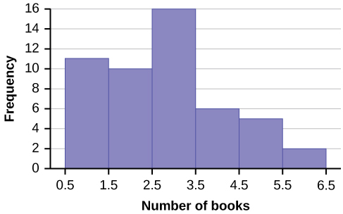
The following data are the number of books bought by 50 part-time college students at ABC College. The number of books is discrete data, since books are counted.
1; 1; 1; 1; 1; 1; 1; 1; 1; 1; 1
2; 2; 2; 2; 2; 2; 2; 2; 2; 2
3; 3; 3; 3; 3; 3; 3; 3; 3; 3; 3; 3; 3; 3; 3; 3
4; 4; 4; 4; 4; 4
5; 5; 5; 5; 5
6; 6
Eleven students buy one book. Ten students buy two books. Sixteen students buy three books. Six students buy four books. Five students buy five books. Two students buy six books.
Because the data are integers, subtract 0.5 from 1, the smallest data value and add 0.5 to 6, the largest data value. Then the starting point is 0.5 and the ending value is 6.5.
Next, calculate the width of each bar or class interval. If the data are discrete and there are not too many different values, a width that places the data values in the middle of the bar or class interval is the most convenient. Since the data consist of the numbers 1, 2, 3, 4, 5, 6, and the starting point is 0.5, a width of one places the 1 in the middle of the interval from 0.5 to 1.5, the 2 in the middle of the interval from 1.5 to 2.5, the 3 in the middle of the interval from 2.5 to 3.5, the 4 in the middle of the interval from _______ to _______, the 5 in the middle of the interval from _______ to _______, and the _______ in the middle of the interval from _______ to _______ .
Answer
Calculate the number of bars as follows:
\(\dfrac{6.5 - 0.5}{\text{number of bars}}\) = 1
where 1 is the width of a bar. Therefore, bars = 6.
The following histogram displays the number of books on the x-axis and the frequency on the y-axis.
Go to [link]. There are calculator instructions for entering data and for creating a customized histogram. Create the histogram for Example.
- Press Y=. Press CLEAR to delete any equations.
- Press STAT 1:EDIT. If L1 has data in it, arrow up into the name L1, press CLEAR and then arrow down. If necessary, do the same for L2.
- Into L1, enter 1, 2, 3, 4, 5, 6.
- Into L2, enter 11, 10, 16, 6, 5, 2.
- Press WINDOW. Set Xmin = .5, Xscl = (6.5 – .5)/6, Ymin = –1, Ymax = 20, Yscl = 1, Xres = 1.
- Press 2nd Y=. Start by pressing 4:Plotsoff ENTER.
- Press 2nd Y=. Press 1:Plot1. Press ENTER. Arrow down to TYPE. Arrow to the 3rdpicture (histogram). Press ENTER.
- Arrow down to Xlist: Enter L1 (2nd 1). Arrow down to Freq. Enter L2 (2nd 2).
- Press GRAPH.
- Use the TRACE key and the arrow keys to examine the histogram.
The following data are the number of sports played by 50 student athletes. The number of sports is discrete data since sports are counted.
1; 1; 1; 1; 1; 1; 1; 1; 1; 1; 1; 1; 1; 1; 1; 1; 1; 1; 1; 1
2; 2; 2; 2; 2; 2; 2; 2; 2; 2; 2; 2; 2; 2; 2; 2; 2; 2; 2; 2; 2; 2
3; 3; 3; 3; 3; 3; 3; 3
20 student athletes play one sport. 22 student athletes play two sports. Eight student athletes play three sports.
Fill in the blanks for the following sentence. Since the data consist of the numbers 1, 2, 3, and the starting point is 0.5, a width of one places the 1 in the middle of the interval 0.5 to _____, the 2 in the middle of the interval from _____ to _____, and the 3 in the middle of the interval from _____ to _____.
Answer
1.5
1.5 to 2.5
2.5 to 3.5
Using this data set, construct a histogram.
| 9.95 | 10 | 2.25 | 16.75 | 0 |
| 19.5 | 22.5 | 7.5 | 15 | 12.75 |
| 5.5 | 11 | 10 | 20.75 | 17.5 |
| 23 | 21.9 | 24 | 23.75 | 18 |
| 20 | 15 | 22.9 | 18.8 | 20.5 |
Answer
Some values in this data set fall on boundaries for the class intervals. A value is counted in a class interval if it falls on the left boundary, but not if it falls on the right boundary. Different researchers may set up histograms for the same data in different ways. There is more than one correct way to set up a histogram.
The following data represent the number of employees at various restaurants in New York City. Using this data, create a histogram.
22; 35; 15; 26; 40; 28; 18; 20; 25; 34; 39; 42; 24; 22; 19; 27; 22; 34; 40; 20; 38 and 28
Use 10–19 as the first interval.
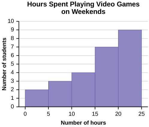
Count the money (bills and change) in your pocket or purse. Your instructor will record the amounts. As a class, construct a histogram displaying the data. Discuss how many intervals you think is appropriate. You may want to experiment with the number of intervals.
Frequency Polygons
Frequency polygons are analogous to line graphs, and just as line graphs make continuous data visually easy to interpret, so too do frequency polygons. To construct a frequency polygon, first examine the data and decide on the number of intervals, or class intervals, to use on the x-axis and y-axis. After choosing the appropriate ranges, begin plotting the data points. After all the points are plotted, draw line segments to connect them.
A frequency polygon was constructed from the frequency table below.
| Lower Bound | Upper Bound | Frequency | Cumulative Frequency |
|---|---|---|---|
| 49.5 | 59.5 | 5 | 5 |
| 59.5 | 69.5 | 10 | 15 |
| 69.5 | 79.5 | 30 | 45 |
| 79.5 | 89.5 | 40 | 85 |
| 89.5 | 99.5 | 15 | 100 |
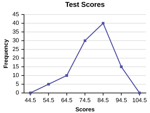
The first label on the x-axis is 44.5. This represents an interval extending from 39.5 to 49.5. Since the lowest test score is 54.5, this interval is used only to allow the graph to touch the x-axis. The point labeled 54.5 represents the next interval, or the first “real” interval from the table, and contains five scores. This reasoning is followed for each of the remaining intervals with the point 104.5 representing the interval from 99.5 to 109.5. Again, this interval contains no data and is only used so that the graph will touch the x-axis. Looking at the graph, we say that this distribution is skewed because one side of the graph does not mirror the other side.
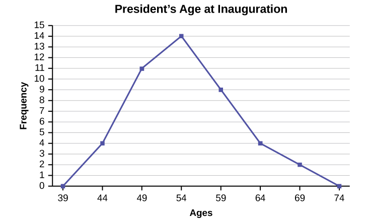
Construct a frequency polygon of U.S. Presidents’ ages at inauguration shown in the Table.
| Age at Inauguration | Frequency |
|---|---|
| 41.5–46.5 | 4 |
| 46.5–51.5 | 11 |
| 51.5–56.5 | 14 |
| 56.5–61.5 | 9 |
| 61.5–66.5 | 4 |
| 66.5–71.5 | 2 |
Answer
The first label on the x-axis is 39. This represents an interval extending from 36.5 to 41.5. Since there are no ages less than 41.5, this interval is used only to allow the graph to touch the x-axis. The point labeled 44 represents the next interval, or the first “real” interval from the table, and contains four scores. This reasoning is followed for each of the remaining intervals with the point 74 representing the interval from 71.5 to 76.5. Again, this interval contains no data and is only used so that the graph will touch the x-axis. Looking at the graph, we say that this distribution is skewed because one side of the graph does not mirror the other side.
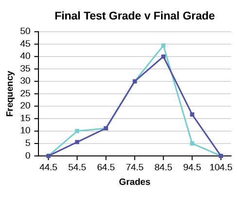
Frequency polygons are useful for comparing distributions. This is achieved by overlaying the frequency polygons drawn for different data sets.
We will construct an overlay frequency polygon comparing the scores from Example with the students’ final numeric grade.
| Lower Bound | Upper Bound | Frequency | Cumulative Frequency |
|---|---|---|---|
| 49.5 | 59.5 | 5 | 5 |
| 59.5 | 69.5 | 10 | 15 |
| 69.5 | 79.5 | 30 | 45 |
| 79.5 | 89.5 | 40 | 85 |
| 89.5 | 99.5 | 15 | 100 |
| Lower Bound | Upper Bound | Frequency | Cumulative Frequency |
|---|---|---|---|
| 49.5 | 59.5 | 10 | 10 |
| 59.5 | 69.5 | 10 | 20 |
| 69.5 | 79.5 | 30 | 50 |
| 79.5 | 89.5 | 45 | 95 |
| 89.5 | 99.5 | 5 | 100 |
Suppose that we want to study the temperature range of a region for an entire month. Every day at noon we note the temperature and write this down in a log. A variety of statistical studies could be done with this data. We could find the mean or the median temperature for the month. We could construct a histogram displaying the number of days that temperatures reach a certain range of values. However, all of these methods ignore a portion of the data that we have collected.
One feature of the data that we may want to consider is that of time. Since each date is paired with the temperature reading for the day, we don‘t have to think of the data as being random. We can instead use the times given to impose a chronological order on the data. A graph that recognizes this ordering and displays the changing temperature as the month progresses is called a time series graph.
Constructing a Time Series Graph
To construct a time series graph, we must look at both pieces of our paired data set. We start with a standard Cartesian coordinate system. The horizontal axis is used to plot the date or time increments, and the vertical axis is used to plot the values of the variable that we are measuring. By doing this, we make each point on the graph correspond to a date and a measured quantity. The points on the graph are typically connected by straight lines in the order in which they occur.
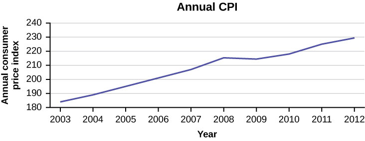
The following data shows the Annual Consumer Price Index, each month, for ten years. Construct a time series graph for the Annual Consumer Price Index data only.
| Year | Jan | Feb | Mar | Apr | May | Jun | Jul |
|---|---|---|---|---|---|---|---|
| 2003 | 181.7 | 183.1 | 184.2 | 183.8 | 183.5 | 183.7 | 183.9 |
| 2004 | 185.2 | 186.2 | 187.4 | 188.0 | 189.1 | 189.7 | 189.4 |
| 2005 | 190.7 | 191.8 | 193.3 | 194.6 | 194.4 | 194.5 | 195.4 |
| 2006 | 198.3 | 198.7 | 199.8 | 201.5 | 202.5 | 202.9 | 203.5 |
| 2007 | 202.416 | 203.499 | 205.352 | 206.686 | 207.949 | 208.352 | 208.299 |
| 2008 | 211.080 | 211.693 | 213.528 | 214.823 | 216.632 | 218.815 | 219.964 |
| 2009 | 211.143 | 212.193 | 212.709 | 213.240 | 213.856 | 215.693 | 215.351 |
| 2010 | 216.687 | 216.741 | 217.631 | 218.009 | 218.178 | 217.965 | 218.011 |
| 2011 | 220.223 | 221.309 | 223.467 | 224.906 | 225.964 | 225.722 | 225.922 |
| 2012 | 226.665 | 227.663 | 229.392 | 230.085 | 229.815 | 229.478 | 229.104 |
| Year | Aug | Sep | Oct | Nov | Dec | Annual |
|---|---|---|---|---|---|---|
| 2003 | 184.6 | 185.2 | 185.0 | 184.5 | 184.3 | 184.0 |
| 2004 | 189.5 | 189.9 | 190.9 | 191.0 | 190.3 | 188.9 |
| 2005 | 196.4 | 198.8 | 199.2 | 197.6 | 196.8 | 195.3 |
| 2006 | 203.9 | 202.9 | 201.8 | 201.5 | 201.8 | 201.6 |
| 2007 | 207.917 | 208.490 | 208.936 | 210.177 | 210.036 | 207.342 |
| 2008 | 219.086 | 218.783 | 216.573 | 212.425 | 210.228 | 215.303 |
| 2009 | 215.834 | 215.969 | 216.177 | 216.330 | 215.949 | 214.537 |
| 2010 | 218.312 | 218.439 | 218.711 | 218.803 | 219.179 | 218.056 |
| 2011 | 226.545 | 226.889 | 226.421 | 226.230 | 225.672 | 224.939 |
| 2012 | 230.379 | 231.407 | 231.317 | 230.221 | 229.601 | 229.594 |
Answer
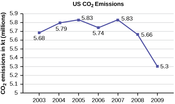
The following table is a portion of a data set from www.worldbank.org. Use the table to construct a time series graph for CO2 emissions for the United States.
| Ukraine | United Kingdom | United States | |
|---|---|---|---|
| 2003 | 352,259 | 540,640 | 5,681,664 |
| 2004 | 343,121 | 540,409 | 5,790,761 |
| 2005 | 339,029 | 541,990 | 5,826,394 |
| 2006 | 327,797 | 542,045 | 5,737,615 |
| 2007 | 328,357 | 528,631 | 5,828,697 |
| 2008 | 323,657 | 522,247 | 5,656,839 |
| 2009 | 272,176 | 474,579 | 5,299,563 |
Uses of a Time Series Graph
Time series graphs are important tools in various applications of statistics. When recording values of the same variable over an extended period of time, sometimes it is difficult to discern any trend or pattern. However, once the same data points are displayed graphically, some features jump out. Time series graphs make trends easy to spot.
Review
A histogram is a graphic version of a frequency distribution. The graph consists of bars of equal width drawn adjacent to each other. The horizontal scale represents classes of quantitative data values and the vertical scale represents frequencies. The heights of the bars correspond to frequency values. Histograms are typically used for large, continuous, quantitative data sets. A frequency polygon can also be used when graphing large data sets with data points that repeat. The data usually goes on y-axis with the frequency being graphed on the x-axis. Time series graphs can be helpful when looking at large amounts of data for one variable over a period of time.Glossary
References
- Data on annual homicides in Detroit, 1961–73, from Gunst & Mason’s book ‘Regression Analysis and its Application’, Marcel Dekker
- “Timeline: Guide to the U.S. Presidents: Information on every president’s birthplace, political party, term of office, and more.” Scholastic, 2013. Available online at www.scholastic.com/teachers/a...-us-presidents (accessed April 3, 2013).
- “Presidents.” Fact Monster. Pearson Education, 2007. Available online at http://www.factmonster.com/ipka/A0194030.html (accessed April 3, 2013).
- “Food Security Statistics.” Food and Agriculture Organization of the United Nations. Available online at http://www.fao.org/economic/ess/ess-fs/en/ (accessed April 3, 2013).
- “Consumer Price Index.” United States Department of Labor: Bureau of Labor Statistics. Available online at http://data.bls.gov/pdq/SurveyOutputServlet (accessed April 3, 2013).
- “CO2 emissions (kt).” The World Bank, 2013. Available online at http://databank.worldbank.org/data/home.aspx (accessed April 3, 2013).
- “Births Time Series Data.” General Register Office For Scotland, 2013. Available online at www.gro-scotland.gov.uk/stati...me-series.html (accessed April 3, 2013).
- “Demographics: Children under the age of 5 years underweight.” Indexmundi. Available online at http://www.indexmundi.com/g/r.aspx?t=50&v=2224&aml=en (accessed April 3, 2013).
- Gunst, Richard, Robert Mason. Regression Analysis and Its Application: A Data-Oriented Approach. CRC Press: 1980.
- “Overweight and Obesity: Adult Obesity Facts.” Centers for Disease Control and Prevention. Available online at http://www.cdc.gov/obesity/data/adult.html (accessed September 13, 2013).
- Frequency
- the number of times a value of the data occurs
- Histogram
- a graphical representation in \(x-y\) form of the distribution of data in a data set; \(x\) represents the data and \(y\) represents the frequency, or relative frequency. The graph consists of contiguous rectangles.
- Relative Frequency
- the ratio of the number of times a value of the data occurs in the set of all outcomes to the number of all outcomes