4.2: Summarizing Data Using Tables
- Page ID
- 7742
\( \newcommand{\vecs}[1]{\overset { \scriptstyle \rightharpoonup} {\mathbf{#1}} } \)
\( \newcommand{\vecd}[1]{\overset{-\!-\!\rightharpoonup}{\vphantom{a}\smash {#1}}} \)
\( \newcommand{\id}{\mathrm{id}}\) \( \newcommand{\Span}{\mathrm{span}}\)
( \newcommand{\kernel}{\mathrm{null}\,}\) \( \newcommand{\range}{\mathrm{range}\,}\)
\( \newcommand{\RealPart}{\mathrm{Re}}\) \( \newcommand{\ImaginaryPart}{\mathrm{Im}}\)
\( \newcommand{\Argument}{\mathrm{Arg}}\) \( \newcommand{\norm}[1]{\| #1 \|}\)
\( \newcommand{\inner}[2]{\langle #1, #2 \rangle}\)
\( \newcommand{\Span}{\mathrm{span}}\)
\( \newcommand{\id}{\mathrm{id}}\)
\( \newcommand{\Span}{\mathrm{span}}\)
\( \newcommand{\kernel}{\mathrm{null}\,}\)
\( \newcommand{\range}{\mathrm{range}\,}\)
\( \newcommand{\RealPart}{\mathrm{Re}}\)
\( \newcommand{\ImaginaryPart}{\mathrm{Im}}\)
\( \newcommand{\Argument}{\mathrm{Arg}}\)
\( \newcommand{\norm}[1]{\| #1 \|}\)
\( \newcommand{\inner}[2]{\langle #1, #2 \rangle}\)
\( \newcommand{\Span}{\mathrm{span}}\) \( \newcommand{\AA}{\unicode[.8,0]{x212B}}\)
\( \newcommand{\vectorA}[1]{\vec{#1}} % arrow\)
\( \newcommand{\vectorAt}[1]{\vec{\text{#1}}} % arrow\)
\( \newcommand{\vectorB}[1]{\overset { \scriptstyle \rightharpoonup} {\mathbf{#1}} } \)
\( \newcommand{\vectorC}[1]{\textbf{#1}} \)
\( \newcommand{\vectorD}[1]{\overrightarrow{#1}} \)
\( \newcommand{\vectorDt}[1]{\overrightarrow{\text{#1}}} \)
\( \newcommand{\vectE}[1]{\overset{-\!-\!\rightharpoonup}{\vphantom{a}\smash{\mathbf {#1}}}} \)
\( \newcommand{\vecs}[1]{\overset { \scriptstyle \rightharpoonup} {\mathbf{#1}} } \)
\( \newcommand{\vecd}[1]{\overset{-\!-\!\rightharpoonup}{\vphantom{a}\smash {#1}}} \)
\(\newcommand{\avec}{\mathbf a}\) \(\newcommand{\bvec}{\mathbf b}\) \(\newcommand{\cvec}{\mathbf c}\) \(\newcommand{\dvec}{\mathbf d}\) \(\newcommand{\dtil}{\widetilde{\mathbf d}}\) \(\newcommand{\evec}{\mathbf e}\) \(\newcommand{\fvec}{\mathbf f}\) \(\newcommand{\nvec}{\mathbf n}\) \(\newcommand{\pvec}{\mathbf p}\) \(\newcommand{\qvec}{\mathbf q}\) \(\newcommand{\svec}{\mathbf s}\) \(\newcommand{\tvec}{\mathbf t}\) \(\newcommand{\uvec}{\mathbf u}\) \(\newcommand{\vvec}{\mathbf v}\) \(\newcommand{\wvec}{\mathbf w}\) \(\newcommand{\xvec}{\mathbf x}\) \(\newcommand{\yvec}{\mathbf y}\) \(\newcommand{\zvec}{\mathbf z}\) \(\newcommand{\rvec}{\mathbf r}\) \(\newcommand{\mvec}{\mathbf m}\) \(\newcommand{\zerovec}{\mathbf 0}\) \(\newcommand{\onevec}{\mathbf 1}\) \(\newcommand{\real}{\mathbb R}\) \(\newcommand{\twovec}[2]{\left[\begin{array}{r}#1 \\ #2 \end{array}\right]}\) \(\newcommand{\ctwovec}[2]{\left[\begin{array}{c}#1 \\ #2 \end{array}\right]}\) \(\newcommand{\threevec}[3]{\left[\begin{array}{r}#1 \\ #2 \\ #3 \end{array}\right]}\) \(\newcommand{\cthreevec}[3]{\left[\begin{array}{c}#1 \\ #2 \\ #3 \end{array}\right]}\) \(\newcommand{\fourvec}[4]{\left[\begin{array}{r}#1 \\ #2 \\ #3 \\ #4 \end{array}\right]}\) \(\newcommand{\cfourvec}[4]{\left[\begin{array}{c}#1 \\ #2 \\ #3 \\ #4 \end{array}\right]}\) \(\newcommand{\fivevec}[5]{\left[\begin{array}{r}#1 \\ #2 \\ #3 \\ #4 \\ #5 \\ \end{array}\right]}\) \(\newcommand{\cfivevec}[5]{\left[\begin{array}{c}#1 \\ #2 \\ #3 \\ #4 \\ #5 \\ \end{array}\right]}\) \(\newcommand{\mattwo}[4]{\left[\begin{array}{rr}#1 \amp #2 \\ #3 \amp #4 \\ \end{array}\right]}\) \(\newcommand{\laspan}[1]{\text{Span}\{#1\}}\) \(\newcommand{\bcal}{\cal B}\) \(\newcommand{\ccal}{\cal C}\) \(\newcommand{\scal}{\cal S}\) \(\newcommand{\wcal}{\cal W}\) \(\newcommand{\ecal}{\cal E}\) \(\newcommand{\coords}[2]{\left\{#1\right\}_{#2}}\) \(\newcommand{\gray}[1]{\color{gray}{#1}}\) \(\newcommand{\lgray}[1]{\color{lightgray}{#1}}\) \(\newcommand{\rank}{\operatorname{rank}}\) \(\newcommand{\row}{\text{Row}}\) \(\newcommand{\col}{\text{Col}}\) \(\renewcommand{\row}{\text{Row}}\) \(\newcommand{\nul}{\text{Nul}}\) \(\newcommand{\var}{\text{Var}}\) \(\newcommand{\corr}{\text{corr}}\) \(\newcommand{\len}[1]{\left|#1\right|}\) \(\newcommand{\bbar}{\overline{\bvec}}\) \(\newcommand{\bhat}{\widehat{\bvec}}\) \(\newcommand{\bperp}{\bvec^\perp}\) \(\newcommand{\xhat}{\widehat{\xvec}}\) \(\newcommand{\vhat}{\widehat{\vvec}}\) \(\newcommand{\uhat}{\widehat{\uvec}}\) \(\newcommand{\what}{\widehat{\wvec}}\) \(\newcommand{\Sighat}{\widehat{\Sigma}}\) \(\newcommand{\lt}{<}\) \(\newcommand{\gt}{>}\) \(\newcommand{\amp}{&}\) \(\definecolor{fillinmathshade}{gray}{0.9}\)A simple way to summarize data is to generate a table representing counts of various types of observations. This type of table has been used for thousands of years (see Figure 4.1).

Let’s look at some examples of the use of tables, again using the NHANES dataset. Type the command help(NHANES) in the RStudio console, and scroll through the help page, which should open within the Help panel if you are using RStudio. This page provides some information about the dataset as well as a listing of all of the variables included in the dataset. Let’s have a look at a simple variable, called “PhysActive” in the dataset. This variable contains one of three different values: “Yes” or “No” (indicating whether or not the person reports doing “moderate or vigorous-intensity sports, fitness or recreational activities”), or “NA” if the data are missing for that individual. There are different reasons that the data might be missing; for example, this question was not asked of children younger than 12 years of age, while in other cases an adult may have declined to answer the question during the interview.
4.2.1 Frequency distributions
Let’s look at how many people fall into each of these categories. We will do this in R by selecting the variable of interest (PhysActive) from the NHANES dataset, grouping the data by the different values of the variable, and then counting how many values there are in each group:
| PhysActive | AbsoluteFrequency |
|---|---|
| No | 2473 |
| Yes | 2972 |
| NA | 1334 |
This table shows the frequencies of each of the different values; there were 2473 individuals who responded “No” to the question, 2972 who responded “Yes”, and 1334 for whom no response was given. We call this a frequency distribution because it tells us how frequent each of the possible values is within our sample.
This shows us the absolute frequency of the two responses, for everyone who actually gave a response. We can see from this that there are more people saying “Yes” than “No”, but it can be hard to tell from absolute numbers how big the difference is. For this reason, we often would rather present the data using relative frequency, which is obtained by dividing each frequency by the sum of all frequencies:
\(\ relative frequency_{i}=\frac{\text {absolute frequency}_{i}}{\sum_{j=1}^{N} \text {absolute frequency}_{j}}\)
The relative frequency provides a much easier way to see how big the imbalance is. We can also interpret the relative frequencies as percentages by multiplying them by 100. In this example, we will drop the NA values as well, since we would like to be able to interpret the relative frequencies of active versus inactive people.
| PhysActive | AbsoluteFrequency | RelativeFrequency | Percentage |
|---|---|---|---|
| No | 2473 | 0.45 | 45 |
| Yes | 2972 | 0.55 | 55 |
This lets us see that 45.4 percent of the individuals in the NHANES sample said “No” and 54.6 percent said “Yes”.
4.2.2 Cumulative distributions
The PhysActive variable that we examined above only had two possible values, but often we wish to summarize data that can have many more possible values. When those values are quantitative, then one useful way to summarize them is via what we call a cumulative frequency representation: rather than asking how many observations take on a specific value, we ask how many have a value of at least some specific value.
Let’s look at another variable in the NHANES dataset, called SleepHrsNight which records how many hours the participant reports sleeping on usual weekdays. Let’s create a frequency table as we did above, after removing anyone who didn’t provide a response to the question.
| SleepHrsNight | AbsoluteFrequency | RelativeFrequency | Percentage |
|---|---|---|---|
| 2 | 9 | 0.00 | 0.18 |
| 3 | 49 | 0.01 | 0.97 |
| 4 | 200 | 0.04 | 3.97 |
| 5 | 406 | 0.08 | 8.06 |
| 6 | 1172 | 0.23 | 23.28 |
| 7 | 1394 | 0.28 | 27.69 |
| 8 | 1405 | 0.28 | 27.90 |
| 9 | 271 | 0.05 | 5.38 |
| 10 | 97 | 0.02 | 1.93 |
| 11 | 15 | 0.00 | 0.30 |
| 12 | 17 | 0.00 | 0.34 |
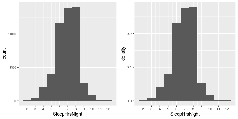
We can already begin to summarize the dataset just by looking at the table; for example, we can see that most people report sleeping between 6 and 8 hours. Let’s plot the data to see this more clearly. To do this we can plot a histogram which shows the number of cases having each of the different values; see left panel of Figure 4.2. The ggplot2() library has a built in histogram function (geom_histogram()) which we will often use. We can also plot the relative frequencies, which we will often refer to as densities - see the right panel of Figure 4.2.

What if we want to know how many people report sleeping 5 hours or less? To find this, we can compute a cumulative distribution. To compute the cumulative frequency for some value j, we add up the frequencies for all of the values up to and including j:
| SleepHrsNight | AbsoluteFrequency | CumulativeFrequency |
|---|---|---|
| 2 | 9 | 9 |
| 3 | 49 | 58 |
| 4 | 200 | 258 |
| 5 | 406 | 664 |
| 6 | 1172 | 1836 |
| 7 | 1394 | 3230 |
| 8 | 1405 | 4635 |
| 9 | 271 | 4906 |
| 10 | 97 | 5003 |
| 11 | 15 | 5018 |
| 12 | 17 | 5035 |
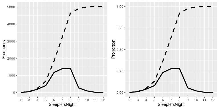
In the left panel of Figure 4.3 we plot the data to see what these representations look like; the absolute frequency values are plotted in solid lines, and the cumulative frequencies are plotted in dashed lines We see that the cumulative frequency is monotonically increasing – that is, it can only go up or stay constant, but it can never decrease. Again, we usually find the relative frequencies to be more useful than the absolute; those are plotted in the right panel of Figure 4.3.

4.2.3 Plotting histograms

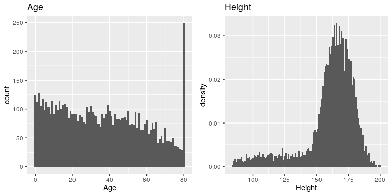
The variables that we examined above were fairly simple, having only a few possible values. Now let’s look at a more complex variable: Age. First let’s plot the Age variable for all of the individuals in the NHANES dataset (see left panel of Figure 4.4). What do you see there? First, you should notice that the number of individuals in each age group is declining over time. This makes sense because the population is being randomly sampled, and thus death over time leads to fewer people in the older age ranges. Second, you probably notice a large spike in the graph at age 80. What do you think that’s about?
If you look at the help function for the NHANES dataset, you will see the following definition: “Age in years at screening of study participant. Note: Subjects 80 years or older were recorded as 80.” The reason for this is that the relatively small number of individuals with very high ages would make it potentially easier to identify the specific person in the dataset if you knew their exact age; researchers generally promise their participants to keep their identity confidential, and this is one of the things they can do to help protect their research subjects. This also highlights the fact that it’s always important to know where one’s data have come from and how they have been processed; otherwise we might interpret them improperly, thinking that 80-year-olds had been somehow overrepresented in the sample.
Let’s look at another more complex variable in the NHANES dataset: Height. The histogram of height values is plotted in the right panel of Figure 4.4. The first thing you should notice about this distribution is that most of its density is centered around about 170 cm, but the distribution has a “tail” on the left; there are a small number of individuals with much smaller heights. What do you think is going on here?
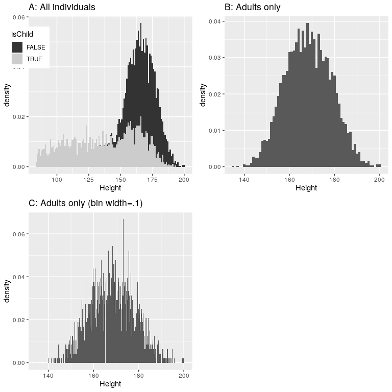
You may have intuited that the small heights are coming from the children in the dataset. One way to examine this is to plot the histogram with separate colors for children and adults (left panel of Figure 4.5). This shows that all of the very short heights were indeed coming from children in the sample. Let’s create a new version of NHANES that only includes adults, and then plot the histogram just for them (right panel of Figure 4.5). In that plot that the distribution looks much more symmetric. As we will see later, this is a nice example of a normal (or Gaussian) distribution.

4.2.4 Histogram bins
In our earlier example with the sleep variable, the data were reported in whole numbers, and we simply counted the number of people who reported each possible value. However, if you look at a few values of the Height variable in NHANES, you will see that it was measured in centimeters down to the first decimal place:
| Height |
|---|
| 170 |
| 170 |
| 168 |
| 155 |
| 174 |
| 174 |
Panel C of Figure 4.5 shows a histogram that counts the density of each possible value. That histogram looks really jagged, which is because of the variability in specific decimal place values. For example, the value 173.2 occurs 32 times, while the value 173.3 only occurs 15 times. We probably don’t think that there is really such a big difference between the prevalence of these two weights; more likely this is just due to random variability in our sample of people.
In general, when we create a histogram of data that are continuous or where there are many possible values, we will bin the values so that instead of counting and plotting the frequency of every specific value, we count and plot the frequency of values falling within a specific range. That’s why the plot looked less jagged above in Panel B of 4.5; in this panel we set the bin width to 1, which means that the histogram is computing by combining values within bins with a width of one; thus, the values 1.3, 1.5, and 1.6 would all count toward the frequency of the same bin, which would span from values equal to one up through values less than 2.
Note that once the bin size has been selected, then the number of bins is determined by the data:
There is no hard and fast rule for how to choose the optimal bin width. Occasionally it will be obvious (as when there are only a few possible values), but in many cases it would require trial and error. There are methods that try to find an optimal bin size automatically, such as the Freedman-Diaconis method (that is implemented within the nclass.FD() function in R); we will use this function in some later examples.


