Statistics LibreTexts

12.1.1: Scatterplots

  • Page ID
    34783
  • \( \newcommand{\vecs}[1]{\overset { \scriptstyle \rightharpoonup} {\mathbf{#1}} } \) \( \newcommand{\vecd}[1]{\overset{-\!-\!\rightharpoonup}{\vphantom{a}\smash {#1}}} \)\(\newcommand{\id}{\mathrm{id}}\) \( \newcommand{\Span}{\mathrm{span}}\) \( \newcommand{\kernel}{\mathrm{null}\,}\) \( \newcommand{\range}{\mathrm{range}\,}\) \( \newcommand{\RealPart}{\mathrm{Re}}\) \( \newcommand{\ImaginaryPart}{\mathrm{Im}}\) \( \newcommand{\Argument}{\mathrm{Arg}}\) \( \newcommand{\norm}[1]{\| #1 \|}\) \( \newcommand{\inner}[2]{\langle #1, #2 \rangle}\) \( \newcommand{\Span}{\mathrm{span}}\) \(\newcommand{\id}{\mathrm{id}}\) \( \newcommand{\Span}{\mathrm{span}}\) \( \newcommand{\kernel}{\mathrm{null}\,}\) \( \newcommand{\range}{\mathrm{range}\,}\) \( \newcommand{\RealPart}{\mathrm{Re}}\) \( \newcommand{\ImaginaryPart}{\mathrm{Im}}\) \( \newcommand{\Argument}{\mathrm{Arg}}\) \( \newcommand{\norm}[1]{\| #1 \|}\) \( \newcommand{\inner}[2]{\langle #1, #2 \rangle}\) \( \newcommand{\Span}{\mathrm{span}}\)\(\newcommand{\AA}{\unicode[.8,0]{x212B}}\)

    A scatterplot shows the relationship between two quantitative variables measured on the same individuals.

    • The predictor variable is labeled on the horizontal or \(x\)-axis.
    • The response variable is labeled on the vertical or \(y\)-axis.

    How to Interpret a Scatterplot:

    • Look for the overall pattern and for deviations from that pattern.
    • Look for outliers, individual values that fall outside the overall pattern of the relationship.
    • A positive linear relation results when larger values of one variable are associated with larger values of the other.
    • A negative linear relation results when larger values of one variable are associated with smaller values of the other.
    • A scatterplot has no association if no obvious linear pattern is present.

    Use technology to make a scatterplot for the following sample data set:

    Hours Studied for Exam 20 16 20 18 17 16 15 17 15 16 15 17 16 17 14 Grade on Exam 89 72 93 84 81 75 70 82 69 83 80 83 81 84 76
    Solution

    TI-84: On the TI-84 press the [STAT] key and then the [EDIT] function; type the \(x\) values into L1 and the \(y\) values into L2. Press [Y=] and clear any equations that are in the \(y\)-editor. Press [2nd] then [STAT PLOT] (above the [Y=] button.) Press 4 or scroll down to PlotsOff and press enter. Press [ENTER] once more to turn off all of the existing plots.

    Entering data for hours studied into L1 and data for grade into L2. Selecting Plot1 on the Stat Plots screen.

    Press [2nd], then [STAT PLOT], then press 1 or hit [ENTER] and select Plot1. Select On and press [ENTER] to activate plot 1. For “Type” select the first graph that looks like a scatterplot and press [ENTER]. For “Xlist” enter the list where your explanatory variable data is stored. For our example, enter L1. For “Ylist” enter the list where your response variable data is stored. For our example, enter L2. Press [ZOOM] then press 9 or scroll down to ZoomStat and press [ENTER]. Press Trace and you can use your arrow keys to see the coordinates of each point.

    Selecting and activating Plot1. Applying ZoomStat. Shows the finished scatterplot and the use of Trace to identify coordinates of a point on the plot.

    TI-89: Press [♦] then [F1] (the Y=) and clear any equations that are in the \(y\)-editor. Open the Stats/List Editor. Enter all \(x\)-values in one list. Enter all corresponding \(y\)-values in a second list. Double check that the data you entered is correct. In the Stats/List Editor select F2 for the Plots menu. Use cursor keys to highlight 1:Plot Setup. Make sure that the other graphs are turned off by pressing F4 button to remove the check marks. Under “Plot 1” press F1 for the Define menu. In the “Plot Type” menu select “Scatter.” In the “x” space type in the name of your list with the x variable without space: for our example, “list1.” In the “y” space type in the name of your list with the y variable without space: for our example, “list2.” Press [ENTER] twice and you will be returned to the Plot Setup menu. Press F5 ZoomData to display the graph. Press F3 Trace and use the arrow keys to scroll along the different points.

    Entering study hour data in list1 and score data in list2. Selecting 1:Plot Setup from the F2 Plots menu. Entering the appropriate list variables in the Define Plot 1 window.

    Excel: Copy the data over to Excel in either two adjacent rows or columns. Select the data, select the Insert tab, then select Scatter, select the first scatter plot.

    Excel sheet containing the given data table, with the filled cells selected and scatter plot option selected to create a scatterplot.

    Then add labels for your axis and change the title to produce the completed scatter plot.

    Correlation Coefficient

    The sample correlation coefficient measures the direction and strength of the linear relationship between two quantitative variables. There are several different types of correlations. We will be using the Pearson Product Moment Correlation Coefficient (PPMCC). The PPMCC is named after biostatistician Karl Pearson. We will just use the lower-case \(r\) for short when we want to find the correlation coefficient, and the Greek letter \(\rho\), pronounced “rho,” (rhymes with sew) when referring to the population correlation coefficient.

    Portrait photograph of Karl Pearson.
    Karl Pearson

    Interpreting the Correlation:

    • A positive \(r\) indicates a positive association (positive linear slope).
    • A negative \(r\) indicates a negative association (negative linear slope).
    • \(r\) is always between \(-1\) and \(1\), inclusive.
    • If \(r\) is close to \(1\) or \(-1\), there is a strong linear relationship between \(x\) and \(y\).
    • If \(r\) is close to \(0\), there is a weak linear relationship between \(x\) and \(y\). There may be a non-linear relation or there may be no relation at all.
    • Like the mean, \(r\) is strongly affected by outliers. Figure 12-1 gives examples of correlations with their corresponding scatterplots.
    8 sample scatterplots, with correlation values ranging from -1 to 1. Plots form a straight line when r=-1 or r=1, and become more random as r approaches 0.
    Figure 12-1: Sample scatterplots with various values of \(r\).

    When you have a correlation that is very close to \(-1\) or \(1\), then the points on the scatter plot will line up in an almost perfect line. The closer \(r\) gets to \(0\), the more scattered your points become.

    Take a moment and see if you can guess the approximate value of \(r\) for the scatter plots below.

    Three sample scatterplots: A has points concentrated in the 1st and 3rd quadrants, approximating a line. B resembles A but with slightly more spread-out points. C has points similarly spread out to B, but concentrated in the 2nd and 4th quadrants.

    Solution

    Scatterplot A: \(r = 0.98\), Scatterplot B: \(r = 0.85\), Scatterplot C: \(r = -0.85\).

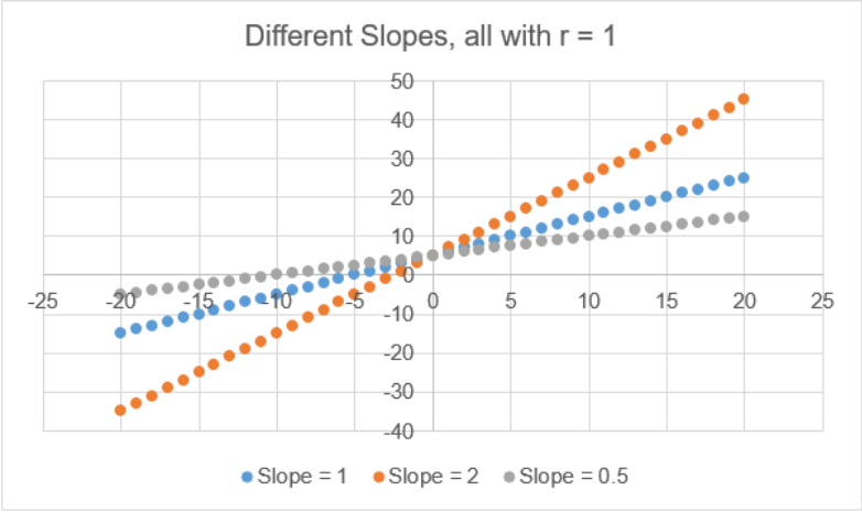
    When \(r\) is equal to \(-1\) or \(1\) all the dots in the scatterplot line up in a straight line. As the points disperse, \(r\) gets closer to zero. The correlation tells the direction of a linear relationship only. It does not tell you what the slope of the line is, nor does it recognize nonlinear relationships. For instance, in Figure 12-2, there are three scatterplots overlaid on the same set of axes. All three data sets would have \(r = 1\) even though they all have different slopes.

    A single set of axes contains 3 different linear scaterplots, of slopes 1, 2, and 0.5, all with r=1.
    Figure 12-2: Any straight line has \(r=1\).

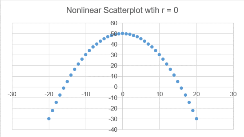
    For the next example in Figure 12-3, \(r = 0\) would indicate no linear relationship; however, there is clearly a non-linear pattern with the data.

    A scatterplot whose points are arranged in a parabola. Scatterplot has h=0.
    Figure 12-3: A plot of points in a parabola, a non-linear pattern, has \(r=0\).

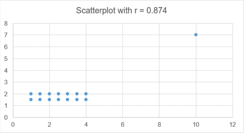
    Figure 12-4 shows a correlation \(r = 0.874\), which is pretty close to one, indicating a strong linear relationship. However, there is an outlier, called a leverage point, which is inflating the value of the slope. If you remove the outlier then \(r = 0\), and there is no up or down trend to the data.

    A scatterplot with r=0.874 consists of 12 data points in a 6-by-2 grid, and a 13th point located significantly higher than and to the right of the grid.
    Figure 12-4: A single outlier can significantly change the value of \(r\).

    Calculating Correlation

    To calculate the correlation coefficient by hand we would use the following formula.

    Sample Correlation Coefficient

    \[r = \frac{\sum \left( \left(x_{i} - \bar{x}\right) \left(y_{i} - \bar{y}\right) \right)}{\sqrt{ \left( \left(\sum \left(x_{i} - \bar{x}\right)^{2}\right) \left(\sum \left(y_{i} - \bar{y}\right)^{2}\right) \right)} } = \frac{SS_{xy}}{\sqrt{ \left(SS_{xx} \cdot SS_{yy}\right) }}\]

    Instead of doing all of these sums by hand we can use the output from summary statistics. Recall that the formula for a variance of a sample is \(s_{x}^{2} = \frac{\sum \left(x_{i} - \bar{x}\right)^{2}}{n-1}\). If we were to multiply both sides by the degrees of freedom, we would get \(\sum \left(x_{i} - \bar{x}\right)^{2} = (n-1) s_{x}^{2}\).

    We use these sums of squares \(\sum \left(x_{i} - \bar{x}\right)^{2}\) frequently, so for shorthand we will use the notation \(SS_{xx} = \sum \left(x_{i} - \bar{x}\right)^{2}\). The same would hold true for the \(y\) variable; just changing the letter, the variance of \(y\) would be \(s_{y}^{2} = \frac{\sum \left(y_{i} - \bar{y}\right)^{2}}{n-1}\), therefore \(SS_{yy} = (n-1) s_{y}^{2}\).

    The numerator of the correlation formula is taking in the horizontal distance of each data point from the mean of the \(x\) values, times the vertical distance of each point from the mean of the \(y\) values. This is time-consuming to find so we will use an algebraically equivalent formula \(\sum \left(\left(x_{i} - \bar{x}\right) \left(y_{i} - \bar{y}\right) \right) = \sum (xy) - n \cdot \bar{x} \bar{y}\), and for short we will use the notation \(SS_{xy} = \sum (xy) - n \cdot \bar{x} \bar{y}\).

    To start each problem, use descriptive statistics to find the sum of squares.

    \(SS_{xx} = (n-1) s_{x}^{2}\) \(SS_{yy} = (n-1) s_{y}^{2}\) \(SS_{xy} = sum (xy) - n \cdot \bar{x} \bar{y}\)

    Use the following data to calculate the correlation coefficient.

    Hours Studied for Exam 20 16 20 18 17 16 15 17 15 16 15 17 16 17 14 Grade on Exam 89 72 93 84 81 75 70 82 69 83 80 83 81 84 76
    Solution

    We could show all the work the long way by hand using the shortcut formula. On the TI-83 press the [STAT] key and then the [EDIT] function, type the \(x\) values into L1 and the y values into L2. Press the [STAT] key again and arrow over to highlight [CALC], select 2-Var Stats, then press [ENTER]. This will return the descriptive stats.

    The TI calculator can run descriptive statistics and quickly get everything we need to find the sum of squares. Go to STAT > CALC > 2-Var Stats. For TI-83, you may need to enter your list names separated by a comma, for example 2-Var Stats L1,L2 then hit enter. On the TI-89, open the Stats/List Editor. Enter all \(x\)-values in one list. Enter all corresponding \(y\)-values in a second list. Press F4, then select 2-Var Stats, then press [ENTER]. This will return the descriptive stats. Use the down arrow to see everything.

    Selecting 2-Var Stats in the CALC menu of the calculator and selecting the appropriate lists for the x and y variables. Shows the resulting values for the descriptive statistics.

    Once you do this the statistics are stored in your calculator so you can use the VARS key, go to Statistics, then select the standard deviation for \(x\), and repeat for the \(y\)-variable. This will reduce rounding errors by using exact values. For the \(SS_{xy}\) you can also use the stored sum of \(xy\) and means.

    Performing calculations using the stored values created from the 2-Variable Stat function, accessed through using the VARS key followed by the Statistics option. Calculations include multiplying the standard deviation of each variable by n-1, or 14, and subtracting 15 times the product of the x and y means from the sum of x times y.

    This gives the following results:

    \(SS_{xx} = (n-1) s_{x}^{2} = (15-1) 1.723783215^{2} = 41.6\)
    \(SS_{yy} = (n-1) s_{x}^{2} = (15-1) )6.717425811^{2} = 631.7333\)
    \(SS_{xy} = \sum (xy) - n \bar{x} \bar{y} = 20087 – (15 \cdot 16.6 \cdot 80.133333) = 133.8\)

    Note that both \(SS_{xx}\) and \(SS_{yy}\) will always be positive, but \(SS_{xy}\) could be negative or positive. For the TI-89, you will see the sum of squares at the very bottom of the descriptive statistics: \(\sum \left(x - \bar{x}\right)^{2} = 41.6\) and \(\sum \left(y - \bar{y}\right)^{2} = 631.7333\).

    To find the correlation, substitute the three sums of squares into the formula to get: \(r = \frac{SS_{xy}}{\sqrt{ \left(SS_{xx} \cdot SS_{yy}\right) }}= \frac{133.8}{\sqrt{ \left(41.6 \cdot 631.7333 \right) }} = 0.8524\). Try this now on your calculator to see if you are getting your order of operations correct.

    For our example, \(r = 0.8254\) is close to 1; therefore it looks like there is positive linear relationship between the number of hours studying for an exam and the grade on the exam.

    Most software has a built-in correlation function.

    TI-84: On the TI-83 press the [STAT] key and then the [EDIT] function, type the \(x\) values into L1 and the \(y\) values into L2. Press the [STAT] key again and arrow over to highlight [TEST], select LinRegTTest, then press [ENTER]. The default is Xlist: L1, Ylist: L2, Freq:1, \(\beta\) and \(\rho: \neq 0\). Arrow down to Calculate and press the [ENTER] key. Scroll down to the bottom until see you \(r\).

    Selecting the LinRegTTest function from the TEST menu under STAT. The default settings for this test. The results from this test.

    TI-89: On the TI-89, open the Stats/List Editor. Enter all \(x\)-values in one list. Enter all corresponding \(y\)-values in a second list. Press F6, then select LinRegTTest, then press [ENTER]. Scroll down to the bottom of the output to see \(r\).

    Selecting the LinRegTTests option from the F6 Tests menu. The default settings for the test, and the final results.

    Excel:

    An Excel spreadsheet with the given data table, including labels, entered in rows 1 and 2, columns A through P. Shows the command to calculate correlation: =CORREL(B1:P1,B2:P2)

    r = CORREL(array1,array2) = CORREL(B1:P1,B2:P2) = 0.8254

    When is a correlation statistically significant? The next subsection shows how to run a hypothesis test for correlations.


    This page titled 12.1.1: Scatterplots is shared under a CC BY-SA 4.0 license and was authored, remixed, and/or curated by Rachel Webb.

    • Was this article helpful?