
2.4: Chapter 2 Exercises
- Page ID
- 24026

1. Which types of graphs are used for quantitative data? Select all that apply.
a) Ogive
b) Pie Chart
c) Histogram
d) Stem-and-Leaf Plot
e) Bar Graph
2. Which types of graphs are used for qualitative data? Select all that apply.
a) Pareto Chart
b) Pie Chart
c) Dotplot
d) Stem-and-Leaf Plot
e) Bar Graph
f) Time Series Plot
3. The bars for a histogram should always touch, true or false?
4. A sample of rents found the smallest rent to be $600 and the largest rent was $2,500. What is the recommended class width for a frequency table with 7 classes?
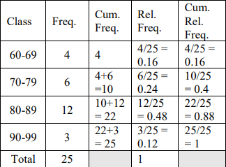
5. An instructor had the following grades recorded for an exam.
| 96 | 66 | 65 | 82 | 85 |
| 82 | 87 | 76 | 80 | 85 |
| 83 | 69 | 79 | 70 | 83 |
| 63 | 81 | 94 | 71 | 83 |
| 99 | 75 | 73 | 83 | 86 |
a) Create a stem-and-leaf plot.
b) Complete the following table.
| Class | Frequency | Cumulative Frequency | Relative Frequency | Cumulative Relative Frequency |
| 60 – 69 | ||||
| 70 – 79 | ||||
| 80 – 89 | ||||
| 90 – 99 | ||||
| Total | 25 |
c) What should the relative frequencies always add up to?
d) What should the last value always be in the cumulative frequency column?
e) What is the frequency for students that were in the C range of 70-79?
f) What is the relative frequency for students that were in the C range of 70-79?
g) Which is the modal class?
h) Which class has a relative frequency of 12%?
i) What is the cumulative frequency for students that were in the B range of 80-89?
j) Which class has a cumulative relative frequency of 40%?
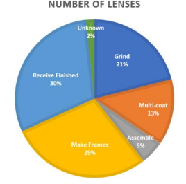
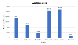
6. Eyeglassomatic manufactures eyeglasses for different retailers. The number of lenses for different activities is in table.
| Activity | Grind | Multi-coat | Assemble | Make Frames | Receive Finished | Unknown |
| Number of lenses | 18,872 | 12,105 | 4,333 | 25,880 | 26,991 | 1,508 |
Grind means that they ground the lenses and put them in frames, multi-coat means that they put tinting or scratch resistance coatings on lenses and then put them in frames, assemble means that they receive frames and lenses from other sources and put them together, make frames means that they make the frames and put lenses in from other sources, receive finished means that they received glasses from another source, and unknown means they do not know where the lenses came from.
a) Make a relative frequency table for the data.
b) How many of the eyeglasses did Eyeglassomatic assemble?
c) How many of the eyeglasses did Eyeglassomatic manufacture all together?
d) What is the relative frequency for the assemble category?
e) What percent of eyeglasses did Eyeglassomatic grind?
7. The following table is from a sample of five hundred homes in Oregon asked the primary source of heating in their residential homes.
| Type of Heat | Percent |
| Electricity | 33 |
| Heating Oil | 4 |
| Natural Gas | 50 |
| Firewood | 8 |
| Other | 5 |
a) How many of the households heat their home with firewood?
b) What percent of households heat their home with natural gas?
8. The following table is from a sample of 50 undergraduate PSU students.
| Class | Relative Frequency Percent |
| Freshman | 18 |
| Sophomore | 13 |
| Junior | 23 |
| Senior | 46 |
a) What percent of students are below a senior class?
b) What is the cumulative frequency of the junior class?
9. A sample of heights of 20 people in cm is recorded below. Make a stem-and-leaf plot.
| Height (cm) | |||||
| 167 | 201 | 170 | 185 | 175 | 162 |
| 182 | 186 | 172 | 173 | 188 | 154 |
| 185 | 178 | 177 | 184 | 178 | 165 |
| 169 | 171 | 185 | 178 | 175 | 176 |
10. The stem-and-leaf plot below is for pulse rates before and after exercise.

a) Was pulse rate higher on average before or after exercise?
b) What was the fastest pulse rate of the before exercise group?
c) What was the slowest pulse rate of the after-exercise group?
11. The following data represents the percent change in tuition levels at public, four-year colleges (inflation adjusted) from 2008 to 2013 (Weissmann, 2013). Below is the frequency distribution and histogram.
| Class Limits | Class Midpoint | Frequency | Relative Frequency |
| 2.2 – 11.7 | 6.95 | 6 | 0.12 |
| 11.8 – 21.3 | 16.55 | 20 | 0.40 |
| 21.4 – 30.9 | 26.15 | 11 | 0.22 |
| 31.0 – 40.5 | 35.75 | 4 | 0.08 |
| 40.6 – 50.1 | 45.35 | 2 | 0.04 |
| 50.2 – 59.7 | 54.95 | 2 | 0.04 |
| 59.8 – 69.3 | 64.55 | 3 | 0.06 |
| 69.4 – 78.9 | 74.15 | 2 | 0.04 |

a) How many colleges were sampled?
b) What was the approximate value of the highest change in tuition?
c) What was the approximate value of the most frequent change in tuition?
12. The following data and graph represent the grades in a statistics course.
| Class Limits | Class Midpoint | Frequency | Relative Frequency |
| 40 – 49.9 | 45 | 2 | 0.08 |
| 50 – 59.9 | 55 | 1 | 0.04 |
| 60 – 69.9 | 65 | 7 | 0.28 |
| 70 – 79.9 | 75 | 6 | 0.24 |
| 80 – 89.9 | 85 | 7 | 0.28 |
| 90 – 99.9 | 95 | 2 | 0.04 |

a) How many students were in the class?
b) What was the approximate lowest and highest grade in the class?
c) What percent of students had a passing grade of 70% or higher?
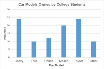
13. The following graph represents a random sample of car models driven by college students. What percent of college students drove a Nissan?

14. The following graph and data represent the percent change in tuition levels at public, four-year colleges (inflation adjusted) from 2008 to 2013 (Weissmann, 2013).

| Class Limits | Cumulative Frequency |
| 2.2 – 11.7 | 6 |
| 11.8 – 21.3 | 26 |
| 21.4 – 30.9 | 37 |
| 31.0 – 40.5 | 41 |
| 40.6 – 50.1 | 43 |
| 50.2 – 59.7 | 45 |
| 59.8 – 69.3 | 48 |
| 69.4 – 78.9 | 50 |
a) How many colleges were sampled?
b) What class of percent changes had the most colleges in that range?
c) How many colleges had a percent change below 50.2% change in tuition?
d) What is the cumulative relative frequency for the 50.2% – 59.7% change in tuition class?
15. Eyeglassomatic manufactures eyeglasses for different retailers. The number of lenses for different activities is in table.
| Activity | Grind | Multi-coat | Assemble | Make Frames | Receive Finished | Unknown |
| Number of lenses | 18,872 | 12,105 | 4,333 | 25,880 | 26,991 | 1,508 |
a) Make a pie chart.
b) Make a bar chart.
c) Make a Pareto chart.
16. The daily sales using different sales strategies is shown in the graph below.

a) Which strategy generated the most sales?
b) Was there a particular strategy that worked well for one product, but not for another product?
17. The following graph represents a random sample of car models driven by college students. What was the most common car model?
18. The Australian Institute of Criminology gathered data on the number of deaths (per 100,000 people) due to firearms during the period 1983 to 1997. The data is in table below. Create a time-series plot of the data. What is the overall trend over time? (2013, September 26). Retrieved from http://www.statsci.org/data/oz/firearms.html.
| Year | Rate |
| 1983 | 4.31 |
| 1984 | 4.42 |
| 1985 | 4.52 |
| 1986 | 4.35 |
| 1987 | 4.39 |
| 1988 | 4.21 |
| 1989 | 3.4 |
| 1990 | 3.61 |
| 1991 | 3.67 |
| 1992 | 3.61 |
| 1993 | 2.98 |
| 1994 | 2.95 |
| 1995 | 2.72 |
| 1996 | 2.95 |
| 1997 | 2.3 |
19. A scatter plot for a random sample of 24 countries shows the average life expectancy and the average number of births per woman (fertility rate). What is the approximate fertility rate for a country that has a life expectancy of 76 years?
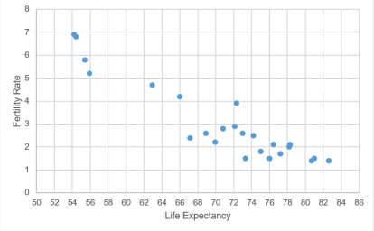
(2013, October 14). Retrieved from http://data.worldbank.org/indicator/SP.DYN.TFRT.IN.
20. The Australian Institute of Criminology gathered data on the number of deaths (per 100,000 people) due to firearms during the period 1983 to 1997. The time-series plot is below. What year had the highest rate of deaths?

(2013, September 26). Retrieved from http://www.statsci.org/data/oz/firearms.html.
21. A survey by the Pew Research Center, conducted in 16 countries among 20,132 respondents from April 4 to May 29, 2016, before the United Kingdom’s Brexit referendum to exit the EU. The following is a time series graph for the proportion of survey respondents by country that responded that the current economic situation is their country was good.

a) Which country had the most favorable outlook of their country’s economic situation in 2010?
b) Which country had the least favorable outlook of their country’s economic situation in 2016?
22. Why is this a misleading or poor graph?
23. Why is this a misleading or poor graph?
24. Why is this a misleading or poor graph?

United States unemployment. (2013, October 14). Retrieved from http://www.tradingeconomics.com/united-states/unemployment-rate
25. The Australian Institute of Criminology gathered data on the number of deaths (per 100,000 people) due to firearms during the period 1983 to 1997. Why is this a misleading or poor graph?

(2013, September 26). Retrieved from http://www.statsci.org/data/oz/firearms.html.
26. Why is this a misleading or poor graph?

- Answer to Odd Numbered Exercises
-
1) a, c,
3) True
5) a) \(\begin{array}{l|llllllllllll}
6 & 3 & 5 & 6 & 9 \\
7 & 0 & 1 & 3 & 5 & 6 & 9 \\
8 & 0 & 1 & 2 & 2 & 3 & 3 & 3 & 3 & 5 & 5 & 6 & 7 \\
9 & 4 & 6 & 9 \\
\end{array}\)b)
 c) 1 d) The sample size n. e) 6 f) 0.24 g) 80-89 h) 90-99 i) 0.88 j) 70-79
 7) a) 40 b) 50%
9) \(\begin{array}{l|lllllllllll}
15 & 4 & & & & & & & & & \\
16 & 2 & 5 & 7 & 9 & & & & & & & \\
17 & 0 & 1 & 2 & 3 & 5 & 5 & 6 & 7 & 8 & 8 & 8 \\
18 & 2 & 4 & 5 & 5 & 5 & 6 & 8 & & & \\
19 & & & & & & & & & & & \\
20 & 1 & & & & & & & & &
\end{array}\)11) a) 50 b) 78 c) 16.55
13) 20%
15) a)
b)
c)

17) Chevy & Toyota
19) 1.5
21) a) Poland
b) Greece
23) There are no labels for both axis or categories.
25) The vertical axis is reversed, making the graph appear to increase when it is actually decreasing. There are no labels for both axes.