
4.3: Idealized Representations of Distributions
- Page ID
- 7743

\( \newcommand{\vecs}[1]{\overset { \scriptstyle \rightharpoonup} {\mathbf{#1}} } \)
\( \newcommand{\vecd}[1]{\overset{-\!-\!\rightharpoonup}{\vphantom{a}\smash {#1}}} \)
\( \newcommand{\dsum}{\displaystyle\sum\limits} \)
\( \newcommand{\dint}{\displaystyle\int\limits} \)
\( \newcommand{\dlim}{\displaystyle\lim\limits} \)
\( \newcommand{\id}{\mathrm{id}}\) \( \newcommand{\Span}{\mathrm{span}}\)
( \newcommand{\kernel}{\mathrm{null}\,}\) \( \newcommand{\range}{\mathrm{range}\,}\)
\( \newcommand{\RealPart}{\mathrm{Re}}\) \( \newcommand{\ImaginaryPart}{\mathrm{Im}}\)
\( \newcommand{\Argument}{\mathrm{Arg}}\) \( \newcommand{\norm}[1]{\| #1 \|}\)
\( \newcommand{\inner}[2]{\langle #1, #2 \rangle}\)
\( \newcommand{\Span}{\mathrm{span}}\)
\( \newcommand{\id}{\mathrm{id}}\)
\( \newcommand{\Span}{\mathrm{span}}\)
\( \newcommand{\kernel}{\mathrm{null}\,}\)
\( \newcommand{\range}{\mathrm{range}\,}\)
\( \newcommand{\RealPart}{\mathrm{Re}}\)
\( \newcommand{\ImaginaryPart}{\mathrm{Im}}\)
\( \newcommand{\Argument}{\mathrm{Arg}}\)
\( \newcommand{\norm}[1]{\| #1 \|}\)
\( \newcommand{\inner}[2]{\langle #1, #2 \rangle}\)
\( \newcommand{\Span}{\mathrm{span}}\) \( \newcommand{\AA}{\unicode[.8,0]{x212B}}\)
\( \newcommand{\vectorA}[1]{\vec{#1}} % arrow\)
\( \newcommand{\vectorAt}[1]{\vec{\text{#1}}} % arrow\)
\( \newcommand{\vectorB}[1]{\overset { \scriptstyle \rightharpoonup} {\mathbf{#1}} } \)
\( \newcommand{\vectorC}[1]{\textbf{#1}} \)
\( \newcommand{\vectorD}[1]{\overrightarrow{#1}} \)
\( \newcommand{\vectorDt}[1]{\overrightarrow{\text{#1}}} \)
\( \newcommand{\vectE}[1]{\overset{-\!-\!\rightharpoonup}{\vphantom{a}\smash{\mathbf {#1}}}} \)
\( \newcommand{\vecs}[1]{\overset { \scriptstyle \rightharpoonup} {\mathbf{#1}} } \)
\(\newcommand{\longvect}{\overrightarrow}\)
\( \newcommand{\vecd}[1]{\overset{-\!-\!\rightharpoonup}{\vphantom{a}\smash {#1}}} \)
\(\newcommand{\avec}{\mathbf a}\) \(\newcommand{\bvec}{\mathbf b}\) \(\newcommand{\cvec}{\mathbf c}\) \(\newcommand{\dvec}{\mathbf d}\) \(\newcommand{\dtil}{\widetilde{\mathbf d}}\) \(\newcommand{\evec}{\mathbf e}\) \(\newcommand{\fvec}{\mathbf f}\) \(\newcommand{\nvec}{\mathbf n}\) \(\newcommand{\pvec}{\mathbf p}\) \(\newcommand{\qvec}{\mathbf q}\) \(\newcommand{\svec}{\mathbf s}\) \(\newcommand{\tvec}{\mathbf t}\) \(\newcommand{\uvec}{\mathbf u}\) \(\newcommand{\vvec}{\mathbf v}\) \(\newcommand{\wvec}{\mathbf w}\) \(\newcommand{\xvec}{\mathbf x}\) \(\newcommand{\yvec}{\mathbf y}\) \(\newcommand{\zvec}{\mathbf z}\) \(\newcommand{\rvec}{\mathbf r}\) \(\newcommand{\mvec}{\mathbf m}\) \(\newcommand{\zerovec}{\mathbf 0}\) \(\newcommand{\onevec}{\mathbf 1}\) \(\newcommand{\real}{\mathbb R}\) \(\newcommand{\twovec}[2]{\left[\begin{array}{r}#1 \\ #2 \end{array}\right]}\) \(\newcommand{\ctwovec}[2]{\left[\begin{array}{c}#1 \\ #2 \end{array}\right]}\) \(\newcommand{\threevec}[3]{\left[\begin{array}{r}#1 \\ #2 \\ #3 \end{array}\right]}\) \(\newcommand{\cthreevec}[3]{\left[\begin{array}{c}#1 \\ #2 \\ #3 \end{array}\right]}\) \(\newcommand{\fourvec}[4]{\left[\begin{array}{r}#1 \\ #2 \\ #3 \\ #4 \end{array}\right]}\) \(\newcommand{\cfourvec}[4]{\left[\begin{array}{c}#1 \\ #2 \\ #3 \\ #4 \end{array}\right]}\) \(\newcommand{\fivevec}[5]{\left[\begin{array}{r}#1 \\ #2 \\ #3 \\ #4 \\ #5 \\ \end{array}\right]}\) \(\newcommand{\cfivevec}[5]{\left[\begin{array}{c}#1 \\ #2 \\ #3 \\ #4 \\ #5 \\ \end{array}\right]}\) \(\newcommand{\mattwo}[4]{\left[\begin{array}{rr}#1 \amp #2 \\ #3 \amp #4 \\ \end{array}\right]}\) \(\newcommand{\laspan}[1]{\text{Span}\{#1\}}\) \(\newcommand{\bcal}{\cal B}\) \(\newcommand{\ccal}{\cal C}\) \(\newcommand{\scal}{\cal S}\) \(\newcommand{\wcal}{\cal W}\) \(\newcommand{\ecal}{\cal E}\) \(\newcommand{\coords}[2]{\left\{#1\right\}_{#2}}\) \(\newcommand{\gray}[1]{\color{gray}{#1}}\) \(\newcommand{\lgray}[1]{\color{lightgray}{#1}}\) \(\newcommand{\rank}{\operatorname{rank}}\) \(\newcommand{\row}{\text{Row}}\) \(\newcommand{\col}{\text{Col}}\) \(\renewcommand{\row}{\text{Row}}\) \(\newcommand{\nul}{\text{Nul}}\) \(\newcommand{\var}{\text{Var}}\) \(\newcommand{\corr}{\text{corr}}\) \(\newcommand{\len}[1]{\left|#1\right|}\) \(\newcommand{\bbar}{\overline{\bvec}}\) \(\newcommand{\bhat}{\widehat{\bvec}}\) \(\newcommand{\bperp}{\bvec^\perp}\) \(\newcommand{\xhat}{\widehat{\xvec}}\) \(\newcommand{\vhat}{\widehat{\vvec}}\) \(\newcommand{\uhat}{\widehat{\uvec}}\) \(\newcommand{\what}{\widehat{\wvec}}\) \(\newcommand{\Sighat}{\widehat{\Sigma}}\) \(\newcommand{\lt}{<}\) \(\newcommand{\gt}{>}\) \(\newcommand{\amp}{&}\) \(\definecolor{fillinmathshade}{gray}{0.9}\)Datasets are like snowflakes, in that every one is different, but nonetheless there are patterns that one often sees in different types of data. This allows us to use idealized representations of the data to further summarize them. Let’s take the adult height data plotted in 4.5, and plot them alongside a very different variable: pulse rate (heartbeats per minute), also measured in NHANES (see Figure 4.6).
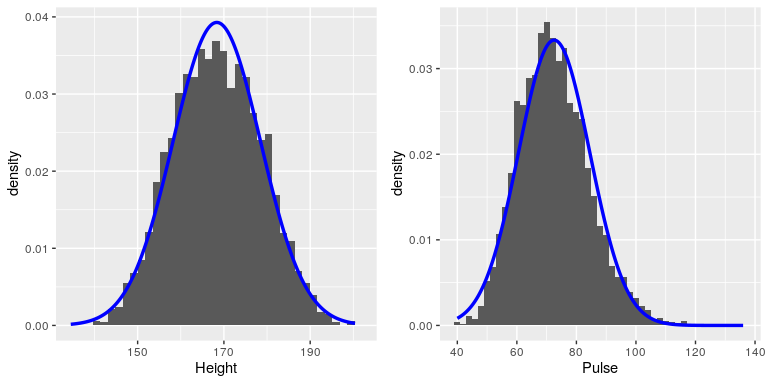
While these plots certainly don’t look exactly the same, both have the general characteristic of being relatively symmetric around a rounded peak in the middle. This shape is in fact one of the commonly observed shapes of distributions when we collect data, which we call the normal (or Gaussian) distribution. This distribution is defined in terms of two values (which we call parameters of the distribution): the location of the center peak (which we call the mean) and the width of the distribution (which is described in terms of a parameter called the standard deviation). Figure 4.6 shows the appropriate normal distribution plotted on top of each of the histrograms.You can see that although the curves don’t fit the data exactly, they do a pretty good job of characterizing the distribution – with just two numbers!
As we will see later in the course when we discuss the central limit theorem, there is a deep mathematical reason why many variables in the world exhibit the form of a normal distribution.
4.3.1 Skewness
The examples in Figure 4.6 followed the normal distribution fairly well, but in many cases the data will deviate in a systematic way from the normal distribution. One way in which the data can deviate is when they are asymmetric, such that one tail of the distribution is more dense than the other. We refer to this as “skewness”. Skewness commonly occurs when the measurement is constrained to be non-negative, such as when we are counting things or measuring elapsed times (and thus the variable can’t take on negative values).
An example of skewness can be seen in the average waiting times at the airport security lines at San Francisco International Airport, plotted in the left panel of Figure 4.7. You can see that while most wait times are less than 20 minutes, there are a number of cases where they are much longer, over 60 minutes! This is an example of a “right-skewed” distribution, where the right tail is longer than the left; these are common when looking at counts or measured times, which can’t be less than zero. It’s less common to see “left-skewed” distributions, but they can occur, for example when looking at fractional values that can’t take a value greater than one.
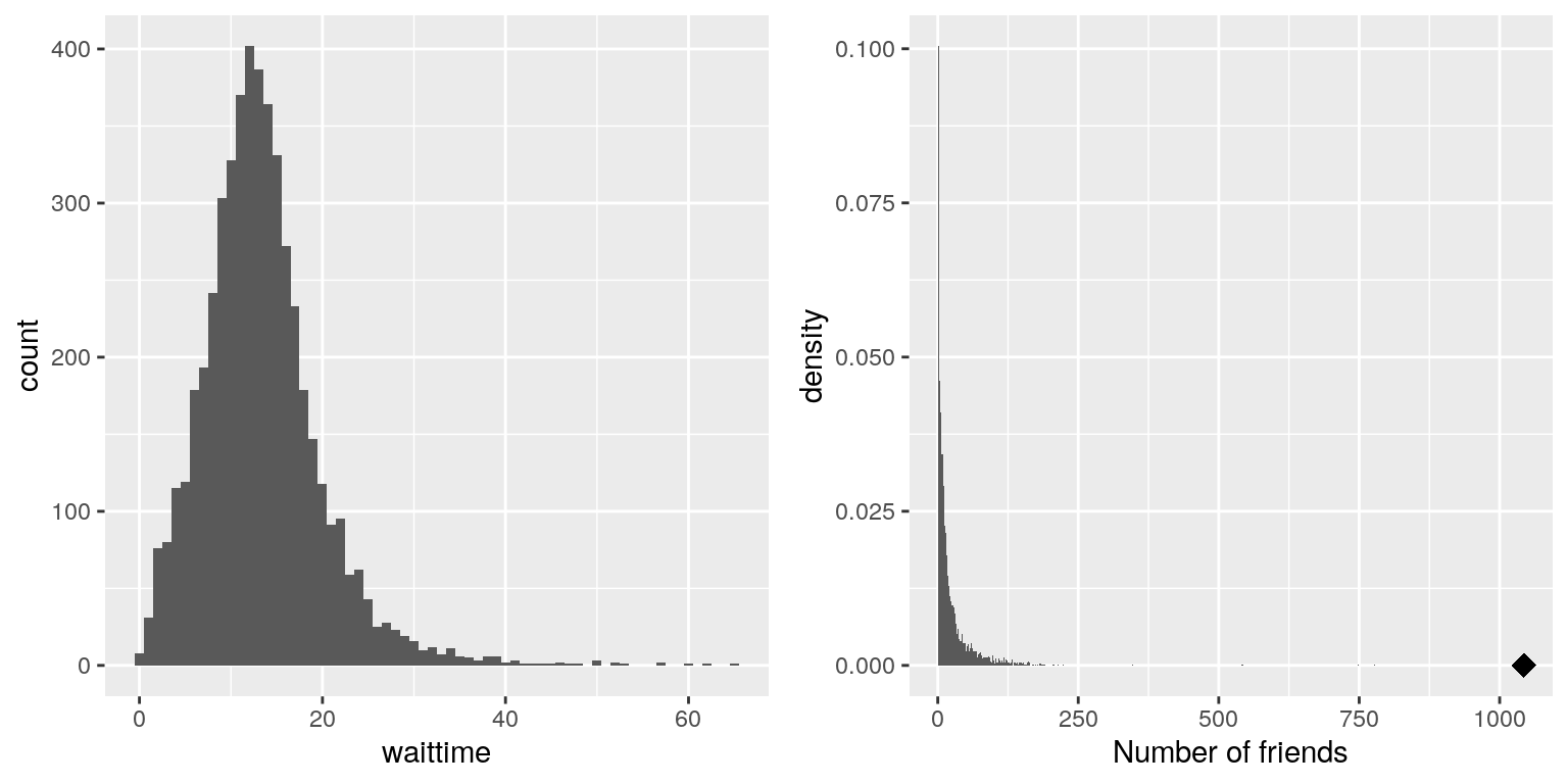
Figure 4.7: Examples of right-skewed and long-tailed distributions. Left: Average wait times for security at SFO Terminal A (Jan-Oct 2017), obtained from https://awt.cbp.gov/ . Right: A histogram of the number of Facebook friends amongst 3,663 individuals, obtained from the Stanford Large Network Database. The person with the maximum number of friends is indicated by the diamond.
4.3.2 Long-tailed distributions
Historically, statistics has focused heavily on data that are normally distributed, but there are many data types that look nothing like the normal distribution. In particular, many real-world distributions are “long-tailed”, meaning that the right tail extends far beyond the most typical members of the distribution. One of the most interesting types of data where long-tailed distributions occur arise from the analysis of social networks. For an example, let’s look at the Facebook friend data from the Stanford Large Network Database and plot the histogram of number of friends across the 3,663 people in the database (see right panel of Figure 4.7). As we can see, this distribution has a very long right tail – the average person has 24.09 friends, while the person with the most friends (denoted by the blue dot) has 1043!
Long-tailed distributions are increasingly being recognized in the real world. In particular, many features of complex systems are characterized by these distributions, from the frequency of words in text, to the number of flights in and out of different airports, to the connectivity of brain networks. There are a number of different ways that long-tailed distributions can come about, but a common one occurs in cases of the so-called “Matthew effect” from the Christian Bible:
For to every one who has will more be given, and he will have abundance; but from him who has not, even what he has will be taken away. — Matthew 25:29, Revised Standard Version
This is often paraphrased as “the rich get richer”. In these situations, advantages compound, such that those with more friends have access to even more new friends, and those with more money have the ability do things that increase their riches even more.
As the course progresses we will see several examples of long-tailed distributions, and we should keep in mind that many of the tools in statistics can fail when faced with long-tailed data. As Nassim Nicholas Taleb pointed out in his book “The Black Swan”, such long-tailed distributions played a critical role in the 2008 financial crisis, because many of the financial models used by traders assumed that financial systems would follow the normal distribution, which they clearly did not.