Case Q→Q
( \newcommand{\kernel}{\mathrm{null}\,}\)
CO-4: Distinguish among different measurement scales, choose the appropriate descriptive and inferential statistical methods based on these distinctions, and interpret the results.
LO 4.35: For a data analysis situation involving two variables, choose the appropriate inferential method for examining the relationship between the variables and justify the choice.
LO 4.36: For a data analysis situation involving two variables, carry out the appropriate inferential method for examining relationships between the variables and draw the correct conclusions in context.
CO-5: Determine preferred methodological alternatives to commonly used statistical methods when assumptions are not met.
Review: From UNIT 1
Video: Case Q→Q (60:27)
Related SAS Tutorials
- 9A – (3:53) Basic Scatterplots
- 9B – (2:29) Grouped Scatterplots
- 9C – (3:46) Pearson’s Correlation Coefficient
- 9D – (3:00) Simple Linear Regression – EDA
- 9E – (5:59) Simple Linear Regression (Inference)
Related SPSS Tutorials
- 9A – (2:38) Basic Scatterplots
- 9B – (2:54) Grouped Scatterplots
- 9C – (3:35) Pearson’s Correlation Coefficient
- 9D – (2:53) Simple Linear Regression – EDA
- 9E – (7:07) Simple Linear Regression (Inference)
Introduction
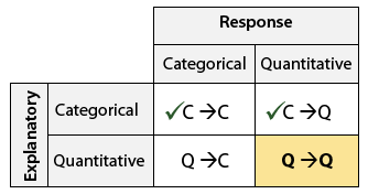
In inference for relationships, so far we have learned inference procedures for both cases C→Q and C→C from the role/type classification table below.
The last case to be considered in this course is case Q→Q, where both the explanatory and response variables are quantitative. (Case Q→C requires statistical methods that go beyond the scope of this course, one of which is logistic regression).
For case Q→Q, we will learn the following tests:
| Dependent Samples | Independent Samples | |
|---|---|---|
| Standard Test(s) |
|
|
| Non-Parametric Test(s) |
|
In the Exploratory Data Analysis section, we examined the relationship between sample values for two quantitative variables by looking at a scatterplot and if the relationship was linear, we supplemented the scatterplot with the correlation coefficient r and the linear regression equation. We discussed the regression equation but made no attempt to claim that the relationship observed in the sample necessarily held for the larger population from which the sample originated.
Now that we have a better understanding of the process of statistical inference, we will discuss a few methods for inferring something about the relationship between two quantitative variables in an entire population, based on the relationship seen in the sample.
In particular, we will focus on linear relationships and will answer the following questions:
- Is the correlation coefficient different from zero in the population, or could it be that we obtained the result in the data just by chance?
- Is the slope different from zero in the population, or could it be that we obtained the result in the data just by chance?
If we satisfy the assumptions and conditions to use the methods, we can estimate the slope and correlation coefficient for our population and conduct hypothesis tests about these parameters.
For the standard tests, the tests for the slope and the correlation coefficient are equivalent; they will always produce the same p-value and conclusion. This is because they are directly related to each other.
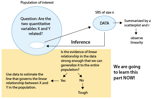
In this section, we can state our null and alternative hypotheses as:
Ho: There is no relationship between the two quantitative variables X and Y.
Ha: There is a relationship between the two quantitative variables X and Y.
Pearson’s Correlation Coefficient
LO 4.45: In a given context, set up the appropriate null and alternative hypotheses for examining the relationship between two quantitative variables.
LO 4.46: In a given context, determine the appropriate standard method for examining the relationship between two quantitative variables interpret the results provided in the appropriate software output in context.
What we know from Unit 1:
- r only measures the LINEAR association between two quantitative variables X and Y
- -1 ≤ r ≤ 1
- If the relationship is linear then:
r = 0 implies no relationship between X and Y (note this is our null hypothesis!!)
r > 0 implies a positive relationship between X and Y (as X increases, Y also increases)
r < 0 implies a negative relationship between X and Y (as X increases, Y decreases)
Now here are the steps for hypothesis testing for Pearson’s Correlation Coefficient:
Step 1: State the hypothesesIf we consider the above information and our null hypothesis,
Ho: There is no relationship between the two quantitative variables X and Y,
Before we can write this using correlation, we must define the population correlation coefficient. In statistics, we use the greek letter ρ (rho) to denote the population correlation coefficient. Thus if there is no relationship between the two quantitative variables X and Y in our population, we can see that this hypothesis is equivalent to
Ho: ρ = 0 (rho = 0).
The alternative hypothesis will be
Ha: ρ ≠ 0 (rho is not equal to zero).
however, one sided tests are possible.
Step 2: Obtain data, check conditions, and summarize data
(i) The sample should be random with independent observations (all observations are independent of all other observations).
(ii) The relationship should be reasonably linear which we can check using a scatterplot. Any clearly non-linear relationship should not be analyzed using this method.
(iii) To conduct this test, both variables should be normally distributed which we can check using histograms and QQ-plots. Outliers can cause problems.
Although there is an intermediate test statistic, in effect, the value of r itself serves as our test statistic.
Step 3: Find the p-value of the test by using the test statistic as follows
We will rely on software to obtain the p-value for this test. We have seen this p-value already when we calculated correlation in Unit 1.
Step 4: Conclusion
As usual, we use the magnitude of the p-value to draw our conclusions. A small p-value indicates that the evidence provided by the data is strong enough to reject Ho and conclude (beyond a reasonable doubt) that the two variables are related (ρ ≠ 0). In particular, if a significance level of 0.05 is used, we will reject Ho if the p-value is less than 0.05.
Confidence intervals can be obtained to estimate the true population correlation coefficient, ρ (rho), however, we will not compute these intervals in this course. You could be asked to interpret or use a confidence interval which has been provided to you.
Non-Parametric Alternative: Spearman’s Rank Correlation
LO 5.1: For a data analysis situation involving two variables, determine the appropriate alternative (non-parametric) method when assumptions of our standard methods are not met.
LO 5.2: Recognize situations in which Spearman’s rank correlation is a more appropriate measure of the relationship between two quantitative variables
We will look at one non-parametric test in case Q→Q. Spearman’s rank correlation uses the same calculations as for Pearson’s correlation coefficient except that it uses the ranks instead of the original data. This test is useful when there are outliers or when the variables do not appear to be normally distributed.
- This measure and test are most useful when the relationship between X and Y is nonlinear and either non-increasing or non-decreasing.
- If the relationship has both increasing and decreasing components, Spearman’s rank correlation is not usually helpful as a measure of correlation.
This measure behaves similarly to r in that:
- it ranges from -1 to 1
- a value of 0 implies no relationship
- positive values imply a positive relationship
- negative values imply a negative relationship.
Now an example:
A method for predicting IQ as soon as possible after birth could be important for early intervention in cases such as brain abnormalities or learning disabilities. It has been thought that greater infant vocalization (for instance, more crying) is associated with higher IQ. In 1964, a study was undertaken to see if IQ at 3 years of age is associated with amount of crying at newborn age. In the study, 38 newborns were made to cry after being tapped on the foot and the number of distinct cry vocalizations within 20 seconds was counted. The subjects were followed up at 3 years of age and their IQs were measured.
Data: SPSS format, SAS format, Excel format
Response Variable:
- IQ at three years of age
Explanatory Variable:
- Newborn cry count in 20 seconds
Results:
Step 1: State the hypotheses
The hypotheses are:
Ho: There is no relationship between newborn cry count and IQ at three years of age
Ha: There is a relationship between newborn cry count and IQ at three years of age
Steps 2 & 3: Obtain data, check conditions, summarize data, and find the p-value
(i) To the best of our knowledge the subjects are independent.
(ii) The scatterplot shows a relationship that is reasonably linear although not very strong.
(iii) The histograms and QQ-plots for both variables are slightly skewed right. We would prefer more symmetric distributions; however, the skewness is not extreme so we will proceed with caution.
Pearson’s correlation coefficient is 0.402 with a p-value of 0.012.
Spearman’s rank correlation is 0.354 with a p-value of 0.029.
Step 4: Conclusion
Based upon the scatterplot and correlation results, there is a statistically significant, but somewhat weak, positive correlation between newborn cry count and IQ at age 3.
Simple Linear Regression
LO 4.46: In a given context, determine the appropriate standard method for examining the relationship between two quantitative variables interpret the results provided in the appropriate software output in context.
In Unit 1, we discussed the least squares method for estimating the regression line and used software to obtain the slope and intercept of the linear regression equation. These estimates can be considered as the sample statistics which estimate the true population slope and intercept.
Now we will formalize simple linear regression which will require some additional notation.
A regression model expresses two essential ingredients:
- a tendency of the response variable Y to vary with the explanatory variable X in a systematic fashion (deterministic)
- a stochastic scattering of points around the curve of statistical relationship (random)
Regression is a vast subject which handles a wide variety of possible relationships.

All regression methods begin with a theoretical model which specifies the form of the relationship and includes any needed assumptions or conditions. Now we will introduce a more “statistical” definition of the regression model and define the parameters in the population.
Simple Linear Regression Model:
We will use a different notation here than in the beginning of the semester. Now we use regression model style notation.
We assume the relationship in the population is linear and therefore our regression model can be written as:
Yi=β0+β1Xi+ϵi
where
- The parameter β0 (beta_zero) is the intercept (in the population) and is the average value of Y when X = 0
- The parameter β1 (beta_1) is the slope (in the population) and is the change in the average Y for each 1 unit increase in X.
- Xi is the value of the explanatory variable for the i-th subject
- Yi is the value of the response variable for the i-th subject
- εi (epsilon_i) is the error term for the i-th subject
- the error terms are assumed to be
- normally distributed with mean zero (check with histogram and QQ-plot of the residuals)
- constant variance (check with scatterplot of Y vs. X for simple linear regression)
- statistically independent (difficult to check, be sure to have independent observations in the data, different methods are required for dependent observations!)
The following picture illustrates the components of this model.
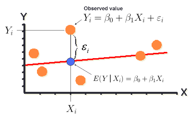
Each orange dot represents an individual observation in the scatterplot. Each observed value is modeled using the previous equation.
Yi=β0+β1Xi+ϵi
The red line is the true linear regression line. The blue dot represents the predicted value for a particular X value and illustrates that our predicted value only estimates the mean, average, or expected value of Y at that X value.
The error for an individual is expected and is due to the variation in our data. In the previous illustration, it is labeled with εi (epsilon_i) and denoted by a bracket which gives the distance between the orange dot for the observed value and the blue dot for the predicted value for a particular value of X. In practice, we cannot observe the true error for an individual but we will be able to estimate them using the residuals, which we will soon define mathematically.
The regression line represents the average Y for a given X and can be expressed as in symbols as the expected value of Y for a given X, E(Y|X) or Y-hat.
E(Y|Xi)=ˆYi=ˆβ0+ˆβ1Xi
In Unit 1, we used a to represent the intercept and b to represent the slope that we estimated from our data.
In formal regression procedures, we commonly use beta to represent the population parameter and beta-hat to represent the parameter estimate.
These parameter estimates, which are sample statistics estimated from our data, are also sometimes referred to as the coefficients using algebra terminology.
For each observation in our dataset, we also have a residual which is defined as the difference between the observed value and the predicted value for that observation.
residuali=Yi−ˆYi
The residuals are used to check our assumptions of normality and constant variance.
In effect, since we have a quantitative response variable, we are still comparing population means. However, now we must do so for EVERY possible value of X. We want to know if the distribution of Y is the same or different over our range of X values.
This idea is illustrated (including our assumption of normality) in the following picture which shows a case where the distribution of Y is changing as the values of the explanatory variable X change. This change is reflected by only a shift in means since we assume normality and constant variation of Y for all X.
The method used is mathematically equivalent to ANOVA but our interpretations are different due to the quantitative nature of our explanatory variable.
This image shows a scatterplot and regression line on the X-Y plane – as if flat on a table. Then standing up – in the vertical axis – we draw normal curves centered at the regression line for four different X-values – with X increasing for each.
The center of the distributions of the normal distributions which are displayed shows an increase in the mean but constant variation.
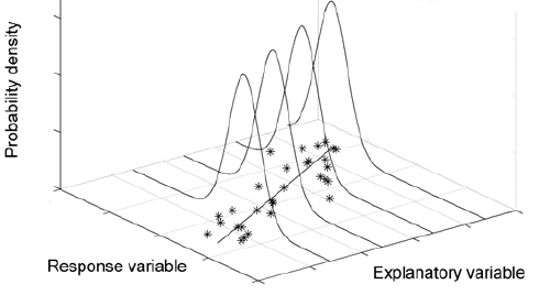
The idea is that the model assumes a normal distribution is a good approximation for how the Y-values will vary around the regression line for a particular value of X.
Coefficient of Determination
LO 4.47: For simple linear regression models, interpret the coefficient of determination in context.
There is one additional measure which is often of interest in linear regression, the coefficient of determination, R2 which, for simple linear regression is simply the square of the correlation coefficient, r.
The value of R2 is interpreted as the proportion of variation in our response variable Y, which can be explained by the linear regression model using our explanatory variable X.
Important Properties of R2
- 0 ≤ R2 ≤ 1
- R2 = 0 implies the model explains none of the variation in Y.
- R2 = 1 implies the model explains all of the variation in Y (perfect fit, very unlikely with data)
A large R2 may or MAY NOT mean that the model fits our data well.
The image below illustrates data with a fairly large R2 yet the model does not fit the data well.

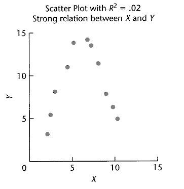
A small R2 may or MAY NOT mean that there is no relationship between X and Y – we must be careful as the relationship that exists may simply not be specified in our model – currently a simple linear model.
The image below illustrates data with a very small R2 yet the true relationship is very strong.
Test Procedure for the Slope in Simple Linear Regression
Now we move into our formal test procedure for simple linear regression.
A small R2 may or MAY NOT mean that there is no relationship between X and Y – we must be careful as the relationship that exists may simply not be specified in our model – currently a simple linear model. The image below illustrates data with a very small R2 yet the true relationship is very strong.
Step 1: State the hypotheses
In order to test the hypothesis that
Ho: There is no relationship between the two quantitative variables X and Y,
assuming our model is correct (a linear model is sufficient), we can write the above hypothesis as
Ho: β1 = 0 (Beta_1 = 0, the slope of our linear equation = 0 in the population).
The alternative hypothesis will be
Ha: β1 ≠ 0 (Beta_1 is not equal to zero).
Step 2: Obtain data, check conditions, and summarize data
(i) The sample should be random with independent observations (all observations are independent of all other observations).
(ii) The relationship should be linear which we can check using a scatterplot.
(iii) The residuals should be reasonably normally distributed with constant variance which we can check using the methods discussed below.
Normality: Histogram and QQ-plot of the residuals.
Constant Variance: Scatterplot of Y vs. X and/or a scatterplot of the residuals vs. the predicted values (Y-hat). We would like to see random scatter with no pattern and approximately the same spread for all values of X.
Large outliers which fall outside the pattern of the data can cause problems and exert undue influence on our estimates. We saw in Unit 1 that one observation which is far away on the x-axis can have an large impact on the values of the correlation and slope.
Here are two examples each using the two plots mentioned above.
Example 1: Has constant variance (homoscedasticity)
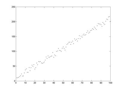
Scatterplot of Y vs. X (above)

Scatterplot of residuals vs. predicted values (above)
Example 2: Does not have constant variance (heteroscedasticity)
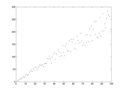
Scatterplot of Y vs. X (above)
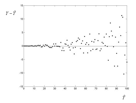
Scatterplot of residuals vs. predicted values (above)
The test statistic is similar to those we have studied for other t-tests:
t=ˆβ1−0SEˆβ1
where
SEˆβ1 = standard error of ˆβ1.
Both of these values, along with the test statistic, are provided in the output from the software.
Step 3: Find the p-value of the test by using the test statistic as follows
Under the null hypothesis, the test statistic follows a t-distribution with n-2 degrees of freedom. We will rely on software to obtain the p-value for this test.
Step 4: Conclusion
As usual, we use the magnitude of the p-value to draw our conclusions. A small p-value indicates that the evidence provided by the data is strong enough to reject Ho and we would conclude there is enough evidence that hat slope in the population is not zero and therefore the two variables are related. In particular, if a significance level of 0.05 is used, we will reject Ho if the p-value is less than 0.05.
Confidence intervals will also be obtained in the software to estimate the true population slope, β1 (beta_1).
A method for predicting IQ as soon as possible after birth could be important for early intervention in cases such as brain abnormalities or learning disabilities. It has been thought that greater infant vocalization (for instance, more crying) is associated with higher IQ. In 1964, a study was undertaken to see if IQ at 3 years of age is associated with amount of crying at newborn age. In the study, 38 newborns were made to cry after being tapped on the foot and the number of distinct cry vocalizations within 20 seconds was counted. The subjects were followed up at 3 years of age and their IQs were measured.
Data: SPSS format, SAS format, Excel format
Response Variable:
- IQ at three years of age
Explanatory Variable:
- Newborn cry count in 20 seconds
Results:
Step 1: State the hypotheses
The hypotheses are:
Ho: There is no (linear) relationship between newborn cry count and IQ at three years of age
Ha: There is a (linear) relationship between newborn cry count and IQ at three years of age
Steps 2 & 3: Obtain data, check conditions, summarize data, and find the p-value
(i) To the best of our knowledge the subjects are independent.
(ii) The scatterplot shows a relationship that is reasonably linear although not very strong.
(iii) The histogram and QQ-plot of the residuals are both reasonably normally distributed. The scatterplots of Y vs. X and the residuals vs. the predicted values both show no evidence of non-constant variance.
The estimated regression equation is
^IQ=90.76+1.54(cry count)
The parameter estimate of the slope is 1.54 which means that for each 1-unit increase in cry count, the average IQ is expected to increase by 1.54 points.
The standard error of the estimate of the slope is 0.584 which give a test statistic of 2.63 in the output and using unrounded values from the output and the formula:
t=ˆβ1−0SEˆβ1=1.536−00.584=2.63.
The p-value is found to be 0.0124. Notice this exactly the same as we obtained for this data for our test of Pearson’s correlation coefficient. These two methods are equivalent and will always produce the same conclusion about the statistical significance of the linear relationship between X and Y.
The 95% confidence interval for β1 (beta_1) given in the output is (0.353, 2.720).
This regression model has coefficient of determination of R2 = 0.161 which means that 16.1% of the variation in IQ score at age three can be explained by our linear regression model using newborn cry count. This confirms a relatively weak relationship as we found in our previous example using correlations (Pearson’s correlation coefficient and Spearmans’ rank correlation).
Step 4: Conclusion
Conclusion of the test for the slope: Based upon the scatterplot and linear regression analysis, since the relationship is linear and the p-value = 0.0124, there is a statistically significant positive linear relationship between newborn cry count and IQ at age 3.
Interpretation of R-squared: Based upon our R2and scatterplot, the relationship is somewhat weak with only 16.1% of the variation in IQ score at age three being explained by our linear regression model using newborn cry count.
Interpretation of the slope: For each 1-unit increase in cry count, the population mean IQ is expected to increase by 1.54 points, however, the 95% confidence interval suggests this value could be as low as 0.35 points to as high as 2.72 points.
We return to the data from an earlier activity (Learn By Doing – Correlation and Outliers (Software)). The average gestation period, or time of pregnancy, of an animal is closely related to its longevity, the length of its lifespan. Data on the average gestation period and longevity (in captivity) of 40 different species of animals have been recorded. Here is a summary of the variables in our dataset:
- animal: the name of the animal species.
- gestation: the average gestation period of the species, in days.
- longevity: the average longevity of the species, in years.
In this case, whether we include the outlier or not, there is a problem of non-constant variance. You can clearly see that, in general, as longevity increases, the variation of gestation increases.
This data is not a particularly good candidate for simple linear regression analysis (without further modification such as transformations or the use of alternative methods).
Pearson’s correlation coefficient (or Spearman’s rank correlation), may still provide a reasonable measure of the strength of the relationship, which is clearly a positive relationship from the scatterplot and our previous measure of correlation.
Output – Contains scatterplots with linear equations and LOESS curves (running average) for the dataset with and without the outlier. Pay particular attention to the problem with non-constant variance seen in these scatterplots.
The data used in the analysis provided below contains the monthly premiums, driving experience, and gender for a random sample of drivers.
To analyze this data, we have looked at males and females as two separate groups and estimated the correlation and linear regression equation for each gender. We wish to predict the monthly premium using years of driving experience.
Use this output for additional practice with these concepts. For each gender consider the following:
- Are the assumptions satisfied?
- Is the correlation statistically significant? Is it positive or negative? Weak or strong?
- Is the slope statistically significant? What does the slope mean in context? What is the confidence interval for the slope?
- What is R2 and what does it mean in context?

