
5.6: The randomization test (permutation test)
- Page ID
- 7917

\( \newcommand{\vecs}[1]{\overset { \scriptstyle \rightharpoonup} {\mathbf{#1}} } \)
\( \newcommand{\vecd}[1]{\overset{-\!-\!\rightharpoonup}{\vphantom{a}\smash {#1}}} \)
\( \newcommand{\id}{\mathrm{id}}\) \( \newcommand{\Span}{\mathrm{span}}\)
( \newcommand{\kernel}{\mathrm{null}\,}\) \( \newcommand{\range}{\mathrm{range}\,}\)
\( \newcommand{\RealPart}{\mathrm{Re}}\) \( \newcommand{\ImaginaryPart}{\mathrm{Im}}\)
\( \newcommand{\Argument}{\mathrm{Arg}}\) \( \newcommand{\norm}[1]{\| #1 \|}\)
\( \newcommand{\inner}[2]{\langle #1, #2 \rangle}\)
\( \newcommand{\Span}{\mathrm{span}}\)
\( \newcommand{\id}{\mathrm{id}}\)
\( \newcommand{\Span}{\mathrm{span}}\)
\( \newcommand{\kernel}{\mathrm{null}\,}\)
\( \newcommand{\range}{\mathrm{range}\,}\)
\( \newcommand{\RealPart}{\mathrm{Re}}\)
\( \newcommand{\ImaginaryPart}{\mathrm{Im}}\)
\( \newcommand{\Argument}{\mathrm{Arg}}\)
\( \newcommand{\norm}[1]{\| #1 \|}\)
\( \newcommand{\inner}[2]{\langle #1, #2 \rangle}\)
\( \newcommand{\Span}{\mathrm{span}}\) \( \newcommand{\AA}{\unicode[.8,0]{x212B}}\)
\( \newcommand{\vectorA}[1]{\vec{#1}} % arrow\)
\( \newcommand{\vectorAt}[1]{\vec{\text{#1}}} % arrow\)
\( \newcommand{\vectorB}[1]{\overset { \scriptstyle \rightharpoonup} {\mathbf{#1}} } \)
\( \newcommand{\vectorC}[1]{\textbf{#1}} \)
\( \newcommand{\vectorD}[1]{\overrightarrow{#1}} \)
\( \newcommand{\vectorDt}[1]{\overrightarrow{\text{#1}}} \)
\( \newcommand{\vectE}[1]{\overset{-\!-\!\rightharpoonup}{\vphantom{a}\smash{\mathbf {#1}}}} \)
\( \newcommand{\vecs}[1]{\overset { \scriptstyle \rightharpoonup} {\mathbf{#1}} } \)
\( \newcommand{\vecd}[1]{\overset{-\!-\!\rightharpoonup}{\vphantom{a}\smash {#1}}} \)
\(\newcommand{\avec}{\mathbf a}\) \(\newcommand{\bvec}{\mathbf b}\) \(\newcommand{\cvec}{\mathbf c}\) \(\newcommand{\dvec}{\mathbf d}\) \(\newcommand{\dtil}{\widetilde{\mathbf d}}\) \(\newcommand{\evec}{\mathbf e}\) \(\newcommand{\fvec}{\mathbf f}\) \(\newcommand{\nvec}{\mathbf n}\) \(\newcommand{\pvec}{\mathbf p}\) \(\newcommand{\qvec}{\mathbf q}\) \(\newcommand{\svec}{\mathbf s}\) \(\newcommand{\tvec}{\mathbf t}\) \(\newcommand{\uvec}{\mathbf u}\) \(\newcommand{\vvec}{\mathbf v}\) \(\newcommand{\wvec}{\mathbf w}\) \(\newcommand{\xvec}{\mathbf x}\) \(\newcommand{\yvec}{\mathbf y}\) \(\newcommand{\zvec}{\mathbf z}\) \(\newcommand{\rvec}{\mathbf r}\) \(\newcommand{\mvec}{\mathbf m}\) \(\newcommand{\zerovec}{\mathbf 0}\) \(\newcommand{\onevec}{\mathbf 1}\) \(\newcommand{\real}{\mathbb R}\) \(\newcommand{\twovec}[2]{\left[\begin{array}{r}#1 \\ #2 \end{array}\right]}\) \(\newcommand{\ctwovec}[2]{\left[\begin{array}{c}#1 \\ #2 \end{array}\right]}\) \(\newcommand{\threevec}[3]{\left[\begin{array}{r}#1 \\ #2 \\ #3 \end{array}\right]}\) \(\newcommand{\cthreevec}[3]{\left[\begin{array}{c}#1 \\ #2 \\ #3 \end{array}\right]}\) \(\newcommand{\fourvec}[4]{\left[\begin{array}{r}#1 \\ #2 \\ #3 \\ #4 \end{array}\right]}\) \(\newcommand{\cfourvec}[4]{\left[\begin{array}{c}#1 \\ #2 \\ #3 \\ #4 \end{array}\right]}\) \(\newcommand{\fivevec}[5]{\left[\begin{array}{r}#1 \\ #2 \\ #3 \\ #4 \\ #5 \\ \end{array}\right]}\) \(\newcommand{\cfivevec}[5]{\left[\begin{array}{c}#1 \\ #2 \\ #3 \\ #4 \\ #5 \\ \end{array}\right]}\) \(\newcommand{\mattwo}[4]{\left[\begin{array}{rr}#1 \amp #2 \\ #3 \amp #4 \\ \end{array}\right]}\) \(\newcommand{\laspan}[1]{\text{Span}\{#1\}}\) \(\newcommand{\bcal}{\cal B}\) \(\newcommand{\ccal}{\cal C}\) \(\newcommand{\scal}{\cal S}\) \(\newcommand{\wcal}{\cal W}\) \(\newcommand{\ecal}{\cal E}\) \(\newcommand{\coords}[2]{\left\{#1\right\}_{#2}}\) \(\newcommand{\gray}[1]{\color{gray}{#1}}\) \(\newcommand{\lgray}[1]{\color{lightgray}{#1}}\) \(\newcommand{\rank}{\operatorname{rank}}\) \(\newcommand{\row}{\text{Row}}\) \(\newcommand{\col}{\text{Col}}\) \(\renewcommand{\row}{\text{Row}}\) \(\newcommand{\nul}{\text{Nul}}\) \(\newcommand{\var}{\text{Var}}\) \(\newcommand{\corr}{\text{corr}}\) \(\newcommand{\len}[1]{\left|#1\right|}\) \(\newcommand{\bbar}{\overline{\bvec}}\) \(\newcommand{\bhat}{\widehat{\bvec}}\) \(\newcommand{\bperp}{\bvec^\perp}\) \(\newcommand{\xhat}{\widehat{\xvec}}\) \(\newcommand{\vhat}{\widehat{\vvec}}\) \(\newcommand{\uhat}{\widehat{\uvec}}\) \(\newcommand{\what}{\widehat{\wvec}}\) \(\newcommand{\Sighat}{\widehat{\Sigma}}\) \(\newcommand{\lt}{<}\) \(\newcommand{\gt}{>}\) \(\newcommand{\amp}{&}\) \(\definecolor{fillinmathshade}{gray}{0.9}\)Welcome to the first official inferential statistic in this textbook. Up till now we have been building some intuitions for you. Next, we will get slightly more formal and show you how we can use random chance to tell us whether our experimental finding was likely due to chance or not. We do this with something called a randomization test. The ideas behind the randomization test are the very same ideas behind the rest of the inferential statistics that we will talk about in later chapters. And, surprise, we have already talked about all of the major ideas already. Now, we will just put the ideas together, and give them the name randomization test.
Here’s the big idea. When you run an experiment and collect some data you get to find out what happened that one time. But, because you ran the experiment only once, you don’t get to find out what could have happened. The randomization test is a way of finding out what could have happened. And, once you know that, you can compare what did happen in your experiment, with what could have happened.
Pretend example does chewing gum improve your grades?
Let’s say you run an experiment to find out if chewing gum causes students to get better grades on statistics exams. You randomly assign 20 students to the chewing gum condition, and 20 different students to the no-chewing gum condition. Then, you give everybody statistics tests and measure their grades. If chewing gum causes better grades, then the chewing gum group should have higher grades on average than the group who did not chew gum.
Let’s say the data looked like this:
So, did the students chewing gum do better than the students who didn’t chew gum? Look at the mean test performance at the bottom of the table. The mean for students chewing gum was 86.55, and the mean for students who did not chew gum was 65.4. Just looking at the means, it looks like chewing gum worked!
“STOP THE PRESSES, this is silly”. We already know this is silly because we are making pretend data. But, even if this was real data, you might think, “Chewing gum won’t do anything, this difference could have been caused by chance, I mean, maybe the better students just happened to be put into the chewing group, so because of that their grades were higher, chewing gum didn’t do anything…”. We agree. But, let’s take a closer look. We already know how the data come out. What we want to know is how they could have come out, what are all the possibilities?
For example, the data would have come out a bit different if we happened to have put some of the students from the gum group into the no gum group, and vice versa. Think of all the ways you could have assigned the 40 students into two groups, there are lots of ways. And, the means for each group would turn out differently depending on how the students are assigned to each group.
Practically speaking, it’s not possible to run the experiment every possible way, that would take too long. But, we can nevertheless estimate how all of those experiments might have turned out using simulation.
Here’s the idea. We will take the 40 measurements (exam scores) that we found for all the students. Then we will randomly take 20 of them and pretend they were in the gum group, and we’ll take the remaining 20 and pretend they were in the no gum group. Then we can compute the means again to find out what would have happened. We can keep doing this over and over again. Every time computing what happened in that version of the experiment.
Doing the randomization
Before we do that, let’s show how the randomization part works. We’ll use fewer numbers to make the process easier to look at. Here are the first 5 exam scores for students in both groups.
Things could have turned out differently if some of the subjects in the gum group were switched with the subjects in the no gum group. Here’s how we can do some random switching. We will do this using R.
We have taken the first 5 numbers from the original data, and put them all into a variable called all_scores. Then we use the sample function in R to shuffle the scores. Finally, we take the first 5 scores from the shuffled numbers and put them into a new variable called new_gum. Then, we put the last five scores into the variable new_no_gum. Then we printed them, so we can see them.
If we do this a couple of times and put them in a table, we can indeed see that the means for gum and no gum would be different if the subjects were shuffled around. Check it out:
Simulating the mean differences across the different randomizations
In our pretend experiment we found that the mean for students chewing gum was
, and the mean for students who did not chew gum was
. The mean difference (gum - no gum) was
. This is a pretty big difference. This is what did happen. But, what could have happened? If we tried out all of the experiments where different subjects were switched around, what does the distribution of the possible mean differences look like? Let’s find out. This is what the randomization test is all about.
When we do our randomization test we will measure the mean difference in exam scores between the gum group and the no gum group. Every time we randomize we will save the mean difference.
Let’s look at a short animation of what is happening in the randomization test. Note, what you are about to see is data from a different fake experiment, but the principles are the same. We’ll return to the gum no gum experiment after the animation. The animation is showing you three important things. First, the purple dots show you the mean scores in two groups (didn’t study vs study). It looks like there is a difference, as 1 dot is lower than the other. We want to know if chance could produce a difference this big. At the beginning of the animation, the light green and red dots show the individual scores from each of 10 subjects in the design (the purple dots are the means of these original scores). Now, during the randomizations, we randomly shuffle the original scores between the groups. You can see this happening throughout the animation, as the green and red dots appear in different random combinations. The moving yellow dots show you the new means for each group after the randomization. The differences between the yellow dots show you the range of differences that chance could produce.
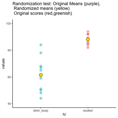
We are engaging in some visual statistical inference. By looking at the range of motion of the yellow dots, we are watching what kind of differences chance can produce. In this animation, the purple dots, representing the original difference, are generally outside of the range of chance. The yellow dots don’t move past the purple dots, as a result chance is an unlikely explanation of the difference.
If the purple dots were inside the range of the yellow dots, then when would know that chance is capable of producing the difference we observed, and that it does so fairly often. As a result, we should not conclude the manipulation caused the difference, because it could have easily occurred by chance.
Let’s return to the gum example. After we randomize our scores many times, and computed the new means, and the mean differences, we will have loads of mean differences to look at, which we can plot in a histogram. The histogram gives a picture of what could have happened. Then, we can compare what did happen with what could have happened.
Here’s the histogram of the mean differences from the randomization test. For this simulation, we randomized the results from the original experiment 1000 times. This is what could have happened. The blue line in the figure shows us where our observed difference lies on the x-axis.
library(ggplot2)
gum<-round(runif(20,70,100))
no_gum<-round(runif(20,40,90))
mean_differences<-length(10000)
for(i in 1:10000){
  all<-sample(c(gum,no_gum))
  mean_differences[i]<-mean(all[1:20])-mean(all[21:40])
}
rand_df <- data.frame(sims=1:10000,mean_differences)
ggplot(rand_df,aes(x=mean_differences))+
  geom_histogram(color="white", bins=30)+
  theme_classic()+
  geom_vline(color="blue",xintercept=(mean(gum)-mean(no_gum)))

What do you think? Could the difference represented by the blue line have been caused by chance? My answer is probably not. The histogram shows us the window of chance. The blue line is not inside the window. This means we can be pretty confident that the difference we observed was not due to chance.
We are looking at another window of chance. We are seeing a histogram of the kinds of mean differences that could have occurred in our experiment, if we had assigned our subjects to the gum and no gum groups differently. As you can see, the mean differences range from negative to positive. The most frequent difference is 0. Also, the distribution appears to be symmetrical about zero, which shows we had roughly same the chances of getting a positive or negative difference. Also, notice that as the differences get larger (in the positive or negative direction, they become less frequent). The blue line shows us the observed difference, this is the one we found in our fake experiment. Where is it? It’s way out to the right. It is is well outside the histogram. In other words, when we look at what could have happened, we see that what did happen doesn’t occur very often.
IMPORTANT: In this case, when we speak of what could have happened. We are talking about what could have happened by chance. When we compare what did happen to what chance could have done, we can get a better idea of whether our result was caused by chance.
OK, let’s pretend we got a much smaller mean difference when we first ran the experiment. We can draw new lines (blue and red) to represent a smaller mean we might have found.
library(ggplot2)
gum<-round(runif(20,70,100))
no_gum<-round(runif(20,40,90))
mean_differences<-length(10000)
for(i in 1:10000){
  all<-sample(c(gum,no_gum))
  mean_differences[i]<-mean(all[1:20])-mean(all[21:40])
}
rand_df <- data.frame(sims=1:10000,mean_differences)
ggplot(rand_df,aes(x=mean_differences))+
  geom_histogram(color="white",bins=30)+
  theme_classic()+
  geom_vline(color="blue",xintercept=10)+
  geom_vline(color="red",xintercept=5)

Look at the blue line. If you found a mean difference of 10, would you be convinced that your difference was not caused by chance? As you can see, the blue line is inside the chance window. Notably, differences of +10 don’t very often. You might infer that your difference was not likely to be due to chance (but you might be a little bit skeptical, because it could have been). How about the red line? The red line represents a difference of +5. If you found a difference of +5 here, would you be confident that your difference was not caused by chance? I wouldn’t be. The red line is totally inside the chance window, this kind of difference happens fairly often. I’d need some more evidence to consider the claim the some independent variable actually caused the difference. I’d be much more comfortable assuming that sampling error probably caused the difference.
Take homes so far
Have you noticed that we haven’t used any formulas yet, but we have been able to accomplish inferential statistics. We will see some formulas as we progress, but these aren’t as the idea behind the formulas.
Inferential statistics is an attempt to solve the problem: where did my data from?. In the randomization test example, our question was: where did the differences between the means in my data come from?. We know that the differences could be produced by chance alone. We simulated what chance can due using randomization. Then we plotted what chance can do using a histogram. Then, we used to picture to help us make an inference. Did our observed difference come from the distribution, or not? When the observed difference is clearly inside the chance distribution, then we can infer that our difference could have been produced by chance. When the observed difference is not clearly inside the chance distribution, then we can infer that our difference was probably not produced by chance.
In my opinion, these pictures are very, very helpful. If one of our goals is to help ourselves summarize a bunch of complicated numbers to arrive at an inference, then the pictures do a great job. We don’t even need a summary number, we just need to look at the picture and see if the observed difference is inside or outside of the window. This is what it is all about. Creating intuitive and meaningful ways to make inferences from our data. As we move forward, the main thing that we will do is formalize our process, and talk more about “standard” inferential statistics. For example, rather than looking at a picture (which is a good thing to do), we will create some helpful numbers. For example, what if you wanted to the probability that your difference could have been produced by chance? That could be a single number, like 95%. If there was a 95% probability that chance can produce the difference you observed, you might not be very confident that something like your experimental manipulation was causing the difference. If there was only 1% probability that chance could produce your difference, then you might be more confident that chance did not produce the difference; and, you might instead be comfortable with the possibility that your experimental manipulation actually caused the difference. So, how can we arrive at those numbers? In order to get there we will introduce you to some more foundational tools for statistical inference.