
5.5: The Crump Test
- Page ID
- 7916

We are going to be doing a lot of inference throughout the rest of this course. Pretty much all of it will come down to one question. Did chance produce the differences in my data? We will be talking about experiments mostly, and in experiments we want to know if our manipulation caused a difference in our measurement. But, we measure things that have natural variability, so every time we measure things we will always find a difference. We want to know if the difference we found (between our experimental conditions) could have been produced by chance. If chance is a very unlikely explanation of our observed difference, we will make the inference that chance did not produce the difference, and that something about our experimental manipulation did produce the difference. This is it (for this textbook).
Statistics is not only about determining whether chance could have produced a pattern in the observed data. The same tools we are talking about here can be generalized to ask whether any kind of distribution could have produced the differences. This allows comparisons between different models of the data, to see which one was the most likely, rather than just rejecting the unlikely ones (e.g., chance). But, we’ll leave those advanced topics for another textbook.
This chapter is about building intuitions for making these kinds of inferences about the role of chance in your data. It’s not clear to me what are the best things to say, to build up your intuitions for how to do statistical inference. So, this chapter tries different things, some of them standard, and some of them made up. What you are about to read, is a made up way of doing statistical inference, without using the jargon that we normally use to talk about it. The goal is to do things without formulas, and without probabilities, and just work with some ideas using simulations to see what happens. We will look at what chance can do, then we will talk about what needs to happen in your data in order for you to be confident that chance didn’t do it.
Intuitive methods
Warning, this is an unofficial statistical test made up by Matt Crump. It makes sense to him (me), and if it turns out someone else already made this up, then Crump didn’t do his homework, and we will change the name of this test to it’s original author. The point of this test is to show how simple operations that you already understand can be used to create a tool for inference. This test is not complicated, it uses
- Sampling numbers randomly from a distribution
- Adding, subtracting
- Division, to find the mean
- Counting
- Graphing and drawing lines
- NO FORMULAS
Part 1: Frequency based intuition about occurence
Question: How many times does something need to happen, for it to happen a lot? Or, how many times does something need to happen for it to happen not very much, or even really not at all? Small enough for you to not worry about it at all happening to you?
Would you go outside everyday if you thought that you would get hit by lightning 1 out of 10 times? I wouldn’t. You’d probably be hit by lightning more than once per month, you’d be dead pretty quickly. 1 out of 10 is a lot (to me, maybe not to you, there’s no right answer here).
Would you go outside everyday if you thought that you would get hit by lightning 1 out of every 100 days? Jeez, that’s a tough one. What would I even do? If I went out everyday, I’d probably be dead in a year! Maybe I would go out 2 or 3 times per year, I’m risky like that, but I’d probably live longer. It would massively suck.
Would you go outside everyday if you thought you would get hit by lightning 1 out of every 1000 days? Well, you’d probably be dead in 3-6 years if you did that. Are you a gambler? Maybe go out once per month, still sucks.
Would you go outside everyday if you thought lightning would get you 1 out every 10,000 days? 10,000 is a bigger number, harder to think about. It’s about once every 27 years. Ya, I’d probably go out 150 days per year, and live a bit longer if I can.
Would you go outside everyday if you thought lightning would get you 1 out every 100,000 days? 100,000 is a bigger number, harder to think about. How many years is that? It’s about 273 years. With those odds, I’d probably go out all the time and forget about being hit by lightning. It doesn’t happen very often, and if it does, c’est la vie.
The point of considering these questions is to get a sense for yourself of what happens a lot, and what doesn’t happen a lot, and how you would make important decisions based on what happens a lot and what doesn’t.
Part 2: Simulating chance
This next part could happen a bunch of ways, I’ll make loads of assumptions that I won’t defend, and I won’t claim the Crump test has problems. I will claim it helps us make an inference about whether chance could have produced some differences in data. We’ve already been introduced to simulating things, so we’ll do that again. Here is what we will do. I am a cognitive psychologist who happens to be measuring X. Because of prior research in the field, I know that when I measure X, my samples will tend to have a particular mean and standard deviation. Let’s say the mean is usually 100, and the standard deviation is usually 15. In this case, I don’t care about using these numbers as estimates of the population parameters, I’m just thinking about what my samples usually look like. What I want to know is how they behave when I sample them. I want to see what kind of samples happen a lot, and what kind of samples don’t happen a lot. Now, I also live in the real world, and in the real world when I run experiments to see what changes X, I usually only have access to some number of participants, who I am very grateful too, because they participate in my experiments. Let’s say I usually can run 20 subjects in each condition in my experiments. Let’s keep the experiment simple, with two conditions, so I will need 40 total subjects.
I would like to learn something to help me with inference. One thing I would like to learn is what the sampling distribution of the sample mean looks like. This distribution tells me what kinds of mean values happen a lot, and what kinds don’t happen very often. But, I’m actually going to skip that bit. Because what I’m really interested in is what the sampling distribution of the difference between my sample means looks like. After all, I am going to run an experiment with 20 people in one condition, and 20 people in the other. Then I am going to calculate the mean for group A, and the mean for group B, and I’m going to look a the difference. I will probably find a difference, but my question is, did my manipulation cause this difference, or is this the kind of thing that happens a lot by chance. If I knew what chance can do, and how often it produces differences of particular sizes, I could look at the difference I observed, then look at what chance can do, and then I can make a decision! If my difference doesn’t happen a lot (we’ll get to how much not a lot is in a bit), then I might be willing to believe that my manipulation caused a difference. If my difference happens all the time by chance alone, then I wouldn’t be inclined to think my manipulation caused the difference, because it could have been chance.
So, here’s what we’ll do, even before running the experiment. We’ll do a simulation. We will sample numbers for group A and Group B, then compute the means for group A and group B, then we will find the difference in the means between group A and group B. But, we will do one very important thing. We will pretend that we haven’t actually done a manipulation. If we do this (do nothing, no manipulation that could cause a difference), then we know that only sampling error could cause any differences between the mean of group A and group B. We’ve eliminated all other causes, only chance is left. By doing this, we will be able to see exactly what chance can do. More importantly, we will see the kinds of differences that occur a lot, and the kinds that don’t occur a lot.
Before we do the simulation, we need to answer one question. How much is a lot? We could pick any number for a lot. I’m going to pick 10,000. That is a lot. If something happens only 1 times out 10,000, I am willing to say that is not a lot.
OK, now we have our number, we are going to simulate the possible mean differences between group A and group B that could arise by chance. We do this 10,000 times. This gives chance a lot of opportunity to show us what it does do, and what it does not do.
This is what I did: I sampled 20 numbers into group A, and 20 into group B. The numbers both came from the same normal distribution, with mean = 100, and standard deviation = 15. Because the samples are coming from the same distribution, we expect that on average they will be similar (but we already know that samples differ from one another). Then, I compute the mean for each sample, and compute the difference between the means. I save the mean difference score, and end up with 10,000 of them. Then I draw a histogram. It looks like this:
library(ggplot2)
difference<-length(10000)
for(i in 1:10000){
  difference[i]<-mean(rnorm(20,100,15)-rnorm(20,100,15))
}
plot_df<-data.frame(sim=1:10000,difference)
ggplot(plot_df,aes(x=difference))+
  geom_histogram(bins=100, color="white")+
  theme_classic()+
  ggtitle("Histogram of mean differences between two samples (n=10) \n
          both drawn from the same normal distribution (u=100, sd=20")+
  xlab("mean difference")

Sidenote: Of course, we might recognize that chance could do a difference greater than 15. We just didn’t give it the opportunity. We only ran the simulation 10,000 times. If we ran it on million times, maybe a difference greater than 20 would happen a couple times. If we ran it a bazillion gazillion times, maybe a difference greater than 30 would happen a couple times. If we go out to infinity, then chance might produce all sorts of bigger differences once in a while. But, we’ve already decided that 1/10,000 is not a lot. So things that happen 0/10,000 times, like differences greater than 15, just don’t happen very much.
Now we can see what chance can do to the size of our mean difference. The x-axis shows the size of the mean difference. We took our samples from the sample distribution, so the difference between them should usually be 0, and that’s what we see in the histogram.
Pause for a second. Why should the mean differences usually be zero, wasn’t the population mean = 100, shouldn’t they be around 100? No. The mean of group A will tend to be around 100, and the mean of group B will tend be around 100. So, the difference score will tend to be 100-100 = 0. That is why we expect a mean difference of zero when the samples are drawn from the same population.
So, differences near zero happen the most, that’s good, that’s what we expect. Bigger or smaller differences happen increasingly less often. Differences greater than 15 or -15 never happen at all. For our purposes, it looks like chance only produces differences between -15 to 15.
OK, let’s ask a couple simple questions. What was the biggest negative number that occurred in the simulation? We’ll use R for this. All of the 10,000 difference scores are stored in a variable I made called difference. If we want to find the minimum value, we use the min function. Here’s the result.
OK, so what was the biggest positive number that occurred? Let’s use the max function to find out. It finds the biggest (maximum) value in the variable. FYI, we’ve just computed the range, the minimum and maximum numbers in the data. Remember we learned that before. Anyway, here’s the max.
Both of these extreme values only occurred once. Those values were so rare we couldn’t even see them on the histogram, the bar was so small. Also, these biggest negative and positive numbers are pretty much the same size if you ignore their sign, which makes sense because the distribution looks roughly symmetrical.
So, what can we say about these two numbers for the min and max? We can say the min happens 1 times out of 10,000. We can say the max happens 1 times out of 10,000. Is that a lot of times? Not to me. It’s not a lot.
So, how often does a difference of 30 (much larger larger than the max) occur out of 10,000. We really can’t say, 30s didn’t occur in the simulation. Going with what we got, we say 0 out of 10,000. That’s never.
We’re about to move into part three, which involves drawing decision lines and talking about them. The really important part about part 3 is this. What would you say if you ran this experiment once, and found a mean difference of 30? I would say it happens 0 times of out 10,000 by chance. I would say chance did not produce my difference of 30. That’s what I would say. We’re going to expand upon this right now.
Part 3: Judgment and Decision-making
Remember, we haven’t even conducted an experiment. We’re just simulating what could happen if we did conduct an experiment. We made a histogram. We can see that chance produces some differences more than others, and that chance never produced really big differences. What should we do with this information?
What we are going to do is talk about judgment and decision making. What kind of judgment and decision making? Well, when you finally do run an experiment, you will get two means for group A and B, and then you will need to make some judgments, and perhaps even a decision, if you are so inclined. You will need to judge whether chance (sampling error) could have produced the difference you observed. If you judge that it did it not, you might make the decision to tell people that your experimental manipulation actually works. If you judge that it could have been chance, you might make a different decision. These are important decisions for researchers. Their careers can depend on them. Also, their decisions matter for the public. Nobody wants to hear fake news from the media about scientific findings.
So, what we are doing is preparing to make those judgments. We are going to draw up a plan, before we even see the data, for how we will make judgments and decisions about what we find. This kind of planning is extremely important, because we discuss in part 4, that your planning can help you design an even better experiment than the one you might have been intending to run. This kind of planning can also be used to interpret other people’s results, as a way of double-checking checking whether you believe those results are plausible.
The thing about judgement and decision making is that reasonable people disagree about how to do it, unreasonable people really disagree about it, and statisticians and researchers disagree about how to do it. I will propose some things that people will disagree with. That’s OK, these things still make sense. And, the disagreeable things point to important problems that are very real for any “real” statistical inference test.
Let’s talk about some objective facts from our simulation of 10,000 things that we definitely know to be true. For example, we can draw some lines on the graph, and label some different regions. We’ll talk about two kinds of regions.
- Region of chance. Chance did it. Chance could have done it
- Region of not chance. Chance didn’t do it. Chance couldn’t have done it.
The regions are defined by the minimum value and the maximum value. Chance never produced a smaller or bigger number. The region inside the range is what chance did do, and the the region outside the range on both sides is what chance never did. It looks like this:
library(ggplot2)
difference<-length(10000)
for(i in 1:10000){
  difference[i]<-mean(rnorm(20,100,15)-rnorm(20,100,15))
}
plot_df<-data.frame(sim=1:10000,difference)
ggplot(plot_df,aes(x=difference))+
  annotate("rect", xmin=min(difference), xmax=max(difference), ymin=0,
           ymax=Inf, alpha=0.5, fill="red") +
  geom_rect(aes(xmin=-Inf, xmax=min(difference), ymin=0, ymax=Inf), alpha=.5,
            fill="lightgreen")+
  geom_rect(aes(xmin=max(difference), xmax=Inf, ymin=0, ymax=Inf), alpha=.5,
            fill="lightgreen")+
  geom_histogram(bins=50, color="white")+
  theme_classic()+
  geom_vline(xintercept = min(difference))+
  geom_vline(xintercept = max(difference))+
  ggtitle("Histogram of mean differences between two samples (n=10) \n
          both drawn from the same normal distribution (u=100, sd=20)")+
  xlim(-30,30)+
  geom_label(data = data.frame(x = 0, y = 250, label = "CHANCE"),
             aes(x = x, y = y, label = label))+
  geom_label(data = data.frame(x = -25, y = 250, label = "NOT \n CHANCE"),
             aes(x = x, y = y, label = label))+
  geom_label(data = data.frame(x = 25, y = 250, label = "NOT \n CHANCE"),
             aes(x = x, y = y, label = label))+
  geom_label(data = data.frame(x = min(difference), y = 750,
                               label = paste0("min \n",round(min(difference)))),
                               aes(x = x, y = y, label = label))+
   geom_label(data = data.frame(x = max(difference), y = 750,
                               label = paste0("max \n",round(max(difference)))),
                               aes(x = x, y = y, label = label))+
  xlab("mean difference")

We have just drawn some lines, and shaded some regions, and made one plan we could use to make decisions. How would the decisions work. Let’s say you ran the experiment and found a mean difference between groups A and B of 25. Where is 25 in the figure? It’s in the green part. What does the green part say? NOT CHANCE. What does this mean. It means chance never made a difference of 25. It did that 0 out of 10,000 times. If we found a difference of 25, perhaps we could confidently conclude that chance did not cause the difference. If I found a difference of 25 with this kind of data, I’d be pretty confident that my experimental manipulation caused the difference, because obviously chance never does.
What about a difference of +10? That’s in the red part, where chance lives. Chance could have done a difference of +10 because we can see that it did do that. The red part is the window of what chance did in our simulation. Anything inside the window could have been a difference caused by chance. If I found a difference of +10, I’d say, coulda been chance. I would not be very confident that my experimental manipulation caused the difference.
Statistical inference could be this easy. The number you get from your experiment could be in the chance window (then you can’t rule out chance as a cause), or it could be outside the chance window (then you can rule out chance). Case closed. Let’s all go home.
Grey areas
So what’s the problem? Depending on who you are, and what kinds of risks you’re willing to take, there might not be a problem. But, if you are just even a little bit risky then there is a problem that makes clear judgments about the role of chance difficult. We would like to say chance did or did not cause our difference. But, we’re really always in the position of admitting that it could have sometimes, or wouldn’t have most times. These are wishy washy statements, they are in between yes or no. That’s OK. Grey is a color too, let’s give grey some respect.
“What grey areas are you talking about?, I only see red or green, am I grey blind?”. Let’s look at where some grey areas might be. I say might be, because people disagree about where the grey is. People have different comfort levels with grey. Here’s my opinion on some clear grey areas.
library(ggplot2)
difference<-length(10000)
for(i in 1:10000){
  difference[i]<-mean(rnorm(20,100,15)-rnorm(20,100,15))
}
plot_df<-data.frame(sim=1:10000,difference)
ggplot(plot_df,aes(x=difference))+
  annotate("rect", xmin=min(difference), xmax=max(difference), ymin=0,
           ymax=Inf, alpha=0.5, fill="red") +
  annotate("rect", xmin=min(difference), xmax=min(difference)+10, ymin=0,
           ymax=Inf, alpha=0.7, fill="light grey") +
  annotate("rect", xmin=max(difference)-10, xmax=max(difference), ymin=0,
           ymax=Inf, alpha=0.7, fill="light grey") +
  geom_rect(aes(xmin=-Inf, xmax=min(difference), ymin=0, ymax=Inf), alpha=.5,
            fill="lightgreen")+
  geom_rect(aes(xmin=max(difference), xmax=Inf, ymin=0, ymax=Inf), alpha=.5,
            fill="lightgreen")+
  geom_histogram(bins=50, color="white")+
  theme_classic()+
  geom_vline(xintercept = min(difference))+
  geom_vline(xintercept = max(difference))+
   geom_vline(xintercept = min(difference)+10)+
  geom_vline(xintercept = max(difference)-10)+
  ggtitle("Histogram of mean differences between two samples (n=10) \n
          both drawn from the same normal distribution (u=100, sd=20)")+
  xlim(-30,30)+
  geom_label(data = data.frame(x = 0, y = 250, label = "CHANCE"),
             aes(x = x, y = y, label = label))+
  geom_label(data = data.frame(x = -25, y = 250, label = "NOT \n CHANCE"),
             aes(x = x, y = y, label = label))+
  geom_label(data = data.frame(x = 25, y = 250, label = "NOT \n CHANCE"),
             aes(x = x, y = y, label = label))+
  geom_label(data = data.frame(x = min(difference), y = 750,
                               label = paste0("min \n",round(min(difference)))),
                               aes(x = x, y = y, label = label))+
   geom_label(data = data.frame(x = max(difference), y = 750,
                               label = paste0("max \n",round(max(difference)))),
                               aes(x = x, y = y, label = label))+
  geom_label(data = data.frame(x = -15, y = 250,
                               label = "?"),
                               aes(x = x, y = y, label = label))+
   geom_label(data = data.frame(x = 15, y = 250,
                               label = "?"),
                               aes(x = x, y = y, label = label))+
  xlab("mean difference")

I made two grey areas, and they are reddish grey, because we are still in the chance window. There are question marks (?) in the grey areas. Why? The question marks reflect some uncertainty that we have about those particular differences. For example, if you found a difference that was in a grey area, say a 15. 15 is less than the maximum, which means chance did create differences of around 15. But, differences of 15 don’t happen very often.
What can you conclude or say about this 15 you found? Can you say without a doubt that chance did not produce the difference? Of course not, you know that chance could have. Still, it’s one of those things that doesn’t happen a lot. That makes chance an unlikely explanation. Instead of thinking that chance did it, you might be willing to take a risk and say that your experimental manipulation caused the difference. You’d be making a bet that it wasn’t chance…but, could be a safe bet, since you know the odds are in your favor.
You might be thinking that your grey areas aren’t the same as the ones I’ve drawn. Maybe you want to be more conservative, and make them smaller. Or, maybe you’re more risky, and would make them bigger. Or, maybe you’d add some grey area going in a little bit to the green area (after all, chance could probably produce some bigger differences sometimes, and to avoid those you would have to make the grey area go a bit into the green area).
Another thing to think about is your decision policy. What will you do, when your observed difference is in your grey area? Will you always make the same decision about the role of chance? Or, will you sometimes flip-flop depending on how you feel. Perhaps, you think that there shouldn’t be a strict policy, and that you should accept some level of uncertainty. The difference you found could be a real one, or it might not. There’s uncertainty, hard to avoid that.
So let’s illustrate one more kind of strategy for making decisions. We just talked about one that had some lines, and some regions. This makes it seem like we can either rule out, or not rule out the role of chance. Another way of looking at things is that everything is a different shade of grey. It looks like this:
library(ggplot2)
difference<-length(10000)
for(i in 1:10000){
  difference[i]<-mean(rnorm(20,100,15)-rnorm(20,100,15))
}
plot_df<-data.frame(sim=1:10000,difference)
ggplot(plot_df,aes(x=difference))+
 # annotate("rect", xmin=min(difference), xmax=max(difference),
 # ymin=0, ymax=Inf, alpha=0.5, fill="red") +
  annotate("rect", xmin=min(difference), xmax=min(difference)+10, ymin=0,
           ymax=Inf, alpha=0.7, fill="light grey") +
  annotate("rect", xmin=max(difference)-10, xmax=max(difference), ymin=0,
           ymax=Inf, alpha=0.7, fill="light grey") +
  geom_rect(aes(xmin=-Inf, xmax=min(difference), ymin=0, ymax=Inf), alpha=.5,
            fill="lightgreen")+
  geom_rect(aes(xmin=max(difference), xmax=Inf, ymin=0, ymax=Inf), alpha=.5,
            fill="lightgreen")+
  geom_histogram(bins=50, color="white", aes(fill=..count..))+
  theme_classic()+
  geom_vline(xintercept = min(difference))+
  geom_vline(xintercept = max(difference))+
   geom_vline(xintercept = min(difference)+10)+
  geom_vline(xintercept = max(difference)-10)+
  ggtitle("Histogram of mean differences between two samples (n=10) \n
          both drawn from the same normal distribution (u=100, sd=20)")+
  xlim(-30,30)+
  geom_label(data = data.frame(x = 0, y = 250, label = "CHANCE"),
             aes(x = x, y = y, label = label))+
  geom_label(data = data.frame(x = -25, y = 250, label = "NOT \n CHANCE"),
             aes(x = x, y = y, label = label))+
  geom_label(data = data.frame(x = 25, y = 250, label = "NOT \n CHANCE"),
             aes(x = x, y = y, label = label))+
  geom_label(data = data.frame(x = min(difference), y = 750,
                               label = paste0("min \n",round(min(difference)))),
                               aes(x = x, y = y, label = label))+
   geom_label(data = data.frame(x = max(difference), y = 750,
                               label = paste0("max \n",round(max(difference)))),
                               aes(x = x, y = y, label = label))+
  geom_label(data = data.frame(x = -15, y = 250,
                               label = "?"),
                               aes(x = x, y = y, label = label))+
   geom_label(data = data.frame(x = 15, y = 250,
                               label = "?"),
                               aes(x = x, y = y, label = label))+
  xlab("mean difference")

OK, so I made it shades of blue (because it was easier in R). Now we can see two decision plans at the same time. Notice that as the bars get shorter, they also get become a darker stronger blue. The color can be used as a guide for your confidence. That is, your confidence in the belief that your manipulation caused the difference rather than chance. If you found a difference near a really dark bar, those don’t happen often by chance, so you might be really confident that chance didn’t do it. If you find a difference near a slightly lighter blue bar, you might be slightly less confident. That is all. You run your experiment, you get your data, then you have some amount of confidence that it wasn’t produced by chance. This way of thinking is elaborated to very interesting degrees in the Bayesian world of statistics. We don’t wade too much into that, but mention it a little bit here and there. It’s worth knowing it’s out there.
Making Bad Decisions
No matter how you plan to make decisions about your data, you will always be prone to making some mistakes. You might call one finding real, when in fact it was caused by chance. This is called a type I error, or a false positive. You might ignore one finding, calling it chance, when in fact it wasn’t chance (even though it was in the window). This is called a ** type II**, or a false negative.
How you make decisions can influence how often you make errors over time. If you are a researcher, you will run lots of experiments, and you will make some amount of mistakes over time. If you do something like the very strict method of only accepting results as real when they are in the “no chance” zone, then you won’t make many type I errors. Pretty much all of your result will be real. But, you’ll also make type II errors, because you will miss things real things that your decision criteria says are due to chance. The opposite also holds. If you are willing to be more liberal, and accept results in the grey as real, then you will make more type I errors, but you won’t make as many type II errors. Under the decision strategy of using these cutoff regions for decision-making there is a necessary trade-off. The Bayesian view get’s around this a little bit. Bayesians talk about updating their beliefs and confidence over time. In that view, all you ever have is some level of confidence about whether something is real, and by running more experiments you can increase or decrease your level of confidence. This, in some fashion, avoids some trade-off between type I and type II errors.
Regardless, there is another way to avoid type I and type II errors, and to increase your confidence in your results, even before you do the experiment. It’s called “knowing how to design a good experiment”.
Part 4: Experiment Design
We’ve seen what chance can do. Now we run an experiment. We manipulate something between groups A and B, get the data, calculate the group means, then look at the difference. Then we cross all of our finger and toes, and hope beyond hope that the difference is big enough to not be caused by chance. That’s a lot of hope.
Here’s the thing, we don’t often know how strong our manipulation is in the first place. So, even if it can cause a change, we don’t necessarily know how much change it can cause. That’s why we’re running the experiment. Many manipulations in Psychology are not strong enough to cause big changes. This is a problem for detecting these smallish causal forces. In our fake example, you could easily manipulate something that has a tiny influence, and will never push the mean difference past say 5 or 10. In our simulation, we need something more like a 15 or 17 or a 21, or hey, a 30 would be great, chance never does that. Let’s say your manipulation is listening to music or not listening to music. Music listening might change something about X, but if it only changes X by +5, you’ll never be able to confidently say it wasn’t chance. And, it’s not that easy to completely change music and make music super strong in the music condition so it really causes a change in X compared to the no music condition.
EXPERIMENT DESIGN TO THE RESCUE! Newsflash, it is often possible to change how you run your experiment so that it is more sensitive to smaller effects. How do you think we can do this? Here is a hint. It’s the stuff you learned about the sampling distribution of the sample mean, and the role of sample-size. What happens to the sampling distribution of the sample mean when N (sample size)? The distribution gets narrower and narrower, and starts to look the a single number (the hypothetical mean of the hypothetical population). That’s great. If you switch to thinking about mean difference scores, like the distribution we created in this test, what do you think will happen to that distribution as we increase N? It will will also shrink. As we increase N to infinity, it will shrink to 0. Which means that, when N is infinity, chance never produces any differences at all. We can use this.
For example, we could run our experiment with 20 subjects in each group. Or, we could decide to invest more time and run 40 subjects in each group, or 80, or 150. When you are the experimenter, you get to decide the design. These decisions matter big time. Basically, the more subjects you have, the more sensitive your experiment. With bigger N, you will be able to reliably detect smaller mean differences, and be able to confidently conclude that chance did not produce those small effects.
Check out this next set of histograms. All we are doing is the very same simulation as before, but this time we do it for different sample-sizes: 20, 40, 80, 160. We are doubling our sample-size across each simulation just to see what happens to the width of the chance window.
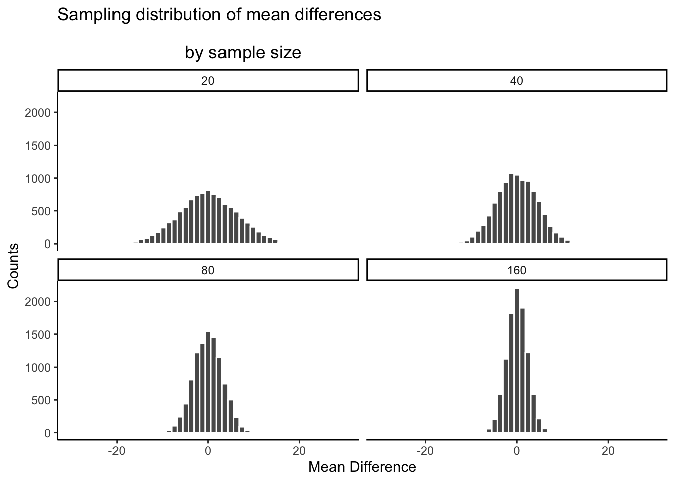
There you have it. The sampling distribution of the mean differences shrinks toward 0 as sample-size increases. This means if you run an experiment with a larger sample-size, you will be able to detect smaller mean differences, and be confident they aren’t due to chance. Let’s look at a table of the minimum and maximum values that chance produced across these four sample-sizes:
| sample_size | smallest | biggest |
|---|---|---|
| 20 | -25.858660 | 26.266110 |
| 40 | -17.098721 | 16.177815 |
| 80 | -12.000585 | 11.919035 |
| 160 | -9.251625 | 8.357951 |
The table is telling… The range of chance’s behavior is very wide for sample-size = 20, but about half as wide for sample-size = 160.
If it turns out your manipulation will cause a difference of +11, then what should you do? Run an experiment with 20 people? I hope not. If you did that, you could get +11s fairly often by chance. If you ran the experiment with 160 people, then you would definitely be able to say that +11 was not due to chance, it would be outside the range of what chance can do. You could even consider running the experiment with 80 subjects. A +11 there wouldn’t happen often by chance, and you’d be cost-effective, spending less time on the experiment.
The point is: the design of the experiment determines the sizes of the effects it can detect. If you want to detect a small effect. Make your sample size bigger. It’s really important to say this is not the only thing you can do. You can also make your cell-sizes bigger. For example, often times we take several measurements from a single subject. The more measurements you take (cell-size), the more stable your estimate of the subject’s mean. We discuss these issues more later. You can also make a stronger manipulation, when possible.
Part 5: I have the power
By the power of greyskull, I HAVE THE POWER - He-man
The last thing we’ll talk about here is something called power. In fact, we are going to talk about the concept of power, not actual power. It’s confusing now, but later we will define power in terms of some particular ideas about statistical inference. Here, we will just talk about the idea. And, we’ll show how to make sure your design has 100% power. Because, why not. Why run a design that doesn’t have the power?
The big idea behind power is the concept of sensitivity. The concept of sensitivity assumes that there is something to be sensitive to. That is, there is some real difference that can be measured. So, the question is, how sensitive is your experiment? We’ve already seen that the number of subjects (sample-size), changes the sensitivity of the design. More subjects = more sensitivity to smaller effects.
Let’s take a look at one more plot. What we will do is simulate a measure of sensitivity across a whole bunch of sample sizes, from 10 to 300. We’ll do this in steps of 10. For each simulation, we’ll compute the mean differences as we have done. But, rather than showing the histogram, we’ll just compute the smallest value and the largest value. This is a pretty good measure of the outer reach of chance. Then we’ll plot those values as a function of sample size and see what we’ve got.

What we have here is a reasonably precise window of sensitivity as a function of sample size. For each sample size, we can see the maximum difference that chance produced and the minimum difference. In those simulations, chance never produced bigger or smaller differences. So, each design is sensitive to any difference that is underneath the bottom line, or above the top line. It’s really that simple.
Here’s another way of putting it. Which of the sample sizes will be sensitive to a difference of +10 or -10. That is, if a difference of +10 or -10 was observed, then we could very confidently say that the difference was not due to chance, because according to these simulations, chance never produced differences that big. To help us see which ones are sensitive, let’s draw some horizontal lines at -10 and +10.
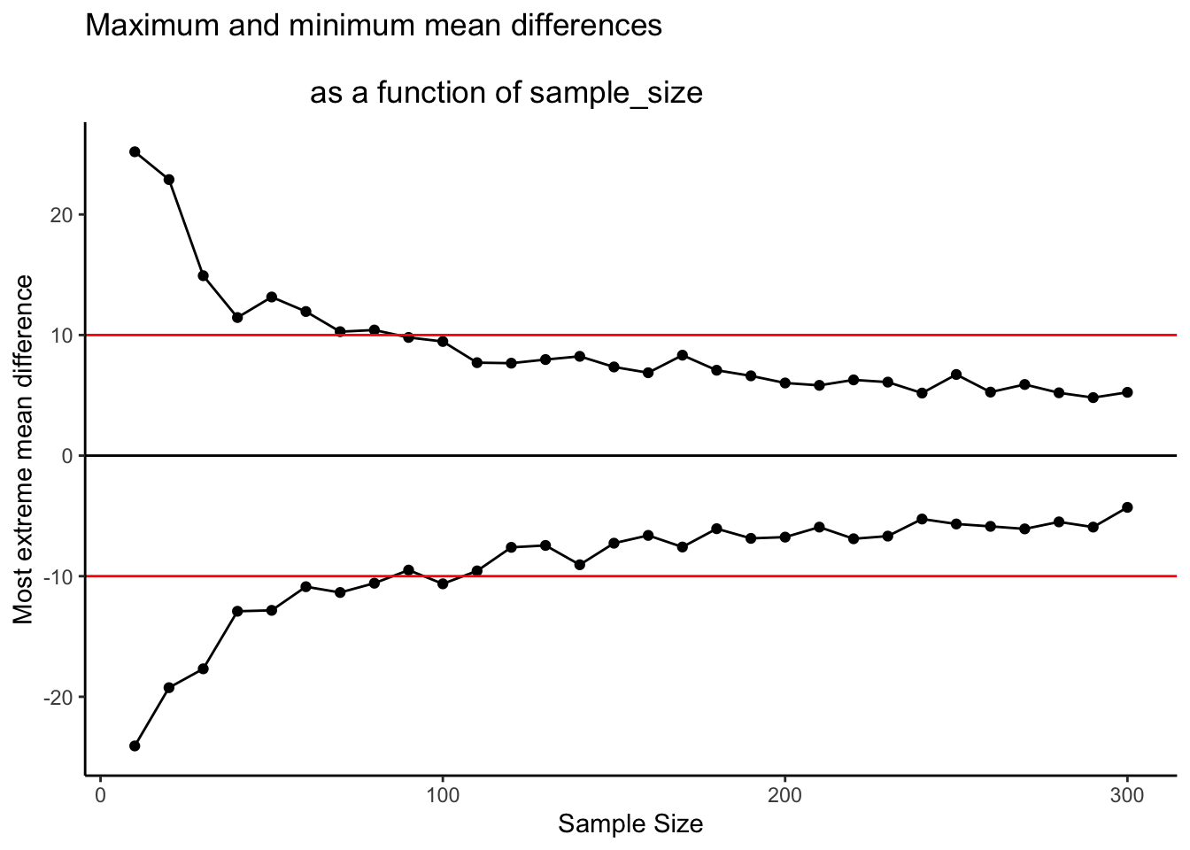
I would say all of the designs with sample size = 100 or greater are all perfectly sensitive to real differences of 10 (if they exist). We can see that all of the dots after sample size 100 are underneath the red line. So effects that are as big as the red line, or bigger will almost never occur due to chance. But, if they do occur in nature, those experiments will detect them straight away. That is sensitivity. And, designing your experiment so that you know it is sensitive to the thing you are looking for is the big idea behind power. It’s worth knowing this kind of thing before you run your experiment. Why waste your own time and run an experiment that doesn’t have a chance of detecting the thing you are looking for.
Summary of Crump Test
What did we learn from this so-called fake Crump test that nobody uses? Well, we learned the basics of what we’ll be doing moving forward. And, we did it all without any hard math or formulas. We sampled numbers, we computed means, we subtracted means, then we did that a lot and counted up the means and put them in a histogram. This showed us what chance do in an experiment. Then, we discussed how to make decisions around these facts. And, we showed how we can manipulate the role of chance just by changing things like sample size.