
9.2: The impact of simulated chronic nitrogen deposition on the biomass and N2-fixation activity of two boreal feather mosscyanobacteria associations
- Page ID
- 33310

In a 16-year experiment, Gundale, Bach, and Nordin (2013) studied the impacts of Nitrogen (N) additions on the mass of two feather moss species (Pleurozium schreberi (PS) and Hylocomium (HS)) in the Svartberget Experimental Forest in Sweden. They used a randomized block design: here this means that within each of 6 blocks (pre-specified areas that were divided into three experimental units or plots of area 0.1 hectare), one of the three treatments were randomly applied. Randomized block designs involve randomization of levels within blocks or groups as opposed to completely randomized designs where each experimental unit (the subject or plot that will be measured) could be randomly assigned to any treatment. This is done in agricultural studies to control for systematic differences across the fields by making sure each treatment level is used in each area or block of the field. In this example, it resulted in a balanced design with six replicates at each combination of Species and Treatment.

The three treatments involved different levels of N applied immediately after snow melt, Control (no additional N – just the naturally deposited amount), 12.5 kg N \(\text{ha}^{-1}\text{yr}^{-1}\) (N12.5), and 50 kg N \(\text{ha}^{-1}\text{yr}^{-1}\) (N50). The researchers were interested in whether the treatments would have differential impacts on the two species of moss growth. They measured a variety of other variables, but here we focus on the estimated biomass per hectare (mg/ha) of the species (PS or HS), both measured for each plot within each block, considering differences across the treatments (Control, N12.5, or N50). The pirate-plot in Figure 9.2 provides some initial information about the responses. Initially there seem to be some differences in the combinations of groups and some differences in variability in the different groups, especially with much more variability in the control treatment level and more variability in the PS responses than for the HS responses.
gdn <- read_csv("http://www.math.montana.edu/courses/s217/documents/gundalebachnordin_2.csv")
gdn <- gdn %>% mutate(Species = factor(Species),
                      Treatment = factor(Treatment)
                      )
library(yarrr)
pirateplot(Massperha ~ Species + Treatment, data = gdn, inf.method = "ci",
           inf.disp = "line", theme = 2, ylab = "Biomass", point.o = 1,
           pal = "southpark")
The Two-WAY ANOVA model that contains a species by treatment interaction is of interest (this has a quantitative response variable of biomass and two categorical predictors of species and treatment)165. We can make an interaction plot to focus on the observed patterns of the means across the combinations of levels as provided in Figure 9.3. The interaction plot suggests a relatively additive pattern of differences between PS and HS across the three treatment levels. However, the variability seems to be quite different based on this plot as well.

library(catstats) #Or directly using:
#source("http://www.math.montana.edu/courses/s217/documents/intplotfunctions_v3.R")
intplotarray(Massperha ~ Species * Treatment, data = gdn, col = viridis(4)[1:3],
             lwd = 2, cex.main = 1)
Based on the initial plots, we are going to be most concerned about the equal variance assumption. We can fit the interaction model and explore the diagnostic plots to verify that we have a problem.
m1 <- lm(Massperha ~ Species * Treatment, data = gdn)
summary(m1)
##
## Call:
## lm(formula = Massperha ~ Species * Treatment, data = gdn)
##
## Residuals:
##    Min     1Q Median     3Q    Max
## -992.6 -252.2  -64.6  308.0 1252.9
##
## Coefficients:
##                          Estimate Std. Error t value Pr(>|t|)
## (Intercept)               1694.80     211.86   8.000 6.27e-09
## SpeciesPS                  859.88     299.62   2.870  0.00745
## TreatmentN12.5            -588.26     299.62  -1.963  0.05893
## TreatmentN50             -1182.91     299.62  -3.948  0.00044
## SpeciesPS:TreatmentN12.5   199.42     423.72   0.471  0.64130
## SpeciesPS:TreatmentN50      88.29     423.72   0.208  0.83636
##
## Residual standard error: 519 on 30 degrees of freedom
## Multiple R-squared:  0.6661, Adjusted R-squared:  0.6104
## F-statistic: 11.97 on 5 and 30 DF,  p-value: 2.009e-06
par(mfrow = c(2,2), oma = c(0,0,2,0))
plot(m1, pch = 16, sub.caption = "")
title(main="Initial Massperha 2-WAY model", outer=TRUE)

There is a clear problem with non-constant variance showing up in a fanning shape166 in the Residuals versus Fitted and Scale-Location plots in Figure 9.4. Interestingly, the normality assumption is not an issue as the residuals track the 1-1 line in the QQ-plot quite closely so hopefully we will not worsen this result by using a transformation to try to address the non-constant variance issue. The independence assumption is violated in two ways for this model by this study design – the blocks create clusters or groups of observations and the block should be accounted for (they did this in their models by adding block as a categorical variable to their models). Using blocked designs and accounting for the blocks in the model will typically give more precise inferences for the effects of interest, the treatments randomized within the blocks. Additionally, there are two measurements on each plot within block, one for SP and one for HS and these might be related (for example, high HS biomass might be associated with high or low SP) so putting both observations into a model violates the independence assumption at a second level. It takes more advanced statistical models (called linear mixed models) to see how to fully deal with this, for now it is important to recognize the issues. The more complicated models provide similar results here and include the treatment by species interaction we are going to explore, they just add to this basic model to account for these other issues.
Remember that before using a log-transformation, you always must check that the responses are strictly greater than 0:
summary(gdn$Massperha)
##    Min. 1st Qu.  Median    Mean 3rd Qu.    Max.
##   319.1  1015.1  1521.8  1582.3  2026.6  3807.6
The minimum is 319.1 so it is safe to apply the natural log-transformation to the response variable (Biomass) and repeat the previous plots:
gdn <- gdn %>% mutate(logMassperha = log(Massperha))
par(mfrow = c(2,1))
pirateplot(logMassperha ~ Species + Treatment, data = gdn, inf.method = "ci",
           inf.disp = "line", theme = 2, ylab = "log-Biomass", point.o = 1,
           pal = "southpark", main = "(a)")
intplot(logMassperha ~ Species * Treatment, data = gdn, col = viridis(4)[1:3],
        lwd = 2, main = "(b)")

The variability in the pirate-plot in Figure 9.5(a) appears to be more consistent across the groups but the lines appear to be a little less parallel in the interaction plot Figure 9.5(b) for the log-scale response. That is not problematic but suggests that we may now have an interaction present – it is hard to tell visually sometimes. Again, fitting the interaction model and exploring the diagnostics is the best way to assess the success of the transformation applied.
The log(Mass per ha) version of the response variable has little issue with changing variability present in the residuals in Figure 9.6 with much more similar variation in the residuals across the fitted values. The normality assumption is leaning toward a slight violation with too little variability in the right tail and so maybe a little bit of a left skew. This is only a minor issue and fixes the other big issue (clear non-constant variance), so this model is at least closer to giving us trustworthy inferences than the original model. The model presents moderate evidence against the null hypothesis of no Species by Treatment interaction on the log-biomass (\(F(2,30) = 4.2\), p-value \(= 0.026\)). This suggests that the effects on the log-biomass of the treatments differ between the two species. The mean log-biomass is lower for HS than PS with the impacts of increased nitrogen causing HS mean log-biomass to decrease more rapidly than for PS. In other words, increasing nitrogen has more of an impact on the resulting log-biomass for HS than for PS. The highest mean log-biomass rates were observed under the control conditions for both species making nitrogen appear to inhibit growth of these species.
m2 <- lm(logMassperha ~ Species * Treatment, data = gdn)
summary(m2)
##
## Call:
## lm(formula = logMassperha ~ Species * Treatment, data = gdn)
##
## Residuals:
##      Min       1Q   Median       3Q      Max
## -0.51138 -0.16821 -0.02663  0.23925  0.44190
##
## Coefficients:
##                          Estimate Std. Error t value Pr(>|t|)
## (Intercept)                7.4108     0.1160  63.902  < 2e-16
## SpeciesPS                  0.3921     0.1640   2.391  0.02329
## TreatmentN12.5            -0.4228     0.1640  -2.578  0.01510
## TreatmentN50              -1.1999     0.1640  -7.316 3.79e-08
## SpeciesPS:TreatmentN12.5   0.2413     0.2319   1.040  0.30645
## SpeciesPS:TreatmentN50     0.6616     0.2319   2.853  0.00778
##
## Residual standard error: 0.2841 on 30 degrees of freedom
## Multiple R-squared:  0.7998, Adjusted R-squared:  0.7664
## F-statistic: 23.96 on 5 and 30 DF,  p-value: 1.204e-09
library(car)
Anova(m2)
## Anova Table (Type II tests)
##
## Response: logMassperha
##                   Sum Sq Df F value    Pr(>F)
## Species           4.3233  1  53.577 3.755e-08
## Treatment         4.6725  2  28.952 9.923e-08
## Species:Treatment 0.6727  2   4.168   0.02528
## Residuals         2.4208 30
par(mfrow = c(2,2), oma = c(0,0,2,0))
plot(m2, pch = 16, sub.caption = "")
title(main="log-Massperha 2-WAY model", outer=TRUE)

The researchers actually applied a \(\log(y+1)\) transformation to all the variables. This was used because one of their many variables had a value of 0 and so they added 1 to avoid analyzing a \(-\infty\) response. This was not needed for most of their variables because most did not attain the value of 0. Adding a small value to observations and then log-transforming is a common but completely arbitrary practice and the choice of the added value can impact the results. Sometimes considering a square-root transformation can accomplish similar benefits as the log-transform and be applied safely to responses that include 0s. Or more complicated statistical models can be used that allow 0s in responses and still account for the violations of the linear model assumptions – see a statistician or continue exploring more advanced statistical methods for ideas in this direction.
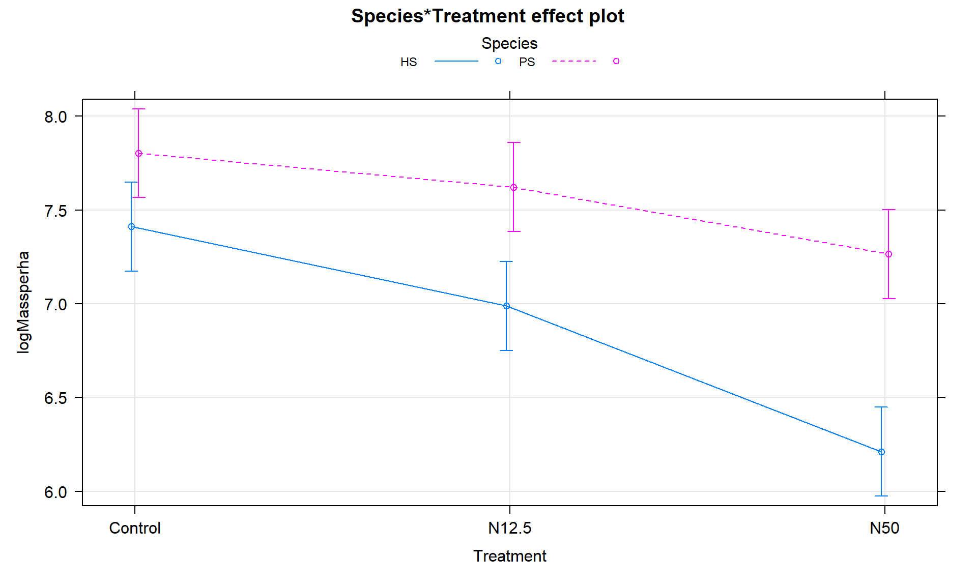
The term-plot in Figure 9.7 provides another display of the results with some information on the results for each combination of the species and treatments. Retaining the interaction because of moderate evidence in the interaction test suggests that the treatments caused different results for the different species. And it appears that there are some clear differences among certain combinations such as the mean for PS-Control is clearly larger than for HS-N50. The researchers were probably really interested in whether the N12.5 results differed from Control for HS and whether the species differed at Control sites. As part of performing all pair-wise comparisons, we can assess those sorts of detailed questions. This sort of follow-up could be considered in any Two-Way ANOVA model but will be most interesting in situations where there are important interactions.
library(effects)
plot(allEffects(m2), multiline = T, lty = c(1,2), ci.style = "bars", grid = T)
Follow-up Pairwise Comparisons:
Given at least moderate evidence against the null hypothesis of no interaction, many researchers would like more details about the source of the differences. We can re-fit the model with a unique mean for each combination of the two predictor variables, fitting a One-Way ANOVA model (here with six levels) and using Tukey’s HSD to provide safe inferences for differences among pairs of the true means. There are six groups corresponding to all combinations of Species (HS, PS) and treatment levels (Control, N12.5, and N50) provided in the new variable SpTrt by the interaction function with new levels of HS.Control, PS.Control, HS.N12.5, PS.N12.5, HS.N50, and PS.N50. The One-Way ANOVA \(F\)-test (\(F(5,30) = 23.96\), p-value \(< 0.0001\)) suggests that there is strong evidence against the null hypothesis of no difference in the true mean log-biomass among the six treatment/species combinations and so we would conclude that at least one differs from the others. Note that the One-Way ANOVA table contains the test for at least one of those means being different from the others; the interaction test above was testing a more refined hypothesis – does the effect of treatment differ between the two species? As in any situation with a small p-value from the overall One-Way ANOVA test, the pair-wise comparisons should be of interest.
# Create new variable:
gdn <- gdn %>% mutate(SpTrt = interaction(Species, Treatment))
levels(gdn$SpTrt)
## [1] "HS.Control" "PS.Control" "HS.N12.5"   "PS.N12.5"   "HS.N50"
## [6] "PS.N50"
newm2 <- lm(logMassperha ~ SpTrt, data = gdn)
Anova(newm2)
## Anova Table (Type II tests)
##
## Response: logMassperha
##           Sum Sq Df F value    Pr(>F)
## SpTrt     9.6685  5  23.963 1.204e-09
## Residuals 2.4208 30
library(multcomp)
PWnewm2 <- glht(newm2, linfct = mcp(SpTrt = "Tukey"))
confint(PWnewm2)
##
##   Simultaneous Confidence Intervals
##
## Multiple Comparisons of Means: Tukey Contrasts
##
##
## Fit: lm(formula = logMassperha ~ SpTrt, data = gdn)
##
## Quantile = 3.0421
## 95% family-wise confidence level
##
##
## Linear Hypotheses:
##                              Estimate lwr      upr
## PS.Control - HS.Control == 0  0.39210 -0.10682  0.89102
## HS.N12.5 - HS.Control == 0   -0.42277 -0.92169  0.07615
## PS.N12.5 - HS.Control == 0    0.21064 -0.28827  0.70956
## HS.N50 - HS.Control == 0     -1.19994 -1.69886 -0.70102
## PS.N50 - HS.Control == 0     -0.14620 -0.64512  0.35272
## HS.N12.5 - PS.Control == 0   -0.81487 -1.31379 -0.31596
## PS.N12.5 - PS.Control == 0   -0.18146 -0.68037  0.31746
## HS.N50 - PS.Control == 0     -1.59204 -2.09096 -1.09312
## PS.N50 - PS.Control == 0     -0.53830 -1.03722 -0.03938
## PS.N12.5 - HS.N12.5 == 0      0.63342  0.13450  1.13234
## HS.N50 - HS.N12.5 == 0       -0.77717 -1.27608 -0.27825
## PS.N50 - HS.N12.5 == 0        0.27657 -0.22235  0.77549
## HS.N50 - PS.N12.5 == 0       -1.41058 -1.90950 -0.91166
## PS.N50 - PS.N12.5 == 0       -0.35685 -0.85576  0.14207
## PS.N50 - HS.N50 == 0          1.05374  0.55482  1.55266
We can also generate the Compact Letter Display (CLD) to help us group up the results.
cld(PWnewm2)
## HS.Control PS.Control   HS.N12.5   PS.N12.5     HS.N50     PS.N50
##       "bd"        "d"        "b"       "cd"        "a"       "bc"
And we can add the CLD to an interaction plot to create Figure 9.8. Researchers often use displays like this to simplify the presentation of pair-wise comparisons. Sometimes researchers add bars or stars to provide the same information about pairs that are or are not detectably different. The following code creates the plot of these results using our intplot function and the cld = T option.
intplot(logMassperha ~ Species * Treatment, cld = T, cldshift = 0.16, data = gdn, lwd = 2,
        main = "Interaction Plot with CLD from Tukey's HSD on One-Way ANOVA")

These results suggest that HS-N50 is detectably different from all the other groups (letter “a”). The rest of the story is more complicated since many of the sets contain overlapping groups in terms of detectable differences. Some specific aspects of those results are most interesting. The mean log-biomasses were not detectably different between the species in the control group (they share a “d”). In other words, without treatment, there is little to no evidence against the null hypothesis of no difference in how much of the two species are present in the sites. For N12.5 and N50 treatments, there are detectable differences between the Species. These comparisons are probably of the most interest initially and suggest that the treatments have a different impact on the two species, remembering that in the control treatments, the results for the two species were not detectably different. Further explorations of the sizes of the differences that can be extracted from selected confidence intervals in the Tukey’s HSD results printed above. Because these results are for the log-scale responses, we could exponentiate coefficients for groups that are deviations from the baseline category and interpret those as multiplicative changes in the median relative to the baseline group, but at the end of this amount of material, I thought that might stop you from reading on any further…