
4.2: Designing a two-way experiment and visualizing results
- Page ID
- 33240

Ideally, we want to randomly assign the levels of each factor so that we can attribute causality to any detected effects and to reduce the chances of confounding, where the differences we think are due to one explanatory variable might be due to another variable that varied with the this explanatory variable of interest. Because there are two factors, we would need to design a random assignment scheme to select the levels of both variables. For example, we could randomly select a brand and then randomly select the number of drops to apply from the levels chosen for each measurement. Or we could decide on how many observations we want at each combination of the two factors (ideally having them all equal so the design is balanced) and then randomize the order of applying the different combinations of levels.
Why might it be important to randomly apply the brand and number of drops in an experiment? There are situations where the order of observations can be related to changes in the responses and we want to be able to eliminate the order of observations from being related to the levels of the factors – otherwise the order of observations and levels of the factors would be confounded. For example, suppose that the area where the experiment is being performed becomes wet over time and the later measurements have extra water that gets onto the paper towels and they tend to fail more quickly. If all the observations for the second brand were done later in the study, then the order of observations impacts could make the second brand look worse. If the order of measurements to be made is randomized, then even if there is some drift in the responses over the order of observations it should still be possible to see the differences in the randomly assigned effects. If the study incorporates repeated measurements on human or animal subjects, randomizing the order of treatments they are exposed to can alleviate impacts of them “learning” through the study or changing just due to being studied, something that we would not have to worry about with paper towels.
In observational studies, we do not have the luxury of random assignment, that is, we cannot randomly assign levels of the treatment variables to our subjects, so we cannot guarantee that the only differences between the groups are based on the differences in the explanatory variables. As discussed before, because we can’t control which level of the variables are assigned to the subjects, we cannot make causal inferences and have to worry about other variables being the real drivers of the results. Although we can never establish causal inference with observational studies, we can generalize our results to a larger population if we have a representative (ideally random) sample from our population of interest.
It is also possible that we might have studies where some of the variables are randomly assigned and others that are not randomly assignable. The most common versions of this are what we sometimes call subject “demographics”, such as gender, income, race, etc. We might be performing a study where we can randomly assign treatments to these subjects but might also want to account for differences based on income level, which we can’t assign. In these cases, the scope of inference gets complicated – differences seen on randomized variables can be causally interpreted but you have to be careful to not say that the demographics caused differences. Suppose that a randomly assigned drug dosage is found to show positive differences in older adults and negative changes in younger adults. We could say that the dosage causes the increases in older adults and decreases in younger ones, but we can’t say that age caused the differences in the responses – it just modified how the drug works and what the drug caused to happen in the responses.
Even when we do have random assignment of treatments it is important to think about who/what is included in the sample. To get back to the paper towel example, we are probably interested in more than the sheets of the rolls we have to work with. If we could randomly select the studied paper towels from all paper towels made by each brand, our conclusions could be extended to those populations. That probably would not be practical, but trying to make sure that the towels are representative of all made by each brand by checking for defects and maybe picking towels from a few different rolls would be a good start to being able to extend inferences beyond the tested towels. But if you were doing this study in the factory, it might be possible to randomly sample from the towels produced, at least over the course of a day.
Once random assignment and random sampling is settled, the final aspect of study design involves deciding on the number of observations that should be made. The short (glib) answer is to take as many as you can afford. With more observations comes higher power to detect differences if they exist, which is a desired attribute of all studies. It is also important to make sure that you obtain multiple observations at each combination of the treatment levels, which are called replicates. Having replicate measurements allows estimation of the mean for each combination of the treatment levels as well as estimation and testing for an interaction. And we always prefer80 having balanced designs because they provide resistance to violation of some assumptions as was discussed in Chapter 3. A balanced design in a Two-Way ANOVA setting involves having the same sample size for every combination of the levels of the two factor variables in the model.
With two categorical explanatory variables, there are now five possible scenarios for the truth. Different situations are created depending on whether there is an interaction between the two variables, whether both variables are important but do not interact, or whether either of the variables matter at all. Basically, there are five different possible outcomes in a randomized Two-Way ANOVA study, listed in order of increasing model complexity:
- Neither A or B has an effect on the responses (nothing causes differences in responses).
- A has an effect, B does not (only A causes differences in responses).
- B has an effect, A does not (only B causes differences in responses).
- Both A and B have effects on response but no interaction (A and B both cause differences in responses but the impacts are additive).
- Effect of A on response differs based on the levels of B, the opposite is also true (means for levels of response across A are different for different levels of B, or, simply, A and B interact in their effect on the response).
To illustrate these five potential outcomes, we will consider a fake version of the paper towel example. It ended up being really messy and complicated to actually perform the experiment as described so these data were simulated. The hope is to use this simple example to illustrate some of the Two-Way ANOVA possibilities. The first step is to understand what has been observed (number observations at each combination of factors) and look at some summary statistics across all the “groups”. The data set is available via the following link:
library(readr)
pt <- read_csv("http://www.math.montana.edu/courses/s217/documents/pt.csv")
pt <- pt %>% mutate(drops = factor(drops),
                    brand = factor(brand)
                    )
The data set contains five observations per combination of treatment levels as provided by the tally function. To get counts for combinations of the variables, use the general formula of tally(x1 ~ x2, data = ...) – noting that the order of x1 and x2 doesn’t matter here:
library(mosaic)
tally(brand ~ drops, data = pt)
## drops
## brand 10 20 30
## B1 5 5 5
## B2 5 5 5The sample sizes in each of the six treatment level combinations of Brand and Drops [(B1, 10), (B1, 20), (B1, 30), (B2, 10), (B2, 20), (B2, 30)] are \(n_{jk} = 5\) for \(j^{th}\) level of Brand (\(j = 1, 2\)) and \(k^{th}\) level of Drops (\(k = 1, 2, 3\)). The tally function gives us an \(R\) by \(C\) contingency table with \(R = 2\) rows (B1, B2) and \(C = 3\) columns (10, 20, and 30). We’ll have more fun with \(R\) by \(C\) tables in Chapter 5 – here it helps us to see the sample size in each combination of factor levels. The favstats function also helps us dig into the results for all combinations of factor levels. The notation involves putting both factor variables after the “~” with a “+” between them. In the output, the first row contains summary information for the 5 observations for Brand B1 and Drops amount 10. It also contains the sample size in the n column, although here it rolled into a new set of rows with the standard deviations of each combination.
favstats(responses ~ brand + drops, data = pt)## brand.drops min Q1 median Q3 max mean sd n missing
## 1 B1.10 0.3892621 1.3158737 1.906436 2.050363 2.333138 1.599015 0.7714970 5 0
## 2 B2.10 2.3078095 2.8556961 3.001147 3.043846 3.050417 2.851783 0.3140764 5 0
## 3 B1.20 0.3838299 0.7737965 1.516424 1.808725 2.105380 1.317631 0.7191978 5 0
## 4 B2.20 1.1415868 1.9382142 2.066681 2.838412 3.001200 2.197219 0.7509989 5 0
## 5 B1.30 0.2387500 0.9804284 1.226804 1.555707 1.829617 1.166261 0.6103657 5 0
## 6 B2.30 0.5470565 1.1205102 1.284117 1.511692 2.106356 1.313946 0.5686485 5 0The next step is to visually explore the results across the combinations of the two explanatory variables. The pirate-plot can be extended to handle these sorts of two-way situations using a formula that is something like y ~ A * B. The x-axis in the pirate-plot shows two rows of labels based on the two categories and the unique combinations of those categories are directly related to a displayed distribution of responses and mean and confidence interval. For example, in Figure 4.1, the Brand with levels of B1 and B2 is the first row of x-axis labels and they are repeated across the three levels of Drops. In reading these plots, look for differences in the means across the levels of the first row variable (Brand) for each level of the second row variable (Drops) and then focus on whether those differences change across the levels of the second variable – that is an interaction as the differences in differences change. Specifically, start with comparing the two brands at each amount of water. Do the brands seem different? Certainly for 10 drops of water the two look different but not for 30 drops, suggesting a different impact of brands based on the amount of water present. We can also look for combinations of factors that produce the highest or lowest responses in this display. It appears that the time to failure is highest in the low water drop groups but as the water levels increase, the time to failure falls and the differences in the two brands seem to decrease. The fake data seem to have relatively similar amounts of variability and distribution shapes except for 10 drops and brand B2 – remembering that there are only 5 observations available for describing the shape of responses for each combination. These data were simulated using a normal distribution with constant variance if that gives you some extra confidence in assessing these model assumptions.
library(yarrr)
set.seed(12)
pirateplot(responses ~ brand * drops, data = pt, xlab = "Drops", ylab = "Time",
inf.method = "ci", inf.disp = "line", theme = 2, point.o = 1) 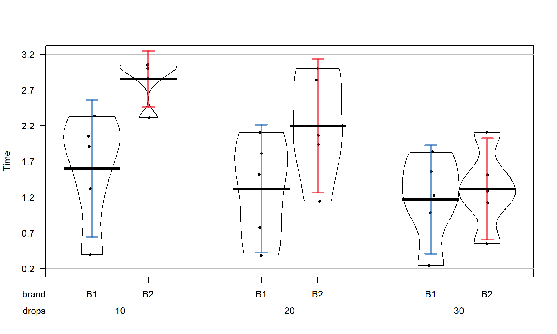
Brand (first row of \(x\)-axis) and Drops (second row of \(x\)-axis).The pirate-plots can handle situations where both variables have more than two levels but it can sometimes get a bit cluttered to actually display the data when our analysis is going to focus on means of the responses. The means for each combination of levels that you can find in the favstats output are more usefully used in what is called an interaction plot. Interaction plots display the mean responses (y-axis) versus levels of one predictor variable on the x-axis, adding points and separate lines for each level of the other predictor variable. Because we don’t like any of the available functions in R, we wrote our own function. It is available two ways. The easiest, if it works, is to install and load the catstats R package (M. Greenwood, Hancock, and Carnegie 2022). If you are working on a local RStudio installation, the first step involves installing the remotes (Csárdi et al. 2021) R package and then loading it – this will allow you to install catstats from our github81 repository (you can type “3” during the installation to avoid updating other packages when you do this step).
# To install the catstats R package (just the first time!):
library(remotes)
remotes::install_github("greenwood-stat/catstats")
After that step, you can load catstats like any other R package, using library(catstats). Some users have experienced issues with getting this package installed, so you can also download the needed intplot and intplotarray functions82 using:
source("http://www.math.montana.edu/courses/s217/documents/intplotfunctions_v3.R")The intplot function allows a formula interface like Y ~ X1 * X2 and provides the means \(\pm\) 1 SE (vertical bars) and adds a legend to help make everything clear.
intplot(responses ~ brand * drops, data = pt)
Drops on the x-axis and different lines based on Brand.Interaction plots can always be made two different ways by switching the order of the variables. Figure 4.2 contains Drops on the x-axis and Figure 4.3 has Brand on the x-axis. Typically putting the variable with more levels on the x-axis will make interpretation easier, but not always. Try both and decide on the one that you like best.
intplot(responses ~ drops * brand, data = pt)
Brand on the x-axis and lines based on Drops.The formula in this function builds on our previous notation and now we include both predictor variables with an “*” between them. Using an asterisk between explanatory variables is one way of telling R to include an interaction between the variables. While the interaction may or may not be present, the interaction plot helps us to explore those potential differences.
There are a variety of aspects of the interaction plots to pay attention to. Initially, the question to answer is whether it appears that there is an interaction between the predictor variables. When there is an interaction, you will see non-parallel lines in the interaction plot. You want to look from left to right in the plot and assess whether the lines connecting the means are close to parallel, relative to the amount of variability in the estimated means as represented by the SEs in the bars. If it seems that there is clear visual evidence of non-parallel lines, then the interaction is likely worth considering (we will use a hypothesis test to formally assess this – see the discussion below). If the lines look to be close to parallel, then there probably isn’t an interaction between the variables. Without an interaction present, that means that the differences in the response across levels of one variable doesn’t change based on the levels of the other variable and vice-versa. This means that we can consider the main effects of each variable on their own83. Main effects are much like the results we found in Chapter 3 where we can compare means across levels of a single variable except that there are results for two variables to extract from the model. With the presence of an interaction, it is complicated to summarize how each variable is affecting the response variable because their impacts change depending on the level of the other factor. And plots like the interaction plot provide us with useful information on the pattern of those changes.
If the lines are not parallel, then focus in on comparing the levels of one variable as the other variable changes. Remember that the definition of an interaction is that the differences among levels of one variable depends on the level of the other variable being considered. “Visually” this means comparing the size of the differences in the lines from left to right. In Figures 4.2 and 4.3, the effect of amount of water changes based on the brand being considered. In Figure 4.3, the three lines represent the three water levels. The difference between the brands (left to right, B1 to B2) is different depending on how much water was present. It appears that Brand B2 lasted longer at the lower water levels but that the difference between the two brands dropped as the water levels increased. The same story appears in Figure 4.2. As the water levels increase (left to right, 10 to 20 to 30 drops), the differences between the two brands decrease. Of the two versions, Figure 4.2 is probably easier to read here. Sometimes it is nice to see the interaction plot made both ways simultaneously, so you can also use the intplotarray function, which provides Figure 4.4. This plot also adds pirate-plots to the off-diagonals so you can explore the main effects of each variable, if that is reasonable. The interaction plots can be used to identify the best and worst mean responses for combinations of the treatment levels. For example, 10 Drops and Brand B2 lasts longest, on average, and 30 Drops with Brand B1 fails fastest, on average. In any version of the plot here, the lines do not appear to be parallel suggesting that further exploration of the interaction appears to be warranted.
intplotarray(responses ~ drops * brand, data = pt)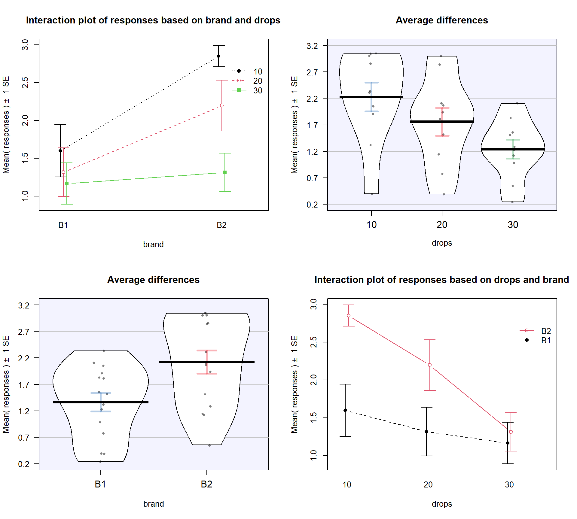
Before we get to the hypothesis tests to formally make this assessment (you knew some sort of p-value was coming, right?), we can visualize the 5 different scenarios that could characterize the sorts of results you could observe in a Two-Way ANOVA situation. Figure 4.5 shows 4 of the 5 scenarios. In panel (a), when there are no differences from either variable (Scenario 1), it provides relatively parallel lines and basically no differences either across Drops levels (x-axis) or Brand (lines). Data such as these would likely result in little to no evidence related to a difference in brands, water levels, or any interaction between them in this data set.

Scenario 2 (Figure 4.5 panel (b)) incorporates differences based on factor A (here that is Brand) but no real difference based on the Drops or any interaction. This results in a clear shift between the lines for the means of the Brands but little to no changes in the level of those lines across water levels. These lines are relatively parallel. We can see that Brand B2 is better than Brand B1 but that is all we can show with these sorts of results.
Scenario 3 (Figure 4.5 panel (c)) flips the important variable to B (Drops) and shows decreasing average times as the water levels increase. Again, the interaction panels show near parallel-ness in the lines and really just show differences among the levels of the water. In both Scenarios 2 and 3, we could use a single variable and drop the other from the model, getting back to a One-Way ANOVA model, without losing any important information.
Scenario 4 (Figure 4.5 panel (d)) incorporates effects of A and B, but they are additive. That means that the effect of one variable is the same across the levels of the other variable. In this experiment, that would mean that Drops has the same impact on performance regardless of brand and that the brands differ but each type of difference is the same regardless of levels of the other variable. The interaction plot lines are more or less parallel but now the brands are clearly different from each other. The plot shows the decrease in performance based on increasing water levels and that Brand B2 is better than Brand B1. Additive effects show the same difference in lines from left to right in the interaction plots.
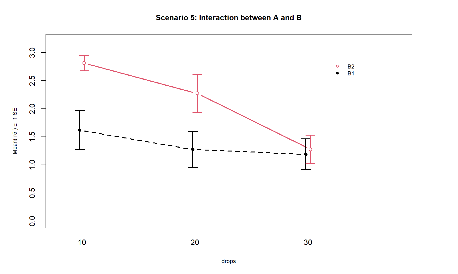
Finally, Scenario 5 (Figure 4.6) involves an interaction between the two variables (Drops and Brand). There are many ways that interactions can present but the main thing is to look for clearly non-parallel lines. As noted in the previous discussion, the Drops effect appears to change depending on which level of Brand is being considered. Note that the plot here described as Scenario 5 is the same as the initial plot of the results in Figure 4.2.
The typical modeling protocol is to start with assuming that Scenario 5 is a possible description of the results, related to fitting what is called the interaction model, and then attempt to simplify the model (to the additive model) if warranted. We need a hypothesis test to help decide if the interaction is “real”. We start with assuming there is no interaction between the two factors in their impacts on the response and assess evidence against that null hypothesis. We need a hypothesis test because the lines will never be exactly parallel in real data and, just like in the One-Way ANOVA situation, the amount of variation around the lines impacts the ability of the model to detect differences, in this case of an interaction.