14.4: Strength, Direction, and Linearity
- Page ID
- 17414
\( \newcommand{\vecs}[1]{\overset { \scriptstyle \rightharpoonup} {\mathbf{#1}} } \)
\( \newcommand{\vecd}[1]{\overset{-\!-\!\rightharpoonup}{\vphantom{a}\smash {#1}}} \)
\( \newcommand{\id}{\mathrm{id}}\) \( \newcommand{\Span}{\mathrm{span}}\)
( \newcommand{\kernel}{\mathrm{null}\,}\) \( \newcommand{\range}{\mathrm{range}\,}\)
\( \newcommand{\RealPart}{\mathrm{Re}}\) \( \newcommand{\ImaginaryPart}{\mathrm{Im}}\)
\( \newcommand{\Argument}{\mathrm{Arg}}\) \( \newcommand{\norm}[1]{\| #1 \|}\)
\( \newcommand{\inner}[2]{\langle #1, #2 \rangle}\)
\( \newcommand{\Span}{\mathrm{span}}\)
\( \newcommand{\id}{\mathrm{id}}\)
\( \newcommand{\Span}{\mathrm{span}}\)
\( \newcommand{\kernel}{\mathrm{null}\,}\)
\( \newcommand{\range}{\mathrm{range}\,}\)
\( \newcommand{\RealPart}{\mathrm{Re}}\)
\( \newcommand{\ImaginaryPart}{\mathrm{Im}}\)
\( \newcommand{\Argument}{\mathrm{Arg}}\)
\( \newcommand{\norm}[1]{\| #1 \|}\)
\( \newcommand{\inner}[2]{\langle #1, #2 \rangle}\)
\( \newcommand{\Span}{\mathrm{span}}\) \( \newcommand{\AA}{\unicode[.8,0]{x212B}}\)
\( \newcommand{\vectorA}[1]{\vec{#1}} % arrow\)
\( \newcommand{\vectorAt}[1]{\vec{\text{#1}}} % arrow\)
\( \newcommand{\vectorB}[1]{\overset { \scriptstyle \rightharpoonup} {\mathbf{#1}} } \)
\( \newcommand{\vectorC}[1]{\textbf{#1}} \)
\( \newcommand{\vectorD}[1]{\overrightarrow{#1}} \)
\( \newcommand{\vectorDt}[1]{\overrightarrow{\text{#1}}} \)
\( \newcommand{\vectE}[1]{\overset{-\!-\!\rightharpoonup}{\vphantom{a}\smash{\mathbf {#1}}}} \)
\( \newcommand{\vecs}[1]{\overset { \scriptstyle \rightharpoonup} {\mathbf{#1}} } \)
\( \newcommand{\vecd}[1]{\overset{-\!-\!\rightharpoonup}{\vphantom{a}\smash {#1}}} \)
\(\newcommand{\avec}{\mathbf a}\) \(\newcommand{\bvec}{\mathbf b}\) \(\newcommand{\cvec}{\mathbf c}\) \(\newcommand{\dvec}{\mathbf d}\) \(\newcommand{\dtil}{\widetilde{\mathbf d}}\) \(\newcommand{\evec}{\mathbf e}\) \(\newcommand{\fvec}{\mathbf f}\) \(\newcommand{\nvec}{\mathbf n}\) \(\newcommand{\pvec}{\mathbf p}\) \(\newcommand{\qvec}{\mathbf q}\) \(\newcommand{\svec}{\mathbf s}\) \(\newcommand{\tvec}{\mathbf t}\) \(\newcommand{\uvec}{\mathbf u}\) \(\newcommand{\vvec}{\mathbf v}\) \(\newcommand{\wvec}{\mathbf w}\) \(\newcommand{\xvec}{\mathbf x}\) \(\newcommand{\yvec}{\mathbf y}\) \(\newcommand{\zvec}{\mathbf z}\) \(\newcommand{\rvec}{\mathbf r}\) \(\newcommand{\mvec}{\mathbf m}\) \(\newcommand{\zerovec}{\mathbf 0}\) \(\newcommand{\onevec}{\mathbf 1}\) \(\newcommand{\real}{\mathbb R}\) \(\newcommand{\twovec}[2]{\left[\begin{array}{r}#1 \\ #2 \end{array}\right]}\) \(\newcommand{\ctwovec}[2]{\left[\begin{array}{c}#1 \\ #2 \end{array}\right]}\) \(\newcommand{\threevec}[3]{\left[\begin{array}{r}#1 \\ #2 \\ #3 \end{array}\right]}\) \(\newcommand{\cthreevec}[3]{\left[\begin{array}{c}#1 \\ #2 \\ #3 \end{array}\right]}\) \(\newcommand{\fourvec}[4]{\left[\begin{array}{r}#1 \\ #2 \\ #3 \\ #4 \end{array}\right]}\) \(\newcommand{\cfourvec}[4]{\left[\begin{array}{c}#1 \\ #2 \\ #3 \\ #4 \end{array}\right]}\) \(\newcommand{\fivevec}[5]{\left[\begin{array}{r}#1 \\ #2 \\ #3 \\ #4 \\ #5 \\ \end{array}\right]}\) \(\newcommand{\cfivevec}[5]{\left[\begin{array}{c}#1 \\ #2 \\ #3 \\ #4 \\ #5 \\ \end{array}\right]}\) \(\newcommand{\mattwo}[4]{\left[\begin{array}{rr}#1 \amp #2 \\ #3 \amp #4 \\ \end{array}\right]}\) \(\newcommand{\laspan}[1]{\text{Span}\{#1\}}\) \(\newcommand{\bcal}{\cal B}\) \(\newcommand{\ccal}{\cal C}\) \(\newcommand{\scal}{\cal S}\) \(\newcommand{\wcal}{\cal W}\) \(\newcommand{\ecal}{\cal E}\) \(\newcommand{\coords}[2]{\left\{#1\right\}_{#2}}\) \(\newcommand{\gray}[1]{\color{gray}{#1}}\) \(\newcommand{\lgray}[1]{\color{lightgray}{#1}}\) \(\newcommand{\rank}{\operatorname{rank}}\) \(\newcommand{\row}{\text{Row}}\) \(\newcommand{\col}{\text{Col}}\) \(\renewcommand{\row}{\text{Row}}\) \(\newcommand{\nul}{\text{Nul}}\) \(\newcommand{\var}{\text{Var}}\) \(\newcommand{\corr}{\text{corr}}\) \(\newcommand{\len}[1]{\left|#1\right|}\) \(\newcommand{\bbar}{\overline{\bvec}}\) \(\newcommand{\bhat}{\widehat{\bvec}}\) \(\newcommand{\bperp}{\bvec^\perp}\) \(\newcommand{\xhat}{\widehat{\xvec}}\) \(\newcommand{\vhat}{\widehat{\vvec}}\) \(\newcommand{\uhat}{\widehat{\uvec}}\) \(\newcommand{\what}{\widehat{\wvec}}\) \(\newcommand{\Sighat}{\widehat{\Sigma}}\) \(\newcommand{\lt}{<}\) \(\newcommand{\gt}{>}\) \(\newcommand{\amp}{&}\) \(\definecolor{fillinmathshade}{gray}{0.9}\)Strength, Direction, and Linearity
We've talk about how Pearson's r can be from -1.00 to 1.00. How close the result is to \( |1.00| \) (the absolute value of 1.00) shows how strong the correlation is; the closer to \( |1.00| \), the more the dots follow a straight line (linearity). With a strong relationship, it's easier to predict the value of one variable from the value of the other variable. The negative or positive part of the result shows whether the variables vary in the same way; one the scores on one variable increase, do the scores on the other variable also increase (positive correlation) or do they decrease (negative correlation).
Scenario
Let’s turn to a topic close to every parent’s heart: sleep. The following data set is fictitious, but based on real events experienced by one of the authors, Dr. Danielle Navarro (a.k.a., Dani).
Suppose Dr. Navarro was curious to find out how much her infant son’s sleeping habits affected her mood. Let’s say that she rated her grumpiness very precisely, on a scale from 0 (not at all grumpy) to 100 (grumpy as a very, very grumpy old man). And, lets also assume that she measured her grumpiness, her sleeping patterns, and her son’s sleeping patterns for quite some time. Let’s say, for 100 days. And, being a nerd, Dr. Navarro calculated some basic descriptive statistics, shown in Table \(\PageIndex{1}\):
| Variable | N | Mean | SD | Median | Minimum | Maximum |
|---|---|---|---|---|---|---|
| Dani's Sleep | 100 | 6.97 | 1.02 | 7.03 | 4.84 | 9.00 |
| Baby's Sleep | 100 | 8.05 | 2.07 | 7.95 | 3.25 | 12.07 |
| Dani's Grumpiness | 100 | 63.71 | 10.05 | 62.00 | 41.00 | 91.00 |
When you look at Table \(\PageIndex{1}\), what do you see?
Exercise \(\PageIndex{1}\)
What can you say about each of the variables based on information in Table \(\PageIndex{1}\)?
- Answer
-
For Dani's Sleep, Dr. MO notices the low Minimum of 4.84 hours; at least once, Dani got less than 5 hours of sleep one night!
Looking at the Baby's sleep, I also see a very low Minimum. The standard deviation (SD) is also twice that of Dani's, suggesting that the baby's sleep is much more variable. And that is confirmed when seeing that on night the baby slept only 3.25 hours but one night he slept over 12 hours! Babies are wierd.
And finally, Dani's Grumpiness seems sorta high since the average and the median are higher than the middle of the scale of 50, suggesting that she tends towards very grumpy.
Because the medians and means are pretty close, Dr. MO thinks that the distributions are fairly symmetrical (not skewed).
To give a graphical depiction of what each of the three interesting variables looks like, Figure \(\PageIndex{1}\) plots histograms.
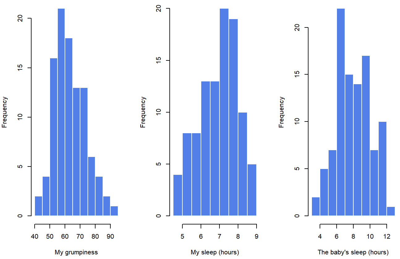
Do our answer in Exercise \(\PageIndex{1}\) match what is shown in Figure \(\PageIndex{1}\)? The histograms aren't quite as symmetrical as Dr. MO interpreted the means and medians to show! Do you see anything new in Figure \(\PageIndex{1}\)?
Strength and Direction of a Relationship
Let's use a different kind of graph to look at these variable. Figure \(\PageIndex{2}\) shows a scatterplot of Dani's Sleep (x-axis) and Dani's Grumpiness (y-axis), and Figure \(\PageIndex{3}\) shows Dani's grumpiness on the y-axis again, but now the Baby's sleep is on the x-axis.
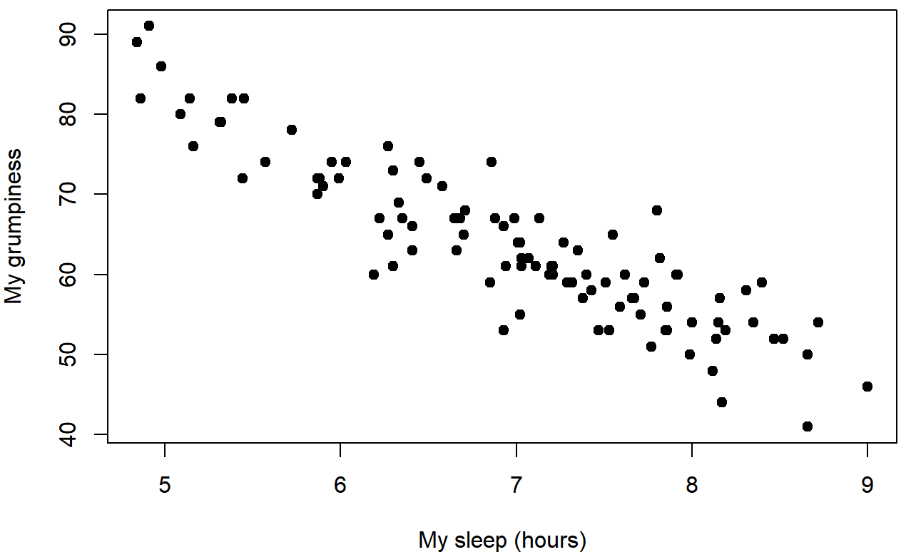
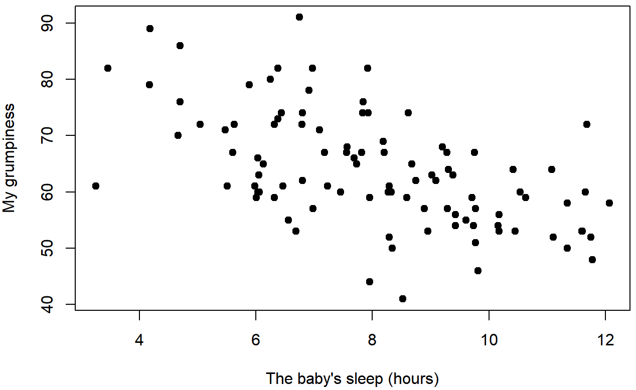
When looking at these two plots side by side, it’s clear that the relationship is qualitatively the same in both cases: more sleep equals less grump! We can see as the sleep hours (on the bottom, x-axis) get higher, the grumpiness gets lower (y-axis); this would be a negative correlation because the variable vary in opposite directions.
However, it’s also pretty obvious that the relationship between Dani's Sleep and Dani's Grumpiness is stronger than the relationship between Baby's Sleep and Dani's Grumpiness. How is this clear? Because Figure \(\PageIndex{2}\) is “neater” than the one on the right. The dots are closer together, and it's easier to see how each dot might be closer to a straight line that we could draw through the data. What it feels like is that if you want to predict what Dani's mood is, it’d help you a little bit to know how many hours her son slept, but it’d be more helpful to know how many hours she slept.
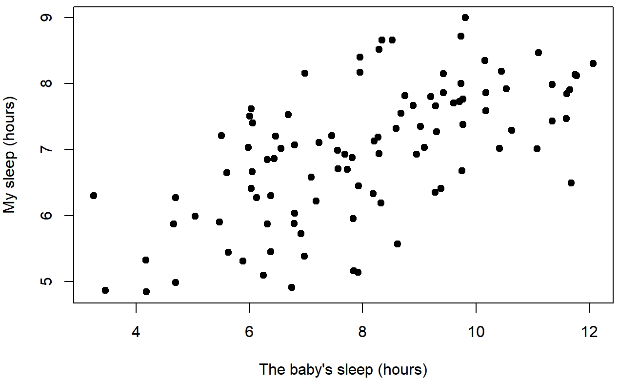
In contrast, let’s consider Figure \(\PageIndex{3}\) versus Figure \(\PageIndex{4}\). If we compare the scatterplot of Baby's Sleep & Dani's Grumpiness with the scatterplot of Baby's Sleep and Dani's Sleep, the overall strength of the relationship is the same (the dots seem about as messy and far from a hypothetical line through the middle), but the direction is different. That is, if Dani's son sleeps more, Dani seems to get more sleep (positive correlation), but if he sleeps more then she get less grumpy (negative correlation).
The Correlation Coefficient
As a refresher, Pearson’s correlation coefficient, which is traditionally denoted by r, shows the relationship betweentwo variables, and is a measure that varies from −1.00 to 1.00. When r=−1.00 it means that we have a perfect negative relationship, and when r=1.00 it means we have a perfect positive relationship. When r=0, there’s no relationship at all. If you look at Figure \(\PageIndex{5}\), you can see several plots showing what different correlations look like.
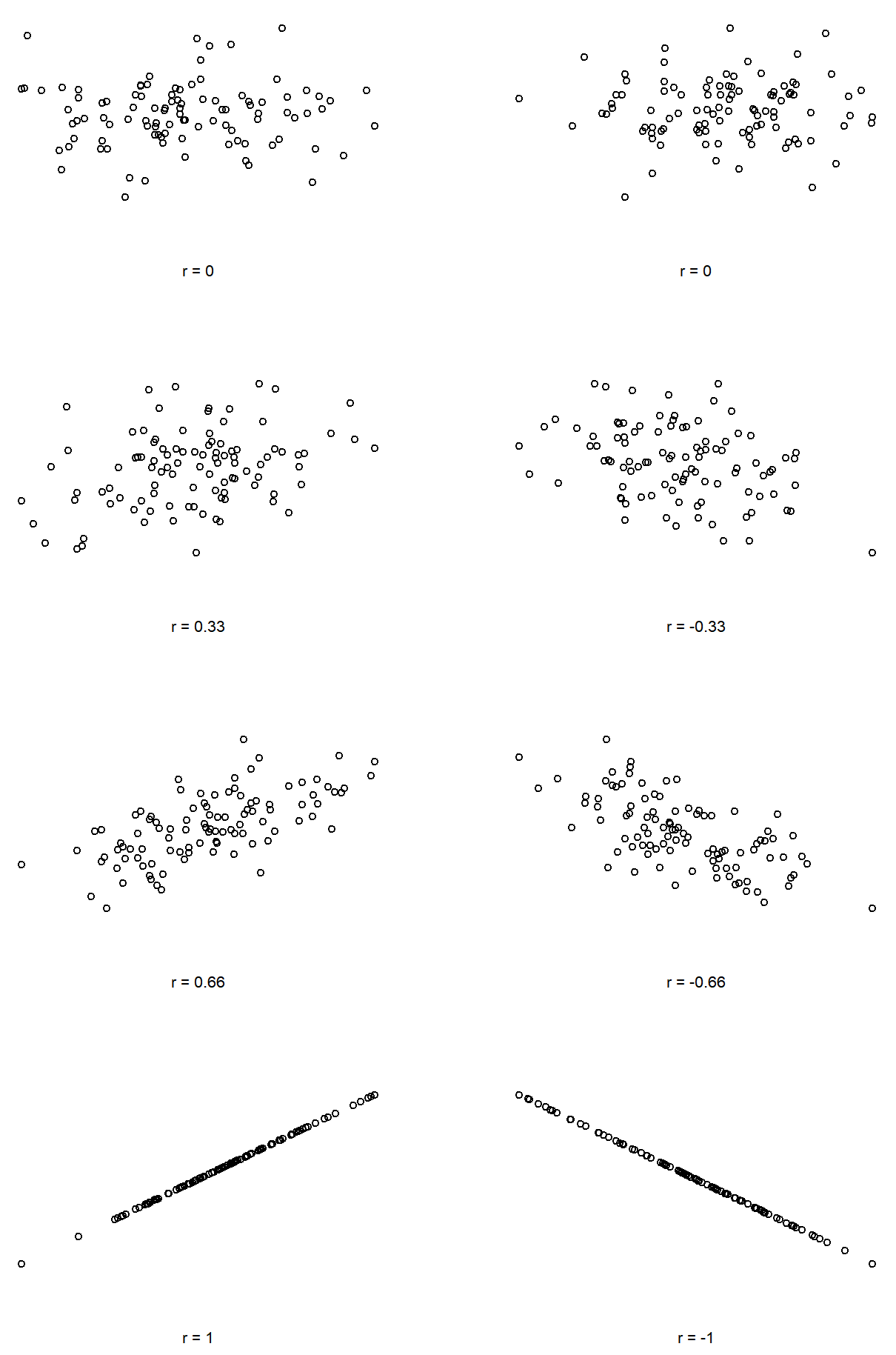
As you can see, strong correlations (shown on the bottom, r-values close to -1.00 or 1.00) are straight lines of dots. The closer to zero, the less linear the dots are, until you get to a correlation of zero (r=0.00) and there's just a random splatter of dots (top scatterplots). You can also see that positive correlations "point" up and to the right; as one variable increases, the other also increases. Negative correlations "point" down and to the right; as one variable increases, the other variable decreases.
Interpreting a Correlation
Naturally, in real life you don’t see many correlations of 1.00. So how should you interpret a correlation of, say r = .40? The honest answer is that it really depends on what you want to use the data for, and on how strong the correlations in your field tend to be. A friend of mine in engineering once argued that any correlation less than .95 is completely useless (I think he was exaggerating, even for engineering). On the other hand there are real cases – even in psychology – where you should really expect correlations that strong. For instance, one of the benchmark data sets used to test theories of how people judge similarities is so clean that any theory that can’t achieve a correlation of at least .90 really isn’t deemed to be successful. However, when looking for (say) elementary correlates of intelligence (e.g., inspection time, response time), if you get a correlation above .30 you’re doing very very well. In short, the interpretation of a correlation depends a lot on the context. That said, the rough guide in Table \(\PageIndex{2}\) is pretty typical.
| Correlation | Strength | Direction |
|---|---|---|
| -1.0 to -0.9 | Very strong | Negative |
| -0.9 to -0.7 | Strong | Negative |
| -0.7 to -0.4 | Moderate | Negative |
| -0.4 to -0.2 | Weak | Negative |
| -0.2 to 0 | Negligible | Negative |
| 0 to 0.2 | Negligible | Positive |
| 0.2 to 0.4 | Weak | Positive |
| 0.4 to 0.7 | Moderate | Positive |
| 0.7 to 0.9 | Strong | Positive |
| 0.9 to 1.0 | Very strong | Positive |
However, something that can never be stressed enough is that you should always look at the scatterplot before attaching any interpretation to the data. As was said in prior sections, a correlation might not mean what you think it means. The classic illustration of this is “Anscombe’s Quartet” (Anscombe, 1973), which is a collection of four data sets. Each data set has two variables, an X and a Y. For all four data sets the mean value for X is 9 (\( \bar{X}_{x-axis} = 9.00 \)) and the mean for Y is 7.5 (\( \bar{X}_{y-axis} = 7.50 \)). The, standard deviations for all X variables are almost identical, as are those for the the Y variables. And in each case the correlation between X and Y is r=0.816. You’d think that these four data sets would look pretty similar to one another. They do not. If we draw scatterplots of X against Y for all four variables, as shown in Figure \(\PageIndex{6}\) we see that all four of these are spectacularly different to each other.
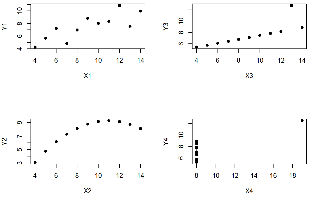
The lesson here, which so very many people seem to forget in real life is “always graph your raw data”.
Now that you know a little more about what correlations can show, let's talk about hypotheses.
Reference
Anscombe, F. J. (1973). Graphs in statistical analysis, The American Statistician, 27(1), 17-21).
Contributors and Attributions


