
11.3: Normal Probability Plots
- Page ID
- 25692

\( \newcommand{\vecs}[1]{\overset { \scriptstyle \rightharpoonup} {\mathbf{#1}} } \)
\( \newcommand{\vecd}[1]{\overset{-\!-\!\rightharpoonup}{\vphantom{a}\smash {#1}}} \)
\( \newcommand{\id}{\mathrm{id}}\) \( \newcommand{\Span}{\mathrm{span}}\)
( \newcommand{\kernel}{\mathrm{null}\,}\) \( \newcommand{\range}{\mathrm{range}\,}\)
\( \newcommand{\RealPart}{\mathrm{Re}}\) \( \newcommand{\ImaginaryPart}{\mathrm{Im}}\)
\( \newcommand{\Argument}{\mathrm{Arg}}\) \( \newcommand{\norm}[1]{\| #1 \|}\)
\( \newcommand{\inner}[2]{\langle #1, #2 \rangle}\)
\( \newcommand{\Span}{\mathrm{span}}\)
\( \newcommand{\id}{\mathrm{id}}\)
\( \newcommand{\Span}{\mathrm{span}}\)
\( \newcommand{\kernel}{\mathrm{null}\,}\)
\( \newcommand{\range}{\mathrm{range}\,}\)
\( \newcommand{\RealPart}{\mathrm{Re}}\)
\( \newcommand{\ImaginaryPart}{\mathrm{Im}}\)
\( \newcommand{\Argument}{\mathrm{Arg}}\)
\( \newcommand{\norm}[1]{\| #1 \|}\)
\( \newcommand{\inner}[2]{\langle #1, #2 \rangle}\)
\( \newcommand{\Span}{\mathrm{span}}\) \( \newcommand{\AA}{\unicode[.8,0]{x212B}}\)
\( \newcommand{\vectorA}[1]{\vec{#1}} % arrow\)
\( \newcommand{\vectorAt}[1]{\vec{\text{#1}}} % arrow\)
\( \newcommand{\vectorB}[1]{\overset { \scriptstyle \rightharpoonup} {\mathbf{#1}} } \)
\( \newcommand{\vectorC}[1]{\textbf{#1}} \)
\( \newcommand{\vectorD}[1]{\overrightarrow{#1}} \)
\( \newcommand{\vectorDt}[1]{\overrightarrow{\text{#1}}} \)
\( \newcommand{\vectE}[1]{\overset{-\!-\!\rightharpoonup}{\vphantom{a}\smash{\mathbf {#1}}}} \)
\( \newcommand{\vecs}[1]{\overset { \scriptstyle \rightharpoonup} {\mathbf{#1}} } \)
\( \newcommand{\vecd}[1]{\overset{-\!-\!\rightharpoonup}{\vphantom{a}\smash {#1}}} \)
\(\newcommand{\avec}{\mathbf a}\) \(\newcommand{\bvec}{\mathbf b}\) \(\newcommand{\cvec}{\mathbf c}\) \(\newcommand{\dvec}{\mathbf d}\) \(\newcommand{\dtil}{\widetilde{\mathbf d}}\) \(\newcommand{\evec}{\mathbf e}\) \(\newcommand{\fvec}{\mathbf f}\) \(\newcommand{\nvec}{\mathbf n}\) \(\newcommand{\pvec}{\mathbf p}\) \(\newcommand{\qvec}{\mathbf q}\) \(\newcommand{\svec}{\mathbf s}\) \(\newcommand{\tvec}{\mathbf t}\) \(\newcommand{\uvec}{\mathbf u}\) \(\newcommand{\vvec}{\mathbf v}\) \(\newcommand{\wvec}{\mathbf w}\) \(\newcommand{\xvec}{\mathbf x}\) \(\newcommand{\yvec}{\mathbf y}\) \(\newcommand{\zvec}{\mathbf z}\) \(\newcommand{\rvec}{\mathbf r}\) \(\newcommand{\mvec}{\mathbf m}\) \(\newcommand{\zerovec}{\mathbf 0}\) \(\newcommand{\onevec}{\mathbf 1}\) \(\newcommand{\real}{\mathbb R}\) \(\newcommand{\twovec}[2]{\left[\begin{array}{r}#1 \\ #2 \end{array}\right]}\) \(\newcommand{\ctwovec}[2]{\left[\begin{array}{c}#1 \\ #2 \end{array}\right]}\) \(\newcommand{\threevec}[3]{\left[\begin{array}{r}#1 \\ #2 \\ #3 \end{array}\right]}\) \(\newcommand{\cthreevec}[3]{\left[\begin{array}{c}#1 \\ #2 \\ #3 \end{array}\right]}\) \(\newcommand{\fourvec}[4]{\left[\begin{array}{r}#1 \\ #2 \\ #3 \\ #4 \end{array}\right]}\) \(\newcommand{\cfourvec}[4]{\left[\begin{array}{c}#1 \\ #2 \\ #3 \\ #4 \end{array}\right]}\) \(\newcommand{\fivevec}[5]{\left[\begin{array}{r}#1 \\ #2 \\ #3 \\ #4 \\ #5 \\ \end{array}\right]}\) \(\newcommand{\cfivevec}[5]{\left[\begin{array}{c}#1 \\ #2 \\ #3 \\ #4 \\ #5 \\ \end{array}\right]}\) \(\newcommand{\mattwo}[4]{\left[\begin{array}{rr}#1 \amp #2 \\ #3 \amp #4 \\ \end{array}\right]}\) \(\newcommand{\laspan}[1]{\text{Span}\{#1\}}\) \(\newcommand{\bcal}{\cal B}\) \(\newcommand{\ccal}{\cal C}\) \(\newcommand{\scal}{\cal S}\) \(\newcommand{\wcal}{\cal W}\) \(\newcommand{\ecal}{\cal E}\) \(\newcommand{\coords}[2]{\left\{#1\right\}_{#2}}\) \(\newcommand{\gray}[1]{\color{gray}{#1}}\) \(\newcommand{\lgray}[1]{\color{lightgray}{#1}}\) \(\newcommand{\rank}{\operatorname{rank}}\) \(\newcommand{\row}{\text{Row}}\) \(\newcommand{\col}{\text{Col}}\) \(\renewcommand{\row}{\text{Row}}\) \(\newcommand{\nul}{\text{Nul}}\) \(\newcommand{\var}{\text{Var}}\) \(\newcommand{\corr}{\text{corr}}\) \(\newcommand{\len}[1]{\left|#1\right|}\) \(\newcommand{\bbar}{\overline{\bvec}}\) \(\newcommand{\bhat}{\widehat{\bvec}}\) \(\newcommand{\bperp}{\bvec^\perp}\) \(\newcommand{\xhat}{\widehat{\xvec}}\) \(\newcommand{\vhat}{\widehat{\vvec}}\) \(\newcommand{\uhat}{\widehat{\uvec}}\) \(\newcommand{\what}{\widehat{\wvec}}\) \(\newcommand{\Sighat}{\widehat{\Sigma}}\) \(\newcommand{\lt}{<}\) \(\newcommand{\gt}{>}\) \(\newcommand{\amp}{&}\) \(\definecolor{fillinmathshade}{gray}{0.9}\)The distributions you have seen up to this point have been assumed to be normally distributed, but how do you determine if it is normally distributed? One way is to take a sample and look at the sample to determine if it appears normal. If the sample looks normal, then most likely the population is also. Here are some guidelines that are use to help make that determination.
Normal quantile plot (or normal probability plot): This plot is provided through statistical software on a computer or graphing calculator. If the points lie close to a line, the data comes from a distribution that is approximately normal. If the points do not lie close to a line or they show a pattern that is not a line, the data are likely to come from a distribution that is not normally distributed.
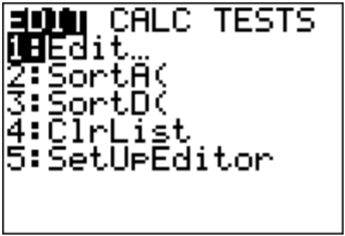
To create a normal quantile plot on the TI-83/84
- Go into the STAT menu, and then Chose 1:Edit
.png?revision=1)
Figure 11.3.10 : STAT Menu on TI-83/84 - Type your data values into L1. If L1 has data in it, arrow up to the name L1, click CLEAR and then press ENTER. The column will now be cleared and you can type the data in.
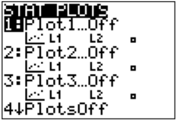
- Now click STAT PLOT (\(2^{\text { nd }} Y=\)). You have three stat plots to choose from.
.png?revision=1)
Figure 11.3.11 : STAT PLOT Menu on TI-83/84 - Use 1:Plot1. Press ENTER.
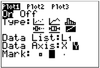
- Put the cursor on the word On and press ENTER. This turns on the plot. Arrow down to Type: and use the right arrow to move over to the last graph (it looks like an increasing linear graph). Set Data List to L1 (it might already say that) and set Data Axis to Y. The Mark is up to you.
.png?revision=1)
Figure 11.3.12 : Plot1 Menu on TI-83/84 Setup for Normal Quantile Plot - Now you need to set up the correct window on which to graph. Click on WINDOW. You need to set up the settings for the x variable. Xmin should be -4. Xmax should be 4. Xscl should be 1. Ymin and Ymax are based on your data, the Ymin should be below your lowest data value and Ymax should be above your highest data value. Yscl is just how often you would like to see a tick mark on the y-axis.
- Now press GRAPH. You will see the normal quantile plot.
In Kiama, NSW, Australia, there is a blowhole. The data in table #6.4.1 are times in seconds between eruptions ("Kiama blowhole eruptions," 2013). Do the data come from a population that is normally distributed?
| 83 | 51 | 87 | 60 | 28 | 95 | 8 | 27 |
| 15 | 10 | 18 | 16 | 29 | 54 | 91 | 8 |
| 17 | 55 | 10 | 35 | 47 | 77 | 36 | 17 |
| 21 | 36 | 18 | 40 | 10 | 7 | 34 | 27 |
| 28 | 56 | 8 | 25 | 68 | 146 | 89 | 18 |
| 73 | 69 | 9 | 37 | 10 | 82 | 29 | 8 |
| 60 | 61 | 61 | 18 | 169 | 25 | 8 | 26 |
| 11 | 83 | 11 | 42 | 17 | 14 | 9 | 12 |
- State the random variable
- Draw the normal scatterplot.
- Do the data come from a population that is normally distributed?
Solution
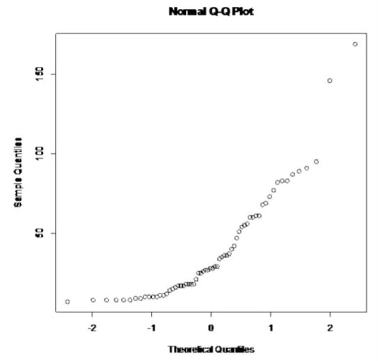
a. x = time in seconds between eruptions of Kiama Blowhole
b. The normal scatterplot is in Figure 11.3.15 .
.png?revision=1)
Figure 11.3.15 : Normal Probability Plot
This graph looks more like an exponential growth than linear.
c. Considering the histogram is skewed right, there are two extreme outliers, and the normal probability plot does not look linear, then the conclusion is that this sample is not from a population that is normally distributed.
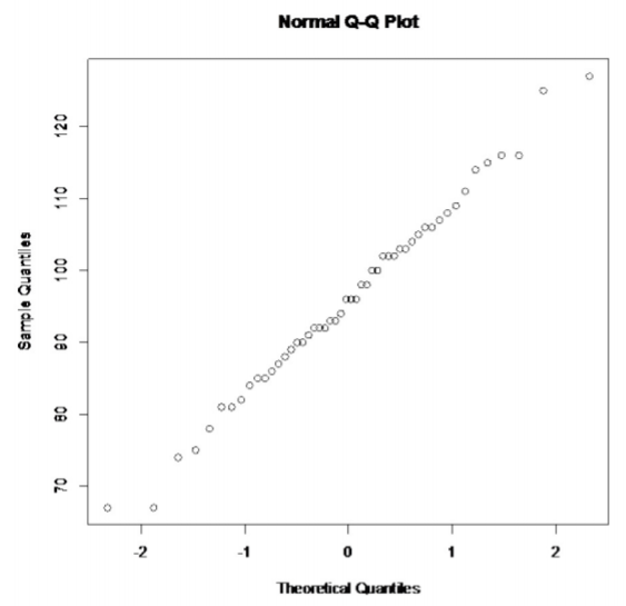
One way to measure intelligence is with an IQ score. Example 11.3.2 contains 50 IQ scores. Determine if the sample comes from a population that is normally distributed.
| 78 | 92 | 96 | 100 | 67 | 105 | 109 | 75 | 127 | 111 |
| 93 | 114 | 82 | 100 | 125 | 67 | 94 | 74 | 81 | 98 |
| 102 | 108 | 81 | 96 | 103 | 91 | 90 | 96 | 86 | 92 |
| 84 | 92 | 90 | 103 | 115 | 93 | 85 | 116 | 87 | 106 |
| 85 | 88 | 106 | 104 | 102 | 98 | 116 | 107 | 102 | 89 |
- State the random variable.
- Draw the normal scatterplot.
- Do the data come from a population that is normally distributed?
Solution
a. x = IQ score
b. The normal scatterplot is in Figure 11.3.18 .
.png?revision=1)
This graph looks fairly linear.
c. Considering the histogram is somewhat symmetric, there are no outliers, and the normal probability plot looks linear, then the conclusion is that this sample is from a population that is normally distributed.
Hypothesis Test on Normality:
A Normal Probability Plot is a scatterplot that show the relationship between a data value (\(x\)-value) and its predicted z-score (\(y\)-value). If the normal probability plot shows a linear relationship and a hypothesis test for \( \rho \) shows that there is a linear relationship, we can assume the population is approximately normal. (Recall from Section 11.3, if two variables do show a linear relationship, then \( \rho \neq 0 \).)
Homework
- Cholesterol data was collected on patients four days after having a heart attack. The data is in Example 11.3.3
. Determine if the data is from a population that is normally distributed.
218 234 214 116 200 276 146 182 238 288 190 236 244 258 240 294 220 200 220 186 352 202 218 248 278 248 270 242 Table 11.3.3 : Cholesterol Data Collected Four Days After a Heart Attack - The size of fish is very important to commercial fishing. A study conducted in 2012 collected the lengths of Atlantic cod caught in nets in Karlskrona (Ovegard, Berndt & Lunneryd, 2012). Data based on information from the study is in Example 11.3.4
. Determine if the data is from a population that is normally distributed.
48 50 50 55 53 50 49 52 61 48 45 47 53 46 50 48 42 44 50 60 54 48 50 49 53 48 52 56 46 46 47 48 48 49 52 47 51 48 45 47 Table 11.3.4 : Atlantic Cod Lengths - The WHO MONICA Project collected blood pressure data for people in China (Kuulasmaa, Hense & Tolonen, 1998). Data based on information from the study is in Example 11.3.5
. Determine if the data is from a population that is normally distributed.
114 141 154 137 131 132 133 156 119 138 86 122 112 114 177 128 137 140 171 129 127 104 97 135 107 136 118 92 182 150 142 97 140 106 76 115 119 125 162 80 138 124 132 143 119 Table 11.3.5 : Blood Pressure Values for People in China - Annual rainfalls for Sydney, Australia are given in Example 11.3.6
. ("Annual maximums of," 2013). Can you assume rainfall is normally distributed?
146.8 383 90.9 178.1 267.5 95.5 156.5 180 90.9 139.7 200.2 171.7 187.2 184.9 70.1 58 84.1 55.6 133.1 271.8 135.9 71.9 99.4 110.6 47.5 97.8 122.7 58.4 154.4 173.7 118.8 88 84.6 171.5 254.3 185.9 137.2 138.9 96.2 85 45.2 74.7 264.9 113.8 133.4 68.1 156.4 Table 11.3.6 : Annual Rainfall in Sydney, Australia
- Answer
-
1. Normally distributed
3. Normally distributed