2.2: Plotting Points and Intervals on the Number Line
- Page ID
- 24823

\( \newcommand{\vecs}[1]{\overset { \scriptstyle \rightharpoonup} {\mathbf{#1}} } \)
\( \newcommand{\vecd}[1]{\overset{-\!-\!\rightharpoonup}{\vphantom{a}\smash {#1}}} \)
\( \newcommand{\id}{\mathrm{id}}\) \( \newcommand{\Span}{\mathrm{span}}\)
( \newcommand{\kernel}{\mathrm{null}\,}\) \( \newcommand{\range}{\mathrm{range}\,}\)
\( \newcommand{\RealPart}{\mathrm{Re}}\) \( \newcommand{\ImaginaryPart}{\mathrm{Im}}\)
\( \newcommand{\Argument}{\mathrm{Arg}}\) \( \newcommand{\norm}[1]{\| #1 \|}\)
\( \newcommand{\inner}[2]{\langle #1, #2 \rangle}\)
\( \newcommand{\Span}{\mathrm{span}}\)
\( \newcommand{\id}{\mathrm{id}}\)
\( \newcommand{\Span}{\mathrm{span}}\)
\( \newcommand{\kernel}{\mathrm{null}\,}\)
\( \newcommand{\range}{\mathrm{range}\,}\)
\( \newcommand{\RealPart}{\mathrm{Re}}\)
\( \newcommand{\ImaginaryPart}{\mathrm{Im}}\)
\( \newcommand{\Argument}{\mathrm{Arg}}\)
\( \newcommand{\norm}[1]{\| #1 \|}\)
\( \newcommand{\inner}[2]{\langle #1, #2 \rangle}\)
\( \newcommand{\Span}{\mathrm{span}}\) \( \newcommand{\AA}{\unicode[.8,0]{x212B}}\)
\( \newcommand{\vectorA}[1]{\vec{#1}} % arrow\)
\( \newcommand{\vectorAt}[1]{\vec{\text{#1}}} % arrow\)
\( \newcommand{\vectorB}[1]{\overset { \scriptstyle \rightharpoonup} {\mathbf{#1}} } \)
\( \newcommand{\vectorC}[1]{\textbf{#1}} \)
\( \newcommand{\vectorD}[1]{\overrightarrow{#1}} \)
\( \newcommand{\vectorDt}[1]{\overrightarrow{\text{#1}}} \)
\( \newcommand{\vectE}[1]{\overset{-\!-\!\rightharpoonup}{\vphantom{a}\smash{\mathbf {#1}}}} \)
\( \newcommand{\vecs}[1]{\overset { \scriptstyle \rightharpoonup} {\mathbf{#1}} } \)
\( \newcommand{\vecd}[1]{\overset{-\!-\!\rightharpoonup}{\vphantom{a}\smash {#1}}} \)
\(\newcommand{\avec}{\mathbf a}\) \(\newcommand{\bvec}{\mathbf b}\) \(\newcommand{\cvec}{\mathbf c}\) \(\newcommand{\dvec}{\mathbf d}\) \(\newcommand{\dtil}{\widetilde{\mathbf d}}\) \(\newcommand{\evec}{\mathbf e}\) \(\newcommand{\fvec}{\mathbf f}\) \(\newcommand{\nvec}{\mathbf n}\) \(\newcommand{\pvec}{\mathbf p}\) \(\newcommand{\qvec}{\mathbf q}\) \(\newcommand{\svec}{\mathbf s}\) \(\newcommand{\tvec}{\mathbf t}\) \(\newcommand{\uvec}{\mathbf u}\) \(\newcommand{\vvec}{\mathbf v}\) \(\newcommand{\wvec}{\mathbf w}\) \(\newcommand{\xvec}{\mathbf x}\) \(\newcommand{\yvec}{\mathbf y}\) \(\newcommand{\zvec}{\mathbf z}\) \(\newcommand{\rvec}{\mathbf r}\) \(\newcommand{\mvec}{\mathbf m}\) \(\newcommand{\zerovec}{\mathbf 0}\) \(\newcommand{\onevec}{\mathbf 1}\) \(\newcommand{\real}{\mathbb R}\) \(\newcommand{\twovec}[2]{\left[\begin{array}{r}#1 \\ #2 \end{array}\right]}\) \(\newcommand{\ctwovec}[2]{\left[\begin{array}{c}#1 \\ #2 \end{array}\right]}\) \(\newcommand{\threevec}[3]{\left[\begin{array}{r}#1 \\ #2 \\ #3 \end{array}\right]}\) \(\newcommand{\cthreevec}[3]{\left[\begin{array}{c}#1 \\ #2 \\ #3 \end{array}\right]}\) \(\newcommand{\fourvec}[4]{\left[\begin{array}{r}#1 \\ #2 \\ #3 \\ #4 \end{array}\right]}\) \(\newcommand{\cfourvec}[4]{\left[\begin{array}{c}#1 \\ #2 \\ #3 \\ #4 \end{array}\right]}\) \(\newcommand{\fivevec}[5]{\left[\begin{array}{r}#1 \\ #2 \\ #3 \\ #4 \\ #5 \\ \end{array}\right]}\) \(\newcommand{\cfivevec}[5]{\left[\begin{array}{c}#1 \\ #2 \\ #3 \\ #4 \\ #5 \\ \end{array}\right]}\) \(\newcommand{\mattwo}[4]{\left[\begin{array}{rr}#1 \amp #2 \\ #3 \amp #4 \\ \end{array}\right]}\) \(\newcommand{\laspan}[1]{\text{Span}\{#1\}}\) \(\newcommand{\bcal}{\cal B}\) \(\newcommand{\ccal}{\cal C}\) \(\newcommand{\scal}{\cal S}\) \(\newcommand{\wcal}{\cal W}\) \(\newcommand{\ecal}{\cal E}\) \(\newcommand{\coords}[2]{\left\{#1\right\}_{#2}}\) \(\newcommand{\gray}[1]{\color{gray}{#1}}\) \(\newcommand{\lgray}[1]{\color{lightgray}{#1}}\) \(\newcommand{\rank}{\operatorname{rank}}\) \(\newcommand{\row}{\text{Row}}\) \(\newcommand{\col}{\text{Col}}\) \(\renewcommand{\row}{\text{Row}}\) \(\newcommand{\nul}{\text{Nul}}\) \(\newcommand{\var}{\text{Var}}\) \(\newcommand{\corr}{\text{corr}}\) \(\newcommand{\len}[1]{\left|#1\right|}\) \(\newcommand{\bbar}{\overline{\bvec}}\) \(\newcommand{\bhat}{\widehat{\bvec}}\) \(\newcommand{\bperp}{\bvec^\perp}\) \(\newcommand{\xhat}{\widehat{\xvec}}\) \(\newcommand{\vhat}{\widehat{\vvec}}\) \(\newcommand{\uhat}{\widehat{\uvec}}\) \(\newcommand{\what}{\widehat{\wvec}}\) \(\newcommand{\Sighat}{\widehat{\Sigma}}\) \(\newcommand{\lt}{<}\) \(\newcommand{\gt}{>}\) \(\newcommand{\amp}{&}\) \(\definecolor{fillinmathshade}{gray}{0.9}\)Learning Outcomes
- Plot a point on the number line
- Plot an interval on the number line
The number line is of fundamental importance and is used repeatedly in statistics. It is a tool to visualize all of the possible outcomes of a study and to organize the results of the study. Often a diagram is placed above the number line to provide us with a picture of the results. By the end of this section, you will be able to plot points and intervals on a number line and use these plots to understand the possible outcomes and actual outcomes of studies.
Drawing Points on a Number Line
A number line is just a horizontal line that is used to display all the possible outcomes. It is similar to a ruler in that it helps us describe and compare numbers. Similar to a ruler that can be marked with many different scales such as inches or centimeters, we get to choose the scale of the number line and where the center is.
Example \(\PageIndex{1}\)
The standard normal distribution is plotted above a number line. The most important values are the integers between -3 and 3. The number 0 is both the mean (average) and median (center).
- Plot the number line that best displays this information.
- Plot the value -1.45 on this number line.
Solution
- We sketch a line, mark 0 as the center, and label the numbers -3, -2, -1, 0, 1, 2, 3 from left to right.

- To plot the point -1.45, we first have to understand that this number is between -1 and -2. It is close to half way between -1 and -2. We put a circle on the number line that is close to halfway between these values as shown below.

Example \(\PageIndex{2}\)
When working with box plots, we need to first set up a number line that labels what is called the five point summary: Minimum, First Quartile, Median, Third Quartile, and Maximum. Suppose the five point summary for height in inches for a basketball team is: 72,74,78,83,89. Plot these points on a number line
Solution
When plotting points on a number line, we first have to decide what range of the line we want to show in order to best display the points that appear. Technically all numbers are on every number line, but that does not mean we show all numbers. In this example, the numbers are all between 70 and 90, so we certainly don't need to display the number 0. A good idea is to let 70 be on the far left and 90 be on the far right and then plot the points between them. We also have to decide on the spacing of the tick marks. Since the range from 70 to 90 is 20, this may be too many numbers to display. Instead we might want to count by 5's. Below is the number line that shows the numbers 70 to 90 and counts by 5's. The five point summary is plotted on this line.

Exercise
A histogram will be drawn to display the annual income that experienced registered nurses make. The boundaries of the bars of the histogram are: $81,000, $108,000, $135,000, $162,000, and $189,000. Plot these points on a number line.
Plotting an Interval on a Number Line
Often in statistics, instead of just having to plot a few points on a number line, we need to instead plot a whole interval on the number line. This is especially useful when we want to exhibit a range of values between two numbers, to the left of a number or to the right of a number.
Example \(\PageIndex{3}\)
A 95% confidence interval for the proportion of Americans who work on weekends is found to be 0.24 to 0.32, with the center at 0.28. Use a number line to display this information.
Solution
We just draw a number line, include the three key numbers: 0.24, 0.32, and 0.28 and highlight the part of the interval between 0.23 and 0.31.

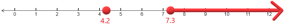
Example \(\PageIndex{4}\): rejection region
In Hypothesis testing, we sketch something called the rejection region which is an interval that goes off to infinity or to negative infinity. Suppose that the mean number of hours to work on the week's homework is 4.2. The rejection region for the hypothesis test is all numbers larger than 7.3 hours. Plot the mean and sketch the rejection region on a number line.
Solution
We plot the point 4.2 on the number line and shade everything to the right of 7.3 on the number line.