
1.3.5.3: Grouping Numeric Data
- Page ID
- 28663
Another way to organize raw data is to group them into class intervals, and to then create a frequency distribution of these class intervals.
There are many methods of creating class intervals, so we will simply focus on creating intervals of equal width.
How to create class intervals of equal width and a frequency distribution
- Choose how many intervals you want. Best is between 5 and 15 intervals.
- Determine the interval width using the formula and rounding UP to a convenient value:
\[\text { IW }=\text { Interval Width }=\dfrac{\text { Maximum Value - Minimum Value+ } 1}{\text { Number of Intervals }} \nonumber \]
- Create the class intervals starting with the minimum value:
Min to under Min + IW,
Min +IW to under Min +2(IW), ...
- Calculate the frequency of each class interval by counting the values in each class interval. Values that are on an endpoint should be put in the lower class interval. This result is called a frequency distribution.
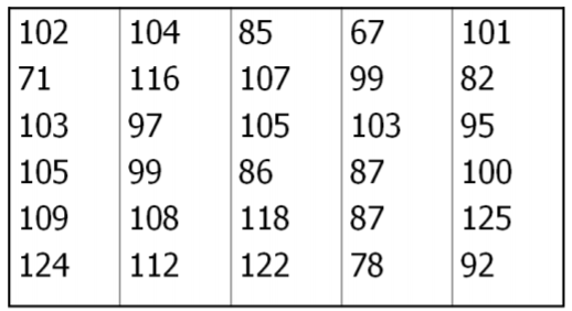
Example: Students browsing the web
Let's return to the data that represents how much time 30 students spent on a web browser in a 24 hour period. Data is rounded to the nearest minute.
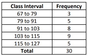
First we choose how many class intervals. In this example, we will create 5 class intervals.
Next Determine the Class Interval Width and round up to a convenient value.
\[\mathrm{IW}=\frac{125-67+1}{5}=11.8 \rightarrow 12 \nonumber\]
Now create class intervals of width 12, starting with the lowest value, 67.
\[\begin{array}{lllll}
(67 \text { to } 79) & (79 \text { to } 91) & (91 \text { to } 103) & (103 \text { to } 115) & (115 \text { to } 127)
\end{array} \nonumber \]
Now, create a frequency distribution, by counting how many are in each interval. Values that are on an endpoint should be put in the higher class interval. For example, 103 should be counted in the interval (103 to 115):
As we did with categorical data, we can define Relative Frequency as the proportion or percentage of values in any Class Interval.
n = sample size ‐ The number of observations in your sample size.
Frequency ‐ the number of times a particular value is observed in a class interval.
Relative frequency ‐ The proportion or percentage of times a particular value is observed in a class interval.
Relative Frequency = Frequency / n
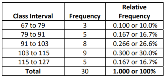
Note that the value for the (91 to 103) class interval was deliberately rounded down to make the totals add up to exactly 100%
From the frequency distribution, we can see that 30% of the students are on the internet between 103 and 115 minutes per day, while only 10% of students are on the internet between 67 and 79 minutes.
Example: Comparing weights of apples and oranges
A Chilean agricultural researcher collected a sample of 100 Royal Gala apples and 100 navel oranges and measured their weights in grams (see previous example on dot plots).
We will start with a value of 100 and make the interval width equal to 30. Using the tally feature of Minitab, we can create a frequency distribution for the two fruits. Minitab uses “Count” for “Frequency” and reports “Percent” for “Relative Frequency”
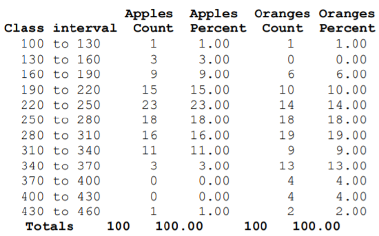
The most frequently occurring interval for apples is 220 to 250 grams while the most frequently occurring interval for oranges is 280 to 310 grams. Notice that there are some intervals with 0 observations, showing a potential high outlier for apples and a low outlier for oranges.