
2.5: Histograms
- Page ID
- 49993
\( \newcommand{\vecs}[1]{\overset { \scriptstyle \rightharpoonup} {\mathbf{#1}} } \)
\( \newcommand{\vecd}[1]{\overset{-\!-\!\rightharpoonup}{\vphantom{a}\smash {#1}}} \)
\( \newcommand{\dsum}{\displaystyle\sum\limits} \)
\( \newcommand{\dint}{\displaystyle\int\limits} \)
\( \newcommand{\dlim}{\displaystyle\lim\limits} \)
\( \newcommand{\id}{\mathrm{id}}\) \( \newcommand{\Span}{\mathrm{span}}\)
( \newcommand{\kernel}{\mathrm{null}\,}\) \( \newcommand{\range}{\mathrm{range}\,}\)
\( \newcommand{\RealPart}{\mathrm{Re}}\) \( \newcommand{\ImaginaryPart}{\mathrm{Im}}\)
\( \newcommand{\Argument}{\mathrm{Arg}}\) \( \newcommand{\norm}[1]{\| #1 \|}\)
\( \newcommand{\inner}[2]{\langle #1, #2 \rangle}\)
\( \newcommand{\Span}{\mathrm{span}}\)
\( \newcommand{\id}{\mathrm{id}}\)
\( \newcommand{\Span}{\mathrm{span}}\)
\( \newcommand{\kernel}{\mathrm{null}\,}\)
\( \newcommand{\range}{\mathrm{range}\,}\)
\( \newcommand{\RealPart}{\mathrm{Re}}\)
\( \newcommand{\ImaginaryPart}{\mathrm{Im}}\)
\( \newcommand{\Argument}{\mathrm{Arg}}\)
\( \newcommand{\norm}[1]{\| #1 \|}\)
\( \newcommand{\inner}[2]{\langle #1, #2 \rangle}\)
\( \newcommand{\Span}{\mathrm{span}}\) \( \newcommand{\AA}{\unicode[.8,0]{x212B}}\)
\( \newcommand{\vectorA}[1]{\vec{#1}} % arrow\)
\( \newcommand{\vectorAt}[1]{\vec{\text{#1}}} % arrow\)
\( \newcommand{\vectorB}[1]{\overset { \scriptstyle \rightharpoonup} {\mathbf{#1}} } \)
\( \newcommand{\vectorC}[1]{\textbf{#1}} \)
\( \newcommand{\vectorD}[1]{\overrightarrow{#1}} \)
\( \newcommand{\vectorDt}[1]{\overrightarrow{\text{#1}}} \)
\( \newcommand{\vectE}[1]{\overset{-\!-\!\rightharpoonup}{\vphantom{a}\smash{\mathbf {#1}}}} \)
\( \newcommand{\vecs}[1]{\overset { \scriptstyle \rightharpoonup} {\mathbf{#1}} } \)
\(\newcommand{\longvect}{\overrightarrow}\)
\( \newcommand{\vecd}[1]{\overset{-\!-\!\rightharpoonup}{\vphantom{a}\smash {#1}}} \)
\(\newcommand{\avec}{\mathbf a}\) \(\newcommand{\bvec}{\mathbf b}\) \(\newcommand{\cvec}{\mathbf c}\) \(\newcommand{\dvec}{\mathbf d}\) \(\newcommand{\dtil}{\widetilde{\mathbf d}}\) \(\newcommand{\evec}{\mathbf e}\) \(\newcommand{\fvec}{\mathbf f}\) \(\newcommand{\nvec}{\mathbf n}\) \(\newcommand{\pvec}{\mathbf p}\) \(\newcommand{\qvec}{\mathbf q}\) \(\newcommand{\svec}{\mathbf s}\) \(\newcommand{\tvec}{\mathbf t}\) \(\newcommand{\uvec}{\mathbf u}\) \(\newcommand{\vvec}{\mathbf v}\) \(\newcommand{\wvec}{\mathbf w}\) \(\newcommand{\xvec}{\mathbf x}\) \(\newcommand{\yvec}{\mathbf y}\) \(\newcommand{\zvec}{\mathbf z}\) \(\newcommand{\rvec}{\mathbf r}\) \(\newcommand{\mvec}{\mathbf m}\) \(\newcommand{\zerovec}{\mathbf 0}\) \(\newcommand{\onevec}{\mathbf 1}\) \(\newcommand{\real}{\mathbb R}\) \(\newcommand{\twovec}[2]{\left[\begin{array}{r}#1 \\ #2 \end{array}\right]}\) \(\newcommand{\ctwovec}[2]{\left[\begin{array}{c}#1 \\ #2 \end{array}\right]}\) \(\newcommand{\threevec}[3]{\left[\begin{array}{r}#1 \\ #2 \\ #3 \end{array}\right]}\) \(\newcommand{\cthreevec}[3]{\left[\begin{array}{c}#1 \\ #2 \\ #3 \end{array}\right]}\) \(\newcommand{\fourvec}[4]{\left[\begin{array}{r}#1 \\ #2 \\ #3 \\ #4 \end{array}\right]}\) \(\newcommand{\cfourvec}[4]{\left[\begin{array}{c}#1 \\ #2 \\ #3 \\ #4 \end{array}\right]}\) \(\newcommand{\fivevec}[5]{\left[\begin{array}{r}#1 \\ #2 \\ #3 \\ #4 \\ #5 \\ \end{array}\right]}\) \(\newcommand{\cfivevec}[5]{\left[\begin{array}{c}#1 \\ #2 \\ #3 \\ #4 \\ #5 \\ \end{array}\right]}\) \(\newcommand{\mattwo}[4]{\left[\begin{array}{rr}#1 \amp #2 \\ #3 \amp #4 \\ \end{array}\right]}\) \(\newcommand{\laspan}[1]{\text{Span}\{#1\}}\) \(\newcommand{\bcal}{\cal B}\) \(\newcommand{\ccal}{\cal C}\) \(\newcommand{\scal}{\cal S}\) \(\newcommand{\wcal}{\cal W}\) \(\newcommand{\ecal}{\cal E}\) \(\newcommand{\coords}[2]{\left\{#1\right\}_{#2}}\) \(\newcommand{\gray}[1]{\color{gray}{#1}}\) \(\newcommand{\lgray}[1]{\color{lightgray}{#1}}\) \(\newcommand{\rank}{\operatorname{rank}}\) \(\newcommand{\row}{\text{Row}}\) \(\newcommand{\col}{\text{Col}}\) \(\renewcommand{\row}{\text{Row}}\) \(\newcommand{\nul}{\text{Nul}}\) \(\newcommand{\var}{\text{Var}}\) \(\newcommand{\corr}{\text{corr}}\) \(\newcommand{\len}[1]{\left|#1\right|}\) \(\newcommand{\bbar}{\overline{\bvec}}\) \(\newcommand{\bhat}{\widehat{\bvec}}\) \(\newcommand{\bperp}{\bvec^\perp}\) \(\newcommand{\xhat}{\widehat{\xvec}}\) \(\newcommand{\vhat}{\widehat{\vvec}}\) \(\newcommand{\uhat}{\widehat{\uvec}}\) \(\newcommand{\what}{\widehat{\wvec}}\) \(\newcommand{\Sighat}{\widehat{\Sigma}}\) \(\newcommand{\lt}{<}\) \(\newcommand{\gt}{>}\) \(\newcommand{\amp}{&}\) \(\definecolor{fillinmathshade}{gray}{0.9}\)Another way you can display your data is with a graph. There are several kinds of graphs that you can use depending upon the type of data you have and what you want to be able to see with or about those data. Let’s consider the kinds of graphs we can make for the variable Years of Experience. Our goal here is simply to summarize our data from this quantitative variable univariately. A graph called a histogram works well for summarizing quantitative data and it builds on the same general ideas as the frequency distribution.
Histograms are frequency distribution graphs for quantitative data which present scores or intervals using abutted bars along the x-axis and frequencies along the y-axis. These are most appropriate for variables which are continuous and measured using an interval or ratio scale. To construct a histogram, data are first organized to identify the range that needs to be shown on the x-axis. Then the frequencies of the scores (or intervals) are counted to identify the height needed for the y-axis. Once these axes are created and labeled, vertical bars are added along the x-axis. The bar widths extend along the x-axis to the real score limits of the score of interval they represent. Essentially, this means each bar extend to the midpoint between itself and the scores to the left and right of it. Because bars extend to the real score limits, bars which represent adjacent scores or intervals abut or touch each other. This is to represent the continuous nature of many quantitative variables. The bar heights extend up corresponding with the frequency with which data occurred at the scores or within the intervals they represent.
Creating Histograms using Scores
Let’s take a look at a histogram for the variable Years of Experience in Data Set 2.1 (see Figure 1). There were two cases of individuals who had 1 year of experience in the data set. We see this represented by the first bar of the graph when read from left to right. This bar is over the number 1 on the x-axis and extends to the midpoint between it and the value to the left of it (which is 0) and the value to the right of it (which is 2); thus, the bar representing 1 year of experience spans from 0.50 to 1.50 on the x-axis. To the right of it is the bar representing 2 years of experience which spans from 1.50 to 2.50 on the x axis. The bars continue in this way along the x-axis. The height of the first bar representing 1 year of experience is 2 units high on the y-axis. This is because the frequency with which data indicating 1 year of experience were observed was 2. Thus, the height of 2 indicates that two cases reported a raw score of 1 for years of experience. This continues for each bar such that their heights correspond to the frequency with which the scores they represent occurred.
Let’s take note of a few other aspects of how the graph was constructed. First, there are no bars over the scores of 0 or 8. This represents an absence of data for those scores. This means that whenever we see a gap where a bar appears to be missing on a histogram, it indicates that the frequency with which that score was observed was 0. It is possible to simply eliminate the sections of the graph representing scores of 0 and 8 which would make the graph narrower. Some statisticians, however, prefer to extend the x-axis one score or interval to the left and right of the range within which data were observed to make the graph a bit easier to read. Essentially, when statisticians leave those gaps in on the left and right, they are visually confirming that the graph was not cut-off somewhere and that no bars are missing. Similarly, you can see that the y-axis extends up to a frequency of 5 despite the fact that the tallest bar only goes up to a frequency of 4. It is sometimes recommended to leave about 20-25% of extra empty space at the top of the y-axis to ensure that the tops of all the bars are clearly visible and to make the graph a bit more visually appealing.

Figure 1 Histogram for Years of Experience (n = 18)
Comparing Histograms to Frequency Distributions. Histograms provide the same general information and summaries as frequency distribution tables but in graph form. Let’s compare the two for Years of Experience to make their similarities and differences clearer. We can take our frequency distribution for Years of Experience (Table 4) and tweak it slightly to use hash marks instead of numbers in the frequency column; the result goes from the version shown on the left to the one shown on the right:
| Frequency of Years of Experience (n = 18) | Frequency of Years of Experience Using Hash Marks (n = 18) | |||
|---|---|---|---|---|
| Score | Frequency | Score | Frequency | |
| 7 | 2 | 7 | ❘ ❘ | |
| 6 | 3 | 6 | ❘ ❘ ❘ | |
| 5 | 4 | 5 | ❘ ❘ ❘ ❘ | |
| 4 | 3 | 4 | ❘ ❘ ❘ | |
| 3 | 2 | 3 | ❘ ❘ | |
| 2 | 2 | 2 | ❘ ❘ | |
| 1 | 2 | 1 | ❘ ❘ | |
The hash marks now use space to represent frequency horizontally the same way the bars of a histogram represent frequency vertically. If you look sideways at the hash marks in Table 4 and read them from low to high (bottom to top) you are essentially looking at a histogram. Here is the rotated and highlighted version of the frequency distribution for Years of Experience next to its histogram to illustrate this:
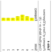

Notice the similarity in the highlighted hash marks in the rotated table and the bars of the histogram. Thus, either the table or the graph are useful ways of creating univariate summaries of quantitative variables but only one is typically used at any given time because using both would be redundant.
Creating Histograms using Intervals
Just like with a frequency distribution table, some data require the use of intervals when creating histograms. When the range of scores is too large to fit into approximately 20 bars or less, intervals are used instead of scores for creating the x-axis of the histogram. There are two ways the x-axis is commonly displayed when intervals are used. The first option, shown in Figure 2, is to label the boundaries between the intervals. To do so, the lower limit of each interval appears under the left (lower) edge of the bar representing it. Therefore, Figure 2 shows labels (also known as “anchors”) on the x-axis that match the lower end of each interval used in the corresponding frequency distribution table created with the same data (as shown in Table 6). Thus, we see anchors at 30,000, 40,000, 50,000, and so on.

Figure 2 Histogram for Annual Salary (n = 18)
An alternative way to label the x-axis is by stating the midpoint of each interval centered under each bar as shown in Figure 3. When this version is used, an extra anchor to the left and right of the ones for which there are data (bars) can be used to make it easier for readers to visually locate the upper and lower limits used for each interval.

Figure 3 Histogram for Annual Salary using Centered Anchors (n = 18)