7.5: Plots with Two Variables
- Page ID
- 8743

\( \newcommand{\vecs}[1]{\overset { \scriptstyle \rightharpoonup} {\mathbf{#1}} } \)
\( \newcommand{\vecd}[1]{\overset{-\!-\!\rightharpoonup}{\vphantom{a}\smash {#1}}} \)
\( \newcommand{\id}{\mathrm{id}}\) \( \newcommand{\Span}{\mathrm{span}}\)
( \newcommand{\kernel}{\mathrm{null}\,}\) \( \newcommand{\range}{\mathrm{range}\,}\)
\( \newcommand{\RealPart}{\mathrm{Re}}\) \( \newcommand{\ImaginaryPart}{\mathrm{Im}}\)
\( \newcommand{\Argument}{\mathrm{Arg}}\) \( \newcommand{\norm}[1]{\| #1 \|}\)
\( \newcommand{\inner}[2]{\langle #1, #2 \rangle}\)
\( \newcommand{\Span}{\mathrm{span}}\)
\( \newcommand{\id}{\mathrm{id}}\)
\( \newcommand{\Span}{\mathrm{span}}\)
\( \newcommand{\kernel}{\mathrm{null}\,}\)
\( \newcommand{\range}{\mathrm{range}\,}\)
\( \newcommand{\RealPart}{\mathrm{Re}}\)
\( \newcommand{\ImaginaryPart}{\mathrm{Im}}\)
\( \newcommand{\Argument}{\mathrm{Arg}}\)
\( \newcommand{\norm}[1]{\| #1 \|}\)
\( \newcommand{\inner}[2]{\langle #1, #2 \rangle}\)
\( \newcommand{\Span}{\mathrm{span}}\) \( \newcommand{\AA}{\unicode[.8,0]{x212B}}\)
\( \newcommand{\vectorA}[1]{\vec{#1}} % arrow\)
\( \newcommand{\vectorAt}[1]{\vec{\text{#1}}} % arrow\)
\( \newcommand{\vectorB}[1]{\overset { \scriptstyle \rightharpoonup} {\mathbf{#1}} } \)
\( \newcommand{\vectorC}[1]{\textbf{#1}} \)
\( \newcommand{\vectorD}[1]{\overrightarrow{#1}} \)
\( \newcommand{\vectorDt}[1]{\overrightarrow{\text{#1}}} \)
\( \newcommand{\vectE}[1]{\overset{-\!-\!\rightharpoonup}{\vphantom{a}\smash{\mathbf {#1}}}} \)
\( \newcommand{\vecs}[1]{\overset { \scriptstyle \rightharpoonup} {\mathbf{#1}} } \)
\( \newcommand{\vecd}[1]{\overset{-\!-\!\rightharpoonup}{\vphantom{a}\smash {#1}}} \)
\(\newcommand{\avec}{\mathbf a}\) \(\newcommand{\bvec}{\mathbf b}\) \(\newcommand{\cvec}{\mathbf c}\) \(\newcommand{\dvec}{\mathbf d}\) \(\newcommand{\dtil}{\widetilde{\mathbf d}}\) \(\newcommand{\evec}{\mathbf e}\) \(\newcommand{\fvec}{\mathbf f}\) \(\newcommand{\nvec}{\mathbf n}\) \(\newcommand{\pvec}{\mathbf p}\) \(\newcommand{\qvec}{\mathbf q}\) \(\newcommand{\svec}{\mathbf s}\) \(\newcommand{\tvec}{\mathbf t}\) \(\newcommand{\uvec}{\mathbf u}\) \(\newcommand{\vvec}{\mathbf v}\) \(\newcommand{\wvec}{\mathbf w}\) \(\newcommand{\xvec}{\mathbf x}\) \(\newcommand{\yvec}{\mathbf y}\) \(\newcommand{\zvec}{\mathbf z}\) \(\newcommand{\rvec}{\mathbf r}\) \(\newcommand{\mvec}{\mathbf m}\) \(\newcommand{\zerovec}{\mathbf 0}\) \(\newcommand{\onevec}{\mathbf 1}\) \(\newcommand{\real}{\mathbb R}\) \(\newcommand{\twovec}[2]{\left[\begin{array}{r}#1 \\ #2 \end{array}\right]}\) \(\newcommand{\ctwovec}[2]{\left[\begin{array}{c}#1 \\ #2 \end{array}\right]}\) \(\newcommand{\threevec}[3]{\left[\begin{array}{r}#1 \\ #2 \\ #3 \end{array}\right]}\) \(\newcommand{\cthreevec}[3]{\left[\begin{array}{c}#1 \\ #2 \\ #3 \end{array}\right]}\) \(\newcommand{\fourvec}[4]{\left[\begin{array}{r}#1 \\ #2 \\ #3 \\ #4 \end{array}\right]}\) \(\newcommand{\cfourvec}[4]{\left[\begin{array}{c}#1 \\ #2 \\ #3 \\ #4 \end{array}\right]}\) \(\newcommand{\fivevec}[5]{\left[\begin{array}{r}#1 \\ #2 \\ #3 \\ #4 \\ #5 \\ \end{array}\right]}\) \(\newcommand{\cfivevec}[5]{\left[\begin{array}{c}#1 \\ #2 \\ #3 \\ #4 \\ #5 \\ \end{array}\right]}\) \(\newcommand{\mattwo}[4]{\left[\begin{array}{rr}#1 \amp #2 \\ #3 \amp #4 \\ \end{array}\right]}\) \(\newcommand{\laspan}[1]{\text{Span}\{#1\}}\) \(\newcommand{\bcal}{\cal B}\) \(\newcommand{\ccal}{\cal C}\) \(\newcommand{\scal}{\cal S}\) \(\newcommand{\wcal}{\cal W}\) \(\newcommand{\ecal}{\cal E}\) \(\newcommand{\coords}[2]{\left\{#1\right\}_{#2}}\) \(\newcommand{\gray}[1]{\color{gray}{#1}}\) \(\newcommand{\lgray}[1]{\color{lightgray}{#1}}\) \(\newcommand{\rank}{\operatorname{rank}}\) \(\newcommand{\row}{\text{Row}}\) \(\newcommand{\col}{\text{Col}}\) \(\renewcommand{\row}{\text{Row}}\) \(\newcommand{\nul}{\text{Nul}}\) \(\newcommand{\var}{\text{Var}}\) \(\newcommand{\corr}{\text{corr}}\) \(\newcommand{\len}[1]{\left|#1\right|}\) \(\newcommand{\bbar}{\overline{\bvec}}\) \(\newcommand{\bhat}{\widehat{\bvec}}\) \(\newcommand{\bperp}{\bvec^\perp}\) \(\newcommand{\xhat}{\widehat{\xvec}}\) \(\newcommand{\vhat}{\widehat{\vvec}}\) \(\newcommand{\uhat}{\widehat{\uvec}}\) \(\newcommand{\what}{\widehat{\wvec}}\) \(\newcommand{\Sighat}{\widehat{\Sigma}}\) \(\newcommand{\lt}{<}\) \(\newcommand{\gt}{>}\) \(\newcommand{\amp}{&}\) \(\definecolor{fillinmathshade}{gray}{0.9}\)Let’s check out mileage by car manufacturer. We’ll plot one continuous variable by one nominal one.
First, let’s make a bar plot by choosing the stat “summary” and picking the “mean” function to summarize the data.
ggplot(mpg, aes(manufacturer, hwy)) +
  geom_bar(stat = "summary", fun.y = "mean")  +
  ylab('Highway mileage')
One problem with this plot is that it’s hard to read some of the labels because they overlap. How could we fix that? Hint: search the web for “ggplot rotate x axis labels” and add the appropriate command.
TBD: fix
ggplot(mpg, aes(manufacturer, hwy)) +
  geom_bar(stat = "summary", fun.y = "mean")  +
  ylab('Highway mileage')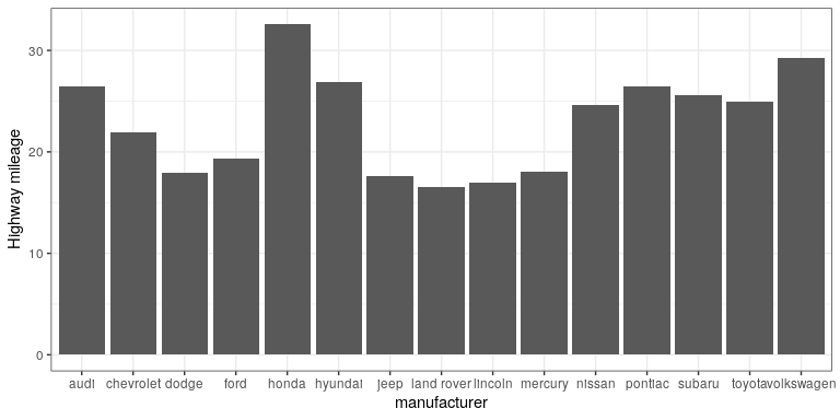
7.5.1 Adding on variables
What if we wanted to add another variable into the mix? Maybe the year of the car is also important to consider. We have a few options here. First, you could map the variable to another aesthetic.
# first, year needs to be converted to a factor
mpg$year <- factor(mpg$year)

ggplot(mpg, aes(manufacturer, hwy, fill = year)) +
  geom_bar(stat = "summary", fun.y = "mean")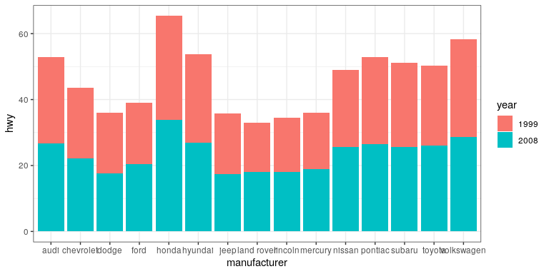
By default, the bars are stacked on top of one another. If you want to separate them, you can change the position argument form its default to “dodge”.
ggplot(mpg, aes(manufacturer, hwy, fill=year)) +
  geom_bar(stat = "summary",
           fun.y = "mean",
           position = "dodge")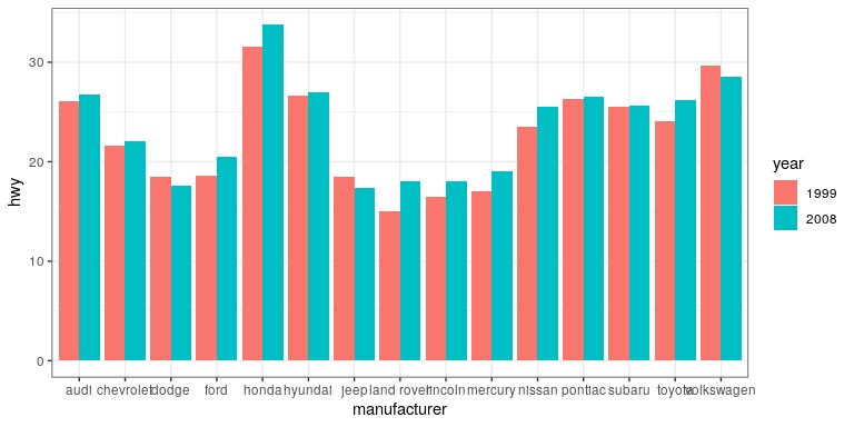
ggplot(mpg, aes(year, hwy,
                group=manufacturer,
                color=manufacturer)) +
  geom_line(stat = "summary", fun.y = "mean")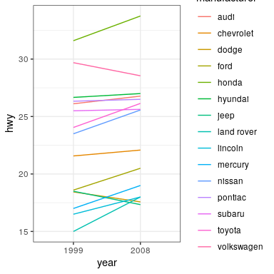
For a less visually cluttered plot, let’s try facetting. This creates subplots for each value of the year variable.
ggplot(mpg, aes(manufacturer, hwy)) +
  # split up the bar plot into two by year
  facet_grid(year ~ .) +
  geom_bar(stat = "summary",
           fun.y = "mean")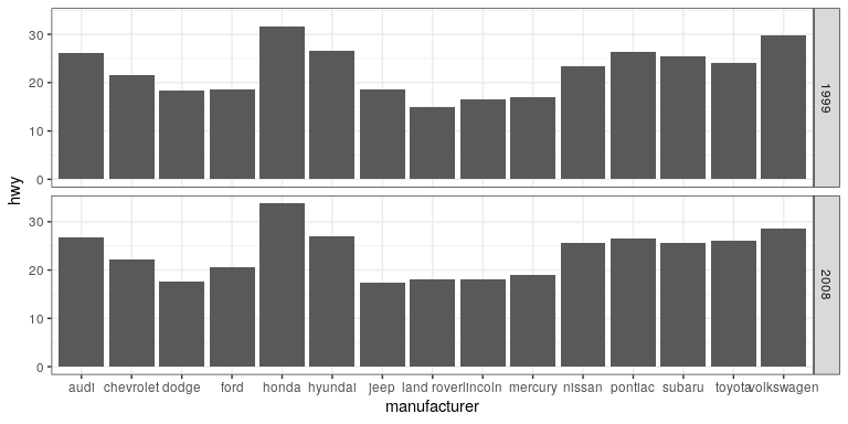
7.5.2 Plotting dispersion
Instead of looking at just the means, we can get a sense of the entire distribution of mileage values for each manufacturer.
7.5.2.1 Box plot
ggplot(mpg, aes(manufacturer, hwy)) +
  geom_boxplot()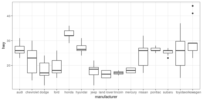
A box plot (or box and whiskers plot) uses quartiles to give us a sense of spread. The thickest line, somewhere inside the box, represents the median. The upper and lower bounds of the box (the hinges) are the first and third quartiles (can you use them to approximate the interquartile range?). The lines extending from the hinges are the remaining data points, excluding outliers, which are plotted as individual points.
7.5.2.2 Error bars
Now, let’s do something a bit more complex, but much more useful – let’s create our own summary of the data, so we can choose which summary statistic to plot and also compute a measure of dispersion of our choosing.
# summarise data
mpg_summary <- mpg %>%
  group_by(manufacturer) %>%
  summarise(n = n(),
            mean_hwy = mean(hwy),
            sd_hwy = sd(hwy))

# compute confidence intervals for the error bars
# (we'll talk about this later in the course!)

limits <- aes(
  # compute the lower limit of the error bar
  ymin = mean_hwy - 1.96 * sd_hwy / sqrt(n),
  # compute the upper limit
  ymax = mean_hwy + 1.96 * sd_hwy / sqrt(n))

# now we're giving ggplot the mean for each group,
# instead of the datapoints themselves

ggplot(mpg_summary, aes(manufacturer, mean_hwy)) +
  # we set stat = "identity" on the summary data
  geom_bar(stat = "identity") +
  # we create error bars using the limits we computed above
geom_errorbar(limits, width=0.5) 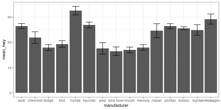
Error bars don’t always mean the same thing – it’s important to determine whether you’re looking at e.g. standard error or confidence intervals (which we’ll talk more about later in the course).
7.5.2.2.1 Minimizing non-data ink
The plot we just created is nice and all, but it’s tough to look at. The bar plots add a lot of ink that doesn’t help us compare engine sizes across manufacturers. Similarly, the width of the error bars doesn’t add any information. Let’s tweak which geometry we use, and tweak the appearance of the error bars.
ggplot(mpg_summary, aes(manufacturer, mean_hwy)) +
  # switch to point instead of bar to minimize ink used
  geom_point() +
  # remove the horizontal parts of the error bars
geom_errorbar(limits, width = 0) 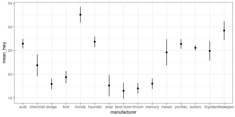
Looks a lot cleaner, but our points are all over the place. Let’s make a final tweak to make learning something from this plot a bit easier.
mpg_summary_ordered <- mpg_summary %>%
  mutate(
    # we sort manufacturers by mean engine size
    manufacturer = reorder(manufacturer, -mean_hwy)
  )

ggplot(mpg_summary_ordered, aes(manufacturer, mean_hwy)) +
  geom_point() +
geom_errorbar(limits, width = 0) 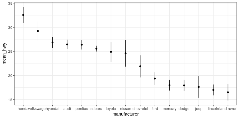
7.5.3 Scatter plot
When we have multiple continuous variables, we can use points to plot each variable on an axis. This is known as a scatter plot. You’ve seen this example in your reading.
ggplot(mpg, aes(displ, hwy)) +
  geom_point()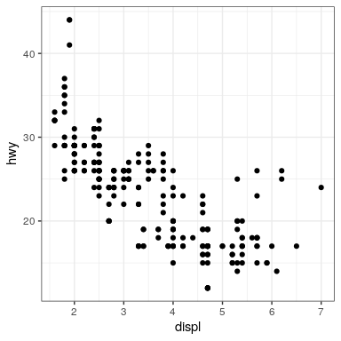
7.5.3.1 Layers of data
We can add layers of data onto this graph, like a line of best fit. We use a geometry known as a smooth to accomplish this.
ggplot(mpg, aes(displ, hwy)) +
  geom_point() +
  geom_smooth(color = "black")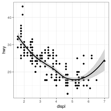
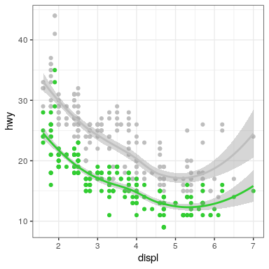
We can add on points and a smooth line for another set of data as well (efficiency in the city instead of on the highway).
ggplot(mpg) +
  geom_point(aes(displ, hwy), color = "grey") +
  geom_smooth(aes(displ, hwy), color = "grey") +
  geom_point(aes(displ, cty), color = "limegreen") +
  geom_smooth(aes(displ, cty), color = "limegreen")