7.2: Classification without learning
- Page ID
- 3583
\( \newcommand{\vecs}[1]{\overset { \scriptstyle \rightharpoonup} {\mathbf{#1}} } \)
\( \newcommand{\vecd}[1]{\overset{-\!-\!\rightharpoonup}{\vphantom{a}\smash {#1}}} \)
\( \newcommand{\dsum}{\displaystyle\sum\limits} \)
\( \newcommand{\dint}{\displaystyle\int\limits} \)
\( \newcommand{\dlim}{\displaystyle\lim\limits} \)
\( \newcommand{\id}{\mathrm{id}}\) \( \newcommand{\Span}{\mathrm{span}}\)
( \newcommand{\kernel}{\mathrm{null}\,}\) \( \newcommand{\range}{\mathrm{range}\,}\)
\( \newcommand{\RealPart}{\mathrm{Re}}\) \( \newcommand{\ImaginaryPart}{\mathrm{Im}}\)
\( \newcommand{\Argument}{\mathrm{Arg}}\) \( \newcommand{\norm}[1]{\| #1 \|}\)
\( \newcommand{\inner}[2]{\langle #1, #2 \rangle}\)
\( \newcommand{\Span}{\mathrm{span}}\)
\( \newcommand{\id}{\mathrm{id}}\)
\( \newcommand{\Span}{\mathrm{span}}\)
\( \newcommand{\kernel}{\mathrm{null}\,}\)
\( \newcommand{\range}{\mathrm{range}\,}\)
\( \newcommand{\RealPart}{\mathrm{Re}}\)
\( \newcommand{\ImaginaryPart}{\mathrm{Im}}\)
\( \newcommand{\Argument}{\mathrm{Arg}}\)
\( \newcommand{\norm}[1]{\| #1 \|}\)
\( \newcommand{\inner}[2]{\langle #1, #2 \rangle}\)
\( \newcommand{\Span}{\mathrm{span}}\) \( \newcommand{\AA}{\unicode[.8,0]{x212B}}\)
\( \newcommand{\vectorA}[1]{\vec{#1}} % arrow\)
\( \newcommand{\vectorAt}[1]{\vec{\text{#1}}} % arrow\)
\( \newcommand{\vectorB}[1]{\overset { \scriptstyle \rightharpoonup} {\mathbf{#1}} } \)
\( \newcommand{\vectorC}[1]{\textbf{#1}} \)
\( \newcommand{\vectorD}[1]{\overrightarrow{#1}} \)
\( \newcommand{\vectorDt}[1]{\overrightarrow{\text{#1}}} \)
\( \newcommand{\vectE}[1]{\overset{-\!-\!\rightharpoonup}{\vphantom{a}\smash{\mathbf {#1}}}} \)
\( \newcommand{\vecs}[1]{\overset { \scriptstyle \rightharpoonup} {\mathbf{#1}} } \)
\(\newcommand{\longvect}{\overrightarrow}\)
\( \newcommand{\vecd}[1]{\overset{-\!-\!\rightharpoonup}{\vphantom{a}\smash {#1}}} \)
\(\newcommand{\avec}{\mathbf a}\) \(\newcommand{\bvec}{\mathbf b}\) \(\newcommand{\cvec}{\mathbf c}\) \(\newcommand{\dvec}{\mathbf d}\) \(\newcommand{\dtil}{\widetilde{\mathbf d}}\) \(\newcommand{\evec}{\mathbf e}\) \(\newcommand{\fvec}{\mathbf f}\) \(\newcommand{\nvec}{\mathbf n}\) \(\newcommand{\pvec}{\mathbf p}\) \(\newcommand{\qvec}{\mathbf q}\) \(\newcommand{\svec}{\mathbf s}\) \(\newcommand{\tvec}{\mathbf t}\) \(\newcommand{\uvec}{\mathbf u}\) \(\newcommand{\vvec}{\mathbf v}\) \(\newcommand{\wvec}{\mathbf w}\) \(\newcommand{\xvec}{\mathbf x}\) \(\newcommand{\yvec}{\mathbf y}\) \(\newcommand{\zvec}{\mathbf z}\) \(\newcommand{\rvec}{\mathbf r}\) \(\newcommand{\mvec}{\mathbf m}\) \(\newcommand{\zerovec}{\mathbf 0}\) \(\newcommand{\onevec}{\mathbf 1}\) \(\newcommand{\real}{\mathbb R}\) \(\newcommand{\twovec}[2]{\left[\begin{array}{r}#1 \\ #2 \end{array}\right]}\) \(\newcommand{\ctwovec}[2]{\left[\begin{array}{c}#1 \\ #2 \end{array}\right]}\) \(\newcommand{\threevec}[3]{\left[\begin{array}{r}#1 \\ #2 \\ #3 \end{array}\right]}\) \(\newcommand{\cthreevec}[3]{\left[\begin{array}{c}#1 \\ #2 \\ #3 \end{array}\right]}\) \(\newcommand{\fourvec}[4]{\left[\begin{array}{r}#1 \\ #2 \\ #3 \\ #4 \end{array}\right]}\) \(\newcommand{\cfourvec}[4]{\left[\begin{array}{c}#1 \\ #2 \\ #3 \\ #4 \end{array}\right]}\) \(\newcommand{\fivevec}[5]{\left[\begin{array}{r}#1 \\ #2 \\ #3 \\ #4 \\ #5 \\ \end{array}\right]}\) \(\newcommand{\cfivevec}[5]{\left[\begin{array}{c}#1 \\ #2 \\ #3 \\ #4 \\ #5 \\ \end{array}\right]}\) \(\newcommand{\mattwo}[4]{\left[\begin{array}{rr}#1 \amp #2 \\ #3 \amp #4 \\ \end{array}\right]}\) \(\newcommand{\laspan}[1]{\text{Span}\{#1\}}\) \(\newcommand{\bcal}{\cal B}\) \(\newcommand{\ccal}{\cal C}\) \(\newcommand{\scal}{\cal S}\) \(\newcommand{\wcal}{\cal W}\) \(\newcommand{\ecal}{\cal E}\) \(\newcommand{\coords}[2]{\left\{#1\right\}_{#2}}\) \(\newcommand{\gray}[1]{\color{gray}{#1}}\) \(\newcommand{\lgray}[1]{\color{lightgray}{#1}}\) \(\newcommand{\rank}{\operatorname{rank}}\) \(\newcommand{\row}{\text{Row}}\) \(\newcommand{\col}{\text{Col}}\) \(\renewcommand{\row}{\text{Row}}\) \(\newcommand{\nul}{\text{Nul}}\) \(\newcommand{\var}{\text{Var}}\) \(\newcommand{\corr}{\text{corr}}\) \(\newcommand{\len}[1]{\left|#1\right|}\) \(\newcommand{\bbar}{\overline{\bvec}}\) \(\newcommand{\bhat}{\widehat{\bvec}}\) \(\newcommand{\bperp}{\bvec^\perp}\) \(\newcommand{\xhat}{\widehat{\xvec}}\) \(\newcommand{\vhat}{\widehat{\vvec}}\) \(\newcommand{\uhat}{\widehat{\uvec}}\) \(\newcommand{\what}{\widehat{\wvec}}\) \(\newcommand{\Sighat}{\widehat{\Sigma}}\) \(\newcommand{\lt}{<}\) \(\newcommand{\gt}{>}\) \(\newcommand{\amp}{&}\) \(\definecolor{fillinmathshade}{gray}{0.9}\)We see that plotting of multivariate data always has two problems: either there are too many elements (e.g., in parallel coordinates) which are hard to understand, or there is a need of some grouping operation (e.g., median or range) which will result in the lost of information. What will be really helpful is to safely process the data first, for example, to reduce dimensions—from many to 2 or 3. These techniques are described in this section.
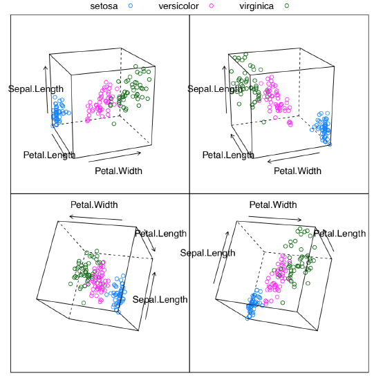
Apart from (a) reduction of dimensionality (projection pursuit), the following methods help to (b) find groups (clusters) in data, (c) discover hidden factors (latent variables) and understand variable importance (feature selection\(^{[1]}\)), (d) recognize objects (e.g., complicated shapes) within data, typically using densities and hiatus (gaps) in multidimensional space, and (e) unmix signals.
Classification with primary data
Primary is what come directly from observation, and did not yet processes in any way (to make secondary data).
Shadows of hyper clouds: PCA
RGL (see above) allows to find the best projection manually, with a mouse. However, it is possible to do programmatically, with principal component analysis, PCA. It belongs to the family of non-supervised methods, methods of classification without learning, or ordination.
PCA treats the data as points in the virtual multidimensional space where every dimension is the one character. These points make together the multidimensional cloud. The goal of the analysis is to find a line which crosses this cloud along its most elongated part, like pear on the stick (Figure \(\PageIndex{2}\)). This is the first principal component. The second line is perpendicular to the first and again span the second most elongated part of the cloud. These two lines make the plane on which every point is projected.
Let us prove this practically. We will load the two-dimensional (hence only two principal components) black and white pear image and see what PCA does with it:
Code \(\PageIndex{1}\) (R):
PCA is related with a task of finding the “most average person”. The simple combination of averages will not work, which is well explained in Todd Rose’s “The End of Average” book. However, it is usually possible to find in the hyperspace the configuration of parameters which will suit most of people, and this is what PCA is for.
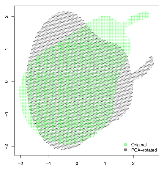
After the PCA procedure, all columns (characters) are transformed into components, and the most informative component is the first, next is the second, then third etc. The number of components is the same as the number of initial characters but first two or three usually include all necessary information. This is why it is possible to use them for 2D visualization of multidimensional data. There are many similarities between PCA and factor analysis (which is out of the scope of this book).
At first, we will use an example from the open repository presenting measurements of four different populations of sedges:
Code \(\PageIndex{2}\) (R):
(Function scale() standardizes all variables.)
The following (Figure \(\PageIndex{4}\)) plot is technical screeplot which shows the relative importance of each component:
Code \(\PageIndex{3}\) (R):
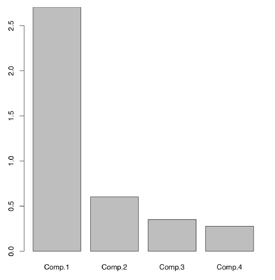
Here it is easy to see that among four components (same number as initial characters), two first have the highest importances. There is a way to have the same without plotting:
Code \(\PageIndex{4}\) (R):
First two components together explain about 84% percents of the total variance.
Visualization of PCA is usually made using scores from PCA model (Figure \(\PageIndex{5}\)):
Code \(\PageIndex{5}\) (R):
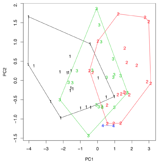
(Last command draws hulls which help to conclude that first sedges from the third population are intermediate between first and second, they might be even hybrids. If there are three, not two, components which are most important, then any of 3D plots like scatterplot3d() explained above, will help to visualize them.)
It is tempting to measure the intersection between hulls. This is possible with Overlap() function, which in turn loads PBSmapping package:
Code \(\PageIndex{6}\) (R):
Sometimes, PCA results are useful to present as a biplot (Figure \(\PageIndex{6}\)):
Code \(\PageIndex{7}\) (R):
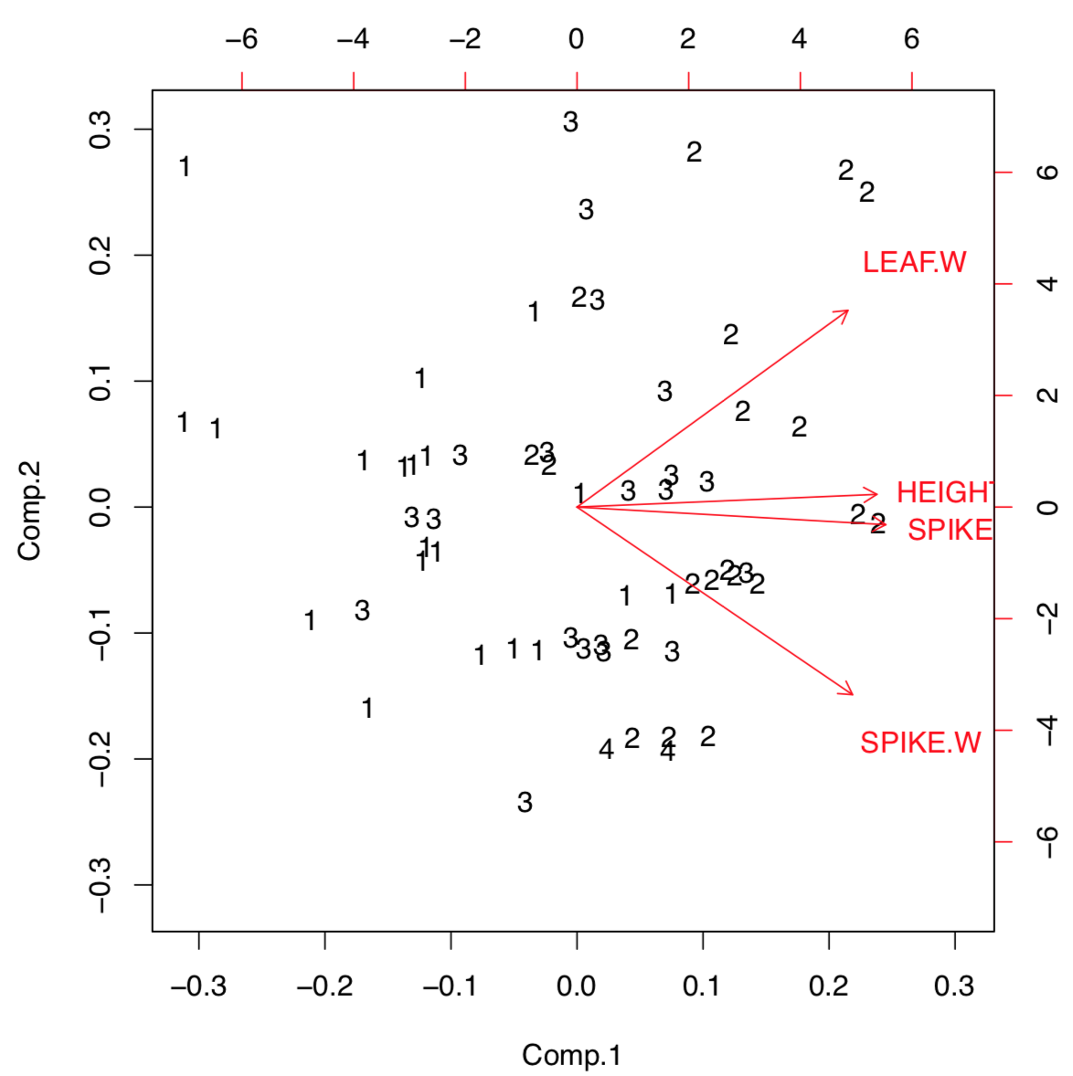
Biplot helps to understand visually how large is the load of each initial character into first two components. For example, characters of height and spike length (but spike width) have a biggest loads into the first component which distinguishes populations most. Function loadings() allows to see this information in the numerical form:
Code \(\PageIndex{8}\) (R):
R has two variants of PCA calculation, first (already discussed) with princomp(), and second with prcomp(). The difference lays in the way how exactly components are calculated. First way is traditional, but second is recommended:
Code \(\PageIndex{9}\) (R):
Example above shows some differences between two PCA methods. First, prcomp() conveniently accepts scale option. Second, loadings are taken from the rotation element. Third, scores are in the the element with x name. Please run the code yourself to see how to add 95% confidence ellipses to the 2D ordination plot. One might see that Iris setosa (letter “s” on the plot) is seriously divergent from two other species, Iris versicolor (“v”) and Iris virginica (“a”).
Packages ade4 and vegan offer many variants of PCA (Figure \(\PageIndex{7}\)):
Code \(\PageIndex{10}\) (R):
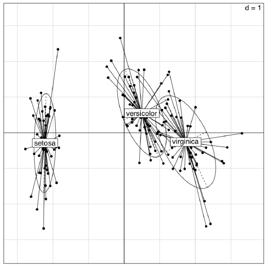
(The plot is similar to the shown on Figure \(\PageIndex{5}\); however, the differences between groups are here more clear.)
In addition, this is possible to use the inferential approach for the PCA:
Code \(\PageIndex{11}\) (R):
Monte-Carlo randomization allows to understand numerically how well are Iris species separated with this PCA. The high Observation value (72.2% which is larger than 50%) is the sign of reliable differences.
There are other variants of permutation tests for PCA, for example, with anosim() from the vegan package.
Please note that principal component analysis is in general a linear technique similar to the analysis of correlations, and it can fail in some complicated cases.
Data solitaire: SOM
There are several other techniques which allow unsupervised classification of primary data. Self-organizing maps (SOM) is a technique somewhat similar to breaking the deck of cards into several piles:
Code \(\PageIndex{12}\) (R):
The resulted plot (Figure \(\PageIndex{8}\)) contains graphical representation of character values, together with the placement of actual data points.
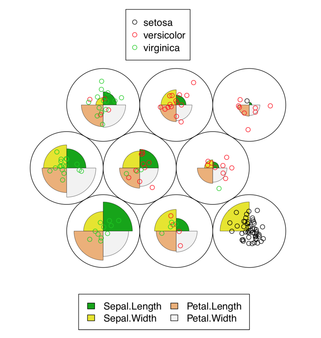
In fact, SOM is the non-learning neural network. More advanced Growing Neural Gas (GNG) algorithm uses ideas similar to SOM.
Data density: t-SNE
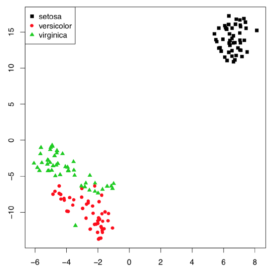
With the really big number of samples, t-SNE algorithm (name stands for “t-Distributed Stochastic Neighbor Embedding”) performs better than classical PCA. t-SNE is frequently used for the shape recognition. It is easy enough to employ it in R(Figure \(\PageIndex{9}\)):
Code \(\PageIndex{13}\) (R):
Classification with correspondence
Correspondence analysis is the family of techniques similar to PCA, but applicable to categorical data (primary or in contingency tables). Simple variant of the correspondence analysis is implemented in corresp() from MASS package (Figure \(\PageIndex{10}\)) which works with contingency tables:
Code \(\PageIndex{14}\) (R):
(We converted here “table” object HE into the data frame. xpd=TRUE was used to allow text to go out of the plotting box.)
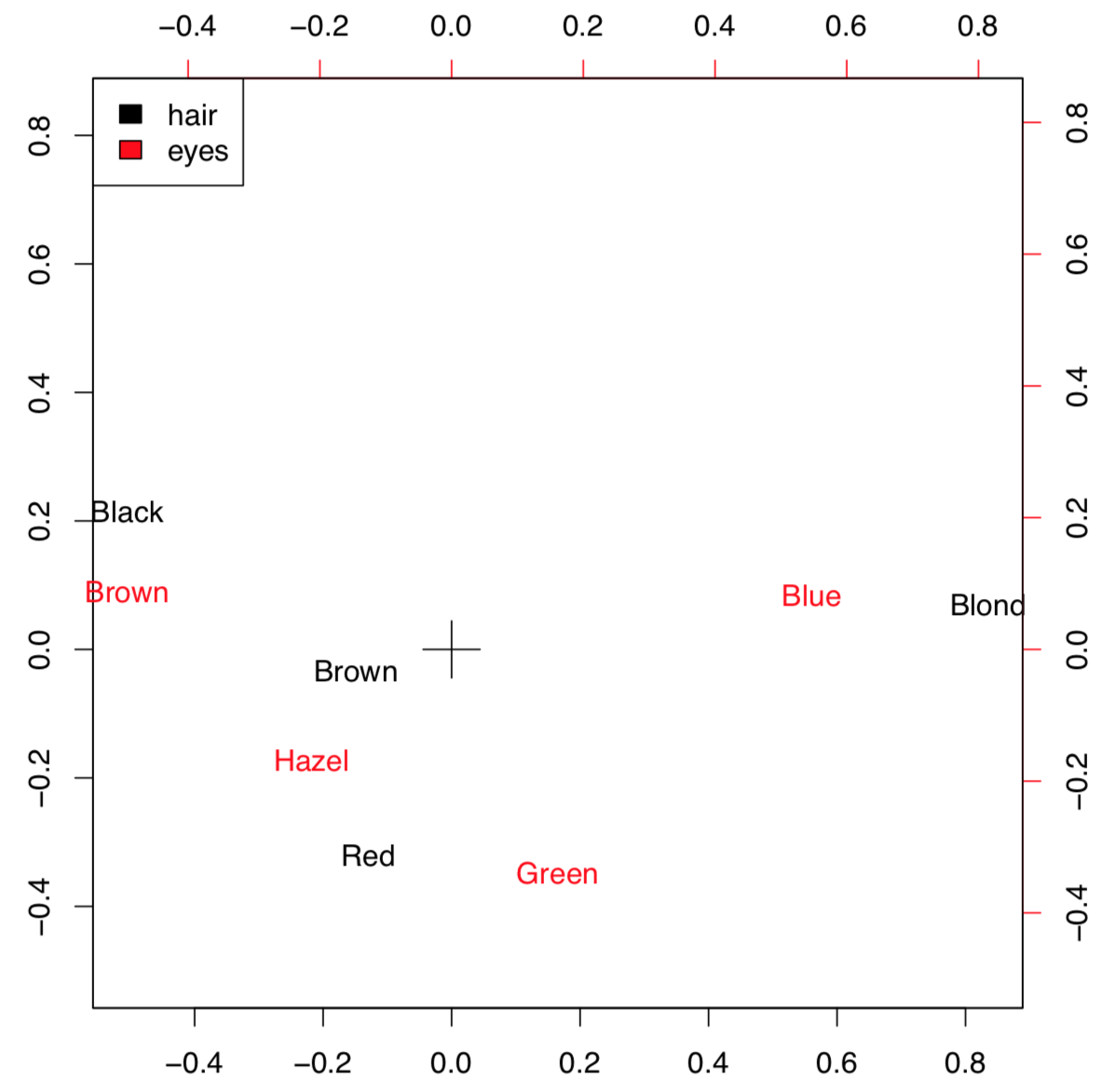
This example uses HairEyeColor data from previous chapter. Plot visualizes both parameters so if the particular combination of colors is more frequent, then positions of corresponding words is closer. For example, black hairs and brown eyes frequently occur together. The position of these words is more distant from the center (designated with cross) because numerical values of these characters are remote.
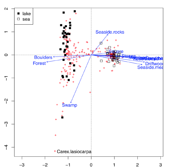
This possibility to visualize several character sets simultaneously on the one plot is the impressive feature of correspondence analysis (Figure \(\PageIndex{11}\)):
Code \(\PageIndex{15}\) (R):
This is much more advanced than biplot. Data used here contained both abiotic (ecotopes) and biotic factors (plant species), plus the geography of some Arctic islands: were these lake islands or sea islands. The plot was able to arrange all of these data: for abiotic factors, it used arrows, for biotic—pluses, and for sites (islands themselves as characterized by the sum of all available factors, biotic and abiotic)—squares of different color, depending on geographic origin. All pluses could be identified with the interactive identify(plot.all.cca, "species") command. We did it just for one most outstanding species, Carex lasiocarpa (woolly-fruit sedge) which is clearly associated with lake islands, and also with swamps.
Classification with distances
Important way of non-supervised classification is to work with distances instead of original data. Distance-based methods need the dissimilarities between each pair of objects to be calculated first. Advantage of these methods is that dissimilarities could be calculated from data of any type: measurement, ranked or nominal.
Distances
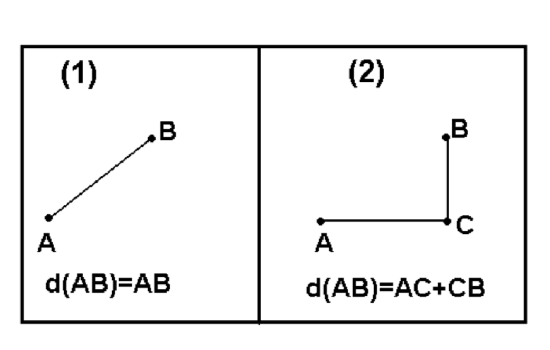
There are myriads of ways to calculate dissimilarity (or similarity which is essentially the reverse dissimilarity)\(^{[2]}\). One of these ways already explained above is a (reverse absolute) correlation. Other popular ways are Euclidean (square) distance and Manhattan (block) distance. Both of them (Figure \(\PageIndex{12}\)) are useful for measurement variables.
Manhattan distances are similar to driving distances, especially when there are not many roads available. The example below are driving distances between biggest North Dakota towns:
Code \(\PageIndex{16}\) (R):
In most cases, we need to convert raw variables into distance matrix. The basic way is to use dist(). Note that ranked and binary variables usually require different approaches which are implemented in the vegan (function vegdist()) and cluster packages (function daisy()). The last function recognizes the type of variable and applies the most appropriate metric (including the universal Gower distance); it also accepts the metric specified by user:
Code \(\PageIndex{17}\) (R):
In biology, one can use Smirnov taxonomic distances, available from smirnov package. In the following example, we use plant species distribution data on small islands.
The next plot intends to help the reader to understand them better. It is just a kind of map which shows geographical locations and sizes of islands:
Code \(\PageIndex{18}\) (R):
(Please plot it yourself.)
Now we will calculate and visualize Smirnov’s distances:
Code \(\PageIndex{19}\) (R):
Smirnov’s distances have an interesting feature: instead of 0 or 1, diagonal of the similarity matrix is filled with the coefficient of uniqueness values (Txx):
Code \(\PageIndex{20}\) (R):
This means that Verik island is a most unique in regards to plant species occurrence.
Making maps: multidimensional scaling
There are many things to do with the distance matrix. One of most straightforward is the multidimensional scaling, MDS (the other name is “principal coordinate analysis”, PCoA):
Code \(\PageIndex{21}\) (R):
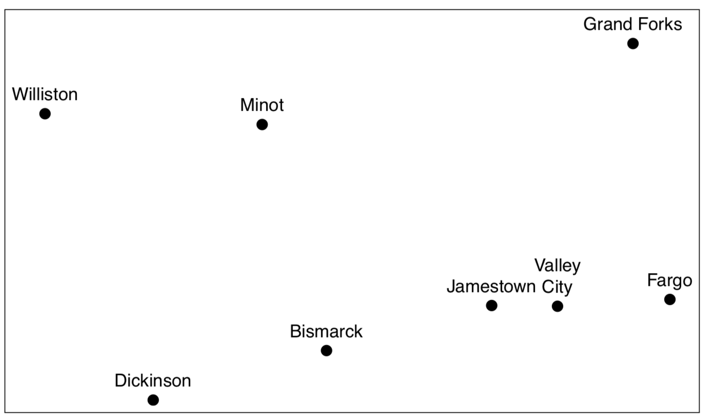
Compare the plot (Figure \(\PageIndex{13}\)) it with any geographical map. If you do not have a map of North Dakota but have these driving distances, cmdscale() allows to re-create the map!
So in essence, MDS is a task reverse to navigation (finding driving directions from map): it uses “driving directions” and makes a map from them.
Another, less impressive but more useful example (Figure \(\PageIndex{14}\)) is from raw data of Fisher’s irises:
Code \(\PageIndex{22}\) (R):
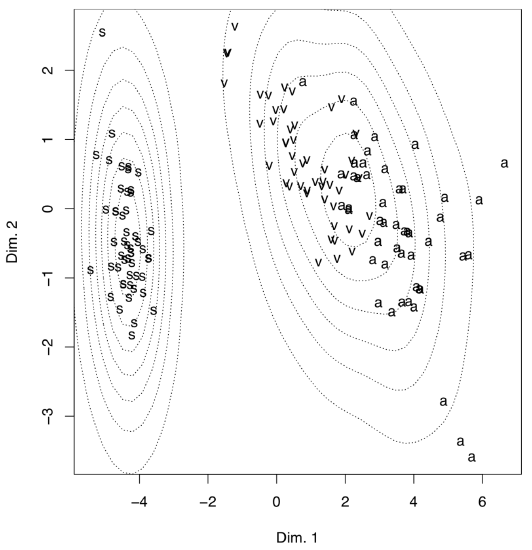
(There is no real difference from PCA because metric multidimensional scaling is related to principal component analysis; also, the internal structure of data is the same.)
To make the plot “prettier”, we added here density lines of point closeness estimated with bkde2D() function from the KernSmooth package. Another way to show density is to plot 3D surface like (Figure \(\PageIndex{15}\)):
Code \(\PageIndex{23}\) (R):
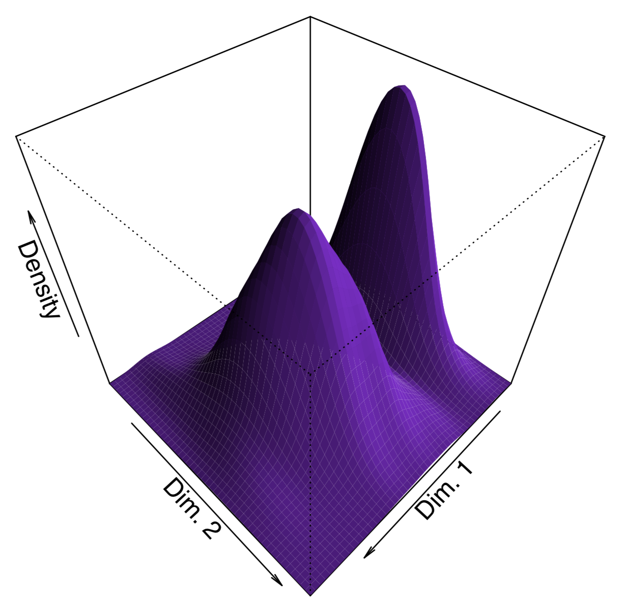
In addition to cmdscale(), MASS package (functions isoMDS() and sammon()) implements the non-metric multidimensional scaling, and package vegan has the advanced non-metric metaMDS(). Non-metric multidimensional scaling does not have analogs to PCA loadings (importances of variables) and proportion of variance explained by component, but it is possible to calculate surrogate metrics:
Code \(\PageIndex{24}\) (R):
Consequently (and similarly to PCA), sepal width character influences second dimension much more than three other characters. We can also guess that within this non-metric solution, first dimension takes almost 98% of variance.
Making trees: hierarchical clustering
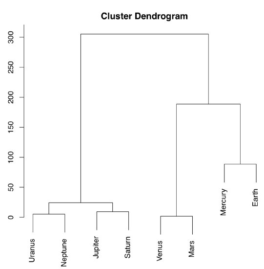
The other way to process the distance matrix is to perform hierarchical clustering which produces dendrograms, or trees, which are “one and a half dimensional” plots (Figure \(\PageIndex{16}\)):
Code \(\PageIndex{25}\) (R):
Ward’s method of clustering is well known to produce sharp, well-separated clusters (this, however, might lead to false conclusions if data has no apparent structure). Distant planets are most similar (on the height \(\approx25\)), similarity between Venus and Mars is also high (dissimilarity is \(\approx0\)). Earth is more outstanding, similarity with Mercury is lower, on the height \(\approx100\); but since Mercury has no true atmosphere, it could be ignored.
The following classification could be produced from this plot:
- Earth group: Venus, Mars, Earth, [Mercury]
- Jupiter group: Jupiter, Saturn, Uranus, Neptune
Instead of this “speculative” approach, one can use cutree() function to produce classification explicitly; this requires the hclust() object and number of desired clusters:
Code \(\PageIndex{26}\) (R):
To check how well the selected method performs classification, we wrote the custom function Misclass(). This function calculates the confusion matrix. Please note that Misclass() assumes predicted and observed groups in the same order, see also below for fanny() function results.
Confusion matrix is a simple way to assess the predictive power of the model. More advanced technique of same sort is called cross-validation. As an example, user might splut data into 10 equal parts (e.g., with cut()) and then in turn, make each part an “unknown” whereas the rest will become training subset.
As you can see from the table, 32% of Iris virginica were misclassified. The last is possible to improve, if we change either distance metric, or clustering method. For example, Ward’s method of clustering gives more separated clusters and slightly better misclassification rates. Please try it yourself.
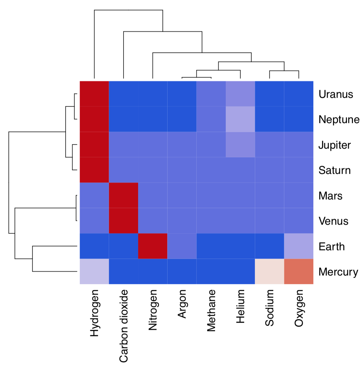
Hierarchical clustering does not by default return any variable importance. However, it is still possible to assist the feature selection with clustering heatmap (Figure \(\PageIndex{17}\)):
Code \(\PageIndex{27}\) (R):
(Here we also used cetcolor package which allows to create perceptually uniform color palettes.)
Heatmap separately clusters rows and columns and places result of the image() function in the center. Then it become visible which characters influence which object clusters and vice versa. On this heatmap, for example, Mars and Venus cluster together mostly because of similar levels of carbon dioxide.
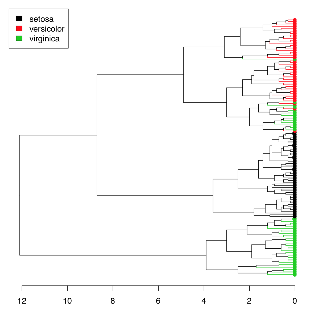
There are too many irises to plot the resulted dendrogram in the common way. One workaround is to select only some irises (see below). Another method is to use function Ploth() (Figure \(\PageIndex{18}\)):
Code \(\PageIndex{28}\) (R):
Ploth() is useful also if one need simply to rotate the dendrogram. Please check the following yourself:
Code \(\PageIndex{29}\) (R):
(This is also a demonstration of how to use correlation for the distance. As you will see, the same connection between Caesar salad, tomatoes and illness could be visualized with dendrogram. There visible also some other interesting relations.)
file.
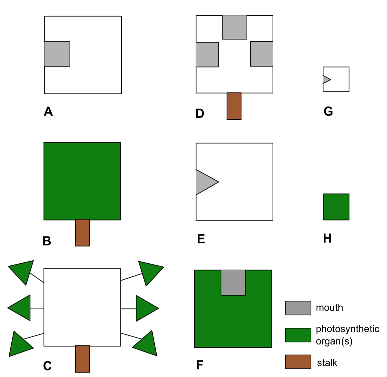
Planet Aqua is entirely covered by shallow water. This ocean is inhabited with various flat organisms (Figure \(\PageIndex{19}\)). These creatures (we call them “kubricks”) can photosynthesize and/or eat other organisms or their parts (which match with the shape of their mouths), and move (only if they have no stalks). Provide the dendrogram for kubrick species based on result of hierarchical clustering.
How to know the best clustering method
Hierarchical cluster analysis and relatives (e.g., phylogeny trees) are visually appealing, but there are three important questions which need to be solved: (1) which distance is the best (this also relevant to other distance-based methods); (2) which hierarchical clustering method is the best; and (3) how to assess stability of clusters.
Second question is relatively easy to answer. Function Co.test(dist, tree) from asmisc.r reveals consistency between distance object and hierachical clusterization. It is essentially correlation test between initial distances and distances revealed from cophenetic structure of the dendrogram.
Cophenetic distances are useful in many ways. For example, to choose the best clusterization method and therefore answer the second question, one might use cophenetic-based
Code \(\PageIndex{30}\) (R):
(Make and review this plot yourself. Which clustering is better?)
Note, however, these “best” scores are not always best for you. For example, one might still decide to use ward.D because it makes clusters sharp and visually separated.
To choose the best distance method, one might use the visually similar approach:
Code \(\PageIndex{31}\) (R):
(Again, please review the plot yourself.)
In fact, it just visualizes the correlation between multidimensional scaling of distances and principal component analysis of raw data. Nevertheless, it is still useful.
How to compare clusterings
Hierarchical clustering are dendrograms and it is not easy to compare them “out of the box”. Several different methods allow to compare two trees.
We can employ methods associated with biological phylogenies (these trees are essentially dendrograms).
Suppose that there are two clusterings:
Code \(\PageIndex{32}\) (R):
Library ape has dist.topo() function which calculates topological distance between trees, and library phangorn calculates several those indexes:
Code \(\PageIndex{33}\) (R):
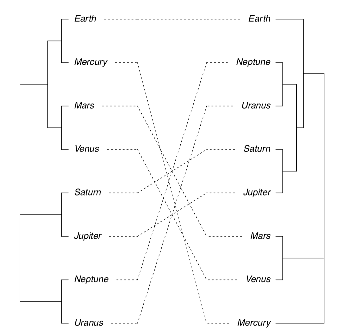
Next possibility is to plot two trees side-by-side and show differences with lines connecting same tips (Figure \(\PageIndex{20}\)):
Code \(\PageIndex{34}\) (R):
(Note that sometimes you might need to rotate branch with rotate() function. Rotation does not change dendrogram.)
There is also possible to plot consensus tree which shows only those clusters which appear in both clusterings:
Code \(\PageIndex{35}\) (R):
(Please make this plot yourself.)
Heatmap could also be used to visualize similarities between two dendrograms:
Code \(\PageIndex{36}\) (R):
(Hclust.match() counts matches between two dendrograms (which based on the same data) and then heatmap() plots these counts as colors, and also supplies the consensus configuration as two identical dendrograms on the top and on the left. Please make this plot yourself.)
Both multidimendional scaling and hierarchical clustering are distance-based methods. Please make and review the following plot (from the vegan3d package) to understand how to compare them:
Code \(\PageIndex{37}\) (R):
How good are resulted clusters
There are several ways to check how good are resulted clusters, and many are based on the bootstrap replication (see Appendix).
Function Jclust() presents a method to bootstrap bipartitions and plot consensus tree with support values (Figure \(\PageIndex{21}\):
Code \(\PageIndex{38}\) (R):
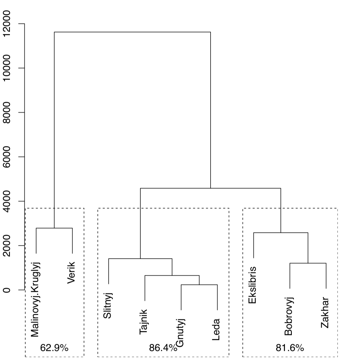
(Note that Jclust() uses cutree() and therefore works only if it “knows” the number of desired clusters. Since consensus result relates with cluster number, plots with different numbers of clusters will be different.)
Another way is to use pvclust package which has an ability to calculate the support for clusters via bootstrap (Figure \(\PageIndex{22}\)):
Code \(\PageIndex{39}\) (R):
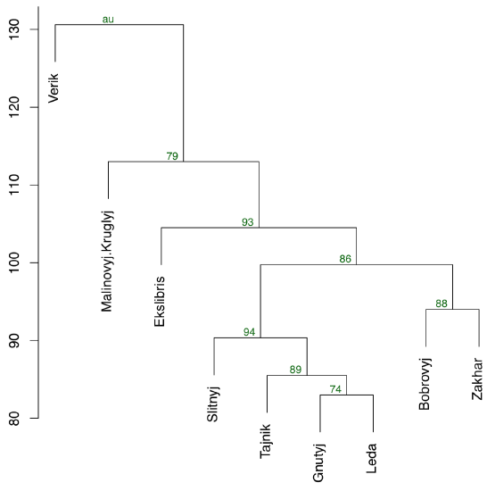
(Function pvclust() clusterizes columns, not rows, so we have to transpose data again. On the plot, numerical values of cluster stability (au) are located above each node. The closer are these values to 100, the better.)
There is also BootA() function in asmisc.r set which allows to bootstrap clustering with methods from phylogenetic package ape:
Code \(\PageIndex{40}\) (R):
(This method requires to make an anonymous function which uses methods you want. It also plots both consensus tree (without support values) and original tree with support values. Please make these trees. Note that by default, only support values greater then 50% are shown.)
Making groups: k-means and friends
Apart from hierarchical, there are many other ways of clustering. Typically, they do not return any ordination (“map”) and provide only cluster membership. For example, k-means clustering tries to obtain the a priori specified number of clusters from the raw data (it does not need the distance matrix to be supplied):
Code \(\PageIndex{41}\) (R):
K-means clustering does not plot trees; instead, for every object it returns the number of its cluster:
Code \(\PageIndex{42}\) (R):
(As you see, misclassification errors are low.)
Instead of a priori cluster number, function kmeans() also accepts row numbers of cluster centers.
Spectral clustering from kernlab package is superficially similar method capable to separate really tangled elements:
Code \(\PageIndex{43}\) (R):
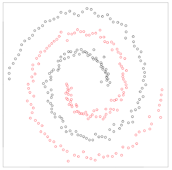
Kernel methods (like spectral clustering) recalculate the primary data to make it more suitable for the analysis. Support vector machines (SVM, see below) is another example. There is also kernel PCA (function kpca() in kernlab package).
Next group of clustering methods is based on fuzzy logic and takes into account the fuzziness of relations. There is always the possibility that particular object classified in the cluster A belongs to the different cluster B, and fuzzy clustering tries to measure this possibility:
Code \(\PageIndex{44}\) (R):
Textual part of the fanny() output is most interesting. Every row contains multiple membership values which represent the probability of this object to be in the particular cluster. For example, sixth plant most likely belongs to the first cluster but there is also visible attraction to the third cluster. In addition, fanny() can round memberships and produce hard clustering like other cluster methods:
Code \(\PageIndex{45}\) (R):
(We had to re-level the Species variable because fanny() gives number 2 to the Iris virginica cluster.)
How to know cluster numbers
All “k-means and friends” methods want to know the number of clusters before they start. So how to know a priori how many clusters present in data? This question is one of the most important in clustering, both practically and theoretically.
The visual analysis of banner plot (invented by Kaufman & Rousseeuw, 1990) could predict this number (Figure \(\PageIndex{24}\)):
Code \(\PageIndex{46}\) (R):
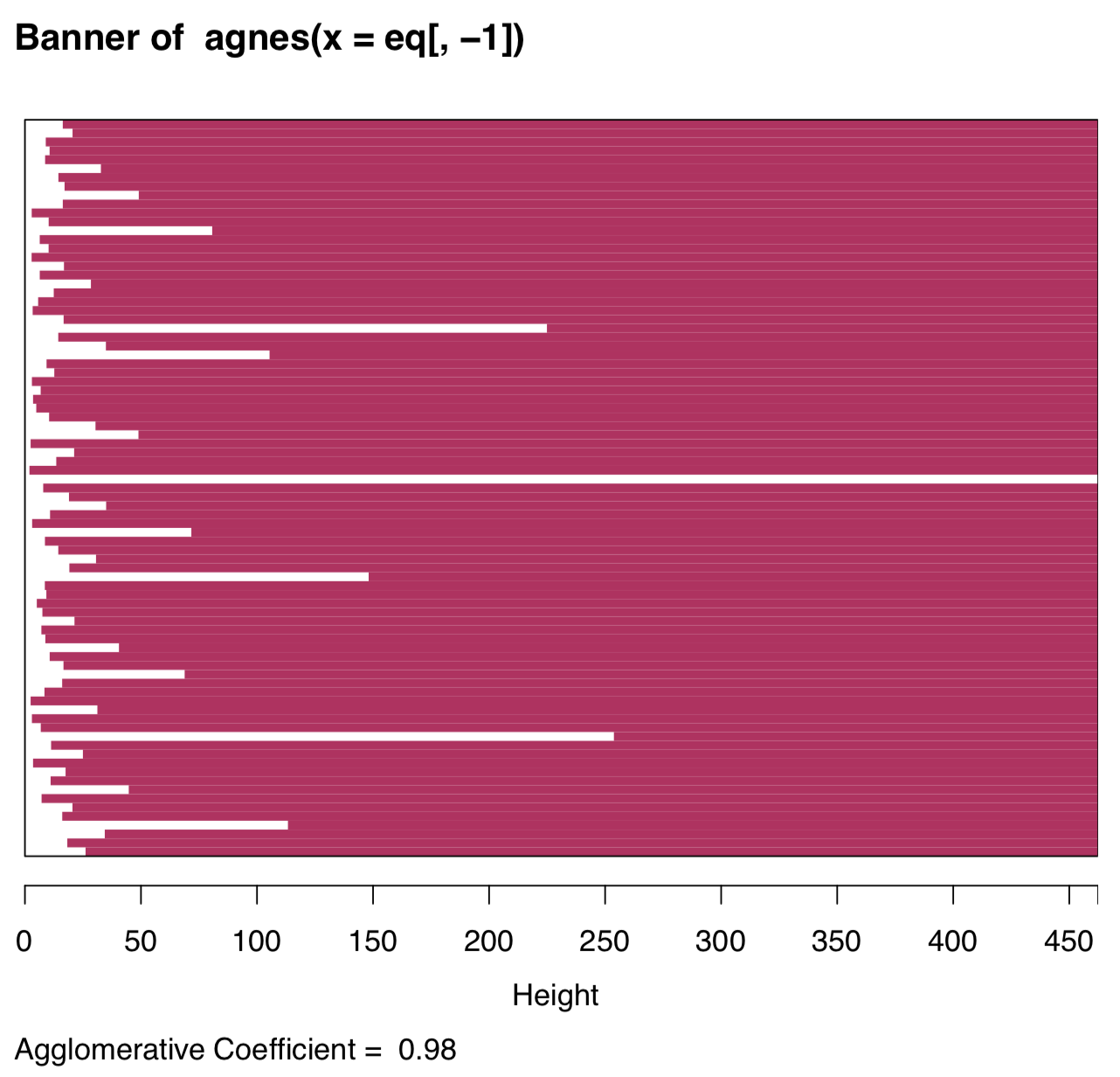
White bars on the left represent unclustered data, maroon lines on the right show height of possible clusters. Therefore, two clusters is the most natural solution, four clusters should be the next possible option.
Model-based clustering allows to determine how many clusters present in data and also cluster membership. The method assumes that clusters have the particular nature and multidimensional shapes:
Code \(\PageIndex{47}\) (R):
(As you see, it reveals two clusters only. This is explanable because in iris data two species are much more similar then the third one.)
DBSCAN is the powerful algorithm for the big data (like raster images which consist of billions of pixels) and there is the R package with the same name (in lowercase). DBSCAN reveals how many clusters are in data at particular resolution:
Code \(\PageIndex{48}\) (R):
(Plots are not shown, please make then yourself. First plot helps to find the size of neighborhood (look on the knee). The second illustrates results. Similar to model-based clustering, DBSCAN by default reveals only two clusters in iris data.)
Note that while DBSCAN was not able to recover all three species, it recovered clouds, and also places marginal points in the “noise” group. DBSCAN, as you see, is useful for smoothing, important part of image recognition. Parameter eps allows to change “resolution” of clustering and to find more, or less, clusters. DBSCAN relates with t-SNE (see above) and with supervised methods based on proximity (like kNN, see below). It can also be supervised itself and predict clusters for new points. Note that k-means and DBSCAN are based on specifically calculated proximities, not directly on distances.
Data stars contains information about 50 brightest stars in the night sky, their location and constellations. Please use DBSCAN to make artificial constellations on the base of star proximity. How are they related to real constellations?
Note that location (right ascension and declination) is given in degrees or hours (sexagesimal system), they must be converted into decimals.
“Mean-shift” method searches for modes within data, which in essence, is similar to finding proximities. The core mean-shift algotithm is slow so approximate “blurring” version is typically preferable:
Code \(\PageIndex{49}\) (R):
Another approach to find cluster number is similar to the PCA screeplot:
Code \(\PageIndex{50}\) (R):
(Please check this plot yourself. As on the banner plot, it visible that highest relative “cliffs” are after 1 and 4 cluster numbers.)
Collection asmisc.r contains function Peaks() which helps to find local maxima in simple data sequence. Number of these peaks on the histogram (with the sensible number of breaks) should point on the number of clusters:
Code \(\PageIndex{51}\) (R):
>
[1] 3
(“Three” is the first number of peaks after “one” and does not change when 8 < breaks < 22.)
Finally, the integrative package NbClust allows to use diverse methods to assess the putative number of clusters:
Code \(\PageIndex{52}\) (R):
How to compare different ordinations
Most of classification methods result in some ordination, 2D plot which includes all data points. This allow to compare them with Procrustes analysis (see Appendix for more details) which rotates ans scales one data matrix to make in maximally similar with the second (target) one. Let us compare results of classic PCA and t-SNE:
Code \(\PageIndex{53}\) (R):
Resulted plot (Figure 7.3.1) shows how dense are points in t-SNE and how PCA spreads them. Which of methods makes better grouping? Find it yourself.
References
1. Package Boruta is especially god for all relevant feature selection.


