6.4: Answers to exercises
- Page ID
- 3578
\( \newcommand{\vecs}[1]{\overset { \scriptstyle \rightharpoonup} {\mathbf{#1}} } \)
\( \newcommand{\vecd}[1]{\overset{-\!-\!\rightharpoonup}{\vphantom{a}\smash {#1}}} \)
\( \newcommand{\id}{\mathrm{id}}\) \( \newcommand{\Span}{\mathrm{span}}\)
( \newcommand{\kernel}{\mathrm{null}\,}\) \( \newcommand{\range}{\mathrm{range}\,}\)
\( \newcommand{\RealPart}{\mathrm{Re}}\) \( \newcommand{\ImaginaryPart}{\mathrm{Im}}\)
\( \newcommand{\Argument}{\mathrm{Arg}}\) \( \newcommand{\norm}[1]{\| #1 \|}\)
\( \newcommand{\inner}[2]{\langle #1, #2 \rangle}\)
\( \newcommand{\Span}{\mathrm{span}}\)
\( \newcommand{\id}{\mathrm{id}}\)
\( \newcommand{\Span}{\mathrm{span}}\)
\( \newcommand{\kernel}{\mathrm{null}\,}\)
\( \newcommand{\range}{\mathrm{range}\,}\)
\( \newcommand{\RealPart}{\mathrm{Re}}\)
\( \newcommand{\ImaginaryPart}{\mathrm{Im}}\)
\( \newcommand{\Argument}{\mathrm{Arg}}\)
\( \newcommand{\norm}[1]{\| #1 \|}\)
\( \newcommand{\inner}[2]{\langle #1, #2 \rangle}\)
\( \newcommand{\Span}{\mathrm{span}}\) \( \newcommand{\AA}{\unicode[.8,0]{x212B}}\)
\( \newcommand{\vectorA}[1]{\vec{#1}} % arrow\)
\( \newcommand{\vectorAt}[1]{\vec{\text{#1}}} % arrow\)
\( \newcommand{\vectorB}[1]{\overset { \scriptstyle \rightharpoonup} {\mathbf{#1}} } \)
\( \newcommand{\vectorC}[1]{\textbf{#1}} \)
\( \newcommand{\vectorD}[1]{\overrightarrow{#1}} \)
\( \newcommand{\vectorDt}[1]{\overrightarrow{\text{#1}}} \)
\( \newcommand{\vectE}[1]{\overset{-\!-\!\rightharpoonup}{\vphantom{a}\smash{\mathbf {#1}}}} \)
\( \newcommand{\vecs}[1]{\overset { \scriptstyle \rightharpoonup} {\mathbf{#1}} } \)
\( \newcommand{\vecd}[1]{\overset{-\!-\!\rightharpoonup}{\vphantom{a}\smash {#1}}} \)
\(\newcommand{\avec}{\mathbf a}\) \(\newcommand{\bvec}{\mathbf b}\) \(\newcommand{\cvec}{\mathbf c}\) \(\newcommand{\dvec}{\mathbf d}\) \(\newcommand{\dtil}{\widetilde{\mathbf d}}\) \(\newcommand{\evec}{\mathbf e}\) \(\newcommand{\fvec}{\mathbf f}\) \(\newcommand{\nvec}{\mathbf n}\) \(\newcommand{\pvec}{\mathbf p}\) \(\newcommand{\qvec}{\mathbf q}\) \(\newcommand{\svec}{\mathbf s}\) \(\newcommand{\tvec}{\mathbf t}\) \(\newcommand{\uvec}{\mathbf u}\) \(\newcommand{\vvec}{\mathbf v}\) \(\newcommand{\wvec}{\mathbf w}\) \(\newcommand{\xvec}{\mathbf x}\) \(\newcommand{\yvec}{\mathbf y}\) \(\newcommand{\zvec}{\mathbf z}\) \(\newcommand{\rvec}{\mathbf r}\) \(\newcommand{\mvec}{\mathbf m}\) \(\newcommand{\zerovec}{\mathbf 0}\) \(\newcommand{\onevec}{\mathbf 1}\) \(\newcommand{\real}{\mathbb R}\) \(\newcommand{\twovec}[2]{\left[\begin{array}{r}#1 \\ #2 \end{array}\right]}\) \(\newcommand{\ctwovec}[2]{\left[\begin{array}{c}#1 \\ #2 \end{array}\right]}\) \(\newcommand{\threevec}[3]{\left[\begin{array}{r}#1 \\ #2 \\ #3 \end{array}\right]}\) \(\newcommand{\cthreevec}[3]{\left[\begin{array}{c}#1 \\ #2 \\ #3 \end{array}\right]}\) \(\newcommand{\fourvec}[4]{\left[\begin{array}{r}#1 \\ #2 \\ #3 \\ #4 \end{array}\right]}\) \(\newcommand{\cfourvec}[4]{\left[\begin{array}{c}#1 \\ #2 \\ #3 \\ #4 \end{array}\right]}\) \(\newcommand{\fivevec}[5]{\left[\begin{array}{r}#1 \\ #2 \\ #3 \\ #4 \\ #5 \\ \end{array}\right]}\) \(\newcommand{\cfivevec}[5]{\left[\begin{array}{c}#1 \\ #2 \\ #3 \\ #4 \\ #5 \\ \end{array}\right]}\) \(\newcommand{\mattwo}[4]{\left[\begin{array}{rr}#1 \amp #2 \\ #3 \amp #4 \\ \end{array}\right]}\) \(\newcommand{\laspan}[1]{\text{Span}\{#1\}}\) \(\newcommand{\bcal}{\cal B}\) \(\newcommand{\ccal}{\cal C}\) \(\newcommand{\scal}{\cal S}\) \(\newcommand{\wcal}{\cal W}\) \(\newcommand{\ecal}{\cal E}\) \(\newcommand{\coords}[2]{\left\{#1\right\}_{#2}}\) \(\newcommand{\gray}[1]{\color{gray}{#1}}\) \(\newcommand{\lgray}[1]{\color{lightgray}{#1}}\) \(\newcommand{\rank}{\operatorname{rank}}\) \(\newcommand{\row}{\text{Row}}\) \(\newcommand{\col}{\text{Col}}\) \(\renewcommand{\row}{\text{Row}}\) \(\newcommand{\nul}{\text{Nul}}\) \(\newcommand{\var}{\text{Var}}\) \(\newcommand{\corr}{\text{corr}}\) \(\newcommand{\len}[1]{\left|#1\right|}\) \(\newcommand{\bbar}{\overline{\bvec}}\) \(\newcommand{\bhat}{\widehat{\bvec}}\) \(\newcommand{\bperp}{\bvec^\perp}\) \(\newcommand{\xhat}{\widehat{\xvec}}\) \(\newcommand{\vhat}{\widehat{\vvec}}\) \(\newcommand{\uhat}{\widehat{\uvec}}\) \(\newcommand{\what}{\widehat{\wvec}}\) \(\newcommand{\Sighat}{\widehat{\Sigma}}\) \(\newcommand{\lt}{<}\) \(\newcommand{\gt}{>}\) \(\newcommand{\amp}{&}\) \(\definecolor{fillinmathshade}{gray}{0.9}\)Correlation and linear models
Answer to the question of human traits. Inspect the data, load it and check the object:
Code \(\PageIndex{1}\) (R):
Data is binary, so Kendall’s correlation is most natural:
Code \(\PageIndex{2}\) (R):
We will visualize correlation with Pleiad(), one of advantages of it is to show which correlations are connected, grouped—so-called “correlation pleiads”:
Code \(\PageIndex{3}\) (R):
(Look on the title page to see correlations. One pleiad, CHIN, TONGUE and THUMB is the most apparent.)
Answer to the question of the linear dependence between height and weight for the artificial data. Correlation is present but the dependence is weak (Figure \(\PageIndex{1}\)):
Code \(\PageIndex{4}\) (R):
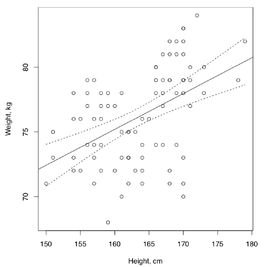
The conclusion about weak dependence was made because of low R-squared which means that predictor variable, height, does not explain much of the dependent variable, weight. In addition, many residuals are located outside of IQR. This is also easy to see on the plot where many data points are distant from the regression line and even from 95% confidence bands.
Answer to spring draba question. Check file, load and check the object:
Code \(\PageIndex{5}\) (R):
Now, check normality and correlations with the appropriate method:
Code \(\PageIndex{6}\) (R):
Therefore, FRUIT.L and FRUIT.MAXW are best candidates for linear model analysis. We will plot it first (Figure \(\PageIndex{2}\)):
Code \(\PageIndex{7}\) (R):
(Points() is a “single” variant of PPoints() from the above, and was used because there are multiple overlaid data points.)
Finally, check the linear model and assumptions:
Code \(\PageIndex{8}\) (R):
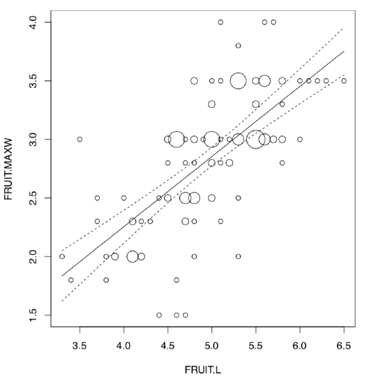
There is a reliable model (p-value: < 2.2e-16) which has a high R-squared value (sqrt(0.4651) = 0.6819824). Slope coefficient is significant whereas intercept is not. Homogeneity of residuals is apparent, their normality is also out of question:
Code \(\PageIndex{9}\) (R):
Answer to the heterostyly question. First, inspect the file, load the data and check it:
Code \(\PageIndex{10}\) (R):
This is how to visualize the phenomenon of heterostyly for all data:
Code \(\PageIndex{11}\) (R):
(Please review this plot yourself.)
Now we need to visualize linear relationships of question. There are many overlaid data points so the best way is to employ the PPoints() function (Figure \(\PageIndex{3}\)):
Code \(\PageIndex{12}\) (R):
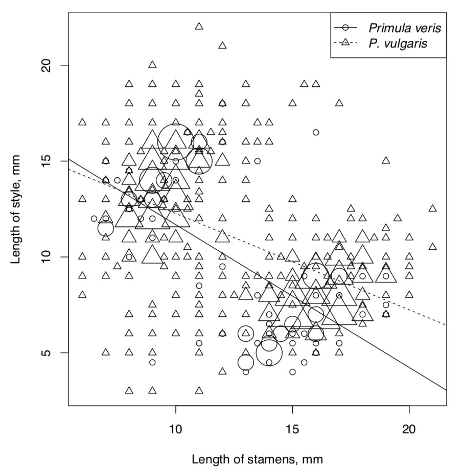
Now to the models. We will assume that length of stamens is the independent variable. Explore, check assumptions and AIC for the full model:
Code \(\PageIndex{13}\) (R):
Reduced (additive) model:
Code \(\PageIndex{14}\) (R):
Full model is better, most likely because of strong interactions. To check interactions graphically is possible also with the interaction plot which will treat independent variable as factor:
Code \(\PageIndex{15}\) (R):
This technical plot (check it yourself) shows the reliable differences between lines of different species. This differences are bigger when stamens are longer. This plot is more suitable for the complex ANOVA but as you see, works also for linear models.
Answer to the question about sundew (Drosera) populations. First, inspect the file, then load it and check the structure of object:
Code \(\PageIndex{16}\) (R):
Since we a required to calculate correlation, check the normality first:
Code \(\PageIndex{17}\) (R):
Well, to this data we can apply only nonparametric methods:
Code \(\PageIndex{18}\) (R):
(Note that "pairwise" was employed, there are many NAs.)
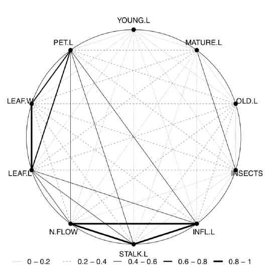
The last plot (Figure \(\PageIndex{4}\)) shows two most important correlation pleiads: one related with leaf size, and another—with inflorescence.
Since we know now which characters are most correlated, proceed to linear model. Since in the development of sundews stalk formed first, let us accept STALK.L as independent variable (influence), and INFL.L as dependent variable (response):
Code \(\PageIndex{19}\) (R):
Reliable model with high R-squared. However, normality of residuals is not perfect (please check model plots yourself).
Now to the analysis of leaf length. Determine which three populations are largest and subset the data:
Code \(\PageIndex{20}\) (R):
Now we need to plot them and check if there are visual differences:
Code \(\PageIndex{21}\) (R):
Yes, they probably exist (please check the plot yourself.)
It is worth to look on similarity of ranges:
Code \(\PageIndex{22}\) (R):
The robust range statistic, MAD (median absolute deviation) shows that variations are similar. We also ran the nonparametric analog of Bartlett test to see the statistical significance of this similarity. Yes, variances are statistically similar.
Since we have three populations to analyze, we will need something ANOVA-like, but nonparametric:
Code \(\PageIndex{23}\) (R):
Yes, there is at least one population where leaf length is different from all others. To see which, we need a post hoc, pairwise test:
Code \(\PageIndex{24}\) (R):
Population N1 is most divergent whereas Q1 is not really different from L.
Logistic regression
Answer to the question about demonstration of objects. We will go the same way as in the example about programmers. After loading data, we attach it for simplicity:
Code \(\PageIndex{25}\) (R):
Check the model:
Code \(\PageIndex{26}\) (R):
(Calling variables, we took into account the fact that R assign names like V1, V2, V3 etc. to “anonymous” columns.)
As one can see, the model is significant. It means that some learning takes place within the experiment.
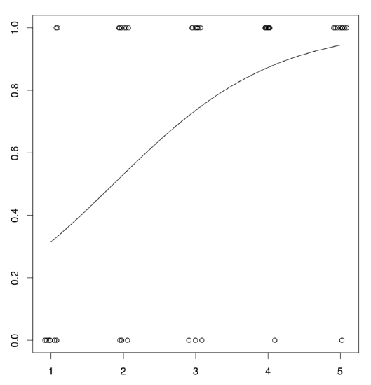
It is possible to represent the logistic model graphically (Figure \(\PageIndex{5}\)):
Code \(\PageIndex{27}\) (R):
We used predict() function to calculate probabilities of success for non-existed attempts, and also added small random noise with function jitter() to avoid the overlap.
Answer to the juniper questions. Check file, load it, check the object:
Code \(\PageIndex{28}\) (R):
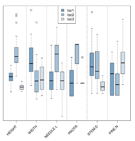
Analyze morphological and ecological characters graphically (Figure \(\PageIndex{6}\)):
Code \(\PageIndex{29}\) (R):
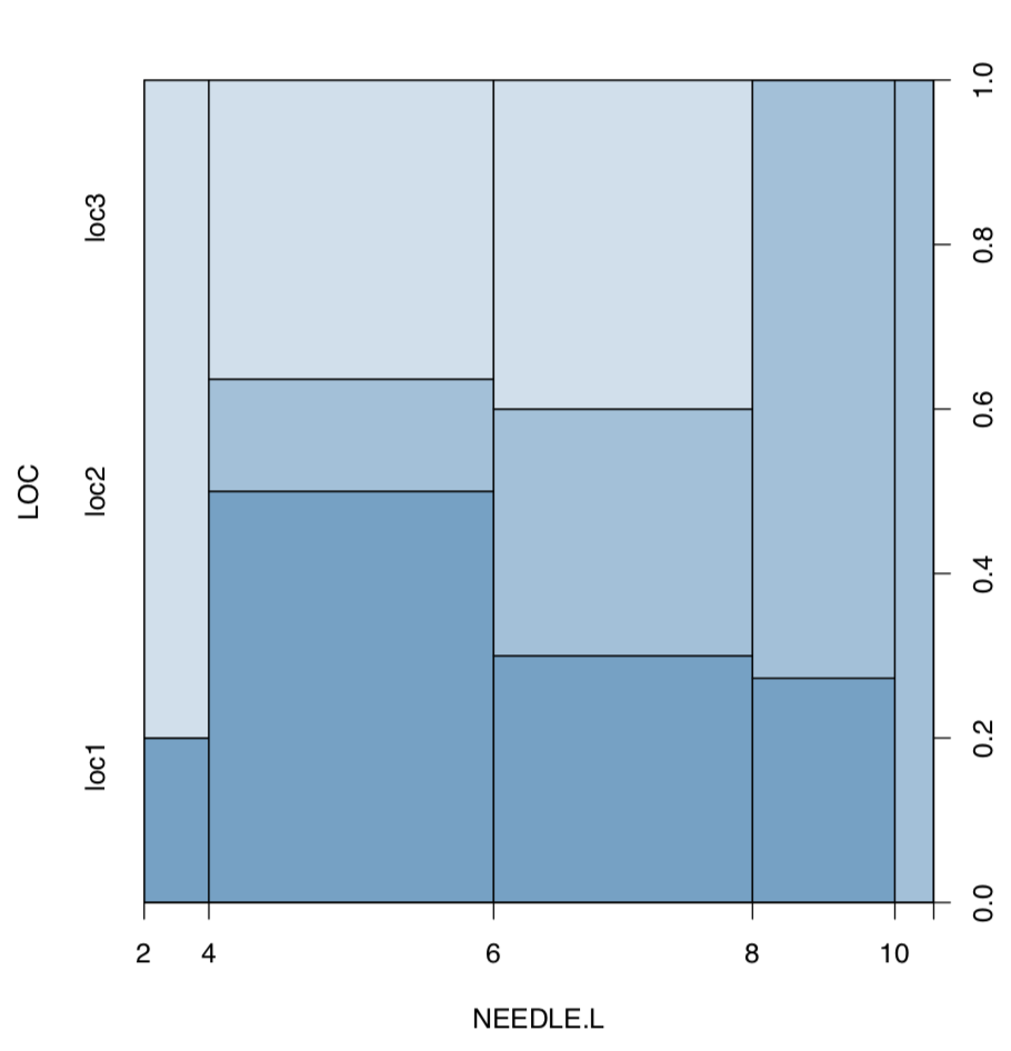
Now plot length of needles against location (Figure \(\PageIndex{7}\)):
Code \(\PageIndex{30}\) (R):
(As you see, spine plot works with measurement data.)
Since there is a measurement character and several locations, the most appropriate is ANOVA-like approach. We need to check assumptions first:
Code \(\PageIndex{31}\) (R):
Code \(\PageIndex{32}\) (R):
(Note how we calculated eta-squared, the effect size of ANOVA. As you see, this could be done through linear model.)
There is significant difference between the second and two other locations.
And to the second problem. First, we make new variable based on logical expression of character differences:
Code \(\PageIndex{33}\) (R):
There are both “species” in the data. Now, we plot conditional density and analyze logistic regression:
Code \(\PageIndex{34}\) (R):
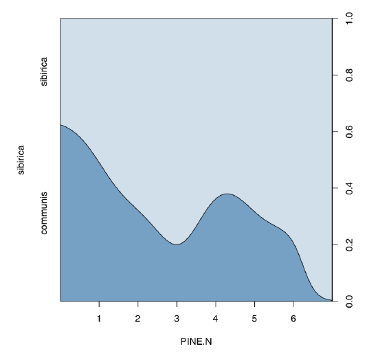
Conditional density plot (Figure \(\PageIndex{8}\)) shows an apparent tendency, and model summary outputs significance for slope coefficient.
On the next page, there is a table (Table \(\PageIndex{1}\)) with a key which could help to choose the right inferential method if you know number of samples and type of the data.
| Type of data | One variable | Two variables | Many variables |
|---|---|---|---|
| Measurement, normally distributed | t-test |
Difference: t-test (paired and non-paired), F-test (scale) Effect size: Cohen's d, Lyubishchev's K Relation: correlation, linear models |
Linear models, ANOVA, one-way test, Bartlett test (scale) Post hoc: pairwise-test, Tukey HSD Effect size: R-squared |
| Measurement and ranked | Wilcoxon test, Shapiro-Wilk test |
Difference: Wilcoxon test (paired and non-paired), sign test, robust rank irder test, Ansari-Bradley test (scale) Effect size: Cliff's delta, Lyubishchev's K Relation: nonparametric correlation |
Linear models, LOESS, Kruskal-Wallis test, Friedman test, Fligner-Killeen test (scale) Post hoc: pairwise Wilcoxon test, pairwise robust rank order test Effect size: R-squared |
| Categorical | One sample test of proportions, goodness-of-fit test |
Association: Chi-squared test, Fisher's exact test, test of proportions, G-test, McNemar's test (paired) Effect size: Cramer's V, Tschuprow's T, odds ratio |
Association tests (see on the left); generalized linear models of binomial family (= logistic regression) Post hoc: pairwise table test |
Table \(\PageIndex{1}\) Key to the most important inferential statistical methods (except multivariate). After you narrow the search with couple of methods, proceed to the main text.


