
4.7: Answers to exercises
- Page ID
- 3926
\( \newcommand{\vecs}[1]{\overset { \scriptstyle \rightharpoonup} {\mathbf{#1}} } \)
\( \newcommand{\vecd}[1]{\overset{-\!-\!\rightharpoonup}{\vphantom{a}\smash {#1}}} \)
\( \newcommand{\id}{\mathrm{id}}\) \( \newcommand{\Span}{\mathrm{span}}\)
( \newcommand{\kernel}{\mathrm{null}\,}\) \( \newcommand{\range}{\mathrm{range}\,}\)
\( \newcommand{\RealPart}{\mathrm{Re}}\) \( \newcommand{\ImaginaryPart}{\mathrm{Im}}\)
\( \newcommand{\Argument}{\mathrm{Arg}}\) \( \newcommand{\norm}[1]{\| #1 \|}\)
\( \newcommand{\inner}[2]{\langle #1, #2 \rangle}\)
\( \newcommand{\Span}{\mathrm{span}}\)
\( \newcommand{\id}{\mathrm{id}}\)
\( \newcommand{\Span}{\mathrm{span}}\)
\( \newcommand{\kernel}{\mathrm{null}\,}\)
\( \newcommand{\range}{\mathrm{range}\,}\)
\( \newcommand{\RealPart}{\mathrm{Re}}\)
\( \newcommand{\ImaginaryPart}{\mathrm{Im}}\)
\( \newcommand{\Argument}{\mathrm{Arg}}\)
\( \newcommand{\norm}[1]{\| #1 \|}\)
\( \newcommand{\inner}[2]{\langle #1, #2 \rangle}\)
\( \newcommand{\Span}{\mathrm{span}}\) \( \newcommand{\AA}{\unicode[.8,0]{x212B}}\)
\( \newcommand{\vectorA}[1]{\vec{#1}} % arrow\)
\( \newcommand{\vectorAt}[1]{\vec{\text{#1}}} % arrow\)
\( \newcommand{\vectorB}[1]{\overset { \scriptstyle \rightharpoonup} {\mathbf{#1}} } \)
\( \newcommand{\vectorC}[1]{\textbf{#1}} \)
\( \newcommand{\vectorD}[1]{\overrightarrow{#1}} \)
\( \newcommand{\vectorDt}[1]{\overrightarrow{\text{#1}}} \)
\( \newcommand{\vectE}[1]{\overset{-\!-\!\rightharpoonup}{\vphantom{a}\smash{\mathbf {#1}}}} \)
\( \newcommand{\vecs}[1]{\overset { \scriptstyle \rightharpoonup} {\mathbf{#1}} } \)
\( \newcommand{\vecd}[1]{\overset{-\!-\!\rightharpoonup}{\vphantom{a}\smash {#1}}} \)
\(\newcommand{\avec}{\mathbf a}\) \(\newcommand{\bvec}{\mathbf b}\) \(\newcommand{\cvec}{\mathbf c}\) \(\newcommand{\dvec}{\mathbf d}\) \(\newcommand{\dtil}{\widetilde{\mathbf d}}\) \(\newcommand{\evec}{\mathbf e}\) \(\newcommand{\fvec}{\mathbf f}\) \(\newcommand{\nvec}{\mathbf n}\) \(\newcommand{\pvec}{\mathbf p}\) \(\newcommand{\qvec}{\mathbf q}\) \(\newcommand{\svec}{\mathbf s}\) \(\newcommand{\tvec}{\mathbf t}\) \(\newcommand{\uvec}{\mathbf u}\) \(\newcommand{\vvec}{\mathbf v}\) \(\newcommand{\wvec}{\mathbf w}\) \(\newcommand{\xvec}{\mathbf x}\) \(\newcommand{\yvec}{\mathbf y}\) \(\newcommand{\zvec}{\mathbf z}\) \(\newcommand{\rvec}{\mathbf r}\) \(\newcommand{\mvec}{\mathbf m}\) \(\newcommand{\zerovec}{\mathbf 0}\) \(\newcommand{\onevec}{\mathbf 1}\) \(\newcommand{\real}{\mathbb R}\) \(\newcommand{\twovec}[2]{\left[\begin{array}{r}#1 \\ #2 \end{array}\right]}\) \(\newcommand{\ctwovec}[2]{\left[\begin{array}{c}#1 \\ #2 \end{array}\right]}\) \(\newcommand{\threevec}[3]{\left[\begin{array}{r}#1 \\ #2 \\ #3 \end{array}\right]}\) \(\newcommand{\cthreevec}[3]{\left[\begin{array}{c}#1 \\ #2 \\ #3 \end{array}\right]}\) \(\newcommand{\fourvec}[4]{\left[\begin{array}{r}#1 \\ #2 \\ #3 \\ #4 \end{array}\right]}\) \(\newcommand{\cfourvec}[4]{\left[\begin{array}{c}#1 \\ #2 \\ #3 \\ #4 \end{array}\right]}\) \(\newcommand{\fivevec}[5]{\left[\begin{array}{r}#1 \\ #2 \\ #3 \\ #4 \\ #5 \\ \end{array}\right]}\) \(\newcommand{\cfivevec}[5]{\left[\begin{array}{c}#1 \\ #2 \\ #3 \\ #4 \\ #5 \\ \end{array}\right]}\) \(\newcommand{\mattwo}[4]{\left[\begin{array}{rr}#1 \amp #2 \\ #3 \amp #4 \\ \end{array}\right]}\) \(\newcommand{\laspan}[1]{\text{Span}\{#1\}}\) \(\newcommand{\bcal}{\cal B}\) \(\newcommand{\ccal}{\cal C}\) \(\newcommand{\scal}{\cal S}\) \(\newcommand{\wcal}{\cal W}\) \(\newcommand{\ecal}{\cal E}\) \(\newcommand{\coords}[2]{\left\{#1\right\}_{#2}}\) \(\newcommand{\gray}[1]{\color{gray}{#1}}\) \(\newcommand{\lgray}[1]{\color{lightgray}{#1}}\) \(\newcommand{\rank}{\operatorname{rank}}\) \(\newcommand{\row}{\text{Row}}\) \(\newcommand{\col}{\text{Col}}\) \(\renewcommand{\row}{\text{Row}}\) \(\newcommand{\nul}{\text{Nul}}\) \(\newcommand{\var}{\text{Var}}\) \(\newcommand{\corr}{\text{corr}}\) \(\newcommand{\len}[1]{\left|#1\right|}\) \(\newcommand{\bbar}{\overline{\bvec}}\) \(\newcommand{\bhat}{\widehat{\bvec}}\) \(\newcommand{\bperp}{\bvec^\perp}\) \(\newcommand{\xhat}{\widehat{\xvec}}\) \(\newcommand{\vhat}{\widehat{\vvec}}\) \(\newcommand{\uhat}{\widehat{\uvec}}\) \(\newcommand{\what}{\widehat{\wvec}}\) \(\newcommand{\Sighat}{\widehat{\Sigma}}\) \(\newcommand{\lt}{<}\) \(\newcommand{\gt}{>}\) \(\newcommand{\amp}{&}\) \(\definecolor{fillinmathshade}{gray}{0.9}\)Answer to the question of shapiro.test() output structure. First, we need to recollect that almost everything what we see on the R console, is the result of print()’ing some lists. To extract the component from a list, we can call it by dollar sign and name, or by square brackets and number (if component is not named). Let us check the structure with str():
Code \(\PageIndex{1}\) (R):
Well, p-value most likely comes from the p.value component, this is easy. Check it:
Code \(\PageIndex{2}\) (R):
This is what we want. Now we can insert it into the body of our function.
Answer to the “birch normality” exercise. First, we need to check the data and understand its structure, for example with url.show(). Then we can read it into R, check its variables and apply Normality() function to all appropriate columns:
Code \(\PageIndex{3}\) (R):
(Note how only non-categorical columns were selected for the normality check. We used Str() because it helps to check numbers of variables, and shows that two variables, LOBES and WINGS have missing data. There is no problem in using str() instead.)
Only CATKIN (length of female catkin) is available to parametric methods here. It is a frequent case in biological data.
What about the graphical check for the normality, histogram or QQ plot? Yes, it should work but we need to repeat it 5 times. However, lattice package allows to make it in two steps and fit on one trellis plot (Figure \(\PageIndex{2}\)):
Code \(\PageIndex{4}\) (R):
(Library lattice requires long data format where all columns stacked into one and data supplied with identifier column, this is why we used stack() function and formula interface.
There are many trellis plots. Please check the trellis histogram yourself:
Code \(\PageIndex{5}\) (R):
(There was also an example of how to apply grayscale theme to these plots.)
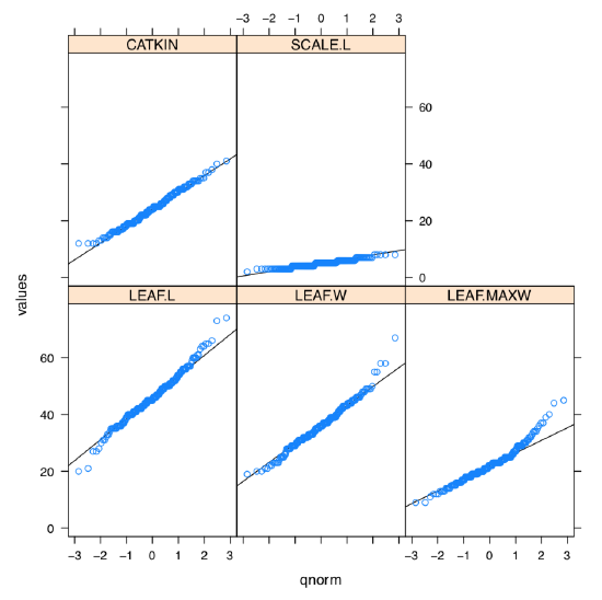
As one can see, SCALE.L could be also accepted as “approximately normal”. Among others, LEAF.MAXW is “least normal”.
Answer to the birch characters variability exercise. To create a function, it is good to start from prototype:
Code \(\PageIndex{6}\) (R):
This prototype does nothing, but on the next step you can improve it, for example, with fix(CV) command. Then test CV() with some simple argument. If the result is not satisfactory, fix(CV) again. At the end of this process, your function (actually, it “wraps” CV calculation explained above) might look like:
Code \(\PageIndex{7}\) (R):
Then sapply() could be used to check variability of each measurement column:
Code \(\PageIndex{8}\) (R):
As one can see, LEAF.MAXW (location of the maximal leaf width) has the biggest variability. In the asmisc.r, there is CVs() function which implements this and three other measurements of relative variation.
Answer to question about dact.txt data. Companion file dact_c.txt describes it as a random extract from some plant measurements. From the first chapter, we know that it is just one sequence of numbers. Consequently, scan() would be better than read.table(). First, load and check:
Code \(\PageIndex{9}\) (R):
Now, we can check the normality with our new function:
Code \(\PageIndex{10}\) (R):
Consequently, we must apply to dact only those analyses and characteristics which are robust to non-normality:
Code \(\PageIndex{11}\) (R):
Confidence interval for the median:
Code \(\PageIndex{12}\) (R):
(Using the idea that every test output is a list, we extracted the confidence interval from output directly. Of course, we knew beforehand that name of a component we need is conf.int; this knowledge could be obtained from the function help (section “Value”). The resulted interval is broad.)
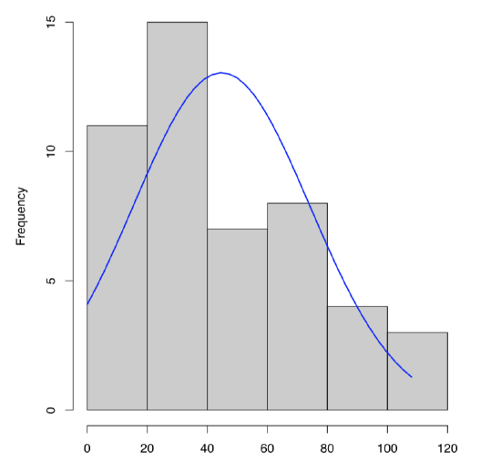
To plot single numeric data, histogram (Figure \(\PageIndex{3}\)) is preferable (boxplots are better for comparison between variables):
Code \(\PageIndex{13}\) (R):
Similar to histogram is the steam-and-leaf plot:
Code \(\PageIndex{14}\) (R):
In addition, here we will calculate skewness and kurtosis, third and fourth central moments (Figure \(\PageIndex{4}\)). Skewness is a measure of how asymmetric is the distribution, kurtosis is a measure of how spiky is it. Normal distribution has both skewness and kurtosis zero whereas “flat” uniform distribution has skewness zero and kurtosis approximately \(-1.2\) (check it yourself).
What about dact data? From the histogram (Figure \(\PageIndex{3}\)) and stem-and-leaf we can predict positive skewness (asymmetricity of distribution) and negative kurtosis (distribution flatter than normal). To check, one need to load library e1071 first:
Code \(\PageIndex{15}\) (R):
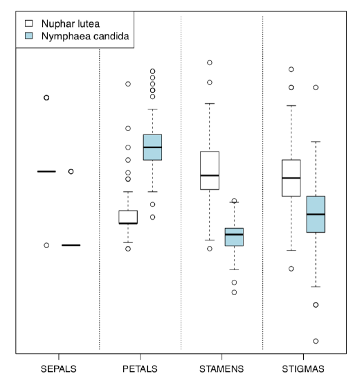
Answer to the question about water lilies. First, we need to check the data, load it into R and check the resulted object:
Code \(\PageIndex{16}\) (R):
(Function Str() shows column numbers and the presence of NA.)
One of possible ways to proceed is to examine differences between species by each character, with four paired boxplots. To make them in one row, we will employ for() cycle:
Code \(\PageIndex{17}\) (R):
(Not here, but in many other cases, for() in R is better to replace with commands of apply() family. Boxplot function accepts “ordinary” arguments but in this case, formula interface with tilde is much more handy.)
Please review this plot yourself.
It is even better, however, to compare scaled characters in the one plot. First variant is to load lattice library and create trellis plot similar to Figure 7.1.8 or Figure 7.1.7:
Code \(\PageIndex{18}\) (R):
(As usual, trellis plots “want” long form and formula interface.)
Please check this plot yourself.
Alternative is the Boxplots() (Figure \(\PageIndex{5}\)) command. It is not a trellis plot, but designed with a similar goal to compare many things at once:
Code \(\PageIndex{19}\) (R):
(By default, Boxplots() rotates character labels, but this behavior is not necessary with 4 characters. This plot uses scale() so y-axis is, by default, not provided.)
Or, with even more crisp Linechart() (Figure \(\PageIndex{6}\)):
Code \(\PageIndex{20}\) (R):
(Sometimes, IQRs are better to percept if you add grid() to the plot. Try it yourself.)
Evidently (after SEPALS), PETALS and STAMENS make the best species resolution. To obtain numerical values, it is better to check the normality first.
Note that species identity is the natural, internal feature of our data. Therefore, it is theoretically possible that the same character in one species exhibit normal distribution whereas in another species does not. This is why normality should be checked per character per species. This idea is close to the concept of fixed effects which are so useful in linear models (see next chapters). Fixed effects oppose the random effects which are not natural to the objects studied (for example, if we sample only one species of water lilies in the lake two times).
Code \(\PageIndex{21}\) (R):
(Function aggregate() does not only apply anonymous function to all elements of its argument, but also splits it on the fly with by list of factor(s). Similar is tapply() but it works only with one vector. Another variant is to use split() and then apply() reporting function to the each part separately.)
By the way, the code above is good for learning but in our particular case, normality check is not required! This is because numbers of petals and stamens are discrete characters and therefore must be treated with nonparametric methods by definition.
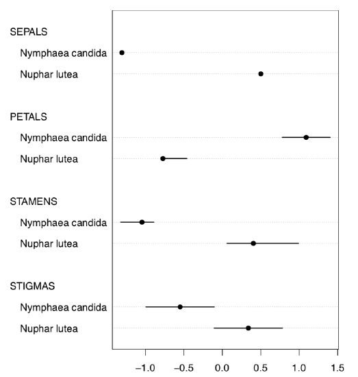
Thus, for confidence intervals, we should proceed with nonparametric methods:
Code \(\PageIndex{22}\) (R):
Confidence intervals reflect the possible location of central value (here median). But we still need to report our centers and ranges (confidence interval is not a range!). We can use either summary() (try it yourself), or some customized output which, for example, can employ median absolute deviation:
Code \(\PageIndex{23}\) (R):
Now we can give the answer like “if there are 12–16 petals and 100–120 stamens, this is likely a yellow water lily, otherwise, if there are 23–29 petals and 66–88 stamens, this is likely a white water lily”.
Answer to the question about phyllotaxis. First, we need to look on the data file, either with url.show(), or in the browser window and determine its structure. There are four tab-separated columns with headers, and at least the second column contains spaces. Consequently, we need to tell read.table() about both separator and headers and then immediately check the “anatomy” of new object:
Code \(\PageIndex{24}\) (R):
As you see, we have 11 families and therefore 11 proportions to create and analyze:
Code \(\PageIndex{25}\) (R):
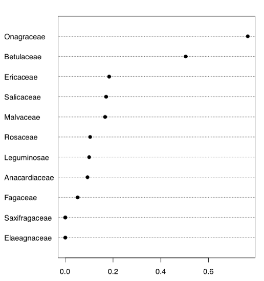
Here we created 10 first classic phyllotaxis formulas (ten is enough since higher order formulas are extremely rare), then made these formulas (classic and non-classic) from data and finally made a table from the logical expression which checks if real world formulas are present in the artificially made classic sequence. Dotchart (Figure \(\PageIndex{7}\)) is probably the best way to visualize this table. Evidently, Onagraceae (evening primrose family) has the highest proportion of FALSE’s. Now we need actual proportions and finally, proportion test:
Code \(\PageIndex{26}\) (R):
As you see, proportion of non-classic formulas in Onagraceae (almost 77%) is statistically different from the average proportion of 27%.
Answer to the exit poll question from the “Foreword”. Here is the way to calculate how many people we might want to ask to be sure that our sample 48% and 52% are “real” (represent the population):
Code \(\PageIndex{27}\) (R):
We need to ask almost 5,000 people!
To calculate this, we used a kind of power test which are frequently used for planning experiments. We made power=0.8 since it is the typical value of power used in social sciences. The next chapter gives definition of power (as a statistical term) and some more information about power test output.