1.3: Visual Representation of Data II - Quantitative Variables
- Page ID
- 7789
\( \newcommand{\vecs}[1]{\overset { \scriptstyle \rightharpoonup} {\mathbf{#1}} } \)
\( \newcommand{\vecd}[1]{\overset{-\!-\!\rightharpoonup}{\vphantom{a}\smash {#1}}} \)
\( \newcommand{\dsum}{\displaystyle\sum\limits} \)
\( \newcommand{\dint}{\displaystyle\int\limits} \)
\( \newcommand{\dlim}{\displaystyle\lim\limits} \)
\( \newcommand{\id}{\mathrm{id}}\) \( \newcommand{\Span}{\mathrm{span}}\)
( \newcommand{\kernel}{\mathrm{null}\,}\) \( \newcommand{\range}{\mathrm{range}\,}\)
\( \newcommand{\RealPart}{\mathrm{Re}}\) \( \newcommand{\ImaginaryPart}{\mathrm{Im}}\)
\( \newcommand{\Argument}{\mathrm{Arg}}\) \( \newcommand{\norm}[1]{\| #1 \|}\)
\( \newcommand{\inner}[2]{\langle #1, #2 \rangle}\)
\( \newcommand{\Span}{\mathrm{span}}\)
\( \newcommand{\id}{\mathrm{id}}\)
\( \newcommand{\Span}{\mathrm{span}}\)
\( \newcommand{\kernel}{\mathrm{null}\,}\)
\( \newcommand{\range}{\mathrm{range}\,}\)
\( \newcommand{\RealPart}{\mathrm{Re}}\)
\( \newcommand{\ImaginaryPart}{\mathrm{Im}}\)
\( \newcommand{\Argument}{\mathrm{Arg}}\)
\( \newcommand{\norm}[1]{\| #1 \|}\)
\( \newcommand{\inner}[2]{\langle #1, #2 \rangle}\)
\( \newcommand{\Span}{\mathrm{span}}\) \( \newcommand{\AA}{\unicode[.8,0]{x212B}}\)
\( \newcommand{\vectorA}[1]{\vec{#1}} % arrow\)
\( \newcommand{\vectorAt}[1]{\vec{\text{#1}}} % arrow\)
\( \newcommand{\vectorB}[1]{\overset { \scriptstyle \rightharpoonup} {\mathbf{#1}} } \)
\( \newcommand{\vectorC}[1]{\textbf{#1}} \)
\( \newcommand{\vectorD}[1]{\overrightarrow{#1}} \)
\( \newcommand{\vectorDt}[1]{\overrightarrow{\text{#1}}} \)
\( \newcommand{\vectE}[1]{\overset{-\!-\!\rightharpoonup}{\vphantom{a}\smash{\mathbf {#1}}}} \)
\( \newcommand{\vecs}[1]{\overset { \scriptstyle \rightharpoonup} {\mathbf{#1}} } \)
\(\newcommand{\longvect}{\overrightarrow}\)
\( \newcommand{\vecd}[1]{\overset{-\!-\!\rightharpoonup}{\vphantom{a}\smash {#1}}} \)
\(\newcommand{\avec}{\mathbf a}\) \(\newcommand{\bvec}{\mathbf b}\) \(\newcommand{\cvec}{\mathbf c}\) \(\newcommand{\dvec}{\mathbf d}\) \(\newcommand{\dtil}{\widetilde{\mathbf d}}\) \(\newcommand{\evec}{\mathbf e}\) \(\newcommand{\fvec}{\mathbf f}\) \(\newcommand{\nvec}{\mathbf n}\) \(\newcommand{\pvec}{\mathbf p}\) \(\newcommand{\qvec}{\mathbf q}\) \(\newcommand{\svec}{\mathbf s}\) \(\newcommand{\tvec}{\mathbf t}\) \(\newcommand{\uvec}{\mathbf u}\) \(\newcommand{\vvec}{\mathbf v}\) \(\newcommand{\wvec}{\mathbf w}\) \(\newcommand{\xvec}{\mathbf x}\) \(\newcommand{\yvec}{\mathbf y}\) \(\newcommand{\zvec}{\mathbf z}\) \(\newcommand{\rvec}{\mathbf r}\) \(\newcommand{\mvec}{\mathbf m}\) \(\newcommand{\zerovec}{\mathbf 0}\) \(\newcommand{\onevec}{\mathbf 1}\) \(\newcommand{\real}{\mathbb R}\) \(\newcommand{\twovec}[2]{\left[\begin{array}{r}#1 \\ #2 \end{array}\right]}\) \(\newcommand{\ctwovec}[2]{\left[\begin{array}{c}#1 \\ #2 \end{array}\right]}\) \(\newcommand{\threevec}[3]{\left[\begin{array}{r}#1 \\ #2 \\ #3 \end{array}\right]}\) \(\newcommand{\cthreevec}[3]{\left[\begin{array}{c}#1 \\ #2 \\ #3 \end{array}\right]}\) \(\newcommand{\fourvec}[4]{\left[\begin{array}{r}#1 \\ #2 \\ #3 \\ #4 \end{array}\right]}\) \(\newcommand{\cfourvec}[4]{\left[\begin{array}{c}#1 \\ #2 \\ #3 \\ #4 \end{array}\right]}\) \(\newcommand{\fivevec}[5]{\left[\begin{array}{r}#1 \\ #2 \\ #3 \\ #4 \\ #5 \\ \end{array}\right]}\) \(\newcommand{\cfivevec}[5]{\left[\begin{array}{c}#1 \\ #2 \\ #3 \\ #4 \\ #5 \\ \end{array}\right]}\) \(\newcommand{\mattwo}[4]{\left[\begin{array}{rr}#1 \amp #2 \\ #3 \amp #4 \\ \end{array}\right]}\) \(\newcommand{\laspan}[1]{\text{Span}\{#1\}}\) \(\newcommand{\bcal}{\cal B}\) \(\newcommand{\ccal}{\cal C}\) \(\newcommand{\scal}{\cal S}\) \(\newcommand{\wcal}{\cal W}\) \(\newcommand{\ecal}{\cal E}\) \(\newcommand{\coords}[2]{\left\{#1\right\}_{#2}}\) \(\newcommand{\gray}[1]{\color{gray}{#1}}\) \(\newcommand{\lgray}[1]{\color{lightgray}{#1}}\) \(\newcommand{\rank}{\operatorname{rank}}\) \(\newcommand{\row}{\text{Row}}\) \(\newcommand{\col}{\text{Col}}\) \(\renewcommand{\row}{\text{Row}}\) \(\newcommand{\nul}{\text{Nul}}\) \(\newcommand{\var}{\text{Var}}\) \(\newcommand{\corr}{\text{corr}}\) \(\newcommand{\len}[1]{\left|#1\right|}\) \(\newcommand{\bbar}{\overline{\bvec}}\) \(\newcommand{\bhat}{\widehat{\bvec}}\) \(\newcommand{\bperp}{\bvec^\perp}\) \(\newcommand{\xhat}{\widehat{\xvec}}\) \(\newcommand{\vhat}{\widehat{\vvec}}\) \(\newcommand{\uhat}{\widehat{\uvec}}\) \(\newcommand{\what}{\widehat{\wvec}}\) \(\newcommand{\Sighat}{\widehat{\Sigma}}\) \(\newcommand{\lt}{<}\) \(\newcommand{\gt}{>}\) \(\newcommand{\amp}{&}\) \(\definecolor{fillinmathshade}{gray}{0.9}\)Now suppose we have a population and quantitative variable in which we are interested. We get a sample, which could be large or small, and look at the values of the our variable for the individuals in that sample. There are two ways we tend to make pictures of datasets like this: stem-and-leaf plots and histograms.
Stem-and-leaf Plots
One somewhat old-fashioned way to handle a modest amount of quantitative data produces something between simply a list of all the data values and a graph. It’s not a bad technique to know about in case one has to write down a dataset by hand, but very tedious – and quite unnecessary, if one uses modern electronic tools instead – if the dataset has more than a couple dozen values. The easiest case of this technique is where the data are all whole numbers in the range \(0-99\). In that case, one can take off the tens place of each number – call it the stem – and put it on the left side of a vertical bar, and then line up all the ones places – each is a leaf – to the right of that stem. The whole thing is called a stem-and-leaf plot or, sometimes, just a stemplot.
It’s important not to skip any stems which are in the middle of the dataset, even if there are no corresponding leaves. It is also a good idea to allow repeated leaves, if there are repeated numbers in the dataset, so that the length of the row of leaves will give a good representation of how much data is in that general group of data values.
Example 1.3.1. Here is a list of the scores of 30 students on a statistics test: \[\begin{matrix} 86 & 80 & 25 & 77 & 73 & 76 & 88 & 90 & 69 & 93\\ 90 & 83 & 70 & 73 & 73 & 70 & 90 & 83 & 71 & 95\\ 40 & 58 & 68 & 69 & 100 & 78 & 87 & 25 & 92 & 74 \end{matrix}\] As we said, using the tens place (and the hundreds place as well, for the data value \(100\)) as the stem and the ones place as the leaf, we get
[tab:stemplot1]
| Stem | Leaf | |||||||||
| 10 | 0 | |||||||||
| 9 | 0 | 0 | 0 | 2 | 3 | 5 | ||||
| 8 | 0 | 3 | 3 | 6 | 7 | 8 | ||||
| 7 | 0 | 0 | 1 | 3 | 3 | 3 | 4 | 6 | 7 | 8 |
| 6 | 8 | 9 | 9 | |||||||
| 5 | 8 | |||||||||
| 4 | 0 | |||||||||
| 3 | ||||||||||
| 2 | 5 | 5 |
One nice feature stem-and-leaf plots have is that they contain all of the data values, they do not lose anything (unlike our next visualization method, for example).
[Frequency] Histograms
The most important visual representation of quantitative data is a histogram. Histograms actually look a lot like a stem-and-leaf plot, except turned on its side and with the row of numbers turned into a vertical bar, like a bar graph. The height of each of these bars would be how many
Another way of saying that is that we would be making bars whose heights were determined by how many scores were in each group of ten. Note there is still a question of into which bar a value right on the edge would count: e.g., does the data value \(50\) count in the bar to the left of that number, or the bar to the right? It doesn’t actually matter which side, but it is important to state which choice is being made.
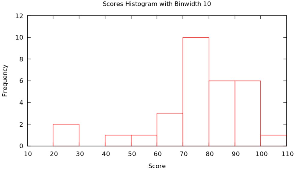
Example 1.3.2 Continuing with the score data in Example 1.3.1 and putting all data values \(x\) satisfying \(20\le x<30\) in the first bar, values \(x\) satisfying \(30\le x<40\) in the second, values \(x\) satisfying \(40\le x<50\) in the second, etc. – that is, put data values on the edges in the bar to the right – we get the figure
Actually, there is no reason that the bars always have to be ten units wide: it is important that they are all the same size and that how they handle the edge cases (whether the left or right bar gets a data value on edge), but they could be any size. We call the successive ranges of the \(x\) coordinates which get put together for each bar the called bins or classes, and it is up to the statistician to chose whichever bins – where they start and how wide they are – shows the data best.
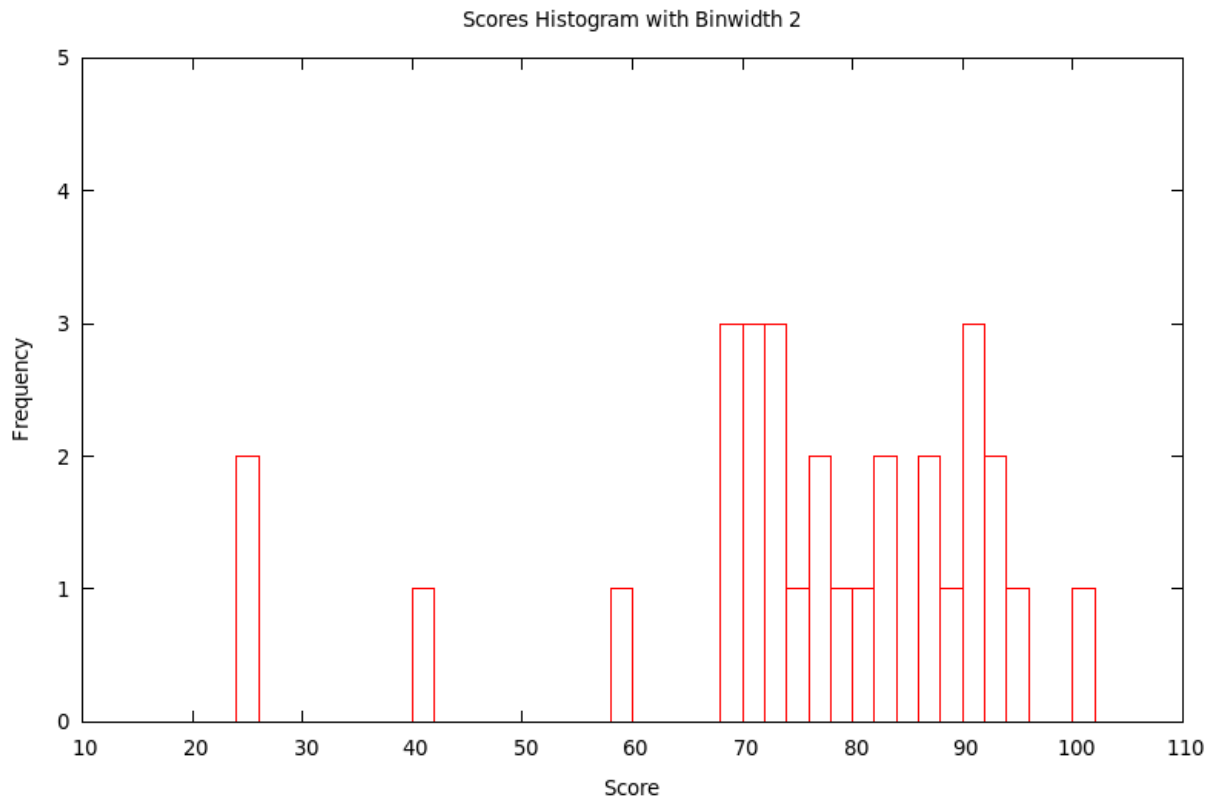
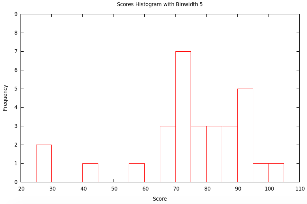
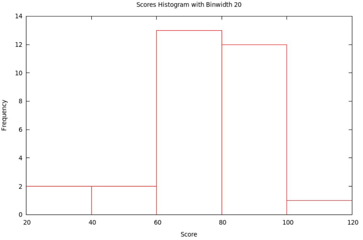
Typically, the smaller the bin size, the more variation (precision) can be seen in the bars ... but sometimes there is so much variation that the result seems to have a lot of random jumps up and down, like static on the radio. On the other hand, using a large bin size makes the picture smoother ... but sometimes, it is so smooth that very little information is left. Some of this is shown in the following
Example 1.3.3. Continuing with the score data in Example 1.3.1 and now using the bins with \(x\) satisfying \(10\le x<12\), then \(12\le x<14\), etc., we get the histogram with bins of width 2:
If we use the bins with \(x\) satisfying \(10\le x<15\), then \(15\le x<20\), etc., we get the histogram with bins of width 5:
If we use the bins with \(x\) satisfying \(20\le x<40\), then \(40\le x<60\), etc., we get the histogram with bins of width 20:
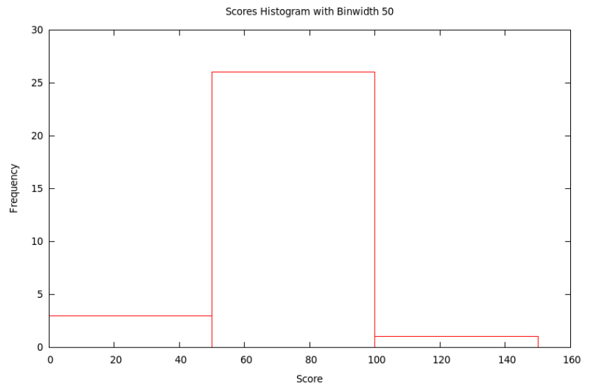
Finally, if we use the bins with \(x\) satisfying \(0\le x<50\), then \(50\le x<100\), and then \(100\le x<150\), we get the histogram with bins of width 50:
[Relative Frequency] Histograms
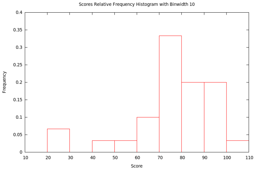
Just as we could have bar charts with absolute (§2.1) or relative (§2.2) frequencies, we can do the same for histograms. Above, in §3.2, we made absolute frequency histograms. If, instead, we divide each of the counts used to determine the heights of the bars by the total sample size, we will get fractions or percents – relative frequencies. We should then change the label on the \(y\)-axis and the tick-marks numbers on the \(y\)-axis, but otherwise the graph will look exactly the same (as it did with relative frequency bar charts compared with absolute frequency bar chars).
Example 1.3.4. Let’s make the relative frequency histogram corresponding to the absolute frequency histogram in Example 1.3.2 based on the data from Example 1.3.1 – all we have to do is change the numbers used to make heights of the bars in the graph by dividing them by the sample size, 30, and then also change the \(y\)-axis label and tick mark numbers.
How to Talk About Histograms
Histograms of course tell us what the data values are – the location along the \(x\) value of a bar is the value of the variable – and how many of them have each particular value – the height of the bar tells how many data values are in that bin. This is also given a technical name
[def:distribution] Given a variable defined on a population, or at least on a sample, the distribution of that variable is a list of all the values the variable actually takes on and how many times it takes on these values.
The reason we like the visual version of a distribution, its histogram, is that our visual intuition can then help us answer general, qualitative questions about what those data must be telling us. The first questions we usually want to answer quickly about the data are
- What is the shape of the histogram?
- Where is its center?
- How much variability [also called spread] does it show?
When we talk about the general shape of a histogram, we often use the terms
[def:symmskew] A histogram is symmetric if the left half is (approximately) the mirror image of the right half.
We say a histogram is skewed left if the tail on the left side is longer than on the right. In other words, left skew is when the left half of the histogram – half in the sense that the total of the bars in this left part is half of the size of the dataset – extends farther to the left than the right does to the right. Conversely, the histogram is skewed right if the right half extends farther to the right than the left does to the left.
If the shape of the histogram has one significant peak, then we say it is unimodal, while if it has several such, we say it is multimodal.
It is often easy to point to where the center of a distribution looks like it lies, but it is hard to be precise. It is particularly difficult if the histogram is “noisy,” maybe multimodal. Similarly, looking at a histogram, it is often easy to say it is “quite spread out” or “very concentrated in the center,” but it is then hard to go beyond this general sense.
Precision in our discussion of the center and spread of a dataset will only be possible in the next section, when we work with numerical measures of these features.


