19.2: Power Curves
- Page ID
- 8815

\( \newcommand{\vecs}[1]{\overset { \scriptstyle \rightharpoonup} {\mathbf{#1}} } \) \( \newcommand{\vecd}[1]{\overset{-\!-\!\rightharpoonup}{\vphantom{a}\smash {#1}}} \)\(\newcommand{\id}{\mathrm{id}}\) \( \newcommand{\Span}{\mathrm{span}}\) \( \newcommand{\kernel}{\mathrm{null}\,}\) \( \newcommand{\range}{\mathrm{range}\,}\) \( \newcommand{\RealPart}{\mathrm{Re}}\) \( \newcommand{\ImaginaryPart}{\mathrm{Im}}\) \( \newcommand{\Argument}{\mathrm{Arg}}\) \( \newcommand{\norm}[1]{\| #1 \|}\) \( \newcommand{\inner}[2]{\langle #1, #2 \rangle}\) \( \newcommand{\Span}{\mathrm{span}}\) \(\newcommand{\id}{\mathrm{id}}\) \( \newcommand{\Span}{\mathrm{span}}\) \( \newcommand{\kernel}{\mathrm{null}\,}\) \( \newcommand{\range}{\mathrm{range}\,}\) \( \newcommand{\RealPart}{\mathrm{Re}}\) \( \newcommand{\ImaginaryPart}{\mathrm{Im}}\) \( \newcommand{\Argument}{\mathrm{Arg}}\) \( \newcommand{\norm}[1]{\| #1 \|}\) \( \newcommand{\inner}[2]{\langle #1, #2 \rangle}\) \( \newcommand{\Span}{\mathrm{span}}\)\(\newcommand{\AA}{\unicode[.8,0]{x212B}}\)
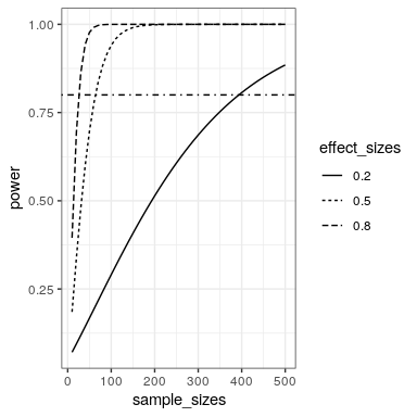
We can also create plots that can show us how the power to find an effect varies as a function of effect size and sample size. We willl use the crossing() function from the tidyr package to help with this. This function takes in two vectors, and returns a tibble that contains all possible combinations of those values.
effect_sizes <- c(0.2, 0.5, 0.8)
sample_sizes = seq(10, 500, 10)

#
input_df <- crossing(effect_sizes,sample_sizes)
glimpse(input_df)
## Observations: 150
## Variables: 2
## $ effect_sizes <dbl> 0.2, 0.2, 0.2, 0.2, 0.2, 0.2, 0.2, 0…
## $ sample_sizes <dbl> 10, 20, 30, 40, 50, 60, 70, 80, 90, …Using this, we can then perform a power analysis for each combination of effect size and sample size to create our power curves. In this case, let’s say that we wish to perform a two-sample t-test.
# create a function get the power value and
# return as a tibble
get_power <- function(df){
  power_result <- pwr.t.test(n=df$sample_sizes,
                             d=df$effect_sizes,
                             type='two.sample')
  df$power=power_result$power
  return(df)
}

# run get_power for each combination of effect size
# and sample size

power_curves <- input_df %>%
  do(get_power(.)) %>%
  mutate(effect_sizes = as.factor(effect_sizes))
Now we can plot the power curves, using a separate line for each effect size.
ggplot(power_curves,
       aes(x=sample_sizes,
           y=power,
           linetype=effect_sizes)) +
  geom_line() +
  geom_hline(yintercept = 0.8,
             linetype='dotdash')