6.2: Principles of Good Visualization
- Page ID
- 8735

\( \newcommand{\vecs}[1]{\overset { \scriptstyle \rightharpoonup} {\mathbf{#1}} } \)
\( \newcommand{\vecd}[1]{\overset{-\!-\!\rightharpoonup}{\vphantom{a}\smash {#1}}} \)
\( \newcommand{\dsum}{\displaystyle\sum\limits} \)
\( \newcommand{\dint}{\displaystyle\int\limits} \)
\( \newcommand{\dlim}{\displaystyle\lim\limits} \)
\( \newcommand{\id}{\mathrm{id}}\) \( \newcommand{\Span}{\mathrm{span}}\)
( \newcommand{\kernel}{\mathrm{null}\,}\) \( \newcommand{\range}{\mathrm{range}\,}\)
\( \newcommand{\RealPart}{\mathrm{Re}}\) \( \newcommand{\ImaginaryPart}{\mathrm{Im}}\)
\( \newcommand{\Argument}{\mathrm{Arg}}\) \( \newcommand{\norm}[1]{\| #1 \|}\)
\( \newcommand{\inner}[2]{\langle #1, #2 \rangle}\)
\( \newcommand{\Span}{\mathrm{span}}\)
\( \newcommand{\id}{\mathrm{id}}\)
\( \newcommand{\Span}{\mathrm{span}}\)
\( \newcommand{\kernel}{\mathrm{null}\,}\)
\( \newcommand{\range}{\mathrm{range}\,}\)
\( \newcommand{\RealPart}{\mathrm{Re}}\)
\( \newcommand{\ImaginaryPart}{\mathrm{Im}}\)
\( \newcommand{\Argument}{\mathrm{Arg}}\)
\( \newcommand{\norm}[1]{\| #1 \|}\)
\( \newcommand{\inner}[2]{\langle #1, #2 \rangle}\)
\( \newcommand{\Span}{\mathrm{span}}\) \( \newcommand{\AA}{\unicode[.8,0]{x212B}}\)
\( \newcommand{\vectorA}[1]{\vec{#1}} % arrow\)
\( \newcommand{\vectorAt}[1]{\vec{\text{#1}}} % arrow\)
\( \newcommand{\vectorB}[1]{\overset { \scriptstyle \rightharpoonup} {\mathbf{#1}} } \)
\( \newcommand{\vectorC}[1]{\textbf{#1}} \)
\( \newcommand{\vectorD}[1]{\overrightarrow{#1}} \)
\( \newcommand{\vectorDt}[1]{\overrightarrow{\text{#1}}} \)
\( \newcommand{\vectE}[1]{\overset{-\!-\!\rightharpoonup}{\vphantom{a}\smash{\mathbf {#1}}}} \)
\( \newcommand{\vecs}[1]{\overset { \scriptstyle \rightharpoonup} {\mathbf{#1}} } \)
\(\newcommand{\longvect}{\overrightarrow}\)
\( \newcommand{\vecd}[1]{\overset{-\!-\!\rightharpoonup}{\vphantom{a}\smash {#1}}} \)
\(\newcommand{\avec}{\mathbf a}\) \(\newcommand{\bvec}{\mathbf b}\) \(\newcommand{\cvec}{\mathbf c}\) \(\newcommand{\dvec}{\mathbf d}\) \(\newcommand{\dtil}{\widetilde{\mathbf d}}\) \(\newcommand{\evec}{\mathbf e}\) \(\newcommand{\fvec}{\mathbf f}\) \(\newcommand{\nvec}{\mathbf n}\) \(\newcommand{\pvec}{\mathbf p}\) \(\newcommand{\qvec}{\mathbf q}\) \(\newcommand{\svec}{\mathbf s}\) \(\newcommand{\tvec}{\mathbf t}\) \(\newcommand{\uvec}{\mathbf u}\) \(\newcommand{\vvec}{\mathbf v}\) \(\newcommand{\wvec}{\mathbf w}\) \(\newcommand{\xvec}{\mathbf x}\) \(\newcommand{\yvec}{\mathbf y}\) \(\newcommand{\zvec}{\mathbf z}\) \(\newcommand{\rvec}{\mathbf r}\) \(\newcommand{\mvec}{\mathbf m}\) \(\newcommand{\zerovec}{\mathbf 0}\) \(\newcommand{\onevec}{\mathbf 1}\) \(\newcommand{\real}{\mathbb R}\) \(\newcommand{\twovec}[2]{\left[\begin{array}{r}#1 \\ #2 \end{array}\right]}\) \(\newcommand{\ctwovec}[2]{\left[\begin{array}{c}#1 \\ #2 \end{array}\right]}\) \(\newcommand{\threevec}[3]{\left[\begin{array}{r}#1 \\ #2 \\ #3 \end{array}\right]}\) \(\newcommand{\cthreevec}[3]{\left[\begin{array}{c}#1 \\ #2 \\ #3 \end{array}\right]}\) \(\newcommand{\fourvec}[4]{\left[\begin{array}{r}#1 \\ #2 \\ #3 \\ #4 \end{array}\right]}\) \(\newcommand{\cfourvec}[4]{\left[\begin{array}{c}#1 \\ #2 \\ #3 \\ #4 \end{array}\right]}\) \(\newcommand{\fivevec}[5]{\left[\begin{array}{r}#1 \\ #2 \\ #3 \\ #4 \\ #5 \\ \end{array}\right]}\) \(\newcommand{\cfivevec}[5]{\left[\begin{array}{c}#1 \\ #2 \\ #3 \\ #4 \\ #5 \\ \end{array}\right]}\) \(\newcommand{\mattwo}[4]{\left[\begin{array}{rr}#1 \amp #2 \\ #3 \amp #4 \\ \end{array}\right]}\) \(\newcommand{\laspan}[1]{\text{Span}\{#1\}}\) \(\newcommand{\bcal}{\cal B}\) \(\newcommand{\ccal}{\cal C}\) \(\newcommand{\scal}{\cal S}\) \(\newcommand{\wcal}{\cal W}\) \(\newcommand{\ecal}{\cal E}\) \(\newcommand{\coords}[2]{\left\{#1\right\}_{#2}}\) \(\newcommand{\gray}[1]{\color{gray}{#1}}\) \(\newcommand{\lgray}[1]{\color{lightgray}{#1}}\) \(\newcommand{\rank}{\operatorname{rank}}\) \(\newcommand{\row}{\text{Row}}\) \(\newcommand{\col}{\text{Col}}\) \(\renewcommand{\row}{\text{Row}}\) \(\newcommand{\nul}{\text{Nul}}\) \(\newcommand{\var}{\text{Var}}\) \(\newcommand{\corr}{\text{corr}}\) \(\newcommand{\len}[1]{\left|#1\right|}\) \(\newcommand{\bbar}{\overline{\bvec}}\) \(\newcommand{\bhat}{\widehat{\bvec}}\) \(\newcommand{\bperp}{\bvec^\perp}\) \(\newcommand{\xhat}{\widehat{\xvec}}\) \(\newcommand{\vhat}{\widehat{\vvec}}\) \(\newcommand{\uhat}{\widehat{\uvec}}\) \(\newcommand{\what}{\widehat{\wvec}}\) \(\newcommand{\Sighat}{\widehat{\Sigma}}\) \(\newcommand{\lt}{<}\) \(\newcommand{\gt}{>}\) \(\newcommand{\amp}{&}\) \(\definecolor{fillinmathshade}{gray}{0.9}\)Many books have been written on effective visualization of data. There are some principles that most of these authors agree on, while others are more contentious. Here we summarize some of the major principles; if you want to learn more, then some good resources are listed in the Suggested Readings section at the end of this chapter.
6.2.1 Show the data and make them stand out
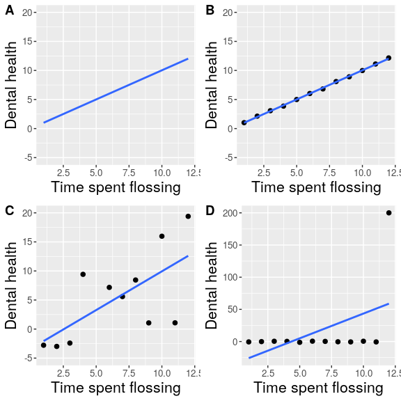
Let’s say that I had performed a study that examined the relationship between dental health and time spent flossing, and I would like to visualize my data. Figure 6.4 shows four possible presentations of these data.
- In panel A, we don’t actually show the data, just a line expressing the relationship between the data. This is clearly not optimal, because we can’t actually see what the underlying data look like.
Panels B-D show three possible outcomes from plotting the actual data, where each plot shows a different way that the data might have looked.
- If we saw the plot in Panel B, we would probably be suspicious – rarely would real data follow such a precise pattern.
- The data in Panel C, on the other hand, look like real data – they show a general trend, but they are messy, as data in the world usually are.
- The data in Panel D show us that the apparent relationship between the two variables is solely caused by one individual, who we would refer to as an outlier because they fall so far outside of the pattern of the rest of the group. It should be clear that we probably don’t want to conclude very much from an effect that is driven by one data point. This figure highlights why it is always important to look at the raw data before putting too much faith in any summary of the data.
6.2.2 Maximize the data/ink ratio
Edward Tufte has proposed an idea called the data/ink ratio:
\(\ data/ink\ ratio = {\frac {amount\ of\ ink\ used\ on\ data}{total\ amount\ of\ ink}}\)
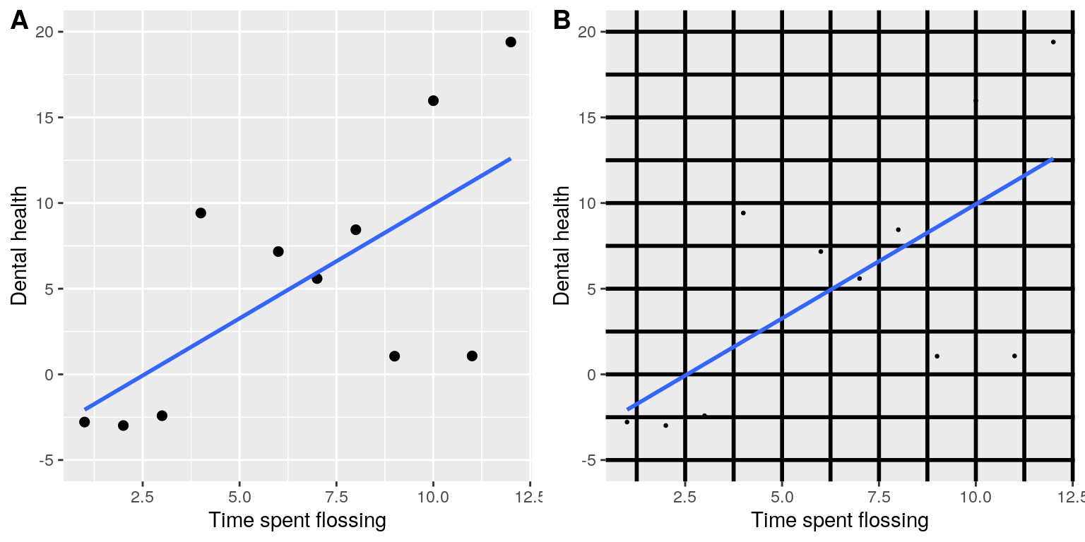
The point of this is to minimize visual clutter and let the data show through. For example, take the two presentations of the dental health data in Figure 6.5. Both panels show the same data, but panel A is much easier to apprehend, because of its relatively higher data/ink ratio.
6.2.3 Avoid chartjunk
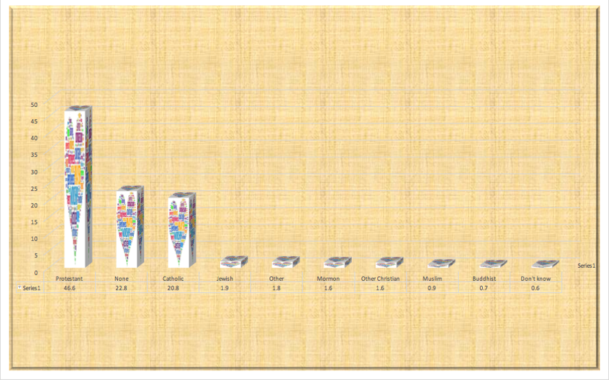
It’s especially common to see presentations of data in the popular media that are adorned with lots of visual elements that are thematically related to the content but unrelated to the actual data. This is known as chartjunk, and should be avoided at all costs.
One good way to avoid chartjunk is to avoid using popular spreadsheet programs to plot one’s data. For example, the chart in Figure 6.6 (created using Microsoft Excel) plots the relative popularity of different religions in the United States. There are at least three things wrong with this figure:
- it has graphics overlaid on each of the bars that have nothing to do with the actual data
- it has a distracting background texture
- it uses three-dimensional bars, which distort the data
6.2.4 Avoid distorting the data
It’s often possible to use visualization to distort the message of a dataset. A very common one is use of different axis scaling to either exaggerate or hide a pattern of data. For example, let’s say that we are interested in seeing whether rates of violent crime have changed in the US. In Figure 6.7, we can see these data plotted in ways that either make it look like crime has remained constant, or that it has plummeted. The same data can tell two very different stories!
One of the major controversies in statistical data visualization is how to choose the Y axis, and in particular whether it should always include zero. In his famous book “How to lie with statistics”, Darrell Huff argued strongly that one should always include the zero point in the Y axis. On the other hand, Edward Tufte has argued against this:
“In general, in a time-series, use a baseline that shows the data not the zero point; don’t spend a lot of empty vertical space trying to reach down to the zero point at the cost of hiding what is going on in the data line itself.” (from https://qz.com/418083/its-ok-not-to-start-your-y-axis-at-zero/)
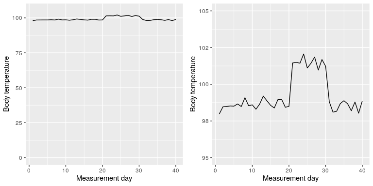
There are certainly cases where using the zero point makes no sense at all. Let’s say that we are interested in plotting body temperature for an individual over time. In Figure 6.8 we plot the same (simulated) data with or without zero in the Y axis. It should be obvious that by plotting these data with zero in the Y axis (Panel A) we are wasting a lot of space in the figure, given that body temperature of a living person could never go to zero! By including zero, we are also making the apparent jump in temperature during days 21-30 much less evident. In general, my inclination for line plots and scatterplots is to use all of the space in the graph, unless the zero point is truly important to highlight.
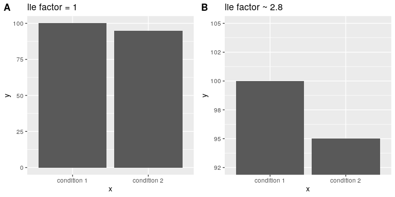
Edward Tufte introduced the concept of the lie factor to describe the degree to which physical differences in a visualization correspond to the magnitude of the differences in the data. If a graphic has a lie factor near 1, then it is appropriately representing the data, whereas lie factors far from one reflect a distortion of the underlying data.
The lie factor supports the argument that one should always include the zero point in a bar chart in many cases. In Figure 6.9 we plot the same data with and without zero in the Y axis. In panel A, the proportional difference in area between the two bars is exactly the same as the proportional difference between the values (i.e. lie factor = 1), whereas in Panel B (where zero is not included) the proportional difference in area between the two bars is roughly 2.8 times bigger than the proportional difference in the values, and thus it visually exaggerates the size of the difference.