
6.1: Cross-Tabulation
- Page ID
- 7230

\( \newcommand{\vecs}[1]{\overset { \scriptstyle \rightharpoonup} {\mathbf{#1}} } \)
\( \newcommand{\vecd}[1]{\overset{-\!-\!\rightharpoonup}{\vphantom{a}\smash {#1}}} \)
\( \newcommand{\dsum}{\displaystyle\sum\limits} \)
\( \newcommand{\dint}{\displaystyle\int\limits} \)
\( \newcommand{\dlim}{\displaystyle\lim\limits} \)
\( \newcommand{\id}{\mathrm{id}}\) \( \newcommand{\Span}{\mathrm{span}}\)
( \newcommand{\kernel}{\mathrm{null}\,}\) \( \newcommand{\range}{\mathrm{range}\,}\)
\( \newcommand{\RealPart}{\mathrm{Re}}\) \( \newcommand{\ImaginaryPart}{\mathrm{Im}}\)
\( \newcommand{\Argument}{\mathrm{Arg}}\) \( \newcommand{\norm}[1]{\| #1 \|}\)
\( \newcommand{\inner}[2]{\langle #1, #2 \rangle}\)
\( \newcommand{\Span}{\mathrm{span}}\)
\( \newcommand{\id}{\mathrm{id}}\)
\( \newcommand{\Span}{\mathrm{span}}\)
\( \newcommand{\kernel}{\mathrm{null}\,}\)
\( \newcommand{\range}{\mathrm{range}\,}\)
\( \newcommand{\RealPart}{\mathrm{Re}}\)
\( \newcommand{\ImaginaryPart}{\mathrm{Im}}\)
\( \newcommand{\Argument}{\mathrm{Arg}}\)
\( \newcommand{\norm}[1]{\| #1 \|}\)
\( \newcommand{\inner}[2]{\langle #1, #2 \rangle}\)
\( \newcommand{\Span}{\mathrm{span}}\) \( \newcommand{\AA}{\unicode[.8,0]{x212B}}\)
\( \newcommand{\vectorA}[1]{\vec{#1}} % arrow\)
\( \newcommand{\vectorAt}[1]{\vec{\text{#1}}} % arrow\)
\( \newcommand{\vectorB}[1]{\overset { \scriptstyle \rightharpoonup} {\mathbf{#1}} } \)
\( \newcommand{\vectorC}[1]{\textbf{#1}} \)
\( \newcommand{\vectorD}[1]{\overrightarrow{#1}} \)
\( \newcommand{\vectorDt}[1]{\overrightarrow{\text{#1}}} \)
\( \newcommand{\vectE}[1]{\overset{-\!-\!\rightharpoonup}{\vphantom{a}\smash{\mathbf {#1}}}} \)
\( \newcommand{\vecs}[1]{\overset { \scriptstyle \rightharpoonup} {\mathbf{#1}} } \)
\(\newcommand{\longvect}{\overrightarrow}\)
\( \newcommand{\vecd}[1]{\overset{-\!-\!\rightharpoonup}{\vphantom{a}\smash {#1}}} \)
\(\newcommand{\avec}{\mathbf a}\) \(\newcommand{\bvec}{\mathbf b}\) \(\newcommand{\cvec}{\mathbf c}\) \(\newcommand{\dvec}{\mathbf d}\) \(\newcommand{\dtil}{\widetilde{\mathbf d}}\) \(\newcommand{\evec}{\mathbf e}\) \(\newcommand{\fvec}{\mathbf f}\) \(\newcommand{\nvec}{\mathbf n}\) \(\newcommand{\pvec}{\mathbf p}\) \(\newcommand{\qvec}{\mathbf q}\) \(\newcommand{\svec}{\mathbf s}\) \(\newcommand{\tvec}{\mathbf t}\) \(\newcommand{\uvec}{\mathbf u}\) \(\newcommand{\vvec}{\mathbf v}\) \(\newcommand{\wvec}{\mathbf w}\) \(\newcommand{\xvec}{\mathbf x}\) \(\newcommand{\yvec}{\mathbf y}\) \(\newcommand{\zvec}{\mathbf z}\) \(\newcommand{\rvec}{\mathbf r}\) \(\newcommand{\mvec}{\mathbf m}\) \(\newcommand{\zerovec}{\mathbf 0}\) \(\newcommand{\onevec}{\mathbf 1}\) \(\newcommand{\real}{\mathbb R}\) \(\newcommand{\twovec}[2]{\left[\begin{array}{r}#1 \\ #2 \end{array}\right]}\) \(\newcommand{\ctwovec}[2]{\left[\begin{array}{c}#1 \\ #2 \end{array}\right]}\) \(\newcommand{\threevec}[3]{\left[\begin{array}{r}#1 \\ #2 \\ #3 \end{array}\right]}\) \(\newcommand{\cthreevec}[3]{\left[\begin{array}{c}#1 \\ #2 \\ #3 \end{array}\right]}\) \(\newcommand{\fourvec}[4]{\left[\begin{array}{r}#1 \\ #2 \\ #3 \\ #4 \end{array}\right]}\) \(\newcommand{\cfourvec}[4]{\left[\begin{array}{c}#1 \\ #2 \\ #3 \\ #4 \end{array}\right]}\) \(\newcommand{\fivevec}[5]{\left[\begin{array}{r}#1 \\ #2 \\ #3 \\ #4 \\ #5 \\ \end{array}\right]}\) \(\newcommand{\cfivevec}[5]{\left[\begin{array}{c}#1 \\ #2 \\ #3 \\ #4 \\ #5 \\ \end{array}\right]}\) \(\newcommand{\mattwo}[4]{\left[\begin{array}{rr}#1 \amp #2 \\ #3 \amp #4 \\ \end{array}\right]}\) \(\newcommand{\laspan}[1]{\text{Span}\{#1\}}\) \(\newcommand{\bcal}{\cal B}\) \(\newcommand{\ccal}{\cal C}\) \(\newcommand{\scal}{\cal S}\) \(\newcommand{\wcal}{\cal W}\) \(\newcommand{\ecal}{\cal E}\) \(\newcommand{\coords}[2]{\left\{#1\right\}_{#2}}\) \(\newcommand{\gray}[1]{\color{gray}{#1}}\) \(\newcommand{\lgray}[1]{\color{lightgray}{#1}}\) \(\newcommand{\rank}{\operatorname{rank}}\) \(\newcommand{\row}{\text{Row}}\) \(\newcommand{\col}{\text{Col}}\) \(\renewcommand{\row}{\text{Row}}\) \(\newcommand{\nul}{\text{Nul}}\) \(\newcommand{\var}{\text{Var}}\) \(\newcommand{\corr}{\text{corr}}\) \(\newcommand{\len}[1]{\left|#1\right|}\) \(\newcommand{\bbar}{\overline{\bvec}}\) \(\newcommand{\bhat}{\widehat{\bvec}}\) \(\newcommand{\bperp}{\bvec^\perp}\) \(\newcommand{\xhat}{\widehat{\xvec}}\) \(\newcommand{\vhat}{\widehat{\vvec}}\) \(\newcommand{\uhat}{\widehat{\uvec}}\) \(\newcommand{\what}{\widehat{\wvec}}\) \(\newcommand{\Sighat}{\widehat{\Sigma}}\) \(\newcommand{\lt}{<}\) \(\newcommand{\gt}{>}\) \(\newcommand{\amp}{&}\) \(\definecolor{fillinmathshade}{gray}{0.9}\)6.1 Cross-Tabulation
To determine if there is an association between two variables measured at the nominal or ordinal levels, we use cross-tabulation and a set of supporting statistics. A cross-tabulation (or just crosstab) is a table that looks at the distribution of two variables simultaneously. Table 6.1 provides a sample layout of a 2 X 2 table.
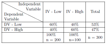
As Table 6.1 illustrates, a crosstab is set up so that the independent variable is on the top, forming columns, and the dependent variable is on the side, forming rows. Toward the upper left-hand corner of the table is the low, or negative, variable categories. Generally, a table will be displayed in a percentage format. The marginals for a table are the column totals and the row totals and are the same as a frequency distribution would be for that variable. Each cross-classification reports how many observations have that shared characteristic. The cross-classification groups are referred to as cells, so Table 6.1 is a four-celled table.
A table like Table 6.1 provides a basis to begin to answer the question of whether our independent and dependent variables are related. Remember that our null hypothesis says there is no relationship between our IV and our DV. Looking at Table 6.1, we can say of those low on the IV, 60% of them will also below on the DV; and that those high on the IV will be low on the DV 40% of the time. Our null hypothesis says there should be no difference, but in this case, there is a 20% difference so it appears that our null hypothesis is incorrect. What we learned in our inferential statistics chapter, though, tells us that it is still possible that the null hypothesis is true. The question is how likely is it that we could have a 20% difference in our sample even if the null hypothesis is true?12
We use the chi-square statistic to test our null hypothesis when using crosstabs. To find chi-square (χ2χ2), we begin by assuming the null hypothesis to be true and find the expected frequencies for each cell in our table. We do so using a posterior methodology based on the marginals for our dependent variable. We see that 53% of our total sample is low on the dependent variable. If our null hypothesis is correct, then where one is located on the independent variable should not matter: 53% of those who are low on the IV should be low on the DV and 53% of those who are high on the IV should be low on the DV. Table 6.2 & 6.3 illustrate this pattern. To find the expected frequency for each cell, we simply multiply the expected cell percentage times the number of people in each category of the IV: the expected frequency for the low-low cell is .53∗200=106.53∗200=106; for the low-high cell, it is .47∗200=94.47∗200=94; for the low-high cell it is .53∗100=53.53∗100=53; and for the high-high cell, the expected frequency is .47∗100=47.47∗100=47. (See Table 6.2 & 6.3).
The formula for the chi-square takes the expected frequency for each of the cells and subtracts the observed frequency from it, squares those differences, divides by the expected frequency, and sums those values:
χ2=∑(O−E)2E(6.1)(6.1)χ2=∑(O−E)2E
where:
χ2χ2 = The Test Statistic
∑∑ = The Summation Operator
OO = Observed Frequencies
EE = Expected Frequencies
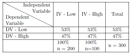
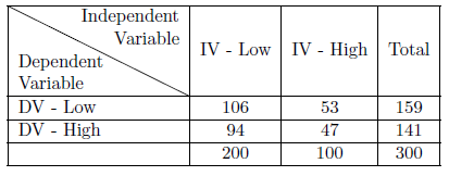
Table 6.4 provides those calculations. It shows a final chi-square of 10.73. With that chi-square, we can go to a chi-square table to determine whether to accept or reject the null hypothesis. Before going to that chi-square table, we need to figure out two things. First, we need to determine the level of significance we want, presumably .05. Second, we need to determine our degrees of freedom. We will provide more on that concept as we go on, but for now, know that it is the number of rows minus one times the number of columns minus one. In this case, we have (2−1)(2−1)=1(2−1)(2−1)=1 degree of freedom.
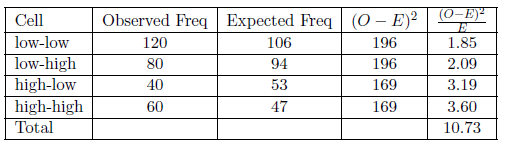
Table 6.9 (at the end of this chapter) is a chi-square table that shows the critical values for various levels of significance and degrees of freedom. The critical value for one degree of freedom with a .05 level of significance is 3.84. Since our chi-square is larger than that we can reject our null hypothesis - there is less than a .05 probability that we could have found the results in our sample if there is no relationship in the population. In fact, if we follow the row for one degree of freedom across, we see we can reject our null hypothesis even at the .005 level of significance and, almost but not quite, at the .001 level of significance.
Having rejected the null hypothesis, we believe there is a relationship between the two variables, but we still want to know how strong that relationship is. Measures of association are used to determine the strength of a relationship. One type of measure of association relies on a co-variation model as elaborated upon in Sections 6.2 and 6.3. Co-variation models are directional models and require ordinal or interval level measures; otherwise, the variables have no direction. Here we consider alternative models.
If one or both of our variables is nominal, we cannot specify directional change. Still, we might see a recognizable pattern of change in one variable as the other variable varies. Women might be more concerned about climate change than are men, for example. For that type of case, we may use a reduction in error or a proportional reduction in error (PRE) model. We consider how well we predict using a naive model (assuming no relationship) and compare it to how much better we predict when we use our independent variable to make that prediction. These measures of association only range from 0−1.00−1.0, since the sign otherwise indicates direction. Generally, we use this type of measure when at least one of our variables are nominal, but we will also use a PRE model measure, r2r2, in regression analysis. Lambda is a commonly used PRE-based measure of association for nominal level data, but it can underestimate the relationship in some circumstances.
Another set of measures of association suitable for nominal level data is based on chi-square. Cramer’s V is a simple chi square-based indicator, but like chi-square itself, its value is affected by the sample size and the dimensions of the table. Phi corrects for sample size but is appropriate only for a 2 X 2 table. The contingency coefficient, C, also corrects for sample size and can be applied to larger tables, but requires a square table, i.e., the same number of rows and columns.
If we have ordinal level data, we can use a co-variation model, but the specific model developed below in Section 6.3 looks at how observations are distributed around their means. Since we cannot find a mean for ordinal level data, we need an alternative. Gamma is commonly used with ordinal level data and provides a summary comparing how many observations fall around the diagonal in the table that supports a positive relationship (e.g. observations in the low-low cell and the high-high cells) as opposed to observations following the negative diagonal (e.g. the low-high cell and the high-low cells). Gamma ranges from −1.0−1.0 to +1.0+1.0.\
Crosstabulations and their associated statistics can be calculated using R. In this example we continue to use the Global Climate Change dataset (ds). The dataset includes measures of survey respondents: gender (female = 0, male = 1); perceived risk posed by climate change, or glbcc_risk (0 = Not Risk; 10 = extreme risk), and political ideology (1 = strong liberal, 7 = strong conservative). Here we look at whether there is a relationship between gender and the glbcc_risk variable. The glbcc_risk variable has eleven categories; to make the table more manageable, we recode it to five categories.
#  Factor the gender variable
ds$f.gend <- factor(ds$gender, levels=c(0,1), labels = c("Women", "Men"))

#  recode glbcc_risk to five categories
library(car)
ds$r.glbcc_risk <- car::recode(ds$glbcc_risk, "0:1=1; 2:3=2; 4:6=3; 7:8:=4;
                          9:10=5; NA=NA")
Using the table function, we produce a frequency table reflecting the relationship between gender and the recoded glbccrisk variable.
#  create the table
table(ds$r.glbcc_risk, ds$f.gend)
##
## Women Men
## 1 134 134
## 2 175 155
## 3 480 281
## 4 330 208
## 5 393 245# create the table as an R Object
glbcc.table <- table(ds$r.glbcc_risk, ds$f.gend)This table is difficult to interpret because of the numbers of men and women are different. To make the table easier to interpret, we convert it to percentages using the prop.table function. Looking at the new table, we can see that there are more men at the lower end of the perceived risk scale and more women at the upper end.
#  Multiply by 100
prop.table(glbcc.table, 2) * 100
##
## Women Men
## 1 8.862434 13.098729
## 2 11.574074 15.151515
## 3 31.746032 27.468231
## 4 21.825397 20.332356
## 5 25.992063 23.949169The percentaged table suggests that there is a relationship between the two variables, but also illustrates the challenge of relying on percentage differences to determine the significance of that relationship. So, to test our null hypothesis, we calculate our chi square using the chisq.test function.
#  Chi Square Test
chisq.test(glbcc.table)
##
## Pearson's Chi-squared test
##
## data: glbcc.table
## X-squared = 21.729, df = 4, p-value = 0.0002269R reports our chiquare to equal 21.73. It also tells us that we have 4 degrees of freedom and a p value of .0002269. Since that p-value is substantially less than .05, we can reject our null hypothesis with great confidence. There is, evidently, a relationship between gender and percieved risk of climate change.
Finally, we want to know how strong the relationship is. We use the assocstats function to get several measures of association. Since the table is not a 2 X 2 table nor square, neither phi not the contingency coefficient is appropriate, but we can report Cramer’s V. Cramer’s V is .093, indicating a relatively weak relationship between gender and the perceived global climate change risk variable.
library(vcd)
assocstats(glbcc.table)
## X^2 df P(> X^2)
## Likelihood Ratio 21.494 4 0.00025270
## Pearson 21.729 4 0.00022695
##
## Phi-Coefficient : NA
## Contingency Coeff.: 0.092
## Cramer's V : 0.0936.1.1 Crosstabulation and Control
In Chapter 2 we talked about the importance of experimental control if we want to make causal statements. In experimental designs, we rely on physical control and randomization to provide that control to give us confidence in the causal nature of any relationship we find. With quasi-experimental designs, however, we do not have that type of control and have to wonder whether any relationship that we find might be spurious. At that point, we promised that the situation is not hopeless with quasi-experimental designs and that there are statistical substitutes for the control naturally afforded to us in experimental designs. In this section, we will describe that process when using crosstabulation. We will first look at some hypothetical data to get some clean examples of what might happen when you control for an alternative explanatory variable before looking at a real example using R.
The process used to control for an alternative explanatory variable, commonly referred to as a third variable, is straightforward. To control for a third variable, we first construct our original table between our independent and dependent variables. Then we sort our data into subsets based on the categories of our third variable and reconstruct new tables using our IV and DV for each subset of our data.
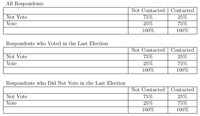
Suppose we hypothesize that people who are contacted about voting are more likely to vote. Table 6.5 illustrates what we might find. (Remember all of these data are fabricated to illustrate our points.) According to the first table, people who are contacted are 50% more likely to vote than those who are not. But, a skeptic might say campaigns target previous voters for contact and that previous voters are more likely to vote in subsequent elections. That skeptic is making the argument that the relationship between contact and voting is spurious and that the true cause of voting is voting history. To test that theory, we control for voting history by sorting respondents into two sets – those who voted in the last election and those who did not. We then reconstruct the original table for the two sets of respondents. The new tables indicate that previous voters are 50% more likely to vote when contacted and that those who did not vote previously are 50% more likely to vote when contacted. The skeptic is wrong; the pattern found in our original data persists even after controlling for the alternative explanation. We still remain reluctant to use causal language because another skeptic might have another alternative explanation (which would require us to go through the same process with the new third variable), but we do have more confidence in the possible causal nature of the relationship between contact and voting.
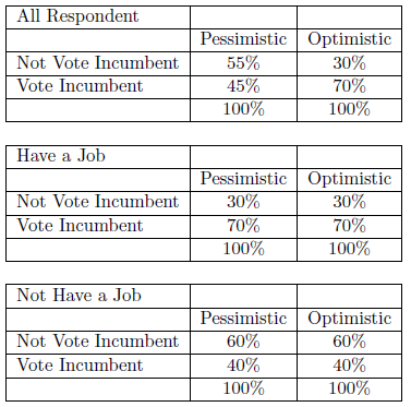
The next example tests the hypothesis that those who are optimistic about the future are more likely to vote for the incumbent than those who are pessimistic. Table 6.6 shows that optimistic people are 25% more likely to vote for the incumbent than are pessimistic people. But our skeptic friend might argue that feelings about the world are not nearly as important as real-life conditions. People with jobs vote for the incumbent more often than those without a job and, of course, those with a job are more likely to feel good about the world. To test that alternative, we control for whether the respondent has a job and reconstruct new tables. When we do, we find that among those with a job, 70% vote for the incumbent - regardless of their level of optimism about the world. And, among those without a job, 40% vote for the incumbent, regardless of their optimism. In other words, after controlling for job status, there is no relationship between the level of optimism and voting behavior. The original relationship was spurious.
A third outcome of controlling for a third variable might be some form of interaction or specification effect. The third variable affects how the first two are related, but it does not completely undermine the original relationship. For example, we might find the original relationship to be stronger for one category of the control variable than another - or even to be present in one case and not the other. The pattern might also suggest that both variables have an influence on the dependent variable, resembling some form of joint causation. In fact, it is possible for your relationship to appear to be null in your original table, but when you control you might find a positive relationship for one category of your control variable and negative for another.
Using an example from the Climate and Weather survey, we might hypothesize that liberals are more likely to think that greenhouse gases are causing global warming. We start by recoding ideology from 7 levels to 3, then construct a frequency table and convert it to a percentage table of the relationship.
#  recode variables ideology to 3 categories
library(car)
ds$r.ideol<-car::recode(ds$ideol, "1:2=1; 3:5=2; 6:7=3; NA=NA")

#  factor the variables to add labels.
ds$f.ideol<- factor(ds$r.ideol, levels=c(1, 2, 3), labels=c("Liberal",
                        "Moderate", "Conservative"))
ds$f.glbcc <- factor(ds$glbcc, levels=c(0, 1),
                          labels = c("GLBCC No", "GLBCC Yes"))

#  3 Two variable table glbcc~ideology
v2.glbcc.table <- table(ds$f.glbcc, ds$f.ideol)
v2.glbcc.table
##
## Liberal Moderate Conservative
## GLBCC No 26 322 734
## GLBCC Yes 375 762 305# Percentages by Column
prop.table(v2.glbcc.table, 2) * 100##
## Liberal Moderate Conservative
## GLBCC No 6.483791 29.704797 70.644851
## GLBCC Yes 93.516209 70.295203 29.355149It appears that our hypothesis is supported, as there is more than a 40% difference between liberals and conservatives with moderates in between. However, let’s consider the chi-square before we reject our null hypothesis:
#  Chi-squared
chisq.test(v2.glbcc.table, correct = FALSE)
##
## Pearson's Chi-squared test
##
## data: v2.glbcc.table
## X-squared = 620.76, df = 2, p-value < 0.00000000000000022The chi-square is very large and our p-value is very small. We can, therefore, reject our null hypothesis with great confidence. Next, we consider the strength of the association using Cramer’s V (since either Phi nor the contingency coefficient is appropriate for a 3 X 2 table):
#  Cramer's V
library(vcd)
assocstats(v2.glbcc.table)
## X^2 df P(> X^2)
## Likelihood Ratio 678.24 2 0
## Pearson 620.76 2 0
##
## Phi-Coefficient : NA
## Contingency Coeff.: 0.444
## Cramer's V : 0.496The Cramer’s V value of .496 indicates that we have a strong relationship between political ideology and beliefs about climate change.
We might, though, want to look at gender as a control variable since we know gender is related both to perceptions on the climate and ideology. First, we need to generate a new table with the control variable gender added. We start by factoring the gender variable.
#  factor the variables to add labels.
ds$f.gend <- factor(ds$gend, levels=c(0, 1), labels=c("Women", "Men"))
We then create a new table. The R output is shown, in which the line \#\# , , = Women indicates the results for women and \#\# , , = Men displays the results for men.
#  3 Two variable table glbcc~ideology+gend
v3.glbcc.table <- table(ds$f.glbcc, ds$f.ideol, ds$f.gend)
v3.glbcc.table
## , , = Women
##
##
## Liberal Moderate Conservative
## GLBCC No 18 206 375
## GLBCC Yes 239 470 196
##
## , , = Men
##
##
## Liberal Moderate Conservative
## GLBCC No 8 116 358
## GLBCC Yes 136 292 109# Percentages by Column for Women
prop.table(v3.glbcc.table[,,1], 2) * 100 ##
## Liberal Moderate Conservative
## GLBCC No 7.003891 30.473373 65.674256
## GLBCC Yes 92.996109 69.526627 34.325744chisq.test(v3.glbcc.table[,,1])##
## Pearson's Chi-squared test
##
## data: v3.glbcc.table[, , 1]
## X-squared = 299.39, df = 2, p-value < 0.00000000000000022assocstats(v3.glbcc.table[,,1])## X^2 df P(> X^2)
## Likelihood Ratio 326.13 2 0
## Pearson 299.39 2 0
##
## Phi-Coefficient : NA
## Contingency Coeff.: 0.407
## Cramer's V : 0.446# Percentages by Column for Men
prop.table(v3.glbcc.table[,,2], 2) * 100 ##
## Liberal Moderate Conservative
## GLBCC No 5.555556 28.431373 76.659529
## GLBCC Yes 94.444444 71.568627 23.340471chisq.test(v3.glbcc.table[,,2])##
## Pearson's Chi-squared test
##
## data: v3.glbcc.table[, , 2]
## X-squared = 320.43, df = 2, p-value < 0.00000000000000022assocstats(v3.glbcc.table[,,2])## X^2 df P(> X^2)
## Likelihood Ratio 353.24 2 0
## Pearson 320.43 2 0
##
## Phi-Coefficient : NA
## Contingency Coeff.: 0.489
## Cramer's V : 0.561For both men and women, we still see more than a 40% difference and the p-value for both tables chi-square is 2.2e-16 and both Cramer’s V’s are greater than .30. It is clear that even when controlling for gender, there is a robust relationship between ideology and perceived risk of climate change. However, these tables also suggest that women are slightly more inclined to believe greenhouse gases play a role in climate change than are men. We may have an instance of joint causation, where both ideology and gender affect (cause" is still too strong a word) views concerning the impact of greenhouse gases on climate change.
Crosstabs, chi-square, and measures of association are used with nominal and ordinal data to provide an overview of a relationship, its statistical significance, and the strength of a relationship. In the next section, we turn to ways to consider the same set of questions with interval level data before turning to the more advanced technique of regression analysis in Part 2 of this book.