
9.5: What do didgeridoos really do about sleepiness?
- Page ID
- 33313

In the practice problems at the end of Chapter 4, a study (Puhan et al. (2006)) related to a pre-post, two group comparison of the sleepiness ratings of subjects was introduced. They obtained \(n = 25\) volunteers and they randomized the subjects to either get a lesson or be placed on a waiting list for lessons. They constrained the randomization based on the high/low apnoea and high/low on the Epworth scale of the subjects in their initial observations to make sure they balanced the types of subjects going into the treatment and control groups. They measured the subjects’ Epworth value (daytime sleepiness, higher is more sleepy) initially and after four months, where only the treated subjects (those who took lessons) had any intervention. We are interested in whether the mean Epworth scale values changed differently over the four months in the group that got didgeridoo lessons than it did in the control group (that got no lessons). Each subject was measured twice (so the total sample size in the data set is 50) in the data set provided that is available at http://www.math.montana.edu/courses/s217/documents/epworthdata.csv.
The data set was not initially provided by the researchers, but they did provide a plot very similar to Figure 9.13. To make Figure 9.13 geom_line is used to display a line for each subject over the two time points (pre and post) of observation and indicate which group the subjects were assigned to. This allows us to see the variation at a given time across subjects and changes over time, which is critical here as this shows clearly why we had a violation of the independence assumption in these data. In the plot, you can see that there are not clear differences in the two groups at the “Pre” time but that treated group seems to have most of the lines go down to lower sleepiness ratings and that this is not happening much for the subjects in the control group. The violation of the independence assumption is diagnosable from the study design (two observations on each subject). The plot allows us to go further and see that many subjects had similar Epworth scores from pre to post (high in pre, generally high in post) once we account for systematic changes in the treated subjects that seemed to drop a bit on average.
epworthdata <- read_csv("http://www.math.montana.edu/courses/s217/documents/epworthdata.csv")
epworthdata <- epworthdata %>% mutate(Time = factor(Time),
                                      Group = factor(Group)
                                      )
levels(epworthdata$Time) <- c("Pre" , "Post")
levels(epworthdata$Group) <- c("Control" , "Didgeridoo")

epworthdata %>%
  ggplot(mapping = aes(x = Time, y = Epworth, group = Subject, color = Group)) +
  geom_point() +
  geom_line() +
  theme_bw() +
  scale_color_colorblind()

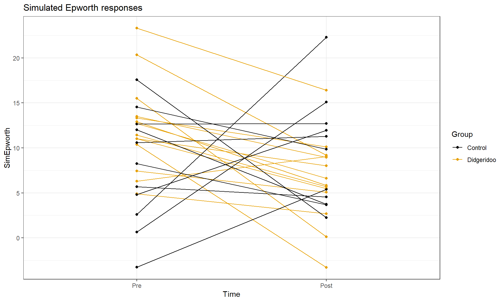
This plot seems to contradict the result from the following Two-Way ANOVA (that is a repeat of what you would have seen had you done the practice problem earlier in the book and the related interaction plot) – there is little to no evidence against the null hypothesis of no interaction between Time and Treatment group on Epworth scale ratings (\(F(1,46) = 1.37\), p-value \(= 0.2484\) as seen in Table 9.2). But this model assumes all the observations are independent and so does not account for the repeated measures on the same subjects. It ends up that if we account for systematic differences in subjects, we can (sometimes) find the differences we are interested in more clearly. We can see that this model does not really seem to capture the full structure of the real data by comparing simulated data to the original one, as in Figure 9.14. The real data set had fairly strong relationships between the pre and post scores but this connection seems to disappear in responses simulated from the estimated Two-Way ANOVA model (that assumes all observations are independent).
library(car)
lm_int <- lm(Epworth ~ Time * Group, data = epworthdata)
Anova(lm_int)
| Sum Sq | Df | F value | Pr(>F) | |
|---|---|---|---|---|
| Time | 120.746 | 1 | 5.653 | 0.022 |
| Group | 8.651 | 1 | 0.405 | 0.528 |
| Time:Group | 29.265 | 1 | 1.370 | 0.248 |
| Residuals | 982.540 | 46 |
If the issue is failing to account for differences in subjects, then why not add “Subject” to the model? There are two things to consider. First, we would need to make sure that “Subject” is a factor variable as the “Subject” variable is initially numerical from 1 to 25. Second, we have to deal with having a factor variable with 25 levels (so 24 indicator variables!). This is a big number and would make writing out the model and interpreting the term-plot for Subject extremely challenging. Fortunately, we are not too concerned about how much higher or lower an individual is than a baseline subject, but we do need to account for it in the model. This sort of “repeated measures” modeling is more often handled by a more complex set of extended regression models that are called linear mixed models and are designed to handle this sort of grouping variable with many levels.
But if we put the Subject factor variable into the previous model, we can use Type II ANOVA tests to test for an interaction between Time and Group (our primary research question) after controlling for subject-to-subject variation. There is a warning message about aliasing that occurs when you do this which means that it is not possible to estimate all the \(\beta\)s in this model (and why we more typically used mixed models to do this sort of thing). Despite this, the test for Time:Group in Table 9.3 is correct and now accounts for the repeated measures on the subject. It provides \(F(1,23) = 5.43\) with a p-value of 0.029, suggesting that there is moderate evidence against the null hypothesis of no interaction of time and group once we account for subject. This is a notably different result from what we observed in the Two-Way ANOVA interaction model that didn’t account for repeated measures on the subjects and matches the results in the original paper closely.
epworthdata <- epworthdata %>% mutate(Subject = factor(Subject))
lm_int_wsub <- lm(Epworth ~ Time * Group + Subject, data = epworthdata)
Anova(lm_int_wsub)
| Sum Sq | Df | F value | Pr(>F) | |
|---|---|---|---|---|
| Time | 120.746 | 1 | 22.410 | 0.000 |
| Group | 0 | |||
| Subject | 858.615 | 23 | 6.929 | 0.000 |
| Time:Group | 29.265 | 1 | 5.431 | 0.029 |
| Residuals | 123.924 | 23 |
With this result, we would usually explore the term-plots from this model to get a sense of the pattern of the changes over time in the treatment and control groups. That aliasing issue means that the “effects” function also has some issues. To see the effects plots, we need to use a linear mixed model from the nlme package (Pinheiro, Bates, and R Core Team 2022). This model is beyond the scope of this material, but it provides the same \(F\)-statistic for the interaction (\(F(1,23) = 5.43\)) and the term-plots can now be produced (Figure 9.15). In that plot, we again see that the didgeridoo group mean for “Post” is noticeably lower than in the “Pre” and that the changes in the control group were minimal over the four months. This difference in the changes over time was present in the initial graphical exploration but we needed to account for variation in subjects to be able to detect this difference. While these results rely on more complex models than we have time to discuss here, hopefully the similarity of the results of interest should resonate with the methods we have been exploring while hinting at more possibilities if you learn more statistical methods.
library(nlme)
lme_int <- lme(Epworth ~ Time * Group, random = ~1|Subject, data = epworthdata)
anova(lme_int)
##             numDF denDF   F-value p-value
## (Intercept)     1    23 132.81354  <.0001
## Time            1    23  22.41014  0.0001
## Group           1    23   0.23175  0.6348
## Time:Group      1    23   5.43151  0.0289
plot(allEffects(lme_int), multiline = T, lty = c(1,2), ci.style = "bars", grid = T)
