
6.11: Old Faithful discharge and waiting times
- Page ID
- 33274

A study in August 1985 considered time for Old Faithful and how that might relate to waiting time for the next eruption (Ripley (2022), Azzalini and Bowman (1990)). This sort of research provides the Yellowstone National Park (YNP) staff a way to show tourists a predicted time to next eruption so they can quickly see it erupt and then get back in their cars, not wasting too much time in the outdoors. Or, less cynically, the opportunity to study the behavior of the eruption of a geyser. Both variables are measured in minutes and the scatterplot in Figure 6.24 shows a moderate to strong positive and relatively linear relationship. We added a smoothing line (dashed line) using geom_smooth to this plot – this is actually the default choice in geom_smooth and we have to use geom_smooth(method = "lm") to get the regression (straight) line. Smoothing lines provide regression-like fits but are performed on local areas of the relationship between the two variables and so can highlight where the relationships change, especially highlighting curvilinear relationships. They can also return straight lines just like the regression line if that is reasonable. The technical details of regression smoothing are not covered here but they are a useful graphical addition to help visualize nonlinearity in relationships and a topic you can explore further based on the sources related to the mgcv R package (Wood 2022), which is being used by geom_smooth.
In these data, there appear to be two groups of eruptions (shorter length, shorter wait and longer length, longer wait) – but we don’t know enough about these data to assume that there are two groups. The smoothing line does help us to see if the relationship appears to change or stay the same across different values of the explanatory variable, Duration. The smoothing line suggests that the upper group might have a less steep slope than the lower group as it sort of levels off for observations with Duration of over 4 minutes. It also indicates that there is one point for an eruption under 1 minute in Duration that might be causing some problems for both the linear fit and the smoothing line. The story of these data involve some measurements during the night that were just noted as being short, medium, and long – and they were re-coded as 2, 3, or 4 minute duration eruptions. You can see responses stacking up at 2 and 4 minute durations and this is obviously a problematic aspect of these data. We’ll see if our diagnostics detect some of these issues when we fit a simple linear regression to try to explain waiting time based on duration of prior eruption.
data(geyser, package = "MASS")
geyser <- as_tibble(geyser)
# Aligns the duration with time to next eruption
G2 <- tibble(Waiting = geyser$waiting[-1], Duration = geyser$duration[-299])

G2 %>% ggplot(mapping = aes(x = Duration, y = Waiting)) +
  geom_point() +
  geom_smooth(method = "lm") +
  geom_smooth(lty = 2, col = "red", lwd = 1.5, se = F) + #Add smoothing line
  theme_bw() +
  labs(title = "Scatterplot with regression and smoothing line,
       Waiting Time vs Duration")
An initial concern with these data is that the observations are likely not independent. Since they were taken consecutively, one waiting time might be related to the next waiting time – violating the independence assumption. As noted above, there might be two groups (types) of eruptions – short ones and long ones. The Normal QQ-Plot in Figure 6.25 also suggests a few observations creating a slightly long right tail. Those observations might warrant further exploration as they also show up as unusual in the Residuals vs Fitted plot. There are no highly influential points in the data set with all points having Cook’s D smaller than 0.5 (contours are not displayed because no points are near or over them), so these outliers are not necessarily moving the regression line around. There are two distinct groups of observations but the variability is not clearly changing so we do not have to worry about non-constant variance here. So these results might be relatively trustworthy if we assume that the same relationship holds for all levels of duration of eruptions.
OF1 <- lm(Waiting ~ Duration, data = G2)
summary(OF1)
##
## Call:
## lm(formula = Waiting ~ Duration, data = G2)
##
## Residuals:
## Min 1Q Median 3Q Max
## -14.6940 -4.4954 -0.0966 3.9544 29.9544
##
## Coefficients:
## Estimate Std. Error t value Pr(>|t|)
## (Intercept) 34.9452 1.1807 29.60 <2e-16
## Duration 10.7751 0.3235 33.31 <2e-16
##
## Residual standard error: 6.392 on 296 degrees of freedom
## Multiple R-squared: 0.7894, Adjusted R-squared: 0.7887
## F-statistic: 1110 on 1 and 296 DF, p-value: < 2.2e-16par(mfrow = c(2,2))
plot(OF1)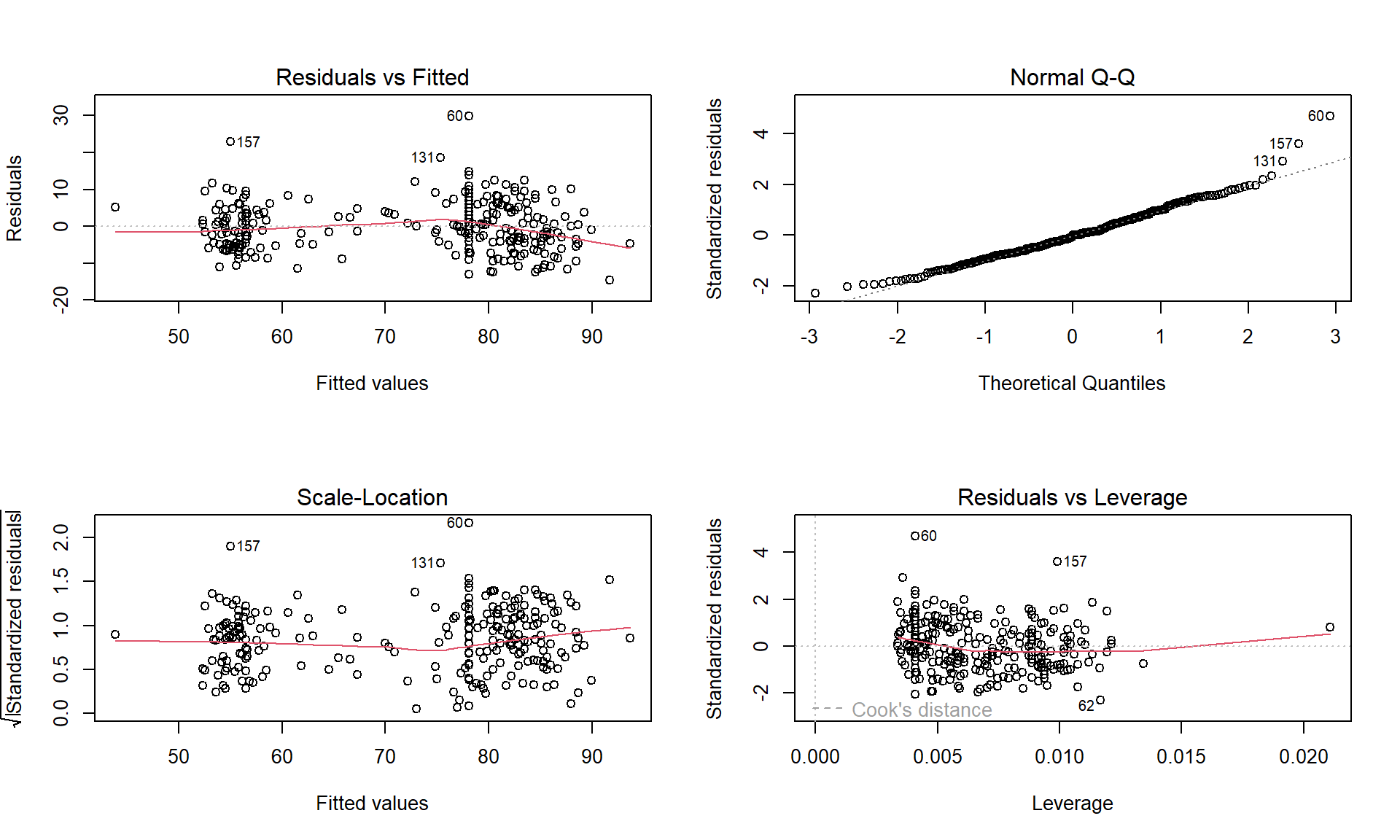
The estimated regression equation is \(\widehat{\text{WaitingTime}}_i = 34.95 + 10.78\cdot\text{Duration}_i\), suggesting that for a 1 minute increase in eruption Duration we would expect, on average, a 10.78 minute change in the WaitingTime. This equation might provide a useful tool for the YNP staff to predict waiting times. The R2 is fairly large: 78.9% of the variation in waiting time is explained by the duration of the previous eruption. But maybe this is more about two types of eruptions/waiting times? We could consider the relationship within the shorter and longer eruptions but since there are observations residing between the two groups, it is difficult to know where to split the explanatory variable into two groups. Maybe we really need to measure additional information that might explain why there are two groups in the responses…