
6.9: Outliers - leverage and influence
- Page ID
- 33272

In the review of correlation, we loosely considered the impacts of outliers on the correlation. We removed unusual points to see both the visual changes (in the scatterplot) as well as changes in the correlation coefficient in Figures 6.4 and 6.5. In this section, we formalize these ideas in the context of impacts of unusual points on our regression equation. In regression, it is possible for a single point to have a big impact on the overall regression results but it is also possible to have a clear outlier that has little impact on the results. We call an observation influential if its removal causes a “big” change in the regression line, specifically in terms of impacting the slope coefficient. Points that are on the edges of the \(x\text{'s}\) (far from the mean of the \(x\text{'s}\)) have the potential for more impact on the line as we will see in some examples shortly.
You can think of the regression line being balanced at \(\bar{x}\) and the further from that location a point is, the more a single point can move the line. We can measure the distance of points from \(\bar{x}\) to quantify each observation’s potential for impact on the line using what is called the leverage of a point. Leverage is a positive numerical measure with larger values corresponding to more leverage. The scale changes depending on the sample size (\(n\)) and the complexity of the model so all that matters is which observations have more or less relative leverage in a particular data set. The observations with \(x\)-values that provide higher leverage have increased potential to influence the estimated regression line. Along with measuring the leverage, we can also measure the influence that each point has on the regression line using Cook’s Distance or Cook’s D. It also is a positive measure with higher values suggesting more influence. The rule of thumb is that Cook’s D values over 1.0 correspond to clearly influential points, values over 0.5 have some influence and values lower than 0.5 indicate points that are not influential on the regression model slope coefficients. One part of the regular diagnostic plots we will use for regression models displays the leverages on the \(x\)-axis, the standardized residuals on the \(y\)-axis, and adds contour lines for Cook’s Distances in a panel that is labeled “Residuals vs Leverage”. This allows us to see the potential for impact of a point (leverage), how far it’s observation was from the regression line (residual), and to see a measure of that point’s influence (Cook’s D).
To extract the level of Cook’s D on the “Residuals vs Leverage” plot, look for contours to show up on the upper and lower right of the plot. They show increasing levels of influence going to the upper and lower right corners as you combine higher leverage (\(x\)-axis) and larger residuals (\(y\)-axis) – the two ingredients required to be influential on the line. The contours are displayed for Cook’s D values of 0.5 and 1.0 if there are points near or over those levels. The Cook’s D values come from a topographical surface of values that is a sort of U-shaped valley in the middle of the plot centered at \(y = 0\) with the lowest contour corresponding to Cook’s D values below 0.5 (no influence). As you move to the upper right or lower right corners, the influence increases and the edges of the valley get steeper. If you do not see any contours in the plot, then no points were even close to being influential based on Cook’s D.
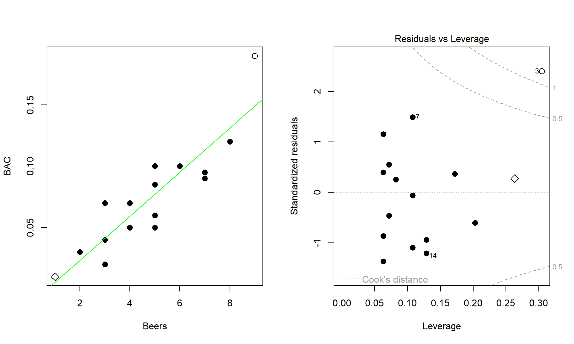
To illustrate these concepts, the original Beers and BAC data are used again. In the scatter plot in Figure 6.20, two points are plotted with different characters. The point for 1 Beer and BAC of 0.010 is displayed as a “\(\diamond\)” and the 9 Beer and BAC 0.19 observation is displayed with a “\(\circ\)”. These two points are the furthest from the mean of the of the \(x\text{'s}\) (\(\overline{\text{Beers}} = 4.8\)) but show two different levels of influence on the line. The “\(\diamond\)” point has a leverage of 0.27 and the 9 Beer observation (“\(\circ\)”) had a leverage of 0.30. The 1 Beer observation was close to the pattern defined by the other points, had a small residual, and a Cook’s D value below 0.5 (it did not exceed the first of the contours). So even though it had high leverage, it was not an influential point. The 9 Beer observation had the highest leverage in the data set and was quite a bit above the pattern defined by the other points and ends up being an influential point with a Cook’s D over 1. We might want to consider fitting this model without that observation to get a better estimate of the effects of beer consumption on BAC or revisit our assumption that the relationship is really linear here.
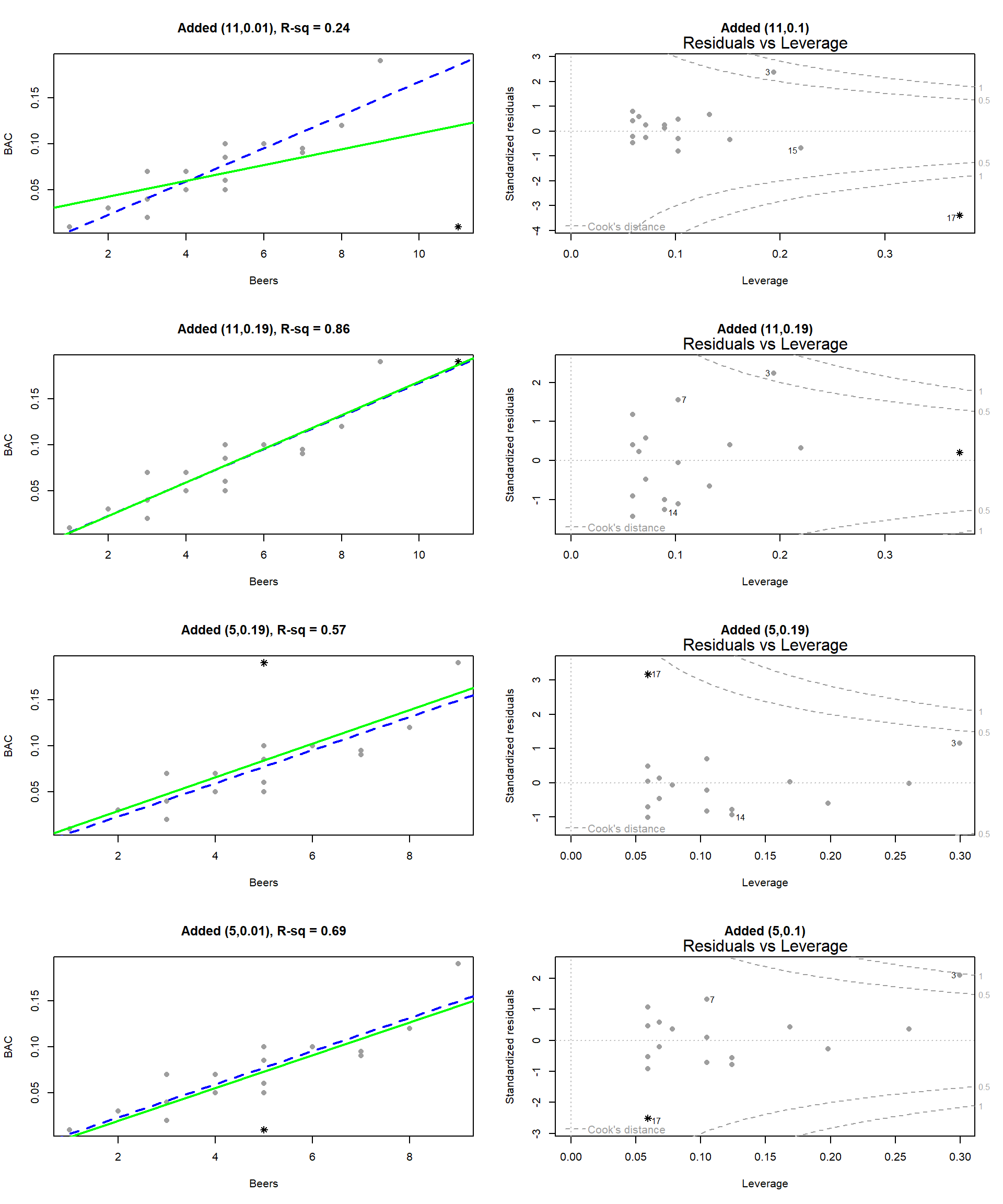
To further explore influence, we will add a point to the original data set and move it around so you can see how those changes impact the results. For each scatterplot in Figure 6.21, the Residuals vs Leverage plot is displayed to its right. The original data are “\(\color{Grey}{\bullet}\)” and the original regression line is the dashed line in Figure 6.21. First, a fake observation at 11 Beers and 0.1 BAC is added, at (11, 0.1), in the top panels of the figure. This observation is clearly an outlier and heavily impacts the slope of the regression line (so is clearly influential). This added point drops the R2 from 0.80 in the original data to 0.24. The accompanying Residuals vs Leverage plot shows that this point has extremely high leverage and a Cook’s D over 1 – it is a clearly influential point. However, having high leverage does not always make points influential. Consider the second row of plots with an added point of (11, 0.19). The regression line barely changes and R2 increases a little. This point has the same leverage as in the first example since it is the same set of \(x\text{'s}\) and the distance to the mean of the \(x\)’s is unchanged. But it is not influential since its Cook’s D value is less than 0.5. This occurred because it followed the overall pattern of observations even though it was “far away” from the other observations in the \(x\)-direction. The last two rows of plots show what happens when low leverage outliers are encountered. If observations are near the center of the \(x\text{'s}\), it ends up that to be influential the points have to be very far from the pattern of the other observations. The (5, 0.19) example almost attains a Cook’s D of 0.5 but has little impact on the regression line, especially the slope coefficient. It does impact the \(y\)-intercept and drops the R-squared value to 0.57. The same result occurs if the observation is noticeably lower than the other points.
When we are doing regressions, we get very worried about points “at the edges” having an undue influence on the results. When we start using multiple predictors, say if we had body weight data on these subjects as well as beer consumption, it becomes harder to “see” if the points are “far away” from the other observations and we will trust the Residuals vs Leverage plots to help us identify the influential points. These techniques work the same in the multiple regression models in Chapter 8 as they do in these simpler, single predictor regression models.