4.6: Sampling Distributions and the Central Limit Theorem
- Page ID
- 17328
\( \newcommand{\vecs}[1]{\overset { \scriptstyle \rightharpoonup} {\mathbf{#1}} } \)
\( \newcommand{\vecd}[1]{\overset{-\!-\!\rightharpoonup}{\vphantom{a}\smash {#1}}} \)
\( \newcommand{\id}{\mathrm{id}}\) \( \newcommand{\Span}{\mathrm{span}}\)
( \newcommand{\kernel}{\mathrm{null}\,}\) \( \newcommand{\range}{\mathrm{range}\,}\)
\( \newcommand{\RealPart}{\mathrm{Re}}\) \( \newcommand{\ImaginaryPart}{\mathrm{Im}}\)
\( \newcommand{\Argument}{\mathrm{Arg}}\) \( \newcommand{\norm}[1]{\| #1 \|}\)
\( \newcommand{\inner}[2]{\langle #1, #2 \rangle}\)
\( \newcommand{\Span}{\mathrm{span}}\)
\( \newcommand{\id}{\mathrm{id}}\)
\( \newcommand{\Span}{\mathrm{span}}\)
\( \newcommand{\kernel}{\mathrm{null}\,}\)
\( \newcommand{\range}{\mathrm{range}\,}\)
\( \newcommand{\RealPart}{\mathrm{Re}}\)
\( \newcommand{\ImaginaryPart}{\mathrm{Im}}\)
\( \newcommand{\Argument}{\mathrm{Arg}}\)
\( \newcommand{\norm}[1]{\| #1 \|}\)
\( \newcommand{\inner}[2]{\langle #1, #2 \rangle}\)
\( \newcommand{\Span}{\mathrm{span}}\) \( \newcommand{\AA}{\unicode[.8,0]{x212B}}\)
\( \newcommand{\vectorA}[1]{\vec{#1}} % arrow\)
\( \newcommand{\vectorAt}[1]{\vec{\text{#1}}} % arrow\)
\( \newcommand{\vectorB}[1]{\overset { \scriptstyle \rightharpoonup} {\mathbf{#1}} } \)
\( \newcommand{\vectorC}[1]{\textbf{#1}} \)
\( \newcommand{\vectorD}[1]{\overrightarrow{#1}} \)
\( \newcommand{\vectorDt}[1]{\overrightarrow{\text{#1}}} \)
\( \newcommand{\vectE}[1]{\overset{-\!-\!\rightharpoonup}{\vphantom{a}\smash{\mathbf {#1}}}} \)
\( \newcommand{\vecs}[1]{\overset { \scriptstyle \rightharpoonup} {\mathbf{#1}} } \)
\( \newcommand{\vecd}[1]{\overset{-\!-\!\rightharpoonup}{\vphantom{a}\smash {#1}}} \)
\(\newcommand{\avec}{\mathbf a}\) \(\newcommand{\bvec}{\mathbf b}\) \(\newcommand{\cvec}{\mathbf c}\) \(\newcommand{\dvec}{\mathbf d}\) \(\newcommand{\dtil}{\widetilde{\mathbf d}}\) \(\newcommand{\evec}{\mathbf e}\) \(\newcommand{\fvec}{\mathbf f}\) \(\newcommand{\nvec}{\mathbf n}\) \(\newcommand{\pvec}{\mathbf p}\) \(\newcommand{\qvec}{\mathbf q}\) \(\newcommand{\svec}{\mathbf s}\) \(\newcommand{\tvec}{\mathbf t}\) \(\newcommand{\uvec}{\mathbf u}\) \(\newcommand{\vvec}{\mathbf v}\) \(\newcommand{\wvec}{\mathbf w}\) \(\newcommand{\xvec}{\mathbf x}\) \(\newcommand{\yvec}{\mathbf y}\) \(\newcommand{\zvec}{\mathbf z}\) \(\newcommand{\rvec}{\mathbf r}\) \(\newcommand{\mvec}{\mathbf m}\) \(\newcommand{\zerovec}{\mathbf 0}\) \(\newcommand{\onevec}{\mathbf 1}\) \(\newcommand{\real}{\mathbb R}\) \(\newcommand{\twovec}[2]{\left[\begin{array}{r}#1 \\ #2 \end{array}\right]}\) \(\newcommand{\ctwovec}[2]{\left[\begin{array}{c}#1 \\ #2 \end{array}\right]}\) \(\newcommand{\threevec}[3]{\left[\begin{array}{r}#1 \\ #2 \\ #3 \end{array}\right]}\) \(\newcommand{\cthreevec}[3]{\left[\begin{array}{c}#1 \\ #2 \\ #3 \end{array}\right]}\) \(\newcommand{\fourvec}[4]{\left[\begin{array}{r}#1 \\ #2 \\ #3 \\ #4 \end{array}\right]}\) \(\newcommand{\cfourvec}[4]{\left[\begin{array}{c}#1 \\ #2 \\ #3 \\ #4 \end{array}\right]}\) \(\newcommand{\fivevec}[5]{\left[\begin{array}{r}#1 \\ #2 \\ #3 \\ #4 \\ #5 \\ \end{array}\right]}\) \(\newcommand{\cfivevec}[5]{\left[\begin{array}{c}#1 \\ #2 \\ #3 \\ #4 \\ #5 \\ \end{array}\right]}\) \(\newcommand{\mattwo}[4]{\left[\begin{array}{rr}#1 \amp #2 \\ #3 \amp #4 \\ \end{array}\right]}\) \(\newcommand{\laspan}[1]{\text{Span}\{#1\}}\) \(\newcommand{\bcal}{\cal B}\) \(\newcommand{\ccal}{\cal C}\) \(\newcommand{\scal}{\cal S}\) \(\newcommand{\wcal}{\cal W}\) \(\newcommand{\ecal}{\cal E}\) \(\newcommand{\coords}[2]{\left\{#1\right\}_{#2}}\) \(\newcommand{\gray}[1]{\color{gray}{#1}}\) \(\newcommand{\lgray}[1]{\color{lightgray}{#1}}\) \(\newcommand{\rank}{\operatorname{rank}}\) \(\newcommand{\row}{\text{Row}}\) \(\newcommand{\col}{\text{Col}}\) \(\renewcommand{\row}{\text{Row}}\) \(\newcommand{\nul}{\text{Nul}}\) \(\newcommand{\var}{\text{Var}}\) \(\newcommand{\corr}{\text{corr}}\) \(\newcommand{\len}[1]{\left|#1\right|}\) \(\newcommand{\bbar}{\overline{\bvec}}\) \(\newcommand{\bhat}{\widehat{\bvec}}\) \(\newcommand{\bperp}{\bvec^\perp}\) \(\newcommand{\xhat}{\widehat{\xvec}}\) \(\newcommand{\vhat}{\widehat{\vvec}}\) \(\newcommand{\uhat}{\widehat{\uvec}}\) \(\newcommand{\what}{\widehat{\wvec}}\) \(\newcommand{\Sighat}{\widehat{\Sigma}}\) \(\newcommand{\lt}{<}\) \(\newcommand{\gt}{>}\) \(\newcommand{\amp}{&}\) \(\definecolor{fillinmathshade}{gray}{0.9}\)The law of large numbers is a very powerful tool, but it’s not going to be good enough to answer all our questions. Among other things, all it gives us is a “long run guarantee”. In the long run, if we were somehow able to collect an infinite amount of data, then the law of large numbers guarantees that our sample statistics will be correct. But as John Maynard Keynes famously argued in economics, a long run guarantee is of little use in real life:
[The] long run is a misleading guide to current affairs. In the long run we are all dead. Economists set themselves too easy, too useless a task, if in tempestuous seasons they can only tell us, that when the storm is long past, the ocean is flat again. Keynes (1923)
As in economics, so too in psychology and statistics. It is not enough to know that we will eventually arrive at the right answer when calculating the sample mean. Knowing that an infinitely large data set will tell me the exact value of the population mean is cold comfort when my actual data set has a sample size of N=100. In real life, then, we must know something about the behavior of the sample mean when it is calculated from a more modest data set!
Sampling Distribution of the Mean
With this in mind, let’s abandon the idea that our studies will have sample sizes of 10,000, and consider a very modest experiment indeed. This time around we’ll sample N=5 people and measure their IQ scores. In a simulated study, the mean IQ in this sample turns out to be exactly 95. Not surprisingly, this is much less accurate than the previous experiment with 10,000 simulated IQ scores. Now imagine that Dr. Navarro decided to replicate the experiment. That is, she repeated the procedure as closely as possible: she could randomly sample 5 new people and measure their IQ. On a second simulation, the mean IQ in my sample is 101. When Dr. Navarro repeated the simulation 10 times, she obtained the results shown in Table \(\PageIndex{1}\). As you can see, the sample mean varies from one replication to the next.
| Replication Time | Person 1 | Person 2 | Person 3 | Person 4 | Person 5 | Mean |
|---|---|---|---|---|---|---|
| Replication 1 | 90 | 82 | 94 | 99 | 110 | 95.0 |
| Replication 2 | 78 | 88 | 111 | 111 | 117 | 101.0 |
| Replication 3 | 111 | 122 | 91 | 98 | 86 | 101.6 |
| Replication 4 | 98 | 96 | 119 | 99 | 107 | 103.8 |
| Replication 5 | 105 | 113 | 103 | 103 | 98 | 104.4 |
| Replication 6 | 81 | 89 | 93 | 85 | 114 | 92.4 |
| Replication 7 | 100 | 93 | 108 | 98 | 133 | 106.4 |
| Replication 8 | 107 | 100 | 105 | 117 | 85 | 102.8 |
| Replication 9 | 86 | 119 | 108 | 73 | 116 | 100.4 |
| Replication 10 | 95 | 126 | 112 | 120 | 76 | 105.8 |
Now suppose that Dr. Navarro decided to keep going in this fashion, replicating this “five IQ scores” simulation over and over again. Every time she replicate the simulation, she write down the sample mean. Over time, she would be amassing a new data set, in which every experiment generates a single data point, a single mean. What if Dr. Navarro continued like this for 10,000 replications, and then drew a histogram? Using the magical powers of statistical software, that’s exactly what Dr. Navarro did, and you can see the results in Figure \(\PageIndex{1}\). As this picture illustrates, the average of 5 IQ scores is usually between 90 and 110. If you sample 5 people at random and calculate their average IQ, you’ll almost certainly get a number between 80 and 120, even though there are quite a lot of individuals who have IQs above 120 or below 80. For comparison, the black line plots the population distribution of IQ scores. But more importantly, what Figure \(\PageIndex{1}\) highlights is that if we replicate an experiment over and over again, what we end up with is a distribution of sample means! This distribution has a special name in statistics: it’s called the sampling distribution of the mean.
Sampling distributions are another important theoretical idea in statistics, and they’re crucial for understanding the behavior of small samples. For instance, when Dr. Navarro ran the very first “five IQ scores” experiment, the sample mean turned out to be 95. If she repeats the experiment, the sampling distribution tells me that we can expect to see a sample mean anywhere between 80 and 120.
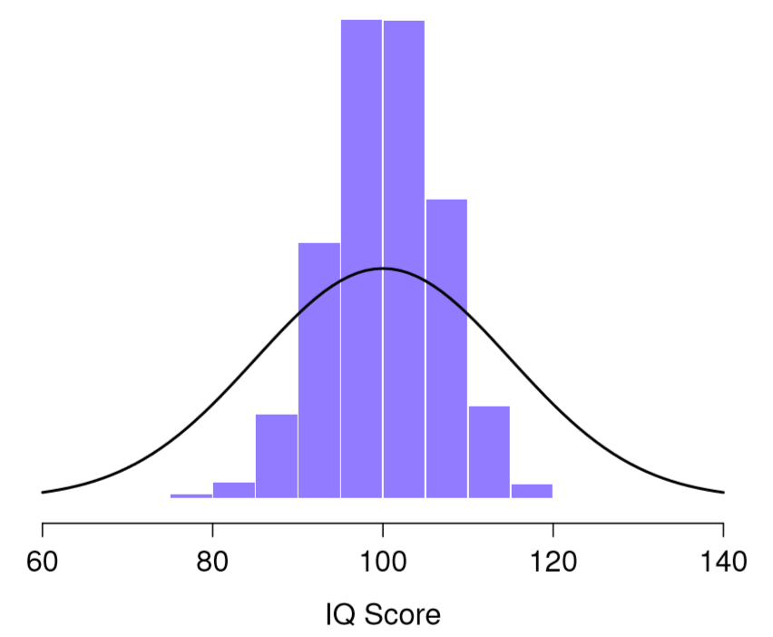
Figure \(\PageIndex{1}\)- Distribution of Means from 10,000 Samples of 5 IQ Scores (CC-BY-SA Danielle Navarro from Learning Statistics with R)
Not Just Distribution of Sample Means
One thing to keep in mind when thinking about sampling distributions is that any sample statistic you might care to calculate has a sampling distribution. For example, suppose that each time Dr. Navarro replicated the “five IQ scores” experiment but wrote down the largest IQ score in the experiment. This would give her a data set that started out like in Figure \(\PageIndex{2}\):
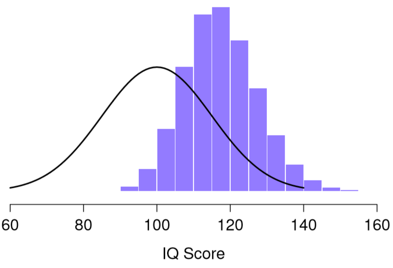
Figure \(\PageIndex{2}\)- Distribution of Highest IQ from 10,000 Samples of 5 IQ Scores (CC-BY-SA Danielle Navarro from Learning Statistics with R)
Doing this over and over again would give Dr. Navarro a very different sampling distribution, namely the sampling distribution of the maximum. The sampling distribution of the maximum of 5 IQ scores is shown in Figure \(\PageIndex{2}\). Not surprisingly, if you pick 5 people at random and then find the person with the highest IQ score, they’re going to have an above average IQ. As shown in Figure \(\PageIndex{2}\), most of the time you’ll end up with someone whose IQ is measured in the 100 to 140 range.
Central Limit Theorem
An illustration of the how sampling distribution of the mean depends on sample size. In each panel, Dr. Navarro generated 10,000 samples of IQ data, and calculated the mean IQ observed within each of these data sets. The histograms in these plots show the distribution of these means (i.e., the sampling distribution of the mean). Each individual IQ score was drawn from a normal distribution with mean 100 and standard deviation 15, which is shown as the solid black line.
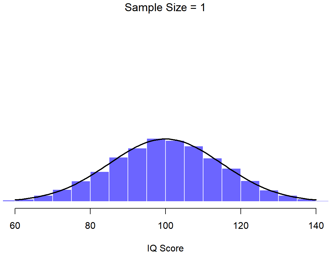
Figure \(\PageIndex{3}\)- Distribution of Mean IQ from 10,000 Samples of 1 IQ Score (CC-BY-SA Danielle Navarro from Learning Statistics with R)
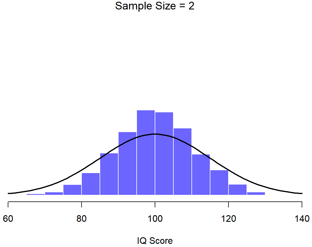
Figure \(\PageIndex{4}\)- Distribution of Mean IQ from 10,000 Samples of 2 IQ Scores (CC-BY-SA Danielle Navarro from Learning Statistics with R)
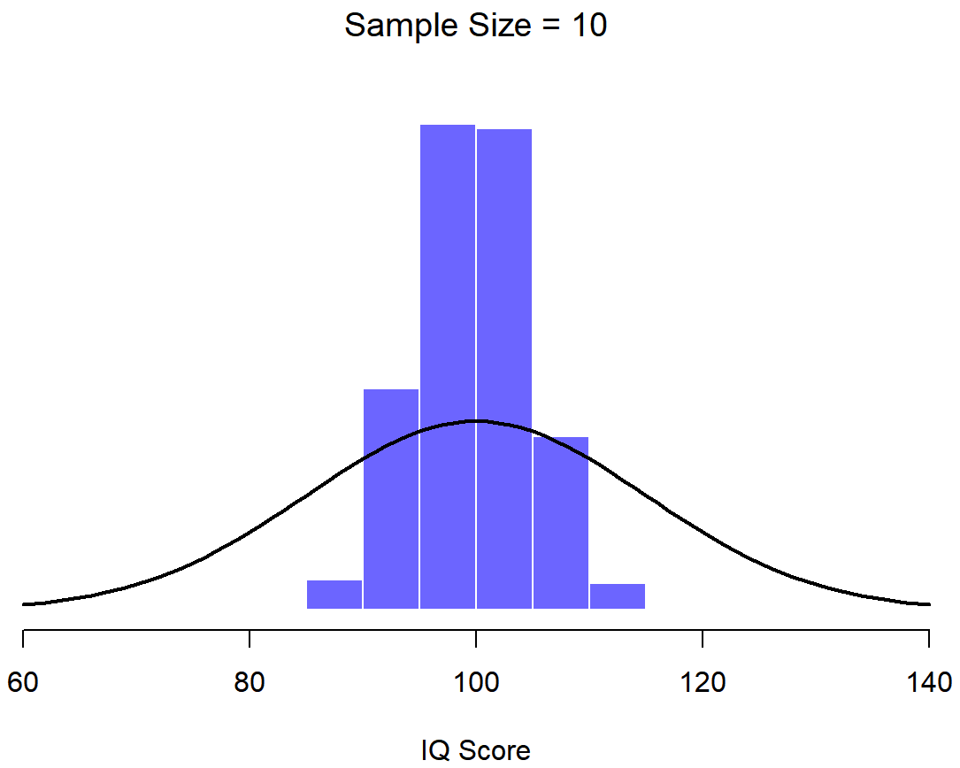
Figure \(\PageIndex{5}\)- Distribution of Mean IQ from 10,000 Samples of 10 IQ Scores (CC-BY-SA Danielle Navarro from Learning Statistics with R)
In Figure \(\PageIndex{3}\), each data set contained only a single observation, so the mean of each sample is just one person’s IQ score. As a consequence, the sampling distribution of the mean is of course identical to the population distribution of IQ scores because there are 10,000 individual scores. When we raise the sample size to 2, as in Figure \(\PageIndex{4}\), the mean of any one sample tends to be closer to the population mean than any one person’s IQ score, and so the histogram (i.e., the sampling distribution) is a bit narrower than the population distribution. By the time we raise the sample size to 10 (Figure \(\PageIndex{5}\)), we can see that the distribution of sample means tend to be fairly tightly clustered around the true population mean.
Sample Size Matters
At this point I hope you have a pretty good sense of what sampling distributions are, and in particular what the sampling distribution of the mean is. This section talks about how the sampling distribution of the mean changes as a function of sample size. Intuitively, you already know part of the answer: if you only have a few observations, the sample mean is likely to be quite inaccurate: if you replicate a small experiment and recalculate the mean you’ll get a very different answer. In other words, the sampling distribution is quite wide. If you replicate a large experiment and recalculate the sample mean you’ll probably get the same answer you got last time, so the sampling distribution will be very narrow. You can see this visually in the Figures in this section: the bigger the sample size, the narrower the sampling distribution gets. We can quantify this effect by calculating the standard deviation of the sampling distribution, which is referred to as the standard error. The standard error of a statistic is often denoted SE, and since we’re usually interested in the standard error of the sample mean, we often use the acronym SEM. As you can see just by looking at the picture, as the sample size N increases, the SEM decreases.
Okay, so that’s one part of the story. However, there’s something I’ve been glossing over so far. All my examples up to this point have been based on the “IQ scores” simlulations, and because IQ scores are usually from a normal distribution, I’ve assumed that the population distribution is shaped like that, a symmetrical, medium bell-shaped curve. What if the population distribution isn’t normally distributed? What happens to the sampling distribution of the mean? The remarkable thing is this: no matter what shape your population distribution is, as N increases the sampling distribution of the mean starts to look more like a normal distribution.
To give you a sense of this, Dr. Navarro ran some simulations . To do this, she started with the “ramped” distribution shown in the histogram in Figure \(\PageIndex{6}\). As you can see by comparing the triangular shaped histogram to the bell curve plotted by the black line, the population distribution doesn’t look very much like a normal distribution at all. Next, Dr. Navarro simulated the results of a large number of experiments. In each experiment she took N=2 samples from this "ramp" distribution, and then calculated the sample mean. Figure \(\PageIndex{7}\) plots the histogram of these sample means (i.e., the sampling distribution of the mean for N=2). This time, the histogram produces a ∩-shaped distribution (reverse-U shaped distribution): it’s still not normal, but it’s a lot closer to the black line than the population distribution in Figure \(\PageIndex{6}\). When Dr. Navarro increases the sample size to N=4, the sampling distribution of the mean is very close to normal (Figure \(\PageIndex{8}\), and by the time we reach a sample size of N=8 (Figure \(\PageIndex{9}\)) it’s almost perfectly symmetrical and bell-shaped!. As you can see, even though the original population distribution is non-normal, the sampling distribution of the mean becomes pretty close to normal by the time you have a sample of even 4 observations. In other words, as long as your sample size isn’t tiny, the sampling distribution of the mean will be approximately normal no matter what your population distribution looks like!
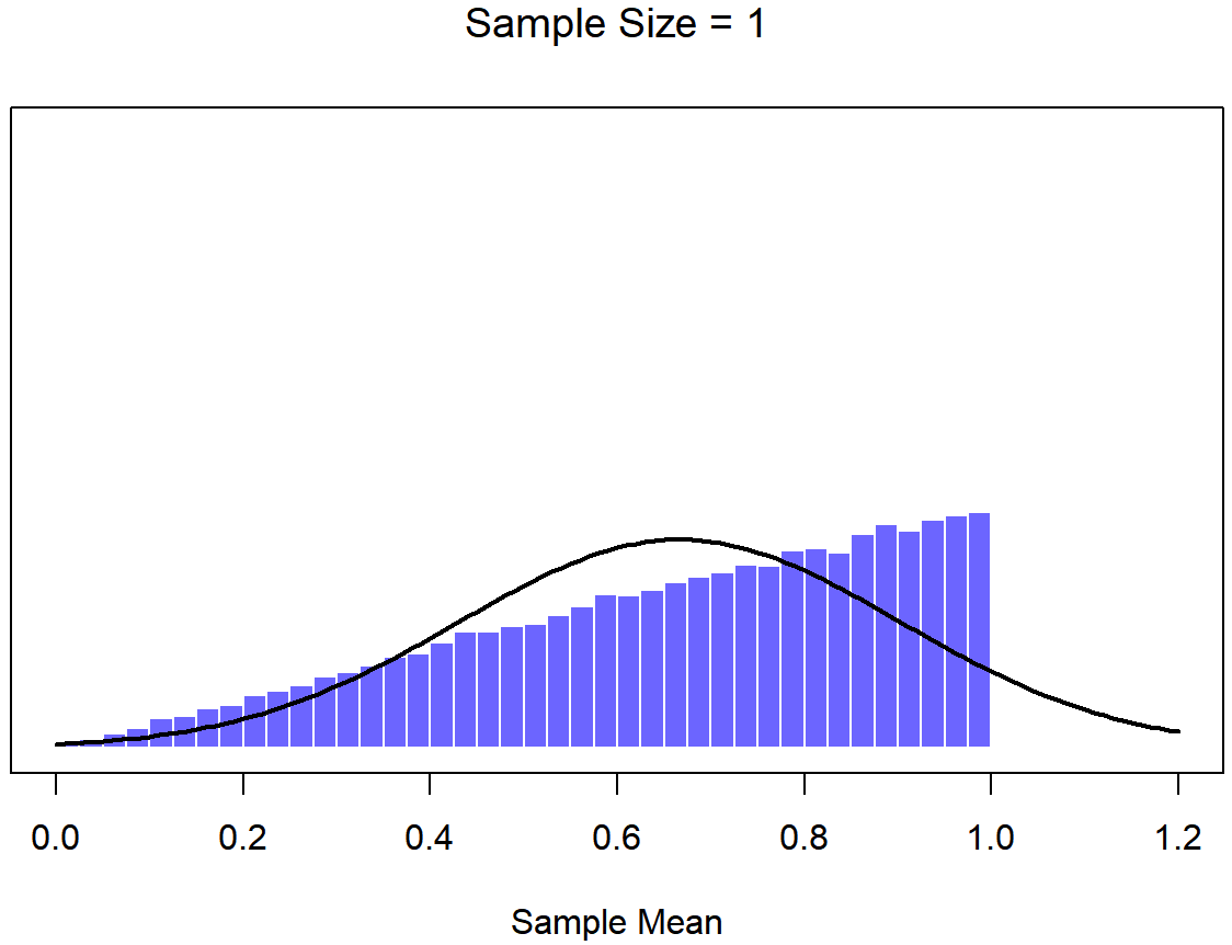
Figure \(\PageIndex{6}\)- Ramp-Shaped Distribution 10,000 Samples of 1 Person (CC-BY-SA Danielle Navarro from Learning Statistics with R)
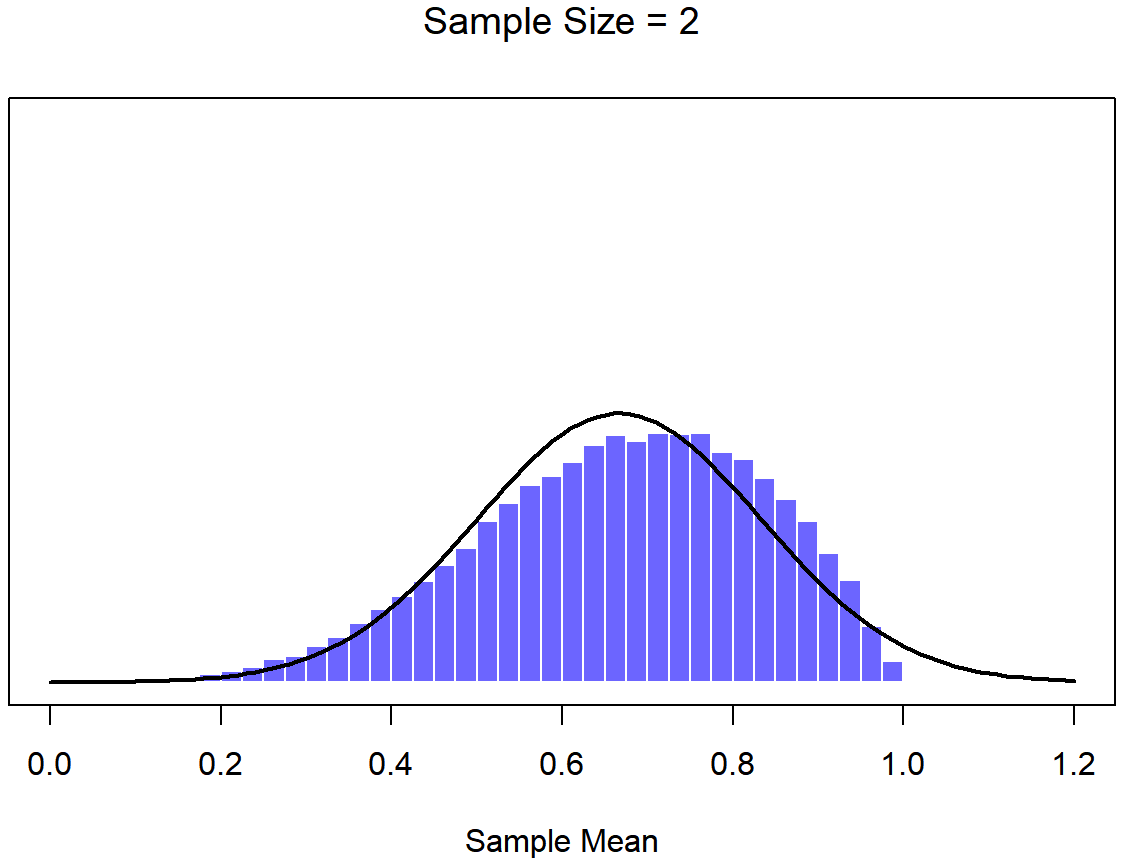
Figure \(\PageIndex{7}\)- Distribution 10,000 Samples of 2 People (CC-BY-SA Danielle Navarro from Learning Statistics with R)
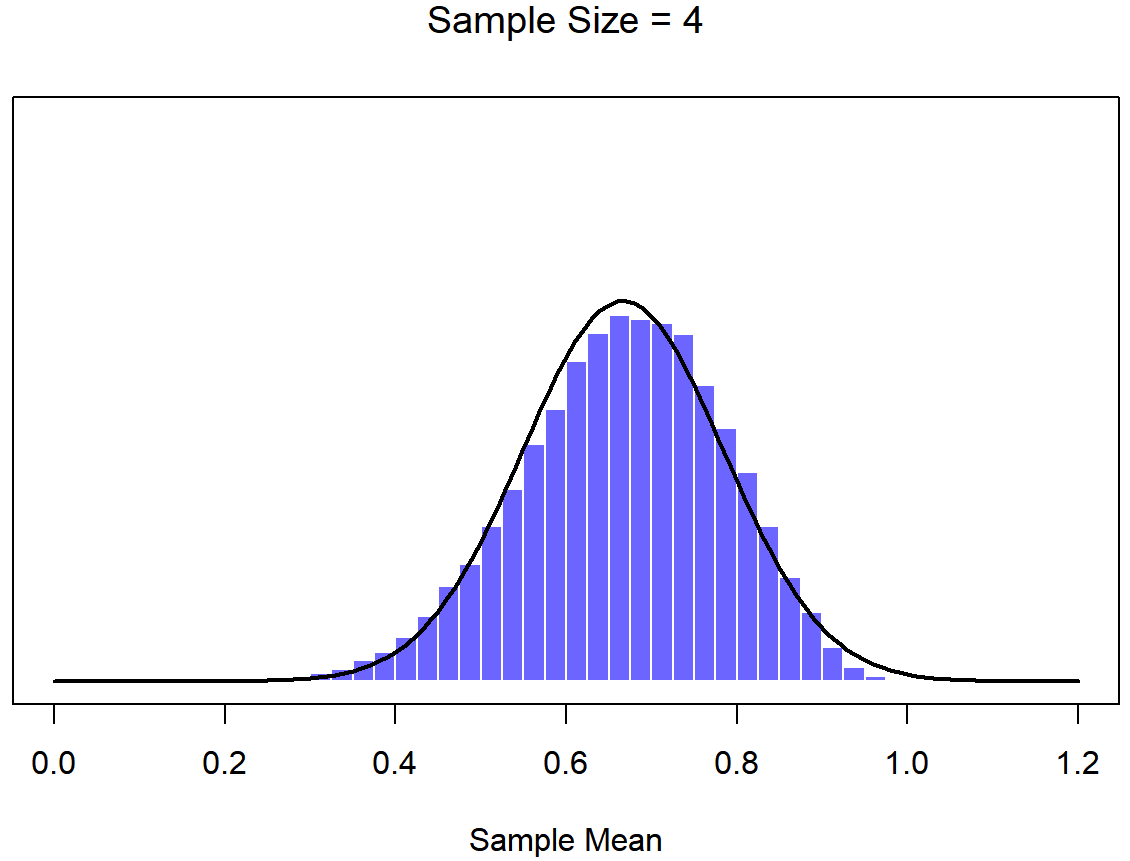
Figure \(\PageIndex{8}\)- Distribution 10,000 Samples of 4 People (CC-BY-SA Danielle Navarro from Learning Statistics with R)
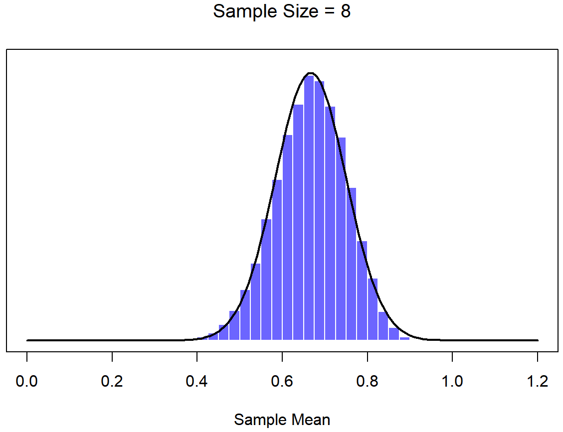
Figure \(\PageIndex{9}\)- Distribution 10,000 Samples of 8 People (CC-BY-SA Danielle Navarro from Learning Statistics with R)
On the basis of these figures, it seems like we have evidence for all of the following claims about the sampling distribution of the mean:
- The mean of the sampling distribution will be VERY similar to the mean of the population.
- The standard deviation of the sampling distribution (i.e., the standard error) gets smaller (taller and narrower distribution) as the sample size increases.
- The shape of the sampling distribution becomes more like a normal distribution as the sample size increases.
As it happens, not only are all of these statements true, there is a very famous theorem in statistics that proves all three of them, known as the central limit theorem. Among other things, the central limit theorem tells us that if the population distribution has mean μ and standard deviation σ, then the sampling distribution of the mean also has mean μ, and the standard error of the mean is
\[
\mathrm{SEM}=\frac{\sigma}{\sqrt{N}}
\nonumber\]
Because we divide the population standard deviation σ by the square root of the sample size N, the SEM gets smaller as the sample size increases. It also tells us that the shape of the sampling distribution becomes normal.
This result is useful for all sorts of things. It tells us why large experiments are more reliable than small ones, and because it gives us an explicit formula for the standard error it tells us how much more reliable a large experiment is. Pay attention to this formula for the standard error, it will come back! It tells us why the normal distribution is, well, normal. In real experiments, many of the things that we want to measure are actually averages of lots of different quantities (e.g., arguably, “general” intelligence as measured by IQ is an average of a large number of “specific” skills and abilities), and when that happens, the averaged quantity should follow a normal distribution. Because of this mathematical law, the normal distribution pops up over and over again in real data.


